What is Miami Art Deco Pastel?
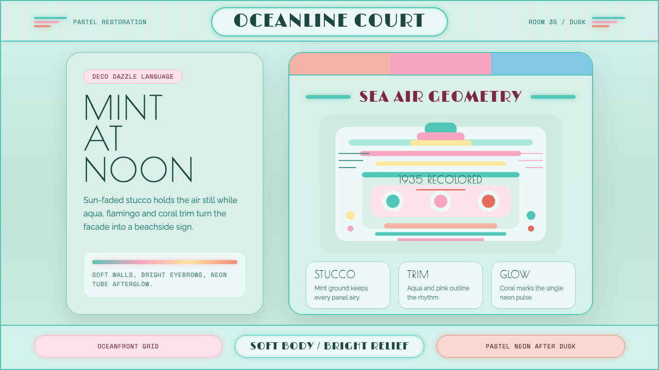
Miami Art Deco Pastel is the sunlit, tropical reinvention of Streamline Moderne — mint stucco, aqua bands, and flamingo-pink trim that turned a fading beachfront into a color scheme.
Miami Art Deco Pastel in brief
Miami Art Deco Pastel is the design system built around South Beach, Miami's distinctive architectural district and the specific 1970s recoloring that made it internationally recognizable. The underlying buildings are 1930s Streamline Moderne — a style defined by rounded corners, horizontal speed-lines, porthole windows, and stepped facades meant to evoke ocean liners and aerodynamic motion. But the system this identity draws on is not the buildings' original pale finish; it is the deliberate, later repainting that picked out architectural details in saturated tropical color.
That recoloring is the actual design event this system reconstructs. The building bodies stay pale — soft mint or cream stucco — while the eyebrows, cornices, trim, and relief ornament that Streamline Moderne architecture is full of get picked out in aqua, flamingo pink, peach, and pale yellow. The result reads as optimistic and airy rather than moody: this is Art Deco stripped of the noir, gilded, urban-nightclub register most people associate with the term, and rebuilt as something sun-bleached and oceanfront.
What distinguishes this system from generic 'pastel' or '1980s retro' palettes is its specificity to a real, documented act of historic preservation and colorist intervention. The pastel scheme was not the buildings' original condition — it was a considered, brand-new color program applied to save a decaying neighborhood, which means every color choice in this system traces back to an actual, nameable decision rather than a vague nostalgic impression.
Where does Miami Art Deco Pastel come from?
South Beach's architecture was built during a concentrated wave of construction in the 1930s, following the devastating 1926 Miami hurricane that leveled much of the area's earlier building stock and cleared the way for a new generation of hotels and apartment buildings. Architects working in Miami during this period embraced Streamline Moderne, an American variant of Art Deco that traded the earlier style's geometric ornament and gilded verticality for the horizontal lines, rounded corners, and nautical references — porthole windows, ship-rail balconies, flagpole-like finials — that suggested speed, modernity, and the machine age optimism of ocean travel and aviation.
For decades after its construction boom, South Beach fell into decline. By the mid-twentieth century the neighborhood had become an aging, unfashionable district, its distinctive buildings overlooked or actively threatened with demolition as Miami's tourism industry and civic attention moved elsewhere. The buildings that survived did so largely in their original pale, unadorned finish — cream, white, or beige stucco with minimal color distinction between structure and ornamental detail.
The neighborhood's rescue and reinvention began with the Miami Design Preservation League, founded in 1976 by activist Barbara Baer Capitman specifically to fight for landmark protection of the district's Art Deco architecture against continued demolition. Capitman's preservation campaign succeeded in getting the Miami Beach Architectural District listed on the National Register of Historic Places in 1979 — at the time, one of the youngest districts ever to receive such recognition, since most register-listed architecture was considerably older.
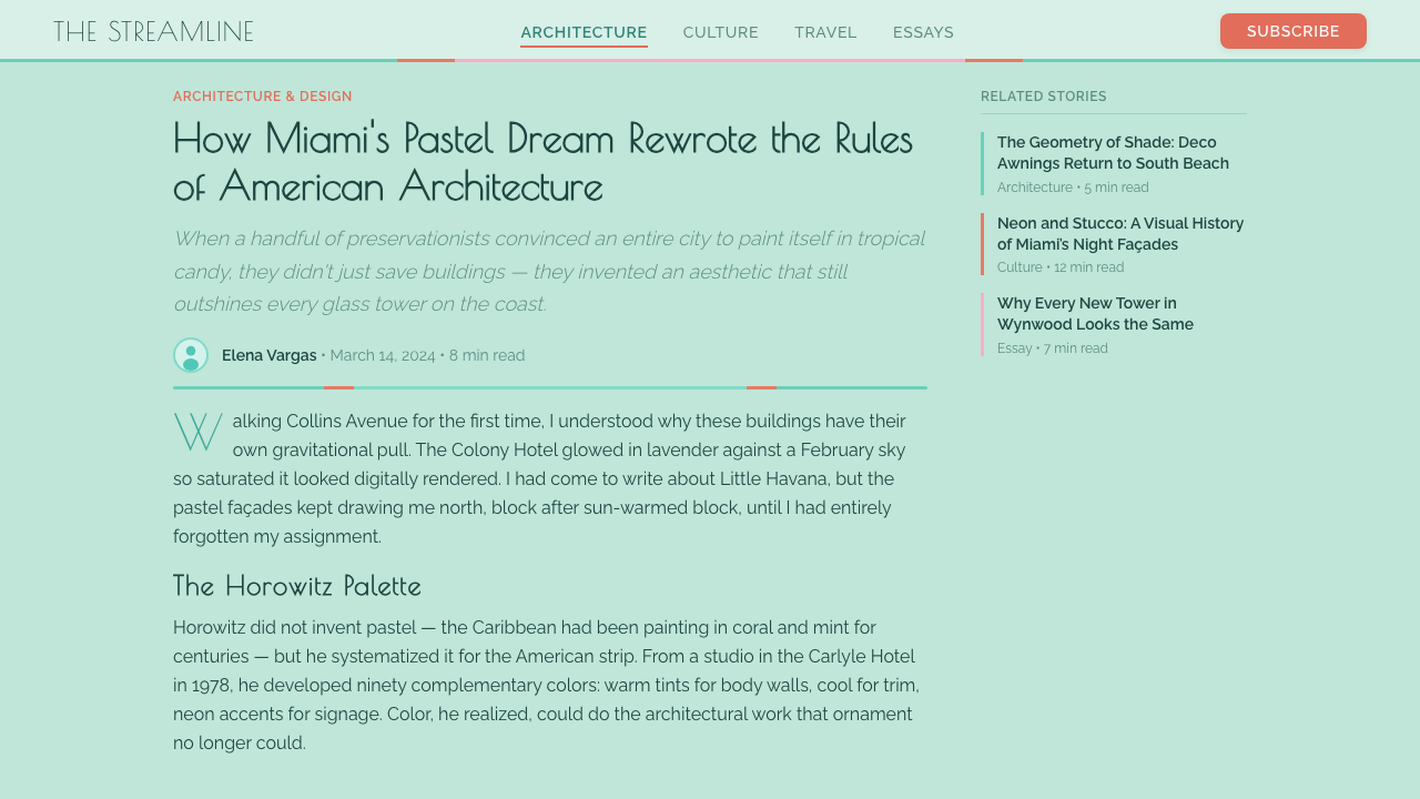
The color scheme that made South Beach globally famous came from colorist Leonard Horowitz, who worked with Capitman's preservation league in the late 1970s and into the 1980s to develop what became known as the 'Deco Dazzle' repainting program. Rather than restoring buildings to their original pale monochrome, Horowitz proposed picking out the buildings' existing architectural relief — the eyebrows, cornices, and geometric trim already built into the Streamline Moderne facades — in saturated tropical pastels, while keeping the main wall surfaces pale. This approach made the underlying architecture more visible and legible rather than less, since ornamental details that had previously blended into a monochrome facade now stood out in contrasting color, and it gave the neighborhood an immediately photogenic, television-and-film-friendly identity that helped drive South Beach's transformation into an international fashion and tourism destination through the 1980s and beyond.
What defines the Miami Art Deco Pastel look?
Color
Building bodies stay pale — soft mint stucco or cream — while trim, eyebrows, and relief ornament are picked out in aqua, flamingo pink, peach, and pale yellow. The palette is deliberately tropical and light-saturated rather than dark or moody, and colors are always applied as accents against a pale ground rather than as full-body saturated fields.
Streamline Geometry
The underlying architectural forms are Streamline Moderne: rounded corners, horizontal speed-lines cut or raised into facades, porthole-style circular windows, and stepped, tiered massing that suggests ocean-liner decks. These forms should be preserved as the structural basis of any layout, with the pastel palette applied to pick them out rather than replacing them.
Neon Glow
Neon-tube signage and accent lighting are a core historical element, associated with South Beach's hotel marquees and storefront signs. In this system neon reads as a soft, evening glow rather than harsh saturated light — a warm accent against the pastel daytime palette, evoking dusk on the beachfront rather than an urban nightclub.
Typography
Lettering favors rounded, geometric forms consistent with the Streamline Moderne era — letterforms with soft corners and confident horizontal emphasis, often rendered as if in neon tubing or cast in the same stepped, rounded logic as the building facades themselves. Overly sharp, angular, or heavily gilded type works against the airy, sun-bleached register this system depends on.
Trim over Field
Color is applied as trim and accent, never as a full saturated background field. The discipline of the original repainting program was to keep large surfaces pale and reserve saturated pastel for cornices, window surrounds, and relief details — this hierarchy should be preserved rather than inverted into an all-over colorful wash.
Optimism over Noir
This system deliberately departs from the darker, gilded, urban-nightclub register that dominates popular ideas of Art Deco. It should always read as sunlit, airy, and oceanfront-optimistic rather than moody or glamorously dark — this emotional register is as much a defining feature of the style as any specific color or shape.
Historic Specificity
The palette and application logic trace back to a real, documented mid-1970s colorist intervention rather than a generic retro impression, which means the system should always be applied with the discipline of restoring architectural detail rather than as a loose 'pastel retro' mood board with no connection to the underlying Streamline forms.
Who shaped Miami Art Deco Pastel?
Horowitz was the colorist who developed South Beach's 'Deco Dazzle' repainting scheme in the late 1970s and into the 1980s, working with the Miami Design Preservation League. His central insight was that picking out existing architectural relief in saturated tropical pastel — rather than restoring buildings to their original pale monochrome — would make Streamline Moderne detail more visible and give the neighborhood an internationally distinctive, photogenic identity.
Capitman founded the Miami Design Preservation League in 1976 to fight the demolition of South Beach's Art Deco and Streamline Moderne architecture, successfully campaigning to have the district listed on the National Register of Historic Places in 1979. Her preservation activism was the foundational effort that made Horowitz's later colorist intervention possible, since it saved the buildings from demolition before they could be recolored at all.
How do you use Miami Art Deco Pastel today?
Miami Art Deco Pastel works best wherever a design needs to feel optimistic, sun-drenched, and coastal without sliding into generic tropical or beach-vacation cliché. Because its discipline is rooted in a real architectural logic — pale bodies, colored trim, Streamline geometry — applying it correctly means preserving that structural hierarchy rather than treating the palette as a free-floating set of pastel colors.
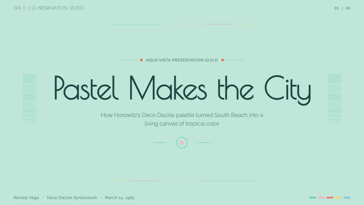
For presentation slides, the system suits a cover page with a pale mint or cream field, a single aqua or flamingo-pink rule or geometric accent echoing a building's stepped cornice, and rounded, confident title type reminiscent of neon signage. Content slides should keep body backgrounds pale, reserving the saturated pastels for section dividers, callout boxes, or data highlights — mirroring the original scheme's discipline of trim-over-field rather than an all-over colorful wash.
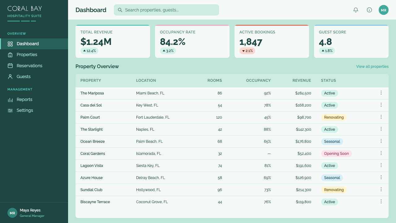
For web interfaces, the palette suits hospitality, travel, lifestyle, and leisure products — booking platforms, resort or hotel sites, wellness apps — where an airy, optimistic register is a genuine asset. Pricing tiers and feature cards read well with pale card backgrounds and a single saturated pastel accent border or icon, and rounded corners throughout reinforce the Streamline geometry that underlies the whole system.
For editorial and marketing work, the system supports travel features, brand campaigns evoking retro-coastal glamour, or any story about revival and reinvention — since the style's own history is literally a story of an aging, threatened neighborhood being saved and made vibrant through color. Photography paired with this system should favor soft daylight and pastel architecture rather than moody evening shots, keeping the emotional register consistent with the style's sunlit optimism.
A common mistake is treating this as a generic 'pastel' or '1980s Miami Vice' palette disconnected from actual Streamline Moderne architectural forms — rounded corners, speed-lines, porthole windows — which strips the system of its structural logic and reduces it to a color trend. A second common mistake is saturating entire backgrounds in pastel color rather than keeping large fields pale and reserving saturation for trim and accent, which inverts the exact hierarchy that made the original 'Deco Dazzle' scheme legible and effective.
Miami Art Deco Pastel — FAQ
Is the Miami Art Deco Pastel palette the buildings' original 1930s color scheme?
No — the buildings were originally finished in pale, largely monochrome stucco with minimal color distinction between structure and ornament. The tropical pastel scheme now associated with South Beach was a deliberate repainting program developed by colorist Leonard Horowitz in the late 1970s and 1980s, working with the Miami Design Preservation League, decades after the buildings were constructed. The system this design draws on is that later colorist intervention, not the original 1930s finish.
How is this different from generic Art Deco design?
Classic Art Deco, associated with 1920s and 1930s urban centers like New York, tends toward dark, gilded, geometric ornament — black lacquer, gold leaf, sunburst motifs, an urban and glamorous register. Miami Art Deco Pastel is a specific regional and later variant: it is built on Streamline Moderne's rounded, horizontal forms rather than Deco's earlier geometric verticality, and its defining color event is a 1970s pastel repainting rather than the original era's palette. The emotional register is airy and optimistic rather than dark and glamorous.
Why does the scheme keep building bodies pale instead of using saturated color everywhere?
Because Horowitz's insight was that saturated color works best as an accent that makes existing architectural relief more visible, not as a full-coverage treatment. Painting an entire building surface in saturated pastel would flatten the visual hierarchy and make the underlying Streamline Moderne detail — the eyebrows, cornices, and stepped forms — harder to read, not easier. Keeping large surfaces pale and reserving saturation for trim is what made the scheme both historically effective and visually legible.
What role did neon signage play in this style?
Neon-tube signage on hotel marquees and storefronts is a core historical element of South Beach's identity, closely tied to the district's revival as a fashion and tourism destination through the 1980s. In this design system, neon should be treated as a warm evening accent — a soft glow suited to dusk photography — rather than as harsh, saturated light, keeping it consistent with the airy, optimistic register the rest of the palette establishes.
Does this style work for brands outside the hospitality or travel industry?
It can, provided the brand genuinely wants to signal optimism, lightness, and a coastal or revival narrative rather than borrowing the palette purely for decorative appeal. It has been applied successfully to lifestyle, wellness, and even some technology brands wanting to distance themselves from cold, clinical minimalism. It is a poor fit for brands needing to signal severity, urgency, or high-stakes seriousness, since the entire palette is built to communicate ease and sunlit optimism rather than gravity.
Related design styles
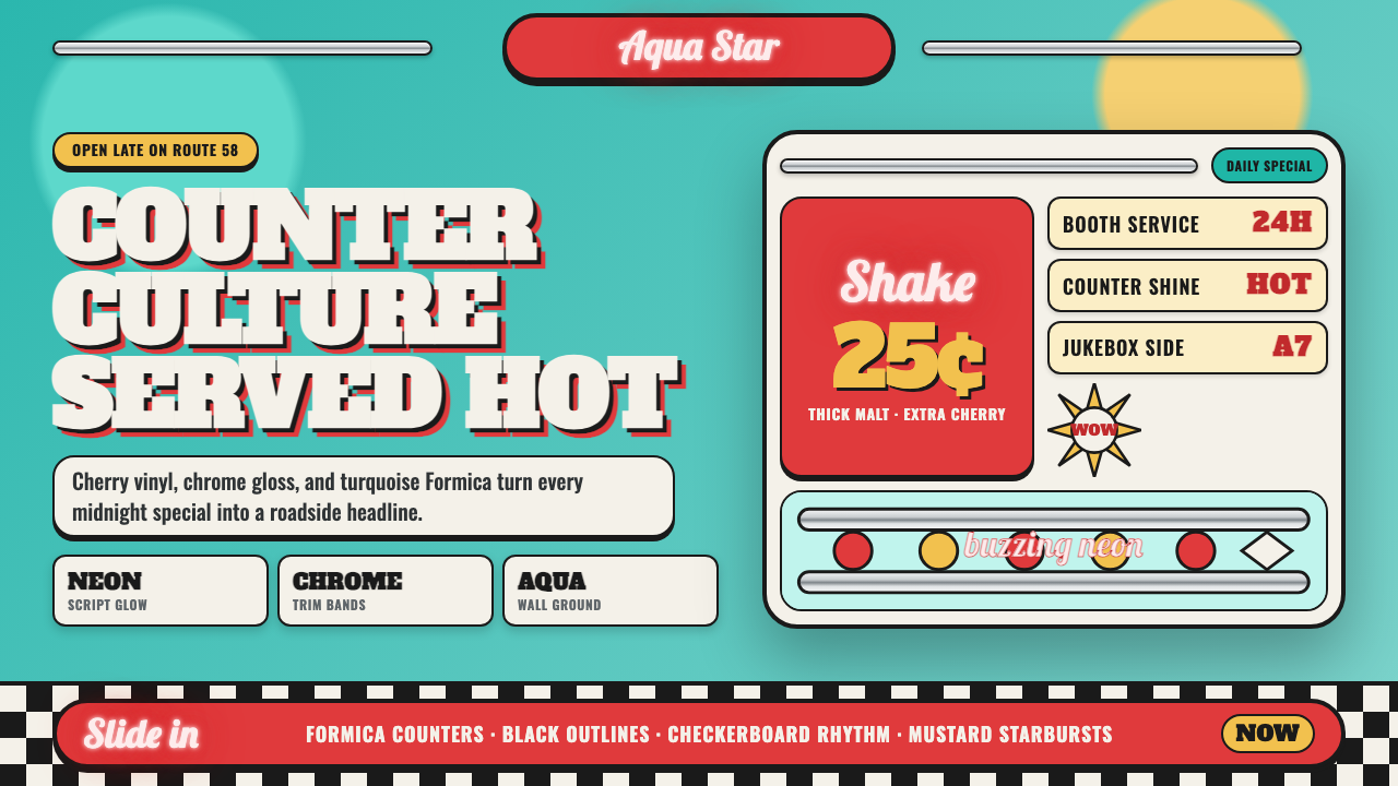 1950s Diner AquaRoadside optimism shouts. Aqua walls, cherry vinyl, chrome bands, and neon sc…
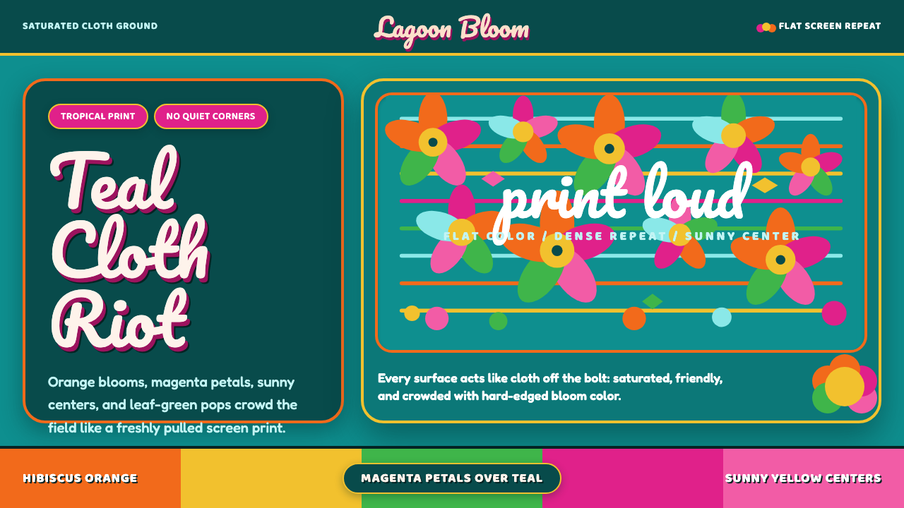 Fiji Bula Floral ShirtLoud cloth, zero quiet corners. Teal ground carries orange blooms and magenta…
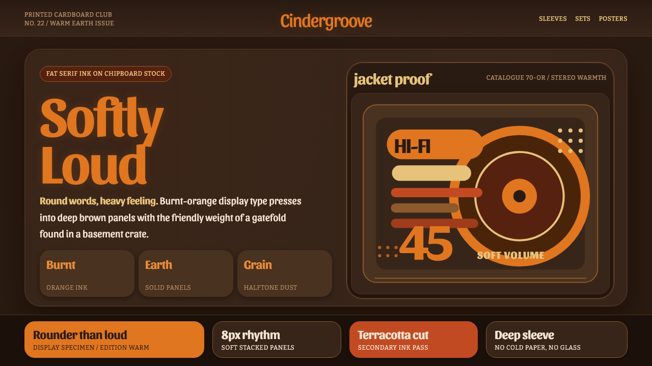 Cooper Black DisplayShouts softly. Burnt-orange Cooper type sinks into deep chipboard brown with…
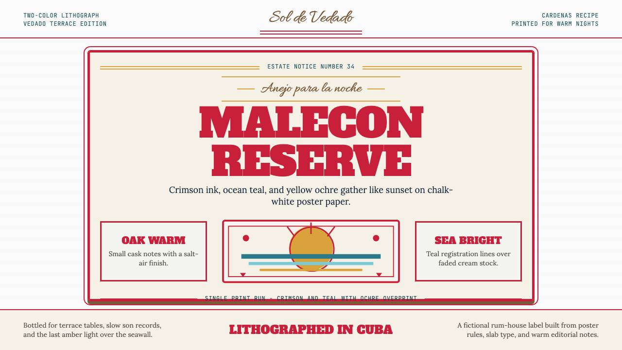 Havana Club Cuban RumSunset in print. Crimson slab type and ocean teal rules age on chalk-white pa…
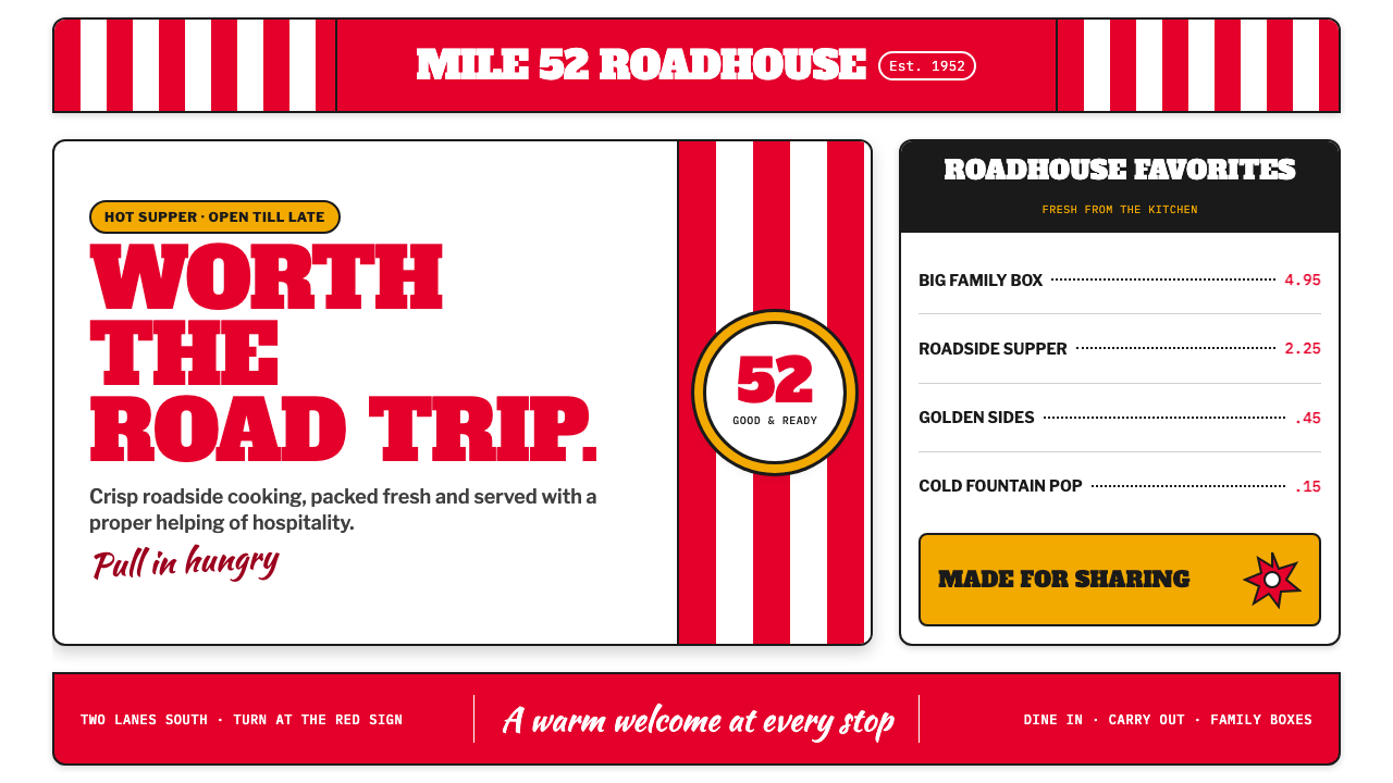 KFC Colonel (1952)Roadside appetite, turned up loud. Enamel red stripes and slab-serif shouts f…
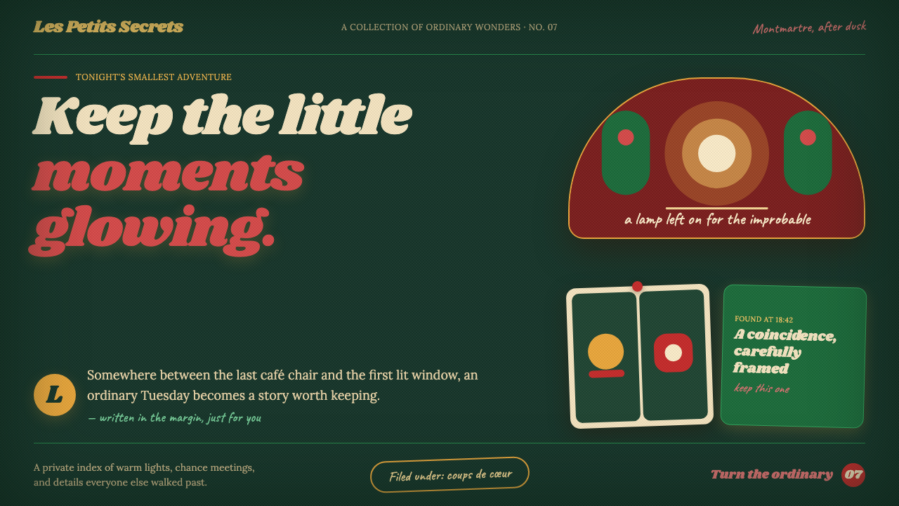 Amélie (Montmartre 2001)Ordinary moments glow like secrets. Storybook green, carmine accents, and cre…