What is Chalkboard Cafe Menu (2010)?什么是 Chalkboard Cafe Menu (2010)?
Chalk on slate turned every café into a gallery — and every barista into a hand-lettering artist.粉笔在板岩上落下,咖啡馆变成了画廊,咖啡师变成了手写艺术家。
Chalkboard Cafe Menu (2010) in briefChalkboard Cafe Menu (2010) 速览
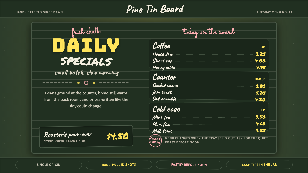
The chalkboard café menu is vernacular typography at its most democratic — a visual tradition in which imperfection is not a flaw to be corrected but the entire aesthetic point. Multiple typefaces stack vertically on a dark ground, hand-drawn flourishes curl around prices, and the slight wobble of a chalk stroke signals authenticity rather than carelessness. The style belongs to the broader hand-lettering revival of the late 2000s and 2010s, but its visual logic is distinctly its own: warm, artisanal, and saturated with the feeling of a neighborhood café on a rainy morning.粉笔咖啡馆菜单是最具民主精神的日常字体艺术——在这一视觉传统中,不完美不是需要纠正的缺陷,而是整个美学的核心所在。多种字形纵向叠放在深色底面上,手绘花饰环绕着价格蜿蜒,粉笔笔触的轻微抖动传递的是真实感而非粗糙。这种风格属于2000年代末至2010年代手写复兴运动的大范畴,但它的视觉逻辑独树一帜:温暖、手工感十足,充满了某个雨天早晨街角咖啡馆的气息。
The palette is built on contrast between a deep, matte dark ground — the color of a weathered chalkboard — and the soft, slightly chalky white of lettering applied by hand. Warm yellows mark prices and headings; dusty pinks and sage greens provide secondary accent strokes and flourishes. Nothing is sharp or saturated in the digital sense: every color reads as slightly faded, as if the board has been wiped down a hundred times and redrawn. This controlled softness is what separates a convincing chalkboard composition from a harsh digital imitation.色板建立在深色亚光底面与手写粉白字迹之间的对比之上——底面如同经年磨损的黑板,字迹如同手工涂抹的粉笔,带着微微的粉质感。温暖的黄色标注价格与标题,尘粉色和鼠尾草绿提供次级强调笔触与花饰。没有什么是数字意义上的锐利或高饱和:每一种颜色都读起来略显褪色,仿佛黑板被擦拭了一百遍又重新书写。这种受控的柔和感,正是有说服力的黑板构图与生硬数字仿制品之间的本质区别。
Typography within the style is deliberately layered and mixed. Script letterforms suggest the flowing hand of a calligrapher; blocky serif display letters provide weight for section headers; hand-printed capitals in a rougher, more casual form label categories. The interplay between these three or four voices — flowing, heavy, casual, decorative — produces a richness that no single typeface could achieve. Flourishes, arrows, banners, botanical sprigs, and decorative borders fill the negative space between text columns, giving the composition a hand-assembled quality that invites lingering.这种风格内的字体排印是刻意分层与混合的。草书字形暗示书法家流动的笔触;厚重衬线展示字母为段落标题提供分量;更粗犷随意的手印大写字母标注分类。这三四种字体声音——流动、厚重、随意、装饰性——的相互交融产生了任何单一字体都无法实现的丰富层次。花饰、箭头、横幅、植物小枝与装饰边框填充着文字栏之间的负空间,赋予构图一种手工拼装的品质,令人愿意驻足流连。
See the Chalkboard Cafe Menu (2010) design system查看 Chalkboard Cafe Menu (2010) 完整设计系统
Where does Chalkboard Cafe Menu (2010) come from?Chalkboard Cafe Menu (2010) 从何而来?
The visual DNA of the chalkboard café menu stretches back to Victorian Britain, where traveling merchants and street vendors painted their prices and offerings directly onto portable slate boards. By the mid-nineteenth century, the practice had moved indoors: butchers, fishmongers, and grocers displayed chalk-lettered specials on fixed boards behind their counters. The hand of the shopkeeper was itself a kind of authenticity mark — proof that the prices were current, the produce fresh, the establishment human-scaled rather than corporate.粉笔咖啡馆菜单的视觉基因可追溯至维多利亚时代的英国——行商与街头小贩将价格和商品直接用粉笔写在便携式板岩上。到十九世纪中叶,这一做法已迁入室内:肉铺、鱼贩与杂货商在柜台后的固定黑板上用粉笔书写每日特价。店主的手迹本身就是一种真实性印记——证明价格是即时的,食材是新鲜的,店铺是人性化而非企业化的。
American diner culture of the 1940s through the 1960s absorbed and amplified the tradition. The roadside diner blackboard became a fixture of the vernacular landscape: a daily-special board behind the counter, lettered in block capitals or casual script by whoever was first in that morning. The boards were functional above all else — communicating changing menus quickly and cheaply — but over decades they accumulated an aesthetic weight. By the time of the 1970s and 1980s nostalgia cycles, the diner blackboard had become a cultural shorthand for honest, unpretentious American food.1940至60年代的美国路边餐厅文化吸收并放大了这一传统。路边餐厅黑板成为日常风景中的固定元素:柜台后的每日特餐板,由那天最早到店的人用印刷大写字母或随意草书写就。这些黑板首先是功能性的——快速而廉价地传达不断变化的菜单——但经过数十年的积累,它们获得了美学分量。到1970至80年代的怀旧浪潮中,餐厅黑板已成为诚实、不做作的美式食物的文化简称。
The third-wave coffee movement of the late 1990s and early 2000s transformed the chalkboard from a functional object into a design statement. Cafés in Portland, Melbourne, Brooklyn, and London began investing deliberate creative labor in their menu boards, hiring calligraphers and graphic artists to letter them. The boards became a visual identity system for an entire ideology of hospitality: locally sourced, carefully prepared, priced honestly, and presented with personality. The chalkboard said, implicitly, that the person behind the counter cared about more than commerce.1990年代末至2000年代初的第三波精品咖啡运动,将黑板从功能物品转变为设计宣言。波特兰、墨尔本、布鲁克林和伦敦的咖啡馆开始在菜单板上投入刻意的创意劳动,聘请书法师和平面艺术家来书写它们。这些黑板成为整个待客理念的视觉识别系统:本地采购、精心制备、诚实定价、个性呈现。黑板在隐含地说:柜台后面的人在乎的不仅仅是生意。
Between 2008 and 2018, Pinterest and Instagram amplified a pre-existing hand-lettering revival into a global phenomenon. Lettering artists such as Sean McCabe, Lauren Hom, Stefan Kunz, and Tobias Saul built substantial audiences by sharing process photographs and finished compositions. The chalkboard café menu aesthetic crossed from physical boards into digital design, illustration, and wedding stationery — anywhere a designer wanted to communicate warmth, craft, and a slight nostalgia for the analog. By 2013 or 2014, the style had achieved such saturation that a minor critical backlash emerged, dismissing it as derivative or overused. This did not stop its spread; it only clarified its cultural positioning as the visual language of a particular moment in artisanal consumer culture.2008至2018年间,Pinterest和Instagram将早已存在的手写复兴运动放大为全球现象。Sean McCabe、Lauren Hom、Stefan Kunz和Tobias Saul等字体艺术家通过分享过程照片和完成作品积累了大量粉丝。粉笔咖啡馆菜单美学从实体黑板渗透至数字设计、插画和婚礼文具——任何设计师希望传递温暖、手工感与对模拟时代淡淡怀旧的地方。到2013或2014年前后,这种风格已达到如此高的饱和度,以至于出现了小规模的批评反弹,将其斥为衍生或过度使用。这并未阻止其传播,只是更清晰地确立了它作为某一特定精品消费文化时刻的视觉语言的文化定位。
What defines the Chalkboard Cafe Menu (2010) look?Chalkboard Cafe Menu (2010) 的视觉特征是什么?
Dark Ground深色底面
The foundational element is a deep, matte ground in the color of aged slate or weathered chalkboard — a dark green with gray undertones rather than pure black. This ground is not flat in the digital sense: it reads as slightly textured, absorbing rather than reflecting light. Everything else in the composition sits on top of this surface, and the ground's matte depth is what gives chalk-white lettering its characteristic soft luminosity. Without this specific quality of darkness, the style collapses into generic dark-mode design.这种风格的基础元素是一块深色亚光底面,颜色如同陈年板岩或风化黑板——是带灰色底调的深绿,而非纯黑。这块底面在数字意义上并不是平坦的:它读起来略有质感,吸收而非反射光线。构图中的一切其他元素都浮于其上,而底面的亚光深度正是粉白字迹呈现出特有柔和光感的原因。没有这种特定的暗部品质,这种风格就会坍缩为普通的深色模式设计。
Chalky White Lettering粉质白色字迹
The primary text color is not pure white but a slightly warm, slightly uneven chalky white that reads as physically applied rather than digitally rendered. Strokes vary subtly in opacity along their length — thicker at the start and end of a stroke, thinner in the middle — mimicking the pressure and release of actual chalk on slate. This textural variation is the most critical detail distinguishing authentic chalkboard aesthetic from a merely dark-background design. Where pure white would look electronic and harsh, chalky white reads as handmade and warm.主要文字颜色不是纯白,而是略带暖意、略显不均匀的粉质白,读起来像是物理施涂而非数字渲染。笔触沿其长度方向有细微的不透明度变化——笔触起止处较厚,中间较细——模拟真实粉笔在板岩上的压力与释放。这种质感变化是区分真实黑板美学与普通深色背景设计的最关键细节。纯白色看起来电子而生硬,粉质白则读起来手工而温暖。
Mixed Lettering Voices多重字体声音
No single typeface dominates; the visual richness comes from the layering of three or four distinct lettering styles within a single composition. A flowing script handles names of drinks or dishes, conveying elegance and craft. Heavy block serifs or slab letters carry section headers, providing visual anchors. Rough hand-printed capitals label categories with casual authority. Inline or outlined letterforms add a vintage poster quality for featured items. The discipline is in the orchestration: each voice has its role, and they are harmonized by consistent color and shared imperfection rather than by formal similarity.没有单一字体占主导;视觉丰富性来自单一构图中三四种截然不同字体风格的叠加分层。流动草书处理饮品或菜肴名称,传递优雅与手工感。厚重块衬线或板形字母承载段落标题,提供视觉锚点。粗犷的手印大写字母以随意的权威感标注类别。内嵌或轮廓字形为特色菜品增添复古海报质感。功力在于编排:每种声音都有其角色,它们通过一致的色彩和共同的不完美而非形式相似性达到和谐。
Warm Accent Colors温暖强调色
Against the dark ground and chalky white, two or three accent colors do the work of hierarchy and visual warmth. A warm, slightly dusty yellow marks prices, nutritional callouts, or featured items — it reads as highlighter-bright without being neon. A muted, dusty pink or rose provides decorative flourishes, borders, and botanical details. A sage or olive green may appear as a third accent, echoing the ground but at a lighter value. None of these colors are fully saturated; they all carry a slightly faded quality consistent with chalk pigment rather than digital color.在深色底面和粉质白字迹之间,两三种强调色承担层级区分和视觉温度的工作。温暖而略带尘感的黄色标记价格、营养提示或特色菜品——读起来像荧光笔一样醒目,却不显霓虹。哑光的尘粉色或玫瑰色提供装饰花饰、边框和植物细节。鼠尾草绿或橄榄绿可能作为第三种强调色出现,呼应底面但明度更高。这些颜色没有一种是完全饱和的;它们都带有与粉笔颜料而非数字色彩一致的略微褪色品质。
Flourishes and Decorative Fill花饰与装饰填充
Empty space is not left empty. Botanical sprigs, swash strokes, arrow indicators, double-line frames, dotted borders, and small illustrative vignettes — coffee cups, wheat stalks, simple leaf forms — fill the gaps between text columns and between the edge of the composition and the nearest letterform. These decorative elements serve a structural purpose as much as an aesthetic one: they unify the composition, establish consistent visual weight across the surface, and prevent the eye from drifting off the board. Their hand-drawn quality — slightly imprecise, slightly variable — is essential; a mechanically perfect flourish reads as decoration, while an imperfect one reads as craft.空白空间不会被留空。植物小枝、花体笔触、箭头指示符、双线边框、点状边界,以及小型插图小景——咖啡杯、麦秆、简单叶形——填充着文字栏之间以及构图边缘与最近字形之间的间隙。这些装饰元素与其说是美学功能,不如说同时具有结构功能:它们统一构图,在整个版面上建立一致的视觉重量,防止视线从黑板上漂移。其手绘质感——略微不精确、略微有变化——是本质所在;机械完美的花饰读起来是装饰,而不完美的花饰读起来是手工。
Vertical Stacking and Centered Composition纵向叠放与居中构图
Where Bauhaus or Swiss style would use an asymmetric grid, the chalkboard café menu is almost always centered and read top-to-bottom in vertical stacks. Each item or section occupies a horizontal band, with the lettering centered on an invisible vertical axis. This centered, stacked structure derives directly from the physical constraints of a board viewed head-on by someone standing at a counter — it is a reading convention, not a formal choice. The result is a composition that feels both carefully organized and hand-assembled, like a stack of hand-lettered signs arranged by someone with a good eye.与包豪斯或瑞士风格的非对称网格不同,粉笔咖啡馆菜单几乎总是居中的,从上到下以纵向叠放方式阅读。每个条目或段落占据一个水平带区,字迹以不可见的垂直轴居中排列。这种居中叠放结构直接来自实体黑板的物理限制——由站在柜台前的人正面观看——它是一种阅读惯例,而非形式选择。结果是一种既感觉精心组织又感觉手工拼装的构图,就像一个有好眼光的人排列的手写标牌堆叠。
Intentional Imperfection刻意的不完美
The style's most philosophically significant characteristic is its embrace of imperfection as a positive value. Slightly uneven letter spacing, minor variations in stroke weight, a flourish that curls a little differently than its mirror on the other side — these are not errors to be fixed but signals to be preserved. They communicate that a human hand was involved, and that hand-made labor has a worth that justifies a slightly higher price for whatever is on the menu. The entire aesthetic is organized around the semiotics of authenticity: visual proof that something was made carefully, individually, and with intention, even if — especially if — it shows the evidence of its making.这种风格在哲学层面最重要的特征,是将不完美视为正面价值加以拥抱。略微不均匀的字间距,笔触粗细的细微变化,一个花饰的卷曲方式与其另一侧镜像略有不同——这些不是需要修正的错误,而是需要保留的信号。它们传达的是:有一双人类的手参与其中,而这双手的手工劳动具有一种价值,足以为菜单上的任何东西正当化略高一些的价格。整个美学围绕真实性的符号学组织:视觉上的证明,某物是被精心、个别、有意图地制作的——即便如此——尤其是因为它显示出其制作过程的痕迹。
See the Chalkboard Cafe Menu (2010) design system查看 Chalkboard Cafe Menu (2010) 完整设计系统
Who shaped Chalkboard Cafe Menu (2010)?谁塑造了 Chalkboard Cafe Menu (2010)?
Lauren Hom is one of the most widely recognized figures of the hand-lettering revival that defined the chalkboard café menu's digital phase. Working across editorial, advertising, and personal projects, she became known for compositions that combined typographic sophistication with deliberate warmth and color — qualities directly aligned with the chalkboard aesthetic. Her viral campaign lettering food-related quotes on chalk surfaces for a daily project in the early 2010s drew widespread attention to the artistic possibilities of the medium beyond the café context.Lauren Hom是定义粉笔咖啡馆菜单数字阶段的手写复兴运动中最广为人知的代表人物之一。她的工作跨越编辑、广告和个人项目,以将字体排印的精致性与刻意的温暖感和色彩结合起来的构图而著称——这些品质与黑板美学直接契合。她在2010年代初的一个日常项目中将与食物相关的引语用粉笔书写在各种表面上,这一病毒式传播的项目将公众的广泛关注带向了这一媒介在咖啡馆语境之外的艺术可能性。
Sean McCabe built an influential body of work and a substantial online following through systematic documentation of his hand-lettering practice, including tutorials, process videos, and finished compositions shared extensively across early Instagram and Pinterest. His emphasis on the craft dimension of lettering — the deliberate practice required to produce apparently effortless results — helped establish hand-lettering as a distinct professional discipline rather than a subsidiary of traditional calligraphy or type design. His work contributed to legitimizing the chalkboard style as worthy of serious design attention.Sean McCabe通过系统性记录其手写实践——包括教程、过程视频以及在早期Instagram和Pinterest上广泛分享的完成作品——建立了有影响力的作品体系和大量在线追随者。他对字体设计手工维度的强调——产生看似毫不费力的结果所需要的刻意练习——帮助将手写字体确立为一个独立的专业学科,而非传统书法或字体设计的附属。他的工作有助于将黑板风格合法化为值得认真关注的设计对象。
Stefan Kunz developed a distinctive approach to lettering that blended rigorous technical execution with organic, flowing forms — qualities that translate directly into the chalkboard café aesthetic's most polished expressions. As an educator as well as a practitioner, he contributed to spreading systematic lettering methodology through workshops and online instruction, ensuring that the techniques underlying the chalkboard style were taught consistently and documented thoroughly across the global hand-lettering community.Stefan Kunz发展出一种将严格的技术执行与有机流动形态融合的独特字体书写方式——这些品质直接转化为粉笔咖啡馆美学最精致的表达形式。作为从业者兼教育者,他通过工作坊和在线教学传播系统性字体书写方法论,确保黑板风格的底层技术在全球手写字体社群中得到一致传授和完整记录。
Tobias Saul represented the European strand of the hand-lettering revival, bringing a formal discipline influenced by Central European lettering traditions to a style that had its strongest cultural roots in the American artisanal café scene. His work demonstrated that the chalkboard aesthetic was not culturally specific to one region but could absorb different lettering heritages and remain coherent — contributing to its successful global spread from Portland and Brooklyn to Melbourne, London, and Tokyo.Tobias Saul代表了手写复兴运动的欧洲支脉,将受中欧字体书写传统影响的形式纪律带入了一种文化根基最强的在美国手工咖啡馆场景中的风格。他的工作证明,黑板美学并非在文化上特定于某一地区,而是能够吸收不同的字体书写传承并保持连贯——这有助于其从波特兰和布鲁克林成功传播至墨尔本、伦敦和东京。
How do you use Chalkboard Cafe Menu (2010) today?今天怎么用 Chalkboard Cafe Menu (2010)?
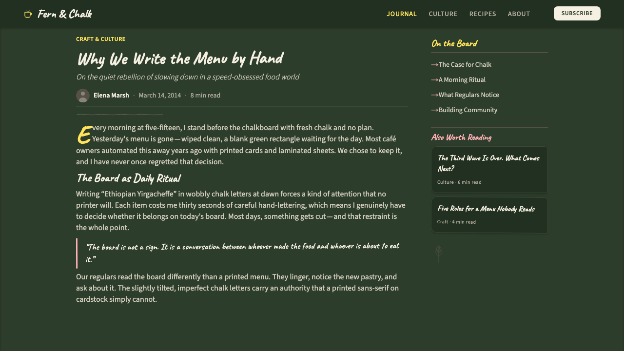
The chalkboard café menu aesthetic transfers well to presentation slides when the goal is to establish warmth, personality, and a sense of craft — particularly for brands in food, hospitality, wellness, specialty retail, or any context where the producer-to-consumer relationship is meant to feel personal and values-driven. A cover slide works best when it commits fully to the dark ground and mixed lettering voices: a large script treatment of the presentation title, a smaller block-letter subtitle, and a botanical or illustrative accent element positioned asymmetrically to avoid the look of a template. The ground should feel like a surface, not a color field.当演示文稿的目标是建立温暖感、个性和手工感时,粉笔咖啡馆菜单美学迁移效果良好——特别是面向食品、待客、健康、特色零售,或任何生产者与消费者关系应当感觉私人化和价值驱动的品牌场景。封面幻灯片在完全投入深色底面和混合字体声音时效果最佳:演示标题的大型草书处理,较小的块形字母副标题,以及一个不对称布置的植物或插图强调元素,以避免模板感。底面应当感觉像一个表面,而非一个色域。
Content slides in this style require restraint. The temptation is to carry all the decorative energy of the cover into every slide, but dense flourish work competes with the information being communicated. A more effective approach uses the dark ground and chalky white as the typographic baseline, reserves the warm yellow for data callouts and key figures, and uses decorative elements sparingly — a single hand-drawn divider between sections, or a small botanical accent at the corner of a slide rather than a full decorative border. Section header slides can afford more decoration; data and body slides should pare back.这种风格的内容幻灯片需要克制。诱惑在于将封面的所有装饰活力带入每一张幻灯片,但繁密的花饰工作会与被传达的信息竞争。更有效的做法是以深色底面和粉质白作为字体排印基准,将温暖黄色保留给数据提示和关键数字,并节制地使用装饰元素——各段落之间的单条手绘分割线,或幻灯片角落的一个小型植物强调,而非完整的装饰边框。段落标题幻灯片可以负担更多装饰;数据和正文幻灯片应当精简。
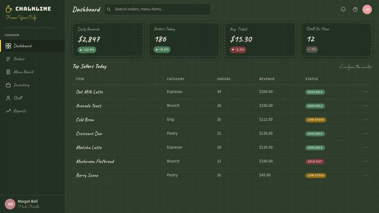
For web interfaces and digital product design, the style is best deployed in contexts with explicit artisanal positioning: menus for food-delivery platforms, specialty coffee or tea brand sites, farm-to-table restaurant experiences, or editorial platforms covering food, craft, or slow living. Dashboard and pricing applications are difficult territory — the style's deliberate imperfection and visual complexity work against the scannability and hierarchy clarity those contexts demand. Where the style does work for interfaces, key decisions include treating cards as boards with slightly textured dark grounds rather than standard white containers, using hand-lettered display type for feature labels while keeping body text in a clean, readable face, and using warm yellow as the primary interactive and alert color.对于网页界面和数字产品设计,这种风格最适合部署在具有明确手工定位的场景中:外卖平台的菜单、精品咖啡或茶叶品牌网站、农场直供餐厅体验,或涵盖食物、手工艺或慢生活的编辑平台。仪表板和定价应用是困难领域——这种风格刻意的不完美和视觉复杂性有悖于这些场景所需的可扫描性和层级清晰度。在界面方面,当这种风格确实有效时,关键决策包括:将卡片视为带有略微质感深色底面的黑板而非标准白色容器,为功能标签使用手写展示字体同时保持正文字体干净可读,以及将温暖黄色作为主要交互和警示色。
In editorial and marketing work, the chalkboard aesthetic is particularly effective for seasonal campaigns, limited-edition product launches, and any initiative that needs to signal authenticity and small-batch character. A campaign executed in this style benefits from genuine hand-lettered elements — even if digitized after the fact — rather than purely digital simulations; the slight inconsistencies introduced by actual chalk or brush work are visible and meaningful at typical viewing distances. For social media formats, the style's vertical stacking and centered composition translate well to portrait-format cards and story templates, where the board metaphor aligns naturally with the frame.在编辑和营销工作中,黑板美学对季节性活动、限量版产品发布,以及任何需要传达真实性和小批量特质的推广活动特别有效。以这种风格执行的活动,受益于真实的手写元素——即便事后数字化——而非纯数字模拟;实际粉笔或毛笔工作引入的轻微不一致性在典型观看距离上是可见且有意义的。对于社交媒体格式,这种风格的纵向叠放和居中构图很好地迁移至竖版卡片和故事模板,黑板隐喻与画框自然契合。
The most common mistake when applying this style digitally is overcleanness. Designers who appreciate the aesthetic but work primarily in vector tools often produce compositions where the dark ground is perfectly flat, the white lettering is perfectly opaque, the flourishes are perfectly symmetrical, and the accent colors are fully saturated. The result reads as a reference to the chalkboard aesthetic rather than an expression of it. The discipline required is counter-intuitive for tool-native designers: deliberately introduce texture into the ground, reduce the opacity of lettering strokes along their middles, allow flourishes to vary slightly from their expected symmetry, and dial accent colors toward dusty and faded rather than clean and vivid. Imperfection, in this style, is not the absence of craft — it is the evidence of it.以数字方式应用这种风格时最常见的错误是过度整洁。欣赏这种美学但主要使用矢量工具工作的设计师,往往会制作出深色底面完全平坦、白色字迹完全不透明、花饰完全对称、强调色完全饱和的构图。结果读起来是对黑板美学的引用,而非对它的表达。所需的纪律对于工具原生的设计师来说是反直觉的:刻意在底面引入质感,沿笔触中段降低字迹不透明度,允许花饰偏离预期对称性,将强调色调向尘淡和褪色而非干净鲜艳。在这种风格中,不完美不是工艺的缺失——而是工艺的证明。
See the Chalkboard Cafe Menu (2010) design system查看 Chalkboard Cafe Menu (2010) 完整设计系统
Chalkboard Cafe Menu (2010) — FAQChalkboard Cafe Menu (2010) · 常见问题
Is the chalkboard café style truly handmade, or is it produced digitally?黑板咖啡馆风格真的是手工制作的,还是数字生成的?
Both, and the distinction matters for quality. The original physical boards — the ones in actual cafés that defined the aesthetic — are genuinely handmade, lettered in real chalk on real slate or painted surfaces. The digitally produced versions range from scans of actual hand-lettered work (the most convincing) to digital compositions using textured brushes and chalk-effect overlays (effective when done carefully) to purely clean vector compositions with dark backgrounds that merely reference the style without capturing its character. The easiest way to tell the difference is to look at the stroke variation and texture density: genuine chalk work shows consistent micro-variation that digital shortcuts rarely replicate at the same level of naturalness.两者兼有,区别对质量至关重要。定义这一美学的原始实体黑板——真实咖啡馆中的那些——是真正手工制作的,用真实粉笔在真实板岩或涂漆表面上书写。数字制作版本的范围很广:从真实手写作品的扫描件(最具说服力)到使用纹理画笔和粉笔效果叠加层的数字构图(谨慎操作时有效),再到深色背景的纯净矢量构图,后者只是引用这种风格而未能捕捉其特质。辨别差异最简单的方法是查看笔触变化和质感密度:真实粉笔工作显示出一致的微观变化,而数字捷径很少能以同等自然度复制这一点。
How does the chalkboard café style differ from general vintage or retro design?黑板咖啡馆风格与一般的复古或怀旧设计有何不同?
Vintage and retro design typically reference historical graphic styles — Art Deco geometric ornament, 1950s advertising illustration, Victorian letterpress typography — and organize their nostalgia around a specific historical period. The chalkboard café style is not historically specific in the same way: it is a living folk tradition that has been continuously practiced, not a revival of something that stopped. Its nostalgia is not for a decade but for a mode of production — the human hand, the impermanent surface, the daily refresh. This gives it a warmth and immediacy that period-specific vintage design sometimes lacks, but it also means it carries less historical authority and more risk of feeling trendy rather than timeless.复古和怀旧设计通常引用历史图形风格——装饰艺术的几何装饰、1950年代的广告插图、维多利亚时代的活字排印——并将其怀旧感围绕特定历史时期组织。黑板咖啡馆风格在同样意义上并不具有历史特殊性:它是一个持续实践的活的民间传统,而非某种已经停止之物的复兴。它的怀旧不是针对某个年代,而是针对一种生产方式——人类的手、无常的表面、每日更新。这赋予它特定年代复古设计有时缺乏的温暖感和即时感,但这也意味着它承载的历史权威较少,感觉时髦而非永恒的风险更高。
Can this style work for non-food brands or contexts?这种风格能用于非食品品牌或场景吗?
Yes, but with care. The chalkboard café aesthetic carries strong cultural associations with artisanal food and coffee specifically — associations that work in its favor when deployed by brands whose values align with craft, locality, and personal care, regardless of category. It has appeared effectively in wellness, stationery, education, and even some music and cultural event contexts, where the hand-lettered quality reads as community-made rather than corporate. Where it struggles is in any context that requires projecting precision, scale, or technical authority — financial services, enterprise software, medical or scientific communication. In those contexts, the aesthetic's core signal (imperfection as authenticity) directly contradicts the brand's need to communicate competence and reliability.可以,但需要谨慎。黑板咖啡馆美学与手工食品和咖啡有着强烈的文化关联——当被与手工艺、本地化和个人关怀价值观相符的品牌所使用时,这些关联有利于品牌,无论类别如何。它在健康、文具、教育,甚至一些音乐和文化活动场景中都有效出现,其中手写字体质量读起来像是社群创作而非企业制造。它在任何需要传达精确性、规模或技术权威的场景中会遇到困难——金融服务、企业软件、医疗或科学传播。在这些场景中,该美学的核心信号(不完美即真实)直接与品牌传达能力和可靠性的需求相矛盾。
Why did the chalkboard style become so widespread, and is it still relevant?为什么黑板风格变得如此普及?它现在还有意义吗?
The style spread because it arrived at the intersection of three simultaneous cultural currents: the third-wave coffee movement's premium artisanal positioning, the social media image economy that rewarded shareable visual content, and a broader consumer reaction against corporate visual homogeneity. Pinterest and Instagram provided both the audience and the incentive structure for hand-lettering artists to develop and share work prolifically. By the mid-2010s, the style had achieved the saturation that typically leads to backlash — and the backlash did come — but the underlying values it expresses (craft, authenticity, human scale) remain durable. The style itself has matured: the most skilled contemporary applications are more refined and intentional than the crowded, flourish-heavy compositions of peak chalkboard saturation around 2013 to 2015, and this maturation has given it longer cultural legs than many trend-driven aesthetics.这种风格的传播是因为它在三股同时并行的文化潮流的交汇处出现:第三波咖啡运动的高端手工定位、奖励可分享视觉内容的社交媒体图像经济,以及消费者对企业视觉同质性更广泛的反应。Pinterest和Instagram既提供了受众,也为手写字体艺术家大量开发和分享作品提供了激励结构。到2010年代中期,这种风格已达到通常导致反弹的饱和度——反弹确实到来了——但它所表达的底层价值观(手工艺、真实性、人性化规模)仍然持久。这种风格本身已经成熟:最熟练的当代应用比2013至2015年黑板饱和高峰期那些拥挤、花饰繁重的构图更为精致和刻意,这种成熟赋予了它比许多趋势驱动美学更长久的文化生命力。
How do I avoid making this style look dated or clichéd?如何避免这种风格看起来过时或陈腐?
The clichés to avoid are specific and well-established: the mason jar vignette, the bicycle illustration, the word 'artisan' or 'craft' written in quotation marks, and the composition that attempts to include every lettering style simultaneously without hierarchy. The path to avoiding datedness is the same as with any historical style — understand the underlying logic rather than copying surface features. A chalkboard composition that applies the dark-ground-plus-chalky-white contrast with restraint, uses two lettering voices rather than five, and commits to the imperfection principle without overdoing the texture effects will read as considered and current rather than 2012-era Pinterest. The deeper principle is that the style's emotional core — warmth, hand-work, authenticity — ages well; only the most specific trend-markers from its peak period feel stale.需要避免的陈腐套路是具体而明确的:梅森罐小景、自行车插图、加引号书写的「artisan」或「craft」字样,以及试图在没有层级的情况下同时包含所有字体风格的构图。避免过时的路径与任何历史风格相同——理解底层逻辑,而非复制表面特征。一个克制地应用深色底面加粉质白对比、使用两种字体声音而非五种、坚守不完美原则而不过度使用质感效果的黑板构图,读起来会是经过深思熟虑的和当代的,而非2012年Pinterest时代的。更深层的原则是:这种风格的情感核心——温暖、手工感、真实性——经得起时间考验;只有其高峰期最具体的趋势标记感觉陈旧。
Related design styles相关设计风格
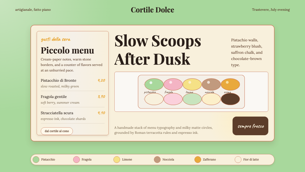 Italian Gelato ShopWarmth is hand-scooped. Pistachio green, cream panels, high-contrast serif, c…手工温暖被舀起。开心果绿、奶油纸卡、高反差衬线和粉笔字。
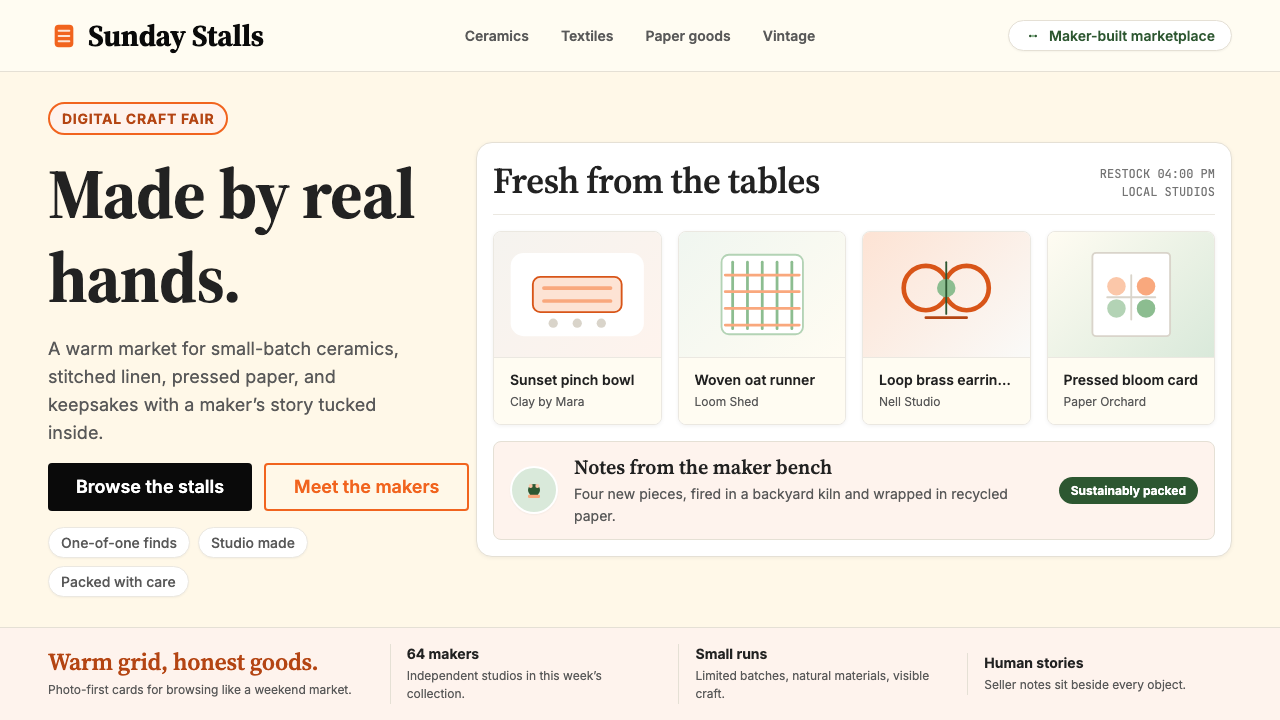 Etsy HandmadeA digital craft fair, in orange. Hand-drawn accents, cream backgrounds, delib…数字时代的手工艺集市:标志性 Etsy 橙、奶油底色、手绘插画点缀——每件物品…
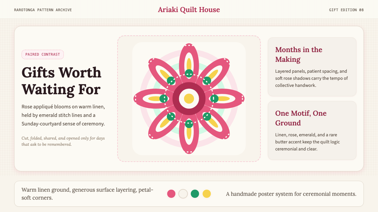 Cook Islands TivaivaiPatient generosity. Rose appliqué geometry blooms on linen with emerald stitc…耐心而慷慨:玫瑰粉贴布几何在亚麻底上绽放,翡翠线勾边。
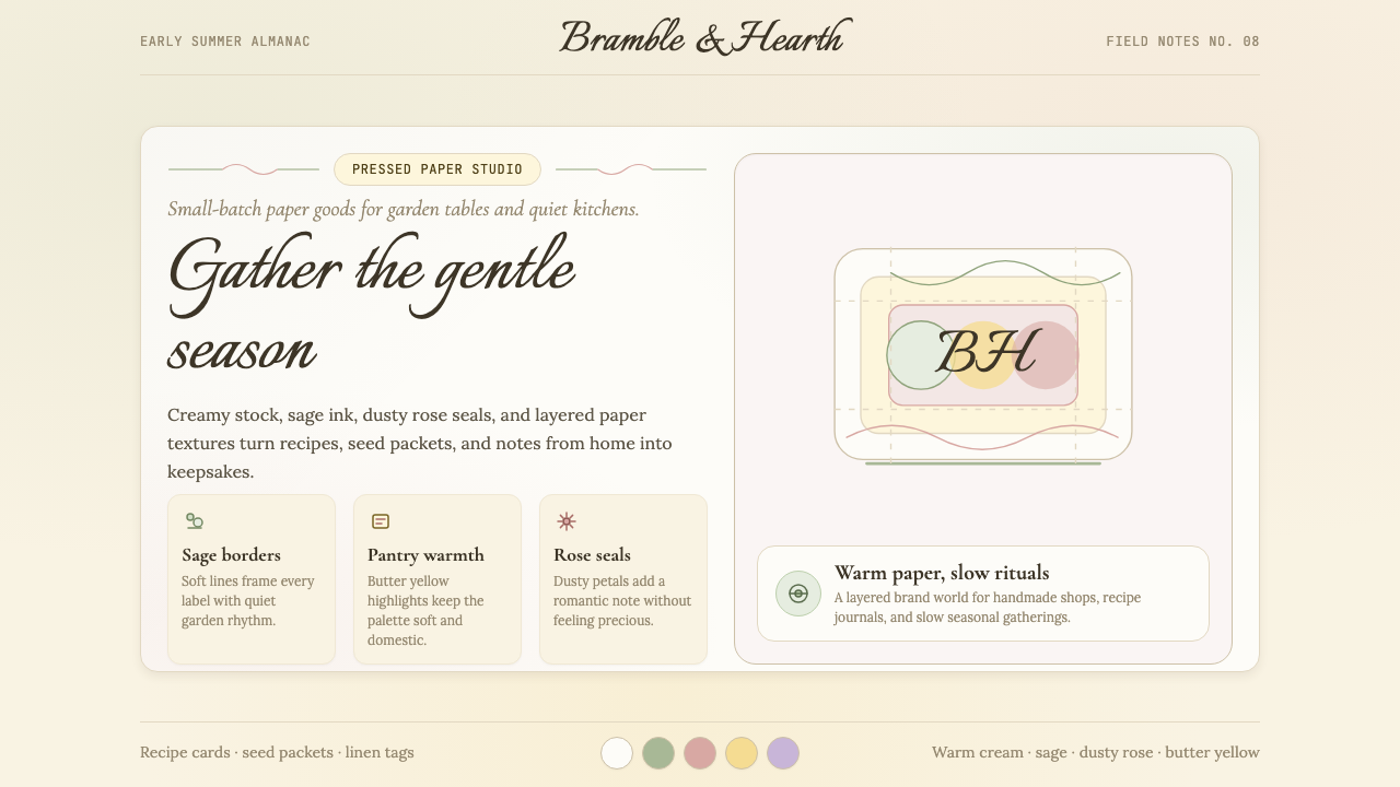 CottagecoreRural romance, hand-drawn. Sage and dusty rose, gingham textures, serif paire…工业化前的乡村浪漫:鼠尾草绿与灰粉、亚麻方格纹质感、衬线搭配手写体——慢生活的…
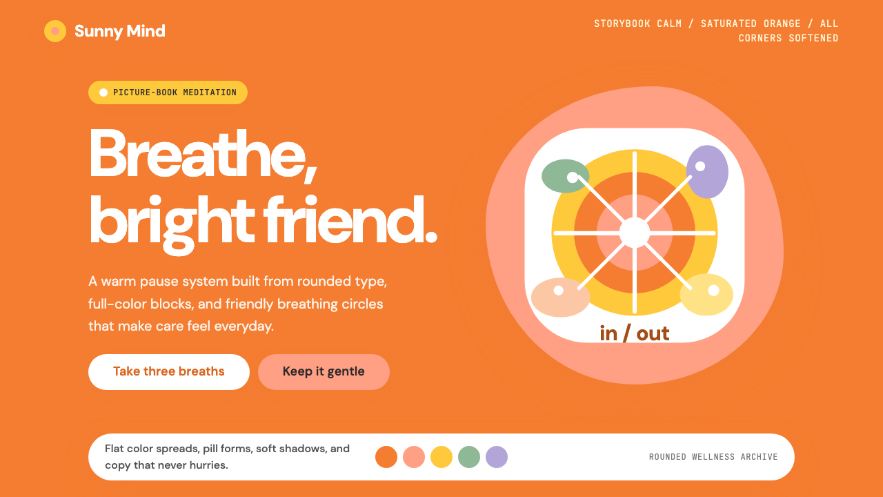 Headspace Orange MeditationMeditation becomes friendly. Orange blocks, DM Sans, and pill shapes soften e…冥想变得亲切:橙色块、DM Sans 与药丸圆角软化一切。
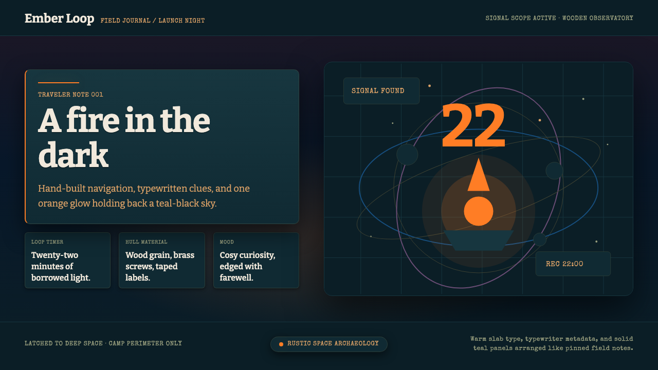 Outer WildsCosy cosmic melancholy. Campfire orange glows through typewritten teal field…温暖又怅然:篝火橙照亮深青色打字田野札记。