What is Studio Ghibli (Miyazaki)?什么是 Studio Ghibli (Miyazaki)?
Studio Ghibli's visual language is a hand-painted world where watercolor skies, meadow greens, and a deep respect for stillness teach every frame — and every layout — to breathe.吉卜力工作室的视觉语言是一个手绘的世界,水彩天空、草甸绿意与对静谧的深切尊重,让每一帧画面——以及每一张版面——学会呼吸。
Studio Ghibli (Miyazaki) in briefStudio Ghibli (Miyazaki) 速览
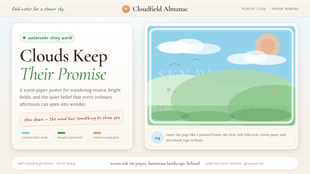
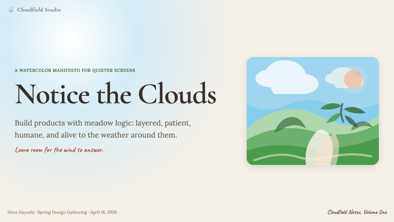
Studio Ghibli's aesthetic is defined by a commitment to the hand-made image: watercolor-washed skies that shift from pale morning grey to deep cumulus blue, meadow greens that feel sun-soaked and alive, surfaces that carry the faint grain of paper or brushwork rather than the clinical smoothness of digital production. It is an aesthetic of presence and slowness — of clouds that move, of grass that bends in an unseen wind, of light that falls at a precise and meaningful angle.吉卜力的美学由对手工图像的坚守所定义:水彩渲染的天空从清晨的浅灰变化为厚重的积云蓝,草甸绿色仿佛浸透了阳光,画面表面带有纸张或笔触的隐约颗粒感,而非数字制作的临床光滑。这是一种存在感与慢节奏的美学——云在移动,草在无形的风中弯曲,光线以精确而有意义的角度倾落。
As a design system, the Ghibli visual language translates those painterly qualities into interface and layout decisions. The palette leans toward muted naturalism: soft blues derived from overcast skies, warm olive and sage greens borrowed from hillside meadows, dusty sunset oranges that anchor attention without shouting, and a paper-warm off-white that replaces the cold neutrality of pure white. Typography is literary and slightly hand-touched — faces with visible calligraphic heritage rather than engineered geometric construction. Geometry is rounded and organic; hard corners are rare and feel out of place.作为一套设计系统,吉卜力视觉语言将那些绘画特质翻译成界面与版面的决策。色板倾向于低饱和的自然主义:从阴天天空中提炼的柔蓝,借自山坡草甸的温暖橄榄绿与鼠尾草绿,不张扬地锚定视线的夕阳橘,以及代替冷中性纯白的温润米纸色。字体是文学性的、略带手写感的——具有可见书法传承的字体,而非工程化的几何构型。几何形态圆润而有机,尖锐的直角少见且显得格格不入。
What separates this aesthetic from generic 'soft' or 'natural' design is its insistence on craftsmanship as a visible value. Every element should look considered, not algorithmic. The texture of a background, the weight of a headline, the curve of a button — each should feel like it was drawn rather than specified. This is not nostalgia for its own sake; it is a deliberate argument that warmth, attention, and care can be legible in visual form.将这种美学与普通的「柔和」或「自然」设计区分开来的,是它对工艺作为可见价值的坚持。每个元素都应看起来是经过思量的,而非算法生成的。背景的质感、标题的字重、按钮的弧度——每一处都应让人感觉是被画出来的,而非被规格化出来的。这不是为了怀旧而怀旧;这是一个有意为之的论断:温暖、专注与用心,可以以视觉形式被读取。
See the Studio Ghibli (Miyazaki) design system查看 Studio Ghibli (Miyazaki) 完整设计系统
Where does Studio Ghibli (Miyazaki) come from?Studio Ghibli (Miyazaki) 从何而来?
Studio Ghibli was founded in June 1985 in Koganei, Tokyo, by directors Hayao Miyazaki and Isao Takahata, producer Toshio Suzuki, and businessman Yasuyoshi Tokuma. The studio's name derives from an Italian word for the Saharan sirocco wind — a detail chosen by Miyazaki that signals, from the outset, the studio's refusal to be provincial. The founding followed the commercial success of Nausicaä of the Valley of the Wind (1984), a film made at Topcraft that demonstrated there was an audience for feature-length animation that took both children and adults seriously.吉卜力工作室由导演宫崎骏与高畑勋、制片人铃木敏夫及商人德间康快,于1985年6月在东京小金井市创立。工作室的名称来源于一个意大利词,指撒哈拉沙漠的西洛可热风——这一由宫崎骏选定的细节,从一开始就宣示了工作室拒绝地方局限的态度。创立的契机是《风之谷》(1984年)的商业成功——那部在TopCraft制作的影片证明了存在一个既认真对待儿童、也认真对待成人的长片动画市场。
The distinctive visual language crystallized around two early masterworks. My Neighbor Totoro (1988) established the studio's color sensibility: the deep greens of the Sayama Hills in Saitama Prefecture, rendered in backgrounds painted by art director Kazuo Oga, created a landscape so specific and luminous that it felt simultaneously like memory and like a place you had never been but recognized immediately. Oga's backgrounds — executed in gouache and watercolor with a meticulous attention to seasonal light — became the aesthetic foundation the studio would return to and refine for decades. Spirited Away (2001), which won the Academy Award for Best Animated Feature in 2003, extended the language into stranger and more dreamlike territory: the bathhouse at the center of the film is a collision of Meiji-era Japanese architecture, Edo-period woodblock color, and pure invention.这套独特的视觉语言围绕两部早期杰作结晶成形。《龙猫》(1988年)确立了工作室的色彩感觉:埼玉县狭山丘陵的深绿色,由美术监督男鹿和雄以水粉与水彩精心绘就的背景画呈现出来,创造出一种如此具体而又如此明光的风景——它同时像是记忆,又像是一个从未到访却一眼便能认出的地方。男鹿和雄的背景画——以细腻的季节光线感知用水粉与水彩绘制——成为工作室此后数十年反复回归与精炼的美学基础。《千与千寻》(2001年)在2003年赢得奥斯卡最佳动画长片奖,将这套语言延伸进更加奇异与梦幻的领域:影片核心的汤屋是明治时代日本建筑、江户时代木版画色彩与纯粹想象力的碰撞。
The studio's visual philosophy was shaped in significant part by Miyazaki's explicit rejection of computer-generated imagery as a primary tool. In a period when the broader animation industry was moving rapidly toward CGI, Ghibli maintained hand-drawn production through films including Princess Mononoke (1997) and Howl's Moving Castle (2004). This was not mere conservatism — it was an argument that the trace of the human hand carries information that machine-generated imagery cannot replicate: the slight tremor of a line, the variation in wash density across a cloud, the evidence of decision-making at the level of individual brushstrokes. The aesthetic consequence is a world that feels inhabited by makers.工作室的视觉哲学,在很大程度上由宫崎骏对以计算机生成图像为主要工具的明确拒绝所塑造。在整个动画行业迅速向CGI转移的时期,吉卜力坚持以手绘制作完成《幽灵公主》(1997年)与《哈尔的移动城堡》(2004年)等作品。这不仅仅是保守主义——这是一个论断:人手的痕迹携带着机器生成图像无法复制的信息:线条的轻微颤动,云朵上水洗密度的变化,单一笔触层面上可见的决策痕迹。美学上的后果是一个让人感受到创作者存在的世界。
Joe Hisaishi's musical collaborations with Miyazaki — spanning My Neighbor Totoro, Spirited Away, Princess Mononoke, and many others — are inseparable from the visual identity. The unhurried pacing of Hisaishi's scores, their willingness to dwell on a moment of ordinary beauty — a field, a doorway, a character's expression — reinforced the visual aesthetic's central proposition: that the best way to honor a moment is to remain with it. This cross-media coherence between image and sound is part of what has made the Ghibli aesthetic so recognizable and so widely loved across cultures and generations, from its Japanese origins through its international reception.久石让与宫崎骏的音乐合作——横跨《龙猫》《千与千寻》《幽灵公主》及众多其他作品——与视觉身份不可分割。久石让配乐的从容节奏,以及它愿意在一个平凡之美的瞬间——一片田野、一道门廊、一个角色的表情——驻留的意愿,强化了视觉美学的核心命题:珍视一个瞬间的最好方式,是与它同在。这种图像与声音之间跨媒介的高度融合,正是吉卜力美学何以如此广为人知、跨越文化与世代被广泛喜爱的原因之一——从日本本土到国际受众,皆是如此。
What defines the Studio Ghibli (Miyazaki) look?Studio Ghibli (Miyazaki) 的视觉特征是什么?
Color色彩
The palette is built around soft, slightly desaturated naturals: cumulus sky blues that lean neither cold nor garish, meadow and hillside greens that feel sun-warmed rather than synthetic, muted sunset oranges and dusty golds used as focal accents. Paper-warm off-whites replace pure white as the resting ground. The governing principle is that every color should feel as though it could be made with a watercolor brush — no color is perfectly flat, and no color calls attention to itself apart from the composition. Saturation is restrained; contrast is achieved through value rather than chromatic intensity.色板建立在柔和、略微去饱和的自然色调之上:积云天蓝既不偏冷也不刺眼,山坡草甸绿带着日晒后的温度而非合成感,低调的夕阳橘与尘金色作为焦点强调色使用。纸张般温润的米白色取代纯白作为底色基础。核心原则是:每一种颜色都应感觉像能用水彩笔调出来——没有颜色是完全平涂的,也没有颜色独立于构图之外吸引注意力。饱和度是克制的,对比通过明度而非色彩强度来实现。
Typography字体排印
Typefaces carry a literary and slightly hand-touched quality — serif faces with visible calligraphic origins, where strokes taper and swell in ways that recall the movement of a pen or brush rather than the regularity of a drawing instrument. A note-like hand-lettered quality in secondary text reinforces the sense that the design was assembled by a person, not generated by a system. Type is set with generous leading and moderate measure, creating a reading rhythm that encourages dwelling rather than scanning. Headlines are weighty but not aggressive; they invite rather than demand.字体具有文学性与略带手写的气质——具有可见书法起源的衬线字体,笔画以令人联想到钢笔或画笔运动的方式逐渐变细、膨胀,而非制图工具的机械规律。辅助文本中类手记的手写气质,强化了设计是由一个人组合而成、而非由系统生成的感觉。字体以充裕的行距和适中的行宽排布,创造一种鼓励驻留而非扫视的阅读节奏。标题有分量但不咄咄逼人——它们是在邀请,而非命令。
Texture and Grain质感与颗粒
Perhaps the most distinctive characteristic of this aesthetic is its embrace of subtle surface texture. Backgrounds carry the faint tooth of watercolor paper; washes show gentle variation in density; flat color areas are softened by a light grain that removes the clinical perfection of digital flatness. This texture is never decorative in a busy or distracting sense — it is a quiet reminder of the hand that made the image. In digital application, it is achieved through paper-toned grounds and carefully restrained noise overlays rather than heavy photographic textures.这套美学最具辨识度的特征或许是它对微妙表面质感的拥抱。背景带有水彩纸的淡淡纹理,水洗笔触显示出密度的柔和变化,平涂色块被轻盈的颗粒感所柔化,消除了数字平涂的临床完美感。这种质感从不以繁复或分散注意力的方式出现装饰性——它是一个关于创作之手的安静提示。在数字应用中,它通过带纸张色调的底色与精心克制的噪点叠加来实现,而非厚重的照片纹理。
Organic Form and Roundness有机形态与圆润感
Shapes in this aesthetic follow organic rather than geometric logic. Corners are rounded generously; containers feel more like vessels than boxes. Illustrations and decorative elements — when used — draw on the natural world: cloud forms, plant silhouettes, irregular stone shapes, flowing water. Hard-edged geometric shapes feel intrusive and are used sparingly, if at all. The underlying message is that the designed object belongs to a living world rather than to an industrial one, and every formal decision reinforces that belonging.这套美学中的形态遵循有机而非几何的逻辑。圆角弧度慷慨,容器感觉更像器皿而非方盒。插图和装饰元素(若使用的话)汲取自然世界:云的形态、植物的轮廓、不规则的石头形状、流动的水纹。硬边几何形状感觉突兀,如果使用也是极为克制。底层的信息是:被设计的对象属于一个有生命的世界,而非一个工业的世界,每一个形式决策都强化了这种归属感。
Light and Atmosphere光线与氛围
Ghibli's animators are masters of atmospheric light — the diffuse golden quality of late afternoon, the blue-white luminosity of overcast mornings, the warm amber of lamplight in an interior. This sensitivity to light conditions is the aesthetic's most emotive quality. In design application, it translates to a careful attention to background tone and layering: elements are not simply placed but seem to exist in a consistent atmospheric envelope. Shadows, when present, are soft and diffuse — traces of light rather than geometric assertions.吉卜力的动画师是大气光线的大师——午后将晚时漫射的金色光质,阴天清晨的蓝白色光亮,室内灯光的温暖琥珀色。这种对光线条件的敏感是这套美学中最具情感力量的品质。在设计应用中,它转化为对背景色调与层次的细心关注:元素不只是被简单放置,而是似乎存在于一个连贯的大气包裹之中。阴影(若出现)是柔和而漫射的——是光的痕迹,而非几何的断言。
Stillness and White Space静谧与留白
One of Miyazaki's most celebrated directorial techniques is the 'ma' — the deliberate pause, the held moment, the frame that contains nothing but sky or a character's resting expression. This principle of meaningful stillness translates directly into layout: generous white space is not an absence but a presence, allowing each element to be noticed individually rather than competing for attention. Crowding is the enemy of this aesthetic; a design in this style should always feel like it has room to breathe.宫崎骏最受称道的导演技法之一是「间」(ma)——有意的停顿,被定格的瞬间,一个只包含天空或角色静息表情的画面。这种有意义的静谧原则直接转化为版面设计:充裕的留白不是一种缺席,而是一种存在,让每个元素能被单独注意到,而非相互争夺注意力。拥挤是这套美学的敌人;这种风格的设计应当始终给人以呼吸空间的感觉。
Narrative Warmth叙事温度
Every element in a Ghibli frame serves a story — the worn leather of a bag, the particular green of a hillside in summer, the specific way steam rises from a bowl of food. Design in this aesthetic should aspire to that same narrative specificity: details that feel chosen rather than defaulted to, choices that accumulate into a coherent world. This is not about adding decorative storytelling elements but about making every design decision — color, type, spacing, imagery — feel like it comes from a person with something particular to say.吉卜力画面中的每个元素都服务于一个故事——一个包的磨损皮革,夏日山坡的特定绿色,蒸汽从一碗食物中升腾的特定方式。这套美学中的设计应当追求同样的叙事精确性:细节感觉是被选择的,而非默认的;每一个选择积累成一个连贯的世界。这不是关于添加装饰性的叙事元素,而是让每一个设计决策——色彩、字体、间距、图像——都感觉来自一个有话要说的人。

See the Studio Ghibli (Miyazaki) design system查看 Studio Ghibli (Miyazaki) 完整设计系统
Who shaped Studio Ghibli (Miyazaki)?谁塑造了 Studio Ghibli (Miyazaki)?
Co-founder of Studio Ghibli and its defining creative force, Miyazaki directed My Neighbor Totoro, Princess Mononoke, Spirited Away, Howl's Moving Castle, and The Wind Rises, among many others. His insistence on hand-drawn animation, his deeply ecological worldview, and his technical command of movement and atmospheric light established the studio's aesthetic signature. His concept of 'ma' — the meaningful pause, the held moment of ordinary beauty — is perhaps the single most transferable principle from his filmmaking to contemporary design practice. He received an honorary Academy Award in 2014.吉卜力工作室联合创始人及其决定性创作力量,宫崎骏执导了《龙猫》《幽灵公主》《千与千寻》《哈尔的移动城堡》与《起风了》等众多作品。他对手绘动画的坚持、深刻的生态世界观,以及对运动与大气光线的技术掌控,确立了工作室的美学特征。他的「间」概念——有意义的停顿,对平凡之美瞬间的定格——或许是他的电影创作对当代设计实践最可移植的单一原则。他于2014年获得奥斯卡荣誉奖。
Art director and background painter, Oga is responsible for the luminous landscape backgrounds that define the studio's visual identity. His work on My Neighbor Totoro established the foundational palette and texture language — the specific greens of Japanese summer hillsides, the quality of overcast and golden light, the way traditional rural architecture sits in a landscape. Working primarily in gouache and watercolor, Oga achieved a density of observation and a warmth of execution that have never been fully replicated digitally, and his backgrounds remain the clearest statement of what the Ghibli aesthetic actually is at a technical level.作为美术监督与背景画师,男鹿和雄是吉卜力视觉身份中那些明光景色背景画的缔造者。他在《龙猫》中的工作确立了基础色板与质感语言——日本夏日山坡的特定绿色,阴天与金色光线的光质,传统乡村建筑融入风景的方式。男鹿和雄主要以水粉和水彩作画,达到了一种从未被数字手段完全复制的观察密度与绘制温度,他的背景画至今仍是吉卜力美学在技术层面最清晰的陈述。
Co-founder and director, Takahata brought a different but complementary sensibility to the studio. His films — including Grave of the Fireflies (1988), Only Yesterday (1991), and The Tale of the Princess Kaguya (2013) — explored more realist, painterly, and at times deliberately rough-hewn aesthetic territories. The Tale of the Princess Kaguya in particular, with its sketch-like, ink-wash backgrounds that intentionally preserve the marks of the drawing process, represents a radical extension of the studio's commitment to visible craft. Takahata's work proves that the Ghibli aesthetic is not a single locked style but a shared commitment to the value of handmade image-making.联合创始人与导演,高畑勋为工作室带来了一种不同却互补的感性。他的影片——包括《萤火虫之墓》(1988年)、《岁月的童话》(1991年)与《辉夜姬物语》(2013年)——探索了更写实、更具绘画感、有时甚至是刻意粗粝的美学领域。《辉夜姬物语》尤为突出,其素描般、刻意保留绘制过程痕迹的水墨背景,代表了工作室对可见工艺这一承诺的激进延伸。高畑勋的作品证明,吉卜力美学不是一种单一锁定的风格,而是对手工图像制作价值的共同承诺。
Composer and long-term collaborator, Hisaishi has scored nearly every Miyazaki film since Nausicaä of the Valley of the Wind (1984). His musical language — unhurried, harmonically rich, with a characteristic willingness to let a theme breathe and recur rather than drive — mirrors the visual aesthetic at an auditory level. The emotional resonance of the Ghibli aesthetic cannot be fully understood without accounting for Hisaishi's contribution: the pacing, the lightness, the sense that ordinary moments deserve orchestral attention, are as much musical propositions as visual ones.作曲家与长期合作者,久石让为几乎所有宫崎骏影片配乐,从1984年的《风之谷》开始。他的音乐语言——从容、和声丰富,具有典型的意愿让主题呼吸与再现而非推动——在听觉层面映照了视觉美学。吉卜力美学的情感共鸣,若不将久石让的贡献纳入考量便无法完全理解:那种节奏感、轻盈感、平凡时刻值得交响关注的感觉,既是音乐命题,也是视觉命题。
Producer and co-founder, Suzuki's role in shaping the Ghibli aesthetic is often underestimated. As the bridge between Miyazaki's creative vision and the realities of production and distribution, Suzuki made decisions that protected the studio's commitment to quality and craft at a commercial level. His insistence that Ghibli films be given the time and resources necessary to realize their visual ambitions — rather than compressed into conventional animation schedules — is a significant reason the aesthetic reached the level of refinement it did.制片人与联合创始人,铃木敏夫在塑造吉卜力美学中的作用常被低估。作为宫崎骏创作愿景与制作、发行现实之间的桥梁,铃木在商业层面做出了保护工作室对品质与工艺承诺的决策。他坚持给予吉卜力影片实现其视觉抱负所需的时间与资源——而非压缩进惯常的动画制作时间表——是这套美学达到如此精炼程度的重要原因。
How do you use Studio Ghibli (Miyazaki) today?今天怎么用 Studio Ghibli (Miyazaki)?
The Ghibli aesthetic translates most naturally into contexts where warmth, care, and an unhurried reading experience are desirable values. Applying it correctly means understanding its underlying logic — that texture signals craft, that soft color signals safety and belonging, that generous space signals respect for the viewer — rather than simply layering watercolor wash effects over a standard layout. The first question to ask when applying this style is not 'how do I make this look like a Ghibli film?' but 'what would this look like if it were made by hand, with patience, by someone who cared deeply about the subject?'吉卜力美学最自然地转化进那些以温暖、用心与从容阅读体验为期望价值的场景。正确应用它意味着理解其底层逻辑——质感传递工艺感,柔色传递安全感与归属感,充裕的空间传递对观者的尊重——而非仅仅在标准版面上叠加水彩笔触效果。应用这种风格时,第一个要问的问题不是「如何让它看起来像一部吉卜力电影」,而是「如果这件作品是由一个对主题深切关心的人耐心手工制作出来的,它会是什么样子」。
For presentation slides, this style works best on covers that establish mood and on content pages that need to convey trust and thoughtfulness rather than data density. A cover built in this aesthetic uses a warm off-white ground, a painterly or softly textured background element, and type set in a literary serif at a weight that reads as considered rather than urgent. Content slides should resist the temptation to fill space — generous margins, single ideas per slide, and type set with enough leading to feel like it is breathing. Data visualization in this style is gentle and rounded: soft color fields rather than hard bars, smooth curves rather than angular line charts, with annotations that feel like handwritten notes rather than system-generated labels.对于演示文稿,这种风格在建立情绪氛围的封面页和需要传达信任与思量感(而非数据密度)的内容页上效果最佳。以这套美学构建的封面使用温润的米白底色,带有绘画感或柔软质感的背景元素,以及以文学衬线字体排布的标题,字重让人感到是经过深思的而非迫切的。内容页应抵制填满空间的诱惑——充裕的页边距,每张幻灯片单一的核心观点,以充足的行距排布让字体感觉在呼吸。这种风格的数据可视化是温和而圆润的:柔色的面积图而非硬边的柱状图,平滑曲线而非折线图,注释感觉像手写笔记而非系统生成的标签。
For web interfaces — particularly editorial sites, portfolio pages, wellness products, cultural institutions, and educational platforms — the aesthetic provides a natural vocabulary. Background tones should stay warm and slightly papery rather than pure white; interactive elements benefit from rounded corners and soft hover transitions rather than hard-shadow or flat-color state changes. Navigation should feel understated: quietly typographic, with enough space around each element that clicking feels like a gentle choice rather than a target acquisition. Hero sections work best with full-width painterly imagery or illustration that occupies space the way a landscape does — unhurriedly, with things worth noticing at the edges.对于网页界面——尤其是编辑类网站、作品集页面、健康类产品、文化机构与教育平台——这套美学提供了一套自然的视觉词汇。背景色调应保持温润、略带纸张感,而非纯白;交互元素从圆润的圆角和柔和的悬停过渡中获益,而非硬阴影或纯色的状态变化。导航应感觉低调:安静的字体性呈现,每个元素周围有足够的空间,让点击感觉像一个温和的选择而非对目标的捕获。首屏区域最适合铺满宽度的绘画感图像或插画,以风景占据空间的方式填满——从容地,边缘有值得注意的东西。
For editorial and marketing work, the style supports long-form reading and brand storytelling particularly well. Article layouts in this aesthetic use a comfortable reading measure, generous line height, and subheadings that feel like chapter titles rather than section dividers. Pull quotes can be set in a hand-touched italic at a larger size, treated as moments of emphasis that slow the reader down. Marketing pages benefit from the style's capacity for emotional warmth: full-width feature sections with softly textured backgrounds alternate with clean body-copy sections; calls to action are warm and inviting rather than urgent and imperative.对于编辑内容与市场营销工作,这种风格在支持长篇阅读与品牌故事讲述方面尤为出色。这套美学的文章版面使用舒适的行宽、充裕的行高,小标题感觉像章节标题而非段落分割线。引语可以用略大字号的带手写感斜体排布,作为让读者放慢脚步的强调时刻。营销页面从这种风格的情感温度中获益:带柔和质感背景的全宽特性区块与干净的正文区块交替出现;行动号召是温暖而邀请性的,而非迫切且命令式的。
A common mistake when applying this aesthetic is over-texturing — adding so much grain, paper effect, and watercolor wash that the texture becomes the message and the actual content is lost. The Ghibli films succeed because texture serves the world-building rather than announcing itself; a background in Oga's paintings is rich and specific, but it does not compete with the characters. The same discipline applies in design: texture should be felt rather than seen, and if a viewer's first impression is 'nice texture' rather than 'this communicates clearly,' the balance has tipped too far. Similarly, this aesthetic is not well-suited to contexts that require urgency, high information density, or a sense of sharp technological precision — those contexts call for different visual values.应用这套美学时最常见的错误是过度质感化——添加了太多颗粒感、纸张效果和水彩笔触,以致质感本身成为了信息,而真正的内容反而消失了。吉卜力电影之所以成功,是因为质感服务于世界建构,而非宣示自身;男鹿和雄的背景画是丰富而具体的,但它不与角色竞争注意力。同样的自律适用于设计:质感应当被感受到而非被看见,如果观者的第一印象是「好漂亮的质感」而非「这传达得很清晰」,那么平衡就已经倾斜过度。同样,这套美学不适合需要紧迫感、高信息密度或锐利技术精确感的场景——那些场景需要不同的视觉价值观。
See the Studio Ghibli (Miyazaki) design system查看 Studio Ghibli (Miyazaki) 完整设计系统
Studio Ghibli (Miyazaki) — FAQStudio Ghibli (Miyazaki) · 常见问题
Is this aesthetic the same as general 'cottagecore' or 'soft' design?这套美学与一般的「乡村核」或「柔软」设计相同吗?
They overlap in palette and texture but differ fundamentally in intent and craft standard. Cottagecore and similar trends are primarily decorative — they apply a visual mood without a corresponding commitment to quality of detail. The Ghibli aesthetic, derived from films where every background was painted individually by master craftspeople, carries a higher standard of specificity and care. A true application of this style requires every detail to feel considered: the particular green of a specific hillside in a particular season, not just 'a green.' The difference shows in the density and coherence of a finished design, and in whether the texture feels like a surface choice or a worldview.它们在色板和质感上有交集,但在意图和工艺标准上有根本差异。「乡村核」和类似趋势主要是装饰性的——它们应用一种视觉情绪,而没有相应的细节品质承诺。吉卜力美学源自每张背景画都由大师工匠单独绘制的电影,承载着更高标准的精确性与用心程度。真正应用这种风格要求每个细节都感觉是经过思量的:特定季节中特定山坡的特定绿色,而不仅仅是「一种绿色」。差异体现在成品设计的密度与连贯性上,以及质感是否感觉像一种表面选择,还是一种世界观。
Can this style work for technology products and SaaS interfaces?这种风格能用于科技产品和SaaS界面吗?
It can, but with meaningful caveats. SaaS and technical products typically require a sense of precision, reliability, and sharp information hierarchy that can work against the style's core values of warmth and organic softness. The aesthetic works best in tech contexts where human connection is a deliberate brand value — educational tools, creative platforms, journaling or wellness apps, consumer-facing products in categories like travel or culture. It is poorly suited to developer tools, financial dashboards, or analytics products where the user needs to trust that every number is precise and every state is unambiguous. Applying a soft, papery texture to a data-dense interface risks making the data feel uncertain rather than authoritative.可以,但有重要的注意事项。SaaS和技术产品通常需要一种精确感、可靠感和清晰的信息层级,这与这种风格的核心价值——温暖与有机柔软——可能产生冲突。这套美学在人文连接是刻意品牌价值的技术产品语境中效果最好——教育工具、创意平台、日记或健康类应用、旅行或文化类别中面向消费者的产品。它不适合开发者工具、金融仪表板或分析产品,在那些产品中,用户需要相信每个数字都是精确的,每个状态都是明确无误的。在数据密集型界面上应用柔和的纸张质感,有让数据感觉不确定而非权威的风险。
How do you avoid making this style look like a Ghibli knockoff?如何避免让这种风格看起来像是吉卜力的山寨品?
The risk of imitation is real, and it increases when designers work from visual references (screenshots, stills) rather than from principles. The Ghibli films are so visually specific that direct reference to their imagery — the Totoro silhouette, the Spirited Away color story, the Howl's Moving Castle mechanical aesthetic — immediately reads as borrowing rather than inspiration. The path to an original application of this style is through its principles: commit to watercolor-like palette behavior, visible texture, generous space, and literary typography, but build every specific element from the project's own subject matter. The warmth and handmade quality should feel like yours, not like something borrowed.模仿的风险是真实存在的,当设计师从视觉参考(截图、画面定格)而非从原则出发工作时,这种风险会增加。吉卜力电影在视觉上如此具体,以致直接引用其图像——龙猫的剪影、《千与千寻》的色彩故事、《哈尔的移动城堡》的机械美学——会立即被读解为借用而非受到启发。原创性应用这种风格的路径在于其原则:承诺于类水彩的色板行为、可见质感、充裕空间与文学性字体排印,但从项目自身的主题中建构每一个具体元素。那种温暖感与手工品质应该感觉是属于你的,而非借来的。
Does this aesthetic work in dark mode?这套美学能用在深色模式中吗?
Dark mode is a genuine tension point for this style. The canonical Ghibli aesthetic is built on light-ground luminosity — the warmth of paper, the brightness of sky, the way afternoon light lifts a hillside. A dark inversion loses these foundational qualities. That said, a night-time Ghibli palette is meaningful within the films themselves — the deep indigos and star-lit blacks of night sequences in Spirited Away or Castle in the Sky have their own beauty. A dark variant can work if it commits fully to the night-sky as its organizing metaphor: deep blue-blacks rather than neutral dark greys, warm amber or soft gold as accent lights, and a continued commitment to soft textures and organic forms. The mistake is creating a dark mode that simply inverts the light version rather than reconceiving it.深色模式对这种风格来说是一个真实的张力点。吉卜力美学的经典形态建立在浅色底面的明光之上——纸张的温度,天空的亮度,午后光线照亮山坡的方式。深色反转会失去这些基础性品质。尽管如此,在影片内部,夜间吉卜力色板本身是有意义的——《千与千寻》或《天空之城》夜间场景中的深靛蓝与星光黑有其自身的美。深色变体在完全承诺以夜空作为其组织性比喻时可以奏效:深蓝黑而非中性深灰,温暖琥珀色或柔金色作为强调光源,并持续承诺于柔和质感与有机形态。错误做法是创建一个简单地将浅色版本倒置而非重新构思的深色模式。
How does this aesthetic handle photography and real images?这套美学如何处理照片与真实图像?
Photography is the greatest challenge for this style, because unprocessed photographs carry the visual logic of the camera — sharp edges, lens bokeh, photographic color science — which is fundamentally different from the logic of watercolor and gouache. The most successful approaches either avoid photography entirely (using illustration, painting, or heavily treated imagery instead) or apply a consistent treatment that moves photographs toward the painterly register: muted tones, slightly reduced contrast, a warm color grade, and a light texture overlay that softens the photographic sharpness. Photographs of natural subjects — landscapes, plants, sky, water, food — adapt more readily than photographs of technology, architecture, or people in formal settings. The editorial test is simple: if a photograph reads as a photograph first and a part of the composition second, it is working against the style.照片是这种风格最大的挑战,因为未经处理的照片携带相机的视觉逻辑——锐利的边缘、镜头虚化、摄影色彩科学——这与水彩和水粉的逻辑有着根本性的差异。最成功的处理方式要么完全回避摄影(改用插图、绘画或经过大量处理的图像),要么应用一套将照片向绘画感方向推移的一致处理:低调的色调、略微降低的对比度、温暖的色彩分级,以及柔化摄影锐度的轻质感叠加。自然主题的照片——风景、植物、天空、水、食物——比科技、建筑或正式场合人物的照片更容易适应这种风格。编辑层面的检验很简单:如果一张照片首先被读解为一张照片,其次才是构图的一部分,那它就在对抗这种风格。
Related design styles相关设计风格
 Peanuts Comic Schulz (1950)Gentle melancholy on newsprint. Caveat lettering, cream panels, yellow and bl…温柔忧郁的新闻纸感:Caveat 手写字、奶油格框、黄蓝点色。
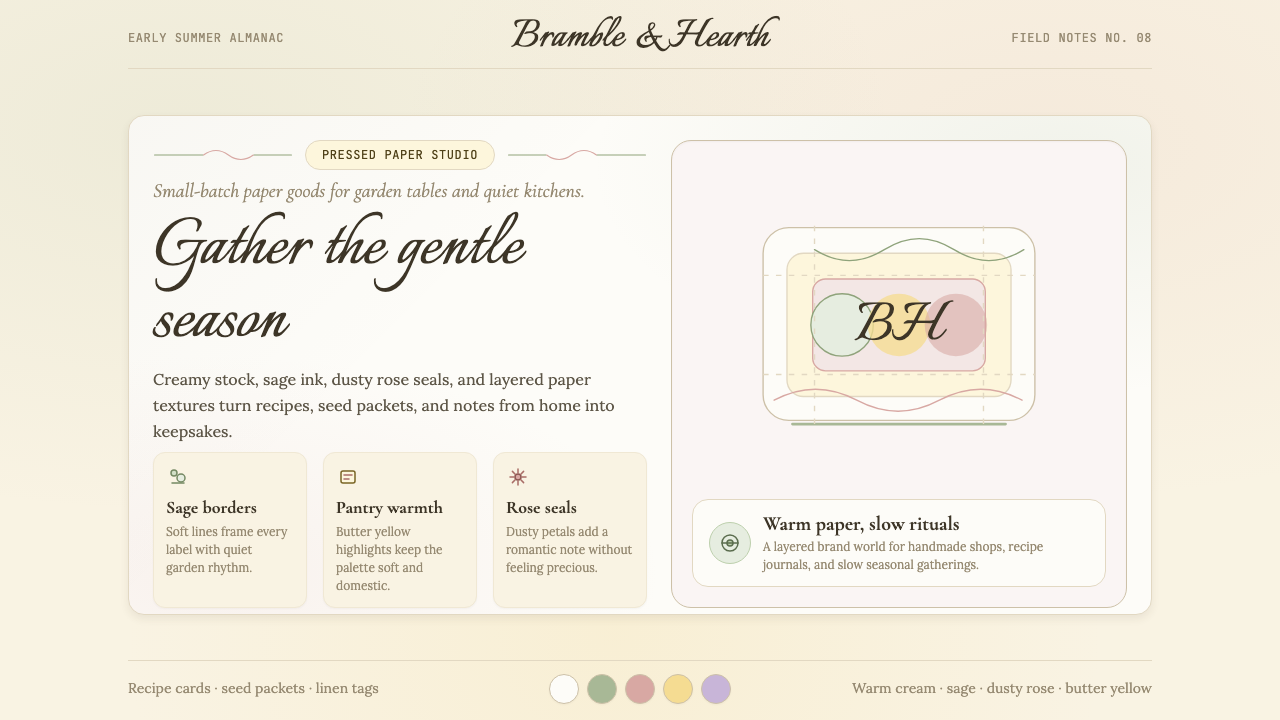 CottagecoreRural romance, hand-drawn. Sage and dusty rose, gingham textures, serif paire…工业化前的乡村浪漫:鼠尾草绿与灰粉、亚麻方格纹质感、衬线搭配手写体——慢生活的…
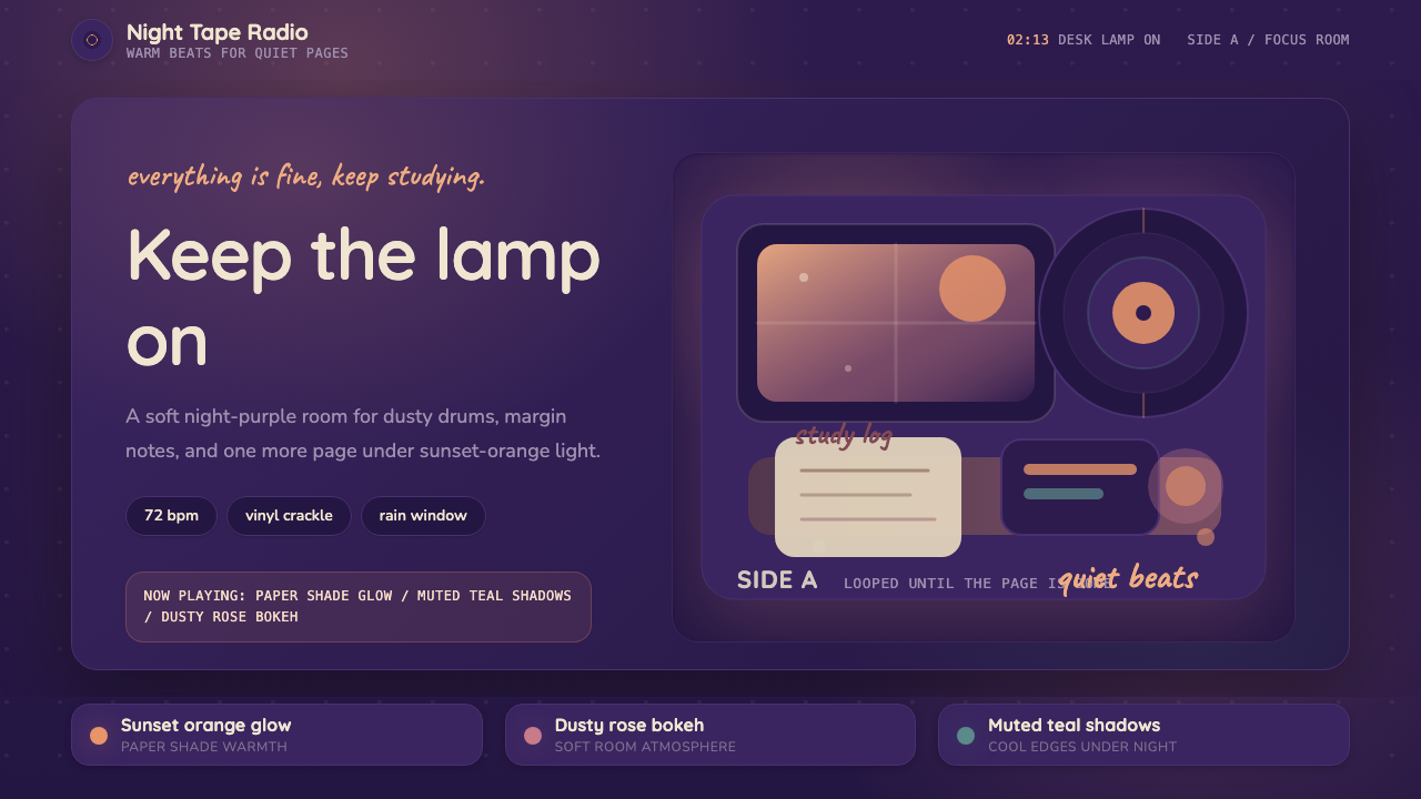 Lo-fi Hip Hop / ChillhopCozy focus at 2am. Night purple, Quicksand type, and sunset-orange lamp glow.凌晨两点的安心感:夜紫底、Quicksand 圆字与夕橙灯光。
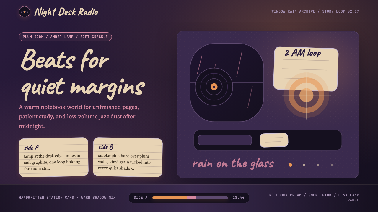 Lofi Hip-Hop Anime Girl (2018)Solitude glows warm. Caveat notes, plum night, and amber geometry loop like v…孤独被暖光照亮:梅紫夜色、Caveat 手写与琥珀几何像黑胶循环。
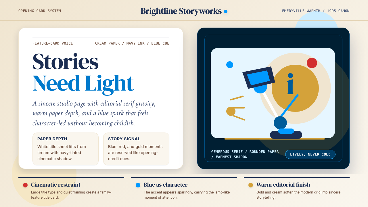 Pixar LuxoSincere story warmth. Cream paper, deep navy serif, and blue lamp geometry ho…真诚的故事温度:奶油纸、深海军蓝衬线与蓝色灯形稳住画面。
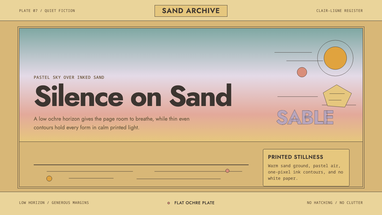 Sable (Mœbius)Still desert science fiction. Ochre ground, pastel sky, and thin ink contours…静默的沙漠科幻。赭黄地面、粉彩天空与细墨线在留白中呼吸。