What is Peanuts Comic Schulz (1950)?什么是 Peanuts Comic Schulz (1950)?
Peanuts turned the humble four-panel newspaper strip into a visual language of cream paper, wobbling ink, and a palette so warm it feels hand-held.《花生漫画》将平凡的四格报纸连载锻造成一套视觉语言——奶油纸底、颤抖墨线,色调温暖得像握在掌心。
Peanuts Comic Schulz (1950) in briefPeanuts Comic Schulz (1950) 速览
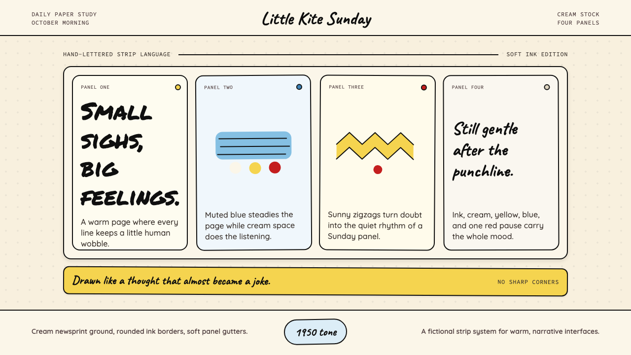
Peanuts Comic Schulz (1950) is a design aesthetic derived from the visual grammar Charles M. Schulz built across fifty years of daily newspaper cartooning. Its hallmarks are a warm cream ground, loosely hand-drawn panel borders with gently rounded corners, a restrained palette anchored by muted golden yellow and soft denim blue, and lettering that preserves the character of a brush-pen rather than the neutrality of typeset text. The system feels at once nostalgic and quietly melancholic — the visual equivalent of reading a Sunday strip on a childhood morning.Peanuts Comic Schulz (1950) 是一套源自查尔斯·舒尔茨五十年日报连载所构建的视觉语法的设计美学。其标志性特质包括:温暖的奶油色底面、边角微微圆润的手绘格框、以柔和金黄与淡牛仔蓝为主轴的克制色板,以及保留毛笔质感而非铅字中性感的手写字体。整套系统既唤起怀旧之情,又弥漫着一种平静的忧郁——如同童年某个清晨阅读周日版连载的视觉感受。
Unlike geometric movements that assert precision and authority, this aesthetic embraces deliberate imperfection. Ink lines vary slightly in weight; panel borders are not machine-straight; letterforms lean and breathe. These qualities are not accidents to be corrected — they are the source of the style's emotional warmth. The visual language signals handcraft, patience, and a gentle sadness that Schulz himself called the defining mood of the strip.与主张精准和权威的几何运动不同,这套美学拥抱刻意的不完美。墨线粗细略有起伏,格框并非机械笔直,字母略带倾斜与喘息。这些特质并非有待纠正的失误——恰恰是风格情感温度的来源。这套视觉语言传递的是手工、耐心,以及舒尔茨本人称为漫画定调情绪的那种温柔忧郁。
Color in this system is drawn from the strip's most iconic imagery: the yellow of Charlie Brown's zigzag sweater becomes the primary accent, the soft blue of Linus's security blanket becomes the secondary voice, and a desaturated Christmas red supplies emotional punctuation. All three float against cream newsprint or near-white grounds, giving the palette the faded warmth of an old printed page rather than the brightness of contemporary screen design.这套系统的用色取自漫画中最具标志性的形象:查理·布朗锯齿衫的黄色成为主要强调色,莱纳斯安全毯的柔蓝成为辅助声音,一抹去饱和度的圣诞红则充当情感标点。三者均漂浮于奶油色新闻纸或接近白色的底面上,使整套色板散发出旧印刷品的褪色温暖,而非当代屏幕设计的鲜亮感。
See the Peanuts Comic Schulz (1950) design system查看 Peanuts Comic Schulz (1950) 完整设计系统
Where does Peanuts Comic Schulz (1950) come from?Peanuts Comic Schulz (1950) 从何而来?
Peanuts debuted on October 2, 1950, in seven American newspapers. Schulz was twenty-seven years old, working from a rented studio in Saint Paul, Minnesota, and had spent the preceding years submitting single-panel gag cartoons to magazines. The strip's launch was modest — the United Feature Syndicate initially ran it under the name Peanuts against Schulz's preference, as he had envisioned a title closer to Good Ol' Charlie Brown. But within a few years the visual and narrative vocabulary Schulz was developing would become one of the most widely recognized in American popular culture.《花生漫画》于1950年10月2日在七家美国报纸上首次亮相。彼时舒尔茨二十七岁,在明尼苏达州圣保罗租用的工作室里创作,此前数年一直向杂志投递单格漫画。连载的起步颇为低调——联合报业辛迪加以「花生」(Peanuts)为题发行,违背了舒尔茨的本意(他设想的标题更接近《好老查理·布朗》)。但短短数年后,舒尔茨正在构建的视觉与叙事语汇,将成为美国流行文化中辨识度最高的符号之一。
The visual language of Peanuts emerged organically from the constraints and conventions of mid-century newspaper printing. Comics in the 1950s were reproduced on cheap newsprint using limited ink coverage. Color, when available for the Sunday strip, came from the four-color printing process of the era — a process that produced warm, slightly muddy tones quite different from saturated modern output. Schulz designed within these constraints rather than fighting them. The cream ground is the color of actual newsprint. The slightly off-register quality of the palette reflects the printing technology of the time. What might have been technical limitations became aesthetic identity.《花生漫画》的视觉语言,是在二十世纪中叶报纸印刷的限制与惯例中有机生长而成的。1950年代的漫画在廉价新闻纸上以有限墨量印刷。周日版的彩色来自当时的四色印刷工艺——这一工艺产生温暖、略带混浊的色调,与当代饱和输出大相径庭。舒尔茨选择在这些限制中创作,而非与之对抗。奶油色底面,是真实新闻纸的颜色。色板略显套准偏差的质感,映照着那个时代的印刷技术。本可成为技术局限的东西,变成了美学身份。
Schulz's lettering practice was equally distinctive. He lettered every strip by hand for nearly fifty years, developing a loose, confident style that contemporary typefaces have since attempted to capture. The brush-pen letterforms have slight variations in stroke weight, occasional slant shifts, and a rhythm that makes word balloons feel like breathing rather than typesetting. This commitment to hand lettering — at a time when mechanical lettering aids were available — was a deliberate choice that kept the strip's visual language rooted in human touch.舒尔茨的手写字体实践同样独树一帜。他以手工为每一格连载书写字母,历时近五十年,发展出一种松弛而自信的风格,当代字体至今仍在尝试还原。毛笔字形有轻微的笔触粗细变化、偶尔的倾斜位移,以及让对话气泡感觉像呼吸而非排版的韵律。在机械刻字辅助工具已然可得的时代,坚持手写字体,是将连载视觉语言根植于人手温度的刻意选择。
The strip ran in up to 2,600 newspapers at its peak syndication, reaching an estimated 355 million readers in 75 countries. Its visual canon was reinforced and extended through animated television specials beginning in 1965 — A Charlie Brown Christmas, with its jazz score by Vince Guaraldi and animation by Bill Melendez, introduced a generation to the strip's emotional palette in motion. Schulz continued drawing the strip until shortly before his death in February 2000, maintaining the hand-drawn warmth of the original through five decades of design trends that passed around him. The final original strip was published posthumously on February 13, 2000.《花生漫画》在峰值联合发行期间刊登于多达2600家报纸,在75个国家触达约3.55亿读者。其视觉规范从1965年起通过电视动画特辑得到强化与延伸——《查理·布朗的圣诞节》以万斯·瓜拉尔迪的爵士乐配乐和比尔·梅兰德斯的动画,让一代人在运动中感受了连载的情感色调。舒尔茨持续绘制漫画直至2000年2月辞世前夕,在五十年的设计潮流更迭中,始终保持着原版的手绘温度。最后一幅原创漫画于2000年2月13日在他身后发表。
What defines the Peanuts Comic Schulz (1950) look?Peanuts Comic Schulz (1950) 的视觉特征是什么?
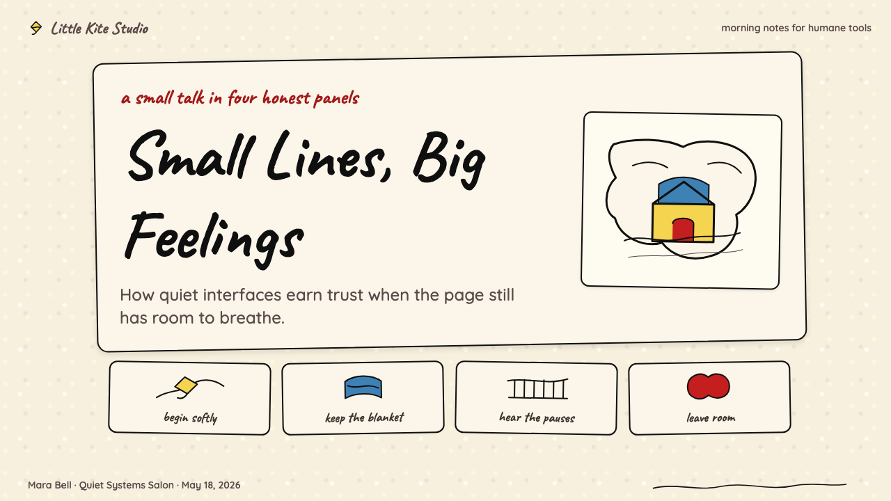
Cream Newsprint Ground奶油新闻纸底面
The foundational surface is not white but a warm off-white that reads as aged paper — the literal color of mid-century newsprint. This ground gives every element placed on it a softened, organic quality. Panels never feel clinical or cold. The warmth of the background sets the emotional register before a single character or line of text appears, functioning as the visual equivalent of the strip's quiet, unhurried melancholy.基础底面并非白色,而是一种温暖的米白——读来如同老化的纸张,正是二十世纪中叶新闻纸的实际颜色。这层底面赋予其上一切元素以柔和的有机质感。格框从不显得临床或冰冷。背景的温度在任何角色或文字出现之前,便已定下情感基调,相当于漫画那份平静、不慌不忙的忧郁在视觉上的等价物。
Muted Accent Palette低饱和点缀色板
The three accent colors — a muted golden yellow, a soft denim blue, and a desaturated brick red — are drawn directly from the strip's most recognizable visual elements. None is fully saturated; all carry a slight faded quality that evokes period printing. Yellow leads as the primary accent because it appears most frequently and carries the most warmth. Blue acts as a calming secondary voice. Red appears sparingly, reserved for emotional weight or seasonal punctuation. Mixing all three at full presence reads as period kitsch rather than authentic Schulz.三种点缀色——低饱和金黄、柔和牛仔蓝和去饱和砖红——直接取自漫画中最具辨识度的视觉元素。没有一种是全饱和的;所有色彩都带有轻微的褪色感,唤起时代印刷的气息。黄色以主要强调色领衔,因为它出现最频繁,承载最多温度。蓝色作为安抚性的辅助声音。红色出现克制,保留给情感分量或季节性标点。三种色彩同时满强度出现,读来是时代媚俗,而非真正的舒尔茨。
Hand-Drawn Line Quality手绘线条质感
Lines in this system are not mechanically uniform. They vary gently in weight along their length, feature slightly rounded endpoints rather than sharp terminations, and carry an implied humanity that distinguishes them from the precision strokes of a digital design tool. Panel borders are close to rectangular but never perfectly so — the corners are slightly rounded, the edges have the small undulations of a drawn rather than a ruled line. This imprecision is intentional and must be preserved; swapping it for clean digital geometry removes the style's defining warmth.这套系统中的线条并非机械均匀。它们沿走向有轻微的粗细变化,端点略微圆润而非锐利截断,承载着一种隐含的人性,将它们与数字设计工具的精准笔触区分开来。格框接近矩形但绝非完美矩形——角落略微圆润,边缘有手绘而非直尺勾勒的微小起伏。这种不精准是刻意为之,必须加以保留;以干净的数字几何替代它,会抹去风格的定义性温度。
Brush-Pen Lettering Voice毛笔手写字体声音
Typography in this system draws from the tradition of hand-lettered comic dialogue — loose, confident, with slight stroke-weight variations that recall an actual brush or marker moving across paper. All-caps lettering is the norm for dialogue and labels, but the letterforms are rounded and open rather than geometric and mechanical. The lettering feels personal: it has the slight inconsistency of a human hand rather than the perfect repeatability of a typeface. Word balloons and caption boxes inherit this quality — their borders are drawn shapes, not geometric primitives.这套系统的字体排印源自手写漫画对话的传统——松弛、自信,笔触粗细的轻微变化令人联想到真实的毛笔或马克笔在纸上移动。对话与标签通常使用全大写字母,但字形圆润开放,而非几何机械。手写字体感觉是私人的:它有人手的轻微不一致,而非字体的完美重复性。对话气泡与说明框继承了这一质感——它们的边框是手绘形状,而非几何图元。
Four-Panel Grid Rhythm四格网格节奏
The underlying compositional logic reflects the daily strip's four-panel structure — a horizontal sequence of near-equal-weight cells with consistent internal margins and minimal variation in panel size. This grid creates a quiet, breathing rhythm rather than the dynamic asymmetry of poster design or the bold hierarchy of editorial layout. It is patient and even-handed: no single panel screams louder than its neighbors. When applied to slides or web interfaces, this rhythmic evenness becomes a layout principle — multiple units of near-equal weight arranged in a horizontal or grid progression.底层构图逻辑反映了日报连载的四格结构——接近等重的格子水平排列,内边距一致,格子尺寸变化极小。这种网格制造的是平静、有呼吸感的节奏,而非海报设计的动态非对称或编辑版面的大胆层级。它耐心而平等:没有哪一格比邻格更大声。应用于幻灯片或网页界面时,这种节奏均匀感成为一种版面原则——接近等重的多个单元以水平或网格序列排列。
Quiet Melancholy Tone温柔忧郁的情感基调
Beyond color and form, the Schulz visual system carries an emotional signature that distinguishes it from merely nostalgic or retro aesthetics. The palette is warm but never cheerful; the imperfect lines suggest effort rather than effortlessness; the cream ground evokes something slightly faded and well-loved. Taken together, these qualities produce a mood that Schulz himself described as the strip's essential character — a gentle, persistent sadness that coexists peacefully with humor and affection. Designs that borrow the palette but lose this tonal restraint tend to read as nostalgic novelty rather than something genuinely felt.超越色彩与形式,舒尔茨视觉系统承载着一种情感印记,将它与单纯的怀旧或复古美学区分开来。色板温暖但从不欢快;不完美的线条暗示努力而非轻松;奶油底面唤起一种略显褪色、饱受爱抚的感觉。这些质素合在一起,产生了一种舒尔茨本人称为漫画本质特征的情绪——一种温柔而持续的忧郁,与幽默和深情和平共处。借用色板却失去这种情感克制的设计,往往读来像怀旧噱头,而非真正有所感触的东西。
Rounded, Organic Shapes圆润的有机形态
Where geometric styles favor hard corners and sharp angles, the Schulz visual language rounds every edge that plausibly could be rounded. Panel borders, speech bubbles, character silhouettes, and decorative elements all curve gently. This roundness is not a formal rule applied in isolation — it is consistent with the hand-drawn line quality and the human imperfection that runs through the entire system. Sharp geometric precision would import the logic of a different aesthetic entirely. The softness of the forms is what makes the style feel safe and approachable rather than structured and demanding.几何风格偏爱硬角与锐利棱线,而舒尔茨视觉语言则将每一个可以圆润的边缘圆润化。格框、对话气泡、角色轮廓和装饰元素都轻柔地弯曲。这种圆润并非孤立应用的形式规则——它与手绘线条质感以及贯穿整套系统的人手不完美性一脉相承。锐利的几何精准会引入一套完全不同的美学逻辑。形态的柔和,正是这种风格让人感觉安全亲切而非结构化且有所要求的原因。

See the Peanuts Comic Schulz (1950) design system查看 Peanuts Comic Schulz (1950) 完整设计系统
Who shaped Peanuts Comic Schulz (1950)?谁塑造了 Peanuts Comic Schulz (1950)?
Schulz created, wrote, and drew every Peanuts strip from the debut on October 2, 1950, until his retirement announcement in December 1999 — a nearly unbroken fifty-year run. Born in Minneapolis in 1922 and raised in Saint Paul, he was a shy, introspective child whose experiences of loneliness, unrequited affection, and social awkwardness became the emotional core of his characters. He resisted assistants and ghost artists throughout his career, insisting that the hand-drawn imperfection of the strip was not a production limitation but a deliberate aesthetic choice. His studio in Santa Rosa, California — where he worked from 1969 onward — became a pilgrimage site for cartoonists worldwide. Schulz died on February 12, 2000, the night before his final strip was published.舒尔茨亲手创作、撰写并绘制了每一幅《花生漫画》,从1950年10月2日首刊到1999年12月宣布退休,历时近五十年几乎未曾中断。他1922年生于明尼阿波利斯,在圣保罗长大,是个内向、沉思的孩子,孤独、单相思和社交尴尬的经历成为他笔下人物情感内核的来源。他终其职业生涯拒绝助手和代笔画家,坚持认为漫画手绘的不完美不是生产局限,而是刻意的美学选择。他位于加利福尼亚州圣罗莎的工作室——从1969年起他在那里工作——成为全球漫画家朝圣之地。舒尔茨于2000年2月12日辞世,就在他最后一幅漫画发表的前夜。
Guaraldi was the jazz pianist and composer who scored A Charlie Brown Christmas (1965) and the subsequent animated specials. His compositions — particularly Linus and Lucy, which became the unofficial Peanuts theme — shaped the emotional register of the Schulz universe in sound as thoroughly as Schulz's visual language shaped it in image. The warm, slightly melancholy quality of Guaraldi's piano lines parallels the warmth and gentle sadness of the visual palette. The two systems reinforce each other so completely that it is nearly impossible to look at the cream-and-yellow aesthetic without hearing the music.瓜拉尔迪是为《查理·布朗的圣诞节》(1965年)及后续动画特辑配乐的爵士钢琴家和作曲家。他的作品——尤其是成为《花生漫画》非官方主题曲的《莱纳斯与露西》——在声音层面塑造了舒尔茨宇宙的情感基调,其彻底程度不亚于舒尔茨的视觉语言在图像层面的塑造。瓜拉尔迪钢琴线条温暖而略带忧郁的质感,与视觉色板的温暖和温柔悲伤相互呼应。这两套系统相互强化,以至于看到奶油与黄色的美学时,几乎不可能不在耳边响起那段音乐。
Mendelson was the television producer who brought Peanuts to the animated special format, partnering with Schulz and director Bill Melendez to create A Charlie Brown Christmas (1965) and dozens of subsequent specials. His decision to use child voice actors — rather than adult performers doing children's voices — was crucial in preserving the strip's emotional authenticity on screen. Mendelson also fought to retain Guaraldi's jazz score when CBS executives wanted something more conventional, a decision that proved definitive for the aesthetic character of the entire animated canon.门德尔森是将《花生漫画》带入动画特辑形式的电视制片人,与舒尔茨和导演比尔·梅兰德斯合作制作了《查理·布朗的圣诞节》(1965年)及数十部后续特辑。他坚持使用儿童配音演员——而非由成人演员模仿儿童声音——这一决定对于在屏幕上保留漫画的情感真实性至关重要。门德尔森还力排CBS高管希望采用更传统配乐的压力,坚持保留瓜拉尔迪的爵士乐——这一决定对整个动画规范的美学特征来说是决定性的。
Melendez was the animation director responsible for bringing Schulz's characters into motion across the television specials and theatrical films. A veteran of Disney and UPA, he developed an animation style for Peanuts that honored the strip's hand-drawn imperfection — characters moved with slight hesitations, the line quality stayed loose, and the color palette respected the muted warmth of the original newsprint aesthetic. He also voiced Snoopy's distinctive unintelligible sounds throughout the specials. Melendez directed or supervised every major Peanuts animated production from 1965 until his death in 2008.梅兰德斯是在电视特辑与院线电影中将舒尔茨笔下角色带入运动状态的动画导演。作为迪士尼和UPA的老将,他为《花生漫画》发展出一套尊重原作手绘不完美感的动画风格——角色运动带有轻微的迟疑,线条质感保持松弛,色板尊重了原版新闻纸美学的低饱和温暖。他还在所有特辑中为史努比的独特咕哝声担任配音。梅兰德斯导演或监制了从1965年到他2008年辞世前的每一部重要《花生漫画》动画作品。
The syndication arm that distributed Peanuts to newspapers across the United States and eventually worldwide played a structural role in shaping the strip's visual constraints. Syndicate production standards for mid-century newspaper comics — column widths, ink coverage limits, color registration tolerances — became design parameters that Schulz worked within and ultimately turned to aesthetic advantage. The cream newsprint ground, the slightly muted palette, and the tolerance for minor printing variation all trace back to the physical and commercial infrastructure of newspaper syndication. The strip's eventual 2,600-paper circulation meant that Schulz's visual language was tested and refined against an enormous range of printing conditions over five decades.将《花生漫画》发行至美国各地乃至全球报纸的联合辛迪加,在塑造连载视觉限制方面扮演了结构性角色。辛迪加对二十世纪中叶报纸漫画的生产标准——栏宽、墨量限制、套色容差——成为舒尔茨在其中创作并最终转化为美学优势的设计参数。奶油新闻纸底面、略显低调的色板、对轻微印刷偏差的容许,都可以追溯到报纸联合发行的物理与商业基础设施。连载最终覆盖2600家报纸,意味着舒尔茨的视觉语言在五十年间经历了大量不同印刷条件的检验与磨砺。
How do you use Peanuts Comic Schulz (1950) today?今天怎么用 Peanuts Comic Schulz (1950)?
The Peanuts visual system is one of the warmest and most emotionally legible design languages available to contemporary practitioners. Its power comes not from formal precision but from accumulated association — audiences who grew up with the strip carry an emotional relationship to its visual cues. Applying this aesthetic correctly means respecting what generates that warmth: the cream ground, the slightly imperfect linework, the muted and purposefully faded accent palette, and the quiet horizontal rhythm of the four-panel grid. Lifting only the surface elements — a yellowish color and some handwriting-style type — without the deeper structural and emotional logic will produce pastiche rather than design.《花生漫画》视觉系统是当代从业者可用的最温暖、情感可读性最强的设计语言之一。它的力量不来自形式精准,而来自积累的联想——伴随这部漫画成长的受众与它的视觉线索之间有着情感关系。正确应用这套美学,意味着尊重产生那份温暖的来源:奶油底面、略显不完美的线条质感、低调而刻意褪色的点缀色板,以及四格网格的平静水平节奏。只摘取表面元素——一种偏黄的颜色加上手写风格的字体——而不理解更深层的结构与情感逻辑,产生的将是仿制品而非设计。
For presentation slides, the Peanuts aesthetic works exceptionally well in contexts where warmth and approachability are more important than authority and precision. A cover slide benefits from the horizontal panel rhythm: place the title in the left two-thirds of the frame, using large hand-lettered display type, and anchor a simple rounded shape — a circle or softly cornered rectangle — in a muted golden yellow on the right. Content slides should feel like a single panel: one dominant message, body text with generous line spacing and a warm mid-weight hand-lettered typeface, and subtle panel borders drawn with slightly irregular lines rather than perfect geometric strokes. Data slides translate well when charts are rendered in the strip's three accent colors against the cream ground, with values labeled in the same hand-lettered voice as body text rather than a contrasting typeface.对于演示幻灯片,《花生漫画》美学在温暖感和亲和力比权威感和精准感更重要的场合表现尤为出色。封面幻灯片适合运用水平格子节奏:将标题置于画面左侧三分之二,使用大号手写体展示字体,在右侧用柔和金黄色锚定一个简单的圆润形状——圆形或圆角矩形。内容幻灯片应当感觉像单个格子:一条主要信息,正文文字行距宽松并使用温暖的中等字重手写字体,格子边框用略带不规则的线条而非完美几何笔触绘制。数据幻灯片在将图表以漫画三种点缀色绘制在奶油底面上时效果很好,数值标注使用与正文相同的手写声音,而非对比性字体。
For web UI, the style is best suited to editorial products, personal brand sites, independent newsletters, and consumer-facing platforms where human warmth is a differentiator. Dashboard interfaces can adopt the panel-grid logic: card components with rounded borders and a very slight texture on the cream background, accent colors reserved for status indicators and calls to action. Pricing pages work well with the strip's color-coding logic — a yellow tier, a blue tier, a red tier — each carrying the muted, non-aggressive saturation of the original palette. Navigation and body copy should use a typeface with humanist proportions and slight stroke variation; perfectly geometric sans-serifs will pull the aesthetic toward something colder and more clinical than the source material supports.对于网页界面,这种风格最适合编辑类产品、个人品牌网站、独立通讯,以及人文温暖是差异化因素的面向消费者的平台。仪表板界面可以采用格子网格逻辑:圆角边框的卡片组件,奶油底面带有极轻微的纹理,点缀色保留给状态指示符和行动号召。定价页面适合运用漫画的色彩编码逻辑——黄色层级、蓝色层级、红色层级——每一种都保持原始色板的低饱和、非攻击性。导航和正文排版应使用具有人文主义比例和轻微笔触变化的字体;完全几何化的无衬线字体会将美学拉向比源材料所支持的更冷、更临床的方向。
In editorial and marketing applications, the style rewards layouts that leave generous white — or cream — space and resist the temptation to fill every margin. A feature article can use a four-column grid where the leftmost column holds pull quotes or illustration captions in a lighter weight of the hand-lettered style, and the remaining columns carry body text. Section breaks marked by a gently wavy hand-drawn horizontal rule reinforce the aesthetic's organic quality. Marketing campaigns can leverage the emotional associations of the palette directly: golden yellow on cream for warmth and nostalgia, soft blue for calm and trust, muted red for urgency that does not shout. The style performs particularly well in contexts addressing childhood, creativity, vulnerability, or community — topics that resonate with the strip's core emotional register.在编辑和营销应用中,这种风格回报那些留有充裕白色——或奶油色——空间、抵制填满每一处页边距诱惑的版面。特稿文章可以使用四栏网格,最左栏用手写风格的较轻字重承载引语或插图说明,其余栏承载正文。以轻柔波状手绘水平线标记段落分隔,强化了美学的有机质感。营销活动可以直接利用色板的情感联想:奶油底面上的金黄传递温暖与怀旧,柔蓝带来平静与信任,低饱和红传递不咆哮的紧迫感。这种风格在涉及童年、创造力、脆弱或社群的场合表现尤为出色——这些主题与漫画核心情感基调产生共鸣。
The most common mistake when applying the Schulz aesthetic is substituting digital cleanliness for the deliberate imperfection that defines it. Perfectly uniform letterforms, fully saturated accent colors, sharp-cornered panel borders, and crisp geometric shapes all work against the system's logic. A second frequent error is treating the warm palette as interchangeable with generic retro or vintage aesthetics — the specific combination of cream ground, muted golden yellow, soft denim blue, and desaturated red is historically grounded and emotionally precise. Replacing any of these with brighter, more saturated, or more generic vintage tones dissolves the identity. Finally, attempting to combine the Peanuts aesthetic with visual systems that operate on competing principles — sharp geometric precision, high-saturation color, aggressive typographic hierarchy — produces visual incoherence. The style asks for restraint, evenness, and a willingness to let quiet warmth do the communicative work.应用舒尔茨美学时最常见的错误,是用数字整洁性取代定义它的刻意不完美。完全均匀的字形、全饱和点缀色、直角格框边框和锐利几何形状,都与这套系统的逻辑背道而驰。第二个常见错误是将温暖色板视为通用复古或怀旧美学的可替换版本——奶油底面、低饱和金黄、柔和牛仔蓝和去饱和红的特定组合,是有历史根基且情感精准的。用更明亮、更饱和或更通用的复古色调替换其中任何一种,都会溶解这套身份。最后,试图将《花生漫画》美学与基于竞争原则运作的视觉系统结合——锐利几何精准、高饱和色彩、攻击性排版层级——会产生视觉不连贯。这种风格需要的是克制、均衡,以及愿意让平静的温暖承担传达工作的意愿。
See the Peanuts Comic Schulz (1950) design system查看 Peanuts Comic Schulz (1950) 完整设计系统
Peanuts Comic Schulz (1950) — FAQPeanuts Comic Schulz (1950) · 常见问题
How is the Peanuts aesthetic different from generic vintage or retro design?《花生漫画》美学与通用复古或复古设计有何不同?
Generic vintage design borrows surface cues of age — distressed textures, faded colors, worn edges — without a specific visual language behind them. The Peanuts aesthetic is precise: it derives from a specific set of production constraints (mid-century newspaper printing), a specific set of character-derived colors (Charlie Brown yellow, Linus blue, Christmas red), and a specific emotional register (gentle melancholy rather than cheerful nostalgia). The difference shows in application. Generic vintage can be applied broadly without commitment; the Schulz system requires consistency in palette, linework, and tonal restraint to function. A design that looks vaguely old but warm is retro. A design with cream ground, muted golden yellow accents, imperfect rounded line borders, and hand-lettered type in the strip's unhurried rhythm is referencing something specific.通用复古设计借用的是岁月的表面线索——做旧纹理、褪色、磨损边缘——背后没有特定的视觉语言。《花生漫画》美学是精准的:它源自特定的生产限制(二十世纪中叶报纸印刷)、特定的角色衍生色彩(查理·布朗黄、莱纳斯蓝、圣诞红),以及特定的情感基调(温柔忧郁而非欢快怀旧)。区别在应用中显现。通用复古可以不加承诺地广泛应用;舒尔茨系统需要在色板、线条质感和情感克制方面的一致性才能发挥作用。看起来模糊老旧但温暖的设计是复古。有奶油底面、低饱和金黄点缀、不完美圆润线框,以及漫画不慌不忙节奏中手写字体的设计,引用的是某个具体的东西。
Can this aesthetic work for professional or corporate contexts, or is it limited to casual and personal brands?这套美学能用于专业或企业场合吗,还是仅限于休闲和个人品牌?
It depends on what kind of professional authority the context requires. The Schulz aesthetic signals warmth, approachability, patience, and gentle wit — qualities that work well for educators, therapists, children's product companies, independent creators, editorial brands, and any professional context where human connection is more important than institutional authority. It works less well where the context demands the visual vocabulary of precision and power: financial institutions, enterprise software, legal services, or any domain where users need to feel that everything is under tight control. The palette's softness can undermine confidence in high-stakes precision contexts. Used intentionally, however, this limitation is also a strength — it is one of the few historical design languages that communicates vulnerability and honesty alongside competence.这取决于场合需要何种专业权威性。舒尔茨美学传递的是温暖、亲和、耐心和温柔的机智——这些品质适合教育工作者、心理治疗师、儿童产品公司、独立创作者、编辑品牌,以及任何人际连接比机构权威更重要的专业场合。在场合需要精准和力量的视觉词汇时则效果欠佳:金融机构、企业软件、法律服务,或任何用户需要感受一切都处于严格控制中的领域。色板的柔和性可能削弱高风险精准场合的可信度。然而,有意为之的话,这一局限也是优势——它是为数不多能在传递能力的同时传递脆弱感与诚实感的历史设计语言之一。
How do you handle dark mode with this aesthetic?这套美学如何处理深色模式?
The Schulz visual system is fundamentally a light-ground aesthetic. Its emotional warmth depends heavily on the cream or off-white background — invert it to a dark ground and you lose the newsprint association that anchors the style's nostalgic character. A dark inversion is technically possible: cream text and muted golden accents on a deep warm charcoal or ink-dark navy can preserve some of the palette's warmth. But the result will read as a different aesthetic — closer to noir illustration or a moody editorial dark theme — than to Peanuts proper. If a dark mode is required, treat it as a distinct variant rather than a direct inversion: keep the accent palette, embrace warm darks rather than cold blacks, and accept that some of the original emotional register will not survive the conversion. The imperfect linework and rounded forms remain viable on dark grounds; the cream-paper warmth does not.舒尔茨视觉系统从根本上是一套浅色底面美学。它的情感温度在很大程度上依赖奶油色或米白色背景——将其反转为深色底面,就失去了锚定风格怀旧特质的新闻纸联想。深色反转在技术上是可行的:深暖木炭色或墨水深蓝底面上的奶油文字和低饱和金黄点缀,可以保留一些色板的温暖感。但结果读来会是一套不同的美学——更接近黑色电影插图或忧郁的编辑深色主题——而非真正意义上的《花生漫画》。如果需要深色模式,将其视为独立变体而非直接反转:保留点缀色板,拥抱温暖深色而非冷黑,并接受原始情感基调的某些部分在转换中无法留存。不完美的线条质感和圆润的形态在深色底面上仍然可行;奶油纸张的温暖则不然。
Does this aesthetic require custom illustration, or can it work with photography and stock imagery?这套美学需要定制插图,还是可以与摄影和图库图像配合使用?
The Schulz aesthetic is at its most authentic with hand-drawn illustration — line art that reflects the strip's loose, rounded visual language. Photography can be incorporated, but it requires deliberate treatment: images processed with a warm, slightly desaturated tone that echoes the newsprint palette, hard-cropped or silhouetted rather than placed as naturalistic scene-windows, and used sparingly so that the overall layout retains its hand-drawn quality. Stock photography that is clean, brightly lit, or shot with contemporary production values will clash with the aesthetic's imperfection and faded warmth. If a photographic element is unavoidable, duotone processing using the accent palette — golden yellow over warm shadow tones, or denim blue over light values — can bring it closer to the system's visual language. The most successful applications use illustration as the primary image register and reserve photography for supporting contexts only.在手绘插图——反映漫画松弛圆润视觉语言的线条艺术——的配合下,舒尔茨美学最为真实。摄影可以融入,但需要刻意处理:图像以呼应新闻纸色板的温暖、略显低饱和调性处理,硬裁切或做轮廓剪影处理,而非以自然主义场景窗口的形式置入,且节制使用,以使整体版面保留手绘质感。干净、明亮打光或以当代制作标准拍摄的图库摄影,会与美学的不完美性和褪色温度产生冲突。如果摄影元素不可避免,使用点缀色板进行双色调处理——金黄叠加温暖阴影调,或牛仔蓝叠加高光调——可以使其更接近系统的视觉语言。最成功的应用以插图作为主要图像语言,将摄影保留在辅助场景中使用。
What makes this style feel melancholy rather than simply warm or nostalgic?是什么让这种风格感觉忧郁,而不仅仅是温暖或怀旧?
The melancholy in the Schulz visual system comes from a specific combination of qualities that distinguish it from purely cheerful retro aesthetics. First, the palette is warm but not bright — the golden yellow is muted, not primary; the blue is soft, not vivid. Colors that have been slightly drained of their saturation carry an implicit sense of fading, of something that was once more vivid. Second, the imperfect line quality suggests effort and vulnerability rather than ease and confidence — lines that wobble slightly imply a human hand that is doing its best rather than a machine producing perfect output. Third, the horizontal evenness of the four-panel grid creates a quiet, measured rhythm that is closer to resignation than to excitement. Together these elements produce a visual mood that holds warmth and sadness simultaneously — the exact emotional register that made the strip so recognizable and so enduring for fifty years.舒尔茨视觉系统中的忧郁感,来自将它与单纯欢快的复古美学区分开来的一组特定品质组合。首先,色板温暖但不明亮——金黄是低饱和的,而非纯原色;蓝色是柔和的,而非鲜亮的。轻微丧失饱和度的色彩隐含着一种褪色感,一种曾经更鲜亮的事物的感觉。其次,不完美的线条质感暗示的是努力与脆弱,而非轻松与自信——轻微颤抖的线条暗示一只在尽力而为的人手,而非产出完美输出的机器。第三,四格网格水平方向的均衡制造了一种平静、有节制的节奏,更接近认命而非兴奋。这些元素合在一起产生了一种同时承载温暖与悲伤的视觉情绪——正是让这部漫画在五十年间如此令人熟悉、如此经久不衰的那种精确情感基调。
Related design styles相关设计风格
 Pink Panther Cartoon (1963)Cool silence with a grin. Pink field, black ink, cream cel space.冷静的默剧感。珊瑚粉底、黑墨线与奶油留白。
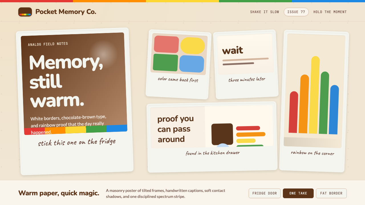 Polaroid InstantMemory made tangible. Photo-white frames tilt on aged paper with a warm rainb…记忆变得可触:相纸白边倾斜在旧纸底上,彩虹条点亮温度。
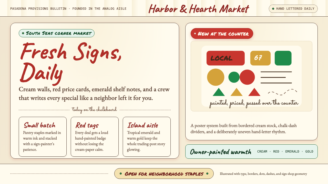 Trader Joe's Hand-LetteredHandmade grocery warmth. Cream chalkboards, red price tags, emerald accents.手写杂货温度:奶油黑板、红色价签、翠绿点缀。
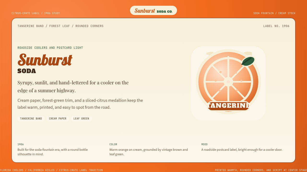 Orange Crush Soda (1906)Syrupy nostalgia. Tangerine, cream, and script make it a postcard label.糖浆般怀旧。橘红、奶油纸与手写体把标签变成明信片。
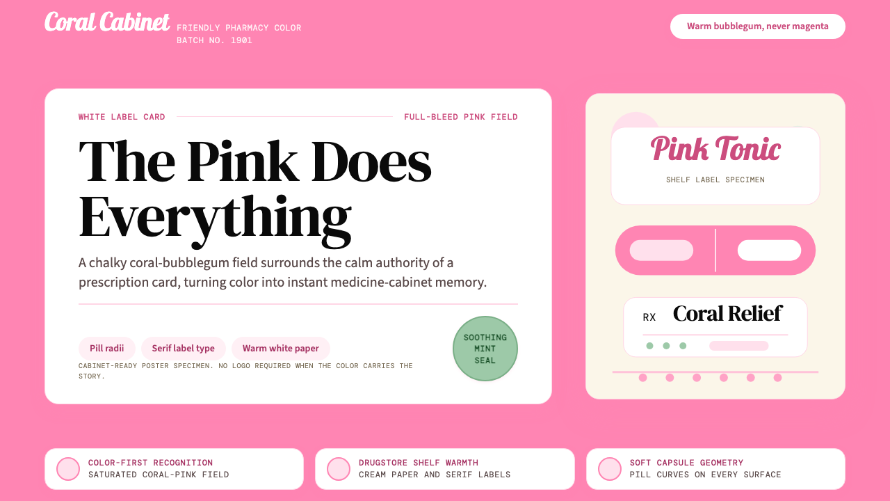 Pepto-Bismol Pink (1901)Color is the cure. Bubblegum pink floods the field; white label cards and pil…颜色就是招牌:泡泡糖粉铺满画面,白色标签卡和药丸弧度稳住信任。
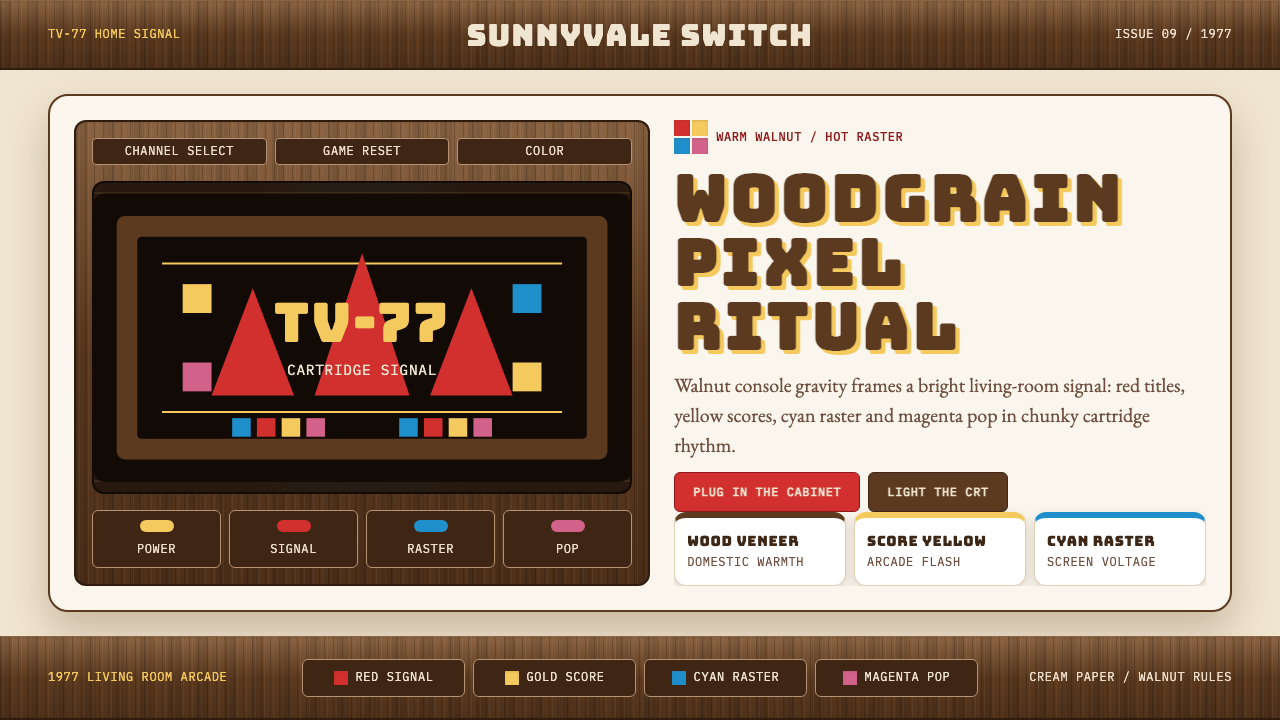 Atari 2600 (Woodgrain)Woodgrain meets raw pixels. Walnut panels frame Bungee type and CMYK raster b…木纹遇上生猛像素:胡桃木面板包裹Bungee字与CMYK色块。