What is Trader Joe's Hand-Lettered?什么是 Trader Joe's Hand-Lettered?
Trader Joe's turned a chalkboard and a piece of chalk into one of the most recognizable retail identities in America — proof that warmth drawn by hand outlasts any polished supermarket brand.Trader Joe's 用一块黑板和一支粉笔,写出了美国最具辨识度的零售视觉身份——手写的温度,比任何光滑的超市品牌都更经得住时间。
Trader Joe's Hand-Lettered in briefTrader Joe's Hand-Lettered 速览
Trader Joe's Hand-Lettered is the visual language of an American specialty-grocery chain that has, since 1967, refused to look like a supermarket. Every store greets customers with hand-painted chalkboard signs, crew members in Hawaiian shirts, and a warm cream interior that borrows more from a tropical trading post than from a fluorescent-lit food warehouse. The result is a design identity built not on precision and system, but on the cumulative warmth of imperfect, human marks.Trader Joe's 手写风格是一家美国精品杂货连锁自1967年起构建的视觉语言——它从一开始就拒绝看起来像一家超市。每一家门店用手绘黑板招牌、身穿夏威夷衫的店员和奶白色暖调内装迎接顾客,借鉴的是热带贸易站的气质,而非荧光灯照耀下的食品仓库。由此形成的设计身份,不是建立在精准与系统之上,而是建立在不完美的、充满人情味的笔触所累积的温度之上。
The aesthetic rests on a small, deliberate palette — creamy off-white grounds, a signature red used for pricing and emphasis, a tropical emerald that nods to the chain's Polynesian South Seas heritage, and flashes of warm gold. Over these colors sit letterforms that look genuinely hand-drawn: casual, bouncy, slightly uneven, with the natural variation you expect from a felt-tip marker or a piece of chalk. Nothing in the system strives for geometric perfection. The imperfections are the point.这套美学依托一个小而刻意的色彩体系:奶油白底色、用于定价与强调的标志性红、呼应品牌波利尼西亚南海主题的热带翠绿,以及点缀其间的暖金。这些颜色之上,是看起来货真价实的手写字形——随意、弹跳、略显参差,带着毡头笔或粉笔书写时自然产生的变化。系统里没有任何元素追求几何意义上的完美,这些不完美本身就是设计意图。
What makes this identity durable is that it solves a genuine emotional problem. Mass-market grocery retail tends toward cold efficiency — bright white light, uniform shelving, sans-serif pricing. Trader Joe's inverts that equation deliberately. Every hand-lettered sign, every illustrated product label, every chalkboard menu reads as evidence that a person was here, paid attention, and wrote this for you. The style communicates neighborly trust rather than corporate scale.这套视觉身份之所以经久耐用,是因为它解决了一个真实的情感问题。大众超市零售往往趋向冷漠的效率——强白光、统一货架、无衬线价格标签。Trader Joe's 有意反转这一等式。每一块手写招牌、每一张手绘商品标签、每一块粉笔菜单,都在说明:有个人在这里,注意到了你,专门为你写下了这些。这种风格传递的是邻里间的信任,而非企业规模的张扬。
See the Trader Joe's Hand-Lettered design system查看 Trader Joe's Hand-Lettered 完整设计系统
Where does Trader Joe's Hand-Lettered come from?Trader Joe's Hand-Lettered 从何而来?
Joe Coulombe founded the first Trader Joe's in Pasadena, California in 1967, converting a small convenience store chain called Pronto Markets into something altogether different. Coulombe's insight was demographic and cultural: he saw that a growing number of educated, well-traveled Americans — people who had encountered interesting food and drink abroad — had no reliable local source for the things they wanted. He would stock unusual wines, international cheeses, and specialty foods at prices that felt fair, and he would make the store itself feel like an adventure rather than an errand.1967年,Joe Coulombe 在加州帕萨迪纳创立了第一家 Trader Joe's,将一个名为 Pronto Markets 的小型便利店连锁改造成了截然不同的东西。Coulombe 的洞见来自人口学与文化层面:他看到越来越多受过良好教育、走过世界的美国人——那些在国外接触过有趣食物和饮品的人——在本地找不到可靠的货源。他要以合理的价格提供少见的葡萄酒、异国奶酪与特色食品,并让门店本身像一场探险,而不是一次日常采购。
The South Seas and Polynesian theming was Coulombe's deliberate invention, inspired in part by the tiki culture popular in mid-century California and in part by his own sense that a 'trading post' metaphor would give the store a coherent, adventurous personality. Hawaiian shirts became the staff uniform. The store name itself — Trader Joe's — evokes the romantic image of a well-traveled merchant who has brought back treasures from distant places. The hand-lettered signage that followed was a natural extension of this ethos: signs that looked like they had been written by hand that very morning felt authentic in a way that printed signage never could.南海与波利尼西亚主题是 Coulombe 刻意发明的,部分灵感来自二十世纪中期加州流行的提基文化,部分来自他自己的判断——「贸易站」这一隐喻能赋予门店连贯而富有冒险感的个性。夏威夷衫成为员工制服。店名本身——Trader Joe's(贸易商乔)——唤起一个走遍四方、带回异地珍品的行商形象。随之而来的手写招牌是这种精神的自然延伸:看起来当天早上刚刚由人手写上去的招牌,拥有印刷品永远无法复制的真实感。
In 1979, Theo Albrecht, the German billionaire co-founder of the Aldi Nord discount grocery empire, purchased Trader Joe's. This was a remarkable pairing on paper — Aldi's entire identity was built on ruthless price efficiency and functional, logo-light packaging — but in practice, Albrecht understood the value of what Coulombe had built and left the visual language essentially untouched. The hand-lettered style continued without interruption, becoming more refined and intentional over the following decades while retaining its warm, imperfect character.1979年,德国亿万富翁、Aldi Nord 折扣超市帝国联合创始人 Theo Albrecht 收购了 Trader Joe's。这在纸面上是一次令人称奇的组合——Aldi 的整个品牌身份建立在对价格效率的极致追求和功能主义的极简包装之上——但在实践中,Albrecht 理解 Coulombe 所构建之物的价值,基本保持视觉语言原封不动。手写风格毫不中断地延续下去,在此后数十年间变得更加精炼而自觉,同时保留了那种温暖而不完美的气质。
By the time Trader Joe's had expanded to approximately six hundred stores across the United States, the hand-lettered identity had become one of the most studied examples of retail brand consistency in American design history. Unlike brands that invest heavily in enforced standardization — pixel-perfect logo reproduction, pantone-matched color management across every touchpoint — Trader Joe's achieved consistency through cultural repetition and a shared aesthetic sensibility rather than rigidity. Each store's signage was slightly different, drawn by local staff trained in the style, and that variation was treated not as a flaw to be corrected but as evidence of the brand's genuine humanity.当 Trader Joe's 扩张至全美约六百家门店时,这套手写视觉身份已成为美国设计史上研究最广泛的零售品牌一致性案例之一。不同于那些投重金于强制标准化的品牌——追求像素级精确的标志复制、每个接触点的潘通色彩管理——Trader Joe's 通过文化重复和共同的审美感性而非刚性规则实现了一致性。每家门店的招牌略有差异,由经过风格培训的当地员工手写完成,这种变化不被视为需要纠正的缺陷,而被视为品牌真实人性的证明。
What defines the Trader Joe's Hand-Lettered look?Trader Joe's Hand-Lettered 的视觉特征是什么?
Hand-Lettered Imperfection手写的不完美
The defining quality of the style is that letterforms look genuinely written rather than typeset or digitally rendered. Stroke weights vary naturally within a single character. Baselines wander slightly. Letter spacing is optically adjusted by eye rather than mathematically locked. This imperfection is not sloppiness — it is the result of skilled lettering artists working within a loose shared sensibility — but it reads as warmth rather than control, as human rather than mechanical.这种风格最核心的特质,是字形看起来是真正被写出来的,而非排版设定或数字渲染的产物。单个字母内的笔画粗细自然变化,基线略有起伏,字母间距靠眼睛光学调整而非数学锁定。这种不完美并非潦草——它是熟练的手写艺术家在宽松共同感性下工作的结果——但读起来是温度而非控制,是人性而非机械。
Chalkboard as Primary Medium黑板作为主要媒介
The chalkboard sign is the visual anchor of the Trader Joe's in-store experience. Cream or off-white chalkboard surfaces — rather than the pure black of a traditional blackboard — provide a softer, warmer ground for lettering in white chalk and colored chalk accents. The medium implies ephemerality: these signs could be erased and rewritten today, which reinforces the sense that they reflect genuine daily attention rather than pre-printed corporate messaging.黑板招牌是 Trader Joe's 店内体验的视觉锚点。奶油色或米白色的黑板表面——而非传统黑板的纯黑——为白色粉笔与彩色粉笔点缀提供了更柔和、更温暖的底色。这一媒介隐含着短暂性:这些招牌今天就可以擦掉重写,这强化了一种感觉——它们反映的是真实的日常用心,而非预制的企业话术。
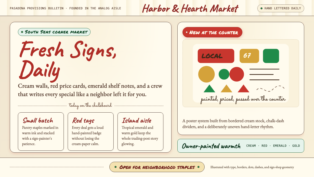
The Signature Color Quartet标志性四色组合
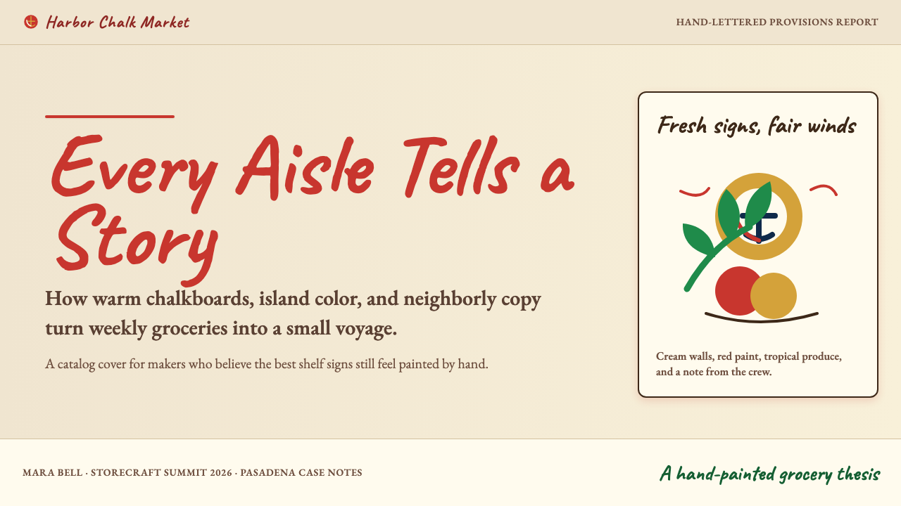
The palette is tightly controlled around four anchors: warm cream for backgrounds and large surface areas; Trader-Joe red for price callouts, headings, and structural emphasis; tropical emerald for accents that reference the Polynesian South Seas heritage; and warm gold used sparingly for highlights and festive moments. These four colors work together to feel warm rather than primary-school bright, inviting rather than aggressive. They are consistently applied across chalkboards, product labels, bags, and printed materials.色板围绕四个锚点严格控制:暖奶白用于背景和大面积区域;Trader Joe 红用于价格标注、标题和结构性强调;热带翠绿作为点缀,呼应品牌的波利尼西亚南海主题;暖金色少量使用于高光和节庆场合。这四种颜色协同工作,感觉是温暖而非小学课本式的鲜亮,是邀请而非冲击。它们在黑板、商品标签、购物袋和印刷品上保持一致的应用。
Illustrated Product Storytelling插画式商品叙事
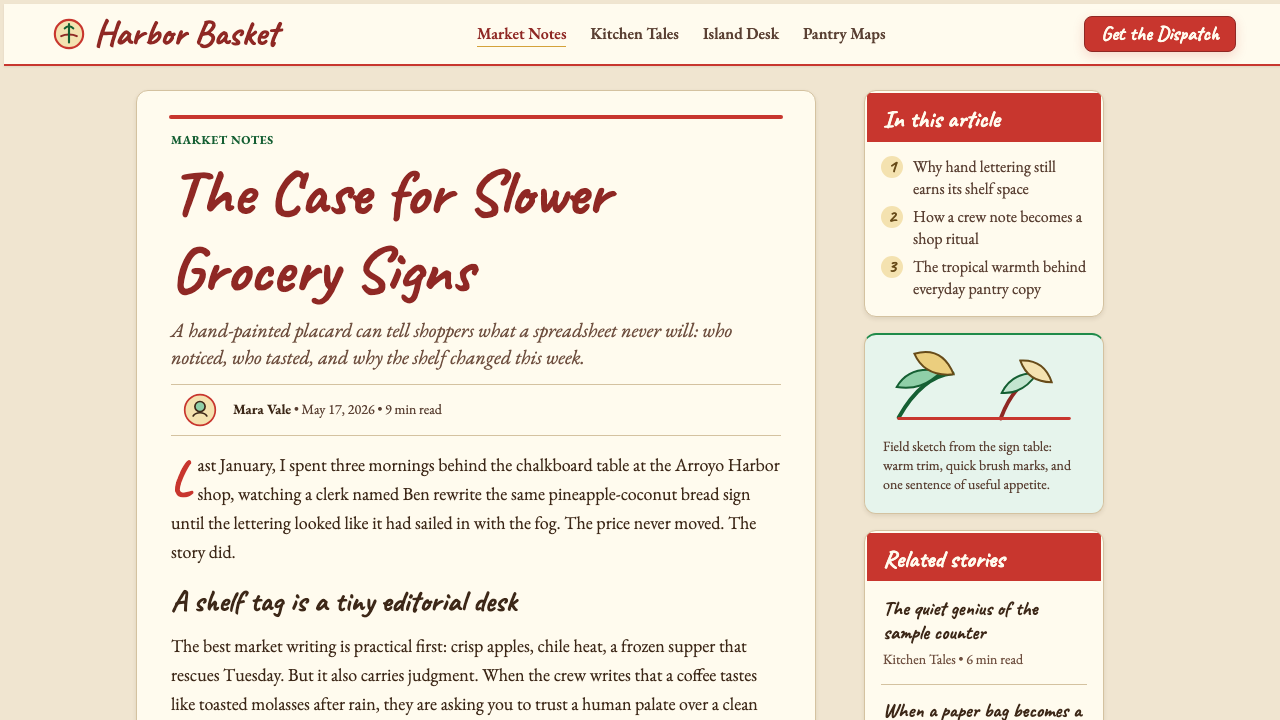
Trader Joe's private-label product packaging pairs hand-lettered text with hand-drawn illustrations — loose tropical motifs, fruit and vegetable line drawings, nautical details — that reinforce the South Seas trading-post narrative. The illustrations are deliberately unpretentious: they have the quality of good doodles made by someone who can actually draw, rather than the polished output of a professional illustration studio. This registers as authentic and personal even at the scale of a mass-market product line.Trader Joe's 自有品牌商品包装将手写文字与手绘插图结合——宽松的热带图案、水果蔬菜线描、航海细节——强化南海贸易站的叙事。这些插图有意保持朴素:它们有着真正会画画的人随手涂鸦的品质,而非专业插画工作室的精致输出。即便在大规模商品线的体量下,这种质感依然传递出真实与个人化的感觉。
Casual Hierarchy Without Grids无网格的随意层级
Where a modernist design system would establish hierarchy through a strict typographic grid, the Trader Joe's approach achieves it through size contrast and color alone. A large bouncy headline in red sits above smaller descriptive text in cream or white, with price information in a contrasting bold. The arrangement feels discovered rather than engineered — as if the person lettering the sign added the most important thing first, then filled in context around it. This optical rather than mathematical organization is central to the style's handmade warmth.现代主义设计系统通过严格的排版网格建立层级,而 Trader Joe's 的方式仅凭尺寸对比和色彩来实现层级。一个大而弹跳的红色标题位于较小的描述性文字之上,价格信息以对比鲜明的粗体呈现。整体排布感觉像是自然发现的,而非精心设计的——像是写招牌的人先写了最重要的东西,然后在四周填入背景信息。这种光学的而非数学的组织方式,是这种风格手作温度的核心。
Tropical and Nautical Motifs热带与航海图案
Running through the visual system is a consistent vocabulary of decorative detail drawn from the chain's Polynesian South Seas mythology: palm fronds, waves, sailing ships, tropical birds, island maps, and tiki-adjacent ornamental borders. These motifs appear on product labels, shopping bags, seasonal decorations, and the hand-painted murals that distinguish each individual store. They give the identity cultural specificity and a sense of place that is rare in mass-market retail — you are not just in a grocery store, you are at Trader Joe's.贯穿整套视觉系统的,是源自品牌波利尼西亚南海神话的一套装饰细节词汇:棕榈叶、波浪、帆船、热带鸟类、岛屿地图和提基风格装饰边框。这些图案出现在商品标签、购物袋、节日装饰和区分每家门店的手绘壁画上。它们赋予品牌身份文化特殊性和场所感——这在大众零售中实属罕见:你不只是在一家杂货店,你在 Trader Joe's。
Warmth Over Efficiency温度先于效率
The overarching design value is warmth, and every specific decision in the style serves this value at the expense of something a conventional retail designer might consider a virtue. Labels are not perfectly aligned. Signs are not identically formatted across stores. Pricing presentation is inconsistent by corporate standards. None of this is accidental. The deliberate rejection of the crisp, efficient, standardized look of mass grocery retail is what makes Trader Joe's feel like a neighborhood store even when it occupies the footprint of a large commercial space.这套风格的核心设计价值是温度,所有具体决策都服务于这一价值,哪怕以牺牲某些常规零售设计师会视为美德的东西为代价。标签不是完美对齐的,招牌在不同门店之间格式不尽相同,定价呈现方式按企业标准来看是不一致的。这一切都不是偶然。对大众超市零售那种清爽、高效、标准化外观的刻意拒绝,正是让 Trader Joe's 即便在大型商业空间里也让人感觉像邻里小店的原因。
See the Trader Joe's Hand-Lettered design system查看 Trader Joe's Hand-Lettered 完整设计系统
Who shaped Trader Joe's Hand-Lettered?谁塑造了 Trader Joe's Hand-Lettered?
Coulombe founded Trader Joe's in 1967 in Pasadena, California, and served as its chief executive until 1988. He invented the South Seas trading-post concept, the Hawaiian-shirt uniform, and the private-label product strategy that would define the chain's identity for decades. Crucially, he established the hand-lettered, chalkboard-heavy visual language as a deliberate counter-positioning against the polished, fluorescent supermarket aesthetic dominant at the time. His instinct that an educated, adventurous consumer segment was underserved in American grocery retail proved prescient: Trader Joe's became a category unto itself.Coulombe 于1967年在加州帕萨迪纳创立 Trader Joe's,并担任首席执行官至1988年。他发明了南海贸易站概念、夏威夷衫制服,以及将在此后数十年定义品牌身份的自有品牌商品策略。最关键的是,他将手写黑板式的视觉语言确立为对当时主流超市光滑荧光灯美学的刻意反向定位。他的直觉——受过良好教育、富有探险精神的消费者群体在美国杂货零售中未被充分服务——被证明极具预见性:Trader Joe's 成为了自成一类的存在。
Albrecht, co-founder of the Aldi retail empire, acquired Trader Joe's in 1979 through Aldi Nord. The acquisition was philosophically surprising — Aldi's aesthetic is the near-opposite of Trader Joe's, built on extreme functional minimalism and absence of brand personality — but Albrecht's stewardship proved decisive in one respect: he did not attempt to rationalize or standardize the Trader Joe's visual language into something more Aldi-compatible. By leaving the hand-lettered, warm, idiosyncratic identity intact, he allowed it to compound in cultural value across subsequent decades.Aldi 零售帝国联合创始人 Albrecht 于1979年通过 Aldi Nord 收购了 Trader Joe's。这次收购在理念上颇为出人意料——Aldi 的美学几乎是 Trader Joe's 的对立面,建立在极致功能主义的简约和对品牌个性的刻意回避之上——但 Albrecht 的管理在一个关键点上被证明具有决定性意义:他没有尝试将 Trader Joe's 的视觉语言理性化或标准化,使其更符合 Aldi 风格。通过保持那套手写的、温暖的、特立独行的身份完整无损,他让它在此后数十年间不断积累文化价值。
Trader Joe's does not employ a centralized team of brand designers who produce finished sign artwork for distribution to stores. Instead, each store maintains staff trained in the house lettering style — crew members who can pick up a chalk pen or a paint marker and produce signs consistent with the brand's aesthetic sensibility without requiring a template. These anonymous artists, working across hundreds of locations, are collectively the authors of the visual identity. The style's resilience is partly a testament to how clearly its values — warmth, imperfection, handmade quality — can be transmitted and interpreted by different people in different places.Trader Joe's 没有设立中央品牌设计团队来制作成品招牌图稿分发给各门店。取而代之,每家门店配备了经过门店手写风格培训的员工——能拿起粉笔笔或马克笔,在不需要模板的情况下制作符合品牌审美感性的招牌的团队成员。这些遍布数百家门店的匿名艺术家,共同是这套视觉身份的作者。这种风格的生命力,部分正是对其价值观——温度、不完美、手作品质——能够被不同地方的不同人清晰传递和诠释的有力证明。
The mid-century American tiki movement — a romanticized, fictional vision of Polynesian culture that swept through bar and restaurant culture from the 1940s through the 1960s — provided the cultural raw material from which Coulombe constructed the Trader Joe's mythology. Establishments like Trader Vic's and Don the Beachcomber had established the visual vocabulary: tropical wood, woven textures, carved totems, warm amber lighting, and a sense of escapist exoticism. Coulombe translated this cultural appetite into a grocery context, and the hand-lettered, tropical-motif visual language of Trader Joe's carries that lineage forward in a form that has proved considerably more durable than the tiki bars that inspired it.二十世纪中期的美国提基运动——一种对波利尼西亚文化的浪漫化、虚构化想象,从1940年代到1960年代席卷酒吧与餐饮文化——提供了 Coulombe 构建 Trader Joe's 神话的文化原材料。Trader Vic's 和 Don the Beachcomber 等场所确立了这套视觉词汇:热带木材、编织纹理、雕刻图腾、暖琥珀色灯光,以及一种逃离日常的异域感。Coulombe 将这种文化食欲转化到杂货店语境中,Trader Joe's 手写、热带图案的视觉语言将这一脉络延续下来,并被证明比启发它的提基酒吧耐久得多。
As the parent company of Trader Joe's since 1979, Aldi Nord occupies a curious position in the brand's story: a company whose own retail aesthetic is nearly the opposite of Trader Joe's has, for over four decades, funded and protected an identity built on handmade warmth and tropical whimsy. This separation of corporate parent from brand identity has been absolute — Aldi and Trader Joe's do not cross-promote, do not share visual identity elements, and operate as entirely distinct brands in the minds of consumers. The arrangement illustrates how a strong, coherent retail identity can persist and compound independently of the entity that owns it.作为自1979年起 Trader Joe's 的母公司,Aldi Nord 在品牌故事中占据一个耐人寻味的位置:一家自身零售美学几乎与 Trader Joe's 完全相反的公司,四十余年来资助并保护着一套建立在手作温度与热带异想之上的品牌身份。这种企业母体与品牌身份的分离是绝对的——Aldi 与 Trader Joe's 不做交叉推广,不共享视觉身份元素,在消费者心中作为完全不同的品牌运营。这种关系说明:一套强大而连贯的零售身份,可以独立于拥有它的实体而持续存在并积累价值。
How do you use Trader Joe's Hand-Lettered today?今天怎么用 Trader Joe's Hand-Lettered?
Trader Joe's Hand-Lettered translates best when its emotional logic is understood first: the style exists to make designed objects feel human-made and locally attentive rather than corporately produced and globally distributed. Any application that captures that emotional register will succeed in the style; any application that treats it as a surface treatment — hand-lettered fonts on an otherwise rigidly systematic layout — will feel costume-like rather than authentic.Trader Joe's 手写风格发挥得最好的时候,是先理解了它的情感逻辑:这种风格存在的意义,是让设计物感觉像人手制作的、当地用心完成的,而非企业批量生产、全球分发的。任何能捕捉到这种情感频率的应用都会在风格上成功;任何将其视为表面处理的应用——在一个其他方面依然刚性系统化的版面上叠加手写字体——都会像穿着戏服而非真实呈现。
For presentation slides, the style works particularly well for brands in food, hospitality, retail, or consumer goods that want to signal approachability and craft. A cover slide benefits from a chalkboard-textured ground in warm cream, with the title lettered in the signature red and a loose tropical or organic motif tucked into a corner. Content slides should lean into casual hierarchy: oversized category headers in a hand-drawn script, body text in a warm serif, and data or statistics treated as featured callouts with hand-drawn underlines or encircling strokes rather than formal data tables. Data slides work especially well when charts are illustrated rather than plotted — bar elements drawn with slight imperfection, pie segments with hand-inked outlines — giving quantitative information the same warmth as the surrounding narrative.在演示文稿中,这种风格对食品、餐饮、零售或希望传递亲切感与工艺感的消费品品牌效果尤佳。封面幻灯片适合使用暖奶油色的黑板质感底色,标题以标志性红色书写,一个宽松的热带或有机图案藏入角落。内容幻灯片应顺应随意的层级感:手写脚本风格的超大分类标题、暖调衬线正文,以及以手绘下划线或环绕笔触而非正式数据表格呈现的数据或统计数字。数据幻灯片在图表被插画化处理时效果尤佳——柱状图元素带着轻微的不完美感绘制,饼图扇区有手工墨线描边——让定量信息与周围叙事拥有同等温度。
For web interfaces, the style is most appropriate for product pages, recipe content, store locators, and seasonal campaign landing pages rather than transactional or dashboard-heavy applications. A pricing or product page in this style uses cream or off-white as the dominant background, reserves the signature red for primary calls to action and featured pricing, and uses the emerald and gold sparingly for categorical differentiation. Card components benefit from a slightly rough border treatment rather than a perfectly radius-cornered container. Navigation benefits from a wordmark-forward approach with minimal iconography — the style reads as personal communication, not wayfinding system.对于网页界面,这种风格最适合产品页面、食谱内容、门店查询和季节性活动落地页,而非交易性或以仪表板为主的应用。这种风格的定价或产品页面以奶油色或米白色为主导背景,将标志性红色留给主要的行动号召和特色定价,翠绿与金色用于分类区分。卡片组件适合略带粗糙感的边框处理,而非完美的圆角容器。导航适合以文字标识为主的方式,图标最少化——这种风格的语感是个人化沟通,而非导航系统。
For editorial and marketing work, the style supports rich storytelling layouts where text and illustration are woven together rather than separated into clean zones. A marketing page for a food brand using this aesthetic might feature full-width illustrated banners, hand-lettered pull quotes set against a warm background, and product photography that is slightly informal — shot on a kitchen counter or wooden table rather than in a studio with seamless paper. The style pairs well with printed materials: menus, packaging inserts, event programs, and seasonal mailers all benefit from the warmth of chalkboard-inspired lettering and hand-drawn illustration against cream stock.对于编辑和营销内容,这种风格支持文字与插图交织而非分隔于清晰区域的丰富叙事版面。使用这一美学的食品品牌营销页面,可能包含全宽插画横幅、衬以暖色背景的手写拉引文,以及略显随意的产品摄影——拍摄于厨房台面或木桌上,而非摄影棚的无缝纸背景前。这种风格与印刷材料极为相配:菜单、包装内页、活动手册和季节性邮寄物,在奶白色纸张上配以黑板风格的手写字和手绘插图,都能充分发挥这种风格的温度。
A common mistake when applying this style is mistaking hand-lettered fonts for hand-lettered feeling. Digital typefaces that simulate hand-drawing — however technically accomplished — will rarely achieve the warmth of the style unless they are surrounded by other hand-made elements: illustrated borders, rough textures, imperfect layout decisions. A second common mistake is over-saturating the palette; the style's warmth comes from the dusty, chalky quality of its colors, not from their brightness. Colors used at full saturation will read as cheerful rather than warm, festive rather than neighborly. Finally, the style does not suit contexts that require precision trust signals — financial services, medical information, complex technical documentation — where imperfection reads as unreliability rather than humanity.应用这种风格时最常见的错误,是将手写字体等同于手写感。数字字体模拟手绘——无论技术上多么精湛——很少能在缺乏其他手作元素的环境中实现风格的温度:手绘边框、粗糙纹理、不完美的版面决策。第二个常见错误是色彩饱和度过高;这种风格的温度来自色彩的粉笔质感和磨砂质地,而非色彩的明亮度。以全饱和度使用的颜色读起来是欢快的而非温暖的,是节庆的而非邻里的。最后,这种风格不适合需要精准信任信号的场景——金融服务、医疗信息、复杂技术文档——在这些场景中,不完美会被解读为不可靠而非人性化。
See the Trader Joe's Hand-Lettered design system查看 Trader Joe's Hand-Lettered 完整设计系统
Trader Joe's Hand-Lettered — FAQTrader Joe's Hand-Lettered · 常见问题
Can this style work for brands that have nothing to do with food or grocery retail?这种风格能用在与食品或杂货零售毫无关系的品牌上吗?
Yes, but with important constraints. The hand-lettered chalkboard aesthetic has migrated well into contexts like coffee shops, farm-to-table restaurants, artisan makers, farmers markets, and small-batch consumer goods — essentially any category where the values of craft, local provenance, and human attention are genuine selling points. It works less well for technology products, financial services, or B2B software, where the imprecision that signals warmth in a grocery context reads as amateurism or lack of rigor. The question to ask is whether imperfection is a genuine value in your context or merely a stylistic affectation borrowed from a different category.可以,但有重要约束。手写黑板美学已成功迁移到咖啡馆、农场直桌餐厅、手工制作者、农夫市集和小批量消费品等场景——本质上是任何手工艺、本地来源和人工用心是真正卖点的品类。它在科技产品、金融服务或B2B软件上效果较差,在这些领域,在杂货语境中意味着温度的不精确,会被解读为业余或缺乏严谨。要问的问题是:在你的场景中,不完美是真实的价值,还是仅仅是从另一个品类借来的风格做作?
How do you balance the style's warmth with the need for clear information hierarchy?如何在这种风格的温度与清晰信息层级的需求之间取得平衡?
The style achieves hierarchy through size and color contrast rather than through grid rigidity, which means the designer must be more intentional about scale differences — not less. The hierarchy collapses when hand-lettered elements are too close in size or when color is applied inconsistently. In practice, the solution is to be bold: make the primary element substantially larger than the secondary, use the signature red as a clear focal color for the most important information, and let secondary and tertiary content settle into a quieter scale and tone. The casual feel of the style comes from texture and imperfection, not from visual muddiness.这种风格通过尺寸和色彩对比而非网格刚性来实现层级,这意味着设计师需要对尺寸差异更加刻意——而非更少。当手写元素尺寸过于接近,或色彩应用不一致时,层级就会崩溃。实践中,解决方案是大胆:让主要元素比次要元素大得多,将标志性红色作为最重要信息的清晰焦点色,让二级和三级内容沉入更安静的尺寸与色调。这种风格的随意感来自质感和不完美,而非视觉上的混乱。
Is it appropriate to use digital hand-lettering tools, or must everything be physically drawn?使用数字手写工具合适吗?还是所有东西都必须物理手绘?
Digital tools are entirely appropriate and increasingly dominant in professional production of this style. Pressure-sensitive drawing tablets and brushes in vector applications can produce results that are indistinguishable from physically drawn lettering in reproduction. What matters is not the tool but the sensibility: whether the output has natural variation in stroke weight, whether letterforms show evidence of a drawing hand rather than a drawing algorithm, whether the composition has the optical rather than mathematical feel of the style. The test is not process but outcome — if it reads as warm and handmade, the method is irrelevant.数字工具完全适合使用,在这种风格的专业生产中日益占据主导。压感绘图板和矢量应用中的画笔,可以产生在印刷复制上与物理手绘无法区分的效果。重要的不是工具,而是感性:输出是否在笔画粗细上有自然变化,字形是否体现出绘制的手而非绘制算法的痕迹,构图是否具有光学感而非数学感。检验标准不是过程而是结果——如果读起来温暖而像是手作的,方法就无关紧要。
How does this style age, and will it feel dated?这种风格如何随时间演变?它会显得过时吗?
The hand-lettered chalkboard aesthetic has shown remarkable durability over Trader Joe's nearly six decades of operation, partly because it is rooted in a genuine material practice — chalked chalkboards and hand-painted signs existed before the chain and will exist after — rather than in a digital design trend. Styles that simulate natural processes and material qualities tend to age more gracefully than styles that simulate digital effects or contemporary UI conventions. That said, the specific combination of tropical motifs, Hawaiian-shirt culture, and the Polynesian romance has generational connotations; a fresh application of this aesthetic might update those cultural references while retaining the hand-lettered warmth that is the style's durable core.手写黑板美学在 Trader Joe's 近六十年的运营中展现出了惊人的耐久性,部分原因在于它植根于一种真实的物质实践——粉笔黑板和手绘招牌在这个品牌出现之前就存在,在它之后也会继续存在——而非植根于数字设计潮流。模拟自然过程和材料特质的风格,往往比模拟数字效果或当代UI惯例的风格老化得更优雅。话虽如此,热带图案、夏威夷衫文化和波利尼西亚浪漫主义的特定组合具有特定世代的文化含义;这一美学的全新应用可以更新那些文化参照,同时保留手写温度这一风格中最经久不衰的核心。
What is the most important single thing to get right when applying this style?应用这种风格时,最重要的一件事是什么?
Color temperature. The entire emotional register of the style depends on its palette reading as warm and slightly dusty rather than bright and saturated. The cream ground, the Trader-Joe red used at a softer tint rather than at maximum saturation, the chalky emerald — these color decisions create the sense of a worn, beloved, humanly inhabited space rather than a freshly-minted commercial environment. Designers who replicate the hand-lettered typography correctly but apply it over cool white backgrounds or highly saturated colors will find that the warmth evaporates entirely. Get the color temperature right and the rest of the style follows; get it wrong and no amount of hand-drawn lettering will recover it.色彩温度。这种风格整体情感频率的维持,完全依赖于色板读起来是暖调而略带粉尘感,而非明亮而饱和。奶白色底色、以较柔和的色调而非最大饱和度使用的 Trader Joe 红、粉笔质感的翠绿——这些色彩决策创造出一种磨损的、被深爱的、有人居住过的空间感,而非一个崭新的商业环境感。那些手写排版部分复制得准确,却将其应用于冷白色背景或高饱和色彩上的设计师,会发现温度彻底消散。把色彩温度做对,风格的其余部分随之而来;做错了,再多手绘字也无法挽回。
Related design styles相关设计风格
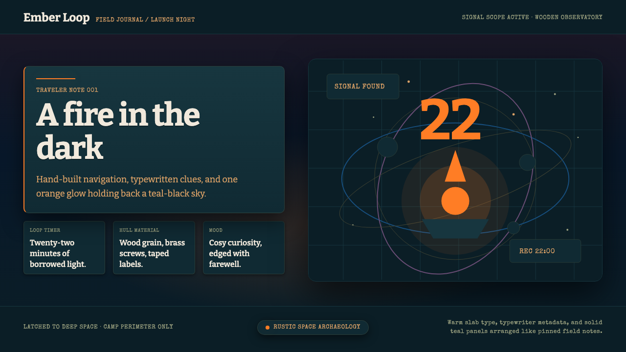 Outer WildsCosy cosmic melancholy. Campfire orange glows through typewritten teal field…温暖又怅然:篝火橙照亮深青色打字田野札记。
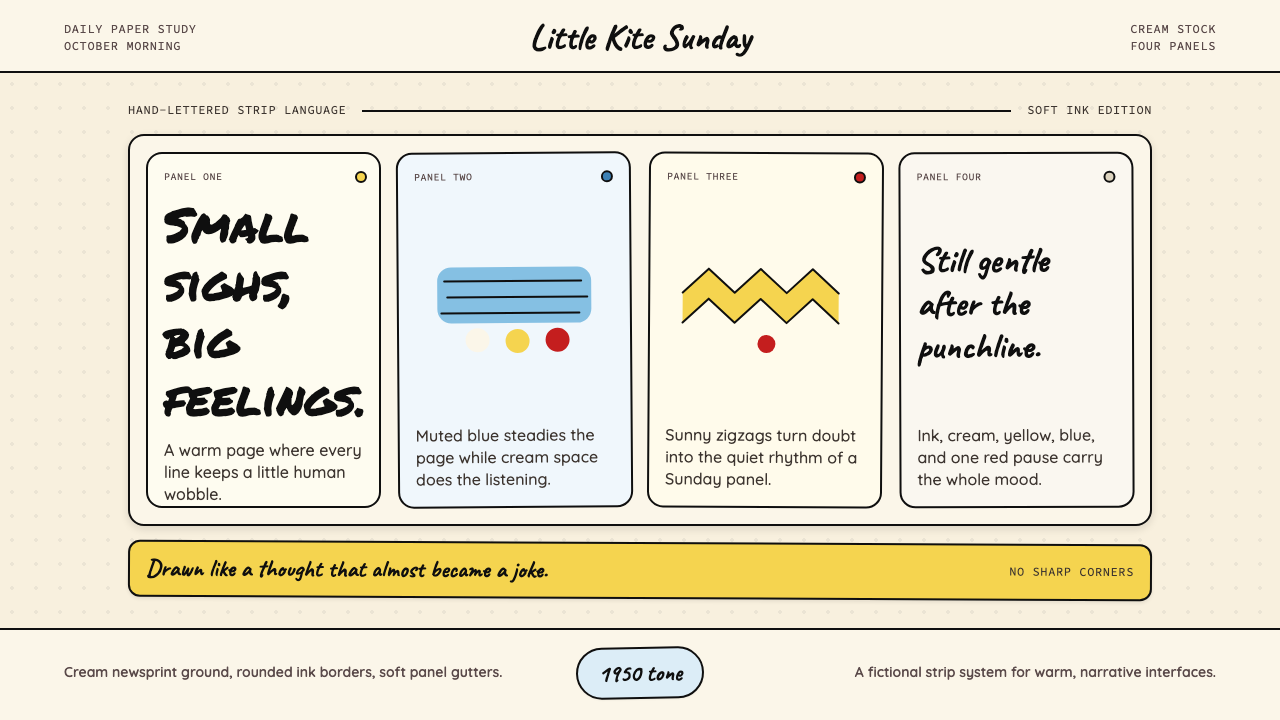 Peanuts Comic Schulz (1950)Gentle melancholy on newsprint. Caveat lettering, cream panels, yellow and bl…温柔忧郁的新闻纸感:Caveat 手写字、奶油格框、黄蓝点色。
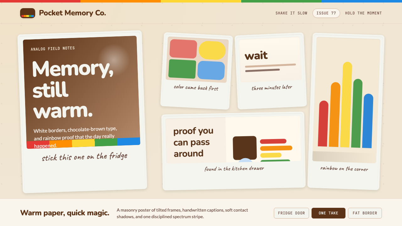 Polaroid InstantMemory made tangible. Photo-white frames tilt on aged paper with a warm rainb…记忆变得可触:相纸白边倾斜在旧纸底上,彩虹条点亮温度。
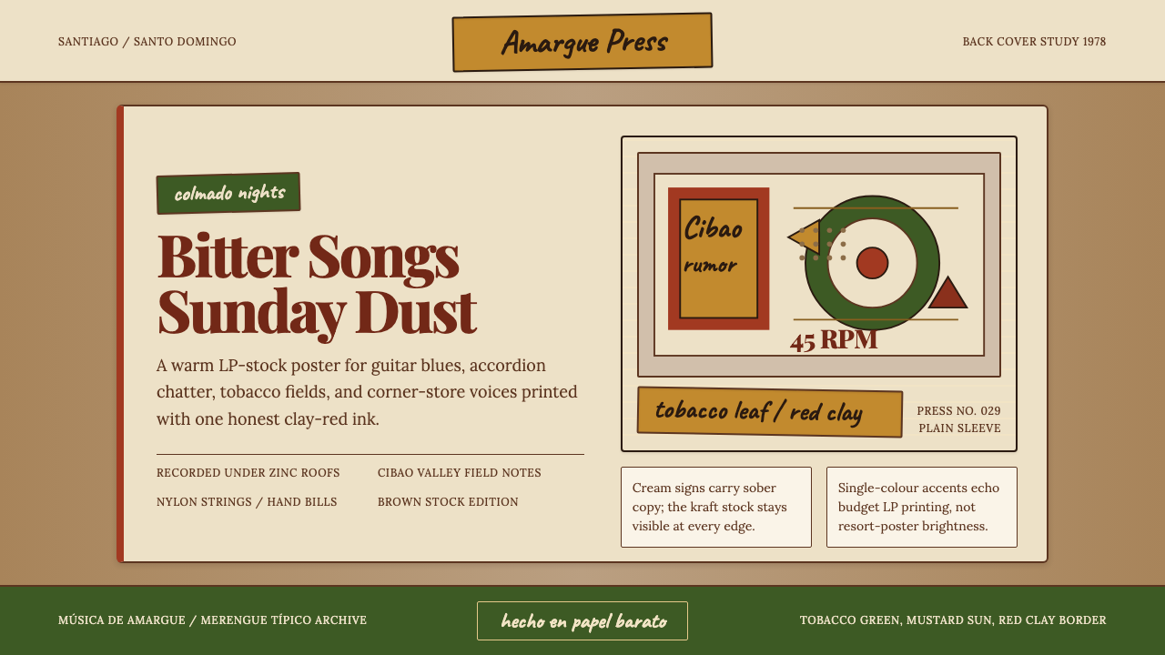 Dominican Bachata & Perico RipiaoPlainspoken warmth. Kraft stock, red clay serif, and typewriter credits carry…质朴而温热。牛皮纸、红土衬线与打字机署名托住苦情。
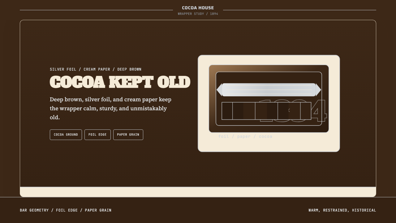 Hershey's Chocolate Brown (1894)Plain, enduring, warm. Cocoa brown meets silver foil on cream paper.朴素而耐久:可可棕配银箔与奶油纸面,克制百年不变。
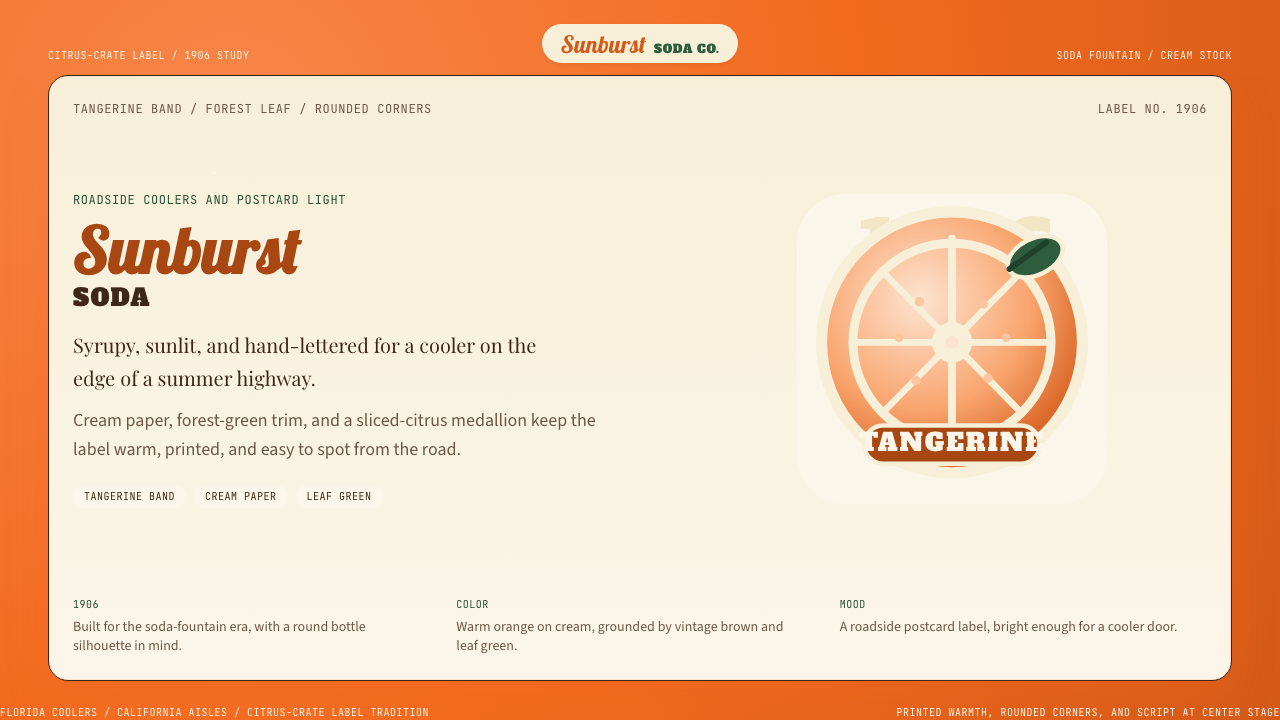 Orange Crush Soda (1906)Syrupy nostalgia. Tangerine, cream, and script make it a postcard label.糖浆般怀旧。橘红、奶油纸与手写体把标签变成明信片。