Design style guide设计风格指南
What is Dominican Bachata & Perico Ripiao?什么是 Dominican Bachata & Perico Ripiao?
Born in the dusty Cibao Valley and the rum-soaked barrios of Santo Domingo, Dominican bachata and perico ripiao turned cheap cardboard, hand-lettered signs, and a palette of tobacco and clay into one of the most soulful visual languages in the Caribbean.诞生于尘土飞扬的锡瓦奥谷地和圣多明各朗姆酒浸透的街区,多米尼加巴恰塔与佩里科·里皮奥用廉价卡纸、手绘招牌,以及烟叶与红土构成的色调,孕育出加勒比海最具灵魂感的视觉语言之一。
Dominican Bachata & Perico Ripiao in briefDominican Bachata & Perico Ripiao 速览
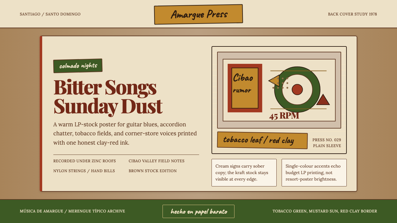
Dominican Bachata & Perico Ripiao is a design aesthetic rooted in the visual culture of working-class Dominican music from the mid-twentieth century onward. It draws directly from the physical artifacts that surrounded these genres: LP record sleeves printed on rough brown stock, hand-painted colmado signs, mimeographed event flyers, and the weathered facades of barrio storefronts. The result is a warm, plainspoken visual system that values authenticity over polish and emotional directness over decoration.多米尼加巴恰塔与佩里科·里皮奥是一套根植于二十世纪中叶以来多米尼加工人阶级音乐视觉文化的设计美学。它直接取材于围绕这些音乐流派的实物:印在粗糙牛皮纸上的黑胶唱片封套、手绘的小卖部招牌、油印的演出传单,以及贫民区街边店铺风化的门面。最终形成的是一套温暖、质朴的视觉系统,它珍视真实胜过精致,看重情感的直接胜过装饰。
Perico ripiao — literally 'ripped parrot,' a nickname for the accordion-driven folk music of the Cibao — predates the modern bachata genre by nearly a century, with roots traceable to the 1860s. Bachata itself emerged in the early 1960s as a guitar-trio form associated with heartbreak, poverty, and the urban barrios, long dismissed by Dominican middle-class culture as música de amargue, or 'bitterness music.' This shared history of marginalization is legible in the aesthetic: nothing aspires to opulence or official approval. The design language is honest about its humble material origins.佩里科·里皮奥——字面意思是“撕碎的鹦鹉”,这是锡瓦奥地区手风琴驱动的民间音乐的绰号——比现代巴恰塔音乐早了将近一个世纪,其根源可追溯至十九世纪六十年代。巴恰塔本身则在二十世纪六十年代初以吉他三重奏的形式出现,与心碎、贫困和城市贫民区相关联,长期被多米尼加中产阶级文化蔑称为“苦情音乐”(música de amargue)。这段共同的被边缘化历史在美学中清晰可见:没有任何元素渴望奢华或官方认可。这套设计语言对其朴素的物质起源是诚实的。
What distinguishes this style from other folk-influenced tropical aesthetics is its restraint. There is no explosion of neon or tourist-postcard saturation. The palette is drawn from things that genuinely existed in the environment — the brown of kraft paper, the muted terracotta of sun-dried adobe, the faded teal of shuttered windows, the near-black of strong coffee. Color is used sparingly, one anchor tone at a time, with the warmth of aged paper doing most of the compositional work.将这种风格与其他具有民俗影响的热带美学区别开来的,是它的克制。没有霓虹爆炸,没有旅游明信片式的过饱和色彩。色板取自真实存在于那个环境中的事物——牛皮纸的棕褐,晒干土坯的哑光赤陶,百叶窗的褪色蓝绿,浓咖啡的近黑。色彩被节制地使用,每次只用一个锚定色调,而陈年纸张的温暖感承担着大部分的构图工作。
Where does Dominican Bachata & Perico Ripiao come from?Dominican Bachata & Perico Ripiao 从何而来?
The perico ripiao tradition takes its name from a brothel in Santiago de los Caballeros where a particular style of merengue típico was played in the late nineteenth century, accompanied by the accordion, the güira (a metal scraper), and the tambora drum. The music was rural, celebratory, and often bawdy — music for cockfighting arenas, harvest parties, and Sunday afternoon drinking. Its visual counterparts were the hand-lettered signs and crudely printed handbills that announced these gatherings, produced with whatever inks and papers were available in the Cibao's market towns.佩里科·里皮奥传统的名字来自圣地亚哥德洛斯卡瓦耶罗斯的一家妓院,十九世纪末,一种特定风格的典型梅伦格在那里演奏,伴奏乐器是手风琴、金属刮奏器奎拉(güira)和坦博拉鼓。这是乡村的、欢庆的、常常带有荤段子的音乐——为斗鸡场、丰收派对和周日下午的饮酒聚会而生。与之对应的视觉物件,是宣布这些聚会的手绘招牌和粗糙印刷的传单,用锡瓦奥集镇上能找到的任何油墨和纸张制作而成。
Bachata's urban chapter began in the years after the assassination of dictator Rafael Trujillo in 1961. As rural Dominicans flooded into Santo Domingo, they brought with them the guitar-trio bolero tradition and the emotional rawness of campesino life. The first bachata recording is generally attributed to José Manuel Calderón in 1962. Through the 1960s and 1970s, the music was documented in LP releases on small local labels — Budget pressings, often with covers designed by hand, photocopied, or printed on low-cost brown or beige stock. These sleeves, with their rough typography and limited color budgets, became the accidental visual archive of a genre.巴恰塔的城市篇章始于1961年独裁者特鲁希略遇刺之后。随着多米尼加农村人口涌入圣多明各,他们带来了吉他三重奏的波莱罗传统以及农民生活的原始情感。第一张巴恰塔唱片通常被认为是何塞·曼努埃尔·卡尔德隆于1962年录制的。整个六十至七十年代,这种音乐被小型本地厂牌以黑胶唱片的形式记录下来——廉价压制,封套往往手工设计、复印,或印在低成本的棕色或米色纸张上。这些封套,带着粗糙的排版和有限的色彩预算,意外地成为一种音乐类型的视觉档案。
The aesthetic of these materials was shaped as much by economic necessity as by artistic intention. Small Dominican labels could not afford full-color offset printing; a single spot color on kraft-toned paper was the standard. The typefaces available were limited to whatever woodblock, transfer lettering, or typewriter fonts existed locally. Hand-painted lettering filled the gaps. The result — unintentionally — was a visual coherence rooted in constraint: every element communicated, because there was no room for anything that did not.这些材料的美学,与其说是艺术意图使然,不如说是经济必然的产物。多米尼加小厂牌负担不起全彩胶印;在牛皮纸色调的纸张上印一种专色,是标准做法。当地可用的字体,仅限于现有的木活字、转印字母或打字机字体。手绘字填补了空白。意外的结果是,一种根植于约束的视觉连贯性出现了:每个元素都在传递信息,因为没有空间留给任何不必要的东西。
By the 1980s and 1990s, artists like Luis Segura, Tatico Henríquez, and Anthony Santos had elevated bachata from barrio stigma to national export. The visual culture evolved alongside the music — incorporating photographs of the artists, more elaborate lettering treatments, and eventually color photography — but the underlying warmth of the kraft-paper era persisted as a kind of cultural memory. Today, designers working in this aesthetic deliberately return to that earlier material vocabulary, treating it not as nostalgia but as a design system with its own structural integrity.到了八九十年代,路易斯·塞古拉、塔蒂科·恩里克斯和安东尼·桑托斯等艺人将巴恰塔从贫民区的污名提升为国家出口品。视觉文化随音乐一同演进——纳入了艺人的照片、更精致的字体处理,最终引入彩色摄影——但牛皮纸时代那种底层温暖感,作为一种文化记忆持续存在。今天,在这种美学中工作的设计师有意回归那个更早时期的物质词汇,将其视为拥有自身结构完整性的设计体系,而非怀旧。
What defines the Dominican Bachata & Perico Ripiao look?Dominican Bachata & Perico Ripiao 的视觉特征是什么?
Color Palette色彩调性
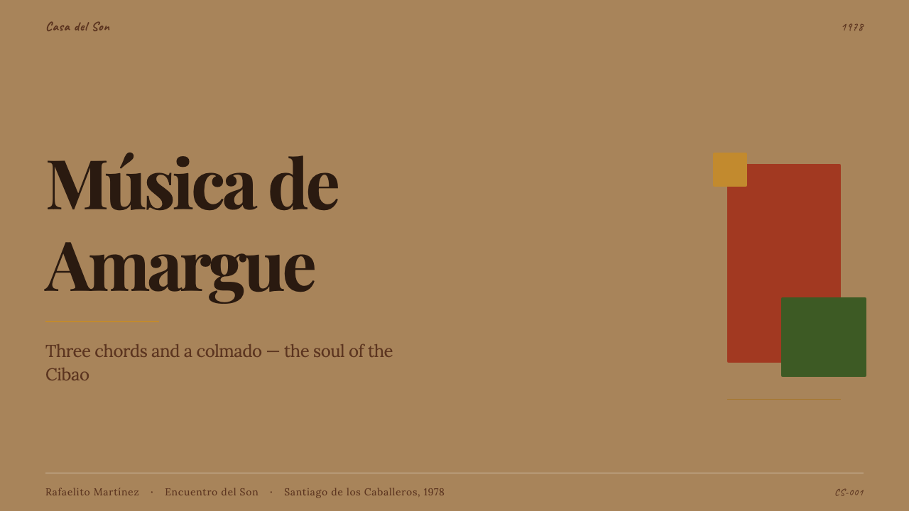
The palette is anchored in warm, desaturated earth tones: kraft brown, sun-dried terracotta, aged parchment, and the muted teal of weathered Caribbean shutters. Against these backgrounds, a single accent color — typically a deep brick red, a faded olive, or an oxidized turquoise — provides visual punctuation. The palette is never tourist-bright. Saturation is kept deliberately low, as if the colors have been exposed to years of tropical sunlight and humidity. Black appears for type and structural elements; white is used rarely and sparingly, as a point of contrast rather than a ground.色板以温暖、低饱和的土色系为锚点:牛皮棕、晒干赤陶、陈年羊皮纸,以及加勒比风化百叶窗的哑光蓝绿。在这些底色之上,单一的强调色——通常是深砖红、褪绿或氧化绿松石——提供视觉标点。这套色板绝非旅游明信片式的鲜亮。饱和度被刻意压低,仿佛颜色经受了多年热带阳光与湿度的洗礼。黑色用于文字与结构性元素;白色极少出现,作为对比点而非底色。
Typography字体排印
Type in this aesthetic draws from two distinct historical registers. The first is typewriter text: monospaced, slightly uneven, with the mechanical imperfection of keys that were struck too hard or too light. This treatment is used for credits, personnel listings, and small-print information — the kind of text that appeared on LP back covers identifying musicians and session dates. The second register is hand-painted lettering: bold, slightly irregular, with strokes that swell and thin in the manner of a sign painter's brush. These two registers coexist in tension, the mechanical and the hand-made, and their combination is central to the style's warmth.这套美学中的字体取材于两种截然不同的历史语域。第一种是打字机文字:等宽、略显参差,带有按键过重或过轻时的机械瑕疵感。这种处理用于署名、人员名单和小字信息——也就是黑胶唱片封底上注明乐手和录音日期的那种文字。第二种语域是手绘美术字:粗犷、略显不均,笔画随招牌画师的刷子起伏变化。这两种语域在张力中共存——机械的与手工的——它们的结合是这种风格温度感的核心。
Texture and Ground质感与底面
The most distinctive visual quality of this aesthetic is the treatment of the background as a material surface rather than a neutral field. Kraft paper grain, slight print bleeding, and the off-register marks of cheap reproduction are not imperfections to be corrected — they are the ground itself. This materiality communicates authenticity and age without resorting to decorative distressing effects. The texture is subtle: it does not compete with content but instead gives the composition a physical warmth that smooth, digital-clean surfaces cannot replicate.这套美学最鲜明的视觉品质,是将背景处理为物质表面而非中性底板。牛皮纸的纸纹、轻微的印刷晕染、廉价复制留下的套印偏差痕迹——这些不是需要纠正的瑕疵,而是底面本身。这种物质性无需诉诸装饰性的做旧效果,便能传递真实感与年代感。质感是内敛的:它不与内容争夺注意力,而是赋予构图一种光滑数字表面无法复制的实体温度。
Frame and Border框架与边界
Compositions in this style are frequently bounded by hand-painted or rough-printed edge frames — not the ruled geometric borders of European modernism, but irregular, brushy delineations that recall the work of sign painters and mural artists. These frames are never decorative in a superficial sense: they serve to concentrate the composition and signal that what is inside is complete, self-contained, finished. Double-rule borders and small repeated ornamental marks at corners echo the typographic traditions of Dominican print culture.这种风格的构图往往由手绘或粗印的边框界定——不是欧洲现代主义那种直尺规整的边框,而是不规则的、带笔触感的边界,令人想起招牌画师和壁画艺人的手笔。这些边框在表面上绝非装饰性的:它们服务于集中构图,并表示内部的内容是完整、自足、已完成的。双线边框和角落处小小的重复装饰标记,回应了多米尼加印刷文化的排版传统。
Composition and Space构图与空间
Layout in this aesthetic is centered and stable rather than asymmetric and dynamic. This distinguishes it sharply from European modernist traditions like Bauhaus or Swiss Style, which prized asymmetric tension. The centered composition reflects the visual conventions of LP front covers, event posters, and signage, where hierarchy is communicated through scale and placement within a vertical axis. Large type at the top names the artist or event; a central visual field carries an image or ornamental block; smaller type below provides details. The arrangement is intuitive and culturally familiar rather than formally designed.这套美学的版面是居中、稳定的,而非非对称、动态的。这使它与包豪斯或瑞士风格等推崇非对称张力的欧洲现代主义传统截然不同。居中构图反映了黑胶唱片封面、演出海报和招牌的视觉惯例——在这些载体上,层级通过纵轴内的尺度与位置来传达:顶部大字体命名艺人或活动,中央视觉区承载图像或装饰性色块,下方小字体提供细节。这种排列是直觉性的、文化上熟悉的,而非经过形式设计的。
Imagery and Portraiture图像与肖像
When photographic imagery appears, it is typically a performer portrait printed with limited tonal range — the kind of reproduction that results when a black-and-white photograph is halftoned for cheap offset or letterpress. Faces are direct, frontal, and unretouched by contemporary standards. The portrait functions as a stamp of authenticity: this is who made this music, in this place, at this time. Non-photographic imagery tends toward simple geometric color blocks, musical instrument silhouettes, or abstract ornamental fills — elements that can be produced with limited printing resources.当摄影图像出现时,通常是一张印刷色调范围有限的演奏者肖像——那是一张黑白照片经过廉价胶印或活字印刷网点化后的结果。面孔正面直视镜头,以当代标准看不加修饰。肖像起到真实性印章的作用:这是谁创作了这段音乐,在哪里,在何时。非摄影图像倾向于简单的几何色块、乐器剪影或抽象装饰性填充——这些都是能在有限印刷资源下完成的元素。
Mood and Register情感基调
The emotional register of this aesthetic is simultaneously melancholic and warm — what the bachata lyrical tradition calls amargue, bitterness, rendered not as darkness but as honest acknowledgment of difficulty. The palette and material choices conspire to produce something that feels both worn and beloved, like a record sleeve handled by many hands over many years. There is no ironic distance here, no postmodern wink: the aesthetic takes its emotional material seriously, and that seriousness is what gives it its particular gravity.这套美学的情感基调同时是忧郁的与温暖的——就是巴恰塔歌词传统所称的amargue(苦情),但它被呈现的不是黑暗,而是对艰辛的诚实承认。色板和材料的选择共同营造出一种既历经磨损又备受珍爱的感觉,犹如一张被无数双手翻阅了许多年的唱片封套。这里没有反讽的距离,没有后现代的眨眼:这套美学认真对待其情感素材,而这份认真赋予了它特有的厚重。
Who shaped Dominican Bachata & Perico Ripiao?谁塑造了 Dominican Bachata & Perico Ripiao?
Calderón is widely credited with recording the first bachata song in 1962, marking the genre's formal beginning as a recorded tradition. His work established the emotional template — guitar-led, lyrically direct, concerned with love and loss in the barrio — that would define bachata through the following decades. As the genre's earliest documented voice, his recordings also represent the first visual artifacts of the form: rough-pressed sleeves and minimal credit text that set the aesthetic precedent for everything that followed.卡尔德隆被广泛认为于1962年录制了第一首巴恰塔歌曲,标志着这一流派作为录音传统的正式开端。他的作品确立了情感模板——以吉他为主导、歌词直白、关注贫民区的爱与失落——这一模板在此后数十年间定义了巴恰塔。作为该流派最早被记录的声音,他的录音也代表了这种形式的第一批视觉文物:粗糙压制的封套和简约的署名文字,为之后的一切确立了美学先例。
Known as 'El Papá de la Bachata,' Luis Segura was among the most prolific bachata recording artists of the 1970s and 1980s, releasing dozens of albums on the small Santo Domingo labels that defined the genre's visual culture during its peak era. His LP sleeves, with their characteristic brown-stock printing and hand-rendered lettering, are among the clearest surviving examples of the aesthetic in its most unself-conscious form — produced not as a style choice but as the only available option.路易斯·塞古拉被称为“巴恰塔之父”,是七八十年代最多产的巴恰塔录音艺人之一,在圣多明各的小厂牌发行了数十张专辑,这些厂牌定义了该流派鼎盛时期的视觉文化。他的黑胶唱片封套,带着典型的棕色纸张印刷和手工字体,是这套美学最清晰的现存案例之一——以最不自觉的形式存在:不是风格选择的产物,而是唯一可用的选项。
Tatico Henríquez was the preeminent perico ripiao accordionist of the mid-twentieth century, whose recordings bridged the older Cibao folk tradition and the emerging urban bachata scene. His visual presence on album covers — direct, unadorned, photographed against plain backgrounds — established a kind of performer-portrait convention that persisted through the genre. Henríquez died in 1976, but his recordings and their accompanying visual materials remain touchstones for the aesthetic's most authentic phase.塔蒂科·恩里克斯是二十世纪中叶最杰出的佩里科·里皮奥手风琴演奏家,他的录音在较早的锡瓦奥民间传统与正在兴起的城市巴恰塔场景之间架起了桥梁。他在专辑封面上的视觉呈现——直接、不加修饰、在素净背景前拍摄——确立了一种演奏者肖像的惯例,这一惯例在整个流派中延续了下来。恩里克斯于1976年去世,但他的录音及其附带的视觉材料,至今仍是这套美学最真实阶段的参照。
Anthony Santos, known as 'El Mayimbe,' represented the transitional moment in bachata's visual culture — the shift from the rough single-color LP era toward more produced, full-color presentation in the 1990s. His commercial success helped bachata achieve mainstream Dominican and international recognition, and his album artwork began incorporating more professional photography and design while retaining the emotional warmth and direct communicative register of the earlier tradition. Santos demonstrates how the aesthetic can evolve without losing its essential character.安东尼·桑托斯,人称“El Mayimbe”,代表了巴恰塔视觉文化的过渡时刻——九十年代从粗糙单色黑胶时代向更具制作感的全彩呈现的转变。他的商业成功帮助巴恰塔赢得了多米尼加主流社会和国际的认可,他的专辑封面开始融入更专业的摄影和设计,同时保留了早期传统的情感温度和直接的传达语域。桑托斯证明了这套美学能够演进而不失其本质特征。
How do you use Dominican Bachata & Perico Ripiao today?今天怎么用 Dominican Bachata & Perico Ripiao?
Dominican Bachata & Perico Ripiao is a style with strong and specific emotional range. It is best suited to contexts where warmth, authenticity, and a grounded sense of cultural history are desired values — not as surface decoration but as the actual emotional register of the project. Applied carelessly, the kraft-paper warmth and typewriter credits can read as affectation; applied with understanding of what they communicate, they produce work that feels genuinely rooted rather than styled.多米尼加巴恰塔与佩里科·里皮奥是一种情感范围强烈而具体的风格。它最适合温暖感、真实性和扎根于文化历史的厚重感是期望价值的场景——不是作为表面装饰,而是作为项目真实的情感语域。不加理解地应用,牛皮纸的温暖和打字机式的署名会显得矫情;在理解其所传达内容的基础上应用,则能产生真正扎根而非被风格化的作品。
For presentation slides, the style works exceptionally well on covers and section dividers. A slide cover can anchor a large performer-portrait photograph — reproduced with reduced tonal range to suggest halftone printing — against a warm brown or parchment ground, with the title set in a bold, slightly irregular display treatment at the top and smaller typewriter-style credits below. Content slides should be treated with restraint: use the warm ground color consistently, keep type in one weight and size for body content, and reserve the accent color for a single data point or highlight per slide. Data slides benefit from the style's ability to make charts feel like printed materials — bars and labels treated as elements on a broadsheet rather than on a screen.在演示文稿中,这种风格在封面和章节分隔页上表现尤为出色。封面可以用一张大型演奏者肖像照片——以减少色调范围的方式处理,暗示网点印刷的效果——锚定于温暖的棕色或羊皮纸底色上,标题以粗犷、略显不均的展示字体置于顶部,下方是更小的打字机式署名文字。内容页应当克制处理:始终使用温暖的底色,正文内容保持单一字重和字号,将强调色留给每页唯一的数据点或高亮信息。数据页受益于这种风格让图表呈现为印刷材料感的能力——柱条和标签被处理为大幅面印刷品上的元素,而非屏幕上的组件。
For web interfaces and digital products, this aesthetic is most at home in contexts with cultural or musical content: streaming platforms for regional music, editorial sites covering folk or roots traditions, cultural archive projects, and food or beverage brands with strong regional identity. The approach to UI components should honor the material vocabulary: card components with a warm parchment background and a single spot-color accent replace clean white cards; monospaced type for metadata and secondary information replaces standard sans-serif body text; border treatments suggest printed edges rather than digital dividers. Navigation should be typographic and spare.对于网页界面和数字产品,这套美学最适合承载文化或音乐内容的场景:地区音乐流媒体平台、涵盖民间或根源音乐传统的编辑站点、文化档案项目,以及具有强烈地区身份认同的食品或饮料品牌。界面组件的处理方式应当尊重物质词汇:带有温暖羊皮纸底色和单一专色强调的卡片组件,取代干净的白色卡片;元数据和次要信息使用等宽字体,取代标准无衬线正文;边框处理暗示印刷边缘而非数字分隔线。导航应当字体化且简洁。
For editorial and marketing applications, the style produces strong results in long-form editorial spreads, music journalism, cultural documentary contexts, and marketing materials for events with folk or roots character. A full-spread layout benefits from placing a large portrait or color block in the central field, with text set in the typewriter register for pull quotes and a bolder display treatment for headlines. The centered, hierarchical composition — headline above, detail below — works naturally for event posters, album announcement graphics, and social media materials where the visual needs to read at a distance before it is read up close.对于编辑和营销应用,这种风格在长篇编辑版面、音乐新闻报道、文化纪录片语境,以及具有民俗或根源特质的活动营销材料中效果突出。全版面设计受益于在中央区域放置大型肖像或色块,引用语以打字机语域设置,标题则用更大胆的展示处理。居中、层级化的构图——标题在上,细节在下——在演出海报、专辑发布图形和社交媒体素材中自然有效,这些场合需要视觉先从远处被读取,再近距离细看。
A common mistake when applying this style is reaching for visual complexity to compensate for unfamiliarity with the aesthetic. The bachata visual tradition was born of constraint: one color, one typeface, one photograph. Introducing multiple accent colors, layering textures upon textures, or mixing hand-lettered treatments with clean geometric elements dilutes the style's structural logic. The restraint is not optional — it is the point. Work that respects the single-accent-color discipline, commits to the warm ground consistently, and allows the typewriter register to carry secondary information will read as coherent. Work that treats the individual elements as separate decorative choices will read as pastiche.应用这种风格时常见的错误,是用视觉复杂性来弥补对这套美学的不熟悉。巴恰塔的视觉传统诞生于约束:一种颜色、一种字体、一张照片。引入多种强调色、质感叠质感、将手绘字处理与干净的几何元素混合,会稀释这种风格的结构逻辑。克制不是可选项——克制就是要点。遵守单一强调色纪律、始终坚持温暖底色、让打字机语域承载次要信息的作品,读起来是连贯的;将各个元素当作独立装饰选择的作品,读起来是拼贴。
Dominican Bachata & Perico Ripiao — FAQDominican Bachata & Perico Ripiao · 常见问题
How is this aesthetic different from other Caribbean or Latin American folk styles?这套美学与其他加勒比或拉丁美洲民间风格有何不同?
The most important distinction is restraint. Many Caribbean visual traditions — Haitian Vodou art, Cuban poster design, Brazilian cordel woodcuts — operate with bold color at high saturation and strong figurative imagery. Dominican bachata visual culture is unusually muted by comparison: the palette is warm but desaturated, the imagery often reduced to portraiture or simple geometric color blocks, and the overall compositional approach is centered and stable rather than dynamically gestural. It shares the material honesty and folk directness of its regional neighbors but expresses these qualities through understatement rather than exuberance.最重要的区别在于克制。许多加勒比视觉传统——海地伏都教艺术、古巴海报设计、巴西科尔德尔版画——以高饱和度的大胆色彩和强烈的具象图像运作。相比之下,多米尼加巴恰塔视觉文化异常低调:色板温暖但低饱和,图像往往简化为肖像或简单的几何色块,整体构图方式是居中、稳定的,而非充满动势的姿态性。它与周边地区邻居共享物质的诚实和民间的直接,但通过含蓄而非张扬来表达这些品质。
Can this style work for digital products that have no connection to music or Dominican culture?这种风格能用于与音乐或多米尼加文化毫无关联的数字产品吗?
It can, but it requires clear thinking about why the emotional register of the style serves the product. The bachata aesthetic communicates warmth, authenticity, slight melancholy, and a sense of cultural rootedness. These are genuinely transferable values — they would suit a food delivery service with regional identity, a personal finance tool aimed at immigrant communities, a cultural archive, or a handcraft marketplace. They would not suit a SaaS analytics platform, a health monitoring dashboard, or a fintech product where precision and neutrality are the expected signals. The style is not merely decorative; it carries meaning, and that meaning needs to align with the product's intent.可以,但需要清楚地思考这种风格的情感语域为何服务于该产品。巴恰塔美学传达温暖、真实、淡淡的忧郁,以及一种文化根植感。这些是真正可移植的价值——它们适合具有地区身份认同的餐饮外卖服务、面向移民社区的个人理财工具、文化档案,或手工艺品市集。它们不适合一个SaaS数据分析平台、健康监测仪表板,或精确性和中性感是预期信号的金融科技产品。这种风格不仅仅是装饰性的;它承载意义,而这种意义需要与产品的意图对齐。
How do you apply the typewriter and hand-lettered elements without the result looking like a Halloween costume version of the style?如何应用打字机和手绘字元素,同时避免结果看起来像是这种风格的廉价模仿?
The key is functional placement, not decorative scattering. In the original bachata sleeve materials, typewriter text appeared where typewriter text was the available tool: credits, personnel, catalog numbers, recording dates. It was never used for headlines or main titles, which were handled by hand-lettered or display type. Applying typewriter treatment to secondary, metadata-level information — and reserving display treatment for primary headings — follows the same logic. Similarly, hand-lettered elements should feel purposeful rather than applied as texture: one large display headline, not multiple small decorative flourishes scattered across the layout.关键是功能性的放置,而非装饰性的散布。在原始的巴恰塔封套材料中,打字机文字出现在打字机是可用工具的地方:署名、人员名单、目录编号、录音日期。它从未用于标题或主标题——这些由手绘字或展示字体处理。将打字机处理应用于次要的、元数据级别的信息——将展示处理留给主标题——遵循同样的逻辑。同样,手绘字元素应感觉是有目的的,而非作为质感被涂抹上去:一个大型展示标题,而非散落在版面各处的多个小型装饰花饰。
What is the right way to use the accent color in this system?在这套体系中,正确使用强调色的方式是什么?
One accent color, used for one purpose per composition. In the original LP materials, the spot color — typically a deep red, a dark green, or an oxidized blue — was used either to print the artist's name, to flood a background panel behind text, or to color a simple graphic element like a border or ornamental mark. It was almost never used for more than one of these functions in the same piece. In contemporary application, the same discipline applies: choose a single accent, assign it a single role in each layout (action color, highlight, or structural element), and resist the temptation to use it for multiple functions simultaneously. The accent earns its warmth by being singular.一种强调色,在每个构图中用于一种目的。在原始的黑胶唱片材料中,专色——通常是深红、暗绿或氧化蓝——要么用于印刷艺人名字,要么用于文字后方的背景色块,要么用于给边框或装饰标记等简单图形元素着色。在同一件作品中,它几乎从不承担多于一种功能。在当代应用中,同样的纪律适用:选择单一强调色,在每个版面中为其分配单一角色(行动色、高亮或结构性元素),抵制同时用于多种功能的诱惑。强调色通过唯一性赢得其温度感。
How does this style age — does it risk looking dated quickly?这种风格的时效性如何——它是否面临迅速过时的风险?
The style is inherently resistant to rapid dating because it is not rooted in current digital trends — it is rooted in material objects from the 1960s through 1990s that already have historical distance. A design that looks like a 1975 Dominican LP sleeve looked that way in 1975 and will continue to look that way in 2035. The risk of dating exists when the style is applied shallowly, relying on surface-level trend signals (a particular grain filter, a currently fashionable font that mimics the period) rather than the underlying structural logic. Work grounded in the actual visual conventions of the tradition — centered composition, warm ground, single accent, typewriter register for secondary text — will hold its character across time because it is describing something that already existed rather than participating in a current moment.这种风格天然抗快速过时,因为它的根基不是当下的数字潮流——而是上世纪六十至九十年代已具历史距离的实物。一个看起来像1975年多米尼加黑胶封套的设计,在1975年就是那个样子,到2035年也仍将如此。过时的风险存在于浅层应用的场合:依赖表层的潮流信号(某种特定的颗粒滤镜、某种当前流行的模仿时期风格的字体),而非底层的结构逻辑。植根于这一传统真实视觉惯例的作品——居中构图、温暖底色、单一强调色、次要文字的打字机语域——将随时间保持其特质,因为它描述的是一个已然存在的事物,而非参与某个当下的时刻。
Related design styles相关设计风格
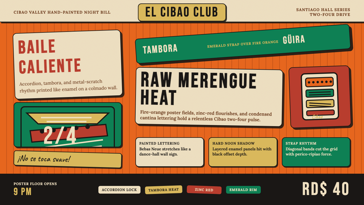 Dominican Merengue Perico RipiaoMaximalism keeps time. Fire-orange fields, Bebas Neue, and diagonal emerald s…极繁主义踩准节拍:火橙底、Bebas Neue 与翡翠斜带。
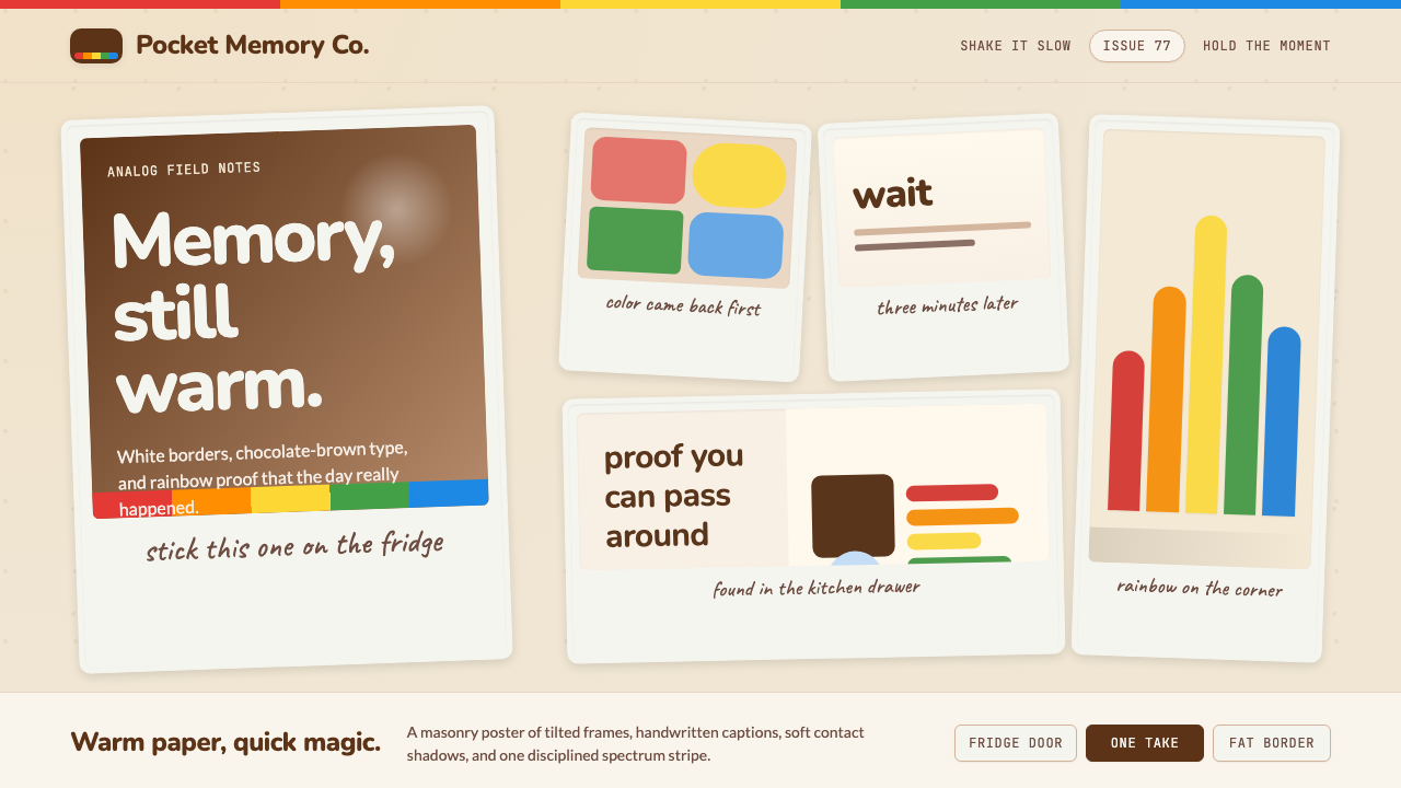 Polaroid InstantMemory made tangible. Photo-white frames tilt on aged paper with a warm rainb…记忆变得可触:相纸白边倾斜在旧纸底上,彩虹条点亮温度。
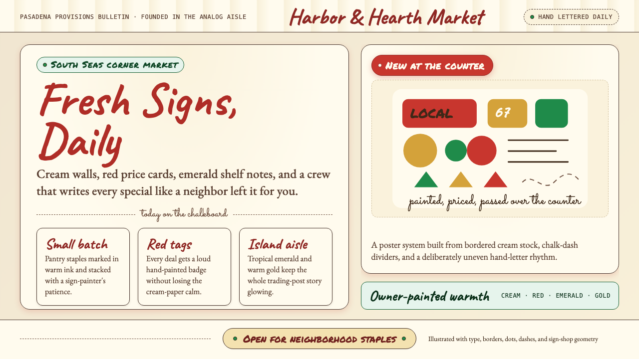 Trader Joe's Hand-LetteredHandmade grocery warmth. Cream chalkboards, red price tags, emerald accents.手写杂货温度:奶油黑板、红色价签、翠绿点缀。
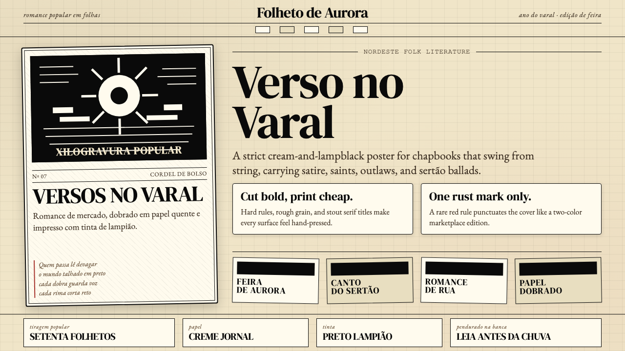 Brazilian Cordel (Northeast Folk Literature)Folk poetry, cut in lampblack. Cream newsprint, bordered chapbooks, one rust-…民间诗被灯黑刻出:奶油新闻纸、黑框小册与一笔锈红。
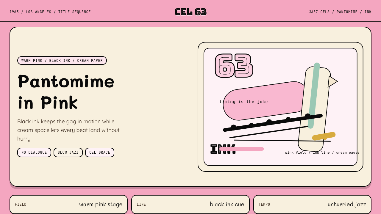 Pink Panther Cartoon (1963)Cool silence with a grin. Pink field, black ink, cream cel space.冷静的默剧感。珊瑚粉底、黑墨线与奶油留白。
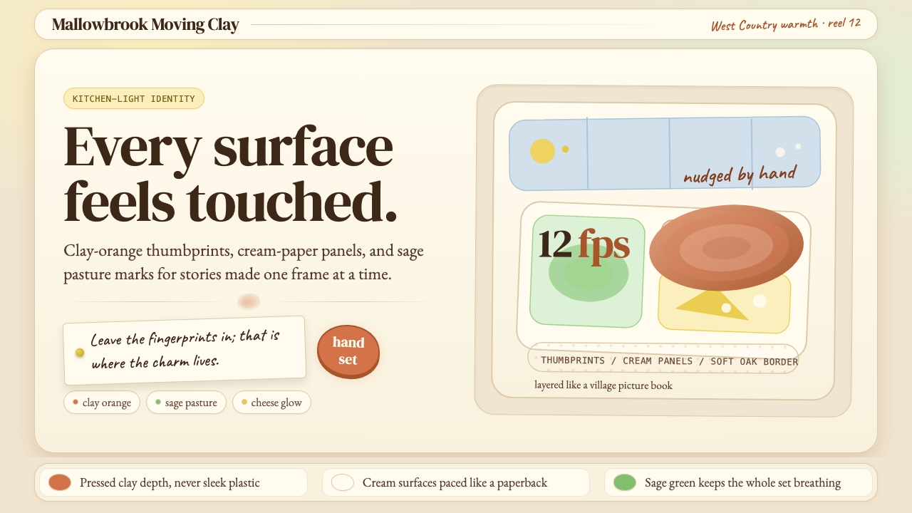 Aardman ClaymationHandmade warmth, visibly touched. Clay-orange panels, Caveat notes, thumbprin…手作温度可见:陶土橙面板、手写便签与指纹几何。