What is Pink Panther Cartoon (1963)?什么是 Pink Panther Cartoon (1963)?
Pink Panther distilled the whole swinging sixties into a single color — cool coral-pink, black ink, and the unhurried confidence of a jazz saxophone.粉红豹把整个摇摆六十年代浓缩成一种颜色——沉静的珊瑚粉、黑色墨线,以及爵士萨克斯风般从容不迫的自信。
Pink Panther Cartoon (1963) in briefPink Panther Cartoon (1963) 速览
Pink Panther Cartoon (1963) is a mid-century American animation aesthetic originating from the DePatie-Freleng studio's theatrical shorts and television series. Its visual grammar is built on a deliberately restricted palette — warm coral-pink grounds, cream cartoon-cel fields, and hand-drawn black ink outlines — applied with the flat, unhurried economy that defines the jazz-cartoon era. No shading, no rendered volume, no photographic illusion: every form is confidently two-dimensional.粉红豹动画(1963)是美国中世纪动画美学的一种,源自DePatie-Freleng工作室的院线短片与电视系列。其视觉语法建立在刻意收窄的色板之上——温暖的珊瑚粉底、奶油色赛璐珞画面与手绘黑色墨线轮廓——以爵士卡通时代特有的平涂、从容的经济感呈现。没有明暗渲染,没有体积感,没有摄影式幻觉:每一个形态都自信地停留在二维平面之中。
The style belongs to the tradition of UPA-influenced minimalism that distinguished West Coast American animation from the lush, naturalistic productions of the same era. Where other studios piled on backgrounds, the Pink Panther's world is almost stage-set spare — a single-color wash, a ruled horizon, an expressive ink gesture. The result reads less like a cartoon and more like a moving illustration, closer to a jazz-club poster than a Hollywood production.这种风格承继了UPA影响下的极简主义传统,使西海岸美国动画有别于同时代那些色彩丰富、写实风格的作品。当其他工作室在堆叠繁复的背景时,粉红豹的世界几乎像舞台布景般简练——单色调渲染、一条地平线、一笔富有表现力的墨线手势。结果看起来与其说像卡通,不如说像一幅会动的插图,更接近爵士俱乐部海报而非好莱坞产品。
As a design system, Pink Panther Cartoon (1963) is built around the radical premise that one dominant hue — deployed with confidence across nearly every surface — can carry an entire visual identity. The black ink line is its second principle: not a border but a statement, not a contour but a character. Together, pink field and black line produce a graphic sensibility that is simultaneously playful and architecturally resolved.作为一套设计系统,粉红豹动画(1963)建立在一个激进的前提之上:单一主导色调——自信地铺满几乎所有表面——足以承载一整套视觉身份。黑色墨线是其第二原则:不是边框,而是声明;不是轮廓,而是性格。粉色底面与黑色线条共同产生一种图形感性——同时兼具玩趣感与建筑般的解析度。
See the Pink Panther Cartoon (1963) design system查看 Pink Panther Cartoon (1963) 完整设计系统
Where does Pink Panther Cartoon (1963) come from?Pink Panther Cartoon (1963) 从何而来?
The Pink Panther was born from a commission, not a concept. In 1963, filmmaker Blake Edwards needed a title sequence for his live-action comedy film about a bumbling French detective and a stolen diamond. He hired the small Hollywood studio DePatie-Freleng Enterprises — founded that same year by director Friz Freleng and producer David H. DePatie after the pair left the shuttered Warner Bros. Animation — to design an animated sequence. What emerged was an elongated, lavender-pink animated panther who moved through the title cards with a lounging, self-amused elegance entirely at odds with the slapstick chaos of the film beneath.粉红豹诞生于一次委托,而非一个预设的概念。1963年,电影人布莱克·爱德华兹为其真人喜剧片——一部关于笨拙法国侦探与一颗被盗钻石的故事——寻觅片头动画。他委托小型好莱坞工作室DePatie-Freleng公司创作这段序列。该公司由导演弗里兹·弗里伦与制片人大卫·德帕蒂在同年离开已停产的华纳兄弟动画部后共同创立。最终呈现的,是一只修长的浅紫粉色动画豹,以一种懒洋洋、自得其乐的优雅穿行于片头字幕之间——与正片的闹剧式混乱形成鲜明反差。
The visual sensibility of that first title sequence drew from the UPA movement of the late 1940s and 1950s. United Productions of America had broken from the rounded, organic naturalism of Disney and Fleischer by championing flat color fields, stylized outlines, limited animation cycles, and compositions that owed more to modern graphic design than to theatrical realism. By 1963, that influence had filtered through much of American animation, but DePatie-Freleng pushed it further — stripping backgrounds to near-abstraction, reducing the panther himself to a few confident curves, and letting the coral-pink negative space do the narrative work that other studios assigned to rendered detail.首段片头序列的视觉感性源自四五十年代末期的UPA运动。美国联合制片公司以平涂色块、风格化轮廓、有限动画循环,以及更接近现代平面设计而非舞台写实主义的构图,打破了迪士尼与弗莱舍工作室圆润、有机、写实的传统。到1963年,这种影响已渗透美国动画的大部分领域,但DePatie-Freleng走得更远——将背景简化至近乎抽象,将豹子本身压缩为几条自信的曲线,让珊瑚粉色的负空间承担其他工作室交给精细渲染的叙事功能。
Henry Mancini's theme music was inseparable from the visual system. The saxophone-led jazz score set a tempo of cool detachment — unhurried, slightly ironic, aware of its own elegance — that became the pacing logic for the animation itself. Art director Hawley Pratt, who had worked under Chuck Jones at Warner Bros., developed the panther's character design: a long, horizontally relaxed silhouette whose movements were drawn in broad arcs rather than tight mechanical cycles. The character never spoke; the ink line and the jazz cadence carried every comedic beat.亨利·曼奇尼的主题音乐与这套视觉系统密不可分。萨克斯主导的爵士配乐确立了一种冷静超然的节奏——从容、略带讽刺、对自身的优雅心知肚明——并由此成为动画本身的运动逻辑。曾在华纳兄弟随恰克·琼斯工作的美术指导霍利·普拉特发展出豹子的角色造型:一个水平舒展的修长剪影,动作以宽弧线而非紧绷的机械循环绘制。这个角色从不开口说话;墨线与爵士节拍承载着每一个喜剧时机。
The success of the Edwards film led directly to a series of theatrical short films beginning in 1964, eventually numbering 124 entries across nearly two decades. The Saturday morning television series launched in 1969 broadened the audience to children while maintaining the studio's flat-color minimalism — a practical choice as much as an aesthetic one, since limited animation was far less expensive to produce for weekly television. By the early 1970s, the panther's pink-and-black graphic language had become one of the most recognizable animated identities in the world, and the style's influence extended beyond animation into product design, poster art, and eventually digital visual culture.爱德华兹电影的成功直接催生了自1964年起的院线短片系列,历经近二十年共计一百二十四部。1969年推出的周六早间电视系列将受众拓展至儿童,同时延续了工作室的平涂极简风格——这既是审美选择,也是务实之举,因为有限动画的生产成本远低于每周播出的剧集所能负担的精细制作。至七十年代初,粉红豹的粉黑图形语言已成为全球最具辨识度的动画视觉身份之一,其影响也超越动画领域,延伸至产品设计、海报艺术,最终进入数字视觉文化。
What defines the Pink Panther Cartoon (1963) look?Pink Panther Cartoon (1963) 的视觉特征是什么?
Dominant Single-Hue Field单色主导底面
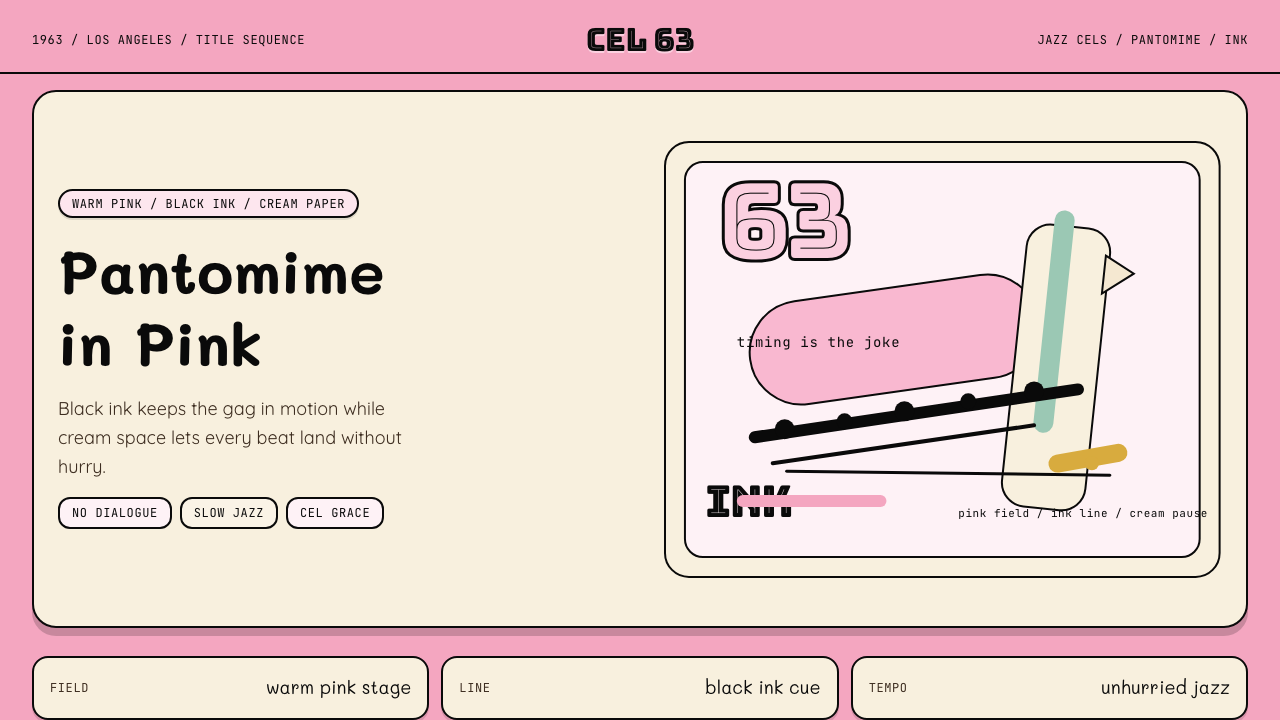
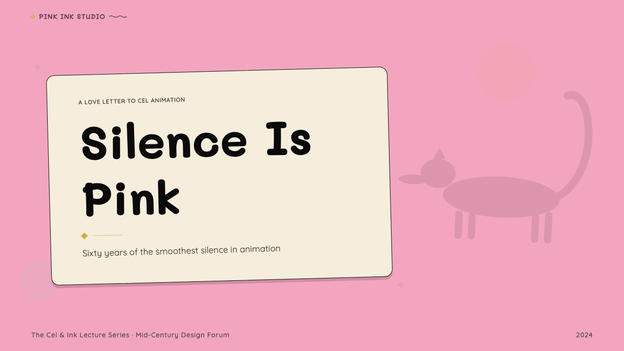
The foundational move of this style is committing one warm, coral-pink tone to nearly every surface — backgrounds, character fills, negative space, and decorative elements. Rather than using pink as an accent within a multi-color system, the aesthetic treats it as the ground from which all other elements emerge. This totality gives the style its distinctive calm: nothing competes with the base field, so the eye rests and the black line reads with maximum clarity.这种风格的基础性动作是将一种温暖的珊瑚粉色调铺满几乎所有表面——背景、角色填色、负空间与装饰元素。粉色在这里并非多色系统中的点缀,而是所有其他元素从中生长的底面。这种整体性赋予风格独特的宁静感:没有任何元素与底面竞争,视线得以安定,黑色线条因此以最大的清晰度被读取。
Expressive Hand-Drawn Ink Line富有表现力的手绘墨线
The ink outline in this style is not a neutral contour — it carries weight, rhythm, and personality. Lines vary from confident, sweeping curves that define the panther's elongated silhouette to quick, gestural strokes that suggest secondary details. The line's variable thickness communicates both form and emotion: a swelling curve signals relaxed elegance, a sudden angular jab signals comic surprise. This hand-made quality distinguishes the style from later, vector-clean animation.这种风格中的墨线轮廓并非中性的轮廓线——它承载着重量、节奏与个性。线条从勾勒豹子修长剪影的自信流畅弧线,到暗示次要细节的快速手势笔触,粗细变化不等。线条粗细的变化同时传递形态与情感:鼓胀的曲线暗示悠然的优雅,突兀的折角笔触暗示喜剧式的意外。这种手工感将风格与后来轮廓干净的矢量动画明确区分。
Cream Cel-Space Negative Area奶油色赛璐珞负空间
Where the coral-pink field is the active ground, cream or near-white areas function as deliberate breathing space — the animation equivalent of an unprinted page. These lighter zones appear in backgrounds simplified to flat washes, in costume details, or in the undefined space surrounding a scene's main action. The cream tone warms the negative space without competing with the pink, keeping the overall palette unified around two closely related warm neutrals.珊瑚粉底面是活跃的底色,奶油色或近白色区域则作为刻意的呼吸空间——相当于动画中未印刷的页面。这些较浅的区域出现在简化为平涂渲染的背景中、服装细节里,或场景主要动作周围的未定义空间中。奶油色调为负空间增添温度,同时不与粉色竞争,使整体色板在两种相近的温暖中性色之间保持统一。
Flat-Pastel Color Economy平涂柔色经济
When additional colors appear beyond the coral-pink, cream, and black triad, they are invariably softer, lower-saturation pastels — pale blues, muted yellows, dusty lilacs — that never challenge the dominant warmth. There are no hard primaries, no high-contrast secondaries, no neon intrusions. Every supporting color is dialed back to a tone that can coexist comfortably with the pink without fracturing the palette's serene cohesion.当珊瑚粉、奶油色与黑色三元组之外出现其他颜色时,它们无一例外是更柔和、饱和度更低的粉彩色调——浅蓝、哑光黄、带灰的淡紫——从不挑战主导的暖色调。没有高纯度的三原色,没有高对比度的间色,没有霓虹感的侵入。每一种辅助色都被调低至能与粉色舒适共存的色调,不破坏色板宁静的整体感。
Pantomime-Driven Composition默剧式构图
Because the Pink Panther character never speaks, every compositional decision must serve physical storytelling. Poses are broad and silhouette-legible — readable even when reduced to a thumbnail. Staging favors the full-body or three-quarter view over close-ups, because the gag lives in the whole posture rather than the facial expression. This principle translates directly into graphic design: compositions work when they communicate their essential content through shape and arrangement alone, without relying on labels or explanatory text.由于粉红豹角色从不开口说话,每一个构图决定都必须服务于肢体叙事。姿势宽阔而轮廓清晰——即便缩小至缩略图大小也能被识读。场景布置偏好全身或四分之三视角而非特写,因为笑点存在于整体姿态之中,而非面部表情。这一原则直接转译为平面设计原则:构图能够仅凭形态与编排传递核心内容,而无需依赖标签或解释性文字,便算成功。
Jazz-Tempo Visual Pacing爵士节奏的视觉节拍
The Pink Panther aesthetic carries what might be called a rhythmic coolness: elements are placed with an offhand confidence that suggests they could not be anywhere else, yet they never feel rigid or over-calculated. Spacing between elements is generous and consistent, like the rests between jazz phrases. Nothing is crowded, nothing is rushed. This quality — easy authority without visible effort — is the hardest aspect of the style to achieve consciously and the most immediately recognizable when it is present.粉红豹美学携带着一种可称为节奏性冷酷的气质:元素的放置带着漫不经心的自信,仿佛它们只能在那里,但又绝不显得僵硬或过度计算。元素之间的间距慷慨而一致,像爵士短句之间的停顿。没有拥挤,没有仓促。这种品质——不露力气的从容权威——是风格中最难有意识地实现的部分,也是最能被立即辨认的部分。
Mid-Century Cartoon Minimalism中世纪卡通极简主义
The style participates in a specific historical moment when American commercial animation, influenced by the graphic design avant-garde and constrained by television production economics, arrived at an aesthetic of productive restraint. Backgrounds are reduced to flat washes or left entirely empty. Props and secondary objects are drawn with the fewest possible lines. What remains after this reduction is not empty — it is charged with the wit and confidence of a style that knows exactly what it does not need.这种风格参与了美国商业动画历史上一个特定时刻——受平面设计前卫思潮影响、又受电视生产经济约束,抵达了一种富有成效的克制美学。背景被简化为平涂渲染或干脆留白。道具与次要物体以尽可能少的线条绘制。经过这种简化之后剩下的,并非空洞——而是充满了一种风格的机智与自信,这种风格清楚地知道自己不需要什么。
See the Pink Panther Cartoon (1963) design system查看 Pink Panther Cartoon (1963) 完整设计系统
Who shaped Pink Panther Cartoon (1963)?谁塑造了 Pink Panther Cartoon (1963)?
Isadore 'Friz' Freleng was a veteran Warner Bros. animation director whose career spanned the golden age of Hollywood cartoons. He co-founded DePatie-Freleng Enterprises in 1963 and directed many of the earliest Pink Panther theatrical shorts. His compositional instincts — honed across decades of working with Bugs Bunny, Tweety, and Sylvester — gave the new studio's minimalist aesthetic a timing precision that prevented its restraint from becoming blankness. Freleng understood that reduction without rhythm produces emptiness, and his direction ensured the pink-and-black compositions breathed with comedic intelligence.伊萨多尔·「弗里兹」·弗里伦是华纳兄弟的资深动画导演,其职业生涯贯穿好莱坞卡通黄金时代。1963年他与大卫·德帕蒂共同创立DePatie-Freleng公司,并执导了最初的多部粉红豹院线短片。他的构图本能——经数十年与兔八哥、崔弟和西维斯特共事而磨砺——为新工作室的极简美学赋予了时机精准度,使其克制不至于沦为空洞。弗里伦深知没有节奏的简化只会产生空虚,他的执导确保了粉黑构图以喜剧智慧呼吸。
David DePatie provided the production and business infrastructure that made DePatie-Freleng's prolific output possible. As co-founder and chief executive of the studio, he negotiated the original United Artists deal that launched the Pink Panther series and oversaw the studio's expansion into Saturday morning television. His production philosophy — maintaining quality aesthetic standards under the economic constraints of limited animation — shaped the consistent visual identity across 124 theatrical shorts and multiple television series. Without DePatie's organizational and commercial acumen, the distinctive graphic style might have fragmented across different directors and formats.大卫·德帕蒂提供了使DePatie-Freleng高产出成为可能的制作与商业基础架构。作为工作室联合创始人与首席执行官,他谈成了启动粉红豹系列的最初联美协议,并监督工作室向周六早间电视的扩张。他的制作哲学——在有限动画的经济约束下维持美学质量标准——塑造了一百二十四部院线短片与多部电视系列中一贯的视觉身份。没有德帕蒂的组织与商业才能,这种独特的图形风格可能早已在不同导演和格式之间碎片化。
Henry Mancini's Academy Award-winning theme for the 1963 Pink Panther film is inseparable from the visual system's identity. The saxophone-led melody established a mood — cool, knowing, unhurried — that became the pacing template for the animated character himself. In the subsequent cartoon series, Mancini's musical vocabulary of jazz phrasing, syncopated rhythm, and spare orchestration directly influenced how the animation team staged gags: a musical rest suggested a visual pause, a melodic swoop prompted a physical arc. Mancini demonstrated that in this design system, sound and image are the same argument.亨利·曼奇尼为1963年粉红豹电影创作的奥斯卡获奖主题曲与这套视觉系统的身份密不可分。萨克斯主导的旋律确立了一种情绪——冷静、心知肚明、从容不迫——并由此成为动画角色本身的节奏模板。在随后的卡通系列中,曼奇尼的爵士短句、切分节奏与简洁配器的音乐词汇直接影响了动画团队设计笑点的方式:音符的停顿暗示视觉的停顿,旋律的上扬引发形体的弧线。曼奇尼证明了在这套设计系统中,声音与图像是同一个论点。
Hawley Pratt served as art director on the original Pink Panther theatrical shorts and is primarily responsible for the visual design of the panther character himself. A veteran of Chuck Jones's unit at Warner Bros., Pratt brought to the new studio a sophisticated understanding of how line economy produces personality. His design for the panther — that impossibly elongated torso, those lazy-lidded eyes, the tail used as a punctuation mark — achieved maximum expressiveness through minimum means. Pratt's layouts also established the compositional grammar of the series: the wide, horizontally oriented staging that placed the character in generous negative space.霍利·普拉特担任最初院线短片的美术指导,并主要负责豹子角色本身的视觉设计。作为华纳兄弟恰克·琼斯小组的资深成员,他为新工作室带来了对线条经济如何产生个性的深刻理解。他对豹子的设计——那个长得不可思议的躯干、慵懒半垂的眼睑、用作标点符号的尾巴——以最少的手段实现了最大的表现力。普拉特的版面设计也确立了系列的构图语法:宽阔、水平导向的场景布置,将角色置于慷慨的负空间之中。
Though primarily known as a live-action filmmaker, Blake Edwards was the creative catalyst for the entire Pink Panther visual universe. His decision to commission a sophisticated, jazz-inflected animated title sequence for what could have been a purely conventional spy comedy film created the context in which DePatie-Freleng's distinctive aesthetic could develop. Edwards's own visual sensibility — elegant, witty, and comfortable with silence — aligned precisely with the animation team's strengths. He retained DePatie-Freleng for subsequent films in the franchise, ensuring continuity of the visual language across multiple decades.尽管布莱克·爱德华兹主要以真人电影人身份为人所知,但他是整个粉红豹视觉宇宙的创意催化剂。他决定为一部本可以是常规间谍喜剧的电影委托制作一段精致的、带有爵士气质的动画片头序列,由此创造了DePatie-Freleng独特美学得以发展的语境。爱德华兹自身的视觉感性——优雅、机智、对沉默感到自在——与动画团队的长处完全契合。他在随后的系列电影中继续留用DePatie-Freleng,确保视觉语言跨越数十年的连贯性。
How do you use Pink Panther Cartoon (1963) today?今天怎么用 Pink Panther Cartoon (1963)?
Pink Panther Cartoon (1963) is a style that rewards commitment over compromise. Because its entire visual logic depends on the dominance of a single warm hue, applying it correctly means accepting that dominance rather than treating the pink as one element among many. The designer who reaches for this aesthetic while hedging with a full multi-color palette will lose the style's defining quality — its calm authority — before the first slide is finished. Decide first whether the project can carry a pink-dominant identity; if yes, commit fully.粉红豹动画(1963)是一种回报全身投入、惩罚妥协折中的风格。由于其整套视觉逻辑依赖于单一暖色调的主导地位,正确应用它意味着接受这种主导性,而非将粉色视为众多元素之一。那种在运用这套美学的同时又以多色板对冲的设计师,会在第一张幻灯片完成之前就失去这种风格的决定性品质——那种从容的权威感。首先判断项目能否承载粉色主导的视觉身份;如果可以,便彻底投入。
For presentation slides, the style offers a distinctive solution for both cover and content contexts. A cover built in this system works through a single large compositional gesture: the dominant coral-pink field, a bold ink-weight typographic treatment in black, and — if imagery is used — a character or object rendered as a flat silhouette against the field rather than a photograph. Content slides should embrace the style's generous negative space: text sits in wide, unhurried margins, data is encoded in flat geometric shapes without decorative chart furniture, and every slide has at least as much open pink field as it does content. Avoid the temptation to fill slides — emptiness in this system is not waste, it is the style's primary texture.在演示文稿中,这种风格为封面页与内容页提供了独特的解决方案。在这套系统中建立的封面通过单一的宏观构图动作发挥作用:主导性的珊瑚粉底面、黑色粗重字重的字体处理,以及——如果使用图像——以平涂剪影而非照片形式置于底面上的角色或物体。内容页应当拥抱这种风格慷慨的负空间:文字置于宽阔、从容的页边距中,数据以平涂几何形状编码而无装饰性图表附件,每张幻灯片的开放粉色底面至少与内容等量。避免填满幻灯片的诱惑——在这套系统中,空白不是浪费,而是风格的主要质感。
For web interfaces, the aesthetic is particularly well-suited to landing pages, feature announcements, and any context where personality and distinctiveness matter more than neutral usability. Dashboard and pricing page applications work when the coral-pink is used as the page's macro background rather than as a UI component fill, with black and cream handling all functional typography and interactive elements. Navigation elements should be typographically simple — black letterforms on the pink field, with no icon decoration. Avoid using the style in dense data-entry interfaces or anywhere that cognitive load is already high: the style's spaciousness requires room to exist.对于网页界面,这种美学尤其适合落地页、功能发布页,以及任何个性与独特性比中性可用性更重要的场景。仪表板与定价页面的应用在以下情况下有效:将珊瑚粉用作页面的宏观背景而非UI组件填充色,让黑色与奶油色处理所有功能性字体排印与交互元素。导航元素应当在字体排印上保持简洁——粉色底面上的黑色字形,不使用图标装饰。避免在高密度数据输入界面或认知负荷已经很高的场景中使用此风格:风格的宽敞性需要足够的空间才能存在。
For editorial and marketing work, Pink Panther Cartoon (1963) produces immediate poster-quality impact. A marketing page built in this system alternates between full-width pink-field sections with black headline type, and cream-field sections for longer body copy — the visual rhythm mimics the bebop alternation of solo and comping. Pull quotes and call-to-action elements appear as black ink outlines enclosing pink-filled shapes, never as conventional button rectangles. In print applications, the style's flat-color structure means it can be executed in two-color printing — pink and black — without any loss of visual richness.对于编辑与营销内容,粉红豹动画(1963)能立即产生海报级别的视觉冲击力。以这套系统构建的营销页面在全宽粉色底面配黑色标题区块与奶油底面配较长正文区块之间交替——这种视觉节奏模拟了波普爵士主奏与伴奏的交替律动。引用语与行动号召元素以黑色墨线轮廓包裹粉色填充形状的方式呈现,从不使用常规的矩形按钮。在印刷应用中,这种风格的平涂色彩结构意味着它可以用双色印刷——粉色加黑色——完成,不损失任何视觉丰富性。
A common mistake when applying this style is reaching for additional colors to add variety or interest. The Pink Panther palette is not poverty — it is a choice. Adding a third distinct hue beyond the pink-cream-black triad immediately weakens the dominant-pink logic and makes the work read as generically retro rather than specifically rooted in this aesthetic. Similarly, replacing hand-drawn-feeling lines with geometric vector strokes removes the gestural warmth that distinguishes the style from mid-century graphic design more broadly. The most frequent production error is using a pink that is too saturated, too violet, or too neon: the authentic tone is warm, slightly orange-leaning coral — the temperature of a sunset rather than a neon sign.应用这种风格时最常见的错误是伸手去取更多颜色,以期增添变化或趣味。粉红豹色板不是贫乏——它是一种选择。在粉-奶-黑三元组之外加入第三种明显的色调,会立即削弱粉色主导的逻辑,使作品读起来像是一般意义上的复古怀旧,而非植根于这种特定美学之中。同样,将带有手绘感的线条替换为几何矢量笔触,会去除将这种风格与更广泛的中世纪平面设计区分开来的手势温度。最常见的生产错误是使用了饱和度过高、过于偏紫或过于霓虹感的粉色:真实的色调应当是温暖的、略微偏橙的珊瑚色——日落的温度而非霓虹招牌的温度。
See the Pink Panther Cartoon (1963) design system查看 Pink Panther Cartoon (1963) 完整设计系统
Pink Panther Cartoon (1963) — FAQPink Panther Cartoon (1963) · 常见问题
How is Pink Panther Cartoon (1963) different from other retro cartoon styles?粉红豹动画(1963)与其他复古卡通风格有何不同?
The key distinction is the single-hue dominance. Most retro cartoon styles — Hanna-Barbera, early Disney, vintage Fleischer — rely on a diverse, multi-color palette with a relatively neutral background. Pink Panther's visual logic inverts this: the background itself is the character, the pink field is the statement, and everything else is a gesture against that ground. The result is closer in spirit to a monochrome poster than to a conventional cartoon. The style is also distinguished by its jazz-tempo restraint — it never tries hard, never overexplains, and leaves more space than most animation-derived aesthetics consider appropriate.关键区别在于单色主导性。大多数复古卡通风格——汉纳-芭芭拉、早期迪士尼、老式弗莱舍——依赖多色丰富的色板,背景相对中性。粉红豹的视觉逻辑则将其颠倒:背景本身就是角色,粉色底面就是声明,其他一切都是在这个底面上的手势。结果在精神上更接近单色海报而非常规卡通。这种风格还以其爵士节奏式的克制著称——它从不用力,从不过度解释,留下的空间比大多数源自动画的美学认为恰当的多得多。
Can this style work for professional or corporate contexts, or does it read as too playful?这种风格能用于专业或企业场景吗,还是说它看起来太过玩趣?
The style carries more sophistication than its cartoon origins suggest. The Pink Panther aesthetic is fundamentally about cool restraint — it is not energetic or busy in the way that makes cartoon styles feel juvenile. Applied correctly, with generous negative space, disciplined typographic hierarchy, and the warm-coral rather than bubblegum-pink tonality, it reads as confident and distinctive rather than playful. It suits creative studios, cultural institutions, entertainment brands, and consumer products where personality is a feature. It is less appropriate for contexts demanding perceived neutrality — financial services, healthcare, legal — where the pink dominance may undermine rather than reinforce trust.这种风格携带的精致程度远超其卡通起源所暗示的。粉红豹美学从根本上是关于冷静克制的——它不像那些让卡通风格显得幼稚的风格那样充满活力或拥挤。正确应用时,搭配慷慨的负空间、严谨的字体层级,以及温暖珊瑚色而非泡泡糖粉的色调,它传递的是自信与独特,而非玩趣。它适合创意工作室、文化机构、娱乐品牌,以及个性本身就是产品特质的消费品。在要求感知中立性的场景中——金融服务、医疗、法律——它的适用性较低,因为粉色的主导性可能削弱而非强化信任感。
What is the right way to handle photography within this style?在这种风格中,处理摄影图像的正确方式是什么?
Naturalistic photography is fundamentally incompatible with this aesthetic — a photograph brings the logic of the real world into a system built on confident graphic abstraction, and the two do not reconcile. When imagery beyond pure illustration is needed, there are two approaches that preserve the style's integrity. The first is aggressive silhouetting: a photographic subject cut out against the pink field with all background removed, ideally then treated with a flat-color overlay to reduce it to a near-silhouette. The second is duotone treatment: the photograph reproduced using only pink and black tonal values, collapsing it into the palette. Both approaches make the photography serve the graphic system rather than fighting it.自然主义摄影从根本上与这套美学不相容——一张照片将真实世界的逻辑带入一个建立在自信图形抽象之上的系统,二者无法调和。当需要纯插图之外的图像时,有两种能保护风格完整性的做法。第一种是激进的剪影处理:将摄影对象从粉色底面中剪出,移除所有背景,理想情况下再以平涂色调覆盖,将其压缩为近乎纯轮廓。第二种是双色调处理:仅使用粉色与黑色的色调值复制照片,将其折叠进色板之中。两种做法都让摄影服务于图形系统,而非与之对抗。
How should dark mode or light mode choice be approached with this style?在这种风格中,应如何处理深色模式或浅色模式的选择?
This style was conceived as a light-field system: the coral-pink and cream are warm, luminous grounds that depend on their lightness for their quality. A strict dark-mode inversion — replacing the pink ground with dark charcoal and using pink as a type or accent color — is technically possible but loses the style's defining warmth and spatial openness. If dark contexts are required, the most authentic approach is to treat the dark ground as a night scene — black field, cream type, with pink used only as a single focal accent rather than the dominant ground. Think of it as the same character moving from daytime to a jazz club at midnight: same personality, different light.这种风格被构想为浅色底面系统:珊瑚粉与奶油色是温暖、发光的底面,其品质依赖于它们的亮度。严格的深色模式反转——以深炭灰替换粉色底面,并将粉色用作字体或强调色——在技术上可行,但会失去风格决定性的温暖感与空间开放性。如果必须处理深色场景,最接近原始精神的做法是将深色底面视为夜景处理——黑色底面、奶油色字体,粉色仅用作单一的焦点强调,而非主导性底面。将其想象为同一个角色从白天走进午夜的爵士俱乐部:相同的个性,不同的光线。
Does this style suit typography-heavy content, or does it favor minimal text?这种风格适合文字密集的内容,还是更偏向极简文字?
The Pink Panther aesthetic is most legible and most itself when text is sparse and given generous surrounding space — consistent with the pantomime logic of the original character, who communicated everything without a single word. That said, the style can accommodate text-heavy layouts if a clear visual hierarchy is maintained and the type is treated with the same graphic decisiveness as other elements: one dominant text level in large ink-weight black, secondary text in a noticeably smaller size, and nothing in between competing for attention. The mistake is running long text blocks at a single undifferentiated size against the pink field — the contrast and warmth of the background will work against readability rather than for it. Cream or near-white panels should be used for extended reading passages, with the pink reserved for headline and structural moments.粉红豹美学在文字稀少、周围留有慷慨空间时最为清晰,也最像它自己——与原始角色的默剧逻辑一致,那个角色不用一个字便传递了一切。话虽如此,若维持清晰的视觉层级,且字体被以与其他元素同等的图形决断性对待,这种风格也能容纳文字密集的版面:一个主导文字层级以大号粗重黑字呈现,次级文字以明显更小的尺寸出现,中间没有任何层级来争夺注意力。错误的做法是在粉色底面上以单一未区分的尺寸排列长段文字——背景的对比度与温暖感会对可读性产生反效果。扩展阅读段落应使用奶油色或近白色面板,粉色保留用于标题与结构性时刻。
Related design styles相关设计风格
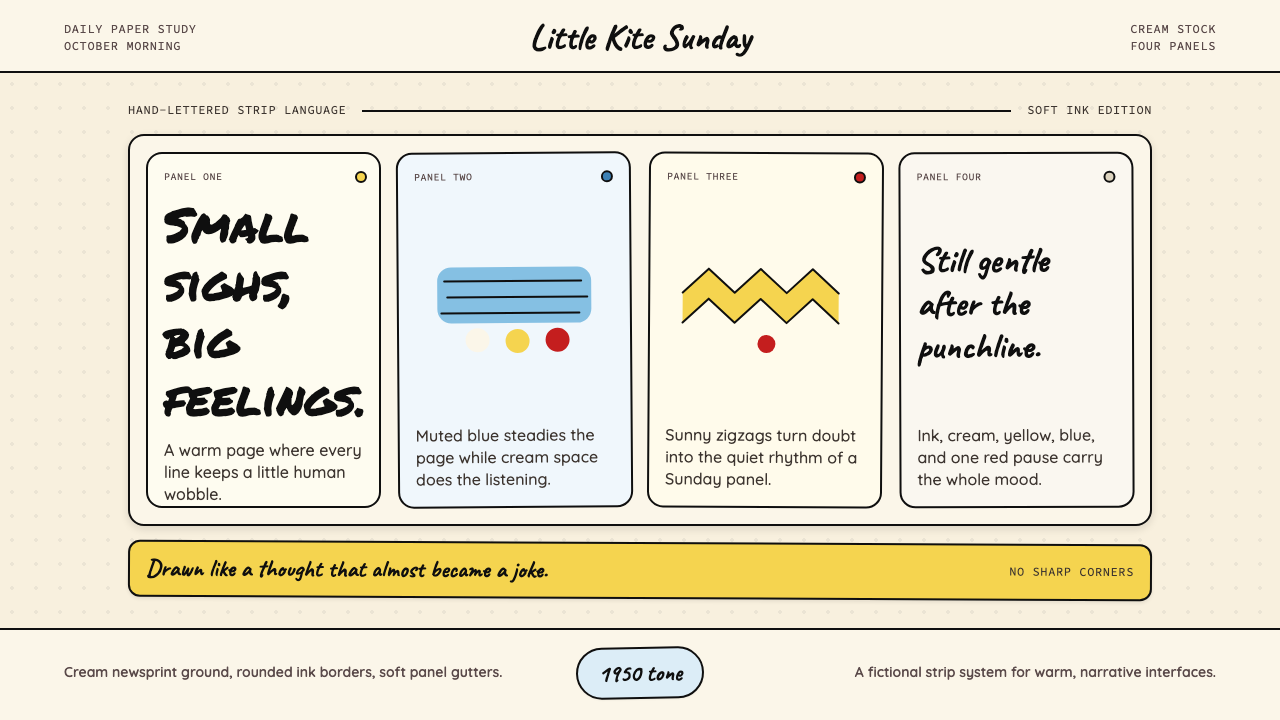 Peanuts Comic Schulz (1950)Gentle melancholy on newsprint. Caveat lettering, cream panels, yellow and bl…温柔忧郁的新闻纸感:Caveat 手写字、奶油格框、黄蓝点色。
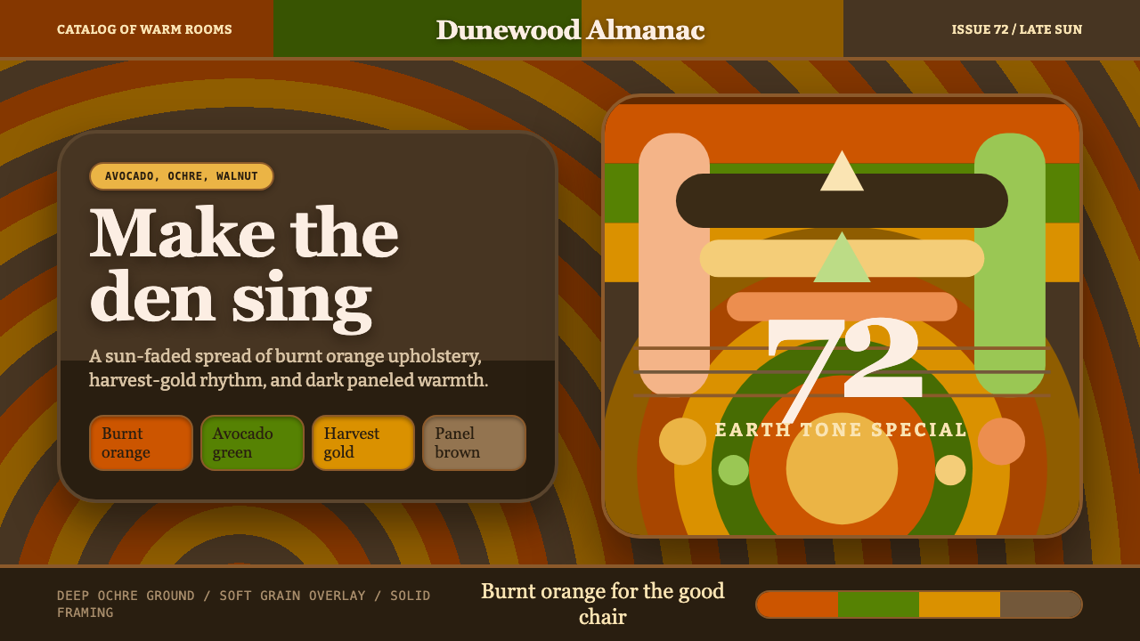 1970s Earth TonesWarm maximalism stays muddy. Bulbous slabs, avocado bands, and harvest-gold r…暖色极繁不怕浑厚:圆胖字、牛油果绿块与丰收金同心环。
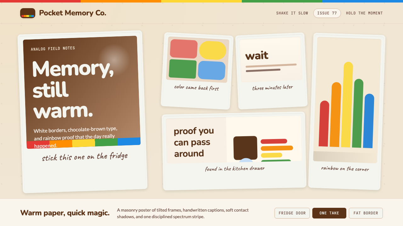 Polaroid InstantMemory made tangible. Photo-white frames tilt on aged paper with a warm rainb…记忆变得可触:相纸白边倾斜在旧纸底上,彩虹条点亮温度。
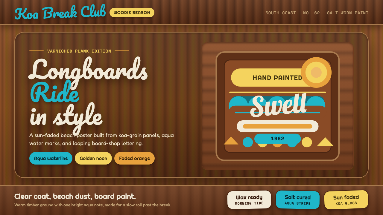 Surf Woodie CultureSalt-worn joy. Aqua script and gold badges ride over varnished koa planks.咸风里的欢快:青蓝手写字与金色徽章压在清漆木纹上。
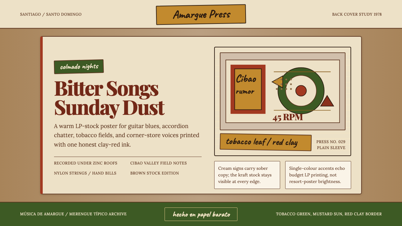 Dominican Bachata & Perico RipiaoPlainspoken warmth. Kraft stock, red clay serif, and typewriter credits carry…质朴而温热。牛皮纸、红土衬线与打字机署名托住苦情。
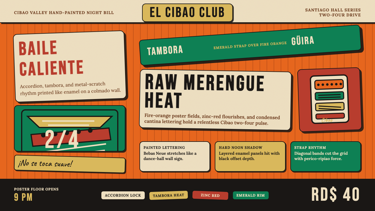 Dominican Merengue Perico RipiaoMaximalism keeps time. Fire-orange fields, Bebas Neue, and diagonal emerald s…极繁主义踩准节拍:火橙底、Bebas Neue 与翡翠斜带。