What is Surf Woodie Culture?
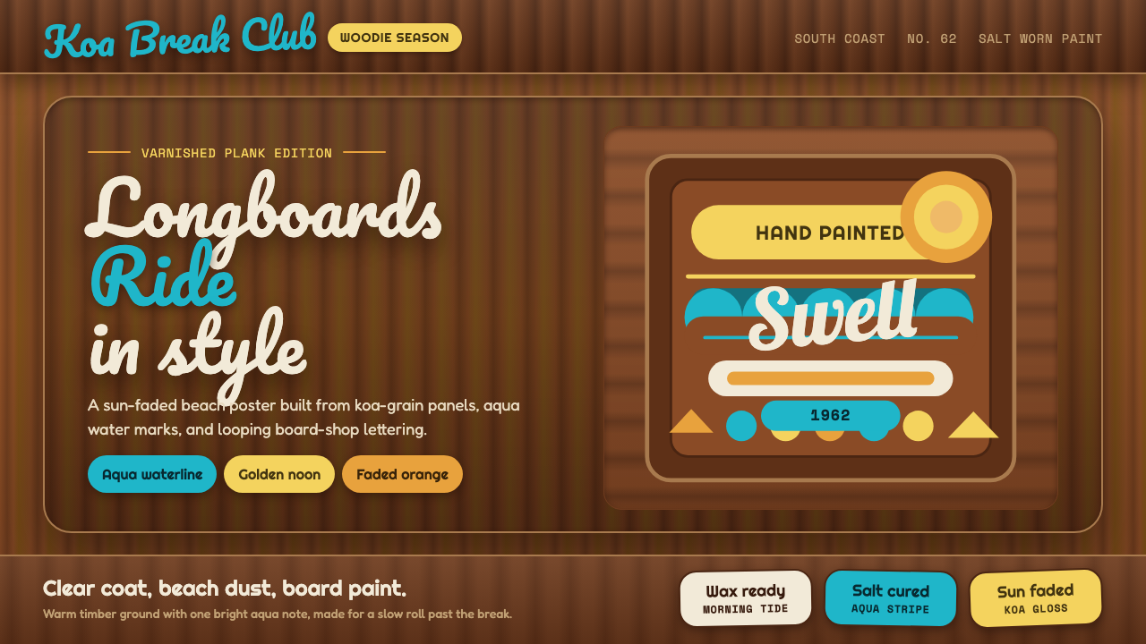
A woodie wagon parked on a Southern California beach in 1962 turned varnished timber, hand-painted surfboard lettering, and salt-worn sunlight into a design language of pure, unhurried joy.
Surf Woodie Culture in brief
Surf Woodie Culture is the design language of the varnished wood flank of a 1962 woodie surf wagon — the station wagons with genuine wood paneling that became inseparable from the early Southern California surf scene. The ground is warm koa and mahogany timber grain, its color built from the natural variation of real wood rather than a flat printed pattern, sealed under a clear varnish that gives everything a soft, sun-warmed glow.
The system exists because surf culture in this era built its visual identity almost entirely by hand, out of practical necessity: surfboard makers, sign painters, and wagon owners painted their own logos, names, and decorations directly onto wood and fiberglass rather than commissioning polished commercial graphics. This hand-painted, slightly imperfect quality is not a limitation the style works around — it is the entire point, the visual signature of a genuinely amateur, homegrown scene rather than a manufactured brand.
Visually, the language pairs warm wood grain with the aqua-cyan of ocean water as its signature accent, hand-lettered in the loose, confident script associated with surfboard logo painting. Golden sun yellow, sun-faded orange, and bleached sand-foam round out a palette that stays warm and salt-worn throughout — nothing neon, nothing cold, nothing that couldn't plausibly have been mixed from a small can of enamel paint on a beach in 1962.

Where does Surf Woodie Culture come from?
The woodie wagon itself originated as a practical automotive body style in the 1930s and 1940s, when structural wood framing was a genuine manufacturing method rather than a decorative choice — steel was expensive and rationed, and coachbuilders used ash, maple, and other hardwoods for exterior body panels on station wagons produced by Ford, Chevrolet, and other American manufacturers. By the postwar years, the wood-bodied wagon had become a practical, spacious vehicle well suited to carrying long surfboards to the beach, and Southern California's surf community adopted it almost by accident, out of pure functional convenience.
The specific surf culture that grew up around Southern California beaches in the 1950s and 1960s was built by a small, tightly knit community of board shapers and surfers, many of whom worked with their hands daily and applied the same improvisational, hand-crafted sensibility to decorating their boards, wagons, and beach gear. Shapers such as Dale Velzy, Hobie Alter, Greg Noll, and Dewey Weber were not just athletes and craftsmen but also, out of necessity, the era's de facto graphic designers — hand-painting their own logos onto boards and encouraging owners to personalize their wagons with similarly loose, confident lettering.
By 1962, the woodie had become inseparable from the visual identity of Southern California surf culture specifically, appearing in surf photography, early surf films, and eventually in the wider popular imagination as the definitive image of the sport's laid-back, sun-soaked lifestyle. The wood grain itself, aged and varnished under years of coastal sun and salt air, took on a specific warm, weathered patina that became as recognizable as any painted logo — proof that the material of the vehicle itself, not just the decoration applied to it, carried the era's visual signature.
This aesthetic sits at the intersection of automotive craft, hand-lettered sign painting, and a genuinely amateur beach-community culture, distinguishing it from more commercially polished later surf-brand marketing. The hand-painted, slightly imprecise lettering and the warm, sun-faded palette both reflect a scene that made its own visual culture directly, tool in hand, rather than one designed from the outside by professional branding agencies.
What defines the Surf Woodie Culture look?
Color
The palette pairs warm koa and mahogany wood tones with aqua-cyan as the signature accent, rounded out by golden sun yellow, sun-faded orange, and bleached sand-foam white. Every hue reads as warm and slightly weathered rather than crisp or saturated — nothing in the palette could exist as a cold, neon, or purely digital color.
Varnished Wood Grain
The ground itself is real wood grain — koa and mahogany timber texture sealed under a clear, glossy varnish that gives the whole surface a warm, slightly amber-tinted glow. The grain's natural irregularity and variation is treated as visual interest in its own right, never smoothed into a flat, uniform pattern.
Hand-Painted Script
Lettering is rendered in the loose, confident script associated with hand-painted surfboard logos — flowing, slightly imperfect strokes rather than a precise commercial typeface. This imperfection is deliberate: it signals genuine hand-craft rather than mass production, and it is the style's single most important marker of authenticity.
Gold Badge Elements
Golden sun-yellow accents appear as small badge or emblem-like shapes, echoing the chrome and gold-toned trim of period automobiles as well as the sun itself. These elements are used sparingly, as accents rather than dominant color fields, keeping the overall palette wood- and water-led.
Salt-Worn Warmth
Every surface carries a quality of gentle, sun-and-salt-worn age — nothing looks brand new or pristine. Edges soften slightly, colors read as sun-faded rather than freshly applied, and the overall effect is of a surface that has spent real time outdoors near the ocean rather than one produced yesterday.
Bleached Sand-Foam Neutrals
Light neutral tones read as bleached sand or sea foam rather than clinical white, giving the palette's lighter areas the same weathered warmth as its darker wood and accent tones. This keeps even the brightest parts of the composition feeling coastal rather than sterile.
Casual, Amateur Craft
Every visual element carries the deliberate looseness of hand-applied work — brushstrokes visible in lettering, slight asymmetry in badge shapes, and a general absence of the precision associated with professional commercial design. This is the aesthetic's central value: it should look made by a surfer with a paintbrush, not by a branding studio.

Who shaped Surf Woodie Culture?
An early Southern California surfboard shaper and one of the first to run a dedicated surf shop, Velzy helped establish the practical, hands-on aesthetic of the era — surfboard logos and shop signage painted directly by shapers themselves rather than commissioned from outside designers.
A pioneering shaper credited with helping popularize foam-core surfboard construction, Alter's boards and brand presence — including hand-lettered logos — shaped the visual conventions that carried over into wagon and beach-gear decoration throughout the era.
Known for his bold, distinctively striped surfboards and larger-than-life presence in the era's big-wave surf scene, Noll's hand-painted board graphics exemplified the confident, unpolished visual style that defined how surfers marked their own equipment.
A surfer and shaper whose branding — including a recognizable painted logo — became one of the more widely recognized visual signatures of the era's surf shop culture, contributing to the broader hand-painted lettering vocabulary the style draws from.
How do you use Surf Woodie Culture today?
Surf Woodie Culture transfers well to any context that wants to communicate warmth, casual authenticity, and unhurried joy rather than polish or precision. Its core discipline is embracing hand-made imperfection deliberately, using warm wood and water tones rather than a designed, corporate color scheme.
For presentation slides, a cover page benefits from a varnished-wood texture as the ground with a hand-lettered-style title in aqua-cyan, evoking a surfboard logo rather than a corporate wordmark. Content slides should keep type loose and warm rather than rigidly gridded, using the gold-badge motif sparingly for section markers. Data slides work best kept simple and warm-toned, since the style's charm depends on informality rather than dense, precise visualization.
For web interfaces, the aesthetic suits lifestyle, travel, hospitality, and outdoor-recreation brands especially well — a pricing page can use warm wood-texture card backgrounds with an aqua-cyan accent for the recommended tier, avoiding anything that reads as corporate or cold. This style is a poor fit for data-dense enterprise dashboards, where its casual looseness works against functional clarity.
For editorial and marketing work, the style suits any content about beach culture, vintage Americana, or laid-back lifestyle branding — a pull-quote in hand-lettered script over a wood-grain texture, with a small gold badge accent, borrows the vocabulary convincingly. Marketing pages for summer products, travel destinations, or nostalgia-driven brands benefit from the warm, salt-worn palette throughout.
The most common mistake is over-polishing the style into something too clean or precise — a perfectly vector-drawn 'hand-lettered' font with crisp edges and a flat wood-pattern background misses the entire point, since the style's authenticity depends on visible imperfection and genuine material texture. Equally, introducing neon or cold digital colors alongside the warm palette breaks the salt-worn, sun-faded quality that holds the whole system together.

Surf Woodie Culture — FAQ
Why does the style specifically use aqua-cyan as its main accent color?
Aqua-cyan directly evokes the color of shallow ocean wave water, the central subject of the surf culture the style comes from. Paired with the warm wood tones of the wagon panel, it creates a natural contrast between land (wood) and sea (aqua) that mirrors the actual physical setting — a wooden vehicle parked at the edge of the water — rather than being an arbitrary color choice.
Why is imperfect, hand-painted lettering treated as a feature rather than something to clean up?
Because the original visual culture was made directly by surfers, shapers, and sign painters working with brushes on boards and vehicles, not by professional graphic designers producing polished commercial output. The slight looseness and imprecision of hand-painted script is the visual proof of that origin — a perfectly clean, vector-precise version of the same lettering would actually misrepresent the culture's genuinely amateur, homegrown character.
What is the historical connection between the woodie wagon and the surf scene?
The woodie's wood-paneled body originated in the 1930s and 1940s as a practical automotive manufacturing method during a period of steel scarcity, unrelated to surfing. Southern California surfers adopted the wagon body style in the postwar years purely for practical reasons — it was spacious and well suited to carrying long boards to the beach — and the association became so strong by the early 1960s that the woodie became one of the defining visual symbols of the entire surf lifestyle.
Does this style require actual wood texture, or can it work with flat color?
The style depends heavily on visible wood grain variation to communicate its warmth and authenticity — a flat, solid brown background loses the natural irregularity that makes the varnished-wood ground feel genuine rather than generic. Even in a purely digital application, the wood texture should retain visible grain variation, knots, and subtle tonal shifts rather than being simplified into a single flat brown fill.
Where does this style struggle or feel out of place?
It struggles wherever a product needs to feel precise, corporate, or technically rigorous — enterprise software, financial products, or anything requiring an impression of exacting accuracy will find the style's deliberate looseness and warmth work against the desired tone. It also loses its authenticity if applied too cleanly: a version of this style rendered with crisp vector shapes and a flat digital color palette, without any genuine textural warmth, ends up reading as a generic 'tropical' theme rather than the specific, hand-crafted 1962 surf culture it draws from.
Related design styles
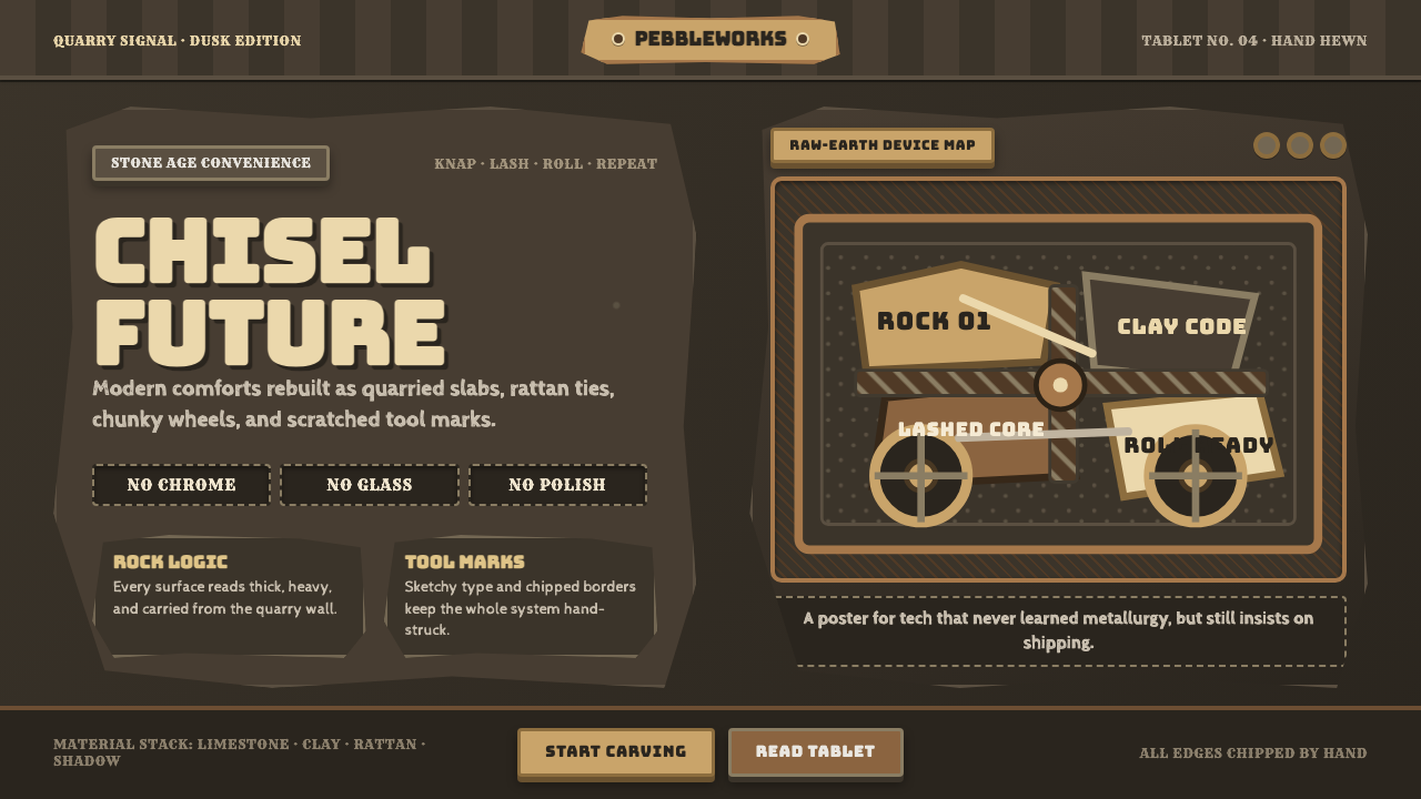 StonepunkPrimitive tech, proudly heavy. Dark quarry slabs, limestone tan, and sketched…
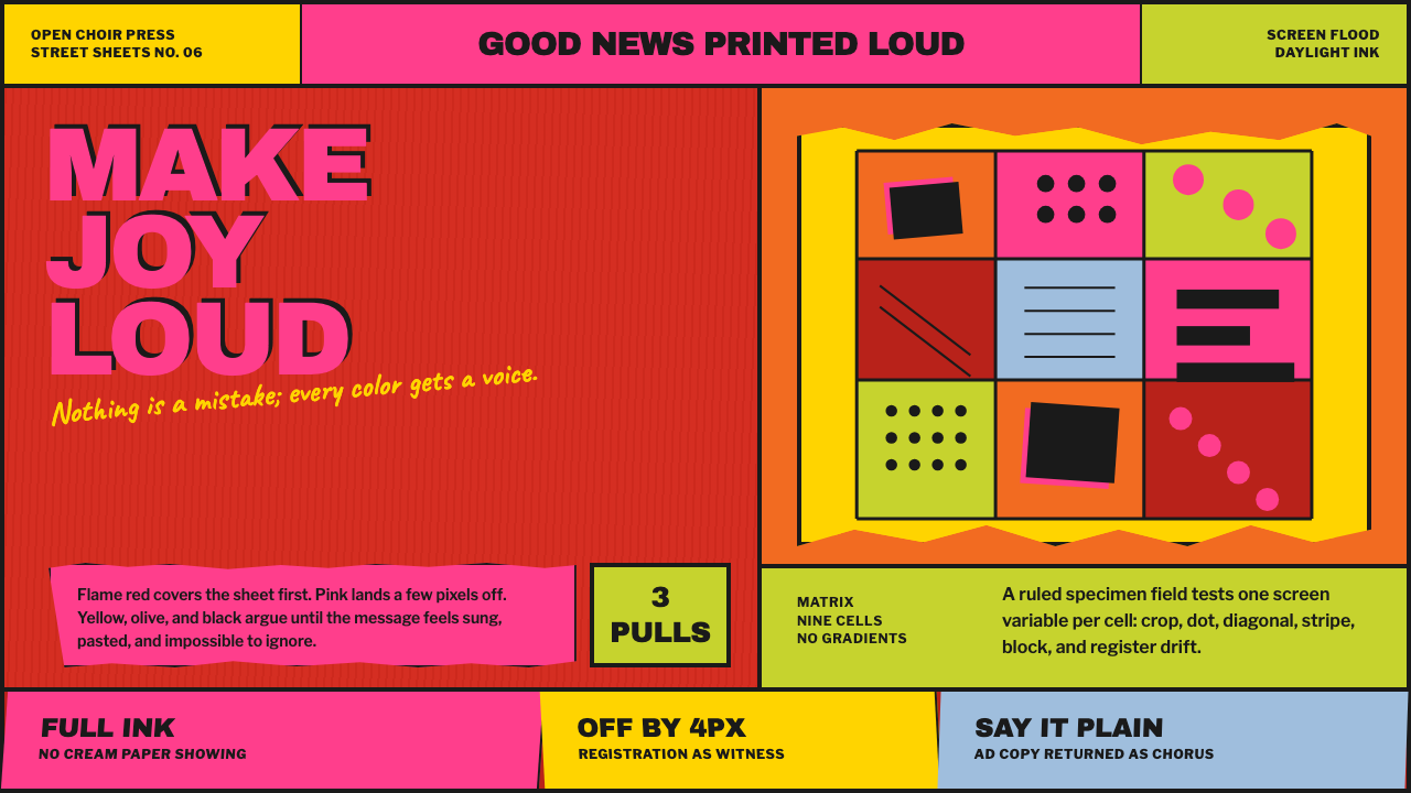 Corita Kent SerigraphJoy printed at full volume. Flame red, hot pink, and misregistered type flood…
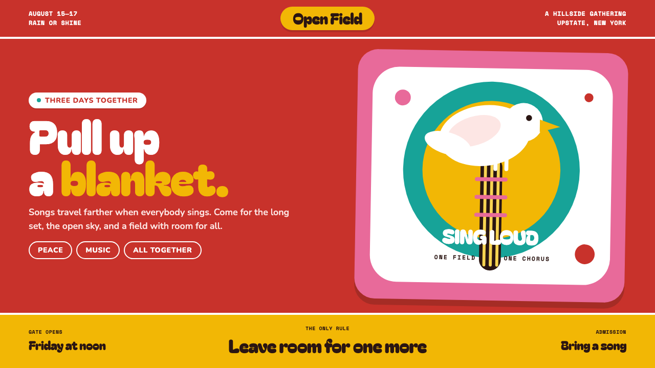 Woodstock (1969)Peace goes poster-loud. Vermilion ink, plump white forms, and bulging hand-cu…
 Ghanaian HighlifeMusic before words. Marigold ground, black keylines, red-green signboard bloc…
 Highlife Record SleevePrint it loud. Hot orange fields and fat slab type keep the sleeve gloriously…
 Pink Panther Cartoon (1963)Cool silence with a grin. Pink field, black ink, cream cel space.