What is Stonepunk?
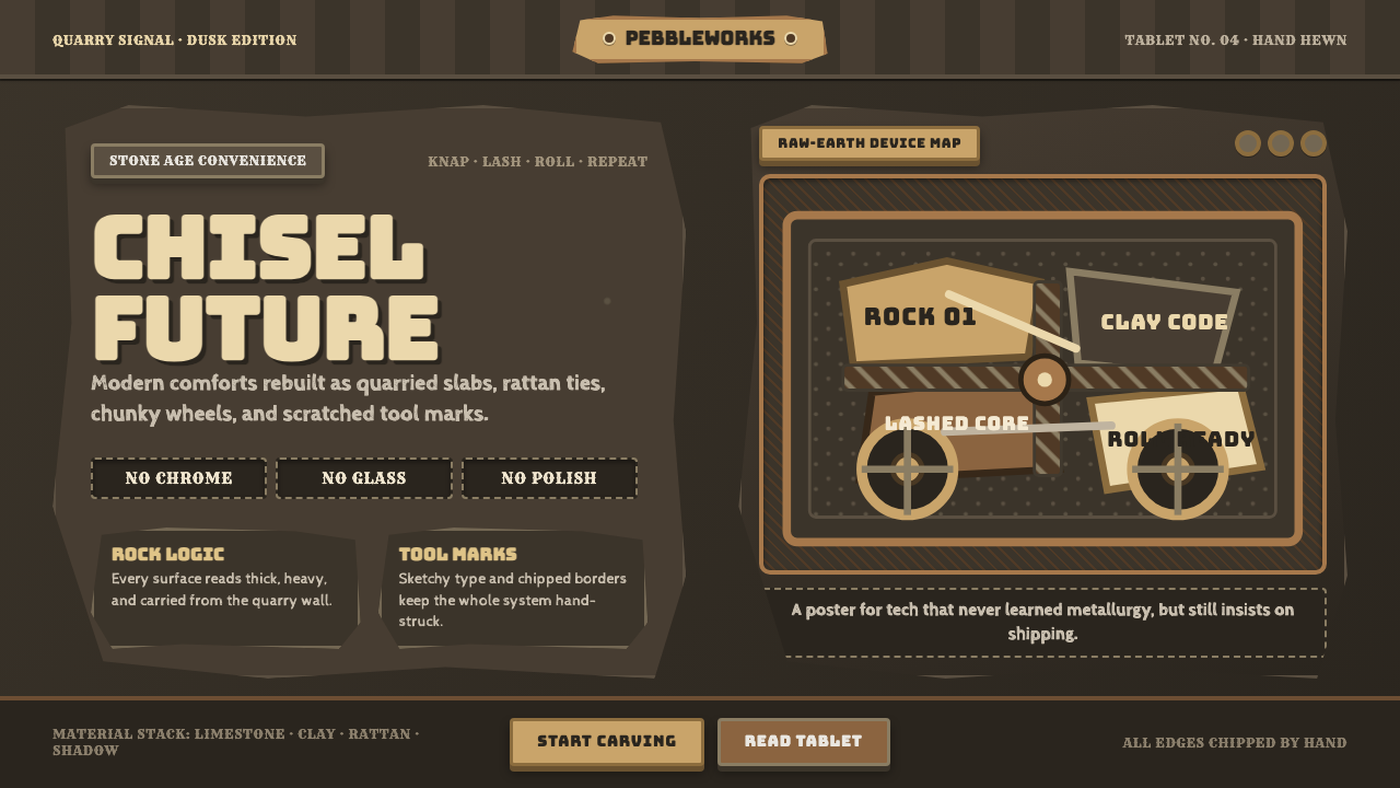
Stonepunk imagines modern convenience rebuilt with prehistoric hands: every switch, vehicle, and screen feels quarried, lashed, carved, and proudly too heavy to hide its making.
Stonepunk in brief
Stonepunk is a speculative design language in which advanced technology is made entirely from prehistoric materials. Knapped limestone, rough wood, bone, rattan lashing, carved menhirs, and crude mudbrick replace metal housings, polished glass, circuitry, and factory-made precision. Its central image is not primitive life without technology, but familiar technology translated into a Stone Age material vocabulary.
The style treats convenience as an act of worldbuilding. A vehicle may still transport people, a display may still communicate information, and a control may still invite an action, yet every function is embodied by something visibly carved, balanced, tied, or stacked. Stonepunk does not ask viewers to believe that stone behaves like modern industrial material; it asks them to enjoy the imaginative friction created when a contemporary need is solved with earth, weight, and hand labor.
Visually, Stonepunk is dark, coarse, and deliberately substantial. Quarry-like slabs form the field, limestone tones provide contrast, and lettering resembles a sketched chisel mark rather than clean mechanical type. Surfaces should feel imperfect and geological: chipped edges, uneven silhouettes, visible seams, and mass that seems difficult to move. The aesthetic gains its charm from a contradiction between crude construction and recognizable modern purpose.
Where does Stonepunk come from?
Stonepunk begins with a fictional premise rather than a historical design school: what if a Stone Age world had developed the everyday conveniences associated with modern life? This premise gives the style its defining structure. Technology remains legible through function, while its materials and construction are pulled back toward stone, wood, bone, mudbrick, and plant fiber. The result is prehistoric retro-technology, where invention is conveyed through analogy rather than industrial realism.
The Flintstones popularized this imaginative world for mass audiences during the 1960s. In Bedrock, ordinary domestic and civic life is presented through a prehistoric lens, allowing familiar objects and routines to be reimagined as rock-carved, animal-powered, or manually assembled contraptions. The enduring visual lesson is that a world can feel technologically complete even when its objects appear handmade, improvised, and materially ancient.
Hanna-Barbera is therefore central to Stonepunk as a shared visual reference, not because it established a formal design doctrine, but because its animated world made the premise immediately readable. The contrast between present-day convenience and rough prehistoric fabrication became a durable visual joke and a durable worldbuilding device. Viewers understand an object quickly because its role is familiar, then enjoy the unexpected material explanation for how it exists.
Later, Stonepunk was formalized within discussion of the Punk Punk family of speculative subgenres. In that broader taxonomy, the name helps distinguish a prehistoric material lens from futures built around chrome, circuitry, or industrial machinery. Stonepunk worldbuilders, prop makers, and set designers continue that logic by treating every object as evidence of a coherent material culture: quarried rather than machined, lashed rather than fastened invisibly, and visibly made from the earth.
What defines the Stonepunk look?
Quarried Mass
Stonepunk objects should look extracted, not manufactured. Large slab forms, blunt profiles, and irregular broken edges establish an impression of mass before any detail is read. Even small controls benefit from appearing embedded in a larger block or held within a rough-cut housing. The object should feel as though it has geological history as well as practical purpose.
Primitive Assembly
Construction is part of the visual story. Wood braces, bone joints, rattan bindings, wedges, and visible seams explain how a heavy form holds together. These details should not become ornamental clutter; their value lies in making the object appear physically accountable. A Stonepunk interface becomes more convincing when each attachment looks necessary, improvised, and capable of carrying weight.
Dark Stone and Limestone Contrast
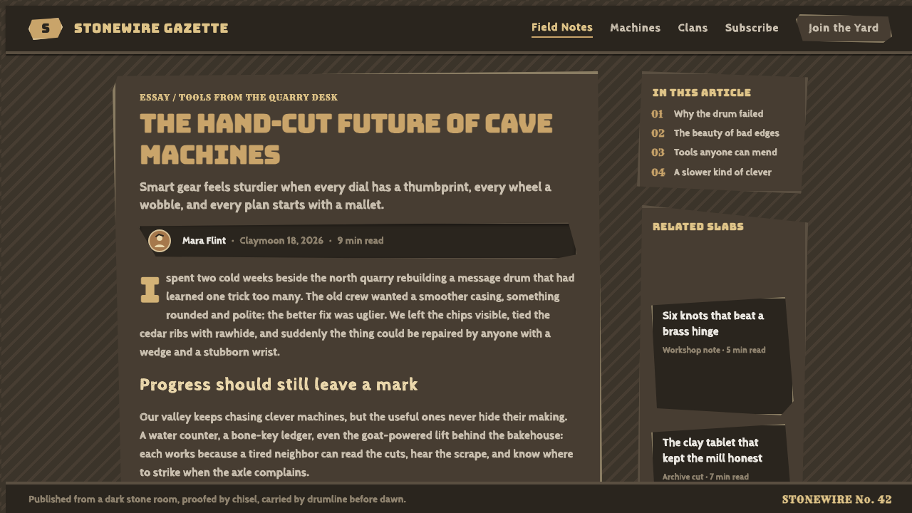
The palette begins in dark quarry stone and opens into limestone tan for readable planes, labels, and focal areas. Contrast should feel mineral rather than glossy: a pale carved face emerging from a dark slab, not a luminous digital layer floating above it. Color is most persuasive when it reinforces excavation, dust, weathering, and material separation.
Chiseled Lettering
Typography should resemble a drawn or incised mark, with uneven pressure, slightly unstable contours, and the sense that a hand has interpreted each letter. It need not become unreadable or theatrically ancient. The strongest treatment keeps the informational clarity of modern labeling while letting letters appear scratched into stone, painted on rough material, or drafted beside a construction plan.
Visible Function
Stonepunk works when a viewer can infer what an object does despite its unlikely fabrication. A control should still feel pressable, a route should still feel directional, and a display should still feel like a place where information is revealed. The prehistoric translation may be humorous, but the interaction logic should remain direct. Function is the bridge between fantasy material and everyday usability.
Earthbound Imperfection
Smooth industrial perfection weakens the style. Stonepunk benefits from chipped corners, asymmetry, hand-cut spacing, uneven silhouettes, and a restrained sense of wear. These qualities should suggest effort and material resistance, not neglect. The goal is a designed roughness: every imperfection makes the world feel touched by tools, weather, and repeated use.

Who shaped Stonepunk?
Hanna-Barbera is the studio associated with The Flintstones, the work that popularized Stonepunk’s prehistoric reinterpretation of modern convenience in the 1960s. Its importance lies in making the material joke instantly legible: a familiar role is preserved while the object’s construction is rerouted through rock, wood, animals, and hand labor.
Fred Flintstone is a central Bedrock character and a useful emblem of Stonepunk’s everyday scale. Through the familiar routines associated with him, the setting turns prehistoric fabrication into domestic and civic infrastructure rather than distant fantasy. Stonepunk is strongest when its heavy material language supports recognizable daily life in this same spirit.
Stonepunk worldbuilders extend the premise beyond a single animated setting. Their task is to make a material culture feel internally consistent: if a surface is stone, its joints, controls, signage, transport, and repair methods should all acknowledge stone. Their contribution is less about a named canon than about maintaining the logic that lets speculative environments feel inhabited.
Prop and set designers are essential interpreters of Stonepunk because the style depends on physical explanation. They decide where a slab is cut, how wood is braced, which elements are tied together, and how a modern function becomes visible through prehistoric construction. Their work converts a broad genre premise into surfaces, silhouettes, and objects viewers can immediately understand.
How do you use Stonepunk today?
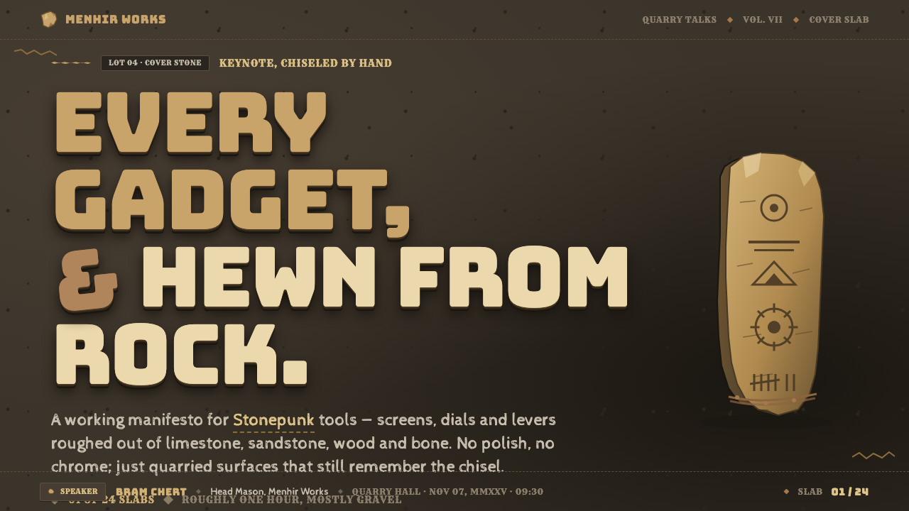
For presentation covers, Stonepunk works best when the composition begins with one dominant quarry-like mass and a concise title cut into, painted onto, or placed against it. Keep the field dark and let limestone-toned text or a pale carved face create the primary reading contrast. The cover should feel like an artifact discovered in a constructed world, not a generic dark slide decorated with random rock texture.
Content slides should use the logic of a carved signboard or workshop plan. Group information into stable stone panels, make hierarchy feel physically embedded, and use visible separators that resemble seams, incisions, or timber braces. Data slides need particular discipline: charts should remain easy to scan, while bars, markers, and labels can adopt blunt, chiseled, or lashed visual cues. Texture must never obscure comparison or turn data into scenery.
For web interfaces, Stonepunk is most effective in dashboards, interactive worldbuilding tools, themed archives, and experiential products where a strong fictional atmosphere is part of the value. A dashboard can frame metrics as carved tablets or marked quarry panels, while navigation can feel like a route across a stone structure. Interactive states should still be unmistakable; material richness is useful only when users can identify what is actionable, selected, or changed.
For editorial and marketing work, the style supports stories about making, endurance, excavation, survival, and imaginative invention. Feature pages can alternate dense dark stone fields with limestone-like reading surfaces, using imagery as evidence of crafted material culture rather than polished lifestyle aspiration. In campaigns, use a few recurring construction motifs consistently—cut edges, bindings, wedges, and carved labels—so the world feels authored rather than merely distressed.
The common mistake is to confuse Stonepunk with any dark interface covered in rock textures. Texture alone produces clutter and hides the core premise. Authentic Stonepunk preserves a clear modern function, then gives it a prehistoric material explanation. Another mistake is making every surface equally cracked, bound, and noisy; reserve the roughest treatment for structural moments, and allow quieter areas so the heavy forms, information, and interaction cues can be read.
Stonepunk — FAQ
Is Stonepunk simply a prehistoric version of steampunk?
They share a speculative habit of rebuilding familiar technology through an alternative material world, but their material logic differs sharply. Steampunk is associated with industrial-era machinery, whereas Stonepunk replaces industrial fabrication with prehistoric stone, wood, bone, mudbrick, and lashing. Stonepunk’s key tension is not mechanical elegance; it is the surprising persistence of modern convenience under radically crude construction.
Does Stonepunk need to look historically accurate?
No. The source premise is fictional Stone Age technology, not a reconstruction of a particular archaeological culture. What matters is internal consistency. If an object is presented as carved stone and lashed wood, the surrounding details should support that fabrication logic. The style is persuasive when its imagined constraints are respected, not when it claims documentary accuracy.
Can Stonepunk support a usable digital product?
Yes, provided usability remains more modern than the material fiction. Navigation, labels, states, and information hierarchy should be immediately understandable. Stone, chisel marks, bindings, and rough silhouettes can give the interface character, but they should frame interaction rather than disguise it. The most successful Stonepunk product design lets users enjoy the world without making them excavate basic controls.
Why is visible construction so important to the style?
Because construction explains the fantasy. A dark slab alone could belong to many styles, but a slab visibly cut, braced, wedged, or tied into service tells the viewer how this world solves practical problems without industrial machinery. Visible assembly turns material into narrative evidence. It makes the object feel made by people working with limited means rather than styled by a modern surface treatment.
Where does Stonepunk struggle as a visual direction?
It can struggle where speed, delicacy, luxury polish, or neutral institutional tone are the central values. The style’s heaviness and overt fiction may distract from products that need to feel frictionless, clinically precise, or culturally invisible. It also loses force when every page carries the same density of texture and prop-like detail. Stonepunk is most useful when material storytelling is a meaningful part of the experience, not an overlay applied to unrelated content.
Related design styles
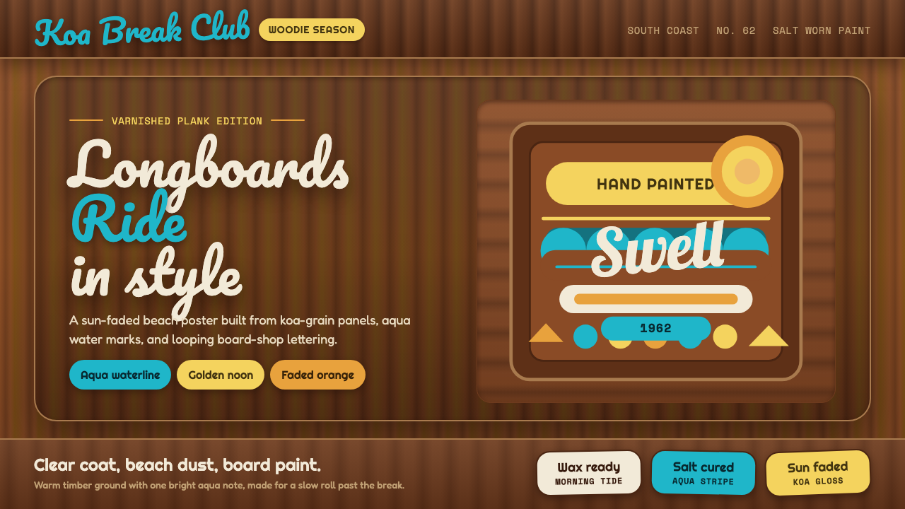 Surf Woodie CultureSalt-worn joy. Aqua script and gold badges ride over varnished koa planks.
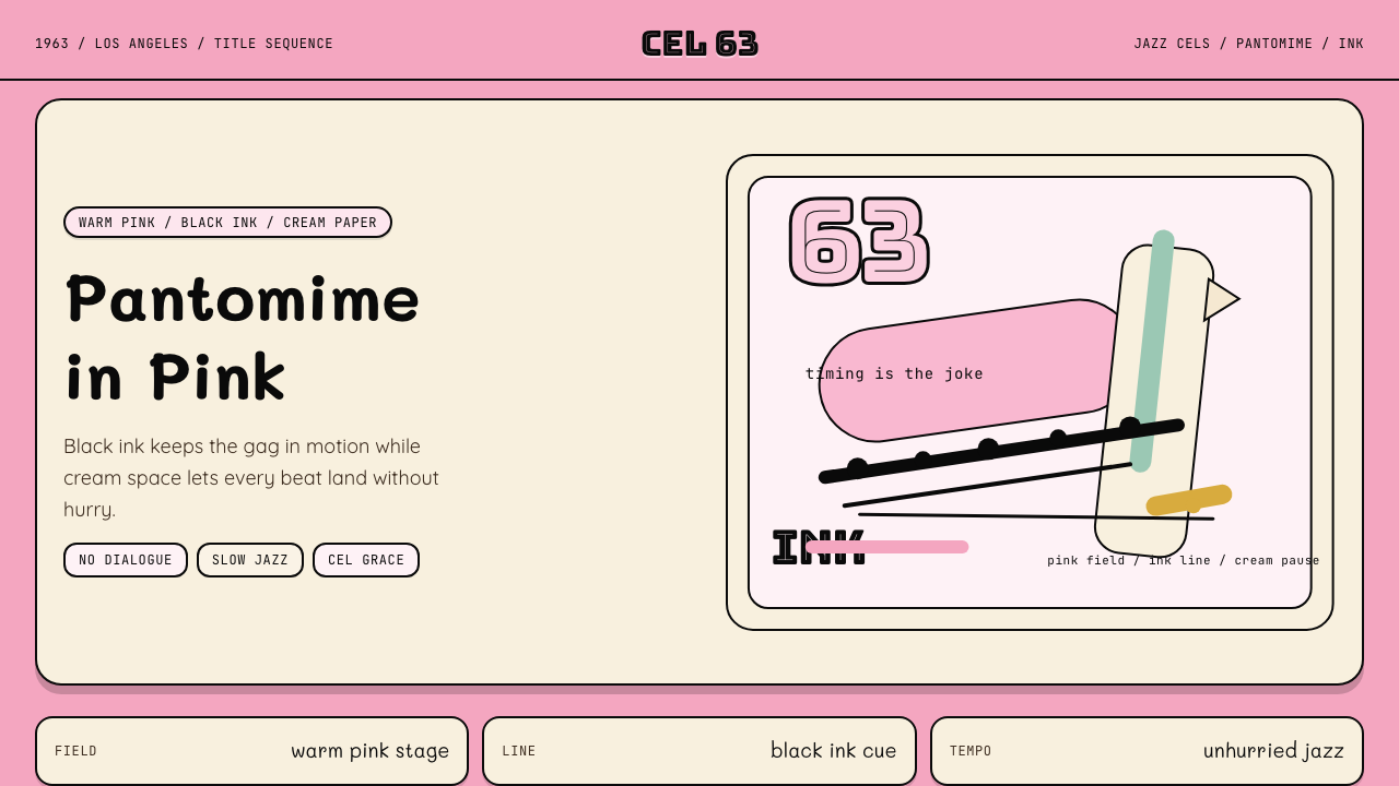 Pink Panther Cartoon (1963)Cool silence with a grin. Pink field, black ink, cream cel space.
 Soyuzmultfilm AnimationStorybook warmth feels alive. Matte amber-ochre, orange-olive accents, rounde…
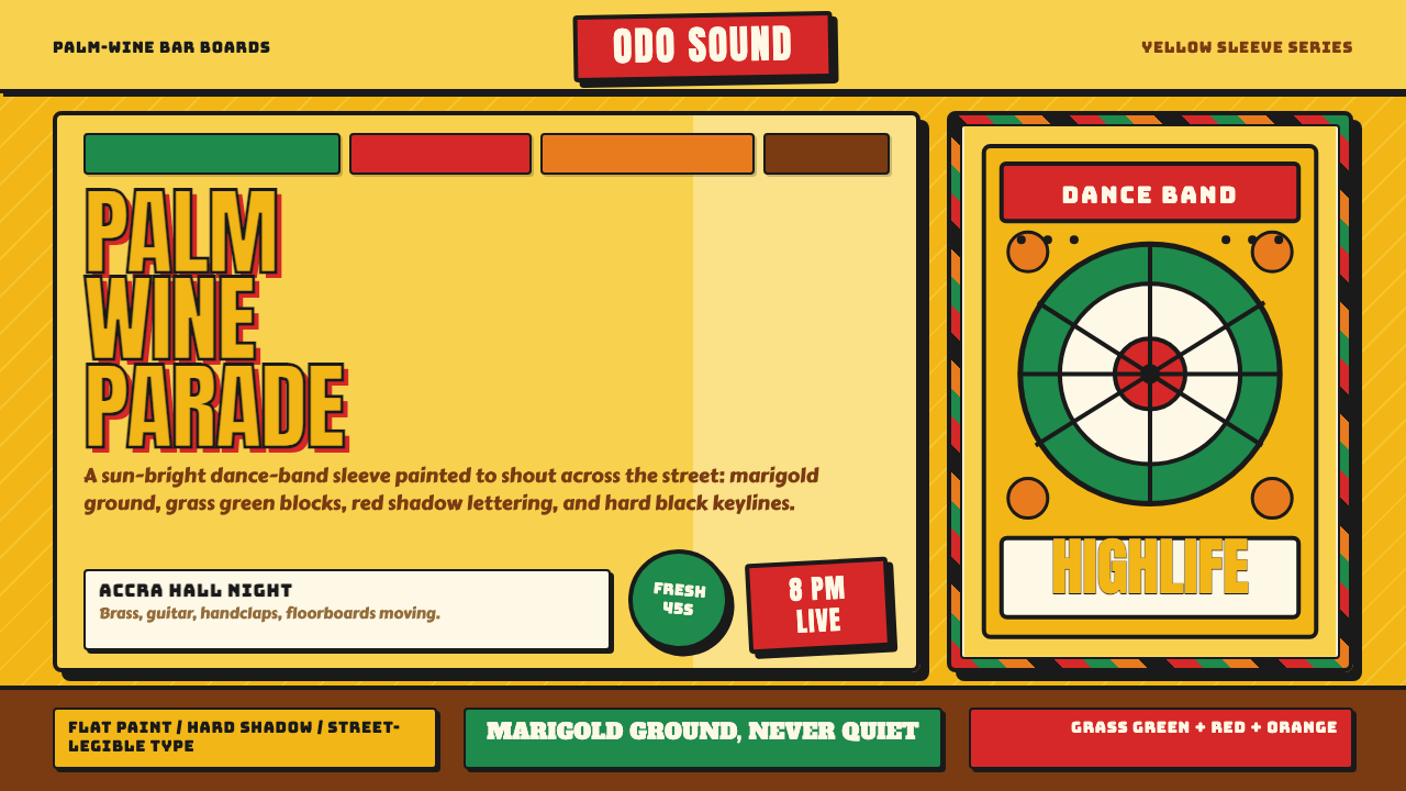 Ghanaian HighlifeMusic before words. Marigold ground, black keylines, red-green signboard bloc…
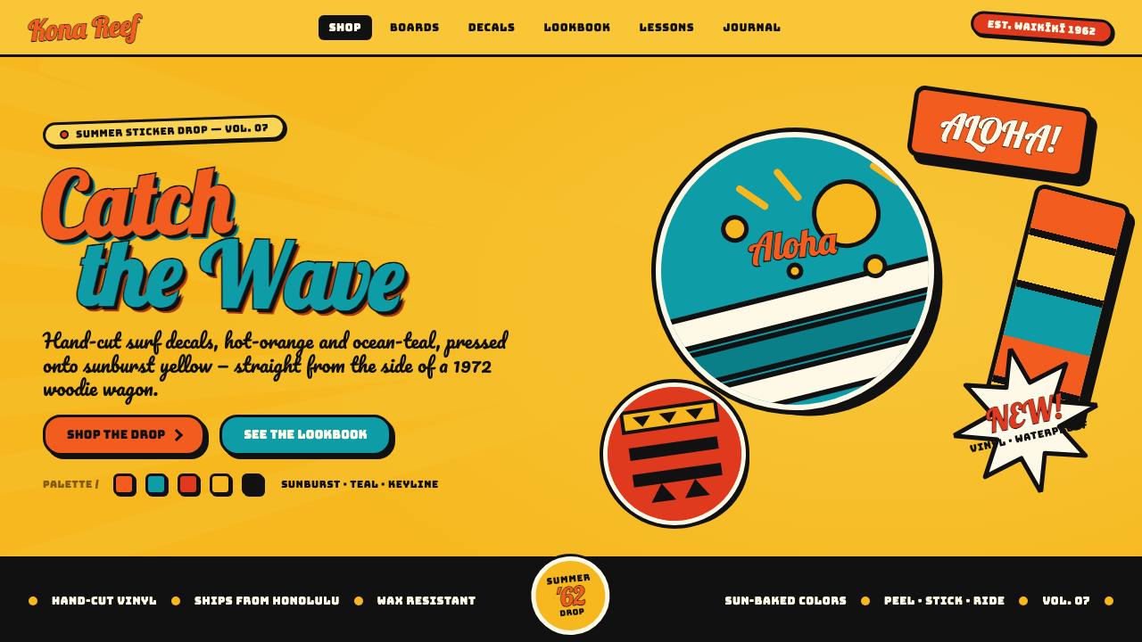 Hapa-Haole Surf DecalSurf-shop signage, loud and laminated. Sunburst yellow ground, chunky black k…
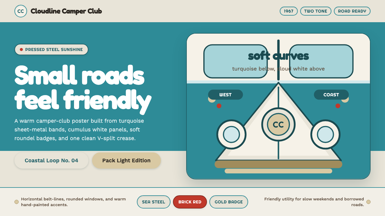 VW Kombi BusSunny steel optimism. Turquoise-and-white belt lines, Fredoka curves, warm go…