What is Soyuzmultfilm Animation?

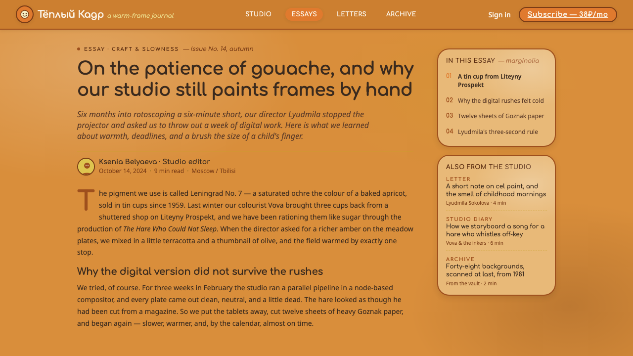
Soyuzmultfilm Animation turns digital design into a storybook world — matte amber-ochre grounds, hand-painted warmth, friendly orange and olive accents, and rounded Cyrillic lettering that feels drawn rather than typeset.
Soyuzmultfilm Animation in brief
Soyuzmultfilm Animation draws from the great Soviet animation studio founded in Moscow in 1936 and from the visual atmosphere associated with Soviet animation between 1950 and 1990. Its defining impression is not polished digital clarity but painted life: worlds rendered in gouache, with soft matte surfaces and a warm amber-ochre field replacing the expected white paper. The result feels intimate, theatrical, and immediately welcoming.
The system carries that warmth into digital form through a saturated amber-ochre ground, orange and olive-green accents, and rounded friendly type. Color should feel absorbed into a painted surface rather than placed as a sharp interface signal. Text should feel approachable and slightly buoyant, while panels and illustrations should seem to belong to the same illustrated world instead of appearing as separate software components.
Its emotional center is storybook movement. A page, card, or dashboard should suggest that something is about to happen: a character may enter from the edge, a title may sit like a hand-painted sign, and a quiet field of color may leave room for expression. The style is warm without becoming washed out, playful without becoming frantic, and nostalgic without reducing itself to retro decoration.
Where does Soyuzmultfilm Animation come from?
Soyuzmultfilm was founded in Moscow in 1936 and became the great Soviet animation studio named by this design tradition. The broader historical frame is Soviet animation from 1950 to 1990, a period represented here not through individual biographies but through a shared visual culture of painted backgrounds, animated characters, and carefully staged color. The studio is therefore both a historical source and a collective vocabulary.
The style’s reference point is placed around 1969, when the studio’s storybook sensibility can be understood through works such as Cheburashka and Nu, Pogodi! These titles matter less as isolated brand references than as shorthand for a world in which characters inhabit warm, saturated painted environments. The background is never an empty technical support for the action. It establishes mood, gives the frame its identity, and makes the animated world feel materially present.
Its material foundation is Soviet hand-painted cel animation combined with gouache-background scenic painting. Gouache supplies the visual logic: color is matte, surfaces feel pigment-rich, and the image carries the softness of a brush rather than the glare of a screen. Scenic painting gives the background an active role. Amber, ochre, orange, and olive are not merely decorative choices; together they create the emotional weather through which a scene is read.
The digital design system abstracts this tradition without pretending to reproduce a film frame literally. It keeps the painted ground, matte color behavior, rounded titling, and friendly sense of character, then applies them to interfaces, presentations, editorial pages, and marketing compositions. The goal is not historical reconstruction. It is to preserve the studio’s central promise: design can feel warm, tactile, and alive while remaining legible and purposeful.
What defines the Soyuzmultfilm Animation look?
Amber-Ochre Ground
The background is the style’s emotional anchor. Use a saturated amber-ochre field instead of default white, allowing the entire composition to feel like it has been painted on warm paper. The ground should remain present behind text, illustrations, and interface surfaces, creating continuity across the frame. It is not a faint tint or a decorative wash; it is the world in which every other element lives.
Gouache Matte
Surfaces should feel soft, pigment-rich, and matte. Color has body but no glossy glare; forms appear painted rather than illuminated by a hard digital source. This quality is especially important for panels, illustration fields, and large background areas. A surface can be gentle without becoming pale, preserving the visual density that keeps the style from feeling flimsy.
Orange and Olive Accents
Orange brings warmth and visible energy; olive green introduces a quieter natural counterpoint. They should support the amber-ochre ground rather than compete with it. Orange works well for invitations, active moments, and character emphasis. Olive is useful for secondary information, calm panels, and visual pauses. Both should remain matte and friendly, never fluorescent or metallic.
Rounded Cyrillic Type
Typography should carry the friendliness of a title card from an illustrated film. Rounded Cyrillic forms are the clearest reference, with generous curves, open counters, and a soft rhythm that feels spoken rather than institutional. Headings can be expressive and compact, while supporting text should remain calm and highly readable. The type is a character in the scene, not a neutral label placed above it.
Storybook Staging
Composition should feel staged rather than mechanically arranged. Leave breathing room around a title, let an illustration occupy a meaningful position, and allow the background to establish a quiet sense of place. Elements may feel as though they entered the frame from a story, but their hierarchy must remain legible. The charm comes from the balance between narrative suggestion and clear communication.
Warm Liveliness
The style should never feel cold, flat, or washed out. Its liveliness comes from the interaction of warm ground, matte color, rounded type, and a sense that every frame contains a small event. Use contrast to create attention, but soften the emotional temperature through color and shape. The result should invite the viewer closer rather than impress them from a distance.
Who shaped Soyuzmultfilm Animation?
The animators of Soyuzmultfilm represent the collective authorship behind the style. Their work provides the broad visual field from which this system draws: painted worlds, expressive characters, warm staging, and a frame that feels inhabited. The important reference is not a single signature but the studio’s shared ability to make animation feel like a living storybook.
The background painters associated with Cheburashka demonstrate how scenic color can shape a character’s emotional home. Their contribution is reflected in the system’s amber-ochre atmosphere and its refusal to treat the background as empty space. Warm scenery gives simple forms a sense of belonging and lets a small character carry a large emotional world.
The scenic artists of Nu, Pogodi! represent the animated environment as an active participant. Their reference supports the use of orange, olive, and ochre to create atmosphere, rhythm, and visual direction around a moving subject. In digital work, this means surrounding content with a world that gives it mood instead of merely framing it.
How do you use Soyuzmultfilm Animation today?
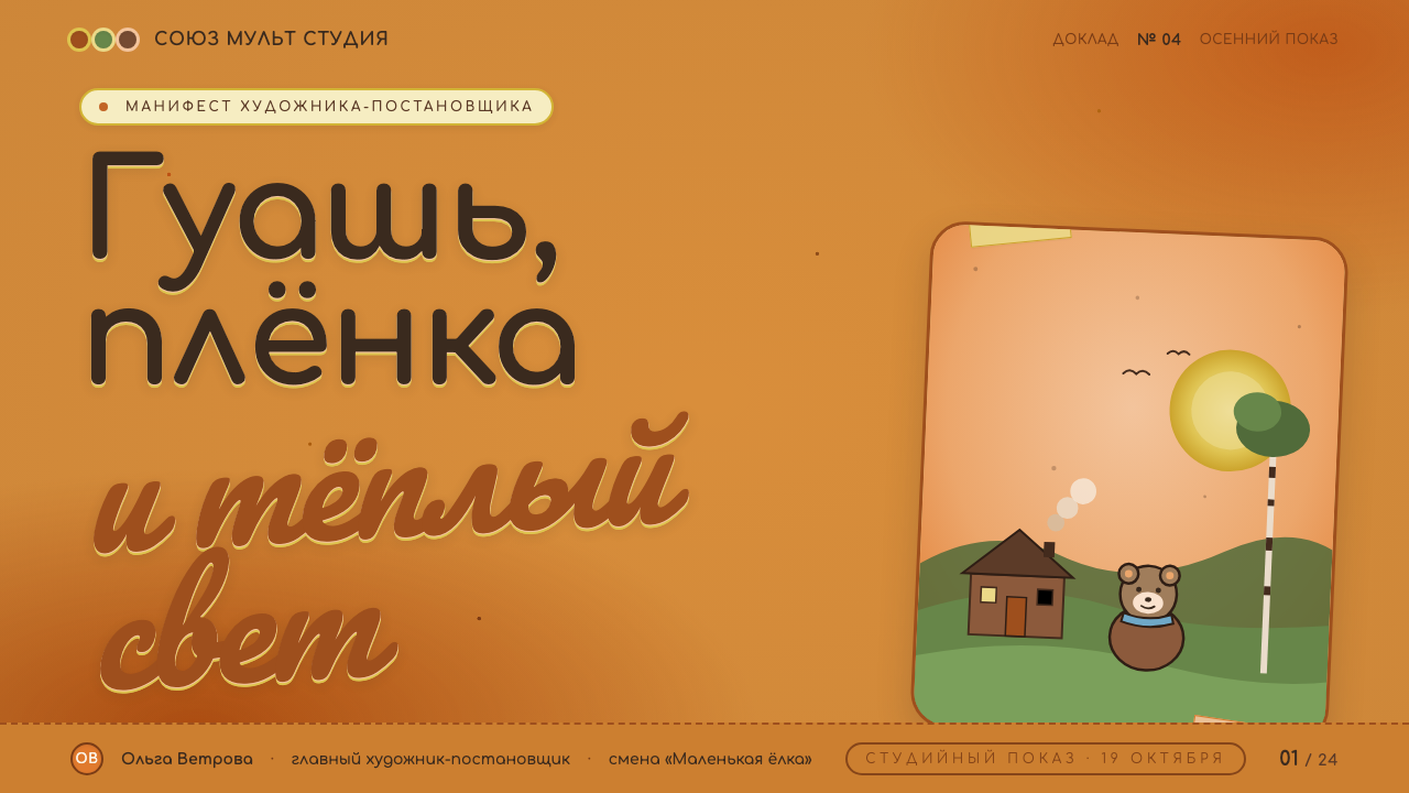
For presentation covers, let the amber-ochre ground establish the mood immediately. A rounded title can sit with the confidence of a hand-painted film card, accompanied by a simple character-like shape or scenic gesture. Keep the composition spacious and warm rather than filling the cover with props. On content slides, use painted color fields to separate ideas and let headings behave like friendly chapter markers.
Data slides should feel like scenes in the same story. Charts can use orange and olive as expressive accents against the warm ground, while the supporting labels remain quiet and readable. Treat a key figure or finding as the protagonist and give it clear visual space. Avoid making every data point equally colorful; the style depends on a calm painted world in which a few elements receive the viewer’s attention.
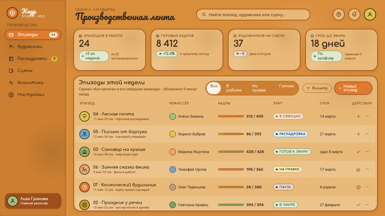
For web dashboards and pricing pages, the approach works best when the product wants to feel approachable, educational, or characterful. Use the amber-ochre field as the shared environment, then organize information with matte panels and rounded headings. Orange can mark active actions or prominent plan benefits, while olive can support secondary tiers and explanatory content. The interface should feel welcoming without losing the hierarchy needed for scanning.
Editorial pages and marketing work can use the style’s storybook quality to make information feel memorable. Open an article with a warm scenic field, a rounded title, and a visual cue that suggests a character or unfolding scene. Marketing sections can alternate between quiet ochre space and richer accent areas, keeping the same tactile surface throughout. The strongest result feels like an invitation into a world, not a costume applied over ordinary content.
The common mistake is confusing warmth with indiscriminate softness. Faded colors, excessive decoration, glossy surfaces, or overly whimsical lettering can destroy the style’s density and clarity. Another mistake is placing orange and olive accents everywhere until the amber-ochre ground loses its role. Keep the palette matte, preserve a clear emotional center, and let the storybook feeling emerge from the relationship between ground, type, color, and space.
Soyuzmultfilm Animation — FAQ
Is Soyuzmultfilm Animation simply a vintage children’s illustration style?
No. Its warmth comes from a specific visual relationship: hand-painted gouache surfaces, an amber-ochre environment, expressive accent colors, and rounded titling that makes the frame feel inhabited. A generic retro treatment may add nostalgia, but it does not necessarily preserve the material softness or the sense of staged story. The style works when those elements operate as a coherent world rather than as isolated decorative references.
Can the style use a white background?
It can, but white weakens the defining atmosphere. The amber-ochre ground is not an optional accent; it is the visual setting that makes the matte colors and friendly type feel connected. If a lighter field is necessary, keep warmth through surrounding painted surfaces, ochre framing, and restrained color transitions. The closer the page moves toward clinical white, the more it loses its Soyuzmultfilm character.
How should orange and olive green be balanced?
Let orange carry visible warmth and activity, while olive green provides rest and contrast. Neither should overpower the amber-ochre ground. Orange is suited to moments that need attention; olive is suited to supporting information and quieter surfaces. Keeping both accents matte and selective will make the system feel richly painted rather than brightly colored for its own sake.
Does rounded Cyrillic typography require a Cyrillic-language product?
No. Cyrillic lettering is the historical cue, while roundedness, openness, and friendly rhythm carry the broader design idea. In another writing system, choose type with similarly generous curves and approachable forms rather than imitating Cyrillic shapes literally. The title should still feel like part of the illustrated world, and readability should remain more important than theatrical resemblance.
Related design styles
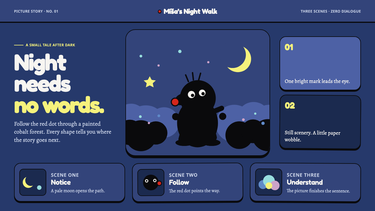 Krtek AnimationWordless wonder. Cobalt gouache stages black paper forms, guided by one red d…
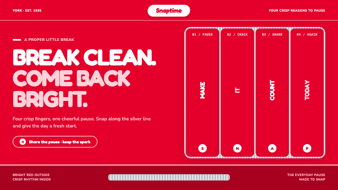 KitKat (1935)A break you can hear. Pillar-box red, plump white type, and silver grooves se…
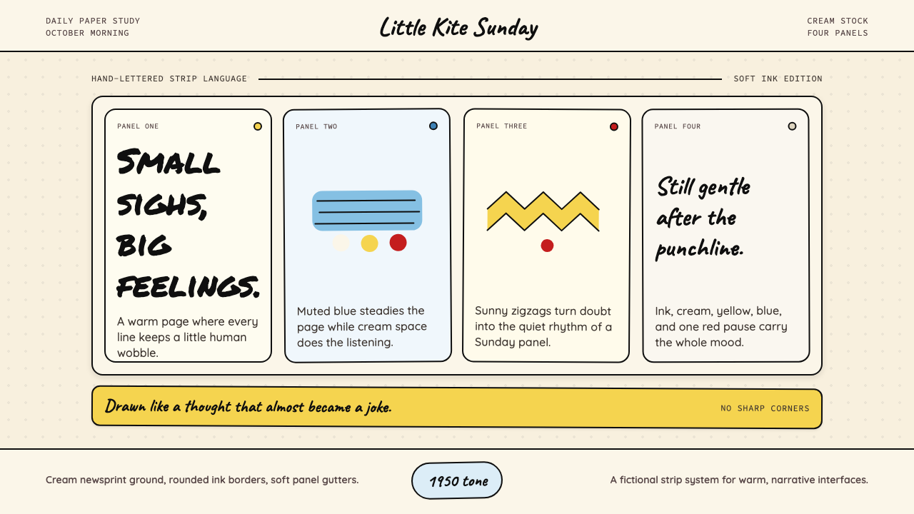 Peanuts Comic Schulz (1950)Gentle melancholy on newsprint. Caveat lettering, cream panels, yellow and bl…
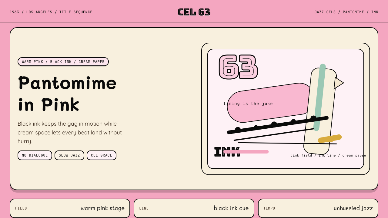 Pink Panther Cartoon (1963)Cool silence with a grin. Pink field, black ink, cream cel space.
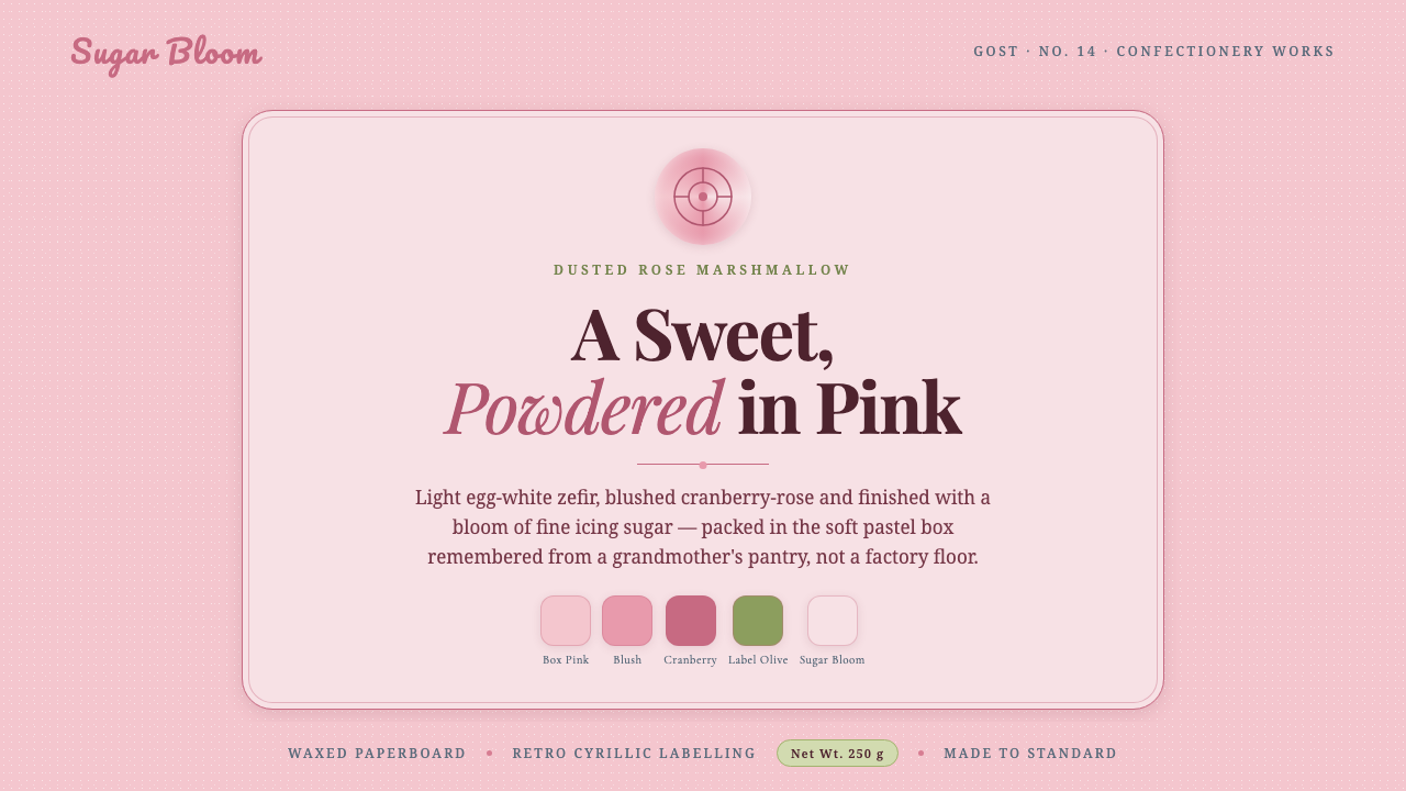 Soviet Zefir ConfectioneryA sweet remembered, not manufactured. Sugar-pink waxed-box ground, berry-rose…
 StonepunkPrimitive tech, proudly heavy. Dark quarry slabs, limestone tan, and sketched…