What is Chibi Maruko-chan?
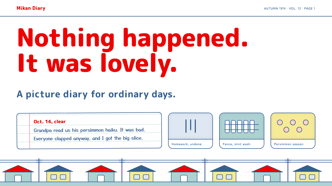
Chibi Maruko-chan style is quiet, dry and domestic: fat red rounded titles on white paper, blue-inked cards and flat washes of mint and autumn yellow.
Chibi Maruko-chan in brief
Chibi Maruko-chan style is a gentle, nostalgic design language drawn from Momoko Sakura's long-running series about a schoolgirl in a small Japanese town. It does not rely on spectacle. A plain white sheet, a line of thick rounded red lettering, round heads with pink blush, and flat, slightly uneven fills of sky blue, mint fence and autumn yellow are enough.
The tone is quiet, funny and domestic. Layouts breathe like a low Shōwa street of houses and telephone poles, with plenty of empty paper. Cards read like school report cards and picture diaries, and a dry narrator voice sits in the margins, delivering the deadpan commentary that gives the series its humour.
It is a style for warm, slightly wry, nostalgic content, not for a loud wall of cute stickers. The emotional register is affectionate rather than excited, and the page is built to feel like something a child would keep in a drawer for decades.

Where does Chibi Maruko-chan come from?
The source is Chibi Maruko-chan by Momoko Sakura, which began as a manga in the girls' magazine Ribon in 1986. It belongs to the tradition of shōjo gag and essay manga, in which everyday episodes from the author's own childhood are told with humour and a sharp eye for small embarrassments. The story is set in 1974 in Shimizu, in Shizuoka prefecture, a town whose alleys and houses define the series' backdrop.
The television anime was produced by Nippon Animation and first aired on Fuji TV from January 1990 to September 1992. It returned in January 1995 and has continued ever since, making it a Sunday-evening family fixture. The theme song by B.B.Queens became widely associated with the series. The anime softened the manga's lines into flat, evenly coloured cel shapes, which is the main reference for the system's flat washes.
Nostalgia is built into the premise. Because the story is set in the mid-seventies while it was broadcast decades later, viewers experience it as a doubled memory: the author's childhood and their own. That is why the visual language prefers faded, flat colours and plain paper, as if everything were seen in an old family album.
As a design system, the style belongs to three currents: shōjo gag and essay manga, Shōwa-era nostalgia, and the Sunday-evening family anime tradition on Fuji TV. Details drawn from the series, such as the grandfather's comic verses, the round glasses of a classmate and the narrow tatami room at home, supply its tone.
What defines the Chibi Maruko-chan look?
Color
The ground is plain white paper. Colour comes as flat, slightly uneven fills: sky blue, mint green for fences and walls, and autumn yellow for leaves and warm patches. Fat red is saved for titles. Faces carry a small touch of pink blush. The overall palette is soft, a little faded and never glossy, as if printed on thin school paper.
Typography
Titles use thick, rounded lettering in red, with the friendly irregularity of hand-drawn type. A handwritten face is used for narration and margin notes, which gives the dry voice of the narrator a physical presence. Body text stays simple and readable. Type is meant to feel written by a person, not set by a machine.
Line and fill
Cards and illustrations are outlined in blue ink, a gentle alternative to black, and filled with flat colour that does not quite reach the line. This slight misregistration is part of the charm and refers to cel painting and school colouring. Shapes are round and simple, and faces are circles with minimal features.
Cards as report cards and diaries
The characteristic container is a card that looks like a report card or a page from a picture diary. It has a clear border in blue, a simple heading and a small drawing, followed by a few lines of text. Layouts stack these in calm sequences, so the interface reads like a childhood scrapbook.
Space and rhythm
There is plenty of empty paper. Compositions feel low and wide, like a street of single-storey houses, with a gentle, uneven rhythm rather than a strict grid. Moments of disappointment are marked with a few vertical blue lines above a head, a well-known comic gesture that can be reused as a tiny decorative motif.
Dry humour
Tone matters as much as colour. Copy is short, matter-of-fact and slightly deadpan, delivered in the narrator's margin voice. The humour comes from understatement. Buttons and labels use plain, unexcited language, which makes the whole interface feel affectionate rather than eager to please.

Who shaped Chibi Maruko-chan?
Sakura is the creator of the original manga, which began in 1986 in Ribon. Her humour, built on small embarrassments and a dry narrative voice, defines the tone that the style tries to reproduce, along with the 1974 setting in Shimizu.
Nippon Animation produced the television anime that began in 1990. Its flat, evenly coloured cel look and calm pacing turned the manga into a Sunday-evening family ritual, and it is the main source of the style's soft, flat fills.
B.B.Queens is the group associated with the series' celebrated theme song. Though a musical rather than visual contribution, the song carries the same cheerful, slightly nostalgic mood, and is part of why the series feels like a shared family memory.
How do you use Chibi Maruko-chan today?
In slide decks, use a white cover with one fat red rounded title, a small blue-inked illustration and plenty of empty space. Content slides become picture-diary pages: a heading, a small drawing and two or three lines of text. Data slides should stay simple, with flat coloured bars in blue, mint or yellow and short handwritten notes. This suits school, family and personal storytelling presentations.
In web interfaces, the style fits gentle consumer products, children's learning tools, family journals and nostalgic media pages. Use cards with blue outlines, a red rounded heading and flat fills. Buttons are plain, with soft rounded shapes and unexcited labels. Pricing pages should remain humble, with small cards and short text rather than glossy tier comparison.
In dashboards, the style is a niche fit. It can work for light, personal dashboards such as habit trackers, study logs or family budgets, where flat coloured bars and card layouts feel friendly. For dense professional analytics it is too soft, and the empty space it loves would waste valuable screen area.
In editorial and marketing work, the style suits Shōwa nostalgia features, family-oriented campaigns, seasonal greeting pages and storytelling about childhood. Use a short dry caption in the margin, a few flat washes and a lot of white paper. Let a single small joke carry the page rather than a barrage of cute graphics.
The most common mistake is turning it into a cute sticker wall. When every corner is filled with faces, hearts and sparkles, the quiet, dry tone disappears and the page becomes generic kawaii. Another mistake is perfect, glossy colour: the fills should be flat and slightly uneven. A third is using exclamation-heavy, over-eager copy that contradicts the deadpan narrator.

Chibi Maruko-chan — FAQ
What is the Chibi Maruko-chan design style?
It is a quiet, nostalgic style based on Momoko Sakura's series: white paper, fat rounded red titles, blue-inked cards and flat fills of sky blue, mint and autumn yellow. It suits warm, wry, domestic content with a Shōwa-era feel rather than loud cute graphics.
Why is the story set in 1974?
The manga draws on the author's own childhood in Shimizu, Shizuoka, and sets its everyday episodes in 1974. This gives viewers a doubled sense of memory. The design system reflects it with faded colours, plain paper and simple domestic imagery, as if seen in an old album.
Why are the fills slightly uneven?
The unevenness imitates cel painting and school colouring, where paint does not perfectly meet the outline. It gives a human, handmade quality and keeps the page from feeling like a polished corporate product. Perfectly smooth gradients would undermine the nostalgic feel.
Can this style be used for business content?
Occasionally, for brands that want to appear friendly and unpretentious, such as family services, education or food. It is less suitable for finance or technical products. If used, keep the layout simple, the copy dry and the colour flat, to avoid slipping into generic cute styling.
How is it different from Cardcaptor Sakura style?
Both are Japanese girls' media styles on white paper, but their moods differ. Cardcaptor Sakura is sparkly and ornamental, with gold trims and pink washes. Chibi Maruko-chan is plain, dry and domestic, with flat fills, blue ink and no glitter. One is a magical album, the other a school diary.
Related design styles
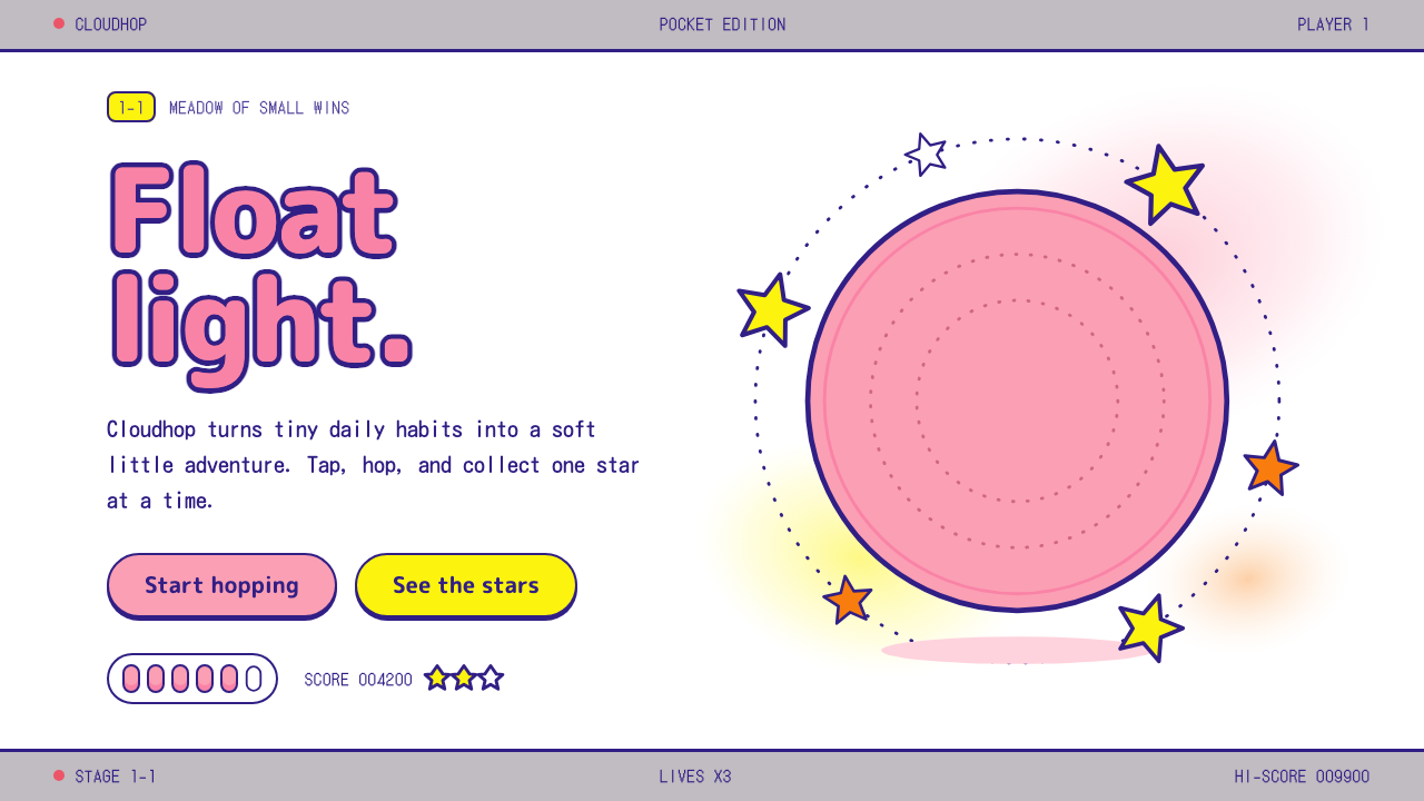 KirbyOne pink puff in a sea of white. Indigo outlines, rounded yellow stars, a gre…
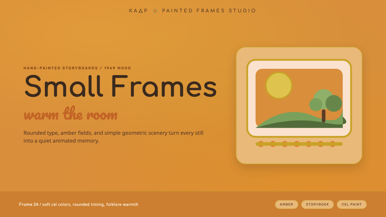 Soyuzmultfilm AnimationStorybook warmth feels alive. Matte amber-ochre, orange-olive accents, rounde…
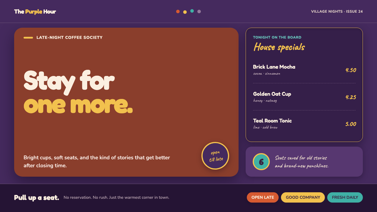 Friends Central Perk (1994)Sitcom warmth, turned TV-bright. Grape walls, couch orange, and bouncing colo…
 Nickelodeon Orange Splat (1984)Kids own the screen. Orange fields, slime-green pops, and wobble borders do t…
 Doge Meme (2013)Anti-design becomes pure joy. Candy Comic Neue captions drift at lazy angles…
 Philippines Jollibee Bee MascotJoy shouts first. Red ground, Fredoka curves, yellow pills, chunky grid.