What is Doge Meme (2013)?
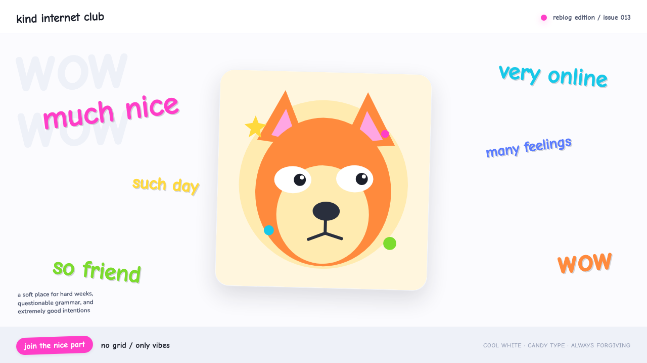
Doge took the internet's most-hated typeface and its worst layout habits and turned them into pure, ironic joy.
Doge Meme (2013) in brief
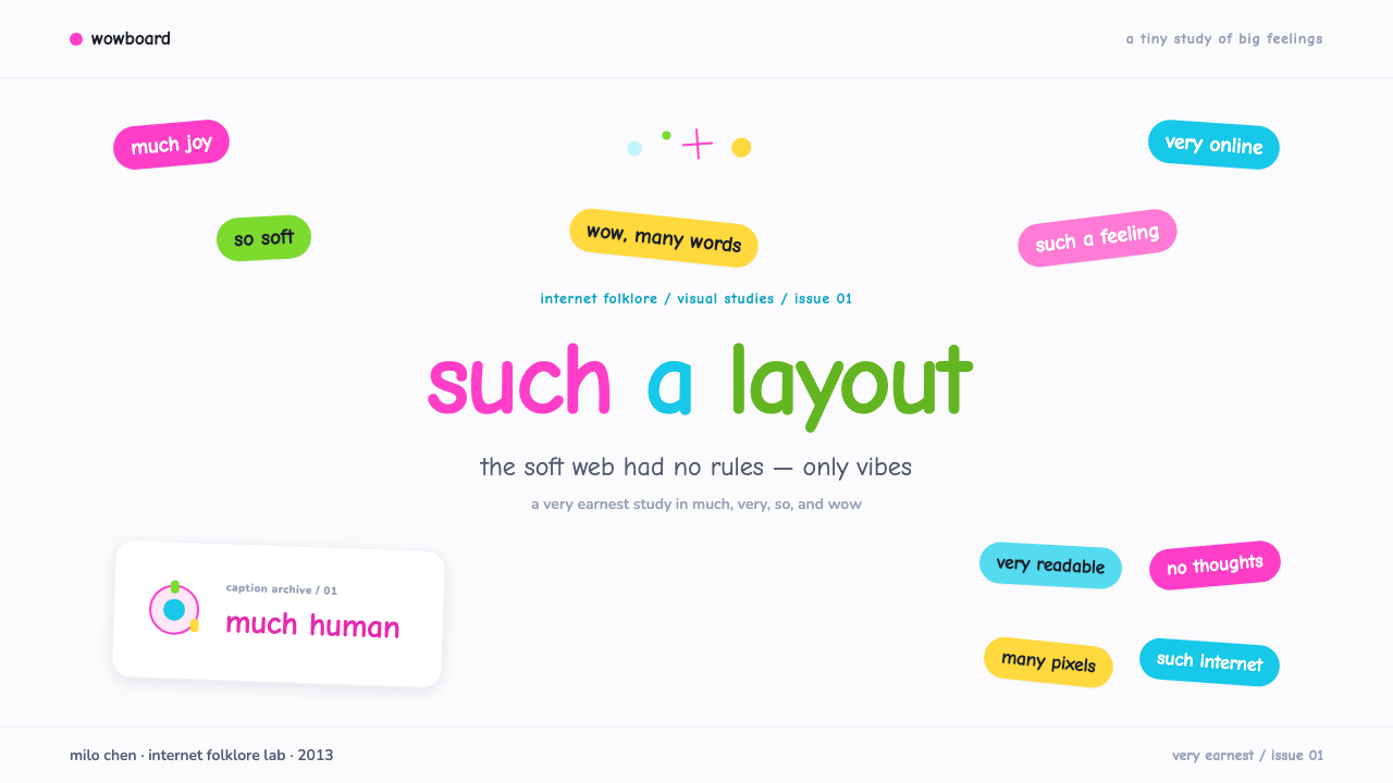
This style is built around a single soft-focus photograph of a Shiba Inu, surrounded by fragments of interior monologue rendered in multicolored Comic Sans, or the closely related rounded Comic Neue: much, very, so, wow. Each phrase floats at its own lazy angle, unrelated to the ones around it, with no grid holding any of it in place. The background stays clean and cool white, which does the important job of letting the saturated, candy-colored captions do all the shouting.
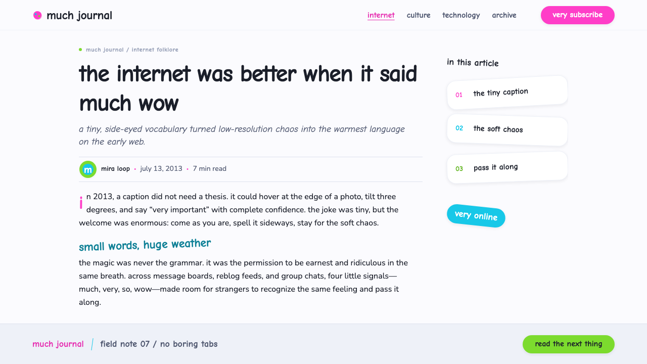
The typeface choice is the entire joke. Comic Sans was designed for friendly, informal contexts and became, over the following decade, the single most mocked font in graphic design — a shorthand for amateurism and bad taste. Doge takes that reputation and inverts it: using the ugliest, least respectable typeface on purpose, at odd angles, in clashing colors, becomes a way of signaling in-on-the-joke affection rather than carelessness.
No two neighboring caption colors match, and none of the phrases share a baseline, a size, or an alignment with each other. This is anti-design as a deliberate choice rather than an accident — the visual opposite of a grid system, and proof that a coherent aesthetic can be built entirely out of things a design textbook would tell you never to do.
Where does Doge Meme (2013) come from?
The dog at the center of the meme is a Shiba Inu named Kabosu, photographed in Japan by her owner, Atsuko Sato, who posted the now-iconic sideways-glancing photo to a personal blog in 2010. The image circulated quietly for a couple of years within dog-photo and Japanese-internet circles before it was picked up by the broader meme ecosystem and paired with the multicolored, broken-English caption style that would define 'doge' as a phenomenon distinct from the original photograph.
The captioning style itself — deliberately ungrammatical fragments like 'such wow' and 'very scare' — is often called doge-speak or a variant of the earlier internet dialect sometimes labeled LOLspeak, and the specific spelling 'doge' as a jokey mispronunciation of 'dog' predates the meme's viral peak by several years. What made 2013 the breakout year was the combination of an already-circulating image, an already-established broken-English joke register, and a font choice — Comic Sans — that was, by that point, a widely recognized punchline in its own right thanks to decades of use in inappropriate corporate and civic contexts.
Comic Sans was designed by Vincent Connare at Microsoft in the mid-1990s, originally intended for a casual, child-friendly software assistant, and it escaped that narrow original purpose to become one of the most widely installed — and widely reviled — typefaces on any Windows computer. By 2013, mocking Comic Sans was already an established internet pastime, which meant the doge captions were doing double duty: parodying bad grammar and parodying bad typography at the same time.
The meme's cultural footprint extended beyond image macros in 2013, when programmer Billy Markus and marketer Jackson Palmer created Dogecoin, a cryptocurrency built as a joke that used the Shiba Inu image as its logo and mascot. Dogecoin's continued, semi-serious existence long after 2013 is part of why the doge aesthetic never fully faded the way most single-year memes do — it kept getting reintroduced to new audiences through an entirely different medium.
What defines the Doge Meme (2013) look?
Color
Each caption phrase gets its own saturated candy-neon hue — a different color for 'much', 'very', 'so', and 'wow' — with no coordinated palette linking them. The background stays cool, clean white, which is what allows the clashing caption colors to read as joyful rather than chaotic; without that neutral ground, the effect would simply look like noise.
Typography
Comic Sans or its rounder cousin Comic Neue carries every caption. The choice is deliberate rather than lazy: this is one of the most widely mocked typefaces in graphic design history, and using it on purpose, loudly, is the aesthetic's central joke. Letters are often set at a slight rotation rather than perfectly horizontal, reinforcing the sense of a caption that just landed rather than one that was carefully placed.
Broken-English Captions
Short, ungrammatical fragments — much, very, so, wow, paired with a noun or adjective — stand in for full sentences. The grammar is wrong on purpose, mimicking an imagined internal monologue for the dog that reads as endearing rather than illiterate, a specific comic register sometimes called doge-speak.
Scattered, Non-Grid Placement
Captions float at independent, lazy angles with no shared baseline, alignment, or spacing logic connecting them. This is the opposite of a grid system, and it is essential to the effect — a neatly aligned version of the same captions would look like a poster, not a meme.
The Photograph Itself
The soft-focus, slightly askew photograph of the dog is not incidental — its specific sideways glance and gentle blur give the whole composition its emotional center. The style depends on this one recognizable image rather than any illustrated or generic dog photo; the specificity of the source photograph is part of what makes it a meme rather than a generic style.
Cool White Ground
Despite the chaos of the captions, the base surface is always clean and cool, never busy or textured. This restraint at the ground level is what keeps the composition readable — the noise is entirely delegated to the colored text, never to the background.
No Rules, Only Vibes
There is no consistent grid, no matched color system, no aligned type scale — and that absence is the entire point. The style works because it commits fully to looking unplanned, which is itself a kind of discipline: every element has to look accidental on purpose.

Who shaped Doge Meme (2013)?
Sato is the owner of Kabosu, the Shiba Inu whose 2010 photograph became the source image for the doge meme. Her original blog post predates the meme's viral spread by several years, and the specific sideways-glance, soft-focus quality of her photograph is what the entire visual style is built around.
Connare designed Comic Sans at Microsoft in the mid-1990s for a casual, informal use case, and could not have anticipated its later status as one of the most mocked typefaces in design history. The doge meme's use of Comic Sans is only funny because of the decades of typographic reputation Connare's typeface accumulated in the meantime.
A software engineer, Markus created Dogecoin in 2013 as a lighthearted, satirical cryptocurrency, adopting the doge image as its logo. Dogecoin's long, semi-serious afterlife gave the doge aesthetic a second life well beyond the typical shelf life of an internet image macro.
A marketer, Palmer co-created Dogecoin alongside Markus in 2013, initially conceiving it as a joke about the speculative excess of the broader cryptocurrency space at the time. The choice to brand that joke with the doge image cemented the meme's association with internet irony aimed at institutions that take themselves too seriously.
How do you use Doge Meme (2013) today?
This style is inherently playful and ironic, and it works best in contexts that can afford to be lighthearted without undermining their own credibility — it is not a neutral aesthetic that can be dropped into any brand, but a specific comic register borrowed wholesale from meme culture.
For presentation slides, doge works well as a single punctuation moment rather than a sustained visual system — one slide with a scattered, multicolored caption treatment to land a joke or break tension, rather than an entire deck rendered this way. A cover slide built around the technique could use scattered Comic Sans-style fragments around a central image or icon relevant to the deck's actual subject.
For web interfaces, the style rarely belongs in a serious product's core UI, but it fits well in error pages, easter eggs, playful onboarding moments, or April Fools' features — anywhere a product wants to signal self-awareness and a sense of humor for a brief, contained moment rather than as an ongoing design language.
For editorial and marketing work, the style is most effective as a nostalgic or ironic reference to a specific cultural moment — internet history retrospectives, 2013-era throwback content, or marketing that wants to signal fluency in meme culture rather than a generic 'fun' tone. Overusing it dilutes the specific joke into generic clip-art chaos.
The most common mistake is treating this as generic 'fun, colorful' design and applying it broadly across a serious product. The style only works when it is legible as a specific reference — Comic Sans, scattered captions, broken-English phrasing — rather than a vague gesture toward playfulness; strip out the specificity and what remains is just messy, unreadable design.
Doge Meme (2013) — FAQ
Is doge the same as other internet dog memes?
No. Many internet dog memes are generic — any cute dog photo with a caption. Doge is specific: it is tied to one particular photograph of one particular dog, Kabosu, combined with a specific typographic choice (Comic Sans), a specific caption grammar (doge-speak), and a specific scattered layout. Losing any one of those specific ingredients turns it into a generic dog meme rather than doge itself.
Can this style work in a dark theme?
It resists it. The cool white ground is what makes the candy-colored captions pop without turning muddy, and it echoes the clean, bright quality of the original photograph. A dark background would mute the caption colors and shift the tone from bright and playful toward something moodier, which works against the meme's entire character.
Why is bad grammar part of the design, not just the joke text?
Because the visual chaos of the scattered captions and the grammatical chaos of the phrasing reinforce each other — both signal the same thing, an unplanned, tumbling stream of thought rather than a composed statement. If the layout were neat but the grammar stayed broken, or the grammar were correct but the layout stayed scattered, the two halves of the joke would no longer match.
Does the style depend on using the exact original photograph?
For a direct doge reference, yes — the specific image of Kabosu is what makes it recognizable as this particular meme rather than a generic playful layout. For a derived design system inspired by the aesthetic's principles (scattered multicolor Comic Sans captions on clean white), the underlying photograph can be swapped for a different subject while keeping the same typographic and compositional logic.
Does this style suit a professional, business-facing product?
Almost never as a core visual system. Its entire value comes from signaling irony, informality, and internet-native humor, all of which undercut the seriousness most professional products need to project. It can appear briefly as a knowing wink — an error page, a hidden easter egg — but should never carry a product's primary interface or its marketing headline.
Related design styles
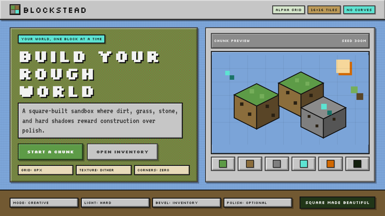 Minecraft VoxelUgly becomes buildable. Grass green, dirt brown, hard bevels, and 16×16 grids…
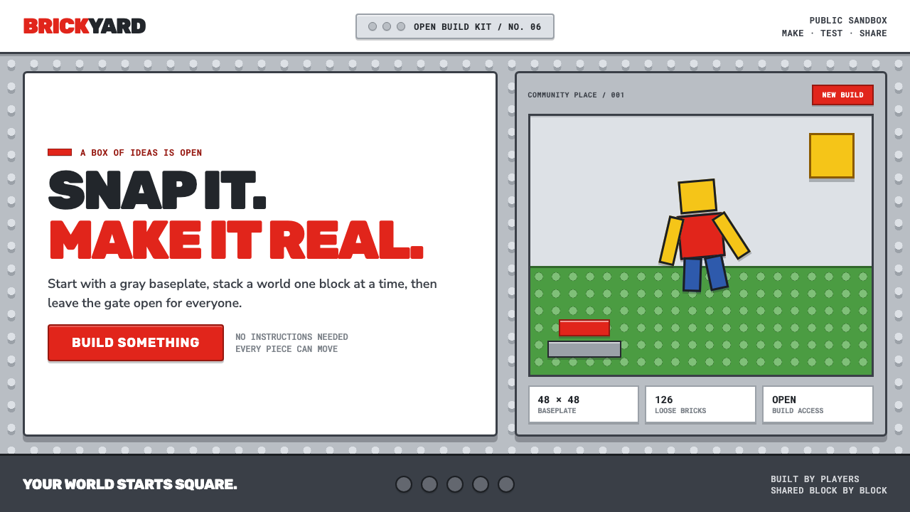 Roblox (2006)Play begins with a click. Fire-engine red cuts through a hard-edged gray stud…
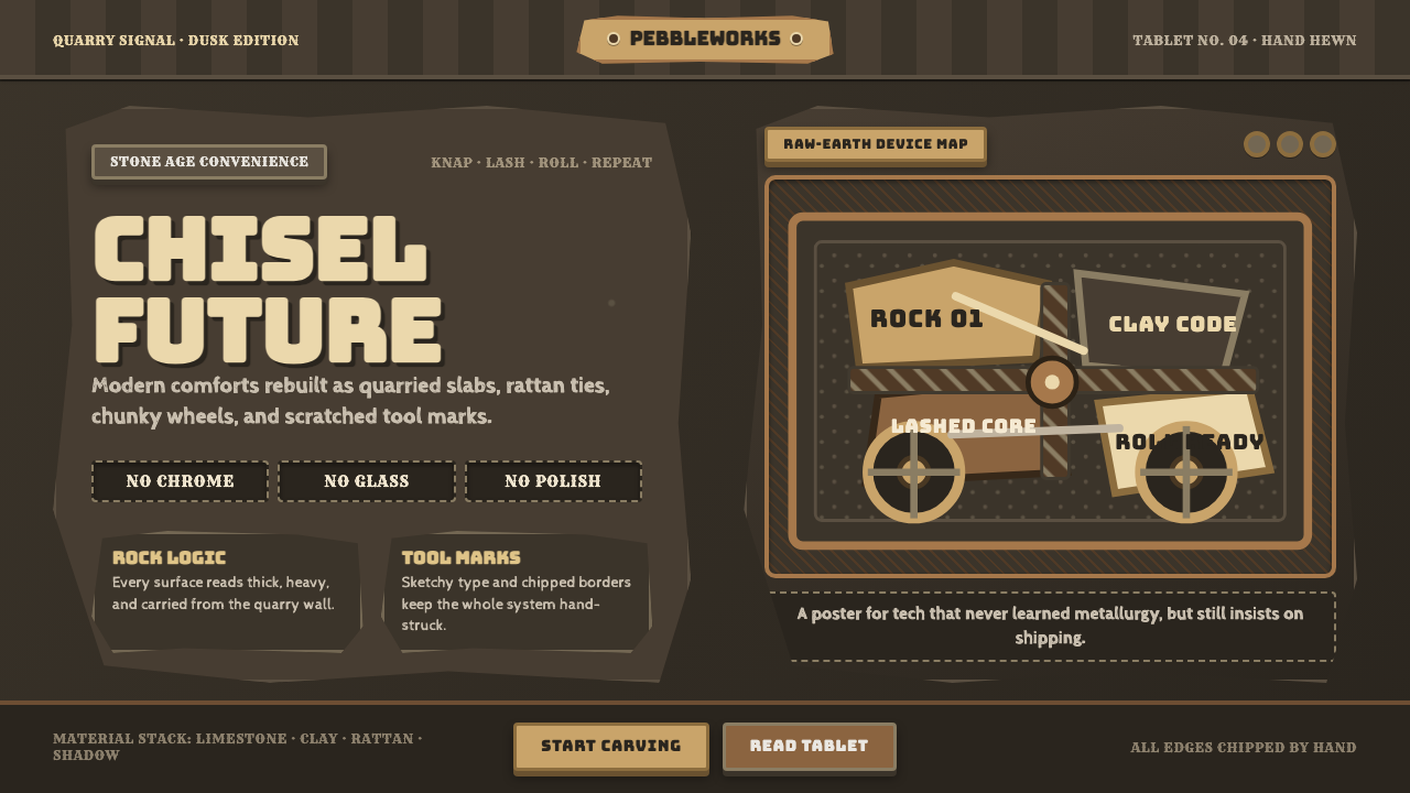 StonepunkPrimitive tech, proudly heavy. Dark quarry slabs, limestone tan, and sketched…
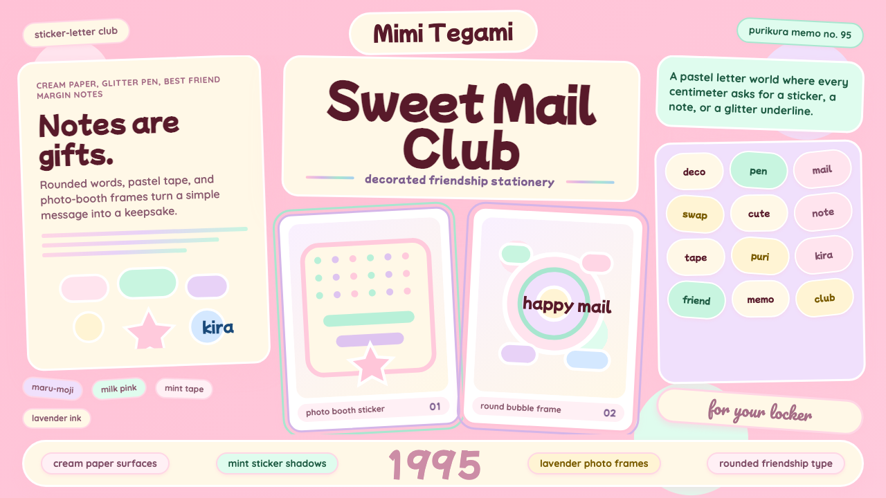 Kawaii Japanese Letter PurikuraCuteness fills every inch. Pink cream paper, mint stickers, lavender frames.
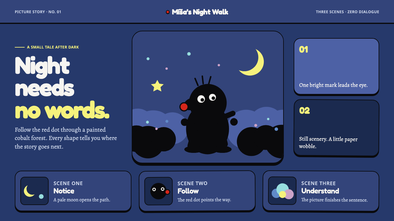 Krtek AnimationWordless wonder. Cobalt gouache stages black paper forms, guided by one red d…
 Nickelodeon Orange Splat (1984)Kids own the screen. Orange fields, slime-green pops, and wobble borders do t…