What is Baemin Typefaces?
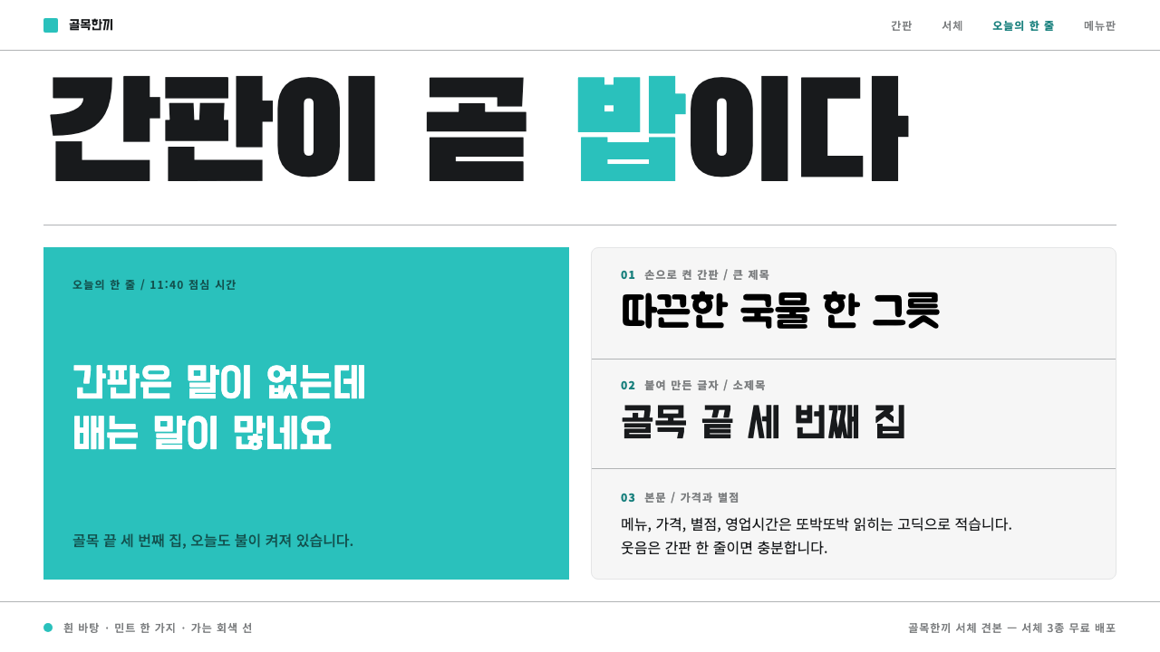
Baemin turned traced shop-sign Hangul into a brand: mint on white, flat hairline panels, and letters big enough to be the advertisement.
Baemin Typefaces in brief
Baemin is the shortened name of Baedal Minjok, the Seoul food-delivery app run by Woowa Brothers. Its visual voice came from old shop signs. The company's free Hangul typeface families were traced from photographed storefronts of the 1960s and 1970s: BM Hanna from hand-cut signboards, BM Jua from brush-painted boards with uneven stroke weight, and BM Dohyeon from letters cut out of acrylic and pasted on one by one. The typefaces were drawn by Sandoll, released free to download, and then used as the advertising itself.
The system is deliberately plain underneath. The canvas is white. Mint is the one colour that leads, and surfaces are flat panels with a single hairline edge, with no gradients, no glossy effects and no decorative illustration. What carries the personality is type set at shop-sign size, plain Hangul big enough to read from across a street, together with a short line of dad-joke copy that lands the punchline.
The effect is a brand that feels local, warm and slightly self-mocking without needing a cartoon mascot. The humour lives in the letterforms and the tone of the sentence. This makes the style unusually efficient: a few typefaces, one colour and a flat layout are enough to produce something unmistakably itself, and anyone who has walked a Seoul street recognises the lineage at once.

Where does Baemin Typefaces come from?
The company behind the style is Woowa Brothers, based in Seoul, which operates the Baedal Minjok delivery app. Kim Bong-jin, the founder, is the figure most closely tied to the brand, and the visual identity that emerged from 2012 onward is inseparable from his company's decision to treat typography as its main marketing asset. Rather than lean on a cartoon mascot, the company went looking for letters that already belonged to the city.
They found them on the street. Woowa Brothers photographed storefronts from the 1960s and 1970s, and each of the resulting typefaces corresponds to a different way of making a sign. BM Hanna follows hand-cut signboards, whose letters were laid out and cut by hand. BM Jua follows brush-painted boards, where each stroke wobbles a little and the weight is uneven. BM Dohyeon follows cut-and-pasted acrylic letters, with the blunt edges and slightly mechanical rhythm that process produces. Hangul suits this kind of signage because its letters are built into compact square blocks, which makes a name on a board feel like a single image.
Sandoll Communication drew the typefaces. BM Hanna was released in 2012, and Jua and Dohyeon came after it, all offered as free downloads. Giving the fonts away was itself part of the strategy: every menu, poster or screenshot that used them became an unpaid advertisement, which is how a corporate typeface became typography-as-advertising. The approach belongs to a small tradition of free corporate typeface releases, but few brands have made the typeface so central to the whole identity.
The story has a limit. BM Hanna was retired in July 2025, together with the arrival of Baemin 2.0, which means the version of the look described here is tied to a specific era, roughly 2012 to 2025. That boundary is useful for a design system. It shows the style as a moment in a living brand, rooted in a Hangul type revival drawn from vernacular signage, rather than a timeless law, and it explains why the system leans so heavily on the three named families.
What defines the Baemin Typefaces look?
Shop-sign scale
Type is set at the size of a shop sign. Headlines fill the width of the screen or panel and are meant to be read at a glance, from across a room, the way a name on a storefront is read from the pavement opposite. Scale is the main design tool here, replacing imagery, illustration and decorative layout. If an idea can be said in a few large characters, it is.
Three families, three methods
Each of the three Hangul families preserves a different sign-making method. BM Hanna keeps the angular, deliberate shapes of hand-cut signboards. BM Jua keeps the wobble and uneven stroke weight of brush-painted boards. BM Dohyeon keeps the blunt, assembled quality of cut-and-pasted acrylic. Choosing among them is a choice of voice, so a page normally commits to one rather than mixing all three.
White canvas
The ground is plain white. It is not a tinted off-white, not a textured paper and not an image. White keeps the lettering as the only strong shape on the page and gives mint the cleanest possible contrast. It also gives the interface a neutral, almost municipal feel, like a notice board, which makes the jokes land harder.
Mint as the lead colour
Mint is the one colour that leads. It appears on key panels, highlights and calls to action, and the rest of the page stays in white, black and grey. Using only one saturated hue makes the brand instantly recognisable from a thumbnail and keeps the system easy to apply. Supporting colours, where they exist, behave like quiet extras, never competing with the lead.
Flat hairline panels
Surfaces are flat panels edged with a single hairline. There are no soft shadows, no layered depth and no glass effects. Panels sit on the white canvas like printed cards, and their thin edges are enough to separate them. This flatness is a quiet counterpart to the loudness of the lettering: the container stays neutral so the text can be as big and as odd as it likes.
Deadpan copy
A short line of dad-joke copy supplies the punchline. The jokes are plain, a little groan-worthy and delivered without winking. Because the letterforms already feel like a neighbourhood shop, the humour reads as local talk rather than a marketing campaign. One joke per surface is the rule; two dilute each other and begin to look like trying too hard.
No mascot needed
The system does not rely on a cartoon mascot to carry its personality. The personality lives in the letterforms and the tone of the sentence, which is why the system is so portable. Without a character to draw, a new layout needs only a heading, a panel and a line of copy. The absence is a decision, and filling the gap with illustration undermines the whole approach.

Who shaped Baemin Typefaces?
Kim Bong-jin is the founder of Woowa Brothers and the person most identified with the Baemin brand. The identity that emerged from 2012 reflects his company's willingness to build a brand around lettering found on the street rather than around a cartoon mascot. He stands for the idea that a corporate typeface can be generous, local and funny at once.
Woowa Brothers is the Seoul company that runs the Baedal Minjok app. It photographed 1960s and 1970s storefronts and traced the free Hangul families BM Hanna, BM Jua and BM Dohyeon from them. Its distinctive move was to release the fonts for free so that the typefaces spread the brand on their own, turning every user's poster or menu into an advertisement.
Sandoll Communication is the Korean type company that drew the Baemin typefaces. Its contribution was to translate rough, photographed sign lettering into complete, usable Hangul families without erasing the quirks that made the originals charming. The craft in these fonts lies in keeping the wobble and angularity while making them work reliably at every size.
The deepest source of the style is the unnamed set of sign-makers who cut, painted and assembled the original storefront lettering. Their work was never intended as design heritage, which is exactly why it feels honest. The system is, in effect, a way of keeping their hand-made decisions alive in a digital interface.
How do you use Baemin Typefaces today?
The Baemin style is best for brands that want to sound like a neighbour rather than an institution. Its three rules are easy to remember and hard to fake: very large type, one lead colour, and a flat layout that stays out of the way. Applied with discipline, it makes small projects feel confident and local.
For presentation slides, a cover can be a white slide with a single line of oversized Hangul or bold plain type, a mint panel behind one key word, and nothing else. Content slides use one panel per idea, edged with a hairline. Data slides stay flat: simple bars in mint, labels in black, and a short deadpan caption instead of a chart title that explains too much.
For web interfaces, the style fits ordering flows, promotion banners and onboarding screens, where short phrases and big targets matter. Cards are flat hairline panels on white, buttons are mint blocks with large lettering, and dashboards keep generous type for the numbers that matter. For pricing, three plain panels with large figures work well; mint marks the recommended plan, and a single joke line can sit under the heading.
For editorial and marketing work, the style suits posters, promotional campaigns, packaging, menus and social posts, anywhere that a phrase set large can carry the message. Because the typefaces originate in Hangul signage, they are strongest for Korean text. For other scripts, choose a bold, plain, sign-like face and keep the same scale, colour and panel discipline so the spirit survives.
The common mistake is to add what the system deliberately lacks: a mascot, a gradient, a glossy shadow or a second lead colour. Another is mixing all three typeface families on one page, which blurs their separate sign-making voices. A third is writing jokes that try too hard. The humour works because it is flat, short and delivered without decoration.

Baemin Typefaces — FAQ
Are the Baemin typefaces really free?
The families were released as free downloads, beginning with BM Hanna in 2012 and followed by BM Jua and BM Dohyeon. That generosity is central to the brand's strategy, since every use of the fonts spreads the look. Licence terms can change, so check the current conditions published by Woowa Brothers before using them in a commercial project or a product you intend to distribute.
What is the difference between BM Hanna, BM Jua and BM Dohyeon?
Each follows a different sign-making method. BM Hanna comes from hand-cut signboards and has deliberate, angular shapes. BM Jua comes from brush-painted boards, with wobbling strokes and uneven weight. BM Dohyeon comes from cut-and-pasted acrylic letters, with blunt, assembled forms. They share a street-sign spirit but each has its own personality, so a page usually commits to one.
What happened to BM Hanna in 2025?
BM Hanna was retired in July 2025 together with the launch of Baemin 2.0. For design purposes, that makes the look described here an era-specific one, running from 2012 to 2025. The system remains a useful, well-documented reference for how to build a brand from vernacular lettering, but it should be understood as a snapshot of that period rather than the brand's current state.
Why mint on white rather than a louder palette?
Because the lettering is already loud. When type is set at shop-sign size, the colour around it needs to stay quiet and clear. White gives maximum contrast, and a single mint lead colour adds recognition without competing with the characters. A louder palette would force the type to share attention, and the deadpan tone of the brand would be lost.
Can the style work for languages other than Korean?
Yes, though with adjustment. The original fonts are Hangul families traced from Seoul storefronts, so they are at their best with Korean text. For Latin, Chinese or other scripts, keep the structural rules, which are shop-sign scale, a white canvas, one lead colour, flat hairline panels and deadpan copy, and use a bold, plain, signage-like face for the lettering.
Related design styles
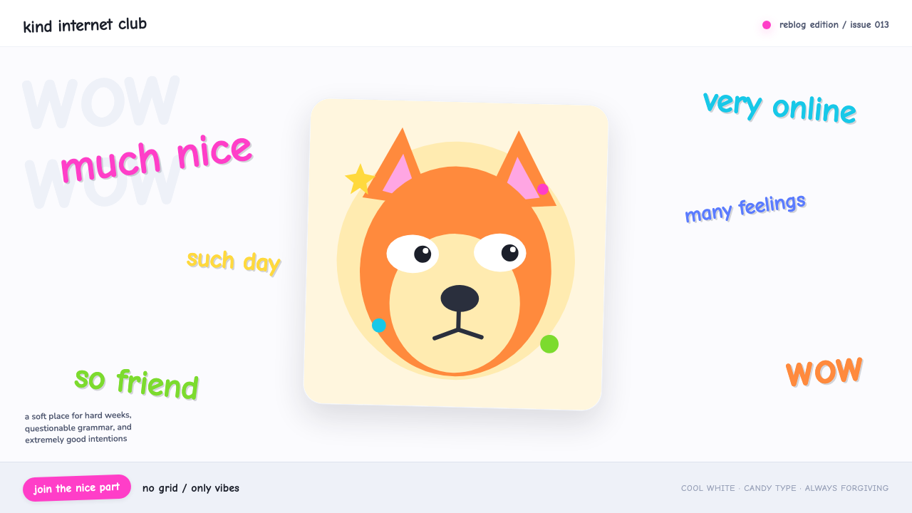 Doge Meme (2013)Anti-design becomes pure joy. Candy Comic Neue captions drift at lazy angles…
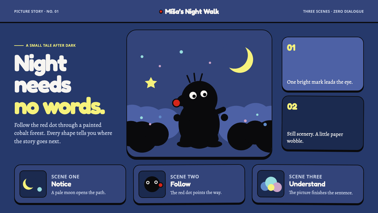 Krtek AnimationWordless wonder. Cobalt gouache stages black paper forms, guided by one red d…
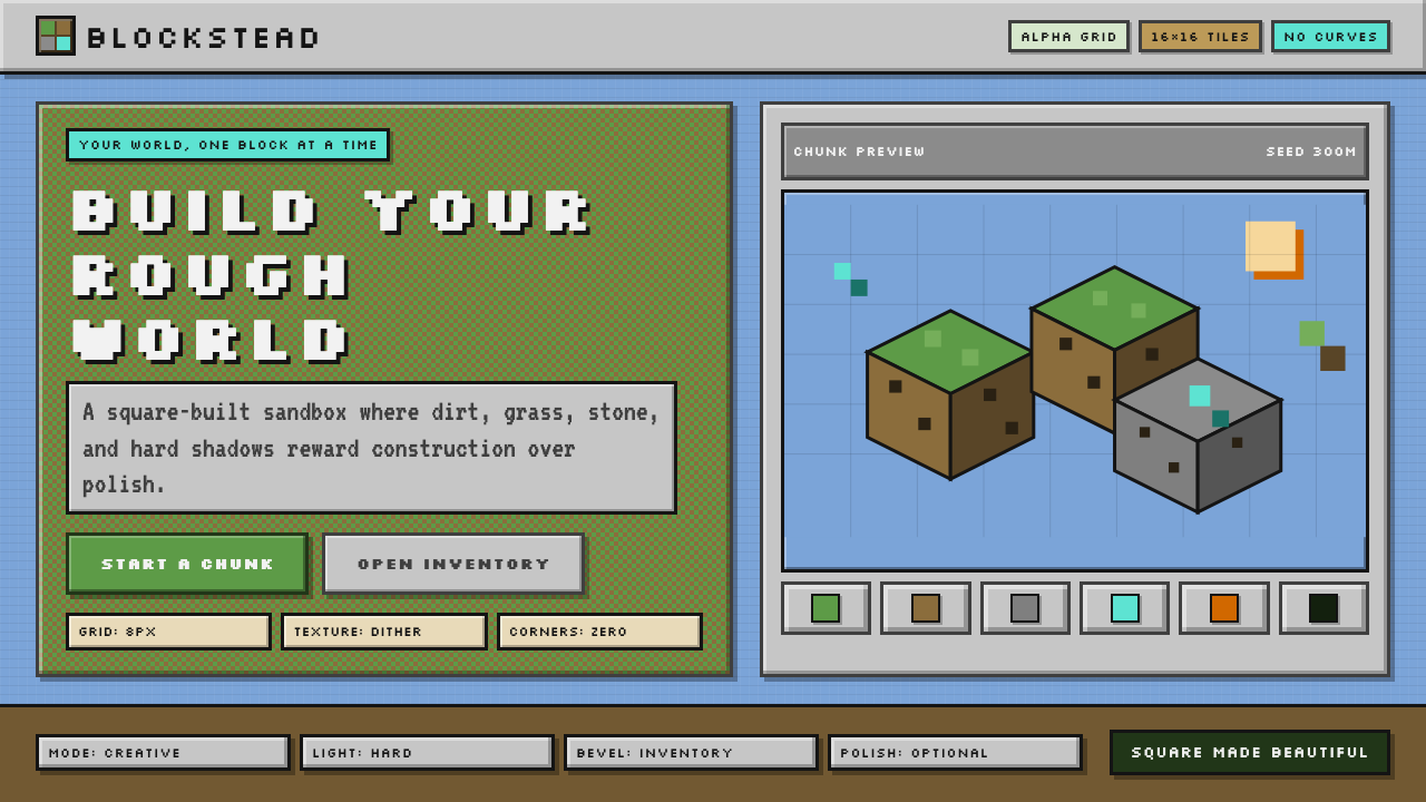 Minecraft VoxelUgly becomes buildable. Grass green, dirt brown, hard bevels, and 16×16 grids…
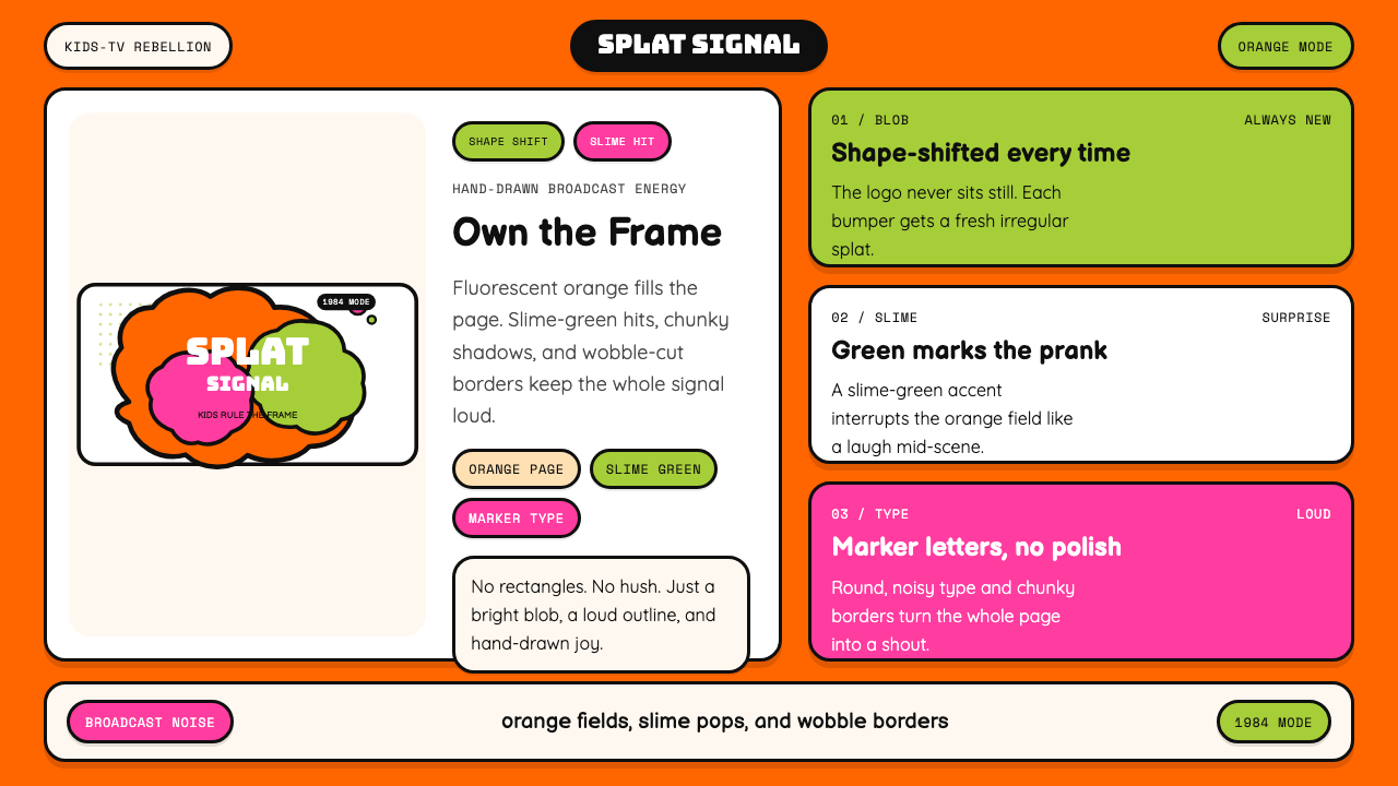 Nickelodeon Orange Splat (1984)Kids own the screen. Orange fields, slime-green pops, and wobble borders do t…
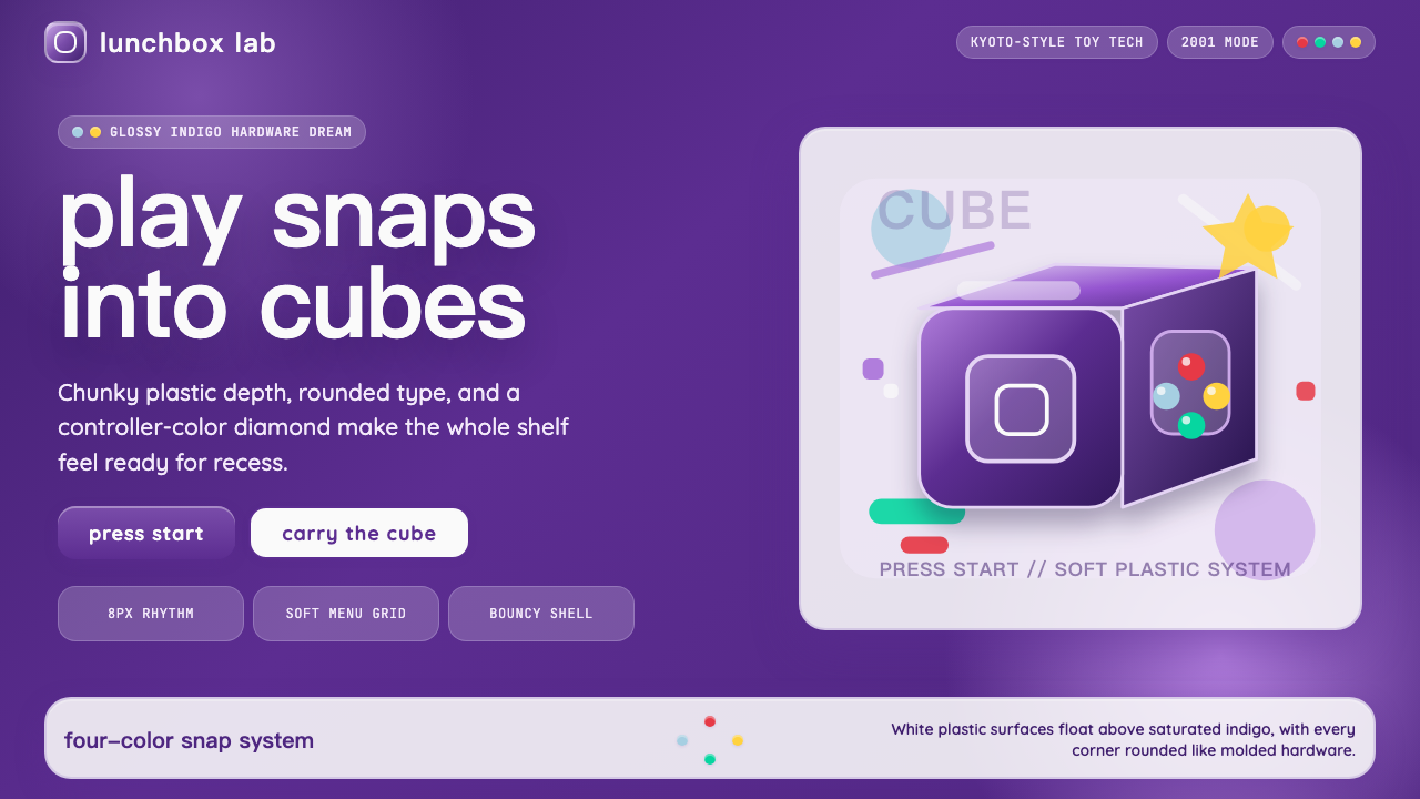 Nintendo GameCube (2001)Toy-tech refuses restraint. Indigo plastic, glossy cubes, and four-color butt…
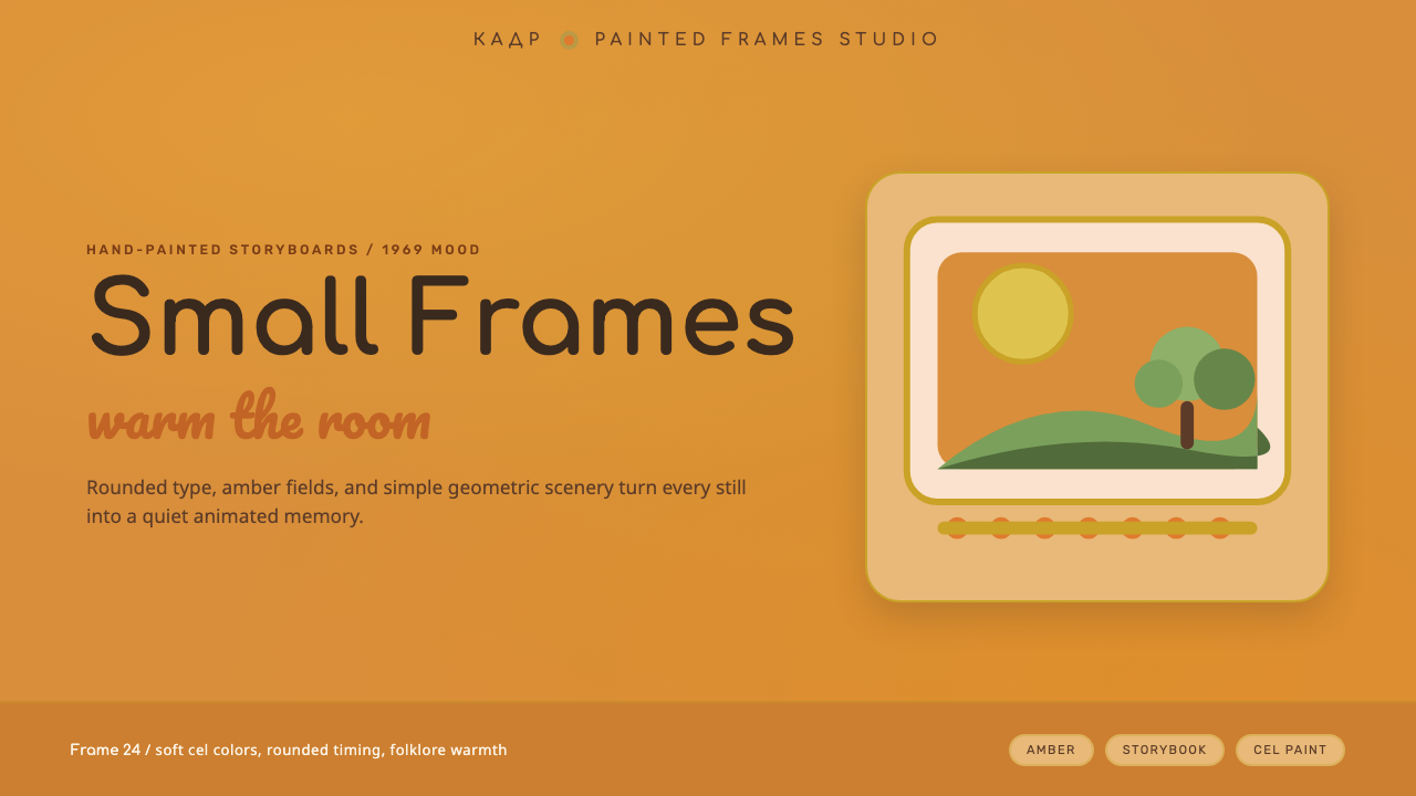 Soyuzmultfilm AnimationStorybook warmth feels alive. Matte amber-ochre, orange-olive accents, rounde…