What is Krtek Animation?
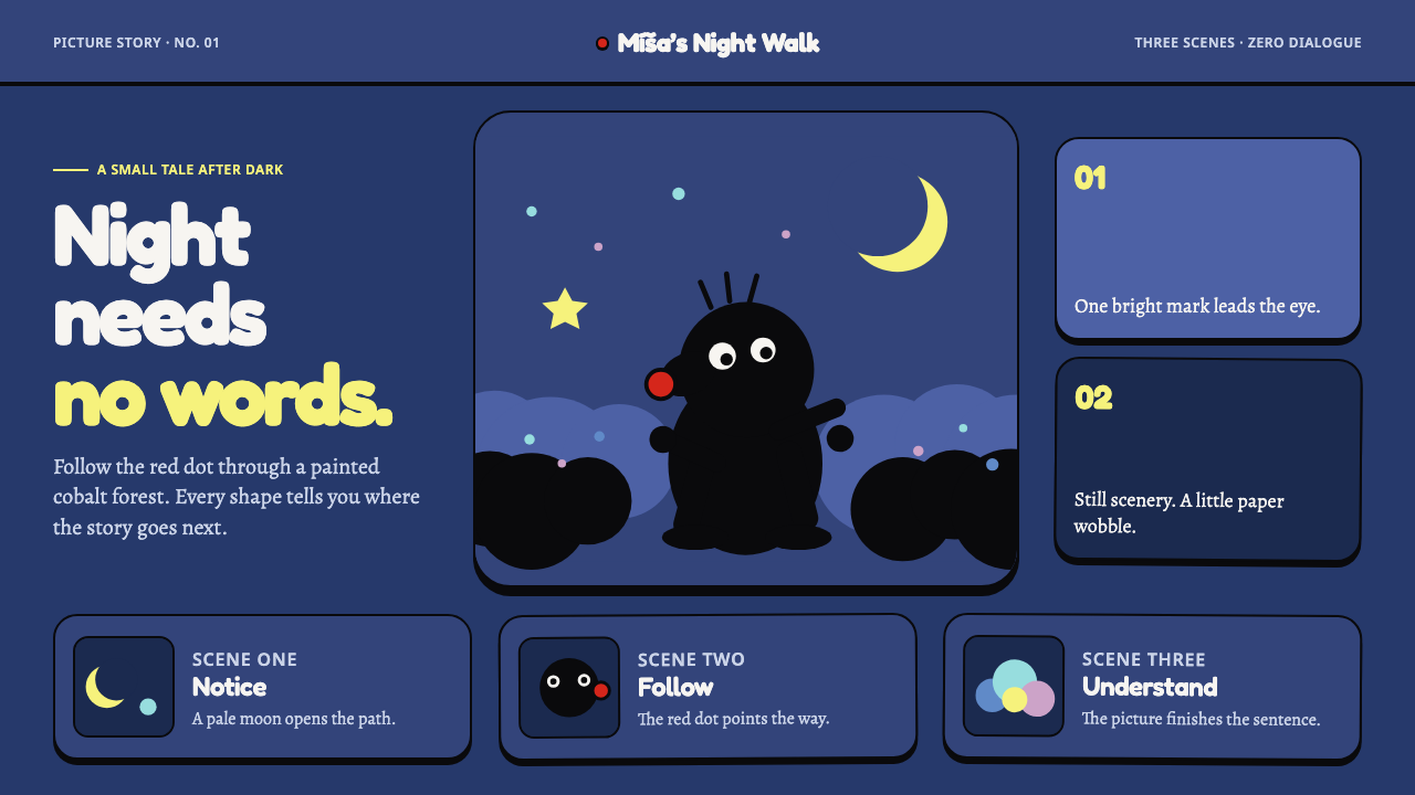
Krtek proves an entire world can be understood without a single word: a black paper-cut mole trembles over flat cobalt gouache sets, with only a red nose and a handful of candy accents to carry the story.
Krtek Animation in brief
Krtek — the Mole — is a Czech animated character and film series built on a wordless storytelling method: paper-cut figures shot frame by frame over painted gouache backgrounds, using a stop-motion process with several exposures per step of movement, so the cut-out figure trembles very slightly while the painted ground behind it stays perfectly still.
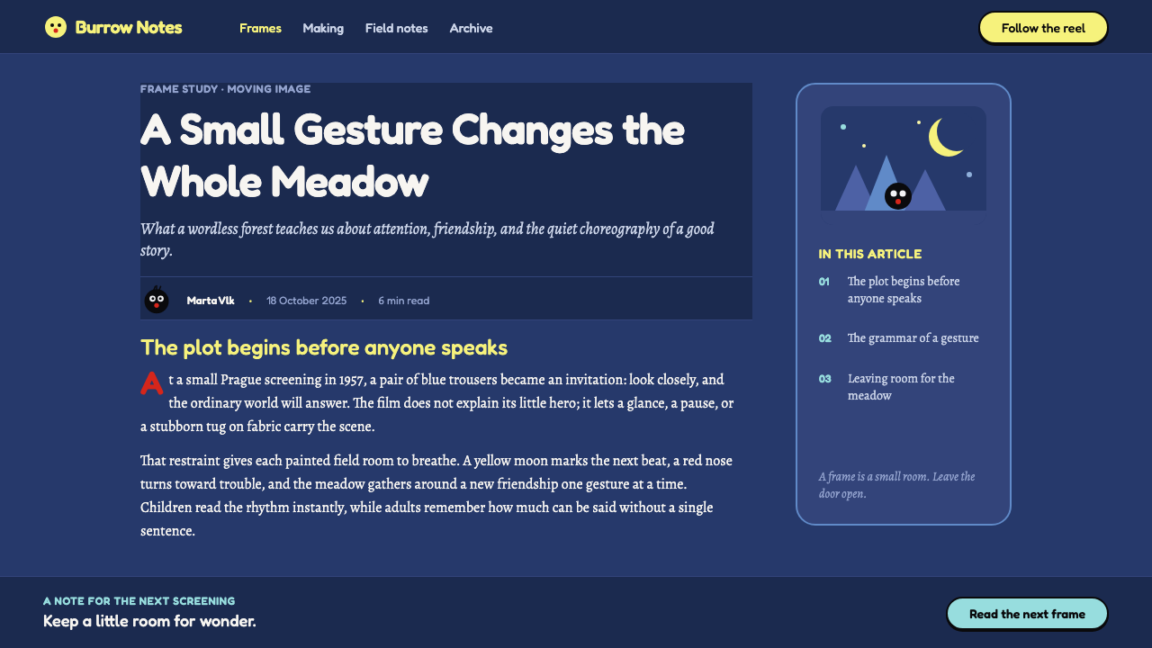
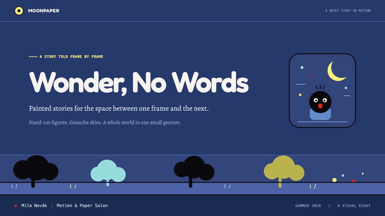
The visual system preserves that same division of labor between figure and ground. The ground is a saturated, completely flat field of cobalt gouache with no gradient; the figure is a pure black silhouette broken only by a single red accent — the mole's nose. Supporting elements stay within a narrow, candy-bright palette that never competes with that two-part figure-and-ground contrast: a lemon-yellow moon, stars in mint green and dusty pink, and stippled brushwork standing in for trees and bushes.
Because nothing in this system depends on written language, it functions as a genuinely wordless visual code. Shape, flat color, and a small vocabulary of accent tones do the entire job of storytelling, with no captions and no dialogue required to read what is happening.
Where does Krtek Animation come from?
The Krtek series began in 1957 in Prague, then part of Czechoslovakia, when animator Zdeněk Miler cut his mole character out of paper and laid it over gouache-painted sets, then shot the results using several exposures per step of movement — a stop-motion process that produces the character's telltale slight tremble against a background that never moves. The first film won the Golden Lion at the Venice Film Festival, and the series went on to run to 49 episodes across a production span lasting until 2002.
The series belongs to two related movements: Czech animated film as a national tradition, and paper cut-out and painted-set animation as the specific production technique that gives it its look. Miler worked within a Prague animation scene that also produced Jiří Trnka, a central figure of Czech animated film whose work in puppet and cut-out animation established much of the technical and aesthetic ground that Miler's mole followed.
The films carry no spoken dialogue. The only vocalizations on the soundtrack were recorded by Miler's own daughter — a small handful of short syllables standing in for speech entirely, rather than any spoken language. That choice, removing language altogether rather than translating it, is what allowed the series to travel internationally without dubbing, and it is inseparable from the purely visual, wordless design logic that defines the look.
Because the technique depends on a stable, unmoving painted ground contrasted against a physically handled paper figure, the visual system carries a distinct texture within Czech animated film: flatter and more graphic than fully painted animation, but warmer and more textured than pure geometric cut-out work, sitting at the intersection of the two named movements it belongs to.
What defines the Krtek Animation look?
Flat Cobalt Ground
The background is rendered as a single saturated, completely flat field of cobalt gouache with no gradient or shading. It functions as an unmoving stage that stays visually constant while the figure moves across it, never competing for attention with the action in front of it.
Pure Black Silhouette Figure
The main figure is reduced to a solid black paper-cut silhouette, with no internal detail, shading, or texture. Everything about the character's expression and movement has to be carried by outline and posture alone, since the shape itself contains no gradation.
Single Red Accent
Exactly one warm accent point breaks the black silhouette — the mole's red nose. It is small, precisely placed, and the only saturated warm color allowed to touch the figure itself, giving the eye a single fixed point to track.
Lemon-Yellow Moon
Where a moon appears, it is rendered in a clear lemon yellow, distinct from the red accent on the figure and from the cooler tones used for stars. It functions as a secondary warm note reserved for a specific, recurring night-sky element.
Mint and Dusty-Pink Stars
Stars carry a paired, softer accent palette of mint green and dusty pink, cooler and more muted than the moon's lemon yellow or the figure's red nose. This pairing gives the night sky its own distinct color identity separate from the ground and figure.
Stippled Brush Foliage
Trees and bushes are built from stippled, dotted brushwork rather than solid fills or outlined shapes, giving vegetation a textured, hand-painted quality that contrasts with the flat cobalt ground and the solid black figure.
Wordless Legibility
Every design choice in this system serves the same goal: the whole scene must be understandable with no text and no dialogue. Shape clarity, color-coding by element, and a strict, limited accent palette all exist to make meaning readable through vision alone.

Who shaped Krtek Animation?
Miler created Krtek in 1957, cutting the mole out of paper and laying it over gouache-painted sets, then shooting the results with several exposures per step of movement — the stop-motion process that gives the figure its signature slight tremble against an unmoving painted ground.
Trnka was a central figure of Czech animated film whose work in puppet and cut-out animation helped establish the technical and aesthetic ground within Prague's animation scene that Miler's mole followed.
The only vocalizations in the Krtek soundtrack were recorded by Miler's daughter — a handful of short syllables standing in for speech entirely, reinforcing the series' commitment to storytelling with no actual spoken language.
How do you use Krtek Animation today?
Because this system is built entirely around wordless legibility — flat color, silhouette clarity, and a small fixed set of accent tones — it works especially well for children's content, educational products, and any interface aiming for universal, language-independent readability.
For presentation slides, a cover slide can use the full cobalt ground with a single black silhouette icon and one red accent point as the sole focal detail, echoing the mole-and-nose relationship directly. Content slides should keep icons and illustrations as flat silhouettes rather than shaded or gradient graphics, reserving the lemon-yellow, mint, and dusty-pink accents for a strict handful of callouts rather than spreading them across every slide.
For web interfaces, the style suits children's learning platforms, storytelling apps, and any product where icon-based, caption-free navigation is a goal. Interactive elements can use the single-accent-point principle directly: a black silhouette icon with one small colored detail communicates state or category without needing a text label.
For editorial and marketing work, this system supports nostalgic, charming brand identities — children's publishing, toy brands, and playful cultural marketing all benefit from the combination of a flat saturated ground, graphic black silhouettes, and a tightly restrained accent palette.
The most common mistake is adding shading, gradients, or too many accent colors to make the silhouette figure feel more three-dimensional or more decorative. Both moves undo the system's core logic: the mole reads clearly precisely because it is flat, solid black, and marked by exactly one point of color, and diluting that restraint removes the wordless clarity the whole style depends on.
Krtek Animation — FAQ
Why does this style avoid all dialogue and on-screen text?
Because the original series was built to be understood without any spoken language, relying instead on flat color, clear silhouette, and a small set of consistent accent tones to carry meaning. That wordless design is also what let the films travel internationally without dubbing, and it remains the core discipline the visual system is built around.
Does the single accent color always have to be red?
Red is specific to the mole's nose and is worth preserving whenever a project is directly referencing this character. The transferable principle for other applications is the discipline itself — exactly one small, precisely placed warm accent breaking an otherwise solid black silhouette — rather than the specific hue, though red keeps the clearest link back to the original design.
Does this system require the physical paper cut-out and stop-motion technique to work visually?
No. The transferable qualities are a flat, unshaded gouache-like ground, a solid black silhouette figure with hard edges, and a strict, limited accent palette — these can be reproduced with any flat illustration or vector technique. The physical tremble that stop-motion produces is a charming historical detail of the original films, not a requirement for the visual system to read correctly.
Is this style limited to children's products only?
Its warmth and simplicity make it a natural fit for children's content, but the underlying lesson — clear silhouette, flat unshaded color, and meaning carried by a strict, small accent palette rather than by text — is useful for any interface that needs to communicate quickly and universally, including wayfinding, icon systems, and onboarding flows well beyond children's products.
Related design styles
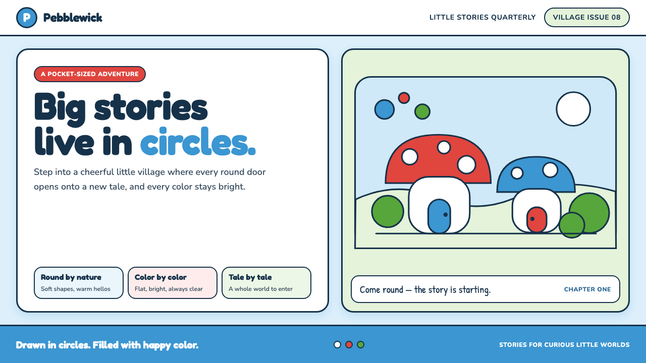 The Smurfs (Peyo, 1958)Joy comes full circle. Sky blue, candy red and soft ink outlines build a flat…
 DoraemonChildhood joy, inked bold. Cyan fields, white panels, red collars, and rounde…
 Soyuzmultfilm AnimationStorybook warmth feels alive. Matte amber-ochre, orange-olive accents, rounde…
 Javanese Becak Folk ArtFolk painting at full volume. Sky-blue enamel, red mountains, white-outlined…
 Looney Tunes (Warner Bros.)Pure cartoon chaos. Bull's-eye rings, Bungee type, and red-blue-yellow blocks.
 Peanuts Comic Schulz (1950)Gentle melancholy on newsprint. Caveat lettering, cream panels, yellow and bl…