What is The Smurfs (Peyo, 1958)?
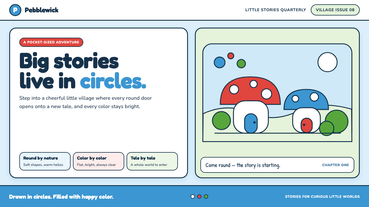
The Smurfs turns a mushroom village into a complete visual promise: soft ink contours, round silhouettes, and flat happy color make every corner feel safe enough to enter.
The Smurfs (Peyo, 1958) in brief
The Smurfs is a Belgian comic world created by Peyo in 1958, first appearing within Johan et Pirlouit before continuing in albums from 1959 onward. Its setting is immediately legible: a village of blue, small-statured creatures in white Phrygian caps and tucked-in white trousers, living among domed mushroom houses, stools, foliage, and other objects drawn as friendly rounded forms. The world does not ask the reader to decode realism. It offers a picture-book place with its own compact visual grammar.
Its defining aesthetic is unusually complete. Faces, architecture, furniture, and landscape all participate in the same rounded logic: bulbous noses, curved caps, pebble-like bodies, spotted domes, and soft organic contours. The result is neither merely cute nor merely decorative. Repetition makes the village coherent. A mushroom house belongs to the same world as a Smurf because both are built from curves, enclosed by the same dependable line, and filled with the same unbroken color.
The color system is equally direct. Cheerful blue skin meets forest greens, candy reds, white clothing, and clean ink outlines. Fills remain flat and poster-like, with no tonal modeling, atmospheric haze, or cross-hatching to complicate the image. This simplicity is the source of its warmth: every object announces its identity quickly, while the soft contour line prevents the flatness from becoming rigid or mechanical.
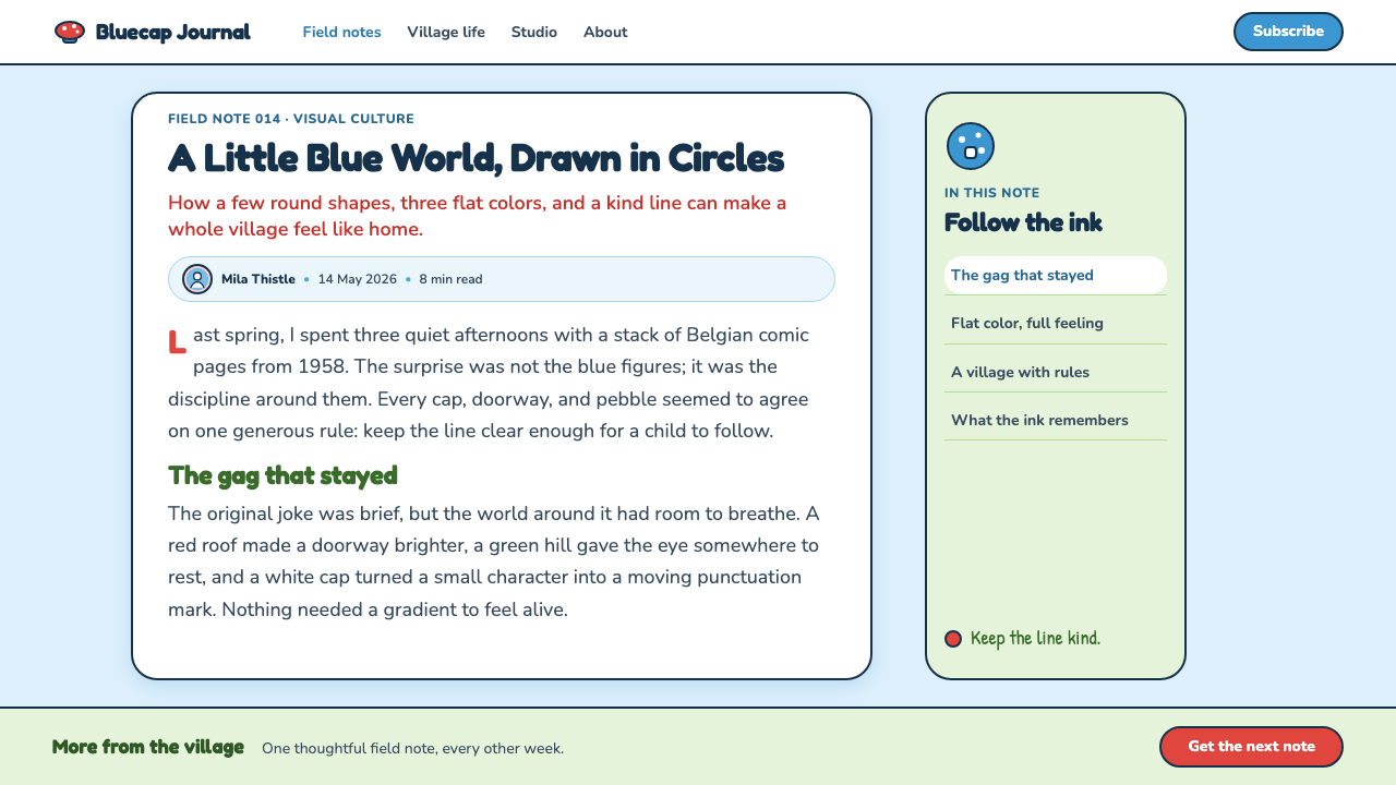
Where does The Smurfs (Peyo, 1958) come from?
The Smurfs debuted in 1958 in Johan et Pirlouit, then moved into albums from 1959 onward. That sequence matters because it explains the world’s compactness. The Smurfs did not begin as an abstract visual brand searching for a story; they arrived as comic characters whose silhouette, costume, and environment had to be understood instantly on the page. Their blue bodies, white caps, and rounded faces establish recognition before any individual scene or action is read.
The work belongs to Belgium’s bande dessinée tradition and is associated with the Marcinelle school of Brussels and Charleroi. The supplied description places its line within the soft Marcinelle approach, while also identifying it as a cartoon cousin of ligne claire. That combination is useful for designers: the drawing is clean enough to stay readable at a glance, yet soft enough that the world never acquires the detached, clinical feeling that a harder geometric outline can produce.
Peyo, also known as Pierre Culliford, is the central named creator. Yvan Delporte and André Franquin are also key figures in the supplied source material, placing the theme within a recognizably Belgian comic context rather than treating it as an isolated children’s illustration style. The named figures are a reminder that the visual language emerged from comic-making: clarity, repeatable characters, expressive poses, and environments that can support recurring stories all matter as much as decorative charm.
The golden run is identified as the 1970s and 1980s. Across the theme’s development, its visual identity remains anchored in the same basic commitments: a small-scale village, rounded forms, soft ink contours, and unmodulated color. This continuity is why the style reads as a world rather than a collection of motifs. A cap, mushroom, red accent, or blue figure gains force because it belongs to a tightly repeated system.
What defines the The Smurfs (Peyo, 1958) look?
Rounded Silhouette
The governing shape is the circle softened into character, object, and shelter. Bodies are pebble-like, noses are bulbous, caps curve gently, and mushroom roofs swell rather than jut. Even when an object is visually distinct, it belongs through roundness. This makes the world feel tactile and harmless: forms appear designed to be held, sat upon, or walked around rather than avoided.
Soft Ink Line
A single clean, confident outline holds the image together. It describes a face, a cap, a leaf, or a house without turning into engraving, texture, or expressive scratchiness. The line is decisive but not severe. It supplies separation between flat color regions while preserving the gentle, hand-drawn feeling central to the Marcinelle character of the style.
Flat Poster Color
Color arrives as complete areas rather than as light falling across a modeled surface. Blue skin, white clothing, greens, reds, and earthy mushroom elements are presented plainly, with no gradient or cross-hatching to suggest volume. The world gains clarity from that refusal. Depth is communicated through overlap, contour, scale, and placement, not through simulated lighting.
Cheerful Contrast
Sky blue, forest green, candy red, white, and ink establish a bright but controlled contrast. The palette is playful because the blue figures stand apart from their woodland setting, yet it remains coherent because the same few colors recur across costume, architecture, and props. Red acts as a lively punctuation rather than an all-over field, helping small details stay visible inside a visually busy village.
Picture-Book Space
The village reads as a place one could enter because its spaces are organized for immediate comprehension. Mushroom houses behave as landmarks, stools and paths create small pauses, and characters remain visually clear against their surroundings. This is not architectural realism. It is a story-friendly spatial logic in which every object helps the reader know where attention should go next.
No Surface Noise
The style avoids visual noise. There is no cross-hatched shading, no elaborate texture, and no atmospheric finish competing with the characters. Surfaces remain open enough for silhouettes, expressions, and color relationships to do the work. This restraint is essential: adding realistic texture or glossy depth would shift the village away from comic clarity and toward a different emotional register.

Who shaped The Smurfs (Peyo, 1958)?
Peyo, the name used by Pierre Culliford, is the named creator of The Smurfs. The visual world associated with the theme begins with the 1958 debut of these blue characters in Johan et Pirlouit and continues through albums from 1959 onward. His importance to the style lies in the completeness of its recurring visual language: character, costume, village, and color all read as parts of one comic environment.
Yvan Delporte is identified in the supplied material as a key figure connected with the theme. His inclusion situates The Smurfs within the collaborative Belgian comic culture surrounding bande dessinée and the Marcinelle context. For a design reading, that context matters because the style is built for serial communication: characters must remain clear, settings must remain welcoming, and visual rules must survive repeated stories.
André Franquin is likewise named as a key figure in the source material. Alongside Peyo and Yvan Delporte, his presence marks the theme’s relationship to the Belgian comic world rather than to a standalone decorative trend. The useful lesson is not imitation of isolated marks, but respect for a shared language of readable line, expressive roundness, and environments designed to support character action.
How do you use The Smurfs (Peyo, 1958) today?
For presentation covers, use the style as an invitation into a small, coherent world. Place one rounded hero object or character-like silhouette against an open field, supported by a mushroom, leaf, cap-like curve, or red accent. Keep the title clear and friendly rather than grandiose. On content slides, let softly outlined panels, rounded illustrations, and generous open areas organize information. The goal is not to turn every slide into a comic strip, but to preserve the sense that each section belongs to the same welcoming village.
Data slides can borrow the style’s clarity without becoming childish. Treat charts as flat, legible objects with restrained outlines and a small recurring palette. Use blue as a focal category, green for environmental or supporting groups, red for a meaningful highlight, and white space to keep comparisons readable. Avoid glossy charts, dimensional rendering, and dense texture. The strongest result feels like a clear illustrated map: lively enough to remember, simple enough to scan.
For web interfaces, this approach suits educational products, family-facing services, community spaces, onboarding flows, and playful dashboards. Use rounded containers and soft outlines to establish a friendly hierarchy; reserve the brightest accents for action, status, or a single important feature. Cards should feel like objects placed in a picture-book space, not floating glass panels. Navigation works best when labels remain plain and direct, with illustration supporting orientation rather than replacing it.
In editorial and marketing work, the Smurfs vocabulary is especially useful for explainers, event pages, product stories, and campaigns that need optimism without visual clutter. A mushroom-house motif can frame a section, a curving path can guide a sequence, and a compact illustrated village can turn several related ideas into one scene. Keep copy blocks easy to enter, using imagery as a companion to reading rather than as a decorative screen placed over it.
The common mistake is to borrow blue characters, mushrooms, or candy-bright accents while abandoning the system that makes them convincing. Sharp geometry, metallic gloss, dramatic lighting, dense gradients, or highly textured surfaces break the picture-book contract. Another mistake is crowding every area with motifs. The original charm depends on open flat areas, clear outlines, repeated rounded shapes, and a limited set of visual signals. Let happiness come from coherence, not from adding more cute objects.
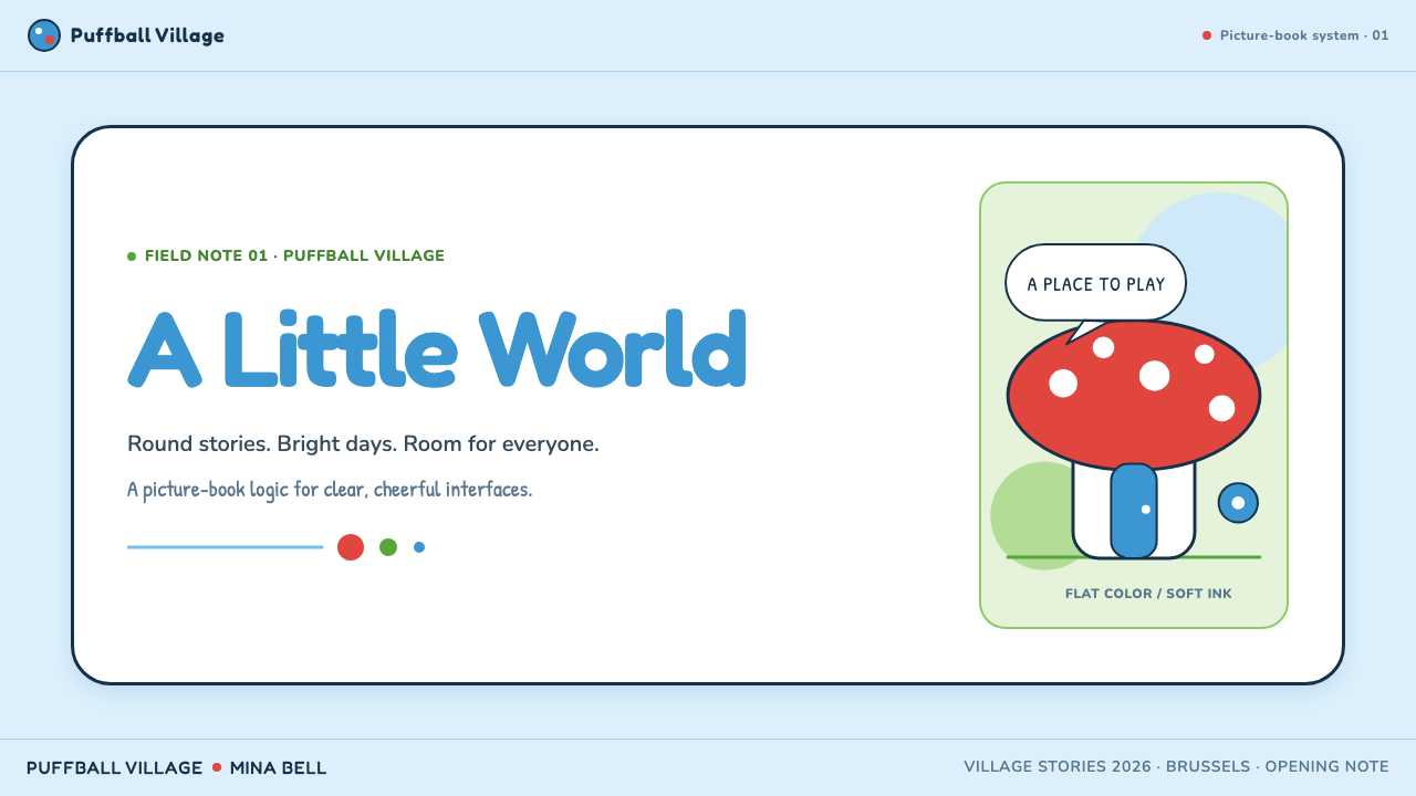
The Smurfs (Peyo, 1958) — FAQ
Is The Smurfs style simply a children’s cartoon style?
It is child-friendly, but reducing it to that label misses its discipline. The style uses a tightly connected system of rounded silhouettes, flat fills, soft outlines, and repeated village motifs. Its accessibility comes from clarity rather than simplification alone. Designers can use that clarity in educational, editorial, community, or interface work without copying a children’s product, provided the result preserves the gentle spatial logic and controlled visual vocabulary.
Why do flat colors work so well in this world?
Flat color keeps the reader’s attention on silhouette, expression, and relationship. A blue figure remains immediately distinct from a green setting, while white caps and red accents stay legible as small signals. Because the line carries form and overlap carries depth, color does not need to imitate lighting. The result is a world that can be visually rich without becoming visually noisy.
Can the style work without drawing Smurf-like characters?
Yes. Its transferable qualities are rounded object design, clean soft contours, flat color fields, mushroom-village spatial warmth, and a small recurring palette. A learning tool might use rounded books, plants, paths, and houses; a community page might use simple objects that imply gathering and care. The work should reference the visual principles, not depend on copying the original characters or costume details.
What most often makes a Smurfs-inspired layout feel wrong?
Usually it is a mismatch between motif and rendering. A mushroom paired with sharp shadows, metallic surfaces, realistic texture, or dramatic depth belongs to another visual language. Overuse also causes trouble: if every panel contains a character, leaf, cap, and mushroom, the layout loses the open calm that makes the village feel inviting. Choose a few rounded motifs, let flat color stay flat, and allow the ink line to carry definition.
Related design styles
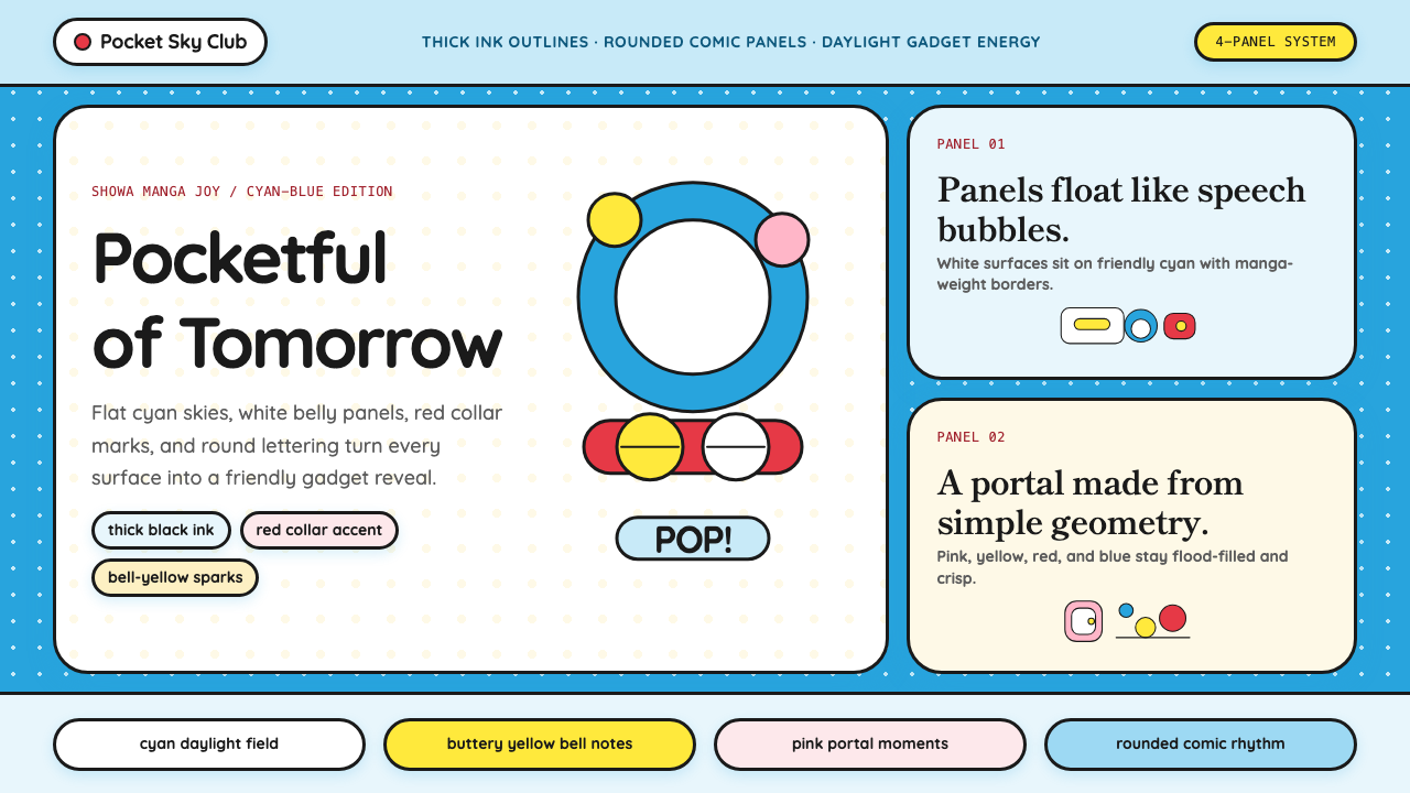 DoraemonChildhood joy, inked bold. Cyan fields, white panels, red collars, and rounde…
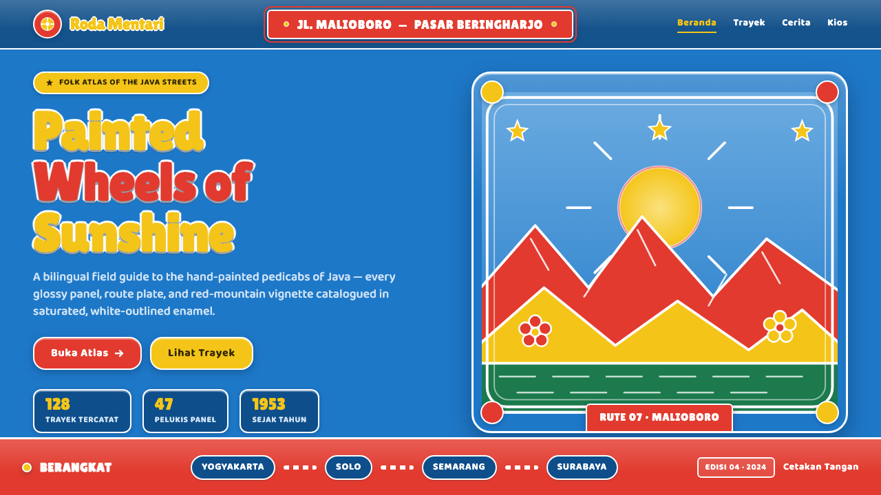 Javanese Becak Folk ArtFolk painting at full volume. Sky-blue enamel, red mountains, white-outlined…
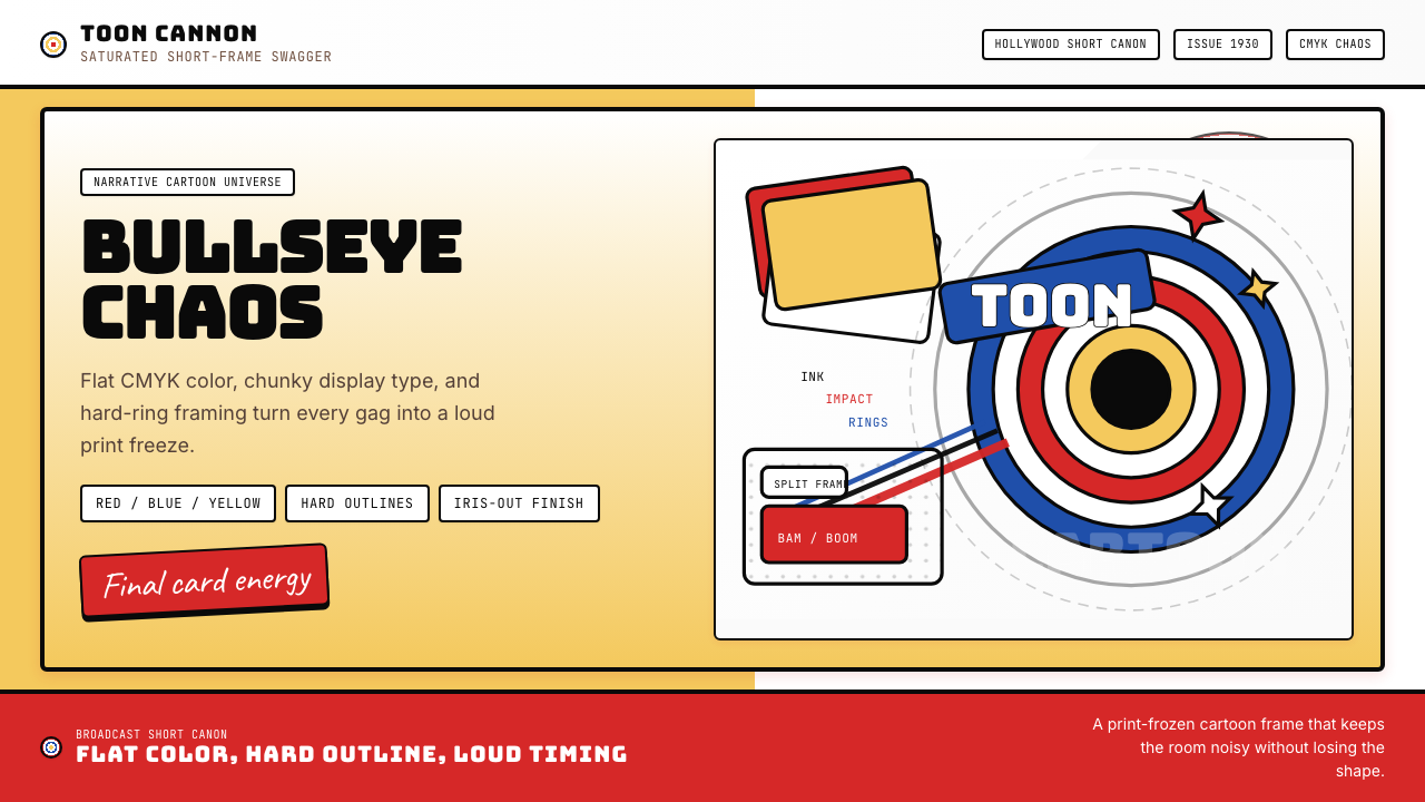 Looney Tunes (Warner Bros.)Pure cartoon chaos. Bull's-eye rings, Bungee type, and red-blue-yellow blocks.
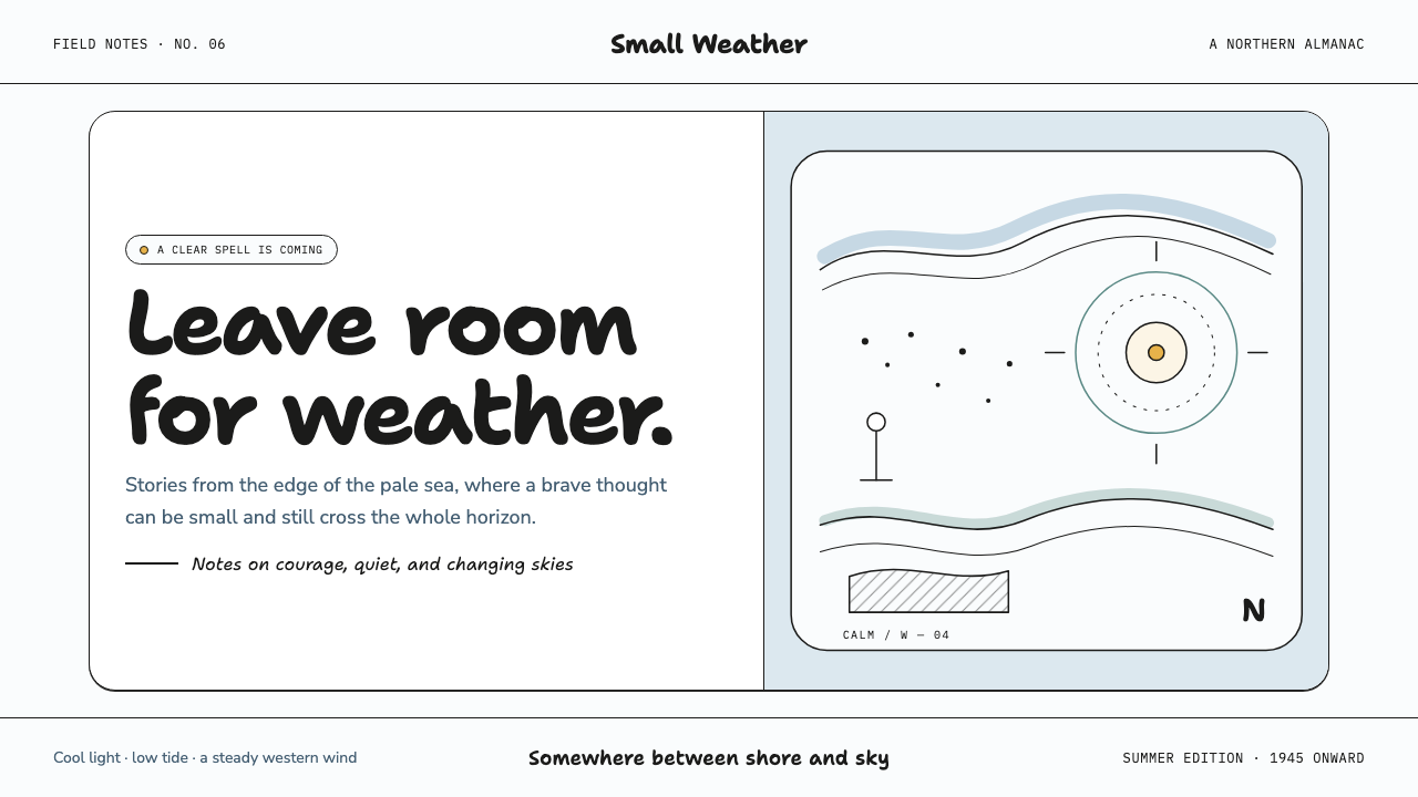 Moomin (Tove Jansson ink)Quiet makes the story brave. Fine black ink drifts through cool white and Bal…
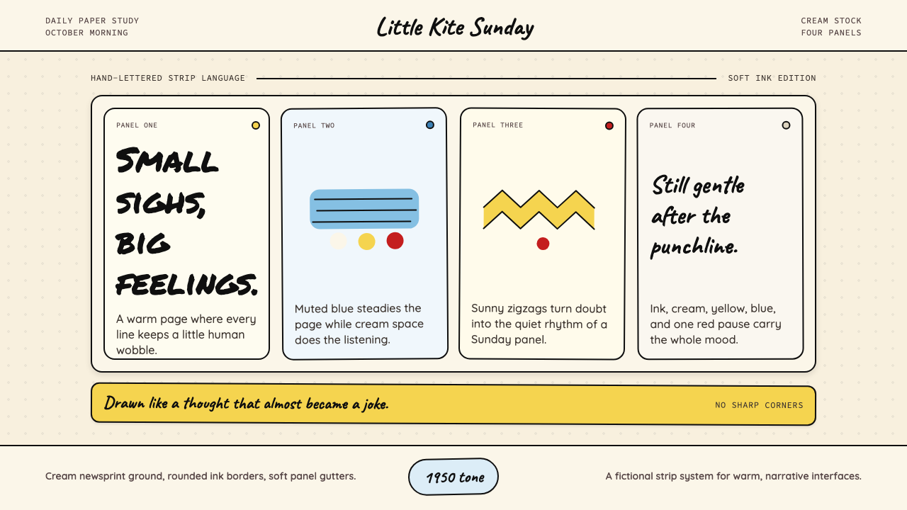 Peanuts Comic Schulz (1950)Gentle melancholy on newsprint. Caveat lettering, cream panels, yellow and bl…
 Pink Panther Cartoon (1963)Cool silence with a grin. Pink field, black ink, cream cel space.