What is Javanese Becak Folk Art?
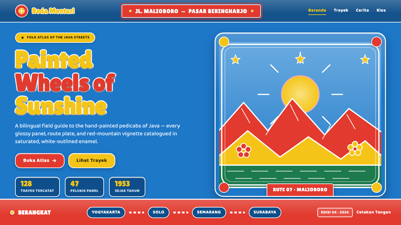
Javanese becak folk art turned a working vehicle into a rolling signboard — glossy sky-blue enamel, cheerful primary colours, and hand-painted scenes outlined like a roadside poster.
Javanese Becak Folk Art in brief
Javanese becak folk art is the decorative language of the Indonesian cycle rickshaw: steel body panels coated in glossy sky-blue enamel, then covered with naive mountains, fields, flowers, and bold route lettering. Its charm comes from treating transportation as a public canvas. The vehicle is practical, but its appearance is celebratory, visible, and made to lift the mood of an ordinary street.
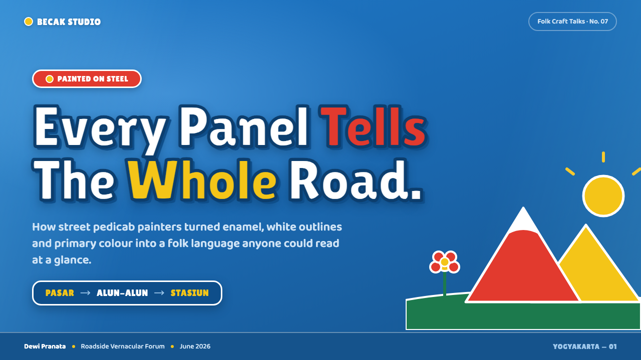
The imagery is deliberately simple rather than naturalistic. Red and yellow mountains rise behind green fields; flowers appear as bright, legible bursts; white outlines separate every shape from the saturated ground. Lettering is chunky, rounded, and poster-like, often functioning as both information and ornament. Nothing aims for quiet neutrality. The whole system speaks at full volume.
This design system translates that tradition into digital form without turning it into polished corporate illustration. The blue ground should feel like painted enamel, the primary colours should remain vivid, and the white outlines should act as a unifying visual frame. The result is sunny, handmade, and slightly irregular: a screen language inspired by the optimism of a Javanese street corner.
Where does Javanese Becak Folk Art come from?
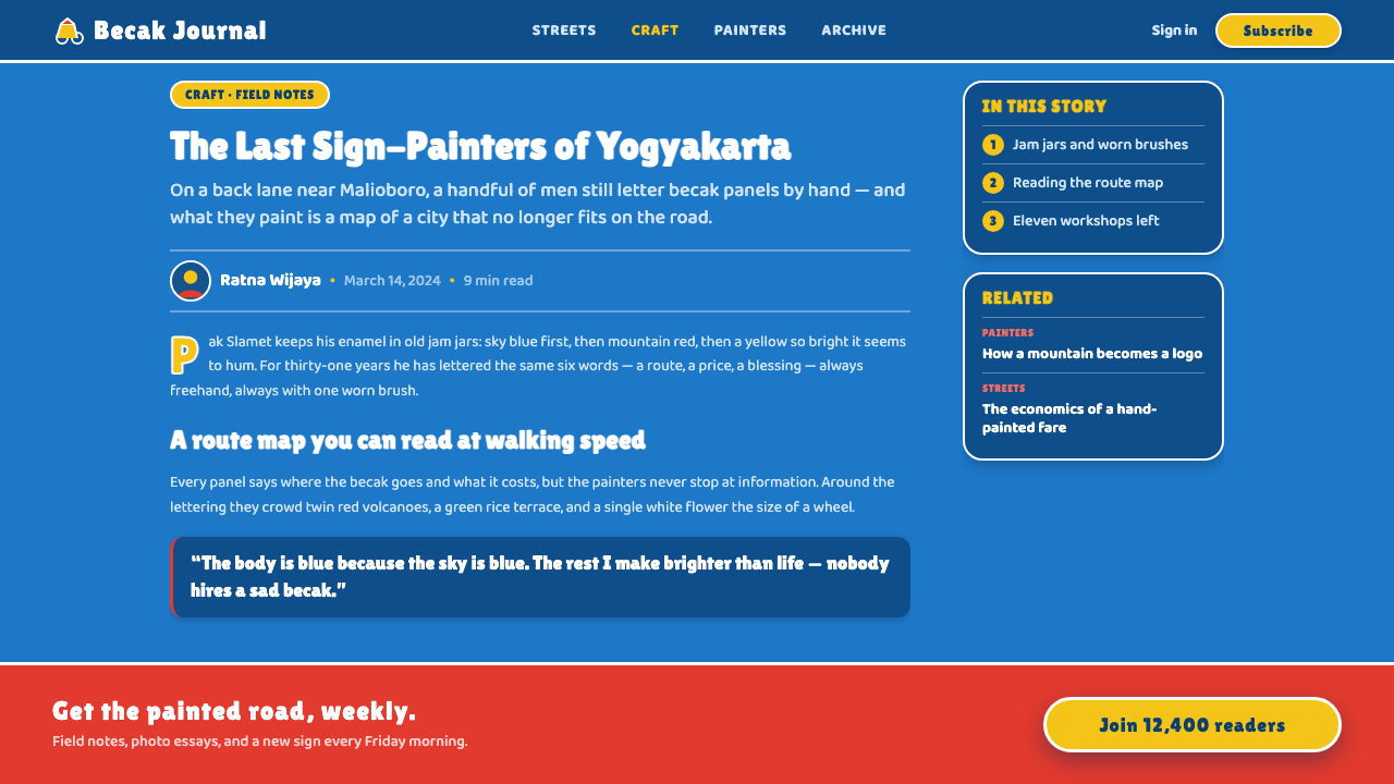
The becak is an Indonesian cycle rickshaw whose steel body panels became a rolling folk canvas. During the golden age of hand-painted Indonesian pedicabs, from 1950 to 1990, roadside sign-painters decorated working vehicles with vivid enamel colour and simple illustrative scenes. The decoration was not separate from daily life; it travelled through the same streets as the people who used it.
The visual tradition belongs to Java and, more broadly, to Indonesia across Southeast Asia. Its strongest identity comes from the combination of a sky-blue enamel ground and high-gloss saturated primaries. Red and yellow mountains, green fields, and bright flowers create a small scenic world on the vehicle body, while white-outlined lettering gives the surface the authority of a painted signboard.
The makers were largely anonymous. Anonymous becak sign-painters, enamel panel decorators, and roadside lettering artists formed the tradition through repeated practical work rather than through a named school or single canonical author. Their contribution was both pictorial and typographic: they made scenery, colour, and route information belong to one continuous hand-painted surface.
This design language survives as a system of attitudes as much as a collection of motifs. It values visibility over restraint, directness over polish, and cheerful invention over uniform finish. Translating it to screens means preserving the sense that every panel is a public-facing canvas: a strong coloured ground, bold outlined lettering, and small illustrative vignettes arranged to be read quickly from the street.
What defines the Javanese Becak Folk Art look?
Enamel Ground
The ground is a vivid sky blue with the visual presence of glossy enamel on painted steel. It is not a quiet background or neutral canvas; it establishes the cheerful atmosphere before any illustration appears. Surfaces should feel solid, saturated, and slightly reflective in spirit, while remaining graphic rather than photorealistic.
Primary Colour Volume
Red, yellow, green, blue, and white are used with confidence and little dilution. Red and yellow carry the scenic energy, green supplies the fields, blue holds the surrounding atmosphere, and white separates forms. The palette should feel abundant and public-facing, as if designed to remain legible in the movement of a street.
White-Outlined Lettering
Lettering is chunky, rounded, and outlined in white like hand-painted poster type. The outline is not a fine technical border; it is a bold separation device that lets words hold their ground against the enamel colour. Text can behave as a sign, a route marker, and a decorative band at the same time.
Naive Scenic Vignettes
Illustrations use simplified mountains, fields, and flowers rather than detailed perspective or realistic modelling. Their appeal lies in immediate recognition and handmade warmth. Small scenes may sit beside type or occupy a panel as a complete view, but each should remain clear, bright, and pictorially direct.
Panel Composition
The visual field behaves like a decorated vehicle panel: colour blocks, lettering, and vignettes share one continuous surface. Composition can be layered and lively, but every element should feel painted onto the same object rather than floating in separate interface boxes. White outlines help maintain unity when the scene becomes busy.
Cheerful Irregularity
The style depends on evidence of the human hand: rounded forms, emphatic outlines, and arrangements that feel painted for a particular vehicle rather than generated from a universal template. Irregularity should add character without damaging recognition. The goal is not messiness, but a warm refusal of sterile uniformity.
Who shaped Javanese Becak Folk Art?
These unnamed roadside artists turned the cycle rickshaw into a moving public image. Their work joined scenery, lettering, and colour on a single working surface, establishing the tradition’s directness and its cheerful visual volume. Because the makers were anonymous, the style is best understood as a shared vernacular practice rather than an individual signature.
The enamel panel decorators gave the becak its glossy colour ground and its durable visual presence. Their contribution was not merely a coating: the painted steel became the setting in which mountains, fields, flowers, and lettering could hold together as one vivid composition.
Roadside lettering artists shaped the system’s typographic voice. Their bold white-outlined route lettering had to function at a glance, yet it also became part of the vehicle’s ornament. In the digital translation, this dual role remains essential: words should inform the composition while adding its most recognizable graphic rhythm.
How do you use Javanese Becak Folk Art today?
For presentation slides, use the sky-blue enamel ground as a strong opening field and let a single scenic vignette or outlined title establish the visual world. Content slides can organize information through painted-panel groupings: one rounded heading, a compact text area, and a small mountain, field, or flower motif. Data slides should turn charts into cheerful pictorial objects, using primary colour blocks and white separation so information stays readable inside the exuberance.
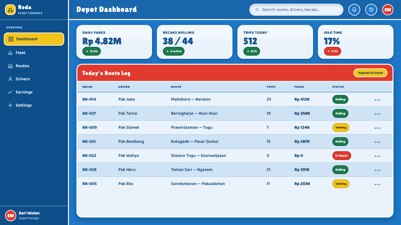
For web interfaces, the style suits dashboards and pricing pages that need energy, memorability, and immediate scanning. A saturated blue shell can hold clear white labels, while red, yellow, and green distinguish states, categories, or plan tiers. Cards should feel like connected painted panels rather than floating glass surfaces. Outlined buttons, chunky type, and small scenic indicators can make functional controls feel public, friendly, and unmistakably hand-made.
For editorial and marketing work, treat the page as a roadside signboard with a strong visual face. Headlines can use rounded poster lettering with a confident white outline, while article sections sit inside broad colour fields or illustrated vignettes. Campaigns benefit from the style’s cheerful directness: a product or message can be placed against blue enamel, surrounded by flowers, mountains, or fields, and made memorable through repetition of the same outlined graphic language.
For branded communications, the system works especially well when the subject is local, optimistic, practical, or community-facing. Route-like labels, illustrated panels, and saturated scenery can give a service the feeling of belonging to a real street rather than an abstract digital marketplace. Keep the illustration vocabulary small and reusable so the work feels like one painted vehicle with many panels, not a collection of unrelated images.
The common mistake is to borrow the blue-and-primary palette while removing the folk character. Overly precise geometry, immaculate gradients, soft atmospheric shadows, or thin fashionable lettering can make the result feel like generic contemporary branding. Another mistake is filling every surface with equal intensity. The style needs clear white outlines, readable type, and moments of open blue ground so its exuberance remains organized rather than noisy.
Javanese Becak Folk Art — FAQ
What is Javanese becak folk art?
It is the hand-painted decorative tradition associated with Indonesian cycle rickshaws, especially during the 1950–1990 golden age. Steel vehicle panels were covered in glossy sky-blue enamel, then painted with simple red and yellow mountains, green fields, bright flowers, and bold white-outlined route lettering. The result was a working vehicle that also functioned as a rolling folk canvas.
Why is sky blue so important to the style?
Sky blue is the enamel ground that gives the whole visual language its first impression. It feels glossy, open, and sunny while providing a strong field for saturated scenery and white lettering. In a digital application, it should be treated as an active compositional surface, not as a passive background beneath more important elements.
Should every design use mountains, flowers, and fields?
No. They are the core scenic vocabulary, but the deeper principle is the use of simple, cheerful vignettes that feel painted onto a shared panel. A design can use only one motif, or rely mainly on lettering and colour, as long as it preserves the naive directness, vivid enamel ground, and white-outlined graphic unity of the tradition.
Can this style be used for a serious product or dashboard?
Yes, if seriousness means clarity and practical usefulness rather than restraint. Strong colour blocks, outlined labels, and pictorial state markers can make information easier to recognize and remember. The system becomes less suitable when the product depends on quiet luxury, subdued emotion, or highly formal authority; its natural voice is optimistic, visible, and community-facing.
How can a digital version stay faithful without looking like a costume?
Preserve the relationships rather than copying every motif. Use the enamel blue as a continuous ground, let primary colours carry the energy, give lettering a substantial rounded presence, and use white outlines to unify illustrations and information. Allow slight irregularity and avoid excessive polish. The style feels authentic when the interface behaves like a painted public object, not when it merely applies folk imagery as surface decoration.
Related design styles
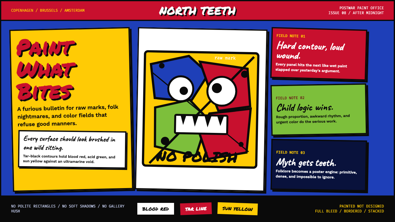 CoBrA (Asger Jorn, 1948)Paint refuses polish. Ultramarine ground, blood red slabs, and marker type th…
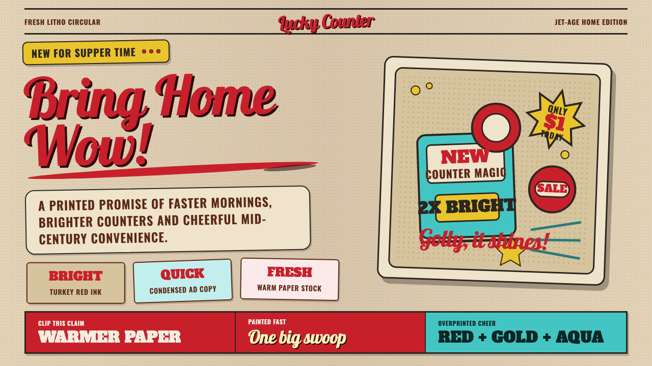 1950s Brush Script AdSells tomorrow in one swoop. Turkey red script, tan paper, starbursts, and ha…
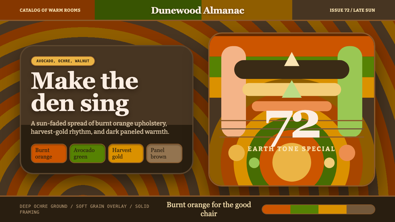 1970s Earth TonesWarm maximalism stays muddy. Bulbous slabs, avocado bands, and harvest-gold r…
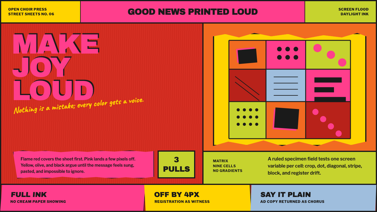 Corita Kent SerigraphJoy printed at full volume. Flame red, hot pink, and misregistered type flood…
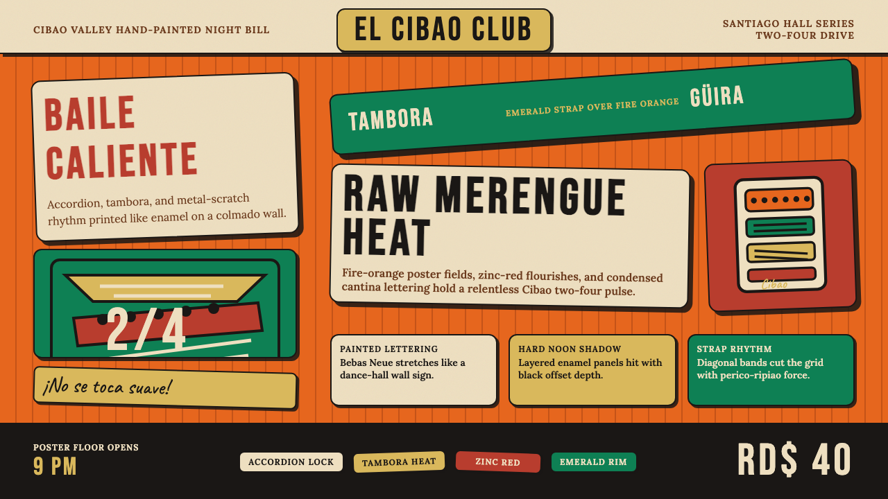 Dominican Merengue Perico RipiaoMaximalism keeps time. Fire-orange fields, Bebas Neue, and diagonal emerald s…
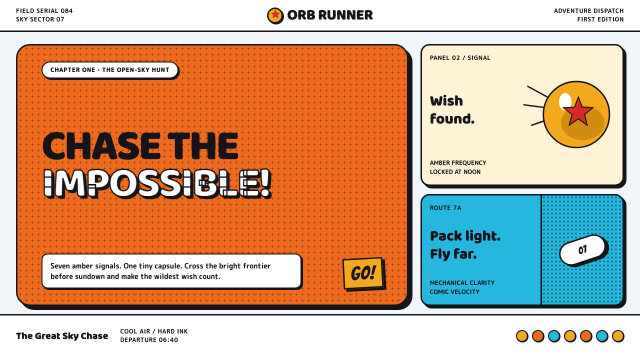 Dragon Ball (1984)Adventure lands with comic force. Gi-orange panels, amber spheres and crisp h…