What is Dragon Ball (1984)?
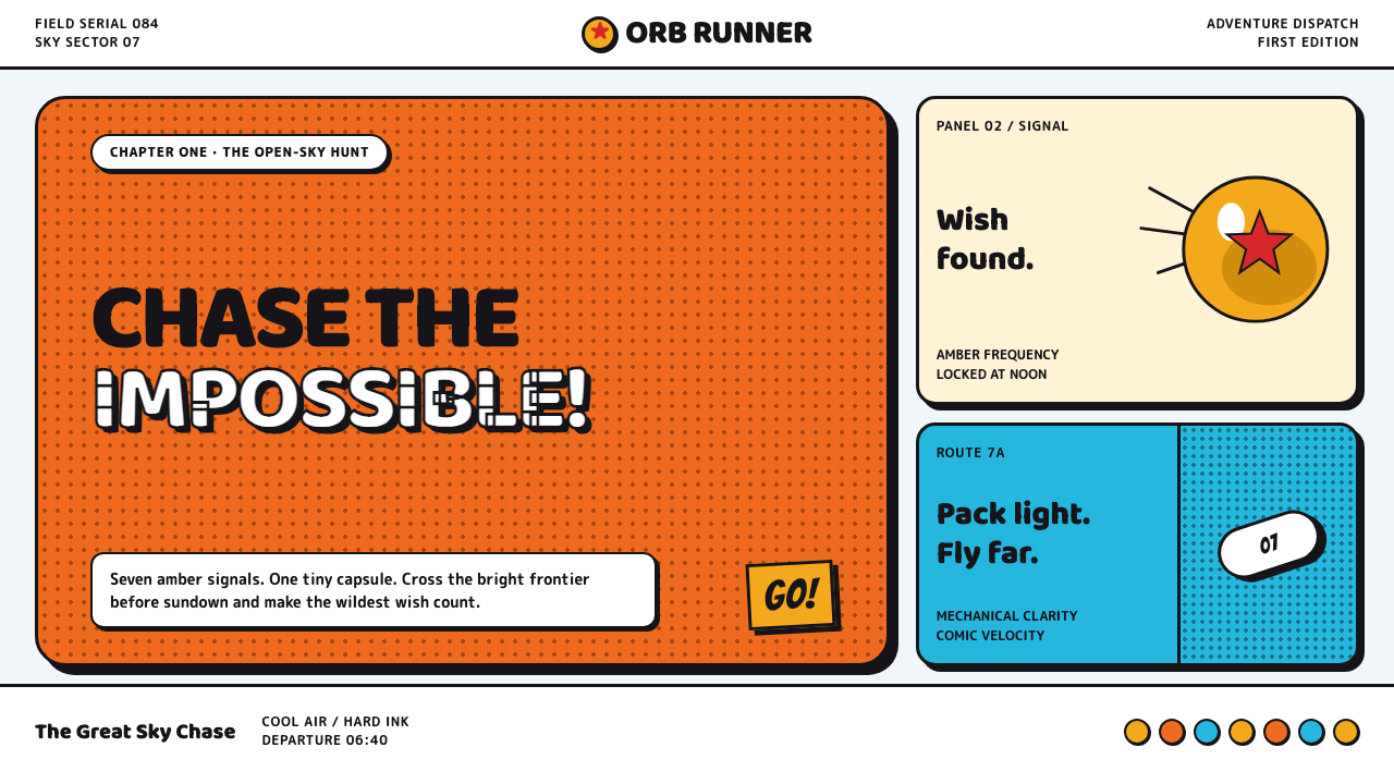
Dragon Ball turns a desert quest into clean-lined comic velocity: gi-orange impact, amber spheres, strange machines, and a sky alive with crisp halftone.
Dragon Ball (1984) in brief
Dragon Ball is the original manga world Akira Toriyama drew for Weekly Shōnen Jump, before the franchise became associated with glowing blond transformations. Its early visual identity follows a monkey-tailed child pursuing seven amber wish-orbs across a desert populated by mushroom-like mecha, dinosaur bandits, gadgets, and improbable vehicles. Adventure is the organizing principle, but the tone remains elastic: danger, comedy, machinery, and wonder share the same page without needing to be separated.
The look is rooted in manga reproduction and in the force of ink. Heavy black keylines give figures, vehicles, rocks, and architecture immediate legibility. Burnt training-gi orange sits against pale open sky, while screen-tone halftones create shade without filling the page with painterly atmosphere. The result feels bright, open, and printable: a world that can hold a sudden fistfight, a visual gag, and a wide desert horizon in one composition.
Toriyama’s car-design-school background is visible in the mechanical confidence of the imagery. Objects are rounded, toy-like, and inviting, yet their linework makes their construction feel unusually clear. A capsule can contain an entire vehicle; a gadget can be as memorable as a character; a machine can be absurd without becoming visually confusing. Dragon Ball’s early style treats functional readability and comic pleasure as the same design problem.
Where does Dragon Ball (1984) come from?
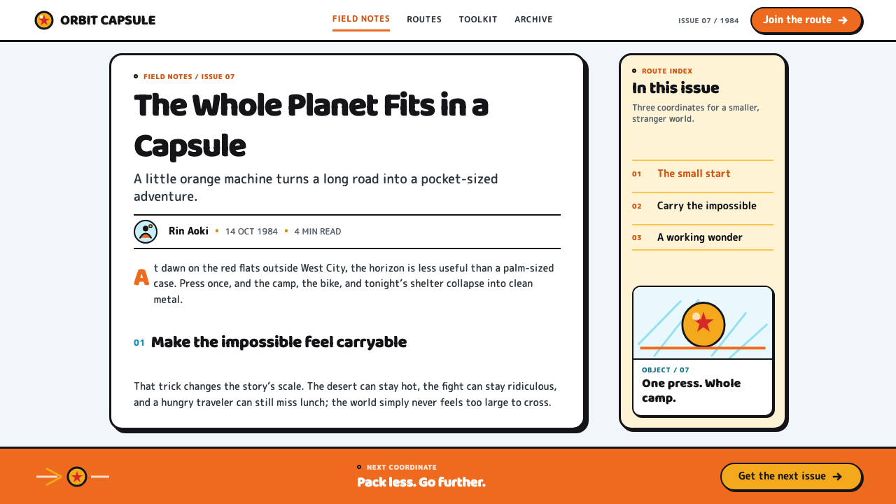
Dragon Ball began in Tokyo, Japan, as a manga published from 1984 to 1995. The early arcs from 1984 through 1989 established the visual territory most closely associated with this theme: a wide, pale desert; amber wish-orbs; training-gi orange; exaggerated creatures; and equipment that turns every journey into an opportunity for a visual invention. The setting is not presented as a realistic future or a historical past. It is an adventure-comedy planet whose logic is carried by drawing.
The work belongs to shōnen manga, but its particular identity comes from the collision of action with play. A chase, a fight, or a discovery can arrive with physical impact, then immediately bend toward comedy. This lets the page stay energetic without becoming severe. The visual system needs strong silhouettes and decisive outlines because the reader must understand an action at once, even when the world introduces a dinosaur, a bandit, a vehicle, and a joke in rapid succession.
Toriyama mecha-pop gadget design gives the style its special texture. Mechanical forms are not treated as cold industrial hardware. They are compact, bulbous, charming, and engineered enough to seem usable within the fiction. Mushroom-like mecha and capsule-scale inventions place the mechanical beside the organic and the absurd. Their design clarity keeps the fantastical world coherent: every object appears to have a purpose, even when that purpose is delightfully strange.
The source identifies Akira Toriyama, Kazuhiko Torishima, and Daisuke Nishio as key figures in the theme’s context. Together with the Jump adventure-comedy tradition, the original manga run frames Dragon Ball as an image system built for momentum and recall. Its essential vocabulary remained strongest in the early period: inked contours, open air, halftone shadow, orange fabric, amber objects, and machinery that lands with the same comic force as a punchline.
What defines the Dragon Ball (1984) look?
Black Keylines
Heavy black outlines are the system’s main instrument of clarity. They separate a character from desert sky, define the moving parts of a gadget, and let a gag land before the reader has to inspect detail. The line is confident rather than delicate: it carries action, shape, and personality at once.
Gi Orange and Amber
Burnt orange functions as an immediate human signal within broad, pale surroundings. Amber wish-orbs supply a second warm focal note, making the quest visible as an object language rather than an abstract plot. These warm accents work because the surrounding page stays breathable and open.
Halftone Sky
Screen-tone halftones shade the world with the unmistakable logic of a manga page. They create atmosphere while preserving the flat, reproducible character of inked art. Halftone is not a soft cinematic veil here; it is a crisp graphic field that can suggest sky, distance, surface, or a sudden change in mood.
Mecha-Pop Forms
Vehicles and devices are rounded, compact, and mechanically legible. Their friendliness is important: even when a machine is strange, it looks designed to be touched, driven, opened, or carried. The forms make technology part of the adventure’s humor rather than a separate technical layer.
Open Desert Space
Pale sky and desert openness give the style room to accelerate. Figures and machines can read in silhouette because they are not crowded by dense scenery. The empty field also makes every arrival matter: a small vehicle, a dinosaur bandit, or an amber sphere becomes an event against the horizon.
Comic Impact
The style allows force and silliness to coexist. A fistfight can be funny, and a beautiful gadget can be absurd. This prevents action imagery from becoming solemn: impact comes from clear staging, emphatic linework, and the surprise of what enters the frame next.
Who shaped Dragon Ball (1984)?
Toriyama inked the original Dragon Ball world for Weekly Shōnen Jump. The source links his car-design-school background to the mechanical clarity of the work: rounded forms remain toy-like and humorous while their linework stays unusually readable. His approach makes character, gadget, vehicle, and joke feel designed within one visual language.
Kazuhiko Torishima is named among the key figures connected with the Dragon Ball theme. Within the supplied context, that placement situates the work inside the original Tokyo manga environment and the Jump adventure-comedy movement that shaped its public identity.
Daisuke Nishio is also identified as a key figure in the supplied Dragon Ball context. His inclusion marks the theme as larger than an isolated collection of images: the early manga vocabulary of orange, amber, black keylines, open sky, and comic machinery became a recognizable franchise-facing visual world.
How do you use Dragon Ball (1984) today?
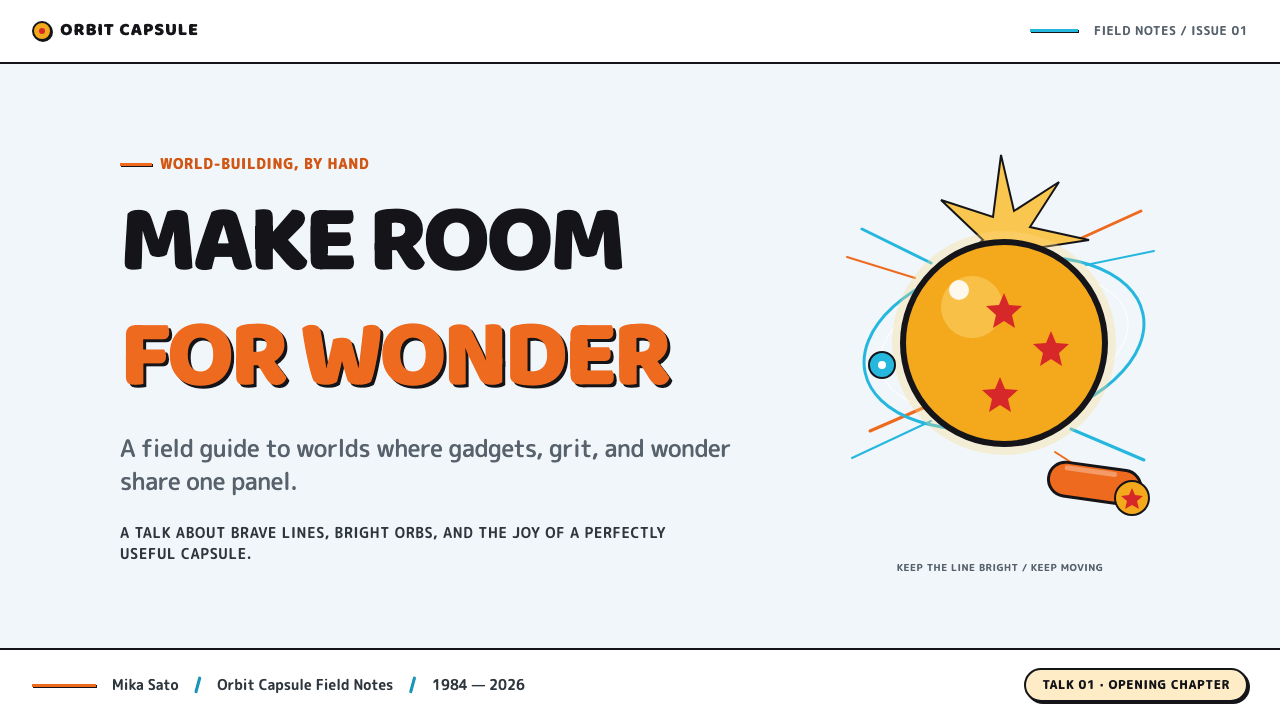
For presentation covers, use the adventure premise as composition rather than decoration. Set a bold title against a pale, spacious field, then introduce one decisive orange figure-like shape, one amber orb-like focal point, or one rounded mechanical silhouette. The cover should feel as though something has just crossed the horizon. Keep secondary information quiet so the main object retains the sudden, comic arrival that defines the source imagery.
For content and data slides, borrow the manga page’s legibility. Use strong black structural lines, generous open space, and clear grouping rather than trying to imitate a literal comic panel. A process can become a quest route, a category can become a capsule-like container, and a highlighted metric can take the visual role of an amber sphere. Charts should remain straightforward and readable; the style enters through outline, silhouette, spacing, and warm focal accents, not through decorative clutter.
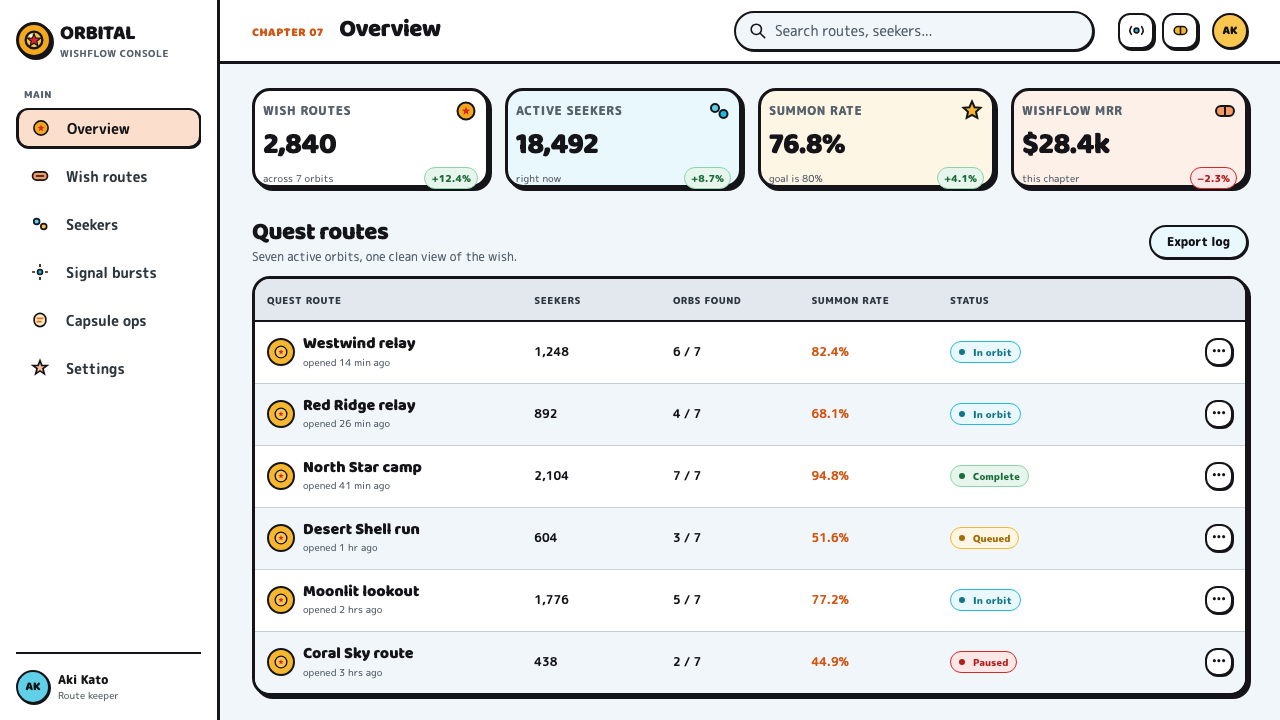
For web interfaces, this language suits dashboards, collection browsers, pricing pages, and product surfaces that benefit from energetic scanning. A pale background can hold black navigation, rounded utility shapes, restrained orange calls to action, and amber markers for progress or discovery. Treat icons as tiny engineered objects with clear contours. Avoid dense atmospheric imagery behind controls, because the original style depends on immediate recognition and enough empty sky around each important thing.
For editorial and marketing work, Dragon Ball’s early look can frame an article or campaign as an expedition through a strange, hospitable world. Let a hero image behave like a chapter splash page: one clear subject, a broad field, and texture supplied by halftone rather than visual noise. Product features can be introduced as compact inventions, while section changes can feel like new stops on a desert route. The tone should stay playful and direct, never grim or hyper-polished.
The common mistake is reducing the style to orange clothing, amber circles, and generic anime energy. That produces costume without the visual grammar. The more faithful application preserves the contrast between open space and decisive contour, the balance between engineered objects and comic absurdity, and the printable clarity of halftone shading. Do not crowd every area with machinery or use every warm accent at once; a single readable object can carry more adventure than a busy collage.
Dragon Ball (1984) — FAQ
Is this the look of all Dragon Ball eras?
No. This theme is specifically anchored in Dragon Ball from 1984 and in the original manga world before the franchise became associated with glowing blond transformations. Its strongest references are the early arcs from 1984 through 1989: desert adventure, amber wish-orbs, training-gi orange, halftone sky, and comic machinery.
Should a Dragon Ball-inspired design look like a literal manga page?
Not necessarily. The transferable principles are heavy keylines, halftone shading, broad pale space, readable mechanical forms, and a comic sense of impact. A modern interface or presentation can use those principles without copying panels, characters, or scenes. The goal is to preserve the source’s clarity and adventurous rhythm.
Why are the machines so important to the aesthetic?
The machines express the source’s central contradiction: they are engineered with clarity but drawn with humor. Toriyama’s car-design-school background is reflected in rounded devices, vehicles, and capsule-scale inventions that appear mechanically understandable while remaining playful. They make the world feel designed rather than merely decorated.
What should be avoided when adapting the style for a product?
Avoid visual congestion, vague anime-like effects, and ornamental detail that weakens the drawing’s immediate readability. The original vocabulary works through a few strong decisions: black contour, pale open field, warm focal color, halftone texture, and one memorable strange object. If every element competes for attention, the comic force disappears.
Related design styles
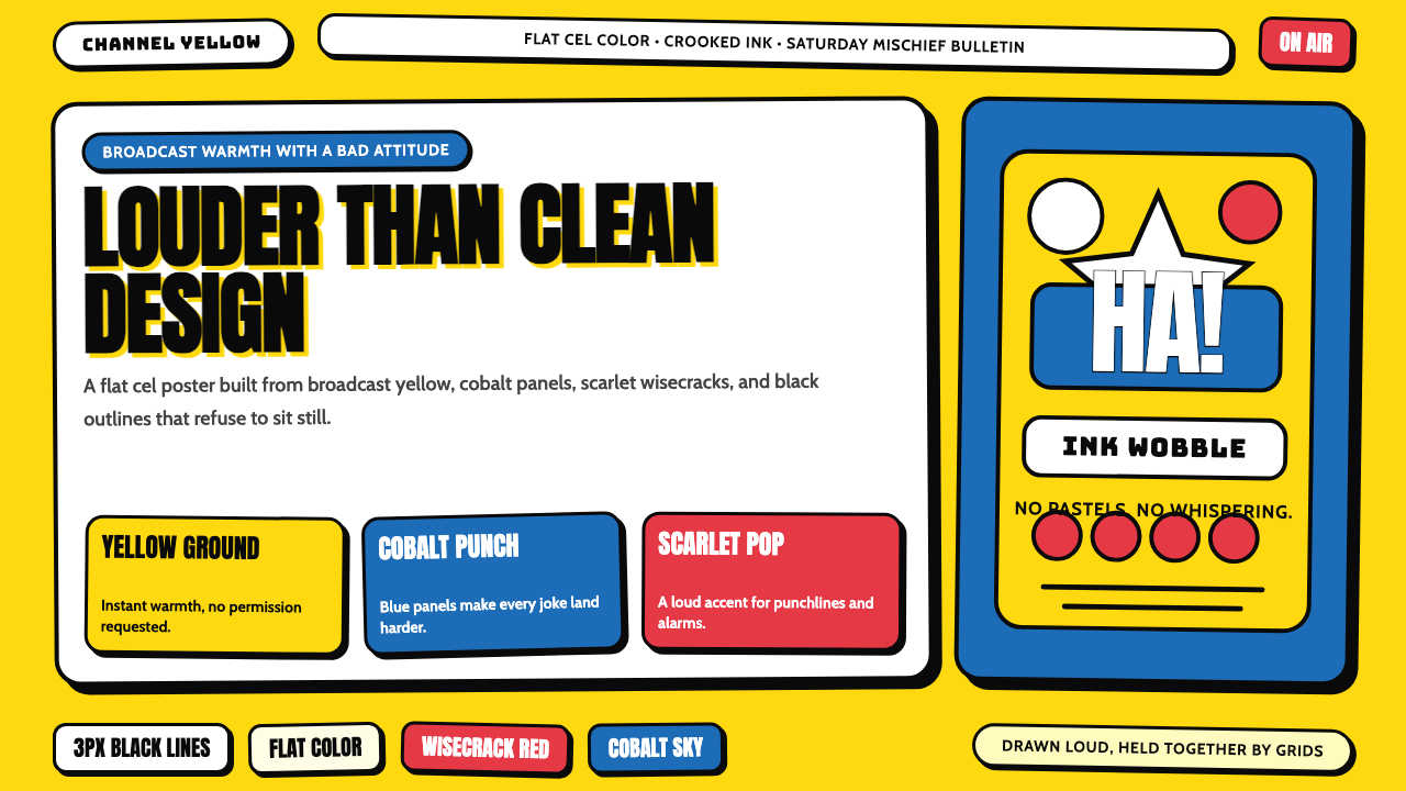 The Simpsons YellowCartoon warmth misbehaves. Yellow ground, cobalt panels, thick wobbly black l…
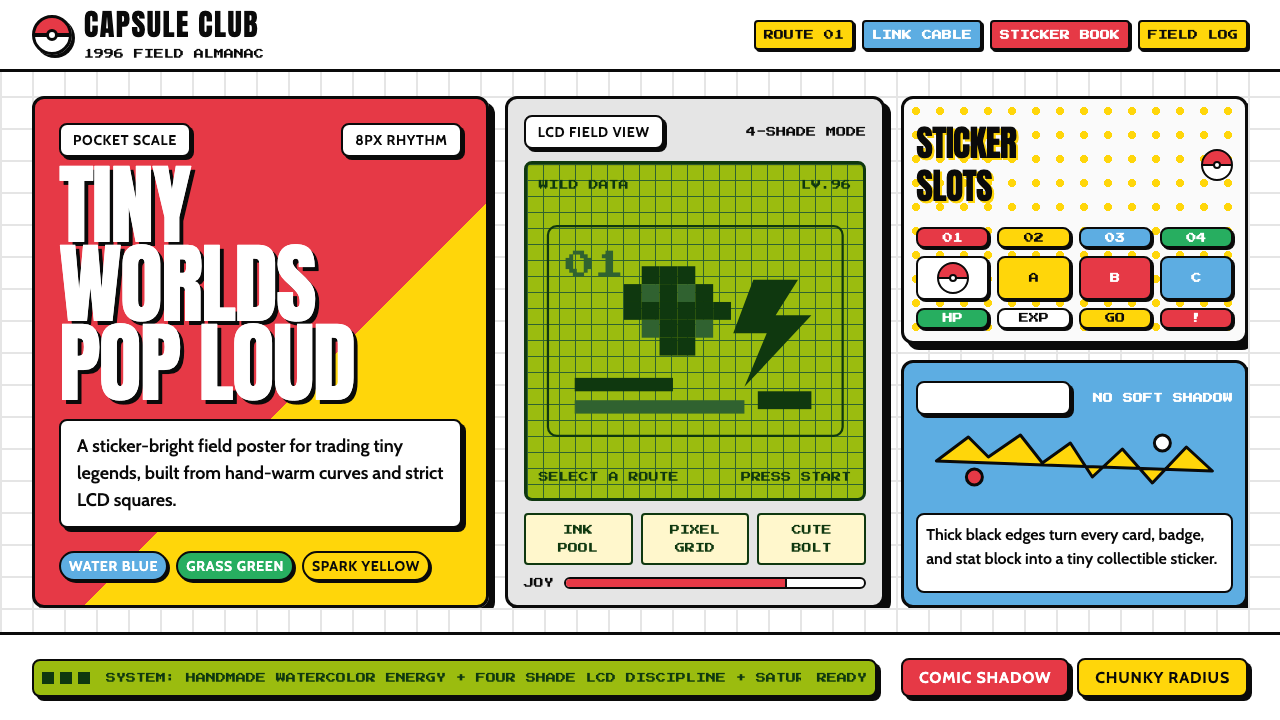 Pokémon Game BoyKawaii meets cartridge logic. Capsule red, LCD green, Anton heft, and 8px gri…
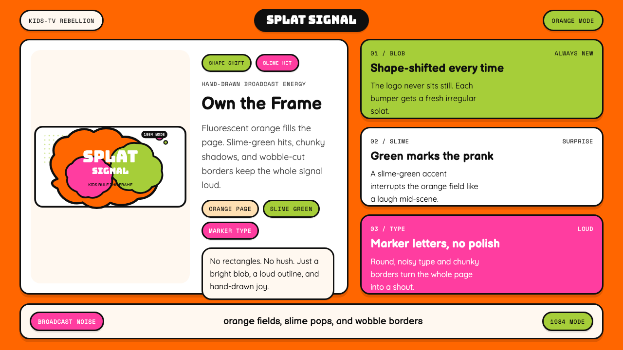 Nickelodeon Orange Splat (1984)Kids own the screen. Orange fields, slime-green pops, and wobble borders do t…
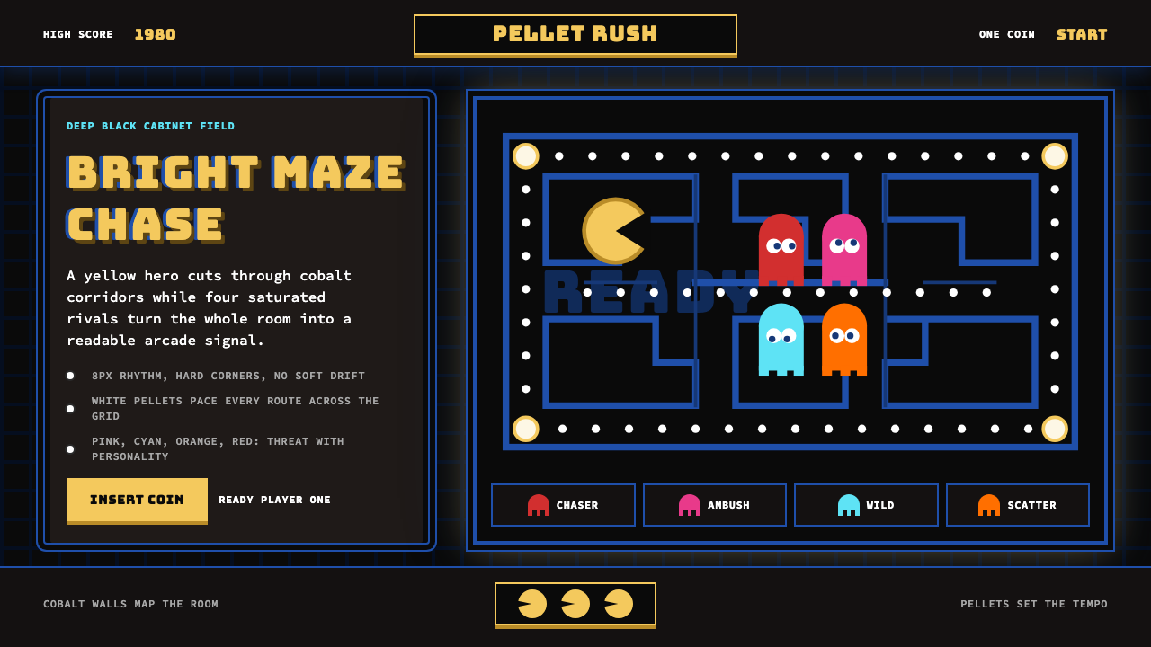 Pac-Man (Namco 1980)Arcade joy burns bright. Yellow disc, cobalt maze, and four ghost hues snap o…
 Sonic the Hedgehog (1991)Velocity has teeth. Sky-cyan, cobalt slant type, gold rings, checkerboard tur…
 Taiwanese Raohe Night Market NeonTaipei night reads vertically. Neon red, cobalt panels, and acid-yellow numbe…