What is CoBrA (Asger Jorn, 1948)?
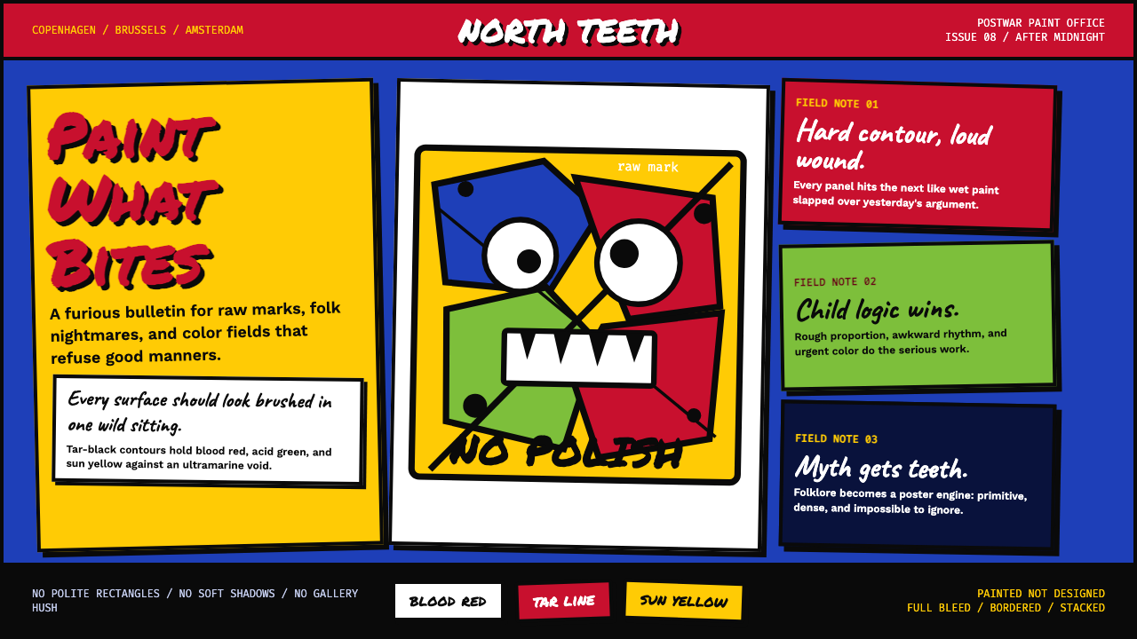
CoBrA threw out European refinement and replaced it with the unpolished ferocity of children's drawings, Nordic myth, and revolutionary spontaneity.
CoBrA (Asger Jorn, 1948) in brief
CoBrA — the name is an acronym built from Copenhagen, Brussels, and Amsterdam — was a short-lived but explosively influential European avant-garde movement active from 1948 to 1951. Its painters rejected the cerebral abstraction of Parisian Surrealism and the cool geometry of postwar Constructivism in favour of raw, gestural paint-handling that drew openly from children's art, Nordic folklore, prehistoric rock carvings, and the spontaneous mark-making traditions of primal cultures.
Visually, the CoBrA sensibility is immediately recognizable: canvases seething with blood-bright reds, acid greens, and solar yellows held together by thick black contour lines that resemble neither academic drawing nor Modernist grid. Figures — half-beast, half-human, entirely monstrous — writhe across the surface. Faces are mask-like or totemic. The surface itself is impasto, heavy, worked over, refusing to pretend it is anything other than paint applied by a body in motion.
As a design system, CoBrA translates this visual energy into a disciplined set of choices: the impasto quality of brushstroke becomes texture in digital surfaces; the thick tar-black contours become hard outline strokes; the hand-lettered protest-poster typography becomes the governing type voice; and the hard-offset block shadow — a hallmark of the movement's graphic output — signals that every element is placed, not floated. The result is a system that looks painted rather than designed.
Where does CoBrA (Asger Jorn, 1948) come from?
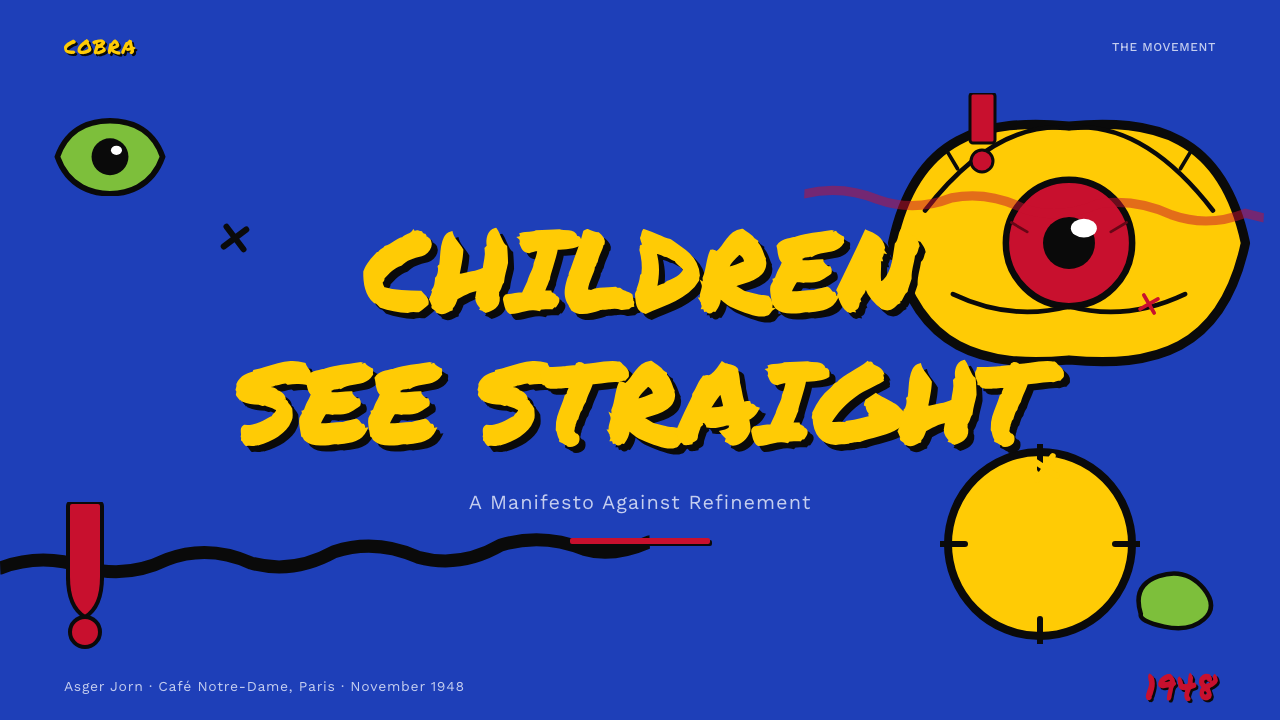
The CoBrA group announced itself in November 1948 at the Cafe Notre-Dame in Paris — paradoxically at the very centre of the sophistication it was rejecting. The founding document, written by Christian Dotremont and signed by Asger Jorn, Karel Appel, Constant Nieuwenhuys, and others, declared war on Parisian cultural hegemony and on the formalist debate between geometric abstraction and representational painting that dominated European art circles. The manifesto called instead for an art rooted in free expression, the unconscious, and the creative impulse shared by the child, the untrained artist, and the mentally ill.
The intellectual backdrop was a specific reading of postwar European trauma. Several CoBrA members had lived through Nazi occupation — Denmark was occupied from 1940 to 1945; the Netherlands from 1940 to 1945; Belgium from 1940 to 1944. The movement's investment in raw, uncoded expression was partly a reaction against the way refined culture had failed to prevent atrocity, and partly a belief, derived loosely from Marxist theory, that spontaneous creative expression was inherently more democratic and honest than art produced within established institutional frameworks.
Asger Jorn, the Danish painter who became the movement's most influential figure, had studied in Paris in the late 1930s under Fernand Leger and worked briefly alongside Le Corbusier. He returned to Denmark during the occupation and produced clandestine work before reconnecting with Dotremont and the Belgian Surrealist Revolutionary group in the late 1940s. Jorn was the engine of CoBrA: prolific, theoretically restless, and uniquely capable of connecting the Nordic folk-art tradition — Viking ornament, Scandinavian textile patterns, Norse mythological imagery — to the group's broader European and Marxist ambitions.
The formal CoBrA group lasted only three years before dissolving in 1951, largely due to financial pressures and Jorn's tuberculosis. But its influence propagated far beyond its brief institutional life. The group's two major exhibitions — in Amsterdam in 1949 and Liege in 1951 — attracted significant critical attention, and the members' subsequent careers (Jorn in Paris, Constant in Amsterdam, Appel internationally) carried the aesthetic into the broader currents of European and American Abstract Expressionism, the Situationist International, and eventually into graphic design and visual culture well into the late twentieth century.
What defines the CoBrA (Asger Jorn, 1948) look?
Color
The palette draws from a specific range of high-intensity, non-pastel hues: blood reds, acidic greens, solar and cadmium yellows, deep ultramarine blues, and flesh tones that edge toward the unhealthy. These are not decorative choices — they carry the emotional directness of the painters' actual pigment choices. Black is used not as a neutral but as a structural force: thick contour lines, aggressive silhouettes, and inky ground zones that anchor the composition's visual weight. White, where it appears, is the unpainted ground showing through impasto — a residue of process rather than a chosen tone.
Texture and Surface
CoBrA surfaces are deliberately impasto — layered, worked-over, and materially present. In digital applications, this quality is replicated through noise overlays, grain textures, and rough-edged strokes that resist clean vector edges. Nothing should look smooth or polished. The surface itself communicates the act of making: the brush drag, the palette-knife scrape, the accidental drip. This is perhaps the most important quality to preserve when translating CoBrA into screen-based design — the anti-slickness that separates it from every corporate aesthetic.
Contour and Outline
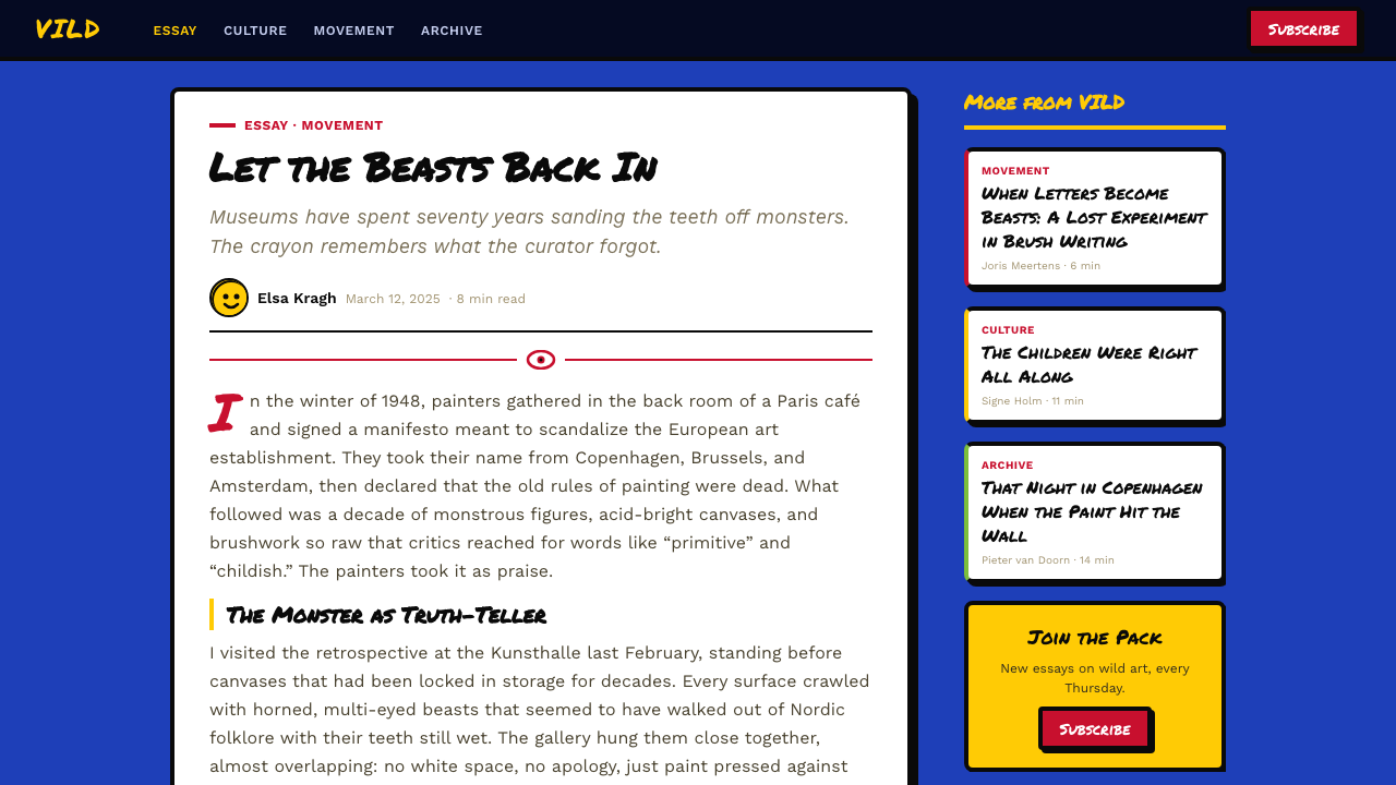
Every form in CoBrA is bounded by a heavy black contour line — thick enough to read as an independent graphic element, irregular enough to appear hand-drawn rather than mechanically applied. This outline performs several functions simultaneously: it contains the high-intensity color from bleeding into chaos, it creates the primitivist figure-from-ground distinction associated with folk art and children's drawings, and it gives the composition a stained-glass quality that organizes visual complexity without reducing it. In design applications, this translates to pronounced stroke weights on UI elements, outlined type treatments, and border-first card components.
Figure and Myth
CoBrA work is densely figurative, but its figures are not representational in any academic sense. They are hybrids: part animal, part human, part mask, part totemic symbol. Eyes are exaggerated or multiplied. Mouths are fang-toothed or howling. Bodies dissolve into landscapes. This vocabulary draws on Viking ornamental art, Danish prehistoric imagery, Inuit carvings, African masks encountered in ethnographic collections, and the dreamlike condensation of Jungian archetypes. In design contexts, the CoBrA figure appears as illustration, iconography, and pattern motif — never photorealistic, always somewhere between the tribal and the cartoonish.
Typography
CoBrA typography is hand-lettered in spirit even when set in type — irregular, energetic, and aggressively non-corporate. The group's magazines and exhibition posters used type that looked drawn rather than composed: letterforms with varying stroke weight, irregular baseline, and the visual energy of protest graphics. In contemporary design applications, the style calls for expressive display type with high contrast between stroke thicknesses, rough-edged letterforms, and a general resistance to the precision and uniformity of digital type rendering. Body text should be set simply and functionally to provide contrast against the high-energy display type.
Shadow and Depth
The CoBrA graphic tradition — particularly evident in the movement's poster and publication design — uses hard-edged block shadows offset at a consistent angle, rendered as solid flat shapes without any gradient or blur. These are not lighting effects; they are graphic decisions that give elements a sense of physical weight and planted presence. The shadow reads as a second, darker silhouette of the form, separated by a deliberate gap. This approach gives even simple typographic elements a poster-like solidity and connects digital screen work to the hand-printed, screen-printed tradition of the movement's actual output.
Composition and Energy
CoBrA compositions resist the classical stability of centered, balanced layouts. Forms crowd against each other, overlap aggressively, push toward the edges, and create a sense of barely contained explosive energy. There is no quiet negative space — even the ground is activated by texture, color fields, or overlapping figure elements. In design applications, this translates to compositions that feel dense and urgent rather than airy and restrained: full-bleed color blocks, layered elements with heavy visual overlap, and a general avoidance of the generous margins and white space that characterize most contemporary digital design.
Who shaped CoBrA (Asger Jorn, 1948)?
Jorn was the intellectual and creative center of CoBrA — the figure who provided both its theoretical framework and its most recognizable visual output. Born in Vejrum, Denmark in 1914, he brought to the group a deep familiarity with Nordic folk art and Viking ornament that gave CoBrA its distinctive mythological dimension, distinguishing it from the Expressionist and Surrealist currents it otherwise resembled. After the group dissolved, Jorn worked in Paris and became a founding member of the Situationist International in 1957, where his concept of detournement — the subversive reuse of existing cultural imagery — influenced a generation of political and design thinking. His paintings from the 1950s and 1960s command major international collections and remain the primary reference point for the CoBrA aesthetic.
The Dutch painter Karel Appel brought the most viscerally painterly energy to CoBrA. Where Jorn theorized, Appel simply painted — aggressively, rapidly, and with an almost physical violence of gesture. His figures are more overtly monstrous and cartoonish than Jorn's, drawing more directly from the visual world of children and less from folk-art scholarly sources. Appel became internationally famous during the 1950s, appearing on the cover of Time magazine and receiving major international commissions, which helped carry the CoBrA visual language into broader public consciousness. His public murals and large-format paintings demonstrated that the movement's aesthetic could operate at monumental scale.
The Dutch artist Constant — who went by his first name alone in the manner of the avant-garde — was among CoBrA's most politically committed members and its most architecturally ambitious. Alongside his painting, Constant spent the decade following CoBrA's dissolution developing New Babylon, an enormous architectural and urban speculation imagining a nomadic society of total creative freedom enabled by automation. This project, which he worked on from the early 1950s through the 1970s, represents the CoBrA impulse extended into spatial and social terms — the same rejection of constraint and the same faith in unconditioned creative spontaneity, applied to the design of an entire society rather than a canvas.
The Belgian poet and visual artist Dotremont co-wrote the founding CoBrA manifesto and served as the movement's primary organizational and theoretical voice. His most original contribution was the development of logogrammes — visual poems in which handwritten text is drawn out until the individual letters lose legibility and become pure graphic forms. This practice sits exactly at the intersection between poetry and painting that CoBrA valorized, and it anticipates later developments in concrete poetry and visual language experimentation. Dotremont's work is less widely known outside specialist circles than Jorn's or Appel's, but his role in articulating the movement's ideas was foundational.
How do you use CoBrA (Asger Jorn, 1948) today?
CoBrA is one of the most direct and visually confrontational styles in the library, which makes it an unusually powerful choice for the right brief — and a ruinous mismatch for the wrong one. The style communicates energy, rawness, and anti-establishment attitude with immediate force. It is best suited to contexts where visual impact matters more than refinement: music and entertainment brands, cultural institutions with a mandate for provocation, festival and event identity systems, streetwear and underground fashion, and any creative project where a conventional design response would feel dishonest.
For presentation slides, CoBrA works most effectively on covers and section dividers where the full force of the palette and mark-making can land without competing with data or sustained reading. A CoBrA cover slide uses the full bleed: impasto-textured color field, hand-lettered or rough-edged display type, and a totemic figure motif anchored by hard block shadow. Content slides in a CoBrA deck should be significantly more restrained — heavy black type on a pale or cream ground, with the CoBrA palette appearing only as accent (a single red rule, a green data highlight) rather than wall-to-wall. The juxtaposition of wild cover and disciplined content creates an intentional contrast that sustains the aesthetic without fatiguing the audience.
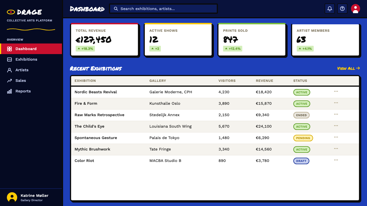
For web interfaces and digital products, CoBrA is most credible in entertainment, arts, gaming, and counterculture contexts. Dashboard or product UI applications exist but require careful constraint: the impasto texture is applied to large hero zones and feature blocks, not to interactive controls or data displays. Navigation and functional UI should be kept typographic and high-contrast in a reduced palette — the CoBrA palette in full force across an entire dashboard would be unworkable. Card components in a CoBrA-influenced product use hard-offset shadows, thick outlines, and rough-texture backgrounds, but the card interior should be readable and functionally clear.
For editorial and marketing work, the style is at its most natural. Poster design, exhibition graphics, album artwork, cultural event programs, and magazine covers all represent contexts where CoBrA's visual language has genuine historical precedent. Full-bleed impasto backgrounds, oversized display type with irregular stroke weight, and monstrous or totemic illustration combine naturally. In marketing applications, the style is well-suited to launch campaigns for products positioning themselves as raw, authentic, and anti-corporate — the aesthetic carries a specific credibility claim that purely formal design styles cannot make.
A common mistake when applying CoBrA is treating its high-intensity palette as permission to use every color simultaneously at full saturation across every element of a composition. The actual CoBrA paintings — and especially the movement's graphic output — typically lead with one or two dominant colors per composition, with the others appearing as accent or within contained figure elements. The black contour is what holds the composition together; remove it or soften it, and the high-saturation colors immediately read as chaotic rather than energetic. Similarly, adding digital refinements — soft drop shadows, smooth gradients, clean vector edges — destroys the aesthetic at its root. The roughness is the point.
CoBrA (Asger Jorn, 1948) — FAQ
How does CoBrA differ from German Expressionism?
Both movements share a commitment to emotional intensity and a rejection of academic refinement, but they differ substantially in source material, color logic, and historical context. German Expressionism (roughly 1905 to 1933, across Die Brucke and Der Blaue Reiter) drew from African masks, medieval German woodcuts, and the artist's psychological interiority, and its palette, while intense, tends toward darker, more tormented tones. CoBrA specifically drew from Nordic folk traditions, prehistoric imagery, children's art, and Marxist political conviction, and its palette has a brighter, more acidic character — the solar yellows and blood reds are distinct from the ochres and deep greens favored by Kirchner or Nolde. CoBrA is also more overtly figurative and mythological; it retains recognizable (if monstrous) creatures, faces, and totems where Expressionism often moves toward pure chromatic intensity.
Can CoBrA work for a brand that needs to feel premium?
Yes, but the premium positioning must be of a specific kind — raw luxury, artistic provenance, or cultural authority rather than corporate refinement or technological precision. Think of an art gallery, a high-end tattoo studio, a luxury spirits brand with artisanal positioning, or a festival that positions itself as the definitive cultural event rather than a commercial product. In these contexts, CoBrA's impasto texture, mythological figures, and anti-slick palette actually function as credibility signals — they communicate that the brand is not trying to appeal to everyone, and that restraint is operating at the level of context selection rather than visual presentation. A CoBrA-inflected premium brand uses the roughness intentionally and confidently. What it cannot be is a CoBrA aesthetic applied with anxiety — nervous softening of the contours, reduction of the color intensity, or the introduction of gradients will read as the worst of both worlds.
Is the CoBrA style appropriate for data-heavy interfaces?
Not without significant adaptation. The style's core qualities — impasto texture, irregular contours, dense figurative imagery, and an absence of quiet negative space — are fundamentally at odds with the demands of data readability, scannable hierarchy, and efficient information density that characterize analytical dashboards or complex data products. The palette alone, if applied uniformly, would make data encoding through color nearly impossible. The adaptation path is to use CoBrA at the identity and chrome layer — hero zones, loading screens, empty states, navigation treatments — while maintaining a clean, conventional grid and palette for the data layer itself. This separation keeps the brand character intact while preserving the functional legibility that data-heavy work demands.
What is the connection between CoBrA and the Situationist International?
The connection is direct and personal. Asger Jorn, after CoBrA dissolved in 1951, became a founding member of the Situationist International in 1957 alongside Guy Debord. Jorn brought the CoBrA sensibility — anti-institutional, anti-refined, committed to spontaneous creative expression as political act — into the Situationist project, contributing both his theoretical voice and his practice of detournement: the reuse of existing cultural imagery in subversive, unintended ways. Situationist visual culture, which directly influenced the graphic language of the 1968 Paris student uprising and subsequent generations of protest graphics, punk design, and culture-jamming, is substantially descended from the CoBrA sensibility. When you encounter rough, confrontational, paste-up visual language in political or counterculture design today, you are looking at a lineage that passes directly through CoBrA and the Situationists.
How do I keep CoBrA legible when applying it to type-heavy layouts?
The key is to confine the most intense CoBrA qualities — heavy texture, high-saturation color fields, figurative imagery — to the display and hero elements, and to treat body text zones as functional ground rather than expressive surface. Body text should sit on a relatively neutral ground: a near-black, a cream, or a deeply saturated single color that gives the text sufficient contrast without competing visually. The CoBrA palette can appear in pull quotes, section markers, decorative rules, and initial caps without compromising the reading experience of the surrounding text. Think of the layout as having two registers: the expressive CoBrA layer for the eye to land on first, and the functional text layer for the reader to inhabit once arrested. Managing the transition between these two registers — through scale, framing, or a tonal shift — is the core craft challenge of CoBrA-inflected editorial design.
Related design styles
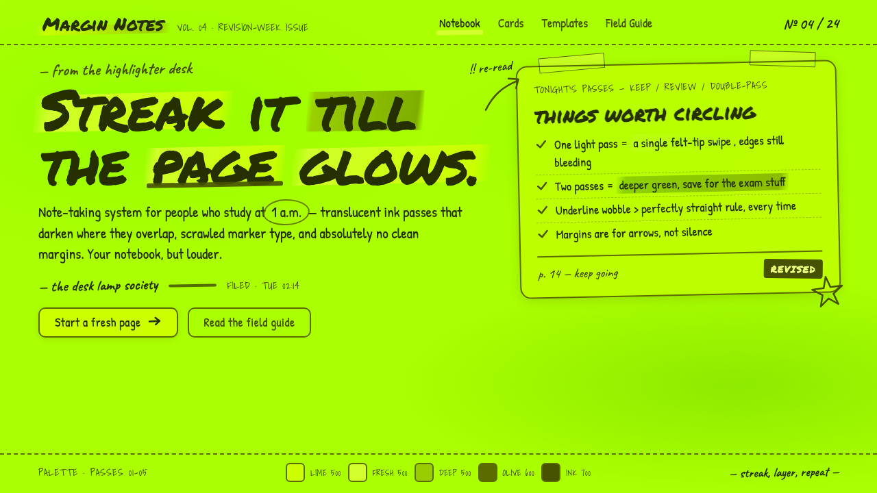 Fluorescent HighlighterStudy notes at 1am, made into a system. Translucent lime ink layered until th…
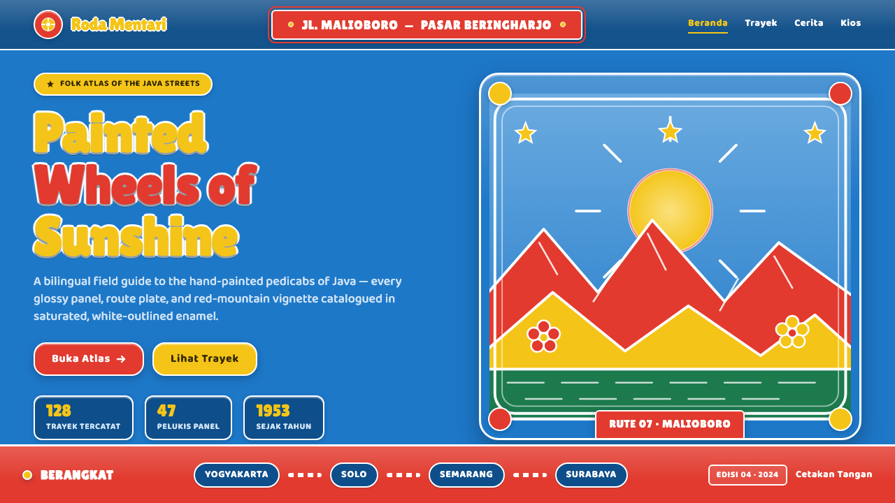 Javanese Becak Folk ArtFolk painting at full volume. Sky-blue enamel, red mountains, white-outlined…
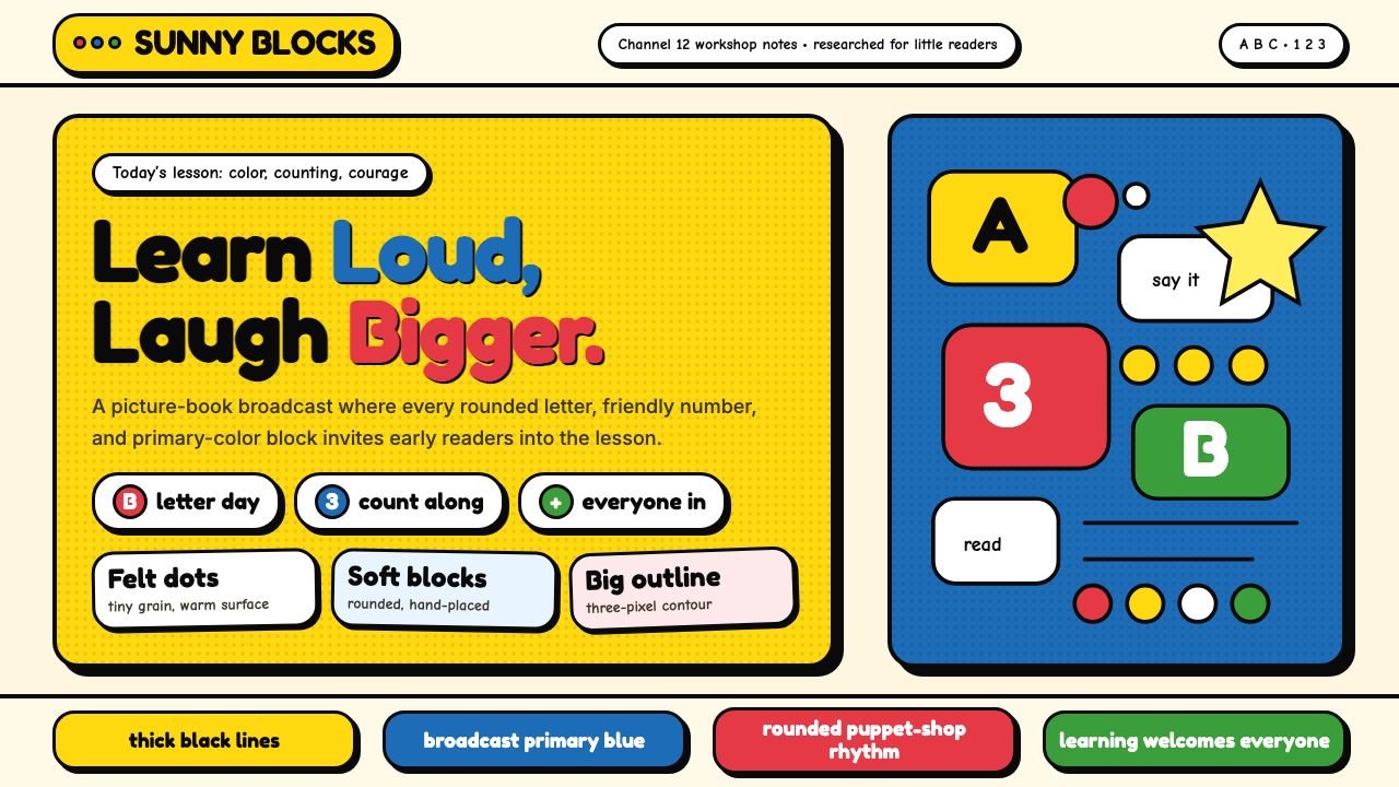 Sesame Street (1969)Learning feels handmade. Big yellow, monster blue, chunky outlines, and round…
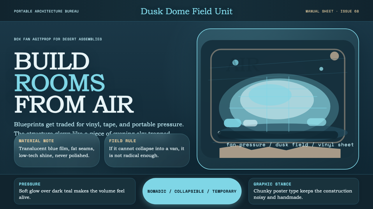 Ant Farm InflatablesTemporary architecture glows. Vinyl-blue domes swell over dark desert teal.
 Behance Maximalist PortfolioPortfolio volume at max. Electric blue, coral and lime stack into a full-blee…
 Ga Fantasy CoffinMemory refuses to whisper. Marine enamel, fat sign type and hard black seams…