Design style guide设计风格指南
What is Salvadoran Fernando Llort Naïf?什么是 Salvadoran Fernando Llort Naïf?
Born in a Salvadoran mountain village during civil war, Fernando Llort's naïf-cubist style turned thick black outlines, cobalt skies, and sun-faced farmhouses into an enduring visual language of communal joy.在内战年代的萨尔瓦多山村里诞生,费尔南多·略尔特的朴素立体主义风格将粗黑轮廓、钴蓝苍穹与太阳脸农舍,化为一种经久不衰的社区欢欣视觉语言。
Salvadoran Fernando Llort Naïf in briefSalvadoran Fernando Llort Naïf 速览
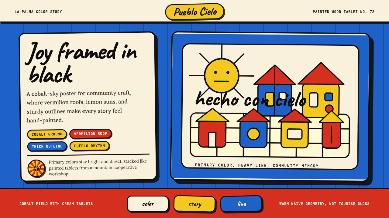
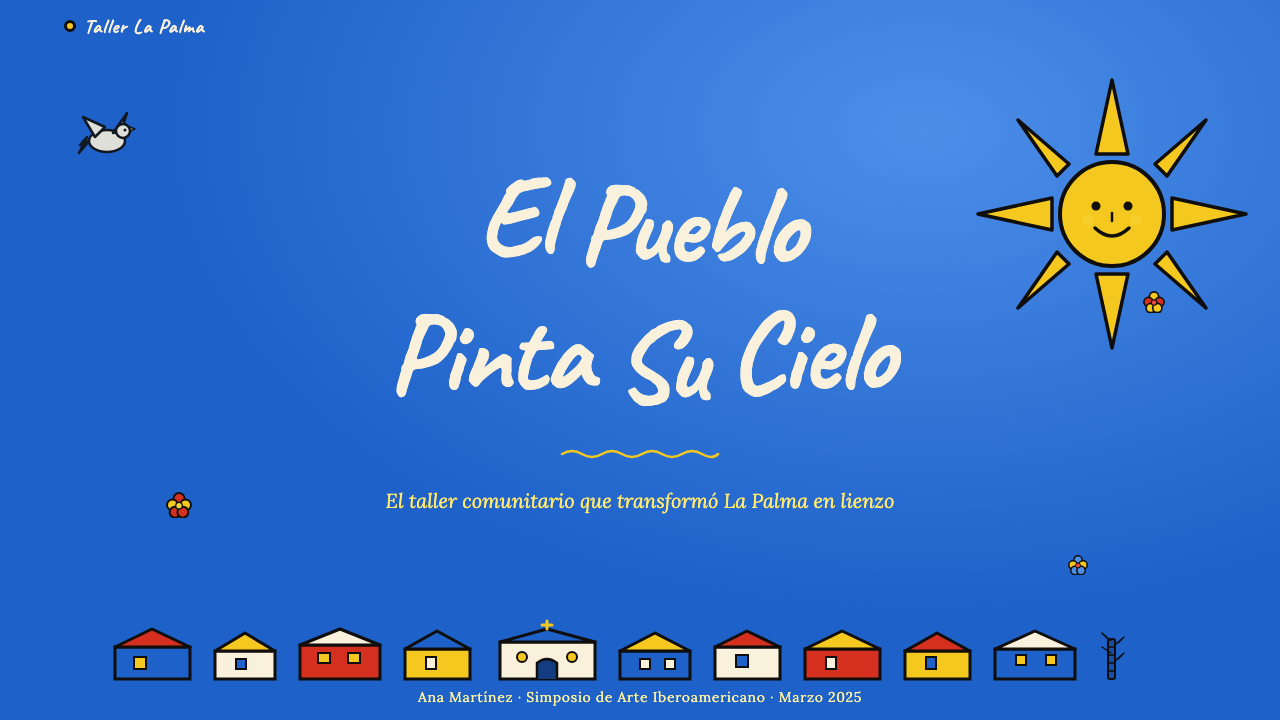
The Salvadoran Fernando Llort Naïf style is a visual language rooted in the community art movement that grew up around the mountain village of La Palma in Chalatenango, El Salvador. Its hallmarks are immediate and joyful: thick hand-drawn black outlines enclosing flat areas of vivid primary and secondary color, simplified forms drawn from rural Central American life — farmhouses with pitched roofs, doves in flight, radiant sun-faces, flowering trees, and figures in festival dress — all arranged against skies of deep cobalt that feel simultaneously ancient and festive.萨尔瓦多费尔南多·略尔特朴素风格,是根植于萨尔瓦多查拉特南戈省拉帕尔马山村的社区艺术运动所孕育的视觉语言。它的特征直接而欢愉:粗重的手绘黑色轮廓圈住平涂的鲜艳原色与间色,形象取材于中美洲乡村日常——坡顶农舍、振翅鸽子、放射光芒的太阳脸、繁花树木与节日盛装的人物——一切排布在深沉钴蓝的天幕之下,那种蓝同时散发着古朴与节庆的气息。
The style belongs to the naïf tradition — art made with deliberate formal simplicity, rejecting academic naturalism in favor of direct emotional expression — but it carries an additional layer of structural intention inherited from Cubism and from the mural traditions of Mexican social realism. Forms are reduced to their most recognizable silhouettes; perspective is flattened or eliminated entirely; colors are chosen for symbolic warmth rather than optical accuracy. The result is imagery that feels hand-made and communal, as if the entire visual world has been rendered in the style of a village festival banner.这种风格属于朴素艺术(naïf)传统——以刻意的形式简洁取代学院派写实,倾向于直接的情感表达——但它同时承载着源自立体主义与墨西哥社会写实主义壁画传统的结构意图。形象被简化为最易辨认的轮廓;透视被压平或彻底消除;色彩按象征性暖意而非光学准确度来选取。结果是一种手工感与集体感兼具的图像——仿佛整个视觉世界都被涂绘成村庄节日旗帜的模样。
What distinguishes this aesthetic from generic folk art is its coherent graphic vocabulary. The thick outline is not merely a drawing convention but a structural principle — it holds forms together, separates fields of color, and gives the composition a quality that translates well from painted wood to printed page to digital screen. The cobalt sky is not a background but an active chromatic anchor that makes the warm reds, yellows, and greens in the foreground radiate with particular intensity.将这种美学与普通民间艺术区分开来的,是其连贯的图形词汇。粗轮廓不仅仅是一种绘画惯例,更是一个结构原则——它将形象凝聚在一起,分隔各色域,并赋予构图一种从彩绘木板到印刷页面再到数字屏幕皆可良好转译的品质。钴蓝的天幕不是背景,而是主动的色彩锚点,正是它让前景中的暖红、鹅黄与翠绿以特别的强度向外辐射。

See the Salvadoran Fernando Llort Naïf design system →查看 Salvadoran Fernando Llort Naïf 完整设计系统 →
Where does Salvadoran Fernando Llort Naïf come from?Salvadoran Fernando Llort Naïf 从何而来?
In 1972, Salvadoran artist Fernando Llort left San Salvador and settled in La Palma, a remote agricultural village in the highlands of Chalatenango department. The move was partly spiritual — Llort had studied theology and was influenced by the Liberation Theology movement then spreading through Latin America — and partly artistic. He wanted to develop a visual practice rooted in the lives of ordinary people rather than in the conventions of fine-art institutions. La Palma, with its traditional craft workshops and close-knit campesino community, offered both the human environment and the material culture he was looking for.1972年,萨尔瓦多艺术家费尔南多·略尔特离开首都圣萨尔瓦多,定居于查拉特南戈省高地的偏远农业小镇拉帕尔马。这次迁居一半出于精神追求——略尔特曾研习神学,深受当时在拉丁美洲蔓延的解放神学运动影响——一半出于艺术使命。他希望建立一种植根于普通人日常生活的视觉实践,而非停留于精英艺术机构的惯例之中。拉帕尔马拥有传统手工坊和紧密团结的农民社区,为他提供了所寻求的人文环境与物质文化土壤。
Working alongside local farmers and artisans, Llort developed a visual language that drew on the indigenous and colonial folk-art traditions of the region while incorporating lessons absorbed from the European avant-garde — particularly from Paul Klee's poetic approach to simplified form and from Diego Rivera's conviction that monumental imagery belonged to the public rather than to collectors. The style Llort and the La Palma community evolved was deliberately accessible: anyone could learn to draw a farmhouse, a dove, or a flowering branch in this system. That accessibility was not a limitation but a political and spiritual commitment — a belief that artistic expression was a human right, not a professional privilege.略尔特与当地农民和手工艺人携手合作,发展出一套视觉语言:它汲取了该地区土著与殖民时期民间艺术传统的养分,同时融入了他从欧洲先锋运动中吸收的观念——尤其是保罗·克利简化形式的诗意方式,以及迪戈·里韦拉关于宏大图像属于公众而非收藏家的信念。略尔特与拉帕尔马社区共同演化出的这种风格,刻意追求可习得性:任何人都能在这套体系里学会画一间农舍、一只鸽子或一枝繁花。这种可及性不是局限,而是一种政治与精神上的承诺——一种相信艺术表达是人权而非职业特权的信念。
When El Salvador's brutal civil war erupted in the late 1970s, La Palma found itself in a conflict zone. Rather than abandoning their work, the community of artisans that had formed around Llort's atelier — organized under the cooperative name Semilla de Dios (Seed of God) — continued producing painted crafts: wooden boxes, gourds, tiles, and textiles decorated with the distinctive naïf-cubist imagery. The cooperative became both an economic lifeline for families under extreme duress and a form of cultural resistance — a declaration that ordinary Salvadoran life, with its doves and its corn and its festivals, was worth depicting and worth preserving.当萨尔瓦多残酷的内战于1970年代末爆发,拉帕尔马发现自己身处冲突地带。围绕略尔特工坊形成的手工艺人社区——以合作社名义“上帝的种子”(Semilla de Dios)为旗帜组织——并未放弃创作,而是持续生产绘有这种独特朴素立体主义图案的手工品:彩绘木盒、葫芦器、瓷砖与纺织品。这个合作社既是极端困境中家庭的经济生命线,也是一种文化抵抗的形式——一次宣言:普通萨尔瓦多人的日常生活,连同那些鸽子、玉米与节日,都值得被描绘、值得被守护。
By the 1980s, the La Palma style had spread beyond Chalatenango and had become internationally recognized as a distinctively Salvadoran aesthetic. Llort himself was commissioned to design large-scale public works, including a mosaic for the facade of the Metropolitan Cathedral of San Salvador in 1997, bringing the naïf-cubist visual language from village workshop to national monument. Fernando Llort continued working until health complications limited his activity around 2018; the cooperative tradition he seeded in La Palma remains active, with artisans across El Salvador continuing to produce work in the style he established.到1980年代,拉帕尔马风格已传播至查拉特南戈以外,并作为一种独特的萨尔瓦多美学在国际间获得认可。略尔特本人受托完成多项大型公共委托作品,其中包括1997年为圣萨尔瓦多主教座堂正立面设计的马赛克壁画,将这套朴素立体主义视觉语言从村庄工坊带入国家纪念建筑。费尔南多·略尔特持续创作,直至约2018年健康原因限制了他的活动;他在拉帕尔马播下的合作社传统至今仍然活跃,萨尔瓦多各地手工艺人延续着他所建立的风格。
What defines the Salvadoran Fernando Llort Naïf look?Salvadoran Fernando Llort Naïf 的视觉特征是什么?
Outline as Structure轮廓作为结构
The most defining feature of this style is the thick, consistent black outline that encases every form. Unlike a sketched line that describes texture or suggests movement, the outline here is architectural — it functions as a wall that holds color in place and gives each shape a clarity that reads at any scale. The weight of the line is deliberately generous, making the forms feel carved rather than drawn, as though each element is a separate object placed within the composition.这种风格最具定义性的特征,是包裹每一个形象的粗重、均匀黑色轮廓。不同于描绘质感或暗示动态的素描线条,这里的轮廓是建筑性的——它如墙壁般将色彩固定在位,赋予每个形状一种在任何尺度下都清晰可辨的明确感。线条的重量刻意厚重,使形象感觉像是被雕刻而非被描绘,仿佛每个元素都是放置于构图之中的一件独立物体。
Cobalt Sky as Chromatic Anchor钴蓝天幕作为色彩锚点
The deep cobalt blue that fills the sky area in canonical La Palma compositions is not decorative background filler — it is the chromatic fulcrum of the entire palette. Set against this cool, saturated blue, the warm reds, yellows, and greens of foreground forms achieve a vibrancy that neither color could generate independently. The sky field is almost always flat and unmodulated, with no gradients from horizon to zenith, which reinforces the sense that this is a designed surface rather than a representation of observed light.在拉帕尔马经典构图中填满天幕区域的深沉钴蓝,并非装饰性背景填充——它是整个色板的色彩支点。在这种冷调、高饱和蓝色的映衬下,前景形象的暖红、鹅黄与翠绿获得了两种色彩单独无法产生的生动性。天幕色域几乎总是平涂且无调制的,从地平线到天顶不见任何渐变,这强化了一种感知:这是一个被设计的表面,而非对观察到的光线的再现。
Flattened Perspective被压平的透视
Spatial depth is handled through stacking and size differentiation rather than vanishing-point perspective. Houses are shown in a semi-frontal elevation that reads as both plan and elevation simultaneously — rooflines are triangular and steep, walls show windows as simple grids, and doors are centered rectangles. This flattening gives the imagery a diagrammatic quality reminiscent of children's drawings and medieval manuscript illustration, which is not a naive accident but a deliberate choice that keeps the composition legible as a flat graphic object.空间深度通过堆叠与大小差异来处理,而非消失点透视。房屋以半正面立面呈现,同时可读作平面图与立面图——屋顶线是陡峭的三角形,墙面以简单网格示意窗户,门是居中的矩形。这种压平手法赋予图像一种示意图式的品质,令人联想到儿童绘画与中世纪手稿插图——这不是天真的偶然,而是刻意的选择,使构图保持为一个清晰可读的平面图形对象。
Symbolic Subject Matter象征性主题
The iconographic vocabulary is specific and recurring: doves representing peace, sun-faces with radiating points symbolizing life and abundance, agricultural imagery rooted in the corn and coffee economy of highland El Salvador, flowers that appear more architectural than botanical, and human figures simplified to silhouettes in festival or everyday dress. This is not decorative imagery selected for pleasantness — each motif carries cultural meaning within the La Palma tradition, and the repetition of the vocabulary across thousands of artisans' works gives it the weight of a shared visual language.图像词汇是特定且反复出现的:象征和平的鸽子、带有放射状光芒的太阳脸(象征生命与丰收)、植根于萨尔瓦多高地玉米与咖啡经济的农业图像、比植物学更具建筑感的花朵,以及被简化为节日或日常装束剪影的人物形象。这不是为了赏心悦目而选取的装饰图像——每个母题在拉帕尔马传统中都承载着文化意义,这套词汇经由数千名手工艺人的重复呈现,已获得一种共享视觉语言的分量。
Polychrome Warmth多彩暖意
While the cobalt sky anchors the cool end of the spectrum, the remaining palette is emphatically warm and polychrome. Vermilion, terracotta, and brick reds share space with lemon yellow, golden ochre, leaf green, and flashes of orange. These colors are applied as flat, unshaded fills — no highlights, no tonal modeling — which gives the composition the visual quality of stained glass or painted enamel: luminous, even, and intensely saturated. The warmth of the palette is not incidental to the style's emotional effect; it is its primary instrument.钴蓝天幕锚定色谱的冷端,其余色板则鲜明地温暖而多彩。朱红、赭石与砖红与柠檬黄、金赭、叶绿及橙色闪点共存。这些颜色以平涂、无阴影的方式填充——无高光,无色调塑造——赋予构图彩绘玻璃或珐琅彩的视觉品质:发光、均匀且高度饱和。色板的温暖感对这种风格的情感效果而言并非偶然;它是主要的情感工具。
Handcraft Legibility手工可读性
The visual system originated in painted wood crafts — small boxes, bowls, and panels painted with brushes by artisans working in village workshops — and it retains the legibility of handcraft even when translated to print or screen. Slight irregularities in the outline, variations in color fill density, and the organic imprecision of the forms are not flaws to be corrected in digital application but properties that distinguish the style from clinical graphic design. The hand-made quality is part of the meaning: it signals origin in a community rather than in a corporation.这套视觉体系起源于彩绘木质工艺品——村庄工坊中手工艺人用画笔绘制的小盒、碗与木板——即便被转译为印刷品或数字屏幕,它仍保留着手工艺品的可读性。轮廓的轻微不规则、填色密度的起伏变化、形象的有机不精确,在数字应用中不是需要纠正的瑕疵,而是将这种风格与冰冷的图形设计区别开来的特质。手工质感是意义的一部分:它指向社区而非企业的起源。
Compositional Density构图密度
La Palma compositions tend toward fullness rather than minimalist breathing room. The sky is populated with birds or stars; the foreground with figures, plants, and buildings arranged in layers; borders are often filled with repeating floral or geometric motifs. This density is not visual clutter — the strong outlines and flat fills keep each element readable within the whole — but it does mean that empty space is used sparingly and purposefully, always as a pause between active elements rather than as a compositional value in itself.拉帕尔马构图倾向于丰满而非极简的呼吸感。天幕上点缀着鸟群或繁星,前景以层叠排布的人物、植物与建筑填充,边框往往以重复的花卉或几何纹样装点。这种密度不是视觉杂乱——强劲的轮廓与平涂填色使每个元素在整体中保持清晰可读——但它的确意味着空白被节制而有目的地使用,始终是活跃元素之间的停顿,而非构图价值本身。
See the Salvadoran Fernando Llort Naïf design system →查看 Salvadoran Fernando Llort Naïf 完整设计系统 →
Who shaped Salvadoran Fernando Llort Naïf?谁塑造了 Salvadoran Fernando Llort Naïf?
Llort (1949–2022) is the originating figure of the La Palma naïf movement. Born in San Salvador, he studied theology and fine arts before relocating to La Palma in 1972 with the intention of developing a community-rooted art practice. Over the following decades he trained hundreds of local artisans in his visual system and organized them into the Semilla de Dios cooperative. His most visible public commission — the mosaic facade of the Metropolitan Cathedral of San Salvador, completed in 1997 — brought the La Palma aesthetic from craft workshops to national monument, cementing his status as one of El Salvador's most significant cultural figures of the twentieth century.略尔特(1949—2022年)是拉帕尔马朴素运动的创始人物。生于圣萨尔瓦多,曾研习神学与美术,1972年迁居拉帕尔马,志在建立一种植根于社区的艺术实践。此后数十年间,他培训了数百名当地手工艺人,并将他们组织进上帝的种子(Semilla de Dios)合作社。他最具代表性的公共委托作品——1997年完成的圣萨尔瓦多主教座堂正立面马赛克——将拉帕尔马美学从手工坊带进国家纪念建筑,奠定了他作为二十世纪萨尔瓦多最重要文化人物之一的地位。
One of the earliest artisans to collaborate with Llort in La Palma, Choto helped establish the distinctive visual conventions of the La Palma school during its formative years in the 1970s. His work exemplifies the way the style developed through collaboration — not as a single artist's invention but as a shared visual grammar refined across multiple hands. Artisans of his generation were instrumental in proving that the La Palma system could generate commercially viable crafts without sacrificing its communal artistic identity.肖托是最早与略尔特在拉帕尔马合作的手工艺人之一,在1970年代的奠基年代,他协助确立了拉帕尔马流派独特的视觉惯例。他的作品体现了这种风格通过协作发展而来的方式——不是单一艺术家的发明,而是经由多双手共同打磨的共享视觉语法。他那一代手工艺人在证明拉帕尔马体系能够在不牺牲集体艺术身份的前提下产出具有商业活力的工艺品方面,发挥了不可或缺的作用。
Sister Maddo was a Catholic nun whose presence in La Palma during the early years of the movement connected Llort's artistic project with the Liberation Theology networks active in rural El Salvador at the time. Her role illustrates how the La Palma aesthetic was not purely an art-world development but was embedded in broader social and spiritual currents — the conviction that serving the poor included cultivating their expressive culture. This ecclesial dimension shaped the cooperative's ethos and gave the Semilla de Dios name its particular resonance.玛多修女是一位天主教修女,她在运动初期于拉帕尔马的存在,将略尔特的艺术项目与当时活跃于萨尔瓦多农村的解放神学网络相连接。她的角色表明,拉帕尔马美学并非纯粹的艺术世界发展,而是深深嵌入更广泛的社会与精神潮流之中——那种信念认为:服务穷人包括培育他们的表达文化。这一教会维度塑造了合作社的精神气质,赋予上帝的种子(Semilla de Dios)这一名称以其特殊的共鸣。
Fernando Llort's son José became a practitioner and advocate of the La Palma tradition in the years following his father's reduced activity. His involvement represents the intergenerational transmission of the style — from founder to family to the wider community of artisans — and his work has helped maintain the cooperative tradition's continuity into the present. He has also been active in efforts to document and promote the La Palma aesthetic as a recognized component of Salvadoran national heritage.费尔南多·略尔特之子何塞·略尔特,在父亲活动减少后成为拉帕尔马传统的实践者与推广者。他的参与代表着这种风格的代际传承——从创始人到家族再到更广泛的手工艺人社群——他的工作有助于将合作社传统的延续维持至今。他也积极参与了将拉帕尔马美学作为萨尔瓦多国家遗产公认组成部分加以记录与推广的努力。
How do you use Salvadoran Fernando Llort Naïf today?今天怎么用 Salvadoran Fernando Llort Naïf?
The Salvadoran Fernando Llort Naïf style is among the warmer and more emotionally direct aesthetics in the Central American folk-art tradition, and its application works best in contexts that welcome that warmth — cultural celebrations, community organizations, artisanal brands, and any project where the values of handcraft, accessibility, and collective joy are part of the message. The style is less suited to applications that demand clinical precision, corporate neutrality, or minimalist restraint.萨尔瓦多费尔南多·略尔特朴素风格是中美洲民间艺术传统中最温暖、情感最直接的美学之一,最适用于欢迎这种温度的场景——文化庆典、社区组织、手工艺品牌,以及任何将手工价值、可及性与集体欢欣纳入核心信息的项目。这种风格不适合要求临床精确、企业中性或极简克制的应用场景。
For presentation slides, the style's strength lies in its ability to turn data and content into something that feels human and festive. A cover slide works well with the cobalt sky as the primary field, a large sun-face or dove silhouette at center, and title text set in a rounded, warm typeface that echoes the hand-drawn quality of the outlines. Content slides benefit from the style's natural use of borders and frames: a thick-outlined panel containing text reads like a painted wooden panel, giving information a crafted, material quality. Data slides should lean into the polychrome palette, using the warm reds, yellows, and greens as distinct categorical colors, always separated by a dark outline treatment that keeps segments readable even at small sizes.在演示文稿中,这种风格的优势在于将数据与内容转化为一种人性化而节日感的呈现。封面幻灯片以钴蓝作为主色域效果出色,中央放置大型太阳脸或鸽子剪影,标题字体选用圆润温暖、与手绘轮廓气质呼应的字形。内容页得益于这种风格对边框与装饰框的自然运用:一个厚轮廓包裹的文字面板读起来像一块彩绘木板,赋予信息一种精工制作的物质感。数据页应充分利用多彩色板,以暖红、鹅黄与翠绿作为明确的分类色,始终以深色轮廓处理分隔各区域,确保在小尺寸下依然清晰可辨。
For web interfaces, the style is most at home in sites for cultural organizations, artisan marketplaces, festival platforms, and community-focused services where a sense of place and handmade warmth is a feature rather than a liability. The key technical translation is maintaining the outlined-form quality: use bordered containers with visible, rounded corners rather than frameless cards; use color fills that are flat and fully saturated rather than gradient-softened; and use imagery that references the decorative motifs — doves, florals, sun-forms — as illustrative elements rather than photographs. Navigation and utility components should be clean and minimal to avoid clashing with the richness of the decorative layer.在网页界面中,这种风格最适合文化机构、手工艺品集市、节日平台和以社区为核心的服务类网站,在那些场合里,地域感与手工温度是特色而非负担。关键的技术转译在于保持有轮廓的形象品质:使用有可见圆角边框的容器而非无框卡片;使用平涂且充分饱和的颜色而非渐变柔化的填充;以鸽子、花卉、太阳形态等装饰母题作为插图元素而非摄影图像。导航与功能性组件应保持简洁克制,避免与装饰层的丰富感产生冲突。
For editorial and marketing work, the style supports vivid feature imagery and celebration-focused campaigns particularly well. A poster or social media graphic in this style places the primary scene — a festival, a product, a milestone — within the compositional logic of a La Palma painting: cobalt background, flat foreground forms, rich polychrome fills, and a border treatment that frames the whole as a deliberate object. Marketing copy should be set in type that reads at the same register of warmth — rounded forms, generous spacing — rather than in the geometric sans-serifs that characterize colder modernist styles.在编辑与营销内容中,这种风格特别适合鲜活的特征图像与庆典主题的传播活动。以这种风格制作的海报或社交媒体图形,将核心场景——节日、产品、重要节点——置于拉帕尔马绘画的构图逻辑之中:钴蓝背景、平涂前景形象、丰富的多彩填色,以及将整体框定为一件刻意之物的边框处理。营销文案的字体应当选用与这种温度相匹配的形态——圆润字形、宽松间距——而非表征冷峻现代主义风格的几何无衬线字体。
A common mistake when applying this style is treating the thick outline as merely decorative and reducing it to a thin border, or omitting it entirely to achieve a cleaner look. The outline is the structural principle that holds everything else together; without it, the flat color fills become disconnected patches rather than forms, and the composition loses its folk-art legibility. A related error is applying the cobalt sky color to every surface, which flattens the crucial warm-cool contrast that gives the palette its energy. Reserve cobalt for background and sky fields, and let the warm colors occupy the foreground.应用这种风格时最常见的错误,是将粗轮廓视为纯粹装饰并将其简化为细边框,甚至为了追求更干净的效果而完全省略轮廓。轮廓是将一切凝聚在一起的结构原则;没有它,平涂色域会变成脱离联系的色块而非形象,构图也将失去民间艺术的可读性。另一个相关错误是将钴蓝色应用于每一个表面,这会压平使色板获得能量的关键冷暖对比。将钴蓝保留给背景与天幕色域,让暖色占据前景。
See the Salvadoran Fernando Llort Naïf design system →查看 Salvadoran Fernando Llort Naïf 完整设计系统 →
Salvadoran Fernando Llort Naïf — FAQSalvadoran Fernando Llort Naïf · 常见问题
Is this style specifically Salvadoran, or does it belong to a broader Central American folk tradition?这种风格是专属萨尔瓦多的,还是属于更广泛的中美洲民间传统?
The La Palma naïf style is specifically Salvadoran in its origin and development — it emerged from a single community in Chalatenango department and was shaped by that community's particular history, including the civil war, the Liberation Theology movement, and the artisan cooperative model. While it draws on broader Central American and Latin American folk-art traditions, and while it shares some visual territory with other naïf movements across the region, its specific iconographic vocabulary (the cobalt sky, the sun-faces, the dove motifs, the campesino farmhouses) and its cooperative economic structure are distinctively La Palma. Applying it as a generic Latin American folk art label misses the point of its specificity.拉帕尔马朴素风格在起源与发展上是专属萨尔瓦多的——它诞生于查拉特南戈省的单一社区,并由该社区的特殊历史所塑造,包括内战、解放神学运动与手工艺合作社模式。尽管它汲取了更广泛的中美洲与拉丁美洲民间艺术传统,与该地区其他朴素运动也共享部分视觉领域,但其特定图像词汇(钴蓝天幕、太阳脸、鸽子母题、农民农舍)与合作社经济结构,是鲜明的拉帕尔马特色。将其作为泛泛的拉丁美洲民间艺术标签使用,恰恰错失了它的独特性所在。
How does this style relate to the naïf art tradition more broadly?这种风格与更广泛的朴素艺术传统是什么关系?
Naïf art — sometimes called folk art, primitive art, or outsider art in different cultural contexts — refers broadly to work made outside academic training conventions, characterized by formal simplicity, direct emotional expression, and a non-illusionistic approach to space and form. The La Palma style fits within this family but is distinguished by its conscious fusion of the naïf sensibility with structural lessons from Cubism and Mexican muralism — particularly in its treatment of form as flat interlocking shapes separated by strong outlines rather than modeled volumes. Llort's academic training meant that the style was not naïf in the sense of untutored; it was naïf in the sense of deliberate formal choice.朴素艺术(naïf art)——在不同文化语境中有时被称为民间艺术、原始艺术或局外人艺术——泛指在学院训练惯例之外创作的作品,以形式简洁、情感直接表达以及非幻觉式的空间与形态处理为特征。拉帕尔马风格归属这一家族,但因其有意将朴素感性与立体主义及墨西哥壁画主义的结构教训相融合而独具特色——尤其体现在将形态处理为由强轮廓分隔的平面互锁形状,而非塑造体积。略尔特的学院训练意味着这种风格并非未受训练意义上的朴素;它的朴素是一种刻意的形式选择。
Can this style work for dark-mode or dark-background applications?这种风格能用于深色模式或深色背景的应用吗?
The La Palma palette is canonically light-ground in one specific sense — the cobalt sky is a deep, saturated cool tone, not a neutral dark — and the style is built around warm colors reading against that cool field. A fully dark neutral background (near-black) can work, but it requires adjustment: the warm foreground colors may need to be slightly more luminous to maintain their vibrancy against a neutral dark rather than the cool cobalt blue. The strong black outlines also become less effective against very dark backgrounds, so a slightly lighter outline tone — deep charcoal or dark indigo — may serve better. The key is preserving the warm-cool contrast that drives the palette's energy.拉帕尔马色板在一个特定意义上是浅底的——钴蓝天幕是一种深沉、饱和的冷调色,而非中性暗色——整套风格建立在暖色在这片冷色域上显现的基础之上。完全中性的深色背景(接近黑色)可以使用,但需要调整:暖色前景可能需要略微提高亮度,才能在中性暗底而非钴蓝底上保持生动性。强劲的黑色轮廓在极深色背景上也会效果减弱,因此略浅的轮廓色调——深炭灰或深靛蓝——可能更适合。关键在于保留驱动色板能量的冷暖对比。
How should digital applications handle the hand-drawn quality of this style?数字应用应当如何处理这种风格的手绘质感?
The hand-drawn quality — slight irregularities in outlines, organic imprecision in forms, visible brush texture in color fills — is a core property of the style, not a limitation to be corrected. In digital applications, this can be preserved through the use of illustrated assets drawn with intentional imperfection (brush-stroke SVGs, hand-rendered icon sets) rather than geometrically perfect vector shapes. Type choices should also honor this quality: rounded humanist letterforms will feel more at home than purely geometric sans-serifs. Where perfect digital precision is unavoidable (UI components, data tables), keep those elements minimal and let the illustrated decorative layer carry the style's personality.手绘质感——轮廓的轻微不规则、形象的有机不精确、色彩填充中可见的笔触纹理——是这种风格的核心特质,而非需要纠正的局限。在数字应用中,可以通过使用刻意带有不完美感的插图资产(笔触SVG、手绘图标集)来保留这种质感,而非使用几何上完美的矢量图形。字体选择也应尊重这种品质:圆润的人文主义字形比纯几何无衬线字体更为契合。在数字精确不可避免的场合(界面组件、数据表格),保持这些元素简洁克制,让插图装饰层承载风格的个性。
Is the Semilla de Dios cooperative still active, and does using this style raise any cultural attribution considerations?上帝的种子合作社仍在运营吗?使用这种风格是否涉及文化归属的考量?
The Semilla de Dios cooperative and the broader community of La Palma artisans remain active, and the style continues to be the primary livelihood for many craftspeople in Chalatenango. Using this style in commercial applications raises genuine cultural attribution considerations — the visual language is the intellectual and cultural property of an identifiable living community, not a generic historical resource. Thoughtful application means acknowledging the La Palma origin explicitly, avoiding direct reproduction of specific artisans' compositions, and considering whether commercial use of the style might compete with or undervalue the source community's own commercial production. At minimum, documentation and marketing materials should credit Fernando Llort and the La Palma tradition by name.上帝的种子(Semilla de Dios)合作社与更广泛的拉帕尔马手工艺人社群至今仍然活跃,这种风格继续是查拉特南戈许多工匠的主要生计来源。在商业应用中使用这种风格,确实涉及真实的文化归属考量——这套视觉语言是一个可识别的现存社区的智识与文化财产,而非泛泛的历史资源。负责任的应用意味着明确注明拉帕尔马起源,避免直接复制特定手工艺人的构图,并考量这种风格的商业使用是否可能与源社区自身的商业生产形成竞争或使其贬值。至少,文档与营销材料应以名义注明费尔南多·略尔特与拉帕尔马传统。
Related design styles相关设计风格
 Mexican Alebrije Oaxaca (Linares 1936)Fever craft glows. Velvet teal carries magenta dots, turquoise zigzags, and C…幻梦手作在发光:暗青底承托洋红点纹、蓝绿锯齿与手写字。
 Brazilian Samba School (2000s Carnaval)Parade at floodlight volume. Royal blue asphalt, sequin gold type, pink ribbo…泛光灯音量的游行。宝蓝路面、亮片金字、玫红斜带。
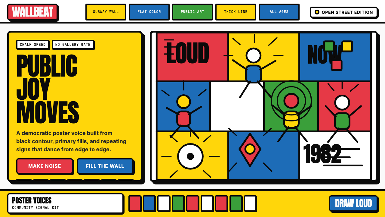 Keith Haring PopJoy refuses the gallery. Thick black contours pack primary color into a danci…快乐拒绝画廊:粗黑轮廓把原色塞进跳动墙面网格。
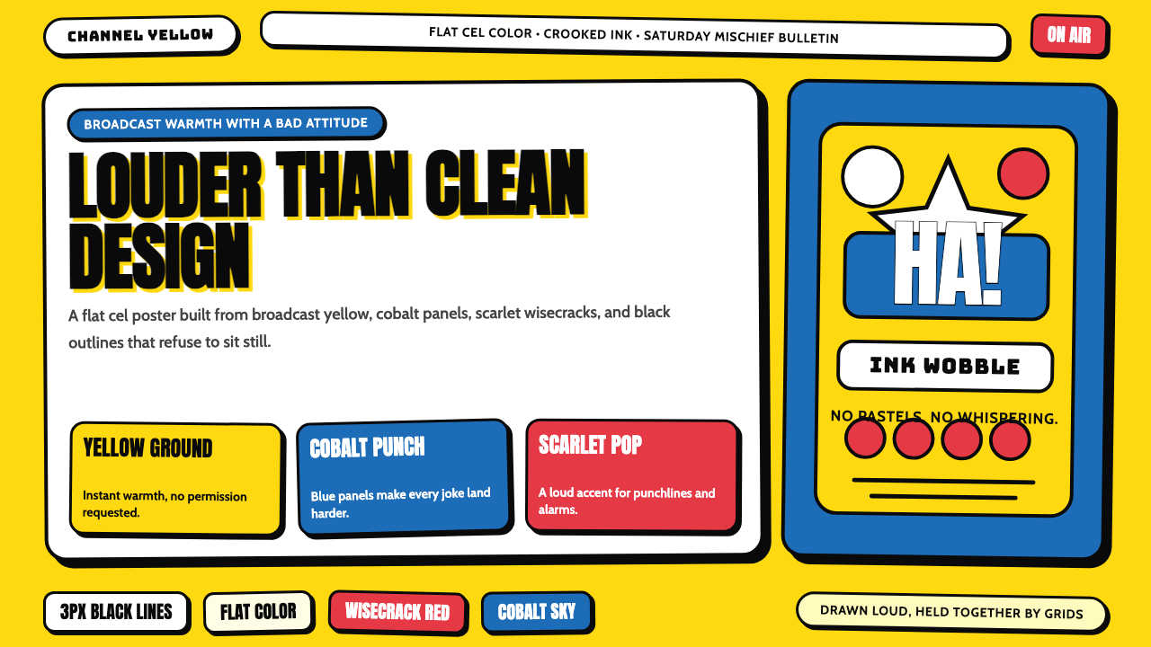 The Simpsons YellowCartoon warmth misbehaves. Yellow ground, cobalt panels, thick wobbly black l…卡通暖意在捣乱:黄色底、钴蓝面板和粗黑抖线。
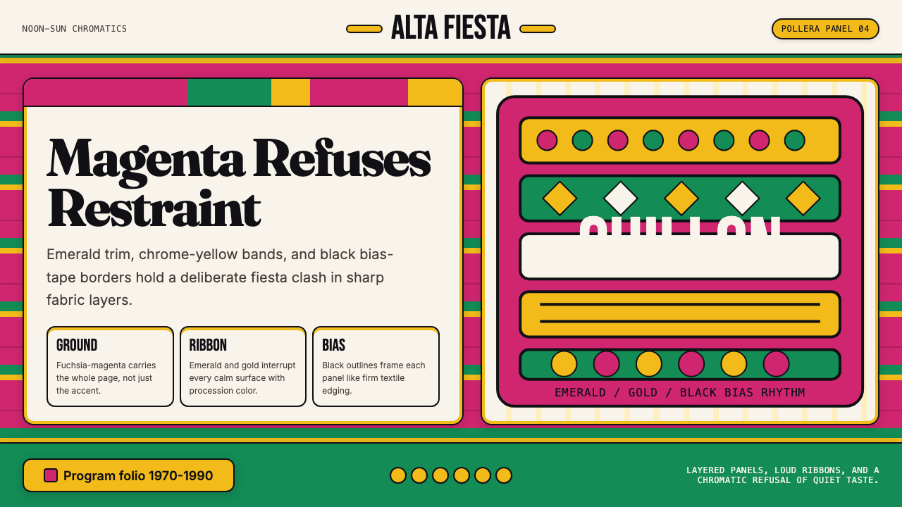 Bolivian Pollera Fiesta MagentaChromatic defiance. Magenta ground, emerald bands and black outlines clash li…色彩拒绝克制:品红底、翡翠带、黑滚边制造节庆撞色。
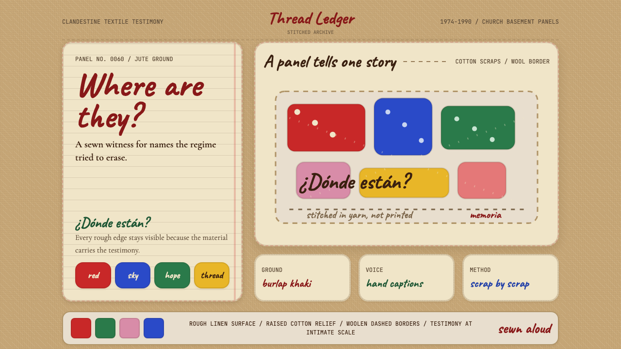 Chilean Arpillera (Pinochet Resistance)Witness sewn, not spoken. Burlap khaki, Caveat captions, and red cotton block…见证被缝上布面。麻布卡其、手写标题与红色棉布块承载控诉。