What is 1950s Brush Script Ad?
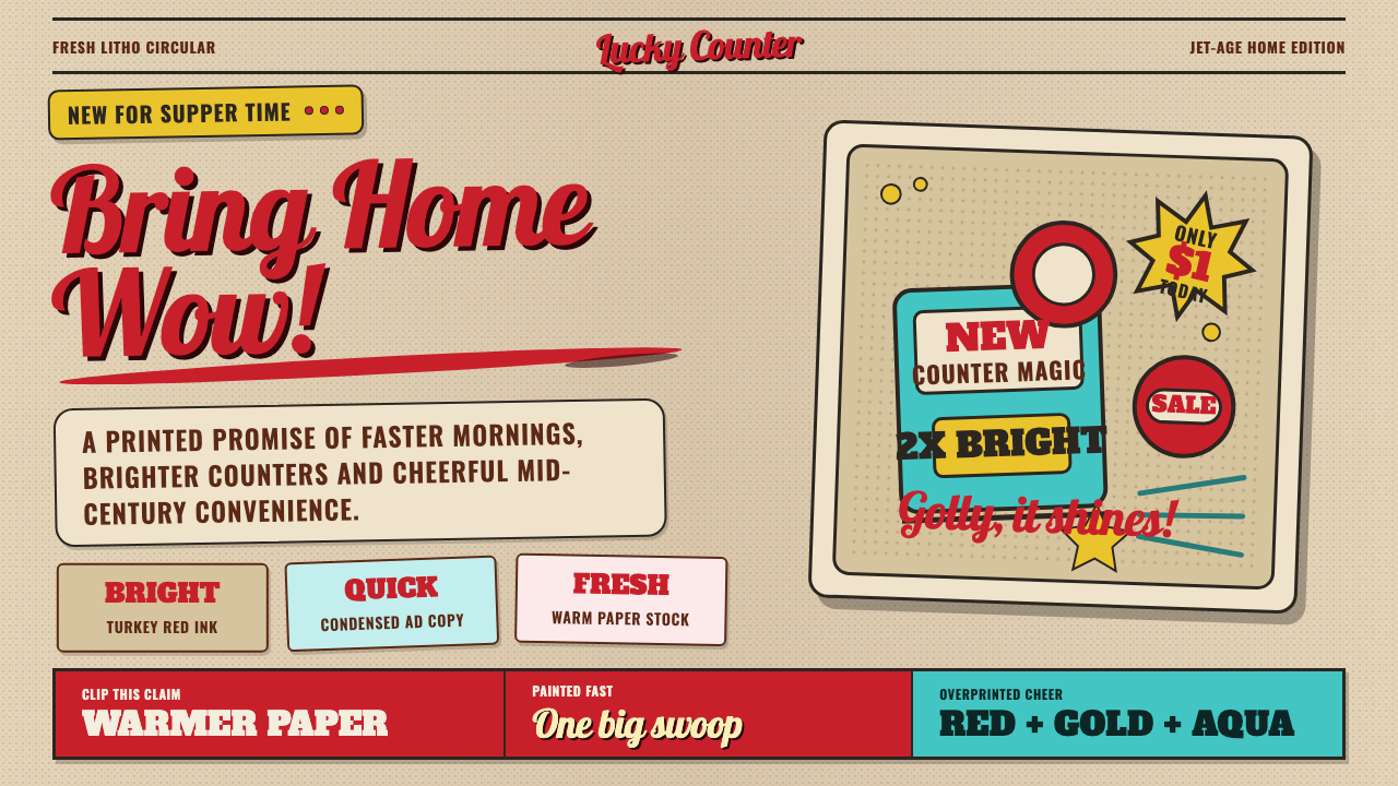
1950s brush-script advertising sold the future in one confident, connected swoop of hand-painted lettering over warm, sun-aged paper.
1950s Brush Script Ad in brief
1950s brush-script advertising is the visual voice of postwar American consumer optimism — the look of a newspaper insert or magazine spread promising a new car, a new appliance, or a weekend sale, printed in saturated ink on paper that has since aged to a warm tan. Its defining move is a headline rendered not in a printed typeface but in flowing, hand-painted script, the kind a sign painter or letterer would produce in a single confident, connected gesture rather than letter by careful letter.
That script sits above sturdier supporting type — bold slab serifs for prices and calls to action, plain sans-serif for fine print — so that the loose, energetic swoop of the headline is grounded by something more disciplined underneath. Illustration in this world is cheerful and forward-looking, part of the same Jet-Age optimism that gave the era its rockets, fins, and boomerang shapes: everything in the layout is telling the reader that tomorrow is going to be better, faster, and shinier than today.
As a design system, the theme reduces this ad to its essential ingredients: a warm, aged paper ground rather than clean white; a hot, saturated red used for prices and urgency; supporting mustard and turquoise as secondary accents; the coarse dot pattern of mid-century halftone printing wherever imagery or shading appears; and brush-script lettering as the unmistakable signature move layered over everything else.
Where does 1950s Brush Script Ad come from?
This aesthetic belongs to the United States in the years surrounding the 1950s, the peak of the broader postwar and mid-century period running roughly from 1950 to 1990. It was a moment of rapid consumer expansion: rationing and wartime austerity had ended, new households were forming in new suburbs, and manufacturers had entire new categories of goods — automobiles with dramatic styling, kitchen appliances, television sets — to sell to a public eager to spend on optimism about the future.
The lettering at the heart of this style did not come from type foundries but from working sign painters and brush-lettering artists, tradespeople who painted storefronts, billboards, and delivery trucks by hand and who brought that same fluid, connected brushwork into print advertising. Their script was designed to be fast to execute and immediately legible at a glance — qualities suited to a commercial culture built on catching a reader's eye in a crowded newspaper page or a passing car window, not on quiet, considered reading.
Mid-century advertising agencies built entire campaigns around this combination of hand-lettered urgency and cheerful illustration, part of a broader Jet-Age and mid-century modern visual culture that also produced the era's product design, architecture, and packaging. The starburst — a simple radiating burst of lines used to flag a special offer or a new product — became a recurring motif of this advertising world, a small graphic shorthand for excitement borrowed from the era's fascination with rockets, atoms, and speed.
The physical printing process itself shaped the look as much as any single artist did. Newsprint and cheap magazine stock reproduced color imperfectly through halftone dot screens, giving illustrations a visible, granular texture rather than smooth photographic reproduction, and decades of aging turned originally white paper stock to the warm tan tone now associated with the whole period. What began as a printing limitation has become, in hindsight, one of the most recognizable signatures of the style.
What defines the 1950s Brush Script Ad look?
Aged Tan Ground
Backgrounds are warm and slightly dulled rather than clean white, evoking newsprint or magazine stock that has yellowed with decades of age. This ground is never sterile — it carries the faint suggestion of paper grain and gentle discoloration, and every other color in the system is chosen to sit warmly against it rather than against a neutral white.
Turkey Red Urgency
A hot, saturated red is the system's single most active color, reserved for prices, sale callouts, and anything meant to be read first. It behaves like a shout in an otherwise conversational layout — used sparingly enough that when it appears, the eye goes there immediately, the same role it played circling a price on a 1950s newspaper ad.
Mustard & Turquoise Accents
Beyond the dominant red, a warm mustard yellow and a cooler turquoise appear as secondary accents, giving the palette a cheerful, period-accurate range without diluting red's primacy. These two colors tend to alternate rather than appear together in equal weight, keeping the overall palette lively but never crowded.
Halftone Dot Texture
Wherever imagery, shading, or tone appears, it is built from visible, coarse dot screens rather than smooth gradients or photographic clarity — the signature of mid-century offset and letterpress printing. This texture reads as warmly imperfect rather than low-quality, and applying it selectively to illustration or background fills is what most reliably signals the period.
Brush-Script Headlines
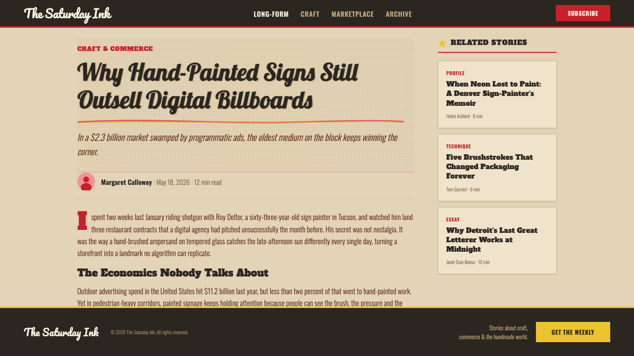
Headline type is rendered as loose, connected, hand-painted script rather than a rigid printed face — letters lean, swoop, and flow into one another as if written in a single fast gesture. This script always carries clear directional energy, usually swinging upward and to the right, reinforcing the sense of forward motion the whole style trades on.
Slab & Sans Support Type
Beneath the expressive script, supporting information — prices, fine print, product names — is set in sturdy slab serif or plain sans-serif type, chosen for legibility rather than personality. This disciplined support type is what keeps the layout functional as an advertisement rather than dissolving entirely into decorative lettering.
Starburst Flags
Small radiating starburst shapes appear as call-out devices around prices, new-product labels, or special offers — a simple graphic of lines bursting outward from a center point. It functions like an exclamation mark rendered as a shape, borrowed visually from the era's broader fascination with rockets and radiating energy.
Who shaped 1950s Brush Script Ad?
Postwar American advertising agencies built entire campaigns around the combination of hand-lettered urgency, saturated color, and cheerful illustration, selling not just individual products but a broader mood of consumer optimism that defined print advertising throughout the 1950s and into the following decades.
Working sign painters, whose trade was lettering storefronts, billboards, and delivery trucks by hand, brought their fluid, fast, connected brushwork into print advertising, supplying the loose confident script that became this style's most identifiable signature.
Specialist letterers who worked specifically in expressive brush script gave advertising headlines their swooping, hand-painted character, treating each headline as a single fluid gesture rather than an assembly of individually drawn letters.
As a broader movement, postwar consumer advertising in the United States shaped the commercial context this style served — an economy of rapid household formation and new consumer goods that needed a visual language urgent and cheerful enough to match the era's optimism.
The illustration accompanying brush-script headlines belonged to the same Jet-Age and mid-century modern visual culture that produced the era's rocket forms, boomerang shapes, and streamlined product design, lending the advertising a shared forward-looking imagery across product categories.
How do you use 1950s Brush Script Ad today?
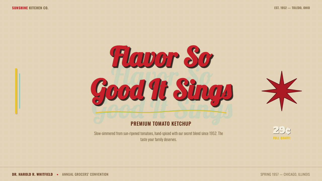
For presentation slides, this theme works best where a deck wants to feel warm, nostalgic, and energetic rather than corporate. A cover slide can use the full aged-tan ground with a large brush-script title treatment swinging across the frame and one starburst accent near a key word — the equivalent of an ad's headline moment. Content slides should keep the tan ground but shift most text into the disciplined slab or sans support type, reserving script for section titles only, so the deck stays readable across many slides rather than fatiguing the eye with expressive lettering throughout. Data slides can borrow the halftone dot texture as a subtle background pattern behind charts, and turkey red as the single highlight color for the one number or bar that matters most.
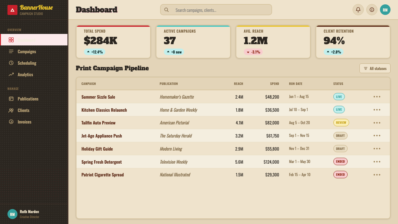
In web interfaces, the aesthetic suits playful consumer brands more than serious dashboards, but disciplined applications exist. A pricing page can use the tan ground and slab-type price numerals with a small turkey-red 'best value' starburst badge on the recommended tier, while keeping form fields and navigation in plain, legible sans-serif so the interface remains usable. Dashboards are a harder fit for this style's full expressiveness, but a lighter version — warm neutral background, one saturated accent color for primary actions, halftone texture used sparingly in empty states or illustrations — can carry the mood without sacrificing clarity.
For editorial and marketing layouts, this is close to the style's native habitat. Landing pages, retro-themed campaigns, and product launches that want a nostalgic, hand-crafted feel can lean fully into brush-script headlines, starburst call-outs, and halftone-textured illustration, much as the original newspaper and magazine ads did. Section breaks work well as bold slab-type rules rather than thin hairlines, keeping the confident, chunky character of mid-century print consistent throughout the page.
The style also lends itself to seasonal sale campaigns, retro food and beverage branding, and any marketing moment that wants to feel like a friendly, slightly theatrical announcement rather than a neutral product description — the brush-script headline itself functions almost like a spoken line, meant to be read aloud in the reader's head.
A common mistake is applying the brush-script treatment to every line of text on a page, including body copy and fine print — the original advertising always paired expressive script with legible, disciplined support type, and a page that is entirely script becomes tiring and hard to scan. A second mistake is using a clean white background instead of the warm aged-tan ground; white flattens the palette and strips away the nostalgic, sun-faded quality that ties the red, mustard, and turquoise accents together into a coherent period mood.
1950s Brush Script Ad — FAQ
Is this style the same as general 'mid-century modern' design?
It overlaps but is more specific. Mid-century modern typically refers to the cleaner, more geometric design language of furniture, architecture, and product design from the same decades. This theme is drawn specifically from print advertising's louder, more commercial cousin — hand-painted brush script, halftone printing texture, and aged newsprint tones — which is more expressive and less restrained than the clean lines usually associated with mid-century modern interiors and objects.
Does this theme require using red as the dominant color?
Red should be the most active color, but it is not meant to dominate by area — the aged tan ground remains the dominant surface, with turkey red reserved for a smaller set of high-priority elements like prices and calls to action. Mustard and turquoise provide additional variety so the palette does not read as monochromatically red. The key relationship to preserve is scarcity: red should feel like a deliberate flag, not a background wash.
Can the halftone dot texture be skipped for a cleaner digital look?
It can be, but doing so removes one of the style's most period-specific cues. Without the visible dot screen, the design tends to read as generic retro rather than specifically 1950s print advertising. If a cleaner look is required, using the texture selectively — in a background pattern, an illustration fill, or a subtle overlay — preserves the reference without covering every surface in dots.
Is brush-script headline type appropriate for all-caps, formal, or highly technical products?
Generally no. Brush script carries an inherently informal, hand-crafted, conversational tone that works against the buttoned-up register technical or highly formal products usually want to project. It is far better suited to friendly, consumer-facing, nostalgic, or celebratory contexts — sales, launches, seasonal campaigns — where a warm, personal voice is an asset rather than a liability.
What kind of imagery pairs best with this theme?
Cheerful, forward-looking illustration in the spirit of Jet-Age mid-century advertising — simplified, optimistic depictions of products, people, or objects rendered with visible halftone texture rather than smooth photographic realism. Photography can work if it is warmed and given a similar aged, slightly grainy treatment, but illustration in the period's own hand generally reads as more authentic to the style than modern photography dropped into a vintage frame.
Related design styles
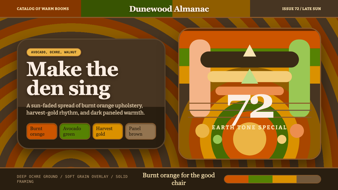 1970s Earth TonesWarm maximalism stays muddy. Bulbous slabs, avocado bands, and harvest-gold r…
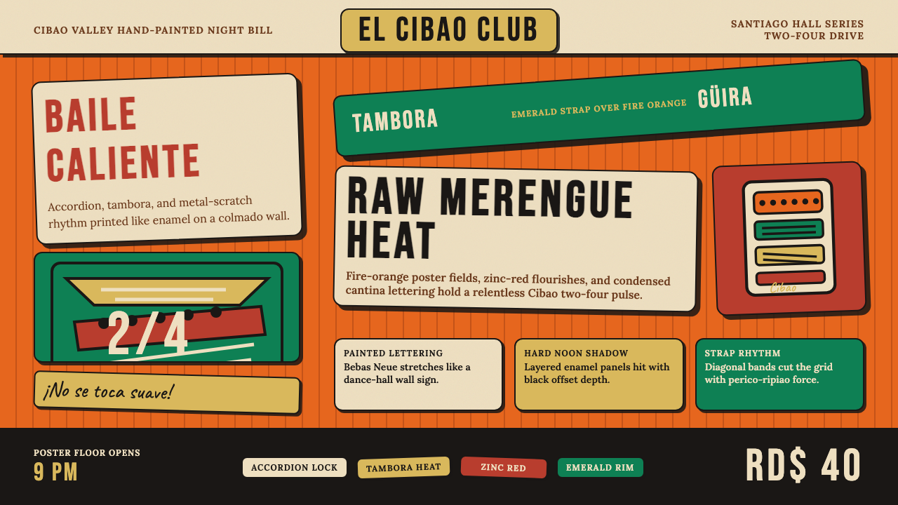 Dominican Merengue Perico RipiaoMaximalism keeps time. Fire-orange fields, Bebas Neue, and diagonal emerald s…
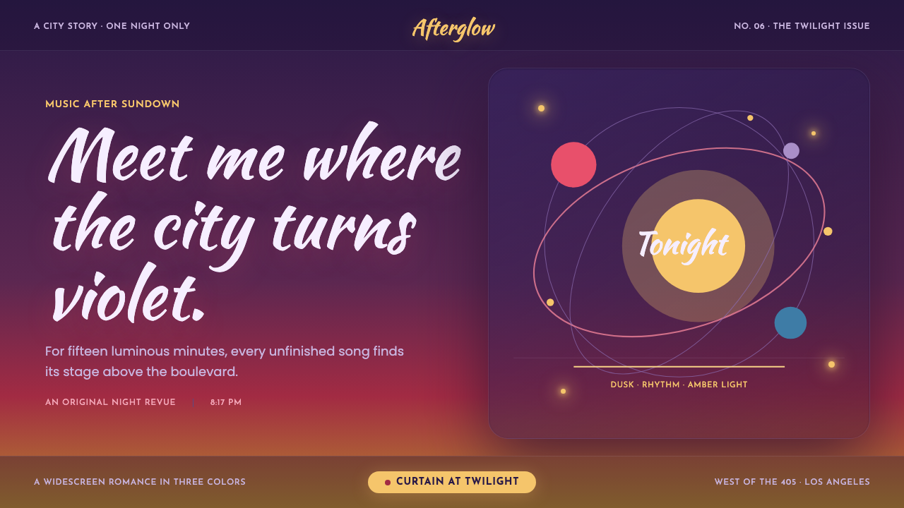 La La Land (2016)Twilight waits for a dance. Violet dusk, rose horizons and amber bulbs frame…
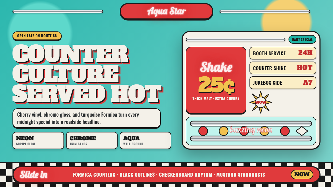 1950s Diner AquaRoadside optimism shouts. Aqua walls, cherry vinyl, chrome bands, and neon sc…
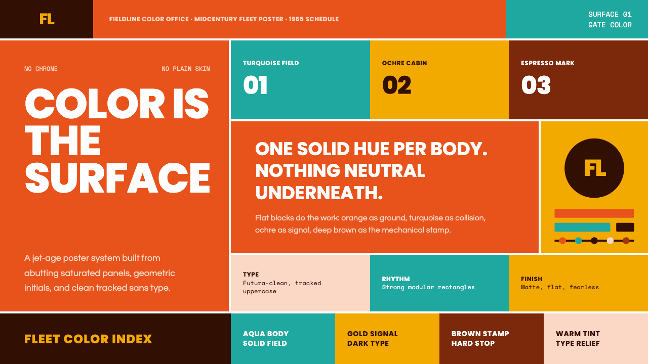 Braniff (Girard)Color becomes fuselage. Jellybean orange, turquoise blocks, and geometric san…
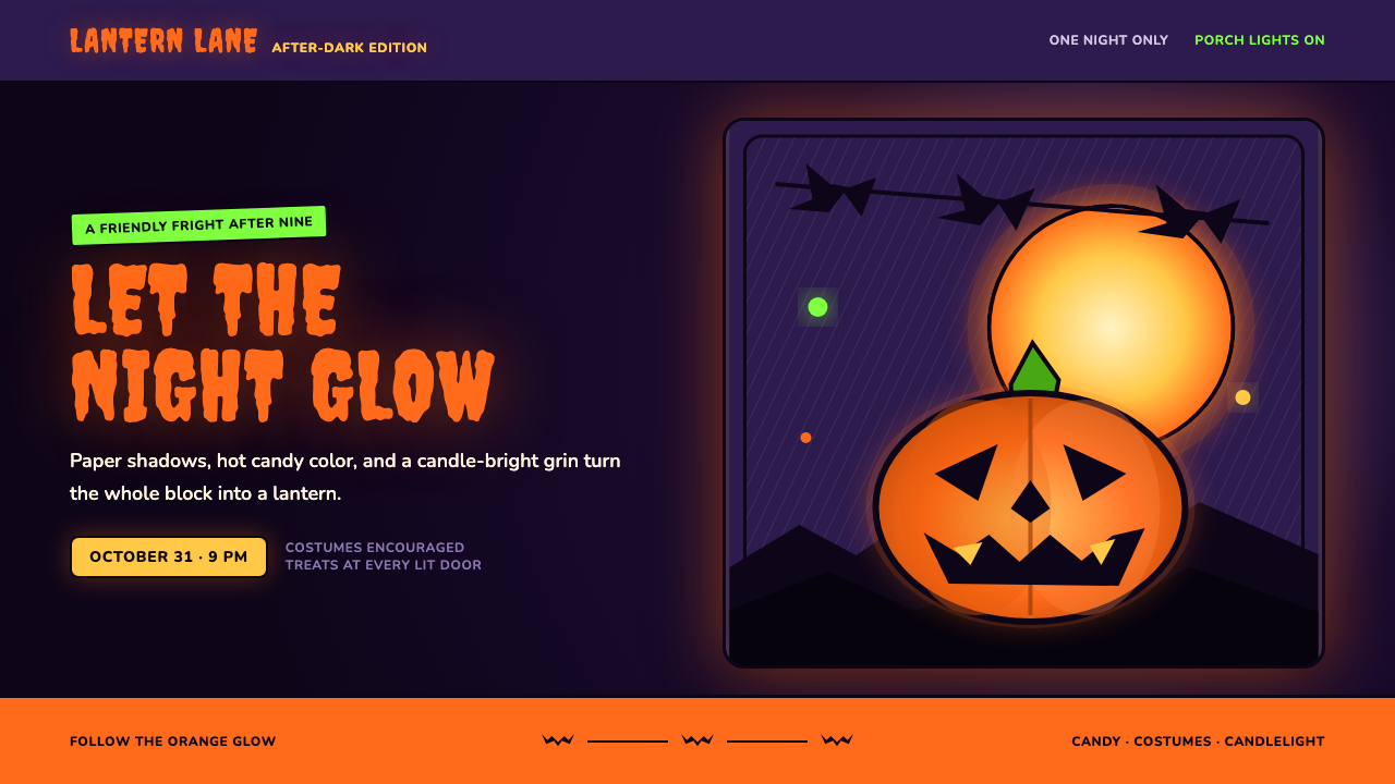 Halloween Jack-o'-LanternFriendly fright, lit from within. Pumpkin orange glows through ink-black cuts…