What is La La Land (2016)?
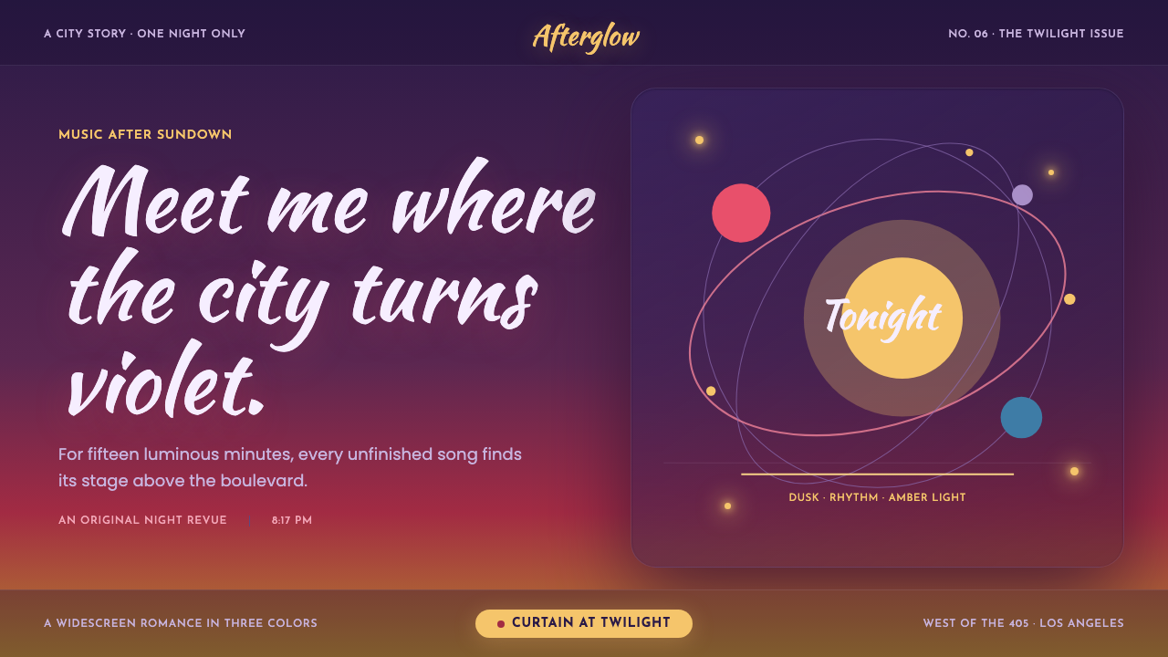
La La Land turns Los Angeles twilight into romance: violet dusk, rose horizons, amber bulbs, and the charged pause before a dance begins.
La La Land (2016) in brief
La La Land is a cinematic design language built around romantic dusk. Its central atmosphere belongs to the brief interval after the Los Angeles sun disappears below the 405: hills settle into lavender, the horizon carries rose and amber, and a warm jazz-club glow seems to wait somewhere beneath the city. The result is not simply a dark theme. It is darkness with theatrical expectation — a city held between the end of one day and the beginning of a performance.
The visual system layers deep twilight purple across broad surfaces, then lets sunset color move toward the horizon in rose, magenta, and amber. Warm tungsten-like lights punctuate that field as small, glowing moments of intimacy. The mood is saturated without becoming harsh, soft without becoming hazy, nostalgic without losing graphic discipline. It treats light as an emotional cue: distant lights imply possibility, while warmer pools of glow create places for conversation, music, and motion.
Its reference frame combines a contemporary Hollywood musical revival with the visual memory of mid-century MGM Technicolor musicals. CinemaScope-inspired letterbox bands create a stage-like frame, while a hand-lettered marquee feeling gives titles their sense of invitation. Geometric Deco-inflected interface type provides the counterweight. One vivid costume-like accent can strike through a dusk composition, making each section feel composed for a musical number rather than merely decorated.
Where does La La Land (2016) come from?
La La Land was released in 2016, but its visual DNA reaches back to the MGM Technicolor musical tradition of 1948–1958. That lineage matters because the style is based on heightened emotion rather than visual realism. Color is not asked to reproduce an ordinary evening exactly; it is asked to make the feeling of an evening legible. Twilight becomes violet, the horizon becomes rose and amber, and a costume-colored accent becomes an event within the frame.
Los Angeles supplies the geography and the emotional contrast. Griffith Park, Angels Flight, and Hermosa Beach connect the theme to hills, city transit, overlook views, and the coastal edge. The setting allows glamour and everyday striving to coexist: a large city can feel expansive in the distance and intensely private in a pool of warm light. This is why the palette needs both broad, cool dusk fields and small, intimate golden glows.
The film’s creative identity is associated with Damien Chazelle, Linus Sandgren, Mary Zophres, and Justin Hurwitz. Within this design interpretation, those names point to an inseparable cinematic whole: direction, image-making, costume color, and music all contribute to the sensation that the city is ready to move. A useful adaptation should preserve that coordination. Typography, color, framing, and interaction should feel like parts of one number, not separate stylistic references pasted together.
Hollywood musical revival, Technicolor homage, CinemaScope widescreen, and mid-century Americana form the style’s principal movements. Together they explain its distinctive balance. It can be richly colored but still composed; deliberately nostalgic but not antique; theatrical but not cluttered. The theme works when it remembers that a musical frame organizes attention. The darkness is a curtain, the warm lights are cues, and the vivid accent is the performer entering the scene.
What defines the La La Land (2016) look?
Twilight Atmosphere
Deep violet dusk is the dominant emotional ground. It should feel expansive and calm rather than heavy or nocturnal in a purely technical sense. Broad dark surfaces create the pause before action; they give glowing details, hand-lettered titles, and vivid accent color enough room to arrive. The atmosphere works best when darkness reads as an open sky over the city, not as an enclosed black interface.
Sunset Horizon
Rose, magenta, and amber belong near transitions, focal moments, or visual horizons. Their role is cinematic: they imply the last light of sunset rather than adding generic brightness. Let the warm progression emerge from or against the violet field, so the composition carries a sense of distance and depth. The horizon is emotional architecture — a place where longing, possibility, and the city’s scale meet.
Warm Practical Light
Amber bulbs should appear like practical lights in a scene: small, warm, and gathered rather than evenly distributed. They recall tungsten glow and the planetarium-like feeling associated with Griffith Observatory. Use them to reward attention around a title, a key action, or a human moment. Their softness should suggest bloom and memory, while their placement remains intentional enough to keep the composition crisp.
Marquee and Deco Type
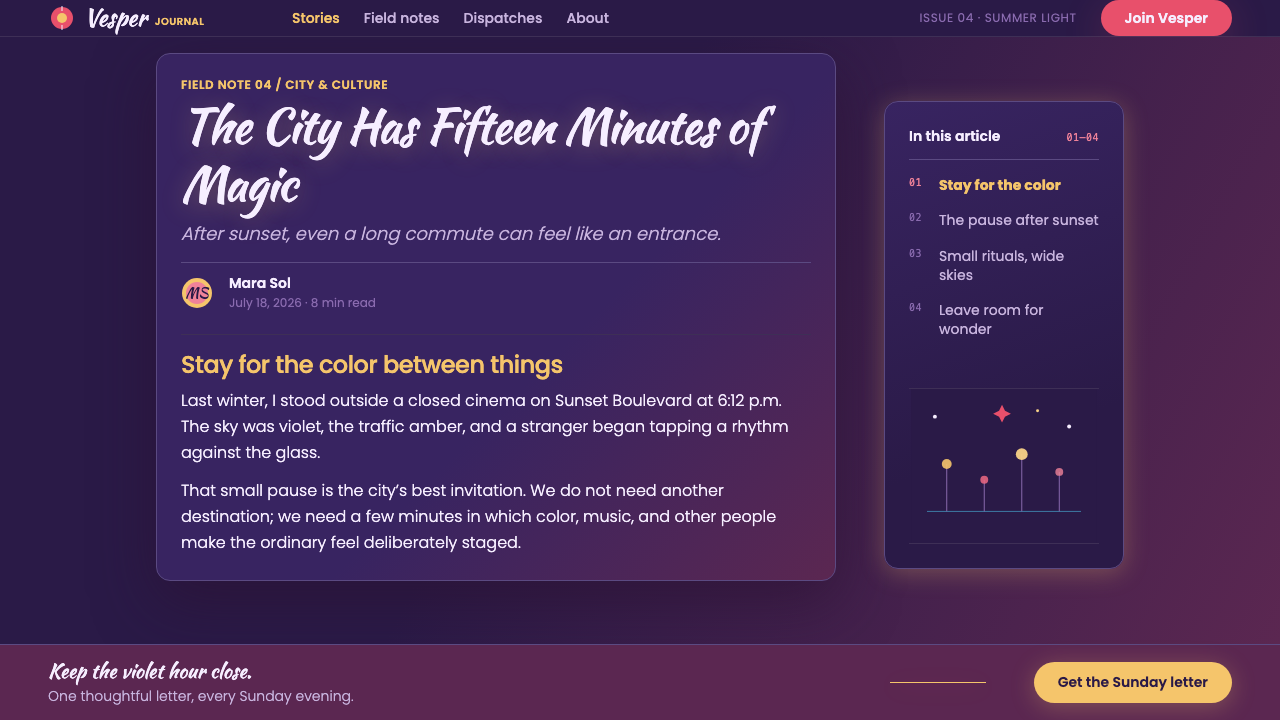
Titles borrow the expressive invitation of Kaushan Script: hand-lettered, theatrical, and personal. Interface text relies on the geometric Deco character of Josefin Sans, which gives controls and labels a cleaner rhythm. The contrast is essential. Display type carries romance and performance; interface type carries navigation and clarity. Treat the title as a voice from the stage, then let the supporting system speak quietly and precisely.
CinemaScope Framing
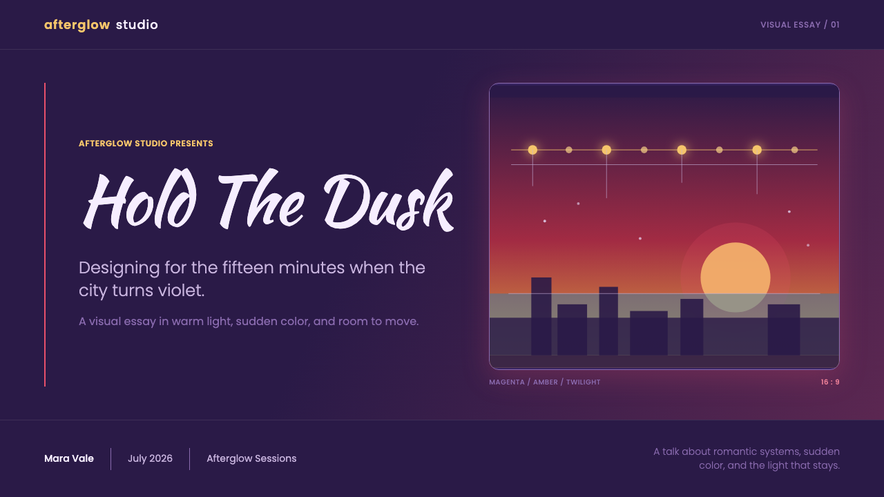
CinemaScope-inspired letterbox bands frame the page as if it were a scene rather than a neutral canvas. They create a deliberate horizontal drama, direct the eye toward the central action, and give expansive imagery a filmic boundary. The bands should feel like compositional punctuation, not a decorative stripe repeated everywhere. Use framing to make a section feel chosen, cropped, and ready for its cue.
Technicolor Accent
Each section can be energized by one saturated costume-like color against the dusk. The accent should behave as a performer: it enters with purpose, carries attention, and then leaves space for the rest of the scene. This discipline prevents the palette from becoming carnival-like. A single vivid note can make a button, statistic, illustration, or section heading feel choreographed without competing against every other element.
Who shaped La La Land (2016)?
Chazelle is a key figure associated with La La Land’s 2016 release and its Hollywood musical revival identity. In the design language, that association is felt through the premise that a page can be staged like a number: each section has an entrance, a focal point, a directional rhythm, and a final release. The visual system is romantic because it is composed as performance, not because it adds indiscriminate vintage decoration.
Sandgren is associated with the film’s image-making and with the twilight vision of Los Angeles that anchors this theme. The corresponding design lesson is to let lighting establish the emotional hierarchy. A violet field, a rose horizon, and a few amber glows can tell the viewer where the scene is, what time it feels like, and where the intimate focus belongs before any explanatory text is read.
Zophres is a key figure associated with the film’s costume color. Her relevance to the style is the idea of the Technicolor costume accent: a concentrated, saturated visual event placed against a larger dusk environment. In interface work, that principle encourages singular emphasis. A strong accent should clarify a moment of action or identity, rather than turning every control into a competing piece of spectacle.
Hurwitz is associated with the musical dimension of La La Land. For designers, music offers a useful structural analogy: repetition creates recognition, pauses create anticipation, and a single louder phrase changes the emotional meaning of what surrounds it. This theme benefits from the same logic. Repeated warm lights, recurring wide framing, and carefully rationed accents create rhythm across a long page.
How do you use La La Land (2016) today?
For presentation covers, begin with a wide twilight field and treat the title as a marquee moment. A rose-to-amber horizon can sit low in the frame while one hand-lettered title carries the emotional premise. Keep the rest of the cover quiet: a few warm lights, a restrained secondary line, and a CinemaScope-like band are more persuasive than a crowded collection of film references. The cover should feel as though the first note has just sounded.
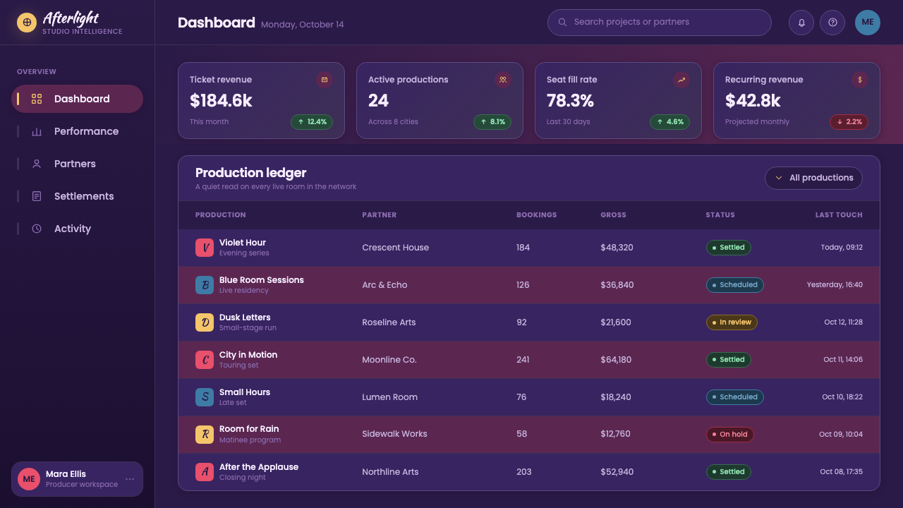
For presentation content and data pages, use the dusk field as continuity rather than decoration. Content pages benefit from clear geometric interface type, generous dark space, and a single warm highlight for the active idea. Data should be presented as a composed scene: let one series take the Technicolor role while other information stays calm and legible. Use warm light sparingly to identify a conclusion, turning point, or selected result rather than treating it as a universal status color.
For web interfaces, the theme is especially effective for dashboards, media experiences, event pages, and pricing pages that want aspiration without corporate coldness. Deep violet surfaces can hold navigation and dense information, while amber glow can direct attention toward the most meaningful action. Use the Deco-influenced interface voice consistently across labels, controls, and tiers. A pricing page can make each option feel like a moment on stage, but comparison information still needs a quiet, reliable reading order.
For editorial and marketing work, use wide framing to create chapters and let the horizon color establish transitions between narrative sections. A long-form article can open in violet, move through warmer editorial moments, and return to darkness for reflection or calls to action. Marketing imagery should feel selected like a film still: spacious, emotionally charged, and allowed to breathe. The strongest compositions preserve the tension between city-scale distance and the small warmth of a nearby light.
The common mistake is to use every romantic signal at once: hand-lettered titles, bright rose, amber bulbs, widescreen bands, and saturated accents in every panel. That produces costume without choreography. The more faithful approach gives each device a role. Let dusk establish the world, let the horizon establish yearning, let warm lights establish intimacy, and let one strong accent establish the current moment. Romance here depends on restraint.
La La Land (2016) — FAQ
Is La La Land style simply a purple dark theme?
No. Violet twilight is the foundation, but the style depends on contrast between distance and intimacy: a broad dusk field, a rose-and-amber horizon, isolated warm lights, and a deliberately staged focal point. If purple is used without the sensation of sunset, theatrical framing, or emotional lighting, the result may be attractive but will not carry the specific La La Land atmosphere.
How should display lettering and interface type work together?
Use the hand-lettered marquee character for moments that need emotional voice: a cover title, a campaign line, or a featured chapter. Use the geometric Deco-oriented interface voice for navigation, labels, supporting copy, and structured information. Their contrast is productive because it separates performance from orientation. When both are used everywhere, neither has a distinct role and the page loses its cinematic hierarchy.
Can this style work for data-heavy dashboards?
Yes, provided atmosphere does not replace legibility. Let the twilight field unify the dashboard, reserve warm glow for selection or priority, and give the primary data story one costume-like accent. Supporting series, labels, and navigation should remain calm and consistent. The useful metaphor is a jazz club below the hills: the room can be moody, but the music still needs a clear lead line.
Why are CinemaScope-style bands useful in a digital layout?
They give the composition a chosen point of view. A wide band can mark a chapter, contain an image-led moment, or make a horizontal sequence feel more like a scene than a generic card. Their value is not nostalgia alone; they establish framing and anticipation. Used selectively, they create cinematic punctuation. Used on every component, they become a repetitive decorative device and lose that power.
Related design styles
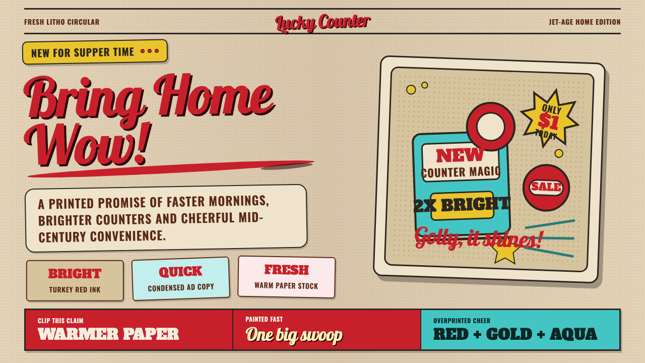 1950s Brush Script AdSells tomorrow in one swoop. Turkey red script, tan paper, starbursts, and ha…
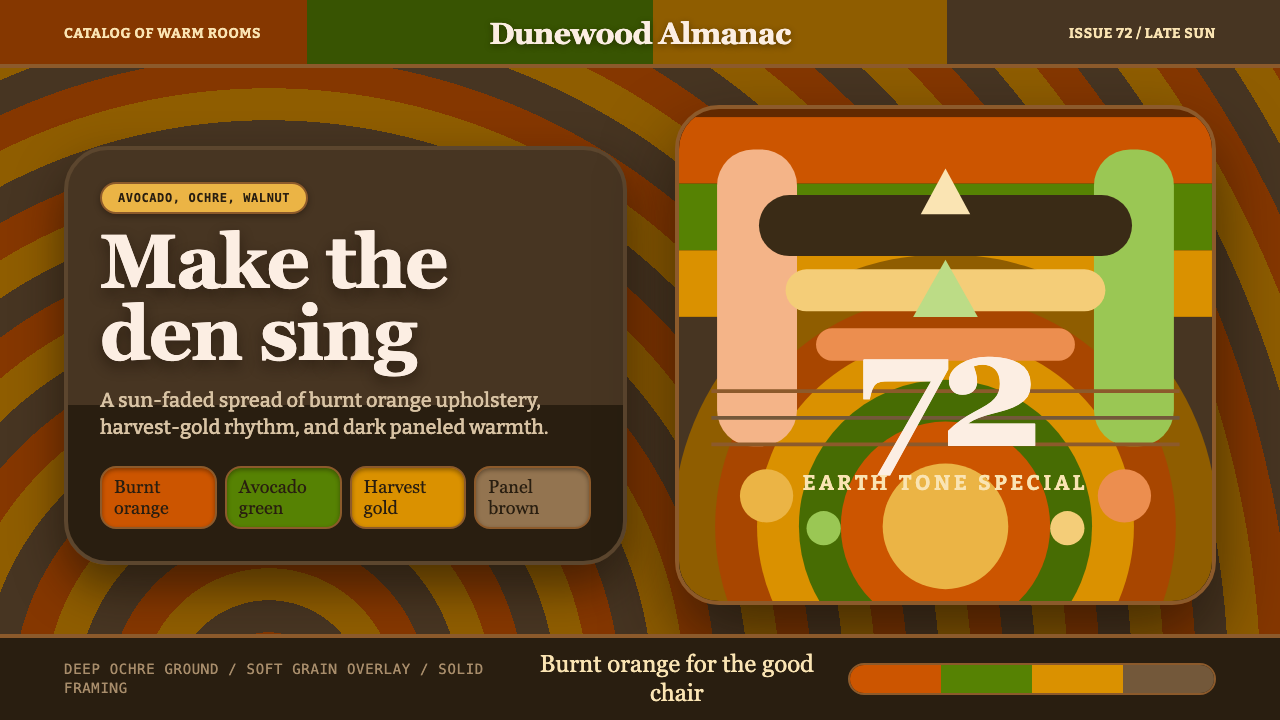 1970s Earth TonesWarm maximalism stays muddy. Bulbous slabs, avocado bands, and harvest-gold r…
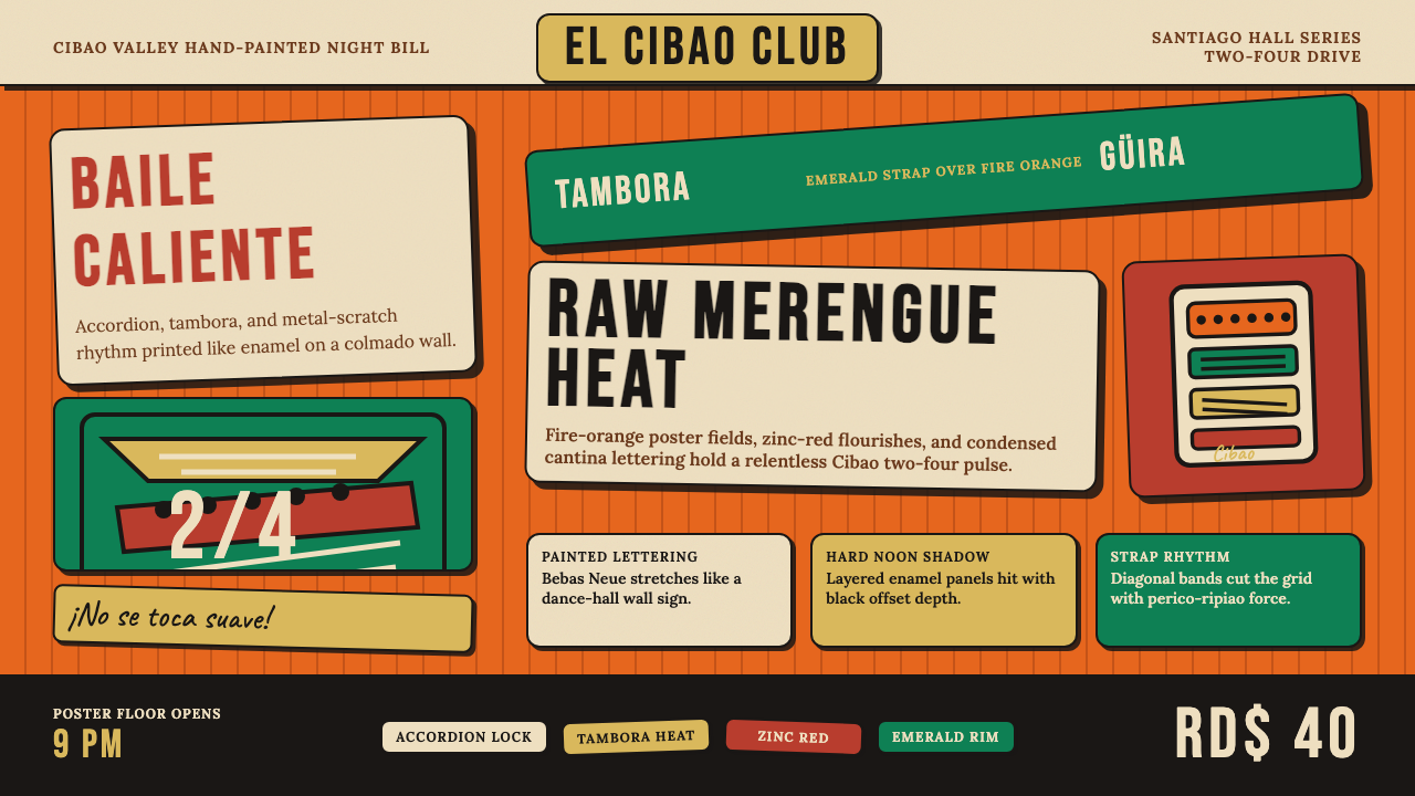 Dominican Merengue Perico RipiaoMaximalism keeps time. Fire-orange fields, Bebas Neue, and diagonal emerald s…
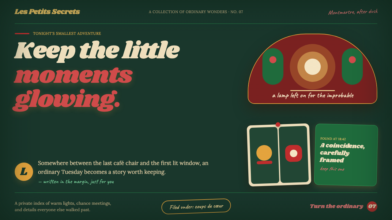 Amélie (Montmartre 2001)Ordinary moments glow like secrets. Storybook green, carmine accents, and cre…
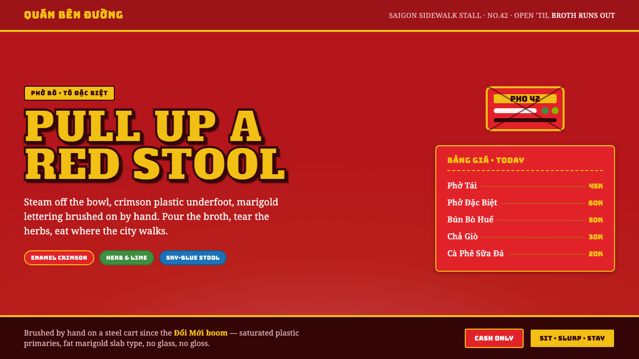 Vietnamese Pho Street CartEat where the city walks. Crimson enamel ground, fat marigold slab signage, b…
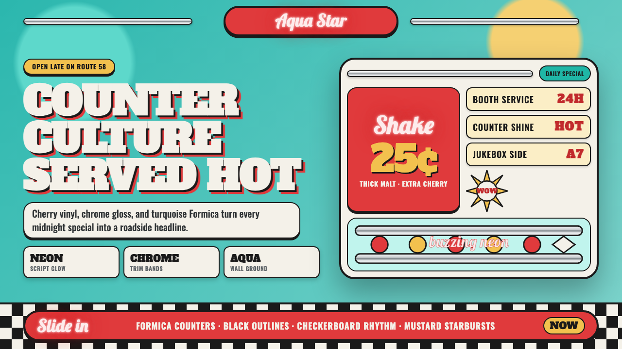 1950s Diner AquaRoadside optimism shouts. Aqua walls, cherry vinyl, chrome bands, and neon sc…