What is Halloween Jack-o'-Lantern?
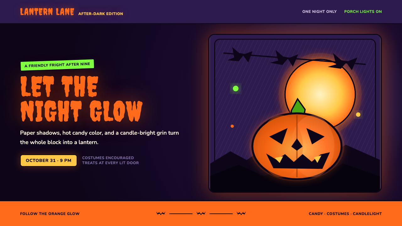
Halloween Jack-o'-Lantern turns the page into a friendly night scene: pumpkin orange glows through ink-black cuts, candy colors pop against bruise-purple darkness, and every shape feels like a paper lantern waiting to be lit.
Halloween Jack-o'-Lantern in brief
Halloween Jack-o'-Lantern is a visual language built from modern American Halloween iconography: the carved pumpkin on the suburban front porch, the bowl of candy by the door, bat silhouettes crossing the moon, and die-cut decorations hanging against the night. Its emotional register is not pure horror. It is friendly fright — spooky enough to signal the holiday, cheerful enough to invite a child closer.
The central idea is illumination from within. Pumpkin orange appears to come through cut-out eyes, mouths, and geometric openings rather than sitting passively on a surface. Dark forms become silhouettes, violet becomes the atmosphere of night, and bright accents feel like small sources of heat. The whole composition should seem backlit, as though the page itself were a lantern viewed from across a porch.
Its visual vocabulary combines folk holiday craft, mid-century die-cut party decoration, horror-comic pop, and spooky-cute character design. Cats, bats, moons, pumpkins, candy corn, and crooked smiles are treated as bold cut shapes with clear outlines. Nothing needs to become grisly or realistic. The strongest expression comes from contrast: warm glow against deep darkness, playful faces against ominous skies, and familiar domestic objects arranged as a tiny theatrical scene.
Where does Halloween Jack-o'-Lantern come from?
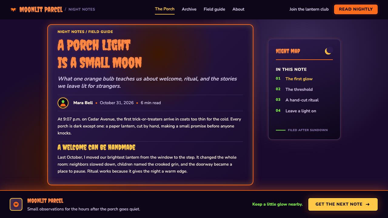
The style belongs to modern American Halloween iconography, a visual tradition that stretches from approximately 1900 to the present. Its emotional foundation is the neighborhood celebration rather than the haunted castle: a decorated porch, a bowl of sweets, handmade paper ornaments, and a carved pumpkin placed where visitors can see it. Halloween Jack-o'-Lantern therefore carries a distinctly domestic kind of theatricality. The setting is ordinary, but the lighting transforms it into a small stage for the supernatural.
The carved pumpkin is the style's organizing object because it unites craft, face, container, and light. Its surface is solid and earthy, but the cuts reveal an interior glow. That relationship between outer darkness and inner brightness becomes a broader design principle. Shapes are often framed as silhouettes, then given a warm internal accent or placed beside one. The result is less about depicting a frightening creature than about showing how darkness can make a small light feel vivid.
A major visual influence comes from the mid-century die-cut party decoration associated with the Beistle Company, whose peak belongs to the period from the 1920s through the 1960s. Die-cut cardboard forms encouraged designers to think in readable silhouettes: a cat had to be recognizable from its outline, a witch or bat had to survive as a single cut shape, and a smiling pumpkin had to communicate at a glance. This production logic explains the style's bold edges, simplified figures, and preference for flat forms that look ready to hang from a wall or string across a porch.
The wider language also draws on horror-comic pop and spooky-cute culture. Charles Addams, Tim Burton, Edward Gorey, and Vincent Price are among the named figures associated with the imaginative territory around dark humor, theatrical unease, eccentric silhouettes, and cultivated fright. They should not be reduced to a single shared style, but their presence in the reference tradition helps explain why Halloween Jack-o'-Lantern can hold menace and charm at the same time. Its darkness is performative rather than despairing: a costume, a grin, a shadow, or a theatrical pause before the candy bowl.
What defines the Halloween Jack-o'-Lantern look?
Inner Glow
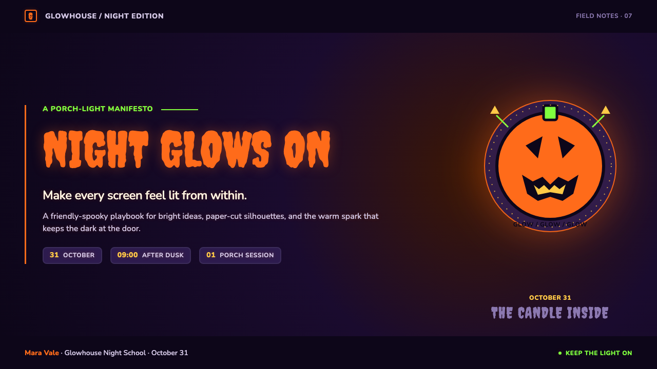
Light should feel trapped inside the object and released through cuts, holes, eyes, mouths, and narrow openings. Pumpkin orange is most convincing when it reads as a source rather than a coating. Small luminous areas can carry the emotional focus of an entire composition, especially when surrounded by generous darkness. The glow is warm and tangible, closer to a tealight behind paper than to a polished digital shine.
Night Ground
Deep violet establishes the atmosphere of the style. It is not a neutral black background and not a realistic sky; it is a bruised, theatrical night that gives orange, green, and yellow room to flare. Violet should feel dense enough to hold silhouettes but colored enough to remain part of the story. The background is an active stage, not empty space.
Ink Silhouette
Ink-black shapes provide the graphic discipline. Cats, bats, branches, roofs, hats, and crooked mouths should be legible as silhouettes before their details are understood. The black edge is not merely an outline added at the end; it is the shape's identity. Strong silhouettes make the composition feel like a cut-paper diorama and preserve clarity when the scene becomes crowded with holiday symbols.
Candy Accent
Poison green and candy-corn yellow introduce a mischievous, edible brightness. These accents should feel celebratory rather than naturalistic: green can suggest a potion, a monster's glow, or an exaggerated leaf, while yellow can signal sweets, moonlight, or a lit window. Their role is to interrupt the violet night with small bursts of comic energy, not to create a balanced rainbow palette.
Paper-Cut Depth
Depth comes from stacked flat layers rather than realistic modeling. A moon sits behind a bat, a cat overlaps a porch rail, and a pumpkin occupies the foreground as if it were a shaped card placed over painted scenery. Edges may overlap decisively, but surfaces remain simple. The viewer should sense a handmade diorama assembled from cardboard, tissue paper, and cut silhouettes.
Friendly Fright
The mood depends on tension without cruelty. Faces may grin too widely, eyes may be triangular, and shadows may gather in unexpected places, but the overall invitation remains playful. The style works when fear is stylized into a costume or prop. A pumpkin should look pleased to be seen; a bat should look graphic and nimble; even a haunted detail should retain the charm of a party decoration.

Who shaped Halloween Jack-o'-Lantern?
Addams belongs to the tradition of dark humor and comic unease that helps Halloween imagery remain witty rather than merely frightening. In this visual territory, the macabre becomes a character, a pose, or a domestic joke. His association is useful when a composition needs elegant gloom with a mischievous smile.
Burton is associated with theatrical eccentricity, elongated silhouettes, crooked charm, and the ability to make darkness feel handmade and emotionally accessible. His place in the reference field supports the style's combination of gothic atmosphere and playful character design.
Gorey represents cultivated oddness: precise silhouettes, dry theatricality, and a sense that the strange can be presented with restraint. His association is valuable for editorial compositions that want Halloween atmosphere without relying on loud visual effects.
The Beistle Company is tied to the mid-century die-cut party-decoration tradition that made Halloween symbols readable as bold hanging shapes. Its importance here is material and formal: cardboard silhouettes, repeatable motifs, and decorations designed to transform an ordinary room or porch into a seasonal scene.
Price is associated with the cultivated, performative side of horror: a voice, presence, and atmosphere that make fright feel theatrical. In this style, that influence appears as ceremony and presentation rather than realism — the raised eyebrow, the dramatic pause, and the pleasure of being slightly unsettled.
How do you use Halloween Jack-o'-Lantern today?
For presentation slides, use the opening slide as a porch-at-night tableau: one large glowing pumpkin, a moon or bat silhouette, and a title that feels cut from the scene rather than placed on top of it. Content slides should alternate between dark atmospheric grounds and warm illuminated panels, keeping text inside clear paper-like shapes. Data slides can turn charts into candy, potion, or lantern forms, but the underlying information must remain immediately legible. A single glowing accent should guide attention through each slide.
For web interfaces, the style suits dashboards, event pages, seasonal commerce, and pricing pages that want warmth without losing contrast. Use deep violet as the night field, ink-black for structural text and silhouettes, and reserve pumpkin orange, poison green, and candy-corn yellow for actions, status signals, featured tiers, or celebratory moments. Cards can feel like layered cut paper rather than floating glass. Buttons should look like bright objects placed into the scene, while navigation stays simple enough to avoid turning the interface into visual noise.
For editorial and marketing work, build a small theatrical world around the content. An article can open with a large carved face, then use bats, moons, cats, or candy as recurring marginal motifs. Section breaks work well as silhouette bands, hanging garlands, or horizontal fields of violet and orange. Marketing pages can treat product benefits as items on a porch: one glowing feature at a time, surrounded by generous night space. The tone should remain inviting, witty, and tactile rather than aggressive.
A common mistake is to confuse Halloween Jack-o'-Lantern with generic horror. Excessive gore, realistic monsters, muddy gradients, and uniformly frightening imagery destroy the friendly-spooky balance. Another mistake is scattering every holiday symbol across every surface. The strongest compositions choose a clear hero object, establish the night ground, and let a few silhouettes or candy-colored accents support it. If everything glows, nothing feels lit from within; if everything is black, the page loses its invitation.
The style also benefits from respecting the logic of physical decoration. Ask whether each shape could plausibly be cut from cardboard, folded from tissue paper, printed as a hanging ornament, or illuminated from behind. This test keeps forms readable and prevents the work from drifting into generic digital fantasy. Texture should suggest paper, ink, or printed party goods when needed, but it should never overwhelm the silhouettes. The goal is a seasonal scene that feels assembled by hand and energized by light.
Halloween Jack-o'-Lantern — FAQ
Is Halloween Jack-o'-Lantern a horror style or a children's holiday style?
It sits between the two, but it leans toward friendly fright. The style uses darkness, silhouettes, strange faces, and theatrical unease to signal Halloween, yet it softens those elements through candy colors, handmade decoration, familiar porch objects, and exaggerated smiles. The intended feeling is a safe encounter with the spooky — a scene that invites curiosity instead of demanding fear.
Why is the inner glow more important than realistic lighting?
Because the inner glow is the style's narrative device. It tells the viewer that the pumpkin, paper ornament, or cut-out face contains a hidden source of life. Realistic lighting could make the scene more dimensional, but it would weaken the specific relationship between hollow darkness and warm interior light. The glow should therefore feel symbolic, tactile, and slightly theatrical.
Can the style work without pumpkin imagery?
Yes, as long as the larger system remains intact. Bats, cats, moons, candy, die-cut ornaments, violet night grounds, ink-black silhouettes, and an internal sense of illumination can carry the language on their own. The pumpkin is the strongest organizing symbol, but it is not the only one. What must remain is the combination of paper-cut clarity, warm contrast, seasonal theatricality, and friendly unease.
How can a designer keep the style from becoming visually cluttered?
Start with one hero object and one atmospheric ground. Let the main pumpkin, moon, or glowing face establish the scale and emotional center, then add silhouettes as supporting actors rather than equal competitors. Use the bright colors sparingly and keep large areas of violet or near-black open. The style becomes clearer when every decoration has a role in the porch scene instead of appearing as an isolated Halloween sticker.
What makes this style feel specifically American rather than generically Halloween?
Its setting is the suburban front porch and its objects belong to a shared holiday vernacular: candy bowls, hanging die-cut decorations, paper party goods, carved pumpkins, and a neighborhood scene viewed after dark. The mood is communal and domestic rather than medieval or folkloric. Even its fright is presented as seasonal hospitality — something placed by the door for visitors to see, enjoy, and perhaps laugh at before taking a piece of candy.
Related design styles
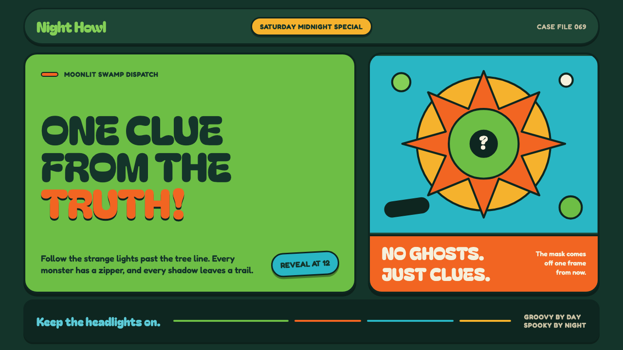 Mystery Machine (Scooby-Doo 1969)Groovy by day, spooky by night. Balloon type and acid-green panels hide the n…
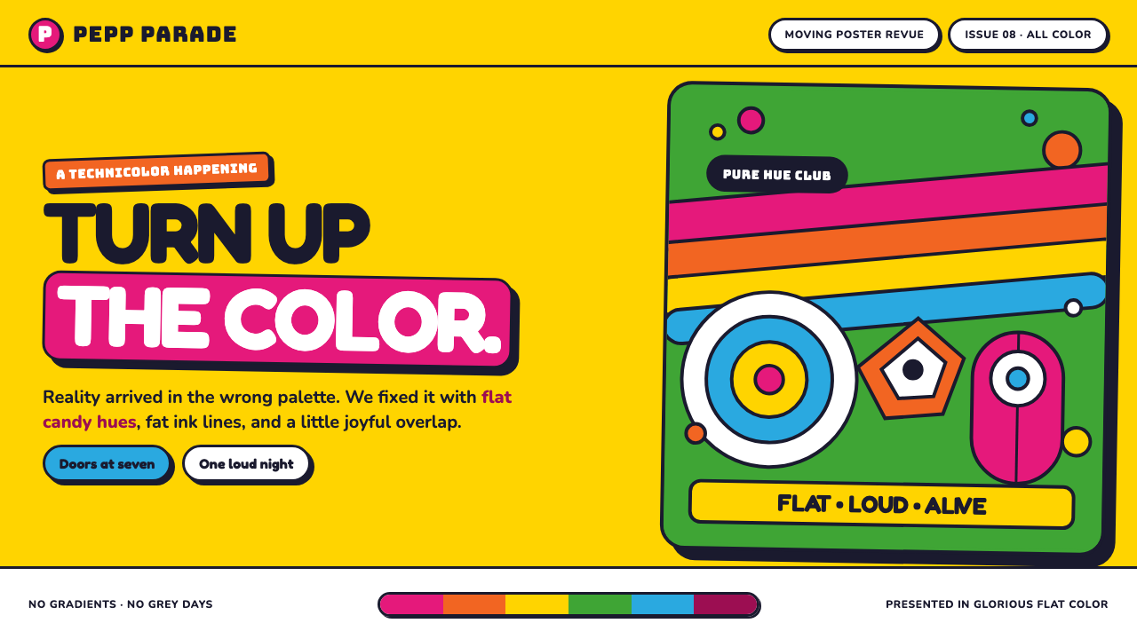 Yellow Submarine (Edelmann pop)Reality, recolored for joy. Candy-flat hues, fat ink outlines, and bouncing o…
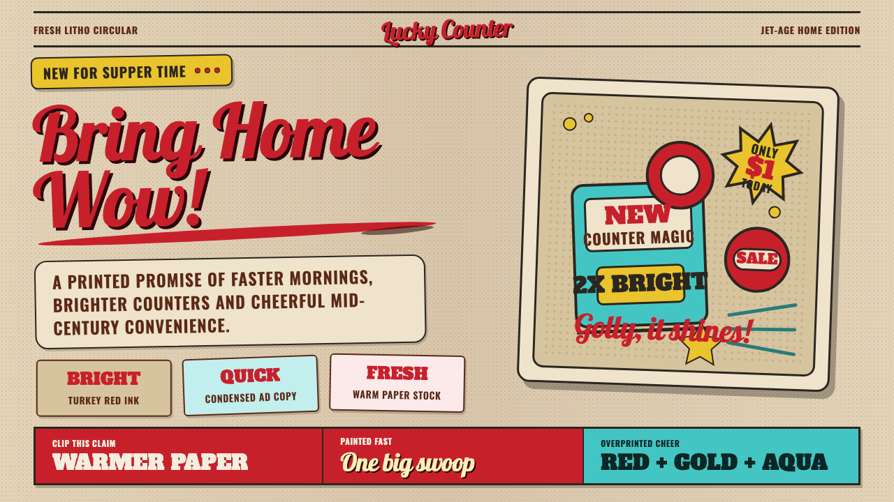 1950s Brush Script AdSells tomorrow in one swoop. Turkey red script, tan paper, starbursts, and ha…
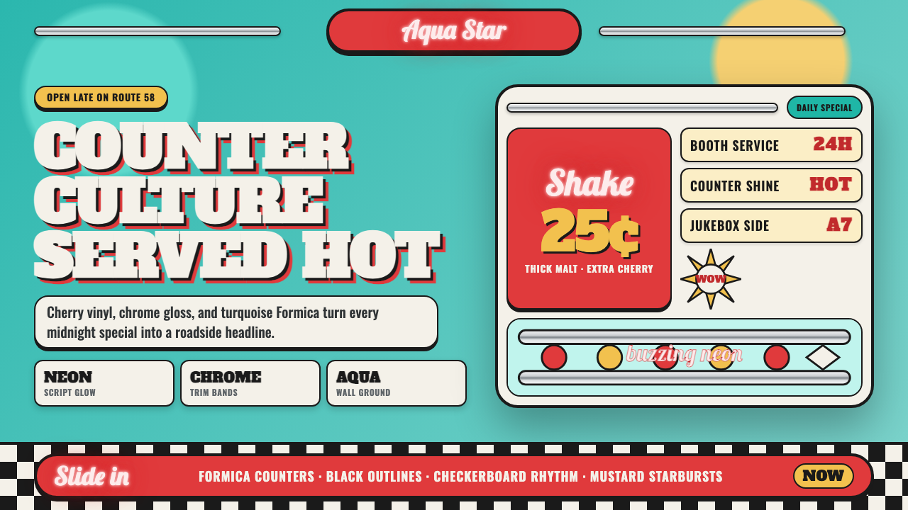 1950s Diner AquaRoadside optimism shouts. Aqua walls, cherry vinyl, chrome bands, and neon sc…
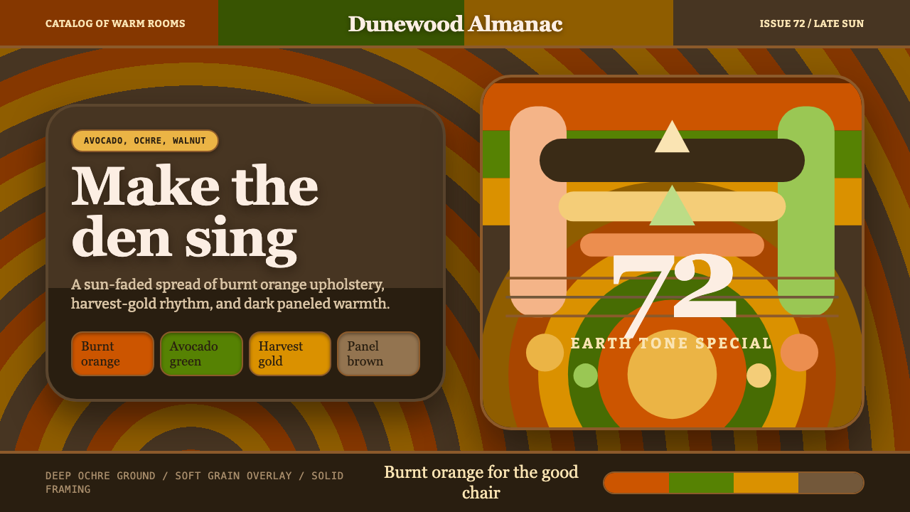 1970s Earth TonesWarm maximalism stays muddy. Bulbous slabs, avocado bands, and harvest-gold r…
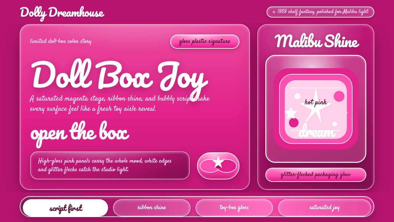 Barbie Hot Pink (Pantone 219)Saturated joy in plastic. Hot magenta, cursive script, gloss streaks, and gli…