What is Yellow Submarine (Edelmann pop)?
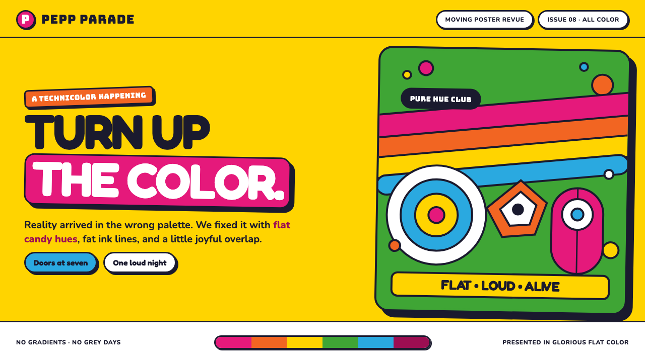
Yellow Submarine turns reality into a buoyant visual party: candy-flat color, fat ink contours, and a world that gains depth by happily colliding with itself.
Yellow Submarine (Edelmann pop) in brief
Yellow Submarine is the flat, saturated, cut-paper psychedelia Heinz Edelmann developed for the animated feature released in July 1968. Its language sits where Pop Art collage, poster illustration, psychedelia, and Op Art meet. Figures, objects, bands, and symbols are enclosed by continuous ink outlines, then filled with unapologetically pure color. The image never asks viewers to mistake illustration for reality; it makes its artificiality part of the pleasure.
The style is defined less by a decorative surface than by a decisive way of constructing a frame. There is no modeled lighting, no tonal shading, and no attempt to make forms recede through naturalistic atmosphere. Instead, a hand, an eye, a clock, or a submarine becomes a crisp graphic cutout. Depth comes from what covers what. A foreground shape overlaps a background field, a rainbow band crosses a figure, and the visual hierarchy becomes instantly legible.
Its emotional register is extroverted and playful. The yellow submarine reads as a rounded toy rather than an engineered machine; the Sea of Green becomes a literal expanse of green; drifting hands, eyes, and clocks make the frame feel open to visual mischief. Even when the composition becomes crowded, flat color and unbroken contour keep it readable. The result is psychedelic without becoming murky: energetic, surreal, and deliberately clear.
Where does Yellow Submarine (Edelmann pop) come from?
The visual language belongs to 1967–1968, the period in which the Edelmann model sheets established the film’s look before its July 1968 release. Its setting was TVC, the TV Cartoons studio in Soho, London. That context matters because the style reads as an animated system rather than an isolated poster: it needs forms that can remain recognizable while moving, colliding, repeating, and crossing broad fields of color.
Heinz Edelmann is the central author named in the approved account. He built a language of saturated cut-paper forms, unbroken outlines, and flat color for Yellow Submarine. The model-sheet basis is important: it implies a coherent visual grammar that could carry many images without abandoning its identity. A submarine, rainbow band, tunnel, eye, or clock can change scale and position, yet remain part of the same world because contour, fill, and overlap follow the same rules.
The style draws together four stated currents: Pop Art, psychedelia, poster illustration, and Op Art. Pop Art contributes the directness of bold, everyday-looking symbols. Psychedelia brings unreality, rhythm, and exuberant color. Poster illustration supplies graphic immediacy and silhouette. Op Art appears in the rippling bands and tunnel-like spaces that make the eye travel across a flat frame. None of these influences needs naturalistic rendering; their shared strength is graphic force.
George Dunning, Jack Stokes, and Robert Balser are identified alongside Edelmann as key figures in the origin account. Their presence places the look within a collaborative animated-feature context centered in London rather than treating it as the expression of a single static image. The enduring lesson of the 1967–1968 visual language is that consistency can come from a few firm graphic commitments: continuous contour, flat color, elastic scale, and layers that remain visibly layered.
What defines the Yellow Submarine (Edelmann pop) look?
Candy-Flat Color
Color is saturated, clean, and unapologetically artificial. Large fields of pure hue establish places and moods immediately: the Sea of Green is not a subtle landscape, but a direct green world. Color does not describe light falling across an object. It declares what the object is, separates it from its neighbors, and gives the frame its celebratory charge.
Unbroken Ink Outline
Every major form is held together by a bold, continuous contour. The outline is not a timid edge treatment; it is the structure that allows improbable colors and floating objects to remain readable. It gives each element the presence of a sticker, cutout, or poster figure, while preserving enough unity for wildly different motifs to coexist in one composition.
Overlap as Depth
Depth is created through ordering rather than illusion. A shape feels closer because it crosses another shape, not because it receives a realistic cast shadow or gradual tonal change. This makes the visual space feel buoyant and theatrical. Layers can slide, bounce, and interrupt each other without losing the graphic certainty of a flat illustrated world.
Elastic Scale
Hands, eyes, clocks, tunnels, and the submarine are free to become larger or smaller according to the composition’s needs. Scale is expressive rather than realistic. A familiar object can become an event simply by expanding into the frame, while a smaller symbol can operate as a rhythmic accent. This freedom gives the style its dreamlike but controlled energy.
Rainbow Rhythm and Optical Motion
Rippled rainbow bands and Op Art tunnels introduce motion without requiring modeled volume. Repetition leads the eye through the composition, while curved bands make a flat image feel as if it is pulsing outward. The effect is rhythmic rather than cinematic realism: visual elements behave like music made visible, moving by recurrence, contrast, and interruption.
Joyful Collage
The composition welcomes mismatched motifs: a toy-like vessel, symbolic body parts, timepieces, and abstract bands can share a single field. Their unity comes from common contour and color treatment, not from realistic perspective or narrative plausibility. This collage logic makes the frame feel generous, surprising, and always slightly ready to tip into a new visual joke.
Who shaped Yellow Submarine (Edelmann pop)?
Edelmann is identified as the creator of Yellow Submarine’s flat, saturated, cut-paper psychedelia. The visual language of the Edelmann model sheets established the film’s recognizable system of continuous ink contour, candy-flat color, and depth through overlap during 1967–1968.
George Dunning is named as a key figure in the Yellow Submarine origin account. His inclusion locates the visual language within the collaborative production environment of the animated feature at TVC in Soho, London, rather than reducing it to a purely standalone illustration style.
Jack Stokes appears among the key figures associated with the film’s 1967–1968 origin period. In design history terms, that shared attribution is useful because the style depends on repeatable visual decisions: forms must remain coherent as they move through fields, bands, tunnels, and layered compositions.
Robert Balser is also identified as a key figure in the approved origin material. Together with the other named figures, he situates Yellow Submarine’s look in a feature-animation context where graphic invention had to operate as a durable visual language across more than a single image.
How do you use Yellow Submarine (Edelmann pop) today?
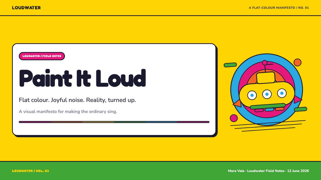
For presentation covers, use the style’s poster-like certainty. Place one large, toy-like central object or symbolic motif against a broad field of pure color, then let a rainbow band, eye, hand, or other outlined form interrupt the frame. The title should feel like a participant in the collage, not a label pasted above it. Keep the visual decision bold: one dominant image, a few supporting elements, and enough empty field for the color to feel expansive rather than crowded.
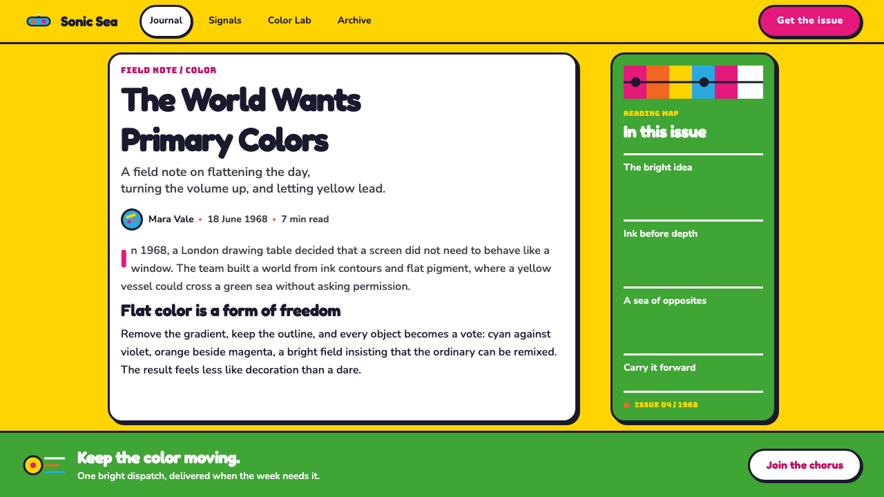
For content slides, translate the style into a clear sequence of outlined containers and color fields. Treat each idea as a flat cutout with a strong silhouette, using overlap to indicate relationships between sections. A slide can carry a main statement, a smaller explanatory group, and a recurring visual motif without needing realistic icons or atmospheric decoration. Repeated curved bands can create continuity between slides, but they should guide reading rather than become background noise.
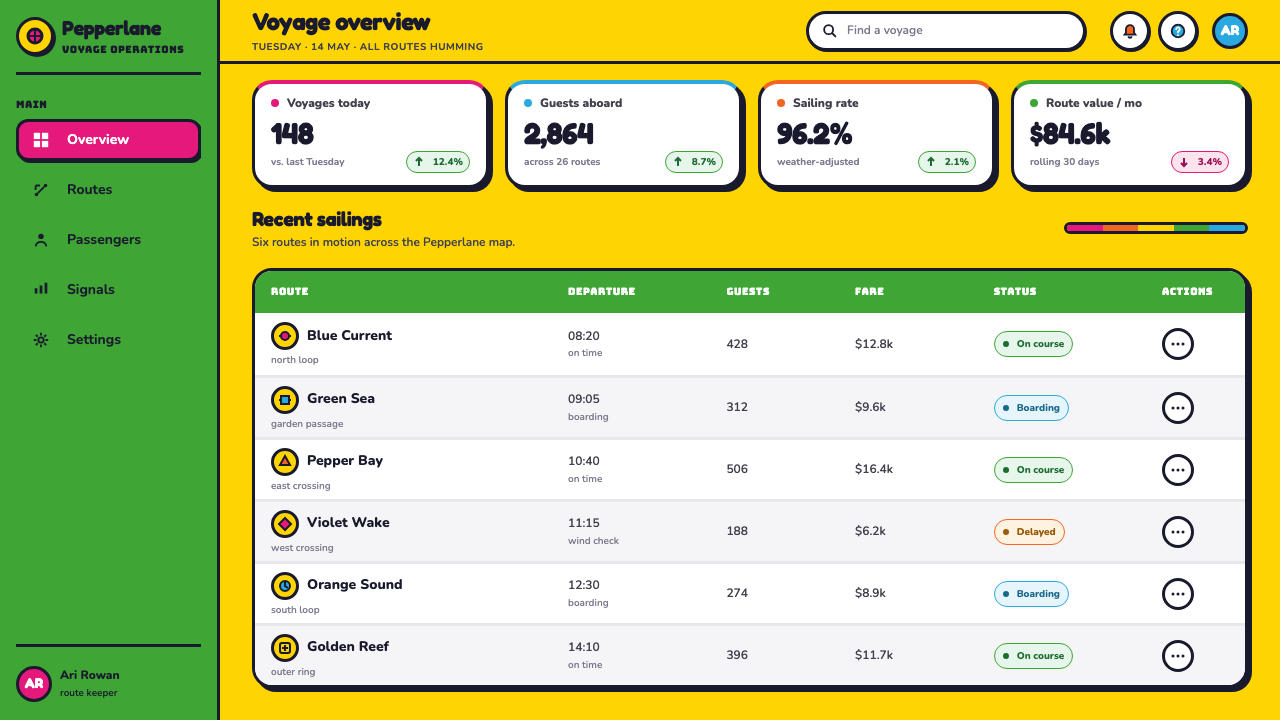
For data slides, preserve the graphic logic instead of forcing every chart into a naturalistic or corporate-neutral treatment. Let bars, segments, labels, and annotations behave as crisp, flat forms with clear outlines. Use a strong color field to separate major categories, and use overlap only when it explains a relationship rather than obscuring a value. A clock or eye motif can frame a timing or attention theme, but the data itself should remain the most immediate element.
For web interfaces, this style is especially effective for campaign pages, playful dashboards, and pricing surfaces that need immediate emotional lift. Use broad color fields to distinguish regions, outlined cards or panels to hold information, and rounded illustrated motifs to make transitions memorable. Navigation and controls should remain direct and legible. The interface can be exuberant, but the action a visitor should take must never be hidden behind the collage.
For editorial and marketing work, use the style to turn ordinary information into a visual event. A feature story can open with an oversized outlined object crossing the masthead area, while sections alternate between expansive color fields and calmer text-led spaces. The common mistake is to copy only the bright palette. Without continuous contours, flat fills, deliberate overlap, and a willingness to simplify reality, bright color alone becomes generic decoration rather than Yellow Submarine’s joyful graphic logic.
Yellow Submarine (Edelmann pop) — FAQ
Is Yellow Submarine style simply psychedelic color?
No. Saturated color is essential, but it works within a more complete system: continuous ink outlines define forms, flat fills reject naturalistic modeling, and overlap creates depth. The style also relies on collage-like juxtaposition and optical movement from bands and tunnels. If color is bright but objects retain realistic shading, soft atmospheric depth, or unrelated rendering styles, the result loses the graphic clarity that makes the language distinctive.
Why does the style avoid gradients and shading?
Because Yellow Submarine’s visual world does not try to persuade viewers that its objects occupy realistic light and space. Its forms are intentionally flat, like colored cutouts held together by ink contour. Removing shading makes color more immediate and lets overlap do the spatial work. This choice also keeps the frame lively: the eye reads silhouettes, intersections, and bands quickly instead of lingering over simulated material or lighting.
How can a busy composition remain readable in this style?
Give every important object a decisive silhouette and continuous outline, then make layer order obvious. A crowded frame can remain clear when each form is distinct from its surrounding field and overlaps have a visible purpose. Reuse a limited set of motifs and let one or two elements lead the composition. The goal is not visual emptiness; it is a controlled abundance in which the viewer always knows where to look first.
Does the style work for serious information?
It can, provided the information structure remains more important than the visual joke. The style is useful when a subject benefits from energy, optimism, memorability, or fast visual separation. For slides, dashboards, and editorial layouts, use flat fields and outlines to clarify groups, actions, and priorities. Avoid adding drifting motifs merely to fill space; each playful element should frame, direct, or reinforce the content it accompanies.
What is the fastest way to make a design feel less like Yellow Submarine?
Introducing realism is the fastest route away from it. Soft shading, dimensional materials, subtle atmospheric depth, and restrained photographic color all weaken the cut-paper premise. Another frequent problem is treating every part of the layout with equal intensity. Yellow Submarine is exuberant, but it still organizes attention through large fields, dominant motifs, outlined boundaries, and clearly staged overlap. Joy needs structure to remain joyful rather than chaotic.
Related design styles
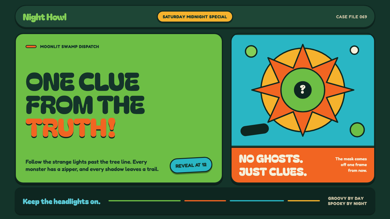 Mystery Machine (Scooby-Doo 1969)Groovy by day, spooky by night. Balloon type and acid-green panels hide the n…
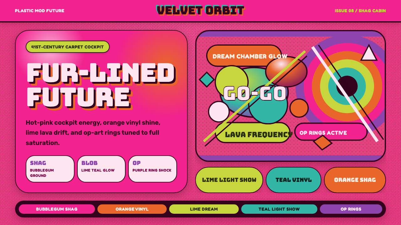 BarbarellaSpace-camp overload. Hot pink shag, lava blobs, and op-art rings collide.
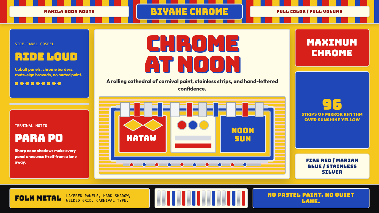 Filipino Jeepney (Chrome & Streamer)Maximalism has wheels. Sunshine yellow, chrome strips, Bungee route-sign type.
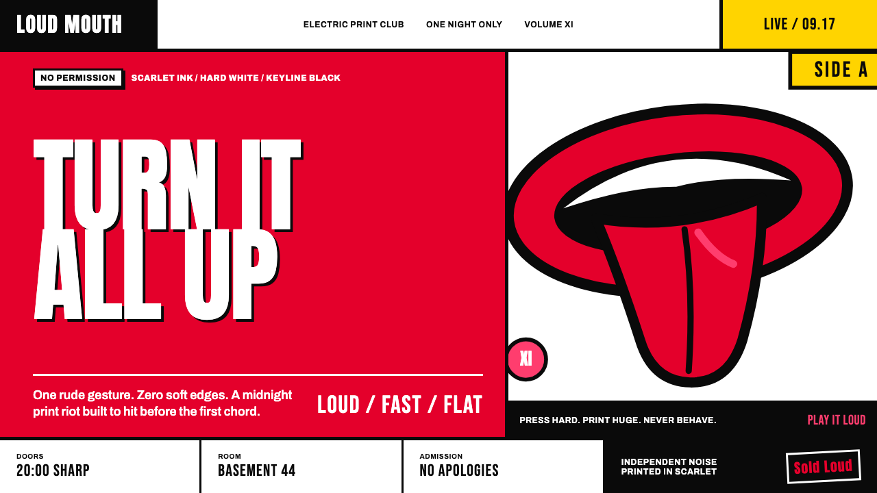 Rolling Stones Tongue (1971)Flat ink shouts loud. Scarlet curves, black keylines, and cropped poster scal…
 1950s Brush Script AdSells tomorrow in one swoop. Turkey red script, tan paper, starbursts, and ha…
 1950s Diner AquaRoadside optimism shouts. Aqua walls, cherry vinyl, chrome bands, and neon sc…