What is Barbarella (1968)?
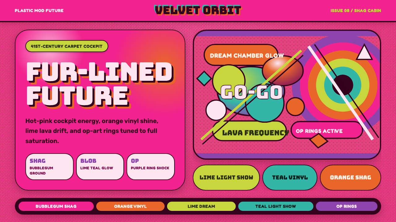
Barbarella turns 1960s psychedelia loose in outer space — a shag-carpeted cockpit, lava-lamp blobs, and op-art rings colliding in electric, plastic-glam excess.
Barbarella (1968) in brief
Barbarella is Roger Vadim's 1968 science-fiction film, adapted from Jean-Claude Forest's French comic strip of the same name and set in the 41st century. Its title character, a space agent sent to track down a renegade scientist, moves through a universe rendered not with sleek machine-age minimalism but with the full, saturated vocabulary of Swinging-Sixties pop culture: her spacecraft cockpit is carpeted floor to ceiling in long-pile shag, its control panels wrapped in the same soft fur as a 1960s bachelor pad rather than brushed metal.
The film's visual world borrows freely from three overlapping late-1960s currents: psychedelia's freeform, color-saturated blob shapes; op art's precise, vibrating geometric rings and concentric patterns; and a plastic, mod pop-future aesthetic that treated the far future as an extension of contemporary teen and youth-culture style rather than a rejection of it. The most celebrated set piece, the Chamber of Dreams sequence, staged pure psychedelic light and color as spectacle in its own right, with no narrative purpose beyond immersion.
This design system distills that collision into a coherent digital language: hot-pink grounds standing in for the shag-carpet cockpit, glossy plastic surface treatment borrowed from the film's mod production design, soft rounded blob shapes drawn from lava-lamp and psychedelic poster forms, and a habit of letting clashing, high-saturation colors sit directly against one another rather than being harmonized into a single palette family.
Where does Barbarella (1968) come from?
Barbarella began as a French comic strip created by Jean-Claude Forest, first serialized starting in 1962. Forest's Barbarella was aimed at an adult readership and was frank about sexuality in a way mainstream American comics of the era were not, following its heroine through an episodic, dreamlike far-future universe. The strip's success made Forest one of the defining figures of the French comics scene's move toward adult subject matter in the 1960s.
Roger Vadim, already known in France for launching Brigitte Bardot's career and for a directing style that mixed fashion sensibility with provocation, adapted the comic into a French-Italian co-production released in 1968, starring Jane Fonda in the title role. Vadim assembled a production team steeped in fashion and design rather than traditional science-fiction art direction: production designer Mario Garbuglia built the film's sets, while costume design drew on the era's most forward-looking fashion houses, giving the film's sense of the future a distinctly 1960s Paris-runway inflection rather than an engineering one.
The film arrived at the height of the psychedelic era, when op-art pioneers were showing precise, optically vibrating geometric compositions in galleries, and when youth culture more broadly was absorbing bright, clashing color as a form of generational signal-sending. Barbarella's production design absorbed all of it — the shag textures and inflatable furniture of contemporary interior design trends, the concentric-ring motifs of op art, and the loose, amoeba-like forms found in psychedelic concert posters and lava-lamp design — and staged them as the interior of a spacecraft rather than a nightclub or living room.
Commercially, Barbarella underperformed on its initial release and was received unevenly by critics, but its aesthetic proved far more durable than its reviews. It became a touchstone of camp cinema, was cited as a direct influence on later glam and space-age fashion, and even lent its heroine's name to the British band Duran Duran, who took their name from the film's villain. Decades on, the film is remembered less for its plot than for the specific, maximalist color-and-texture language of its sets and costumes.
What defines the Barbarella (1968) look?
Electric Hot Pink
The system's default ground color is an intensely saturated, almost fluorescent pink drawn directly from the shag carpet lining Barbarella's cockpit — a color with none of the softness of a pastel or blush tone. It functions less as a background than as an environment, the way the actual carpet wraps floor, wall, and control panel into one continuous field, so pink here reads as atmosphere rather than accent.
Glossy Plastic Surface
Surfaces throughout carry a hard, reflective sheen — the specific gloss of injection-molded plastic and vinyl rather than the softness of fabric or the shine of polished metal. Highlights sit as bright, concentrated points rather than broad soft glows, giving even flat shapes a sense of a curved, light-catching plastic skin.
Lava-Lamp Blobs
Organic, rounded, asymmetric blob shapes recur throughout, borrowed directly from the free-floating forms inside a lava lamp — no straight edges, no sharp corners, shapes that appear to be mid-motion even when static. These blobs are used as decorative fields and background motifs, always soft-edged and always slightly irregular rather than drawn to any regular geometric formula.
Op-Art Rings
Set against the blobs are precise, mechanically regular concentric rings and radiating patterns, borrowed from the optical-art tradition popular in galleries at the same moment the film was produced. Where the blobs are loose and organic, the rings are exact and vibrating, and the tension between the two — freeform against precise geometry — is one of the system's central visual moves.
Maximal Clashing Color
Color pairings are chosen for friction rather than harmony — orange against magenta, acid green against hot pink — deliberately avoiding the kind of restrained, coordinated palette a more conservative system would use. The effect is meant to feel groovy and overloaded rather than tasteful, closer to a psychedelic concert poster than a considered brand palette.
Shag and Pile Texture
Where texture is implied, it leans toward deep, soft pile rather than smooth or woven surface — the tactile equivalent of the shag carpet that lines every visible surface of the Alpha 7 cockpit. This texture cue softens what would otherwise be a very hard, plastic-and-neon system, giving it a lounge-like, almost cozy undertone beneath the visual noise.
Bubble and Dome Forms
Rounded, transparent-feeling dome and bubble shapes appear as framing devices — echoes of the film's space helmets and capsule interiors — used to contain or spotlight a single piece of content inside an otherwise busy, pattern-dense field. A bubble form gives the eye a place to land amid the system's characteristic visual overload.
Who shaped Barbarella (1968)?
Vadim directed Barbarella and shaped its tone as knowing, fashion-inflected spectacle rather than straight science fiction, building on a directing career already associated with mixing provocation and high style. His decision to stage the far future through contemporary 1960s design trends — rather than an imagined machine aesthetic — is the reason the film reads today as a period document of psychedelic pop culture as much as a science-fiction artifact.
Forest created the original Barbarella comic strip in 1962, establishing the character and her dreamlike, episodic far-future universe for an explicitly adult readership. His comic helped push French comics toward more mature subject matter in the 1960s, and the loose, illustrative sensibility of his panels carried through into the film's own preference for organic, hand-drawn-feeling shapes over hard technical futurism.
Garbuglia served as the film's production designer, responsible for translating its far-future setting into built sets — most famously the shag-lined Alpha 7 cockpit. His work grounded the film's psychedelic aesthetic in physical, three-dimensional space rather than treating it as surface decoration, giving later designers a genuine set of forms and materials to draw from rather than a purely graphic reference.
Fonda starred as the title character, and the film's marketing and enduring cultural memory are inseparable from her performance and image in the role. Its opening zero-gravity title sequence became one of the most widely referenced images of the film, cementing Barbarella's status as a camp icon of 1960s pop cinema well beyond genre-film circles.
Rabanne, already known for avant-garde fashion built from unconventional materials like metal discs and plastic, contributed to the film's costume design, reinforcing its link to contemporary high fashion rather than conventional science-fiction costuming. His involvement is part of why the film's look has aged as a fashion document as much as a film one, still cited in retrospectives of 1960s space-age style.
How do you use Barbarella (1968) today?
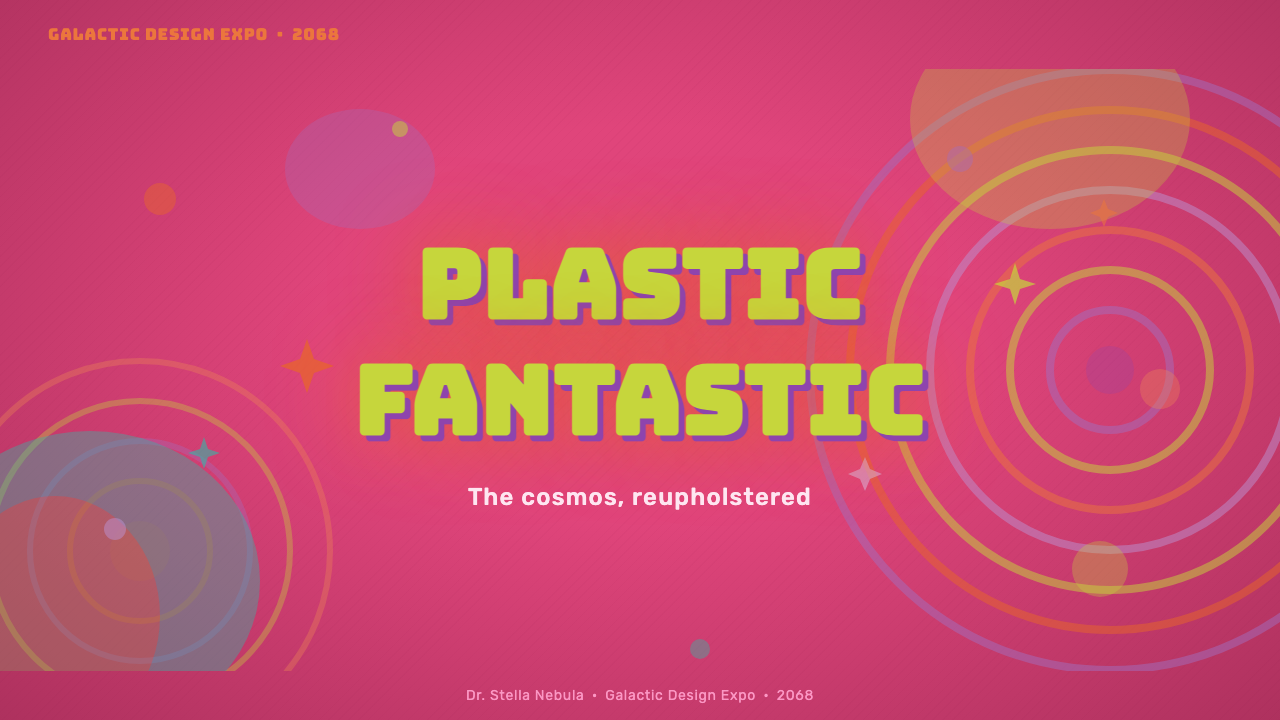
For presentation slides, this system's high-energy, maximalist color works best for covers and short bursts rather than dense information — brand launches, entertainment and lifestyle pitches, anything that wants to announce itself as playful and bold rather than authoritative. A cover slide can use a hot-pink ground with a single large blob shape and an op-art ring as the dominant graphic device, with the title set plainly enough to survive the visual noise around it. Content slides should dial the pattern back to margins or a single accent panel — filling an entire content slide with clashing color and blob shapes will fight the audience's ability to read data or bullet points.
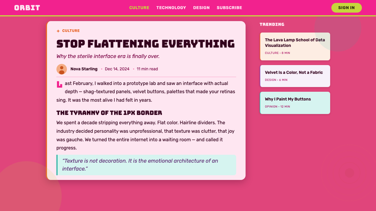
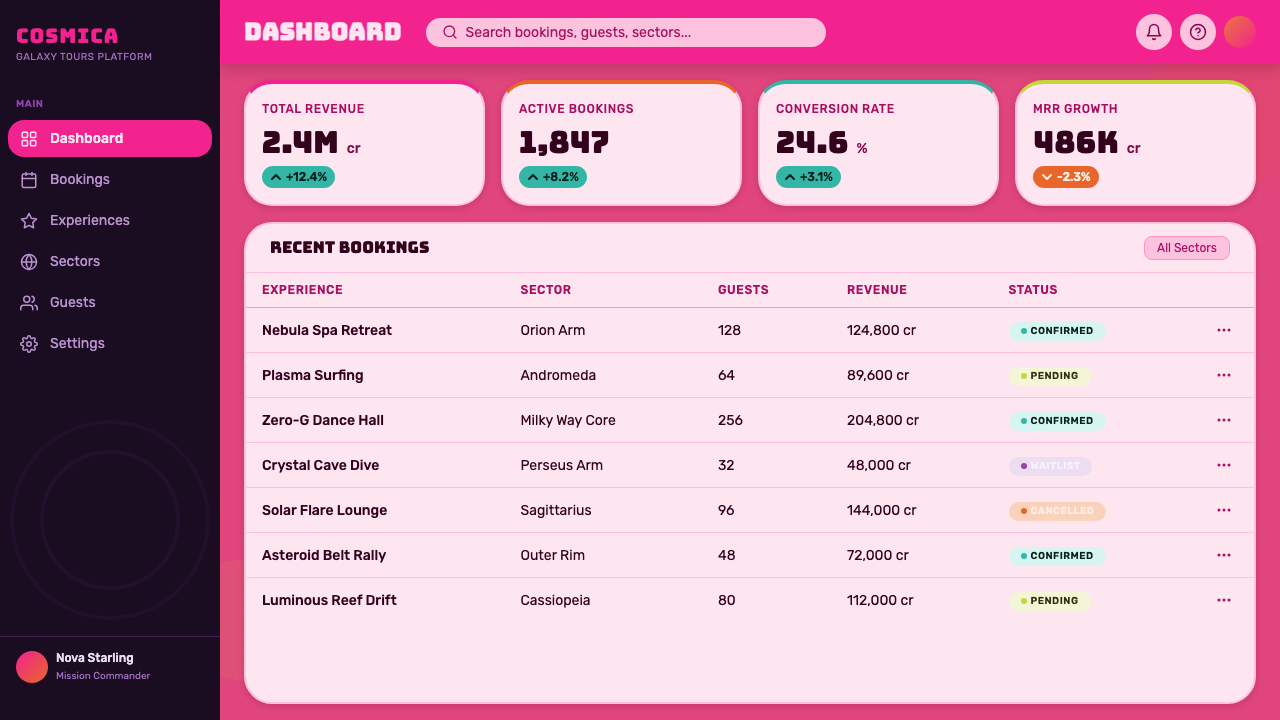
For web interfaces, the system suits entertainment, nightlife, beauty, and lifestyle brands far better than utility software — a music festival site, a retro-themed product launch, a beauty or fashion storefront. Dashboards and enterprise software are a poor match: the deliberately clashing palette and organic blob shapes work against the calm, low-noise hierarchy those interfaces need, and there is no natural vocabulary here for the neutral states — disabled, muted, secondary — that functional software depends on. Where the system does appear in UI, it works best in hero banners and marketing sections rather than persistent navigation or data-dense screens.
For editorial and marketing work, the system is a strong match for retro-futurism, camp, and nostalgia-driven storytelling — a piece about 1960s design history, a feature on cult film, a campaign playing on kitsch or groovy aesthetics. Article layouts can use the op-art ring motif as a recurring section-break device against a field of blob shapes, while marketing collateral — posters, social cards, event promotion — can lean fully into the clashing palette, since a poster only needs to hold attention for a moment rather than sustain long reading.
A common mistake is softening the palette to make it feel more modern or tasteful, coordinating the pinks and oranges into a single harmonious family. That defeats the entire premise: the system's energy comes specifically from unresolved color tension, not from a curated palette, and toning it down produces a generic retro look with none of the specific late-1960s camp-and-psychedelia character. A second mistake is using the blob and ring motifs as isolated decoration rather than letting them interact — the visual interest comes from organic shapes colliding with precise geometric ones, not from either used alone.
Barbarella (1968) — FAQ
Is Barbarella's design system historically accurate to 1960s sci-fi film production design generally, or is it specific to this one film?
It is specific. Most 1960s science-fiction production design pursued a cold, clinical, machine-age aesthetic. Barbarella deliberately went the opposite direction, treating its far-future setting as an extension of contemporary fashion, interior design, and youth culture rather than an imagined engineering future. That choice — comfort and pop-culture excess over sterile futurism — is what makes its look distinctive rather than a generic period sci-fi reference.
What is the relationship between this system's blob shapes and its op-art rings — are they meant to be used together?
Yes, and that tension is central to the look. The blob shapes are loose, organic, and psychedelic in origin; the rings are precise, mechanical, and drawn from optical art. Used alone, either motif reads as a fairly generic period reference — loose blobs alone read as vague retro, precise rings alone read as sterile op-art. It's the collision of the two registers within the same composition that produces the system's specific, slightly chaotic energy.
Why does the palette favor clashing colors instead of a more coordinated scheme?
Because the source material's visual identity is built on excess and friction rather than harmony — a shag-carpet cockpit in fluorescent pink sitting next to op-art panels in unrelated hues is not an accident of the era's taste but a deliberate maximalist choice. Coordinating the palette into a tasteful, harmonious family removes exactly the quality — overload, groovy chaos — that defines the reference. This system is not meant to be calm.
Who was Jean-Claude Forest, and why does the comic's origin matter for the visual style?
Forest created the original Barbarella comic strip in 1962 for an adult French readership, giving the character a loose, dreamlike, episodic universe well before the film existed. That comic-strip origin matters because it explains the film's preference for organic, illustrative, hand-drawn-feeling shapes over hard technical detail — the visual DNA traces back to panel art rather than industrial-design concept sketches.
Does this style work for anything besides retro or entertainment branding?
It can extend to any brand that wants to signal playfulness, boldness, and a refusal of good taste as conventionally defined — beauty, nightlife, festival and event branding, youth-oriented consumer products. It struggles anywhere trust, precision, or calm is the primary value being communicated, such as financial services, healthcare, or enterprise software, where the system's clashing color and organic chaos would undercut the message rather than support it.
Related design styles
 Googie / Space Age (1960s)Tomorrow pulls in grinning. Atomic orange, space turquoise, tilted signs and…
 Barbie Hot Pink (Pantone 219)Saturated joy in plastic. Hot magenta, cursive script, gloss streaks, and gli…
 Elvis Presley (1956)Rock learned to shout. Bubblegum pink, acid green and jailhouse type land wit…
 Rolling Stones Tongue (1971)Flat ink shouts loud. Scarlet curves, black keylines, and cropped poster scal…
 Yellow Submarine (Edelmann pop)Reality, recolored for joy. Candy-flat hues, fat ink outlines, and bouncing o…
 1950s Diner AquaRoadside optimism shouts. Aqua walls, cherry vinyl, chrome bands, and neon sc…