What is Barbie Hot Pink (Pantone 219)?
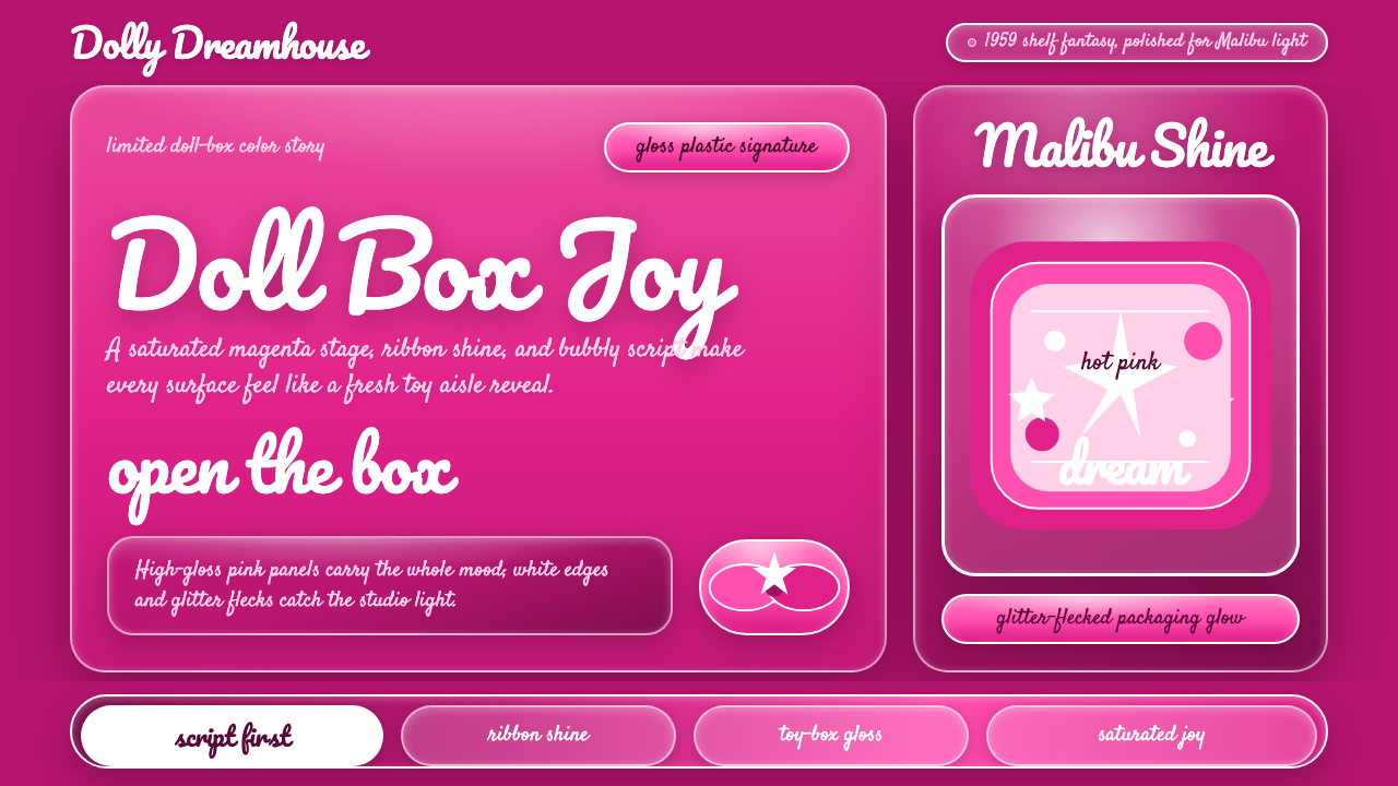
Barbie's entire identity rests on one trademarked color — a saturated magenta-pink so specific that Mattel and Pantone codified it by name, and every gloss, ribbon, and cursive flourish in the system exists to frame it.
Barbie Hot Pink (Pantone 219) in brief
Barbie's visual identity is built around a single, unmistakable color rather than a broad palette: a hot, saturated magenta-pink that Mattel developed with Pantone and has treated as core brand property since the doll's debut in 1959. That color — publicly known by its Pantone reference, 219 C — functions less like a background hue and more like a logo in its own right: seeing it alone, without any accompanying text or logotype, is enough to signal the brand.
Around that anchor color sits a consistent supporting vocabulary: a bubbly, confident cursive script used for the wordmark, high-gloss surface finishes borrowed directly from doll-box packaging plastic, ribbon and bow motifs pulled from gift-wrap and hair-accessory culture, and a scattering of glitter or sparkle treatment that signals celebration rather than restraint. Nothing in this system whispers — every element is pitched at the volume of a toy-aisle end-cap designed to be seen from across a store.
The system also carries a specific geographic and cultural undertone: Malibu. Mattel is headquartered in Southern California, and the brand's fictional version of Barbie has long been associated with a beach-glamour, California lifestyle — sun, surf culture, and an easy poolside confidence — which shows up as a kind of breezy, sun-bright optimism layered on top of the packaging-plastic gloss. The result reads as pure, uncomplicated joy rendered in plastic: nothing about it is subtle, and that is the entire point.
Where does Barbie Hot Pink (Pantone 219) come from?
Barbie was created by Ruth Handler, co-founder of Mattel, who developed the doll after observing her daughter playing with paper dolls in adult roles rather than baby dolls, and pushed the concept through a skeptical, male-dominated toy industry that initially doubted a doll with an adult figure would sell. The doll launched at the American International Toy Fair in New York in 1959, manufactured by Mattel, then headquartered in Southern California.
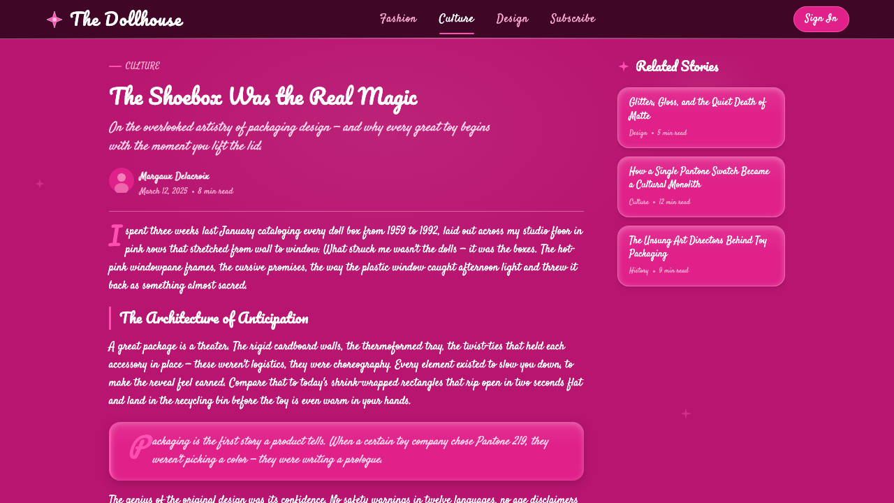
From the beginning, packaging and presentation were as central to the product as the doll itself — the box was designed to function as a small stage, with a clear window, striped detailing, and a script logotype that gave the brand a consistent, recognizable presence on shelves crowded with competitors. Over decades, Mattel's design teams refined that packaging language, but the core proposition never changed: a saturated pink ground, a confident cursive wordmark, and a glossy, celebratory finish that reads as a gift the moment it is seen, before the box is even opened.
The relationship between Barbie and its signature pink deepened into a formal, legally recognized partnership with Pantone, the color-standards company whose numbered system is the reference point the design and printing industries use to match color precisely across materials. Mattel worked with Pantone to codify its specific shade — publicly identified as Pantone 219 C — as a proprietary, trademark-protected color associated specifically with the Barbie brand, joining a small, exclusive group of brand colors that have achieved formal trademark status.
That trademark recognition, formalized in the years surrounding the brand's more recent cultural resurgence, cemented decades of informal association into legal fact: the specific pink is now treated as core intellectual property, not merely a favored packaging choice. It also reflects a broader mid-century-to-present arc in toy and consumer branding, in which color itself — not just a logo or wordmark — became a primary vehicle for brand recognition, alongside other contemporaries who built similarly strong single-color identities in packaging design.
What defines the Barbie Hot Pink (Pantone 219) look?
Saturated Magenta-Pink
The system's anchor is a hot, highly saturated pink pitched toward magenta rather than toward a softer rose or blush tone — bright enough to be recognized at a glance, from a distance, or in peripheral vision. This is not a pastel or a muted tone; it carries none of that restraint. Its saturation is the entire brand signal, which is why the system treats it as sacred and rarely dilutes it with competing bright hues.
High-Gloss Plastic Finish
Surfaces throughout carry the specific sheen of injection-molded doll-box plastic and coated packaging card — a hard, bright gloss rather than a matte or satin finish. Highlights sit as tight, bright streaks rather than broad soft glows, echoing the way light catches a plastic doll-box window or a laminated box surface under store lighting.
Bubbly Cursive Script
The wordmark logic favors a confident, rounded, connected cursive script — playful and slightly bouncy rather than formal or elegant in the way a luxury script might be. This script carries most of the system's personality on its own; a headline set in this cursive against the saturated pink ground is often enough to read as the brand without any other supporting element.
Ribbon and Bow Motifs
Recurring decorative elements draw from gift-wrap and hair-accessory culture — looping ribbon curves, bow shapes, and streamer-like flourishes that frame content the way a bow tops a wrapped present. These motifs are used sparingly as accents rather than as an all-over pattern, functioning as punctuation marks within a composition rather than its primary structure.
Glitter and Sparkle Accents
A light scattering of glitter-like texture or sparkle treatment appears at key focal points, signaling celebration and glamour without turning the entire surface reflective or busy. This is used as seasoning rather than a base ingredient — a highlight on a key phrase or a corner accent, never a texture applied uniformly across large surfaces.
Malibu Sun-Bright Warmth
Beneath the saturated pink sits an undertone of California beach-glamour optimism — the kind of bright, easy warmth associated with poolside and coastline leisure rather than urban sophistication. This shows up less as a specific added color and more as a mood: light, confident, unbothered, favoring open composition and generous breathing room over dense, layered detail.
Packaging-First Composition
Layouts are built with the logic of a retail box front rather than an editorial page — a dominant hero element (the doll, the product, the headline) framed by the pink ground, with supporting information kept minimal and secondary. This packaging-first instinct favors instant, single-glance recognition over layered hierarchy, since the format's entire job, historically, was to win attention from across a crowded store aisle.
Who shaped Barbie Hot Pink (Pantone 219)?
Handler co-founded Mattel and created Barbie, pushing the doll into production against internal skepticism that an adult-figured doll would sell in a market built around baby dolls. Her insistence on packaging and presentation as central to the product — not an afterthought — set the precedent for treating the brand's signature pink as core identity rather than mere decoration.
Across decades, Mattel's in-house design teams refined Barbie's packaging language — box structure, script logotype, ribbon and bow detailing — into a consistent, instantly recognizable retail presence, adapting it season after season while preserving the same underlying color and typographic logic. Their work turned a single product line's packaging into one of the most recognized pieces of brand design in the toy industry.
As the color-standards company whose numbered matching system is the reference industry designers and printers use worldwide, Pantone worked with Mattel to codify Barbie's specific pink under a formal reference number, elevating it from a beloved packaging choice to a documented, trademark-protected brand asset — one of a small handful of colors in consumer branding to achieve that formal status.
Korn worked within Mattel's design leadership on formalizing and protecting the brand's visual identity, part of the internal effort that helped move Barbie's signature pink from informal convention to a codified, legally documented brand color in partnership with Pantone.
How do you use Barbie Hot Pink (Pantone 219) today?
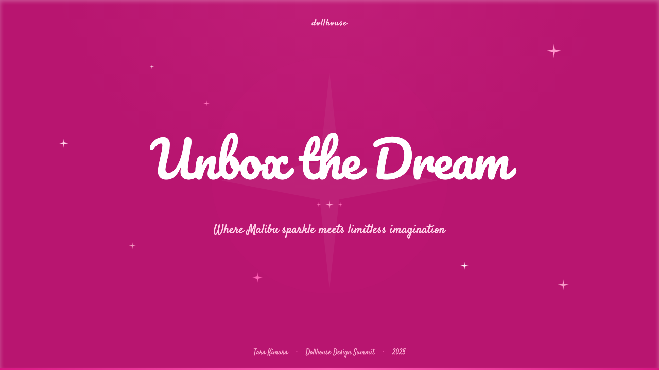
For presentation slides, this system's confident single-color anchor works best on covers and moment-of-impact slides rather than dense information — brand launches, consumer product pitches, lifestyle and beauty decks, anything meant to feel celebratory. A cover slide can use the full saturated pink as ground with the cursive wordmark logic applied to the headline and a single gloss highlight for polish; content slides should keep the pink to a header band or accent rather than filling the entire canvas, since large fields of highly saturated color fatigue the eye across many consecutive slides. Data slides should borrow the packaging-first instinct — one clear number or takeaway per slide, framed simply, rather than dense charting.
For web interfaces, the system suits consumer, beauty, lifestyle, and toy or gift retail experiences far better than utility software — a product launch page, a beauty or fashion storefront, a gift-registry or celebration app. Dashboards and enterprise software are a poor match: the system has no native vocabulary for the calm, neutral states functional interfaces depend on, and a saturated magenta ground would fatigue users across long working sessions. Where the system appears in UI, it works best in hero sections, promotional banners, and celebratory moments — an order-confirmation screen, a gift-wrap option, a seasonal campaign page — rather than persistent navigation chrome.
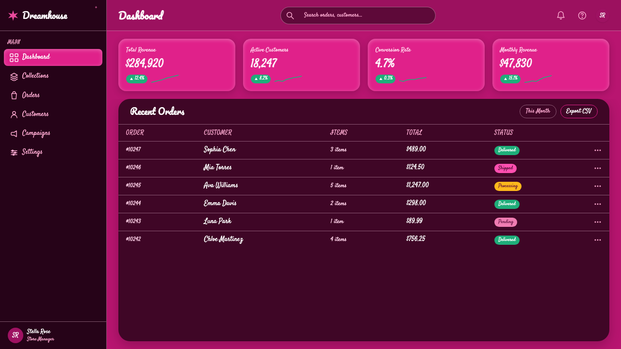
For editorial and marketing work, this is where the system performs most naturally, since its entire origin is packaging and retail marketing. A magazine feature on toy history, brand design, or pop-culture nostalgia can use the saturated pink as a section-divider color and the cursive script as pull-quote treatment; marketing collateral for beauty, fashion, or gift brands can lean directly into the packaging-first composition — a bold pink field, a script headline, a single gloss or glitter accent — because that formula was refined over decades specifically to win attention in a crowded retail environment.
A common mistake is muting the anchor pink toward a softer, more sophisticated rose or blush tone, assuming restraint reads as more premium. That misunderstands the brand logic entirely — the saturation itself is the recognition signal, and diluting it produces a generic pastel-feminine look with none of the specific, confident punch of the source identity. A second mistake is layering too many decorative motifs — ribbons, bows, glitter, script — onto a single composition at once; the real system uses these as sparing accents against a dominant, uncluttered pink field, not as an all-over maximalist pattern.
Barbie Hot Pink (Pantone 219) — FAQ
Is Pantone 219 the only pink used in this system, or does the palette include other shades?
The trademarked magenta-pink is the system's anchor and its most important visual signal, but it is not necessarily the only tone present — supporting neutrals like white and black, plus the occasional gloss highlight, round out compositions so the pink has something to be seen against. What matters is hierarchy: the saturated pink must always read as the dominant, unmistakable color, with any supporting tones kept clearly secondary rather than competing for attention.
Why does a toy brand's packaging color matter enough to become a formal trademark?
Because decades of consistent use turned the color itself into a recognition device as powerful as a logo — a shopper can identify the brand from the color alone, at a distance, without reading any text. Formal trademark protection over a specific color is rare and reserved for cases where that link between hue and brand has become genuinely unmistakable in the public mind; Barbie's pink, refined through consistent packaging use since 1959, reached that threshold.
How does the Malibu, California influence show up visually, given it's not a specific color?
It shows up as a mood rather than a distinct visual element — an easy, sun-bright optimism and generous, uncluttered composition that echoes beach and poolside leisure rather than urban density. Practically, this means favoring open space and simple, confident layouts over dense, layered detail, since that breathing room is part of what reads as breezy California glamour rather than tight, busy packaging design.
What's the difference between using this system tastefully and just making everything pink?
The difference is discipline in where color, gloss, and ornament are concentrated. The authentic system uses the saturated pink as a dominant field but keeps decorative accents — ribbon, bow, glitter, script flourish — sparse and purposeful, arranged the way a packaging designer would place a single bow on a box rather than covering every surface. Simply flooding a layout with pink and adding decoration everywhere produces visual noise rather than the confident, single-glance recognition the real identity is built to achieve.
Does this style work outside consumer and toy branding?
It extends naturally to any brand built on celebration, femininity-forward glamour, or nostalgic pop-culture appeal — beauty, fashion, gifting, party and event branding. It is a poor fit wherever calm, trust, or technical seriousness needs to be communicated, such as financial, healthcare, or enterprise software contexts, where a dominant saturated pink and celebratory ornament would undercut rather than reinforce the intended tone.
Related design styles
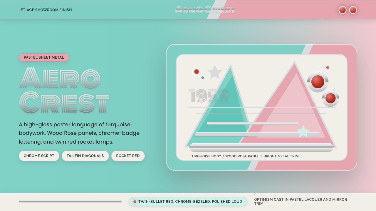 Cadillac TailfinShowroom optimism. Pastel aqua, Wood Rose panels, chrome Monoton, and rocket…
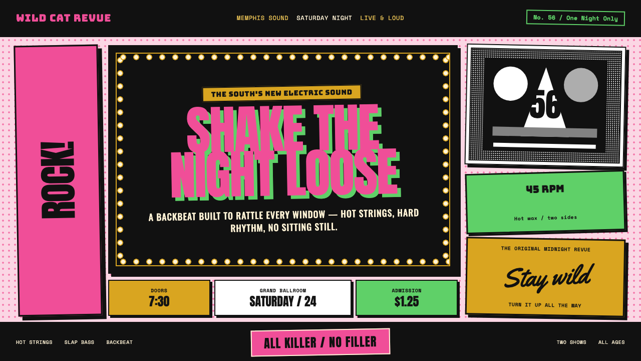 Elvis Presley (1956)Rock learned to shout. Bubblegum pink, acid green and jailhouse type land wit…
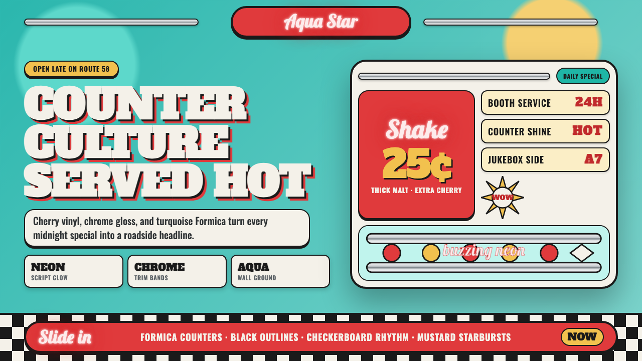 1950s Diner AquaRoadside optimism shouts. Aqua walls, cherry vinyl, chrome bands, and neon sc…
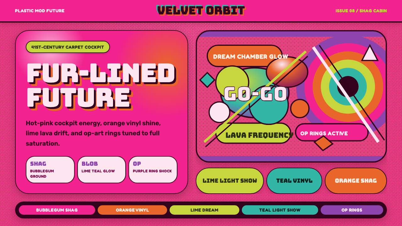 BarbarellaSpace-camp overload. Hot pink shag, lava blobs, and op-art rings collide.
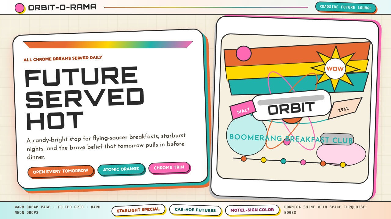 Googie / Space Age (1960s)Tomorrow pulls in grinning. Atomic orange, space turquoise, tilted signs and…
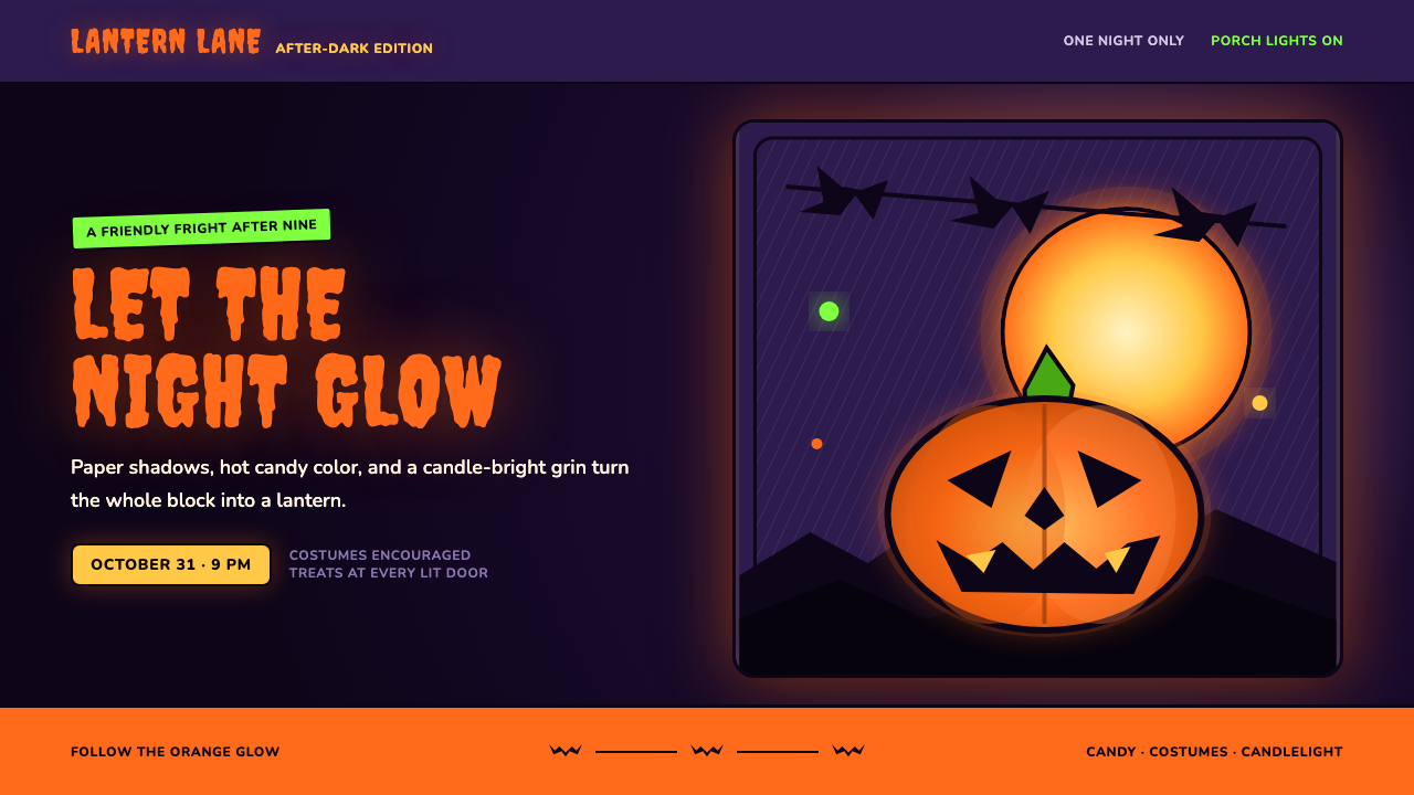 Halloween Jack-o'-LanternFriendly fright, lit from within. Pumpkin orange glows through ink-black cuts…