What is Mystery Machine (Scooby-Doo 1969)?
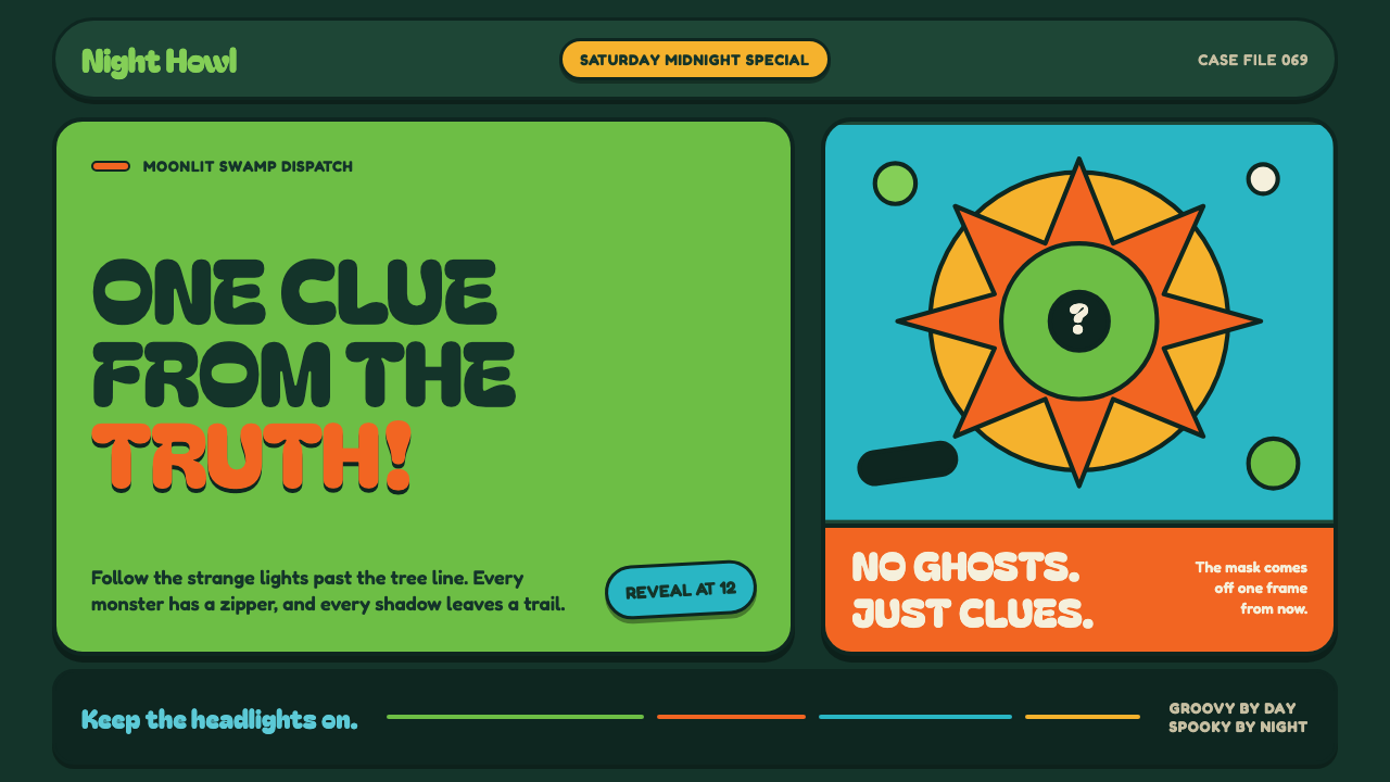
Mystery Machine turns late-sixties flower power into a friendly haunted-house chase: dark forest atmosphere, inflated lettering, and neon-bright clues waiting beneath the next mask.
Mystery Machine (Scooby-Doo 1969) in brief
Mystery Machine is a visual language drawn from the original 1969–1970 Scooby-Doo, Where Are You! era: late-sixties counterculture filtered through Saturday-morning children’s television. Its central image is a lime-green panel van, decorated with orange and turquoise blossoms, arriving at a haunted house. The style makes that contradiction productive. It is cheerful without becoming soft, eerie without becoming frightening, and deliberately broad enough for a mystery to feel playful rather than threatening.
The atmosphere begins in a deep, moonlit forest-teal field. Against that darkness, acid green, pumpkin orange, and harvest gold appear with immediate force. These bright colors do not simply decorate the scene; they operate like clues in a cartoon mystery, pulling attention toward a title, a button, a frame, or the object that may matter next. The dark ground gives the palette its nighttime tension, while the warm accents preserve the exuberance of psychedelic pop.
Everything in the system is rounded, outlined, and visibly constructed for quick reading. Balloon-like headlines, pill-shaped controls, thick cartoon contours, and flat daisy motifs turn an interface or page into a theatrical set. The visual rhythm should suggest a sequence of reveals: the van has arrived, the hallway is dark, a suspicious shape moves behind a door, and the explanation is just about to be uncovered. Mystery Machine is not restrained modernism; it is pop-art suspense with a grin.
Where does Mystery Machine (Scooby-Doo 1969) come from?
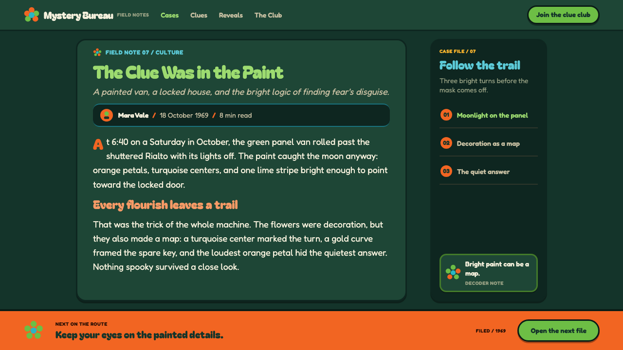
The source era is 1969–1970, the original run of Scooby-Doo, Where Are You!, at the height of late-sixties psychedelic pop. In Hollywood, California, children’s television absorbed visual signals already circulating through flower-power culture and pop-art poster design: emphatic color, enlarged simple forms, floral motifs, and a willingness to make every graphic element feel louder than ordinary life. Mystery Machine concentrates those signals into an immediately legible setting for comic investigation.
Joe Ruby and Ken Spears are among the key figures associated with the source material, alongside Iwao Takamoto, William Hanna, and Joseph Barbera. Their names anchor the style in the Hanna-Barbera production world rather than in an abstract revival of the sixties. For a contemporary designer, that distinction matters: the reference is not psychedelic imagery in isolation. It is psychedelic imagery adapted for character-led, repeatable mystery storytelling, where the audience must instantly identify danger, movement, humor, and the next place to look.
Saturday-morning limited animation is one of the stated movements behind the system. Its visual economy favors broad silhouettes, stable color areas, decisive outlines, and props that remain recognizable at a glance. This does not mean the result feels empty. Instead, it makes the field of action unusually clear: a dark setting establishes suspense, a bright vehicle or floral accent establishes identity, and a strong outline keeps forms from dissolving into the background.
The other stated influences, psychedelic flower power and sixties pop-art poster design, supply the exuberance that limited-animation clarity alone would not create. Flowers scatter like confetti rather than botanical illustration. Bright panels feel painted onto the van and carried outward into the page. Rounded lettering reads as performance, not neutral information. The resulting style balances two forces that might otherwise clash: the visual freedom of counterculture and the disciplined clarity needed for a children’s animated mystery.
What defines the Mystery Machine (Scooby-Doo 1969) look?
Night Forest Color
A deep forest-teal ground creates the moonlit, haunted setting. Acid green, pumpkin orange, harvest gold, and turquoise then emerge as bright interruptions rather than evenly distributed decoration. The contrast should feel like a painted van arriving in the dark: bright enough to be festive, but surrounded by enough shadow to keep the promise of a mystery alive.
Balloon Typography
Headlines are fat, rounded, buoyant, and theatrical. They should feel inflated rather than mechanically assembled, with a silhouette strong enough to carry the mood before the words are fully read. This lettering belongs to a world of exclamations, chase scenes, and surprise reveals. It works best when used as a large graphic event, while supporting copy remains clear and calm enough to keep the page usable.
Cartoon Outline
Thick dark outlines give every panel, flower, icon, and illustrated object a dependable cartoon boundary. The outline is not a delicate finishing touch; it is what allows bright, flat forms to remain distinct against the nocturnal background. Consistent contour treatment makes the system feel hand-drawn and animated, even when its components are arranged with the discipline of an interface.
Flower-Power Motifs
Flat pop-art daisies are scattered like confetti across the composition. They should read as painted signs of movement and cheer, not as naturalistic floral decoration. Used sparingly, a blossom can mark a corner, soften a hard information block, or echo the decorated body of the Mystery Machine. Used everywhere, it weakens the chase-story tension and turns the setting into generic retro wallpaper.
Rounded Frames and Controls
Panels and buttons favor swollen, pill-like silhouettes over sharp formal containers. Their softness makes the dark, spooky atmosphere approachable and preserves the children’s-TV quality of the source. A frame should feel like a sign placed on a cartoon set, ready to contain a clue, suspect, or reveal. The rounded geometry also creates a useful contrast with the uncertainty of shadowy scenery.
Reveal-Driven Composition
The composition should always imply that something is about to happen. A bright panel can conceal a secondary detail, a cropped illustration can suggest movement beyond the edge, and a large headline can behave like a theatrical cue. This is a style of anticipation rather than stillness. Its strongest layouts make the viewer feel that the mask-peeling explanation is not complete yet, but is only a glance away.
Who shaped Mystery Machine (Scooby-Doo 1969)?
Joe Ruby is listed among the key figures of the original Mystery Machine source era. Within this design reference, his significance is as part of the creative context that turned a haunted-house mystery into a recurring children’s-TV world: recognizable enough to revisit, broad enough to support humor, and visually direct enough to communicate at a glance.
Ken Spears is another key figure named in the source material. The Mystery Machine language reflects a storytelling environment in which visual identity has to carry repeated episodes: the decorated van, the dark setting, the bright interruptions, and the sense that an explanation will follow. That repeatable clarity is central to adapting the style beyond nostalgia.
Iwao Takamoto appears in the source material as a key figure of the original era. The style associated with Mystery Machine depends on visual forms that are unmistakable in motion and at small scale: rounded silhouettes, bold outlines, flat motifs, and a color story that separates the playful foreground from the spooky night behind it.
William Hanna and Joseph Barbera are named as key figures in the Hollywood production context of the original run. Their presence situates Mystery Machine within Saturday-morning limited animation, where graphic decisions had to be bold, efficient, and repeatable. That production logic remains useful today: let a few strong shapes and a clear color hierarchy do the narrative work.
How do you use Mystery Machine (Scooby-Doo 1969) today?
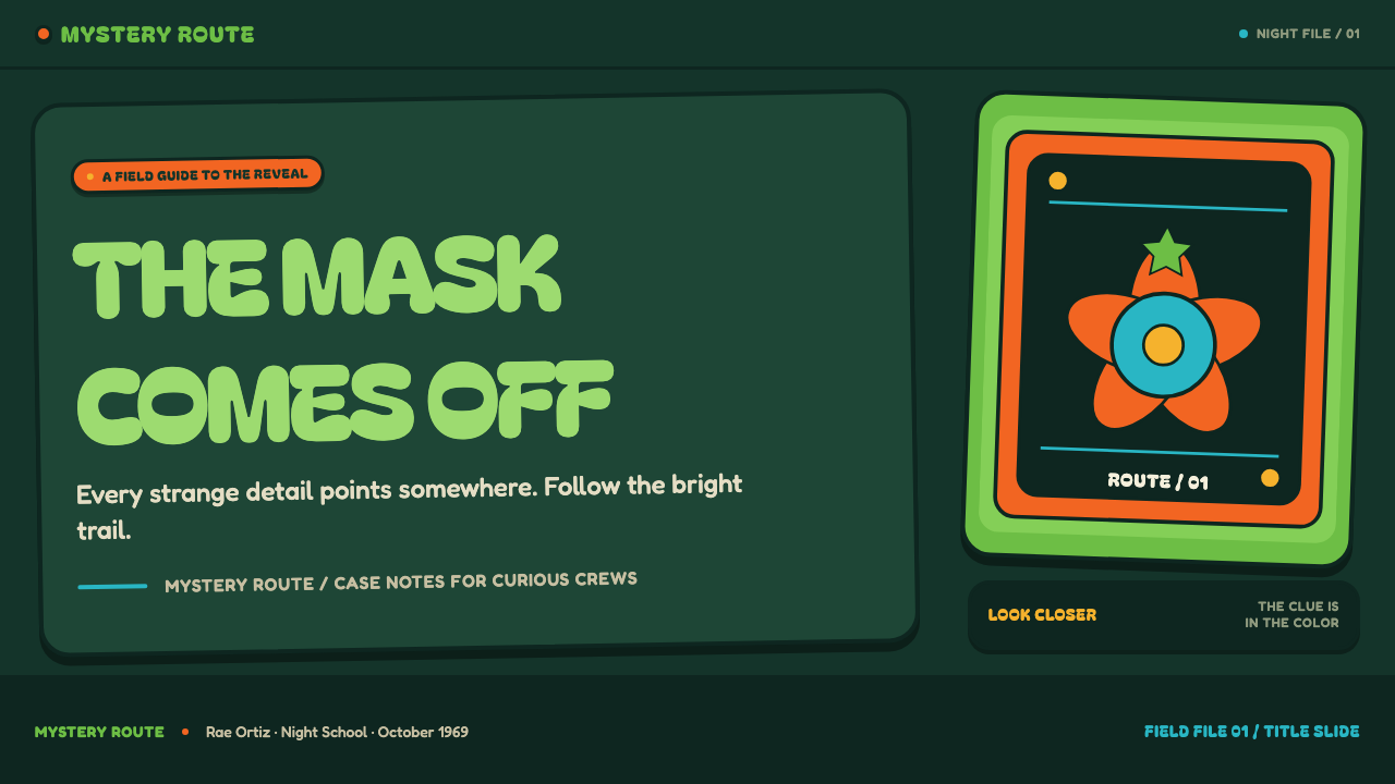
For presentation covers, treat the page as the arrival shot before the mystery begins. Let a large balloon headline and one oversized floral or van-inspired form dominate a deep forest-teal field. Use acid green or pumpkin orange as the main interruption, with harvest gold or turquoise in a supporting role. The cover should feel like an invitation into a spooky adventure, not a dense summary of the deck’s contents.
For content and data slides, keep the theatrical surface but give information a stable home. Rounded panels can group a claim, a quotation, or a chart; dark outlines keep adjacent sections distinct. Data should use the bright palette as an intentional hierarchy, with one color carrying the main series and others reserved for comparison or emphasis. Avoid decorative flowers inside the chart area, where they compete with labels and turn evidence into scenery.
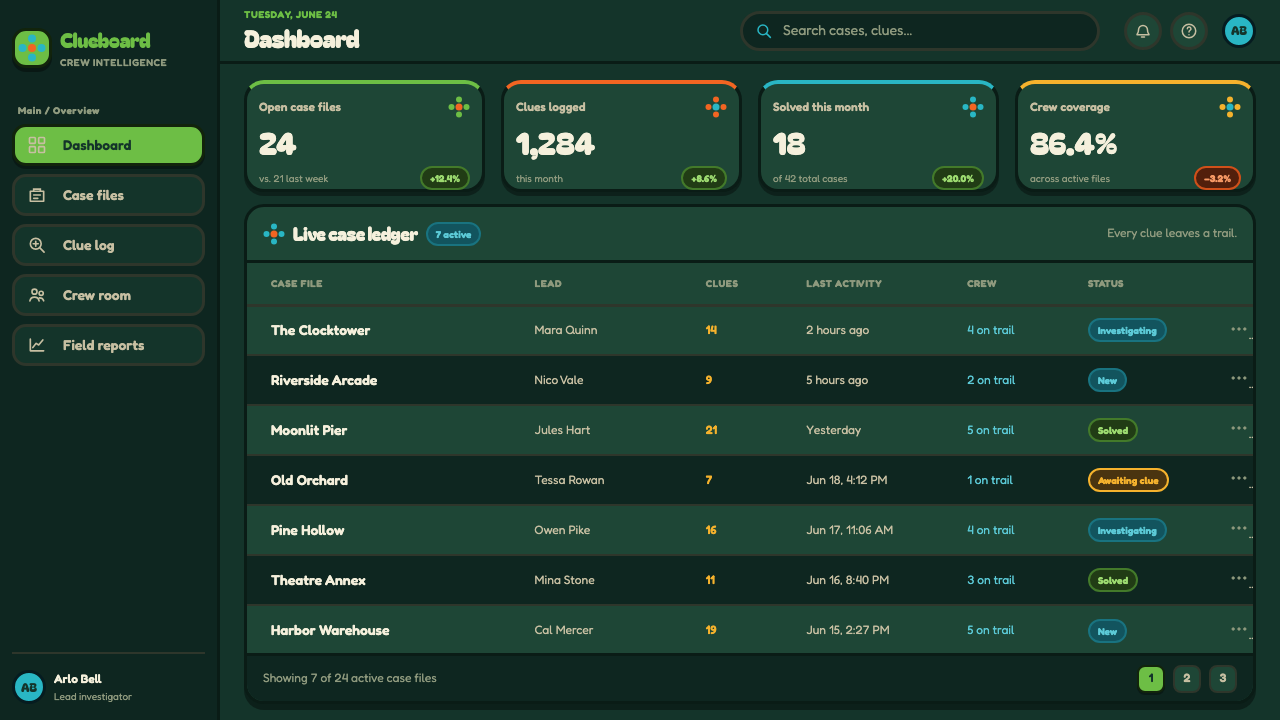
For web interfaces, Mystery Machine works especially well for dashboards, event pages, discovery tools, and playful pricing pages that need an immediate personality. Establish the dark forest setting as the shared canvas, then use rounded cards and bright framed actions to guide the eye through tasks. The interface should still preserve a clear reading order. A glowing clue-like accent is useful only when it signals something actionable, such as a next step, a selected state, or a newly revealed result.
For editorial and marketing work, use the style as a narrative device. A campaign page can unfold in chapters that resemble locations in a mystery: the arrival, the strange evidence, the chase, and the reveal. Flat flowers, framed illustrations, and cropped cartoon details can create transitions between sections without replacing explanatory copy. The best marketing expression captures the contrast between sunny grooviness and moonlit suspense, giving a product story momentum rather than merely applying retro decoration.
The common mistake is to copy every visible signal at once: too many neon accents, too many flowers, too much inflated type, and too many outlines competing for attention. Mystery Machine relies on contrast between a dark atmosphere and a few highly legible interruptions. If every component shouts, there is no mystery left to reveal. Keep the headline playful, the controls rounded, and the palette vivid, but let shadow, empty space, and a single clear narrative cue carry the suspense.
Mystery Machine (Scooby-Doo 1969) — FAQ
Is Mystery Machine simply a psychedelic design style?
Psychedelic flower power is one of its stated influences, but the style is more specific than a general sixties revival. It combines floral pop, acid-bright color, and rounded lettering with the clarity of Saturday-morning limited animation and the narrative structure of a comic haunted-house mystery. The result should feel designed for a chase and a reveal, not for an abstract psychedelic poster alone.
Can the style work without a dark background?
It can, but the deep moonlit forest-teal ground is central to the source mood. Without darkness, the acid green, pumpkin orange, and harvest gold lose the contrast that makes them feel like signals in a spooky setting. A lighter adaptation can retain rounded forms, flowers, and cartoon outlines, but it will read more as daytime groovy pop and less as the Mystery Machine arriving at a haunted house.
How should imagery be handled in a Mystery Machine layout?
Treat imagery as a flat cartoon prop or a framed clue. Crop it boldly, keep its outline clear, and use it to imply a place, a suspicious detail, or motion just beyond the composition. The image should support the reveal-driven story rather than compete with it. Decorative realism is less useful here than a simplified object, flower, doorway, vehicle detail, or shadowy silhouette.
Where does Mystery Machine work best in contemporary design?
It works best where playfulness, discovery, and serialized storytelling are genuine parts of the experience: youth-oriented events, entertainment pages, themed dashboards, creative workshops, game-like product flows, and editorial campaigns. It is less suitable when a brand needs quiet seriousness, conventional luxury, or a neutral institutional voice. The style succeeds when its groovy suspense supports the product’s actual tone.
Related design styles
 Cooper Black DisplayShouts softly. Burnt-orange Cooper type sinks into deep chipboard brown with…
 Hulk Gamma GreenDon't make us whisper. Muscle green, trouser purple, inked panels, Ben-Day ha…
 Kryptonite GreenRadioactive pulp glows hard. Neon green shard, black gutters, Ben-Day grit.
 Pinball BackglassGlows like paid light. Monoton type, black outlines, orange-red halftones cro…
 Tom and Jerry (1940)Every frame lands a laugh. Scarlet, scalloped gold and a yellow impact burst…
 Yellow Submarine (Edelmann pop)Reality, recolored for joy. Candy-flat hues, fat ink outlines, and bouncing o…