What is Hulk Gamma Green?
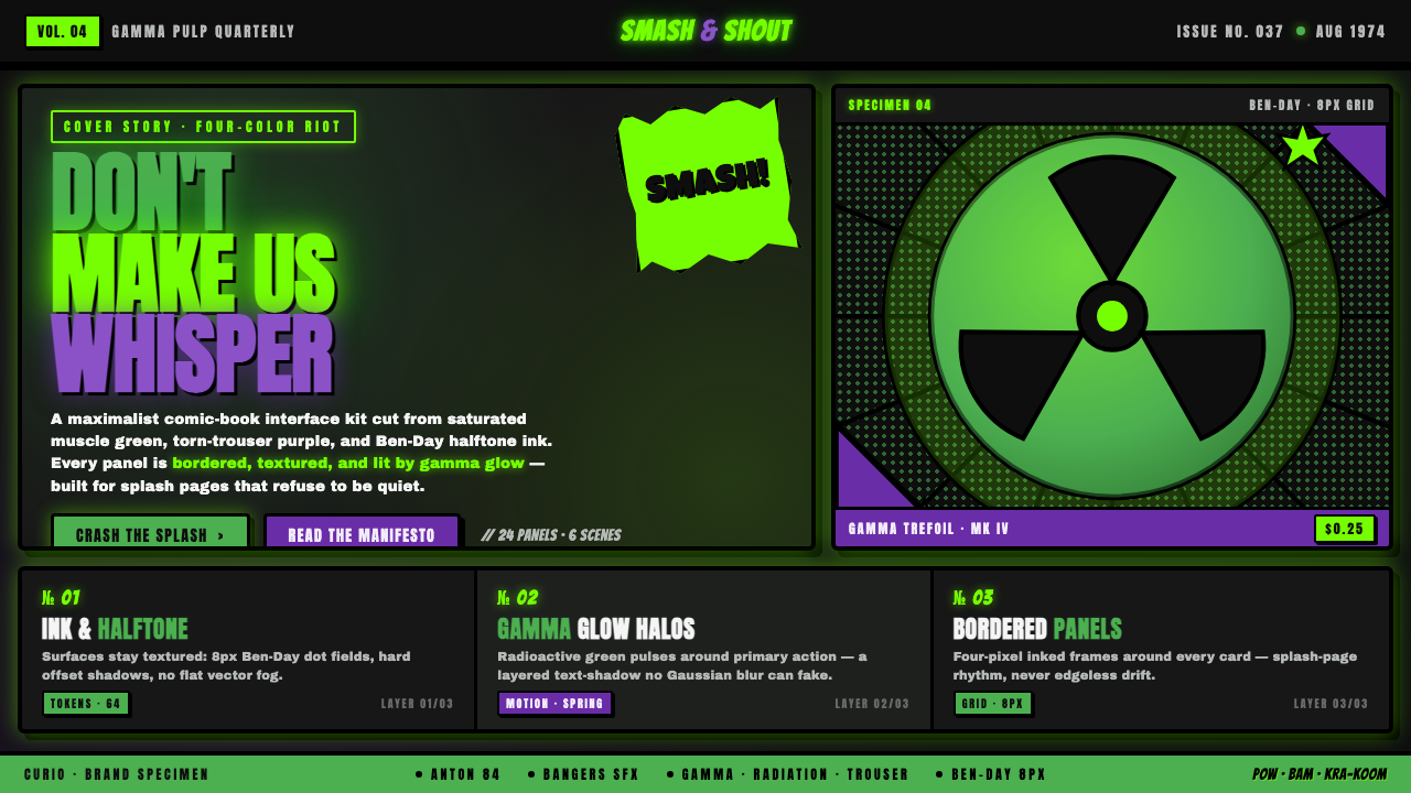
Hulk Gamma Green turns the comic page into a collision zone — saturated muscle green, torn-trouser purple, radioactive light, and inked fury exploding through the dark.
Hulk Gamma Green in brief
Hulk Gamma Green is a dark, maximal comic-book style derived from the visual identity of Marvel’s Incredible Hulk. Its central image is gamma-irradiated muscle rendered in saturated green, framed by iconic purple torn trousers and set against a black comic-page void. The contrast is immediate and theatrical: green signifies overwhelming physical force, purple identifies the figure, and black supplies the silence that makes every impact feel louder.
The style belongs to the language of Silver and Bronze Age American comics and their four-color printing aesthetic. Forms are modeled with heavy black contours, compressed areas of shadow, and fields of Ben-Day halftone dots. Panels, captions, and oversized sound-effect lettering organize the page as a sequence of impacts rather than a calm continuous surface. Texture is not incidental distress; it recalls ink, screened color, and mechanically reproduced paper.
As a contemporary design system, Hulk Gamma Green converts that printed vocabulary into an interface language of gamma flashes, high-contrast panels, radioactive highlights, and declarative display type. It is deliberately loud and unapologetically excessive. The goal is not general superhero polish but a specific sensation: contained pressure breaking its frame, with every heading, edge, and burst participating in the release.
Where does Hulk Gamma Green come from?
The style begins with The Incredible Hulk, created for Marvel Comics in New York from a script by Stan Lee and pencils by Jack Kirby. The character debuted in The Incredible Hulk number one in 1962, within the broader Silver Age of North American comic art. Its foundational image joined impossible physical mass to a simple, reproducible color identity: green skin, purple torn trousers, black ink, and the implied glare of gamma radiation.
That identity was inseparable from the production language of four-color comic printing. Saturated process colors needed to remain legible beside dense black outlines, while Ben-Day halftone dots allowed color and tonal variation to emerge from patterned fields rather than continuous painted shading. The resulting page did not conceal reproduction. Dots, overlaps, ink boundaries, and abrupt tonal changes became part of its visual energy.
The comic panel supplied a second source of structure. Hulk imagery gains force through containment: a massive body is cropped by a box, a fist pushes toward an edge, or lettering occupies space like another physical object. High contrast helps each action survive the density of the page. Sound-effect forms and emphatic words do more than describe noise; their scale, angle, and inked mass make noise visible.
Across the Silver and Bronze Age span associated with the source material, this combination of character color, halftone texture, and panel drama became a durable comic vocabulary. Its kinship with pop-art halftone aesthetics lies in the visible mechanics of mass reproduction, but Hulk Gamma Green keeps the narrative aggression of the comic page. The contemporary style distills that legacy into a reusable system while preserving its defining tension between printed limitation and apparently limitless strength.
What defines the Hulk Gamma Green look?
Gamma Color
Saturated muscle green is the dominant signal, not merely one accent among many. It should occupy the principal figure, headline, or active state, while trouser purple works as a secondary identity color. Radioactive yellow-green light may sharpen moments of transformation or impact. Black remains the essential ground, giving the bright colors the appearance of energy emerging from a void.
Inked Typography
Display lettering should feel drawn, compressed, and physically forceful. Heavy strokes, irregular contours, angled baselines, and tightly packed capitals evoke inked sound effects and the blunt command of HULK SMASH. Supporting text must remain simpler and quieter, allowing the display voice to erupt selectively. When every sentence shouts, the page loses the distinction between tension and impact.
Panel Structure
Content is divided into hard-edged panels that behave like consecutive comic frames. Panels may vary in proportion, but each requires a clear focal action and a decisive boundary. Cropping is aggressive: figures, letters, or bursts can press against an edge or appear to break through it. The layout should feel sequenced and tense rather than evenly modular.
Ben-Day Texture
Halftone dots supply both tonal depth and historical texture. Dense fields can darken a shadow or intensify a background, while more open patterns create light and air around a highlight. The dots should remain visibly graphic rather than dissolving into smooth photographic shading. Used consistently, they connect modern surfaces to the mechanics of printed comic color.
Impact Geometry
Jagged bursts, radiating lines, tilted rectangles, and abrupt diagonals turn force into geometry. These forms should originate from an event — a headline, a button, an impact point, or a data change — rather than float as generic decoration. Curves are most effective when they describe muscle or an expanding shockwave; straight edges provide the panel discipline that holds the explosion together.
Hard Contrast
Depth comes from abrupt separation rather than atmospheric softness. Black shadows cut into green forms; pale gamma flashes strike across dark panels; purple areas remain distinctly bounded. Highlights can glow, but their function is radioactive intensity, not polished realism. The strongest compositions alternate compressed darkness with concentrated brightness, creating the visual rhythm of pressure followed by release.
Maximal Restraint
The style is maximal, but it is not random. Green, purple, halftone, lettering, bursts, and panel borders must reinforce the same dramatic hierarchy. One element leads, several support, and quieter black space prepares the next impact. Adding more effects without assigning them narrative roles produces superhero-themed clutter rather than the focused fury of Hulk Gamma Green.

Who shaped Hulk Gamma Green?
Stan Lee supplied the script behind the Incredible Hulk’s 1962 debut. Within this style’s history, his importance lies in establishing a character whose emotional state and physical transformation could be expressed through direct, emphatic comic language. The Hulk’s anger invites oversized declarations, abrupt changes of scale, and action organized around release, giving the visual system its narrative engine rather than merely its palette.
Jack Kirby provided the pencils for the Hulk’s debut and therefore helped establish the visual premise of gamma-powered mass, torn clothing, and high-impact comic drama. For Hulk Gamma Green, his role is represented by forceful anatomy, decisive silhouettes, dense ink boundaries, and figures that appear barely containable within the panel. The style inherits this conviction that composition should make physical power visible before any caption explains it.
Benjamin Day is the key figure associated with the Ben-Day process named in this visual tradition. In Hulk Gamma Green, the method’s patterned dots are treated as an active design material: they build shadow, separate tones, recall mass-produced comic pages, and make mechanical reproduction visible. Their presence prevents the style from becoming a smooth digital superhero theme by preserving the rough, screened character of printed color.
How do you use Hulk Gamma Green today?
For presentation covers, establish a single confrontation: a dominant green title or cropped muscular form against black, countered by one purple element and a concentrated gamma flash. Let lettering press against the frame as if the slide can barely contain it. Content slides should calm the spectacle without abandoning the language, using comic panels for sections, quieter halftone fields for secondary information, and one emphatic caption to announce the central claim.
Data slides work when information is staged as action rather than ornamented with comic effects. A rising value can become a green mass pushing through a dark grid; a critical comparison can place green and purple forms in direct opposition; an exceptional result can trigger a restrained burst. Labels and scales must remain plainly readable. The visual drama should reveal the hierarchy of the data, never compete with the evidence.
For web dashboards and pricing pages, use black as the stable environment and reserve gamma green for active metrics, primary actions, or the leading plan. Purple can distinguish an alternative tier or secondary status without weakening the green hierarchy. Cards may resemble inked panels with hard boundaries and halftone headers. Navigation and dense tables should stay comparatively quiet so that alerts, transformations, and calls to action retain their impact.
Editorial and marketing layouts benefit from the style’s built-in narrative sequence. Open with a poster-like headline, then alternate dense image-led panels with calmer explanatory passages. Pull quotes can become sound-effect forms, while campaign claims may arrive inside radioactive bursts. Product imagery should be cropped assertively and integrated with inked edges or halftone fields. The best pages feel like a story accelerating toward a decisive release rather than a collection of unrelated comic references.
The most common mistake is making every component equally loud. Covering all surfaces in green, filling every gap with dots, and turning every label into explosive lettering destroys contrast and quickly becomes costume rather than system. Lead with one major impact, use purple as a controlled counterpoint, and leave enough black quiet around dense areas. Authentic force depends on compression, anticipation, and release; uninterrupted shouting has no climax.
Hulk Gamma Green — FAQ
Is Hulk Gamma Green simply a green superhero theme?
No. Green is the strongest identifier, but the style depends equally on purple counterpoints, black comic-page space, Ben-Day halftone texture, inked contours, panel sequencing, and sound-effect typography. Removing those relationships leaves a generic action aesthetic. Hulk Gamma Green is recognizable because color, reproduction texture, and narrative impact operate together as one system.
How is this style related to pop-art halftone aesthetics?
Both expose the visual mechanics of mass-printed imagery, especially patterned dots, flat process color, and hard tonal boundaries. The distinction is one of purpose. Pop-art halftone aesthetics can isolate reproduction as an image in itself, while Hulk Gamma Green keeps the dots inside a dramatic comic narrative. Here, halftone builds muscle, shadow, atmosphere, and impact rather than functioning as detached commentary.
Can Hulk Gamma Green be used on a light background?
It can, but the source language is fundamentally dark. Black gives saturated green a radioactive appearance and allows inked panels to merge with the surrounding page. A light adaptation should retain substantial black structure through borders, shadows, lettering, or isolated panels. Without that darkness, the green may feel cheerful or sporty rather than gamma-charged, and the purple loses much of its dramatic tension.
How should photography or product imagery be treated?
Treat imagery as material inside a comic panel, not as an untouched window onto reality. Crop closely, emphasize a decisive silhouette, and integrate the image with inked boundaries, dark shadow blocks, or controlled halftone texture. A green gamma highlight may identify the focal action, but it should not obscure essential details. The image must participate in the panel’s hierarchy rather than sit above it as decoration.
Which products are poorly suited to this visual language?
The style struggles when the desired mood is quiet, neutral, delicate, or reassuring. Its saturated color, confrontational type, and compressed panel drama naturally communicate force and urgency. It is better suited to entertainment, energetic campaigns, bold product launches, gaming contexts, or dashboards that benefit from strong alerts. Products centered on calm reflection should use it only for isolated moments of emphasis, if at all.
Related design styles
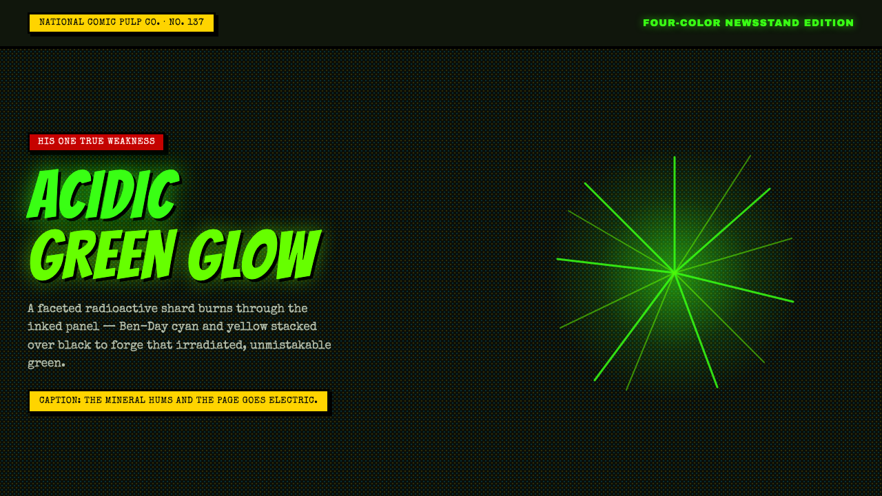 Kryptonite GreenRadioactive pulp glows hard. Neon green shard, black gutters, Ben-Day grit.
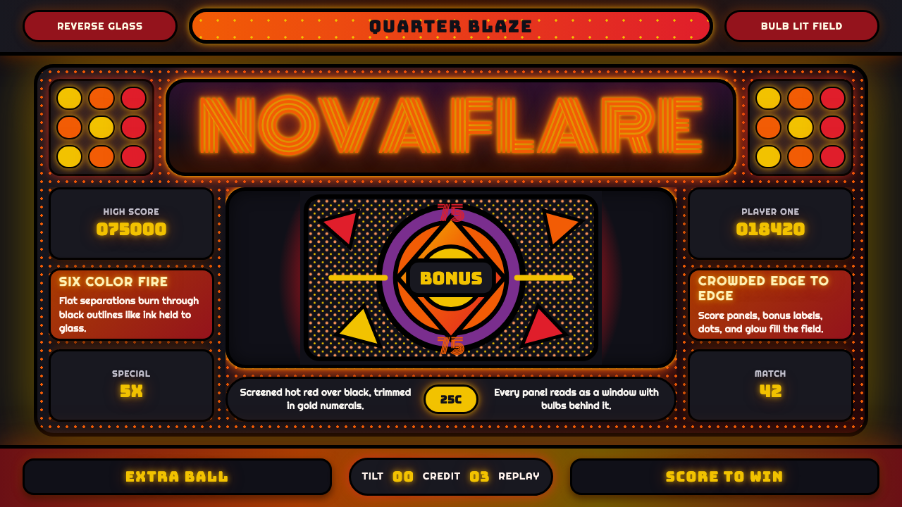 Pinball BackglassGlows like paid light. Monoton type, black outlines, orange-red halftones cro…
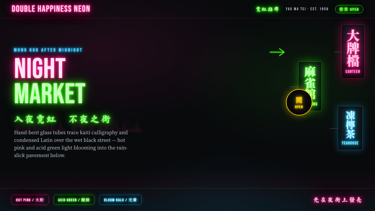 Hong Kong Neon SignboardsLight only reads against the wet black night. Hand-bent pink and green tubes…
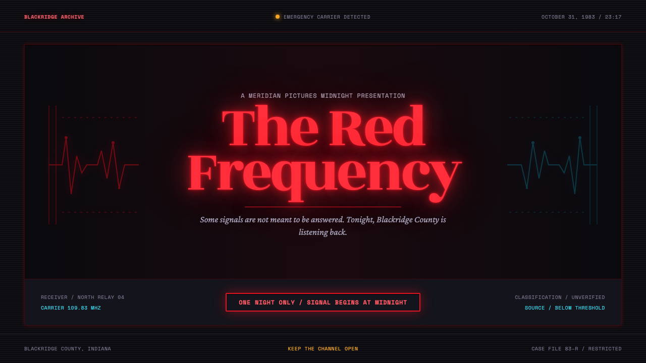 Stranger Things (1983)Red light breaks the void. A spurred serif blooms through VHS static and cold…
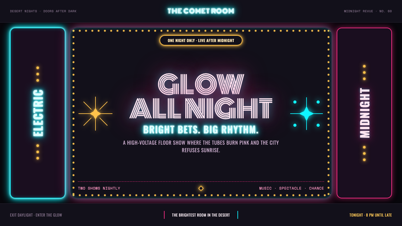 Las Vegas Neon (1960)Night refuses to dim. Hot-pink tubes, cyan bloom and amber bulbs turn black i…
 Mystery Machine (Scooby-Doo 1969)Groovy by day, spooky by night. Balloon type and acid-green panels hide the n…