What is Stranger Things (1983)?
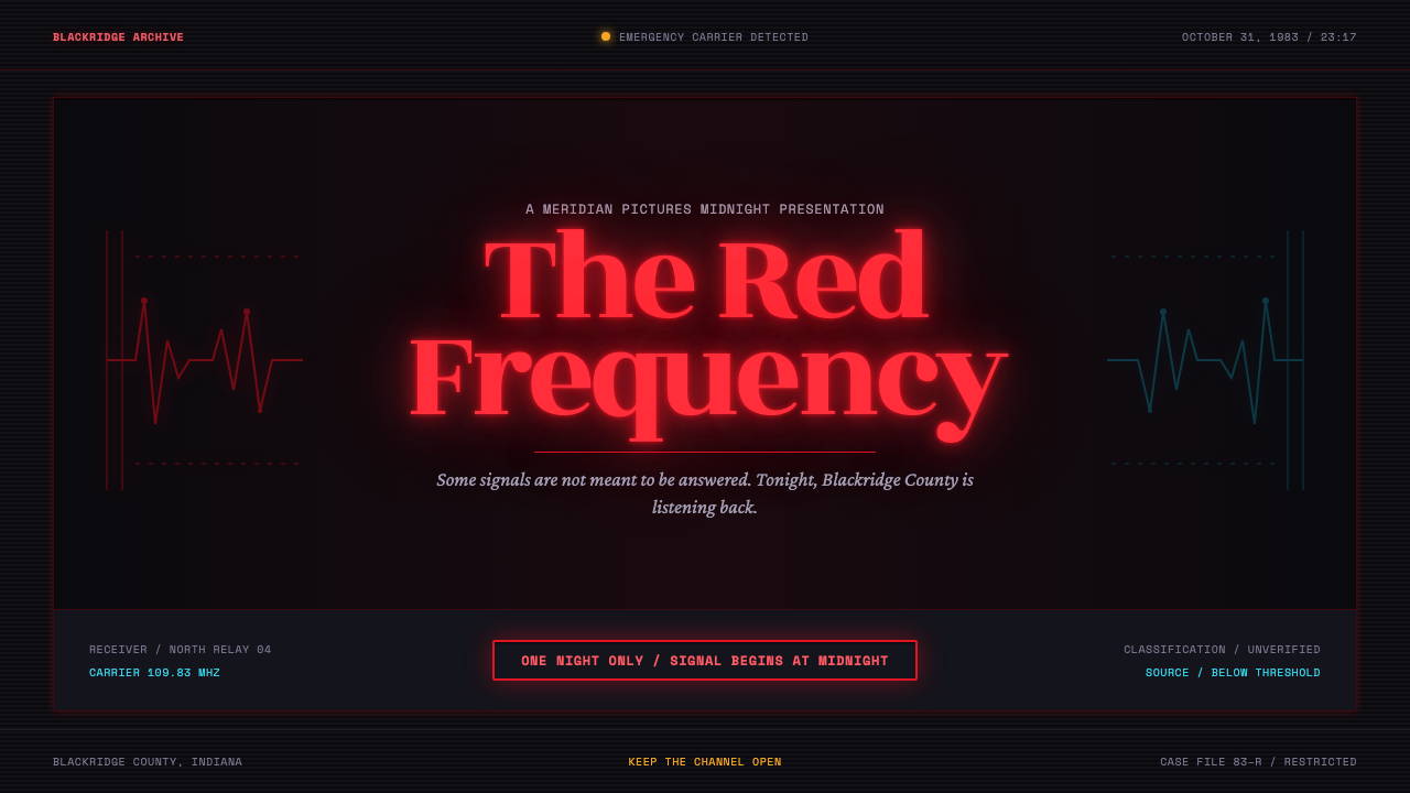
Red light breaches the void: a spurred serif advances through VHS noise while cold cyan interference warns that Hawkins is never entirely safe.
Stranger Things (1983) in brief
Stranger Things (1983) is a dark retro-futurist visual language built around a title-card event: thick, spurred serif letters emerge from near-black and seem to crawl toward the viewer. Red is treated as emitted light rather than ordinary printed color. It blooms outward, staining the surrounding darkness with a halo and giving the title a dangerous, magnetic presence. The result is less like a page of text than a signal breaking through a dead television screen.
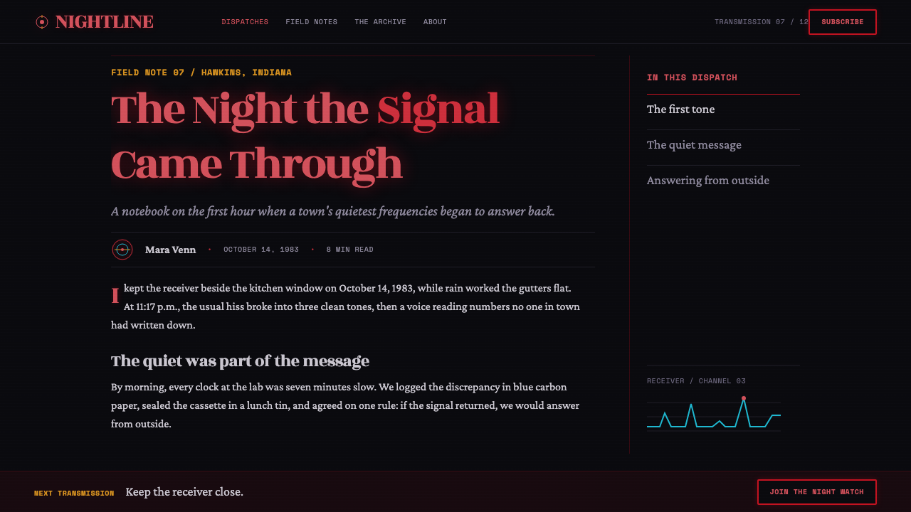
Its atmosphere joins several late-1970s and 1980s codes without flattening them into a generic nostalgia collage. VHS tracking lines, horror interference, paperback-pulp warmth, Amblin-style bicycle adventure, synthwave tension, and the cold contamination of the Upside Down all occupy the same frame. Hawkins is presented as familiar small-town America under electronic pressure: childhood wonder remains visible, but it is continually interrupted by laboratory labels, blue decay, drifting spores, and darkness beyond the edge of the image.
The style is cinematic because it makes every visual decision feel like evidence of a larger world. A headline behaves as a light source. A monospace label suggests institutional machinery. Cyan noise implies a rupture in reality. Warm body copy recalls a worn paperback passed from reader to reader. Even when the page is quiet, it should feel electrically unstable, as if the image has been paused at the instant before a signal shifts or something steps through.
Where does Stranger Things (1983) come from?
The fictional setting spans 1983–1985 in Hawkins, Indiana, while the visual language was crafted from 2016 onward as a revival of late-1970s and 1980s codes. That double time frame is central to the style. It does not attempt to recreate a single historical graphic system with archival purity. Instead, it reconstructs the emotional circuitry associated with an imagined early-1980s America: analog media, small-town adventure, pulp suspense, dark laboratories, and a supernatural threat that corrupts familiar technology.
Hawkins supplies the style with its ordinary surface. The town implies bicycles, bedrooms, local institutions, friendships, and the reassuring scale of a place where the familiar should be enough to explain the world. The visual system gains force by allowing that warmth to remain visible. Red glow is not merely ominous; it is also the last source of heat in a nearly black field. Paperback-like body copy and adventure-coded imagery keep the design from becoming sterile horror.
The opposing force comes from the Upside Down, represented through cold blue interference, damaged signal texture, and airborne spores. Rather than describing that world through detailed illustration, the aesthetic lets it leak into the frame as contamination. Cyan appears at edges and in interruptions. VHS noise becomes a threshold rather than a decorative overlay. The contrast between a warm red title and cold blue disturbance gives the system its central dramatic conflict: human memory and adventure on one side, electronic rot and intrusion on the other.
The named reference field includes Matt & Ross Duffer, Michelle Dougherty, Kyle Dixon & Michael Stein, and Ed Benguiat. Around them sit the movements identified by the theme: 80s retro-futurism, synthwave and darksynth, VHS horror, Amblin-Spielberg adventure, and paperback-pulp cover art. The style’s coherence comes from treating these references as one narrative environment. Type, glow, noise, labels, and atmosphere must all suggest the same suspended moment: a red title emerging from black while a colder signal presses in.
What defines the Stranger Things (1983) look?
Red as a Light Source
Red is the system’s emotional engine. It should appear to radiate from within the title, producing a visible halo against darkness rather than reading as a flat colored fill. That glow gives the typography heat, danger, and a faint promise of refuge. Because it is treated as illumination, red works best when it is concentrated and allowed to dominate a quiet field.
Spurred Display Serif
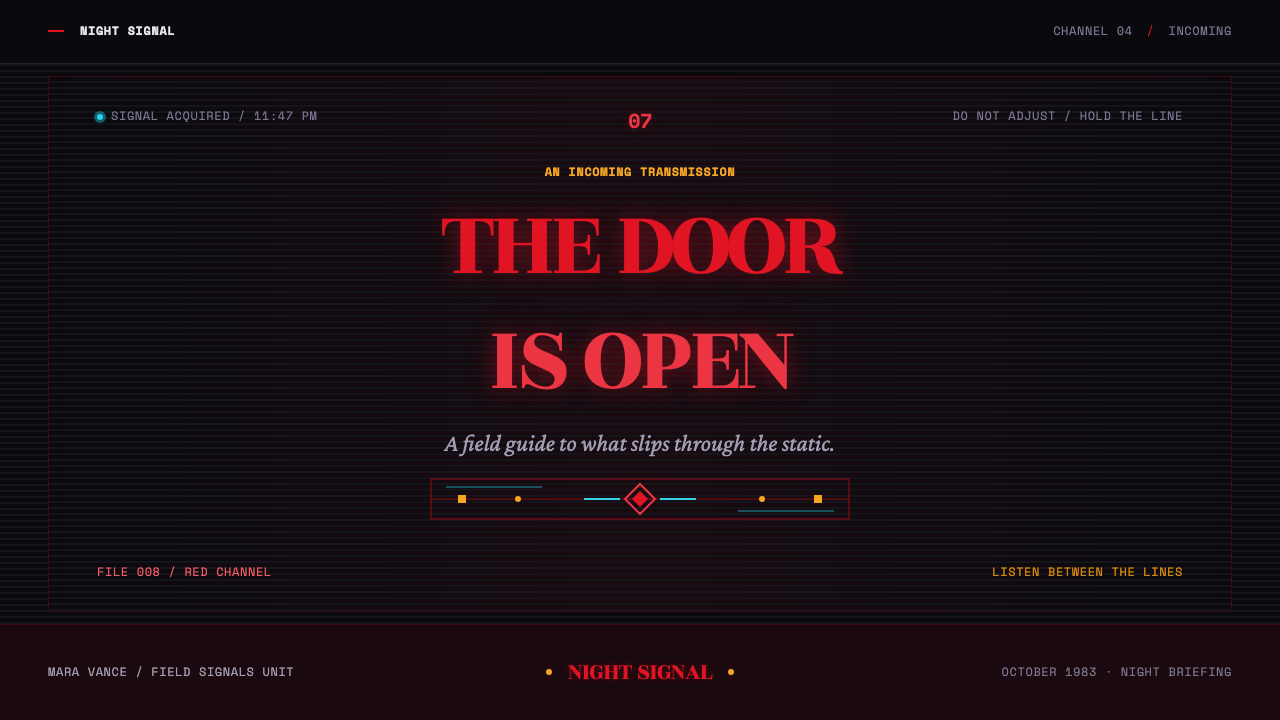
Headlines use a fat serif with pronounced spurs and a theatrical silhouette. The letters should feel bodily and advancing, as though they are moving out of depth toward the camera. This is not neutral literary typography: the title is a creature, an announcement, and a source of pressure. Its scale and glow create the visual climax before any image needs to appear.
Near-Black Void
The dominant ground is almost completely black, but it should behave as depth rather than empty absence. It makes red bloom visible, gives cyan interference somewhere to enter, and leaves large areas of uncertainty around the message. The darkness is not a fashionable dark interface treatment. It is the void from which the title arrives and into which the world can disappear.
Cold Cyan Intrusion
Cold cyan belongs to interference, edge damage, and the blue rot of the Upside Down. It should not compete with red as an equal decorative accent. Its role is to unsettle the composition: a trace at a boundary, a fracture in a signal, or a chill that interrupts a warmer passage. Used this way, cyan makes the red feel more alive and more threatened.
Analog Signal Texture
VHS tracking lines and static introduce physical instability into the surface. They should feel like evidence of transmission failure, not a uniformly applied retro filter. The texture works when it shifts attention toward the possibility that the image is being received imperfectly. A clean message is therefore never completely trustworthy; noise becomes part of the story.
Warm Prose, Institutional Labels
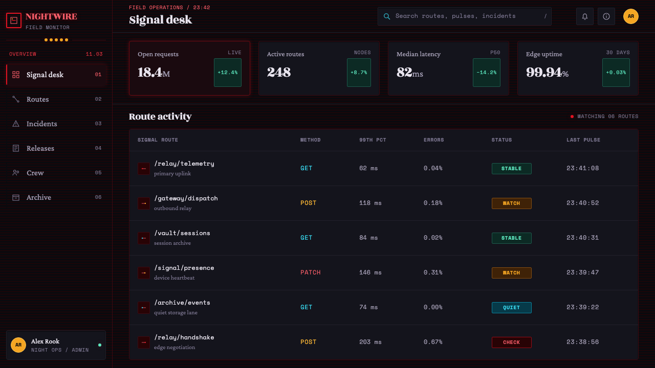
Body copy carries the approachable warmth of a dog-eared Stephen King paperback, while laboratory labels arrive in a government-issue monospace voice. The contrast separates human storytelling from impersonal systems. A page can move between intimate recollection and bureaucratic evidence without losing cohesion, because both forms belong to the same Hawkins world.
Who shaped Stranger Things (1983)?
Matt & Ross Duffer are named among the key figures attached to this theme. Their presence anchors the visual language in the Hawkins setting and its blend of small-town adventure, VHS horror, and supernatural intrusion.
Michelle Dougherty is identified as a key figure in the theme’s visual reference field. Her inclusion places title imagery and graphic atmosphere at the center of the system, rather than treating them as secondary packaging around the story.
Kyle Dixon & Michael Stein appear among the key figures alongside synthwave and darksynth references. Their placement reinforces the style’s sense of electronic tension: darkness is not silent, but charged with an approaching, unstable signal.
Ed Benguiat is named as a key figure in the typographic reference field. In this visual language, the display serif is not merely readable wording; it is the principal dramatic object, carrying glow, depth, threat, and recognition.
How do you use Stranger Things (1983) today?
For presentation covers, treat the title as an arrival rather than a label. Let a spurred serif emerge from a broad near-black field and give the red glow enough darkness to radiate into. Any cyan disturbance should remain peripheral, as though the slide’s signal has been touched by something outside its intended frame. On content slides, preserve that atmosphere through clear hierarchy: warm reading text for explanation, monospace treatment for evidence, categories, or lab-like annotations.
Data slides work best when they feel like recovered material rather than ordinary business charts. Keep the analytical structure calm and legible, then use red to identify the live point of attention and cyan only to suggest anomaly, contamination, or interference. Headings can carry the title-card drama, while labels adopt the more institutional voice. The contrast allows data to remain useful without breaking the fictional analog world.
For web interfaces, this style suits dashboards, archives, episode-like collections, and pricing or membership pages that need suspenseful hierarchy. Near-black space should make information feel discovered rather than crowded. A red glow can identify the primary action or active state, while cold cyan can mark unstable conditions, secondary signals, or boundary moments. Avoid turning every control into a glowing object; the darkness must retain authority for the accent to feel charged.
Editorial and marketing work should exploit the tension between paperback intimacy and supernatural transmission. Long-form copy can use warm, readable prose, interrupted by clipped monospace labels, signal fragments, or chapter-like titles. Marketing modules should unfold like evidence from a broadcast: a red headline, a dark pause, a colder interference mark, then an invitation back into the human story. Drifting spores can add atmosphere when they remain sparse and do not obscure the message.
The common mistake is to reduce the style to red text on black with generic retro noise. That produces a costume without the underlying conflict. The red must behave as heat and illumination, cyan must behave as intrusion, and VHS texture must imply imperfect transmission. Likewise, the display serif should feel cinematic and advancing rather than simply old-fashioned. If every element glows, flickers, or competes for attention, the page loses the suspense created by restraint.
Stranger Things (1983) — FAQ
Is this style simply an 1980s retro look?
No. Its reference frame includes late-1970s and 1980s codes, but its effect depends on conflict rather than nostalgia alone. Amblin-style adventure and paperback warmth are continually disrupted by VHS horror, darksynth tension, cold cyan interference, and the Upside Down. A convincing application should feel like a familiar memory receiving an unfamiliar signal.
Why should red glow instead of appearing as flat color?
Because the title-card image depends on red acting as a source of illumination inside near-black space. Flat red can preserve the palette but loses the sense that the letters are emerging from darkness. The halo gives the title its pressure and scale, making it feel transmitted, supernatural, and alive rather than merely printed.
How should cyan be used without weakening the red title?
Use cyan as a sign of intrusion rather than as a matching accent. It belongs at the edge of a frame, in damaged signal texture, or around moments of instability. Red remains the warm center of attention; cyan indicates the colder force approaching it. When cyan is spread everywhere, the visual story becomes decorative instead of threatening.
Can the style support readable long-form content?
Yes, if the title-card drama is reserved for moments of emphasis. The source language explicitly gives body copy the warmth of a dog-eared Stephen King paperback. Let prose remain comfortable and human, then introduce monospace labels, interference, or red display type at structural transitions. The page should alternate between storytelling and recovered evidence, not remain at maximum intensity.
What makes an application feel generic instead of Stranger Things-inspired?
Generic versions borrow surface cues while removing their narrative jobs: red becomes decoration, static becomes wallpaper, cyan becomes a trendy accent, and serif type becomes a period costume. The stronger approach preserves the system of roles. Darkness creates uncertainty, red supplies heat, cyan introduces corruption, labels imply institutions, and warm prose keeps human stakes visible.
Related design styles
 Prince — Purple Rain (1984)Decadence turns electric. Eggplant violet, gold foil glyphs, and smoky symmet…
 Hulk Gamma GreenDon't make us whisper. Muscle green, trouser purple, inked panels, Ben-Day ha…
 Jurassic Park (1993)Warm welcome, lethal edge. Amber plates, red rings and black chevrons turn aw…
 Kryptonite GreenRadioactive pulp glows hard. Neon green shard, black gutters, Ben-Day grit.
 Nollywood VHS CoversEvery inch shouts. Magenta, warning yellow, hard shadows, and part stamps pac…
 NYC Subway Graffiti (1983)Bombed steel gets loud. Electric purple and acid yellow stack as hard-outline…