What is Jurassic Park (1993)?
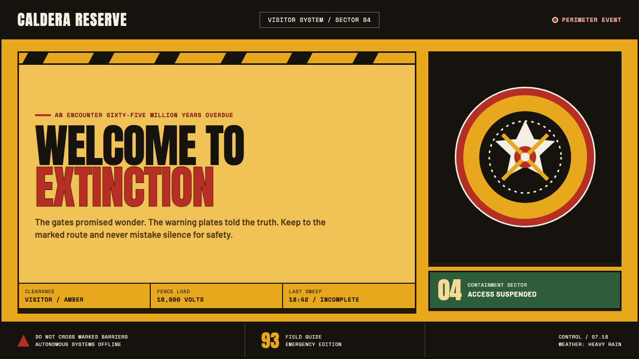
Jurassic Park turns a warm amber welcome into a warning system: ancient wonder is always one breached fence away from catastrophe.
Jurassic Park (1993) in brief
Jurassic Park is a blockbuster design language built from productive contradiction. Its amber ground suggests a visitor center, preserved resin, and the promise of a spectacular attraction; its red ring, black keylines, hazard chevrons, and electrified-fence placards insist that the attraction is dangerous. Awe never appears without containment.
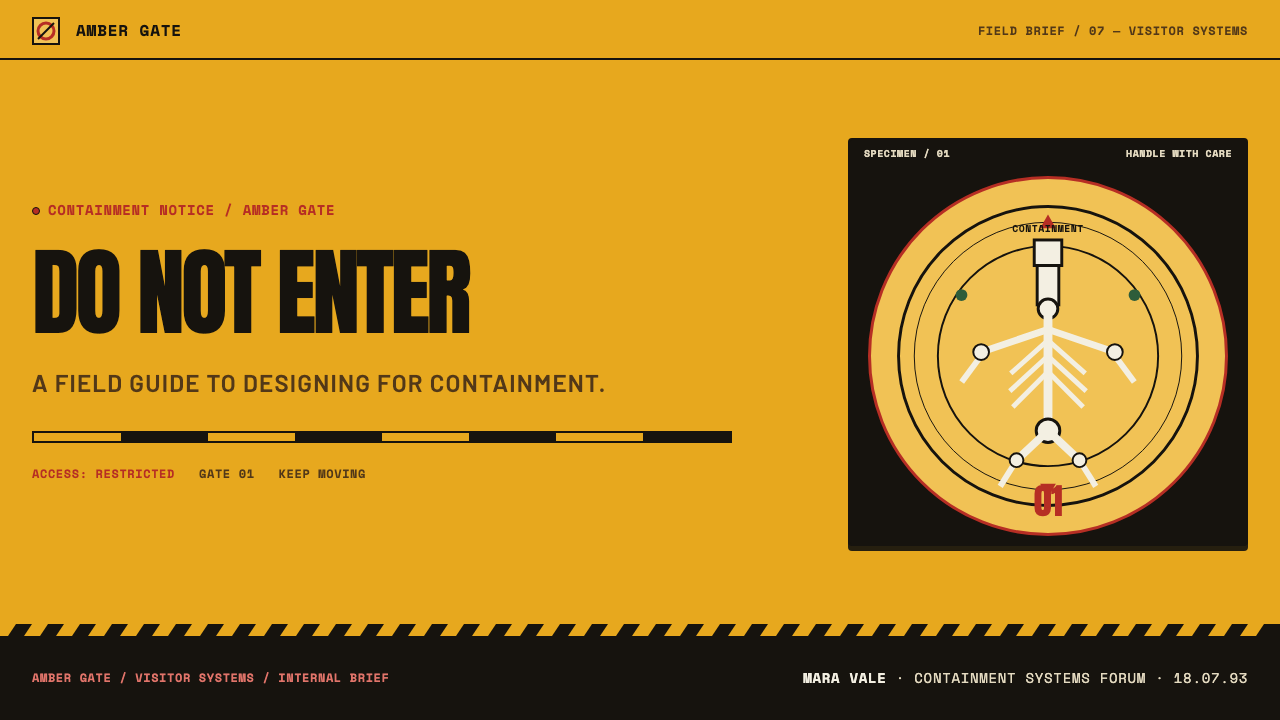
The central emblem is Chip Kidd’s bone-white T-Rex skeleton enclosed by a red-ringed roundel. It reads simultaneously as fossil display, institutional seal, warning sign, and brand mark. The dinosaur is not rendered as a living animal but as monumental evidence: an object from natural history made legible at billboard scale.
Everything behaves like park infrastructure. Screaming capitals, riveted metal plates, alert lamps, fencing references, and sharp directional graphics make the identity feel stamped, posted, and enforced. The mood is cinematic but not ornamental: a rain-soaked public sign glowing through amber resin while the promised tour begins to fail.
Where does Jurassic Park (1993) come from?
The system belongs to the period between Michael Crichton’s 1990 source novel and the 1993 film release. Its setting is Isla Nublar, a fictional island off Costa Rica, while its production context is Hollywood and Universal in Los Angeles. That split is fundamental: the identity sells a distant scientific spectacle through the immediate clarity of mass entertainment.
Its visual roots combine blockbuster brand design, hazard and wayfinding signage, and natural-history museum display. These are not separate references layered for atmosphere. Museum display supplies the fossil and the authority of evidence; signage supplies instruction and danger; blockbuster branding supplies an emblem strong enough to travel across posters, placards, and public memory.
The source material identifies Steven Spielberg, Michael Crichton, Chip Kidd, Stan Winston, and John Williams as key figures in the wider Jurassic Park context. Within the visual system, Kidd’s skeletal T-Rex mark is the decisive compact image: it gives the park a single silhouette that can function as both invitation and threat.
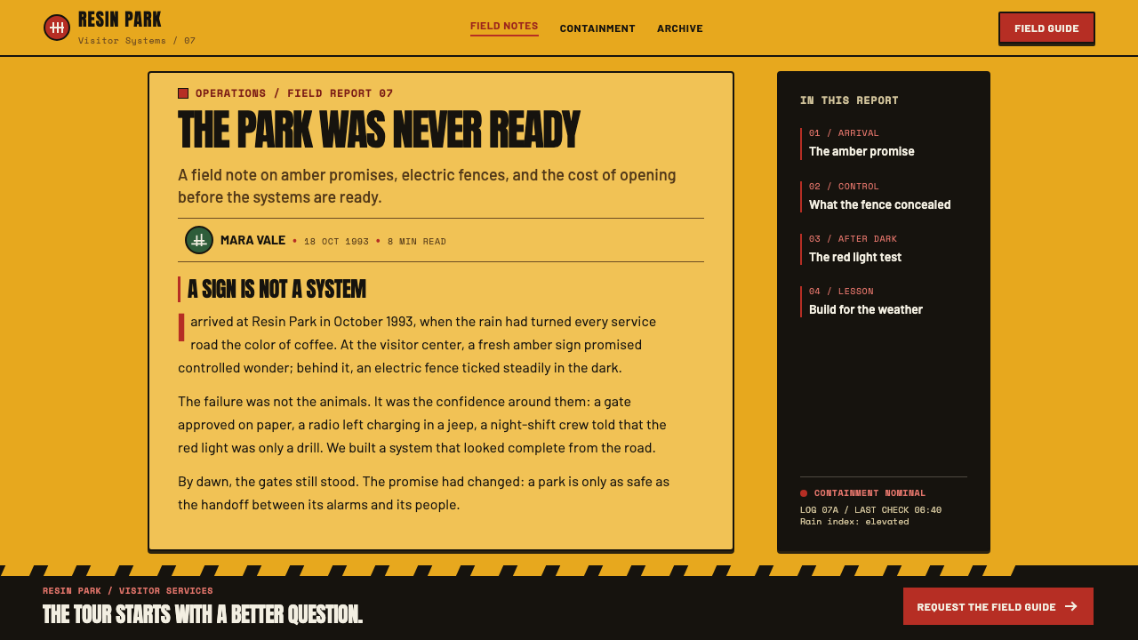
The resulting identity avoids the polished reassurance of a conventional destination brand. It stages a park that is already under strain. Amber warmth is countered by black hazard graphics, red containment signals, and electrified boundaries, creating a public-facing language that makes danger part of the attraction rather than something hidden behind it.
What defines the Jurassic Park (1993) look?
Amber Welcome
Amber is the emotional ground of the system. It suggests resin, age, enclosure, and warm public hospitality, but never simple comfort. The color behaves like illuminated material behind glass: inviting at a distance, enclosed and slightly unsettling when examined closely.
Containment Red
The red ring around the skeletal emblem acts as containment rather than decoration. It frames, encloses, and heightens the sense that the dinosaur must remain inside a controlled boundary. Red alert lamps extend the same logic into the environment.
Monumental Fossil
The bone-white T-Rex skeleton is treated as a graphic monument. Its pale fossil form gains force from the darker surrounding field and from its scale. It does not ask to be studied like an illustration; it confronts the viewer like evidence mounted on a public wall.
Hazard Grammar
Black-and-yellow chevrons, sharp keylines, and electrified-fence placards borrow the grammar of restricted access. Direction, prohibition, and potential injury are embedded in the composition. Even when the layout is celebratory, it carries the posture of a sign that expects compliance.
Stamped Typography
The type feels monolithic, loud, and physically applied. Screaming capitals behave less like literary text than institutional signage. Their force comes from blunt hierarchy and immediate legibility, matching the authority of a gate, placard, or emergency instruction.
Industrial Surface
Riveted metal plates, alert lamps, and hard black outlines make the identity feel engineered rather than merely printed. The surfaces imply gates, cages, machinery, and visitor-center hardware. This industrial language keeps the prehistoric subject from becoming sentimental.
Who shaped Jurassic Park (1993)?
Kidd is identified with the bone-white T-Rex skeleton enclosed by the red-ringed roundel. That image condenses fossil display, park branding, containment, and danger into a single public mark.
Spielberg is named among the key figures in the Jurassic Park context. The resulting design language carries the scale and directness expected of a major film event while retaining the specific fiction of a perilous park.
Crichton’s 1990 source novel establishes the earlier point in the system’s development. The film identity translates that source-world into a visible public environment of fossils, warnings, boundaries, and commercial spectacle.
Winston appears in the source material’s list of key figures. His presence in that broader context helps locate the identity within a project where creatures, material presence, and visual spectacle are inseparable.
Williams is also named as a key figure in the wider Jurassic Park context. The design shares the same essential tension: an expansive sense of wonder continually held against an awareness of danger.
How do you use Jurassic Park (1993) today?
For presentation covers, use the style as a threshold. Set a monumental title against an amber field, let one skeletal or fossil-like image dominate, and introduce a red enclosure or black warning structure as counterpressure. The cover should feel like entry into a controlled attraction, not a generic adventure poster.
On content and data slides, borrow the logic of museum signage and hazard placards. Use strong section labels, disciplined panels, directional dividers, and a limited alert hierarchy. Charts work best when they feel like part of a monitored system: categories become zones, highlights become warnings, and annotation becomes instruction.
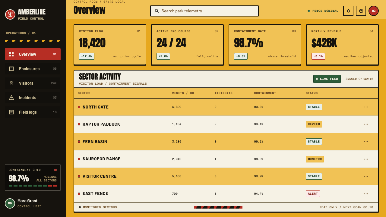
For web dashboards and pricing pages, the style can make operational information feel immediate and consequential. Amber surfaces can establish a welcoming base, while black framing and red states identify boundaries, alerts, or irreversible actions. Use the danger language selectively; if every component screams, the system loses its ability to warn.
For editorial and marketing work, combine a large fossil-scale image with the compressed authority of a public sign. A feature page can alternate between warm exhibition-like fields and darker warning panels. Product stories should retain the tension between discovery and control, rather than reducing the style to dinosaur imagery alone.
The common mistake is copying the T-Rex mark, chevrons, and red ring as detached decoration. Jurassic Park works because every device supports the same narrative: guests are welcomed into something magnificent that cannot be fully domesticated. If the interface has no sense of boundary, consequence, or monitored access, the visual language becomes costume.
Jurassic Park (1993) — FAQ
Is Jurassic Park design simply a dinosaur-themed aesthetic?
No. Dinosaurs provide the subject, but the system is organized around containment, public signage, spectacle, and danger. Its recognizability comes from the conflict between invitation and restriction: amber hospitality is always interrupted by fences, warning graphics, and institutional control.
Why is the T-Rex shown as a skeleton rather than a living animal?
The skeleton connects the brand to natural-history display and turns the animal into evidence rather than character. In bone-white against a darker field, it also becomes a highly legible emblem that can carry both scientific authority and the threat of something enormous.
Can this style work without a literal fossil or dinosaur image?
Yes, if the core tension remains intact. Amber illumination, red containment, hard black framing, hazard grammar, and sign-like typography can create the same feeling around another subject. The replacement image should still feel displayed, monitored, or potentially beyond control.
How should amber and red be balanced?
Let amber carry atmosphere and red carry consequence. Amber should make the world feel valuable, luminous, and inviting; red should appear where containment, alert, or exceptional attention is needed. When both perform the same role, the design loses its central dramatic contrast.
Where does Jurassic Park styling struggle?
It struggles where calm, softness, and low-stakes reassurance are essential. The system naturally implies surveillance, boundaries, and looming failure. It is strongest for experiences involving discovery, risk, controlled access, scientific spectacle, or a deliberate sense that the stakes are real.
Related design styles
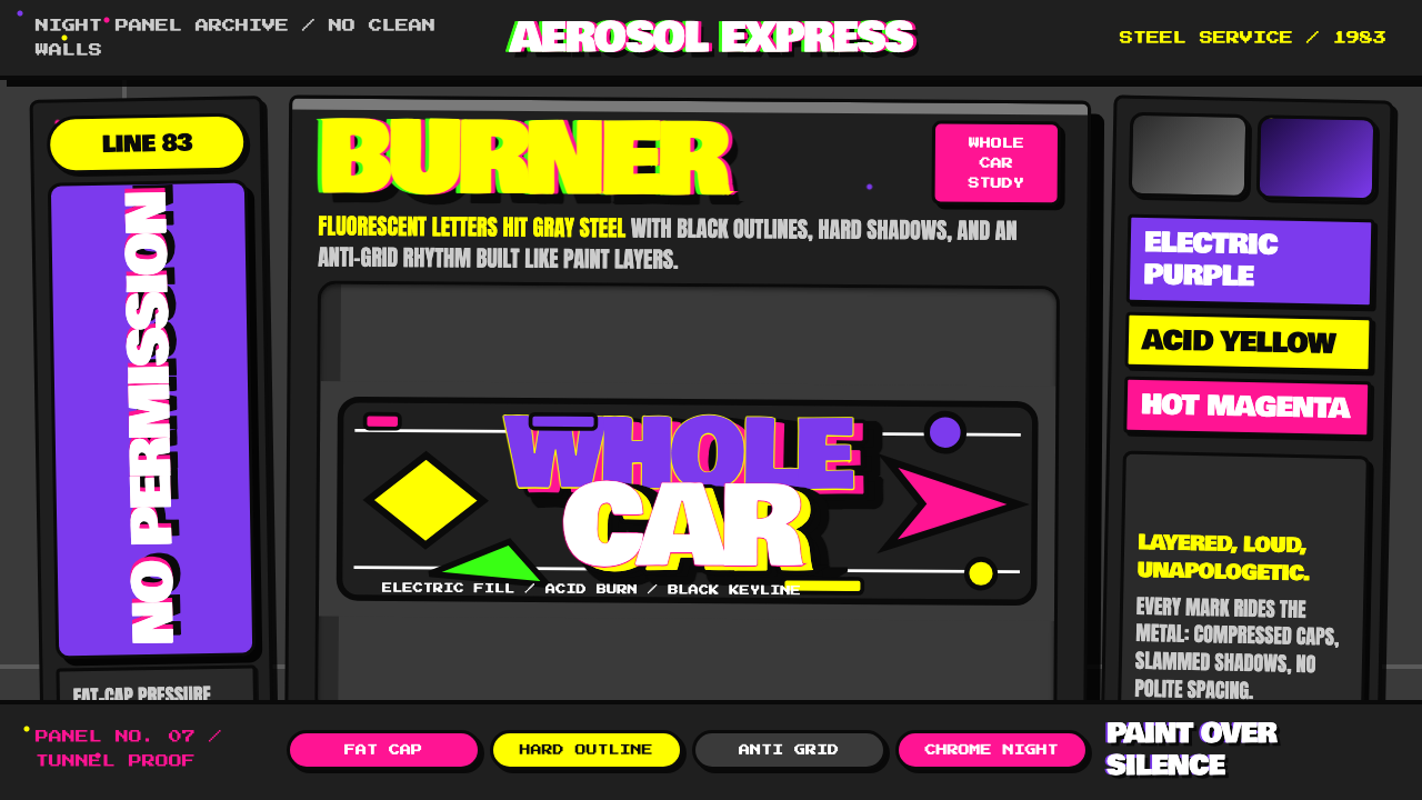 NYC Subway Graffiti (1983)Bombed steel gets loud. Electric purple and acid yellow stack as hard-outline…
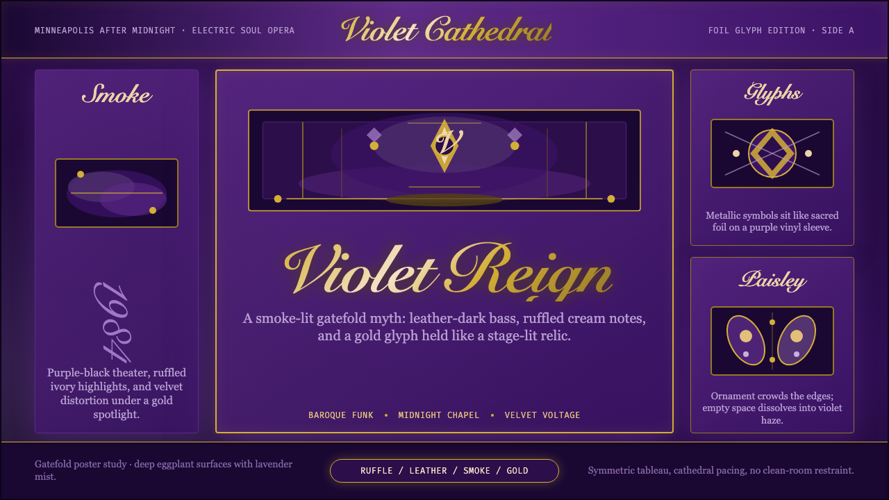 Prince — Purple Rain (1984)Decadence turns electric. Eggplant violet, gold foil glyphs, and smoky symmet…
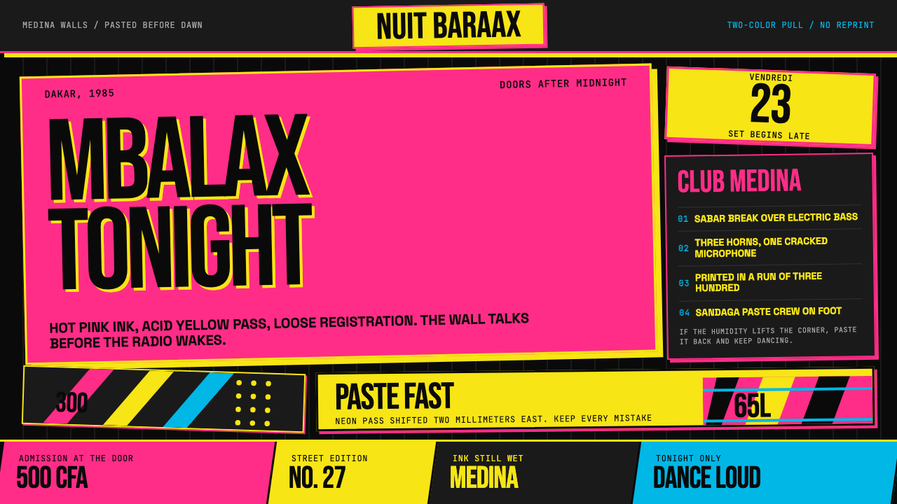 Senegalese Mbalax Poster (Dakar 1985)Street urgency, screen-printed loud. Hot pink and acid yellow drift over blac…
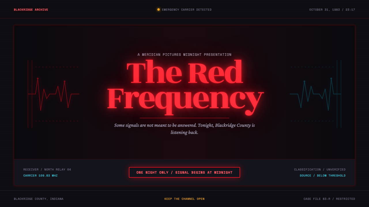 Stranger Things (1983)Red light breaks the void. A spurred serif blooms through VHS static and cold…
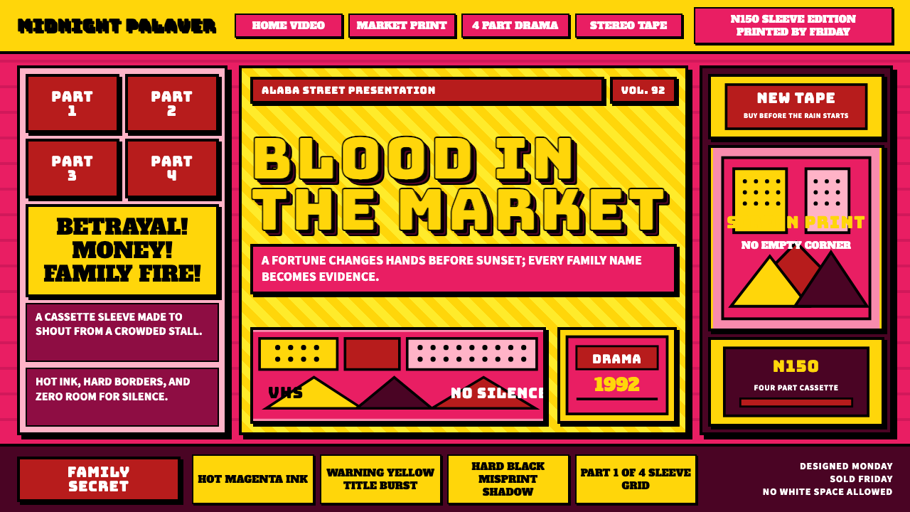 Nollywood VHS CoversEvery inch shouts. Magenta, warning yellow, hard shadows, and part stamps pac…
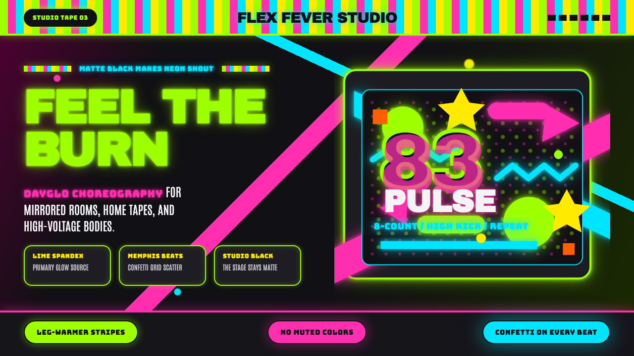 80s Aerobics Fluoro SpandexNeon refuses restraint. Lime spandex, pink-cyan confetti, and black-stage typ…