What is Pulp Fiction (1994)?
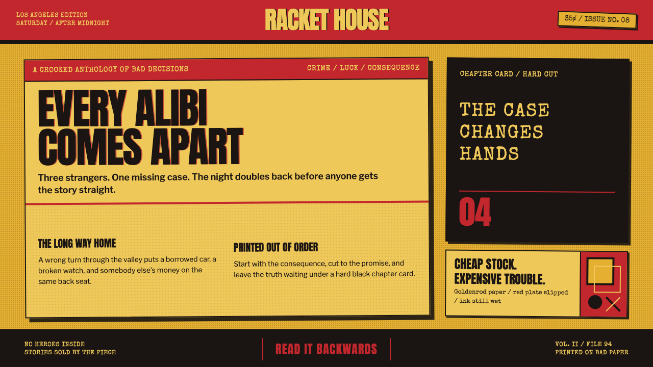
Cheap print, dangerous rhythm: Pulp Fiction turns goldenrod paper, pulp red, hard black type, and abrupt chapter cards into a visual grammar for stories that arrive already stained with trouble.
Pulp Fiction (1994) in brief
Pulp Fiction is a design language drawn from the American crime paperback: the kind of inexpensive book pulled from a drugstore spinner rack, printed for quick circulation rather than careful preservation. Its visual field is loud and immediate. Goldenrod stock supplies the aged, low-cost ground; red carries alarm and lurid promise; black lettering lands with the blunt force of a warning. The resulting surface does not ask to be admired from a distance. It asks to be picked up.
The style treats physical imperfection as evidence of character. Halftone grain, cover creases, worn paper, and ink that sits slightly out of register are not production failures to conceal. They make the object feel handled, reproduced, and a little disreputable. A polished surface would weaken the fiction. The desired impression is a paperback that has survived a rack, a pocket, and several bad decisions.
Its most cinematic device is the black chapter card. A title on black interrupts one sequence and launches another with the force of a tabbed divider in a crime-fiction anthology. This creates a rhythm of rupture rather than smooth continuity: chapters arrive as declarations, and the story can be broken apart, rearranged, and re-entered from a new angle. The visual language is therefore not only cover art translated to film; it is print structure turned into editing logic.
Where does Pulp Fiction (1994) come from?
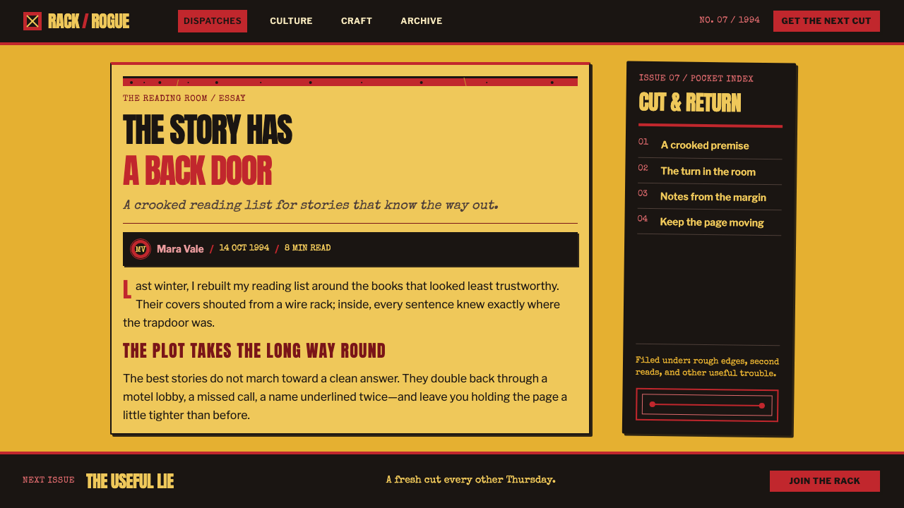
The immediate cultural reference is the American pulp paperback tradition of the 1940s through the 1960s, associated here with Gold Medal, Signet, and Black Lizard. These books belonged to a commercial crime-fiction world in which the cover had to announce danger quickly: a reader should understand the temperature of the story before opening it. Cheap paper and aggressive display lettering were not incidental styling choices. They were part of the format's public identity.
Pulp Fiction was released in 1994 in Los Angeles, but its visual lineage reaches backward through hardboiled crime fiction and pulp paperback cover art. The film language does not reproduce that history as a museum object. It cuts it apart and recomposes it through American independent cinema and postmodern pastiche. The old paperback becomes a live visual source: its stock, ink, chapter structure, and blunt promotional urgency are made useful again in another medium.
The style's narrative structure is inseparable from its graphic structure. Black chapter titles act like printed dividers, giving separate scenes the status of named installments. That device makes discontinuity legible rather than apologetic. Instead of hiding the seams between episodes, the design calls attention to them, allowing the work to feel like an anthology whose pages have been shuffled deliberately.
The approved lineage identifies Quentin Tarantino, Roger Avary, Andrzej Sekula, James Verdesoto, and Robert McGinnis as key figures around this world. Together, those names locate the theme at the crossing of film, image-making, graphic presentation, and the older crime-paperback tradition. The style should be understood less as a neutral retro look than as a deliberate pastiche: it borrows the charged economy of cheap print while making that cheapness visibly intentional.
What defines the Pulp Fiction (1994) look?
Goldenrod Ground
The ground should resemble worn goldenrod paperback stock rather than a clean, neutral page. It carries age, low cost, and circulation before any image or headline appears. The paper-like field is not a quiet background; it is the first signal that this object belongs to the world of cheap crime fiction.
Pulp Red and Black
Red and black form the style's most forceful contrast. Red is the scream: lurid, urgent, and willing to overstate the danger. Black is the cut: hard lettering, chapter fields, and graphic interruption. Neither color is used to create refinement. Their job is to make the composition feel printed, blunt, and impossible to ignore.
Hard Display Type
Lettering should arrive as a headline, not as atmosphere. It is dense, dark, and declarative, with the blunt visual authority of a paperback cover trying to stop a passing reader. Type does not whisper around imagery or dissolve into texture. It sits on top of the surface and states the title, chapter, or warning with deliberate force.
Printed Wear
Halftone grain, cover creases, and slight misregistration give the surface its credibility. The texture should feel like a consequence of reproduction and handling, not a decorative filter applied after the fact. Wear is most convincing when it interrupts certainty a little: edges lose pristine sharpness, fields feel rubbed, and ink seems to have met paper imperfectly.
Black Chapter Cards
A chapter title on black is an editorial interruption made visible. It creates a clean, severe pause between scenes, then restarts attention under a new label. Unlike a soft transition, this device embraces the cut. It makes the audience aware of story architecture and gives each narrative fragment the sensation of a separate, lurid printed installment.
Proud Cheapness
The style succeeds when it looks intentionally under-resourced but compositionally controlled. Loudness, wear, and apparent roughness are not excuses for disorder. The work still needs clear hierarchy: the yellow field, red alarm, black declaration, and chapter interruption each have a distinct role. Its pleasure comes from making low-fi materials feel chosen rather than accidental.
Who shaped Pulp Fiction (1994)?
Tarantino is named among the key figures for Pulp Fiction. The supplied material places the film's paperback-derived visual language on his editing table, where chapter cards and broken narrative order become central parts of its identity.
Roger Avary is identified as a key figure in the approved origin material. His inclusion situates the theme within the film's creative world rather than treating its pulp references as an anonymous surface treatment.
Andrzej Sekula appears among the key figures associated with the theme. The name helps locate Pulp Fiction's design language at the meeting point of graphic pulp reference and cinematic image-making.
James Verdesoto is named as a key figure in the source material. Within this theme, graphic presentation matters because the paperback reference depends on how titles, color fields, wear, and visual interruption are organized into an immediately readable whole.
Robert McGinnis is included among the key figures connecting the theme to pulp paperback cover art. His presence anchors the style in the broader American crime-fiction paperback tradition that the film revisits through postmodern pastiche.
How do you use Pulp Fiction (1994) today?
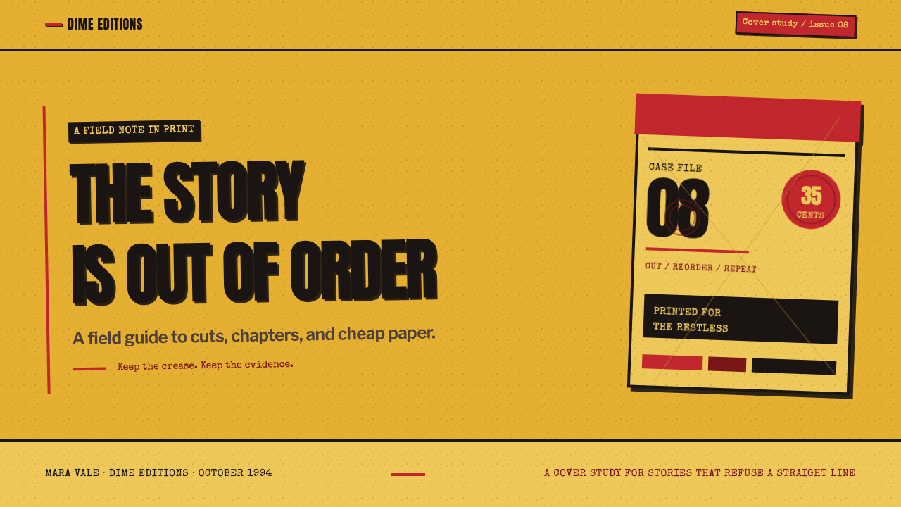
For presentation covers, begin with the paperback premise rather than a generic retro collage. Let a worn goldenrod field establish the page, then use a hard black title and a controlled red intervention to supply danger. A single image may be treated as cover evidence rather than polished illustration: cropped assertively, allowed to feel printed, and prevented from becoming too glossy. The cover should read like a story sold from a rack, not a prestige edition placed behind glass.
For content slides, use chapter cards as structural punctuation. A black field with a terse section title can reset attention before a new argument, case study, or scene. On the slides that follow, keep the hierarchy blunt: a strong heading, a limited amount of supporting copy, and one visual event with a clear job. The style is effective when the audience can feel the chapter break without losing the thread of the presentation.
For data slides, translate the language of cheap print into deliberate diagramming rather than adding distress indiscriminately. Use the goldenrod ground and the red-black contrast to make the central comparison unmistakable. Treat chart marks as printed evidence: firm, high-contrast, and plainly labeled. If a chapter card introduces a data section, it should frame the numbers as the next episode of the same story, not as an unrelated dashboard inserted into a retro deck.
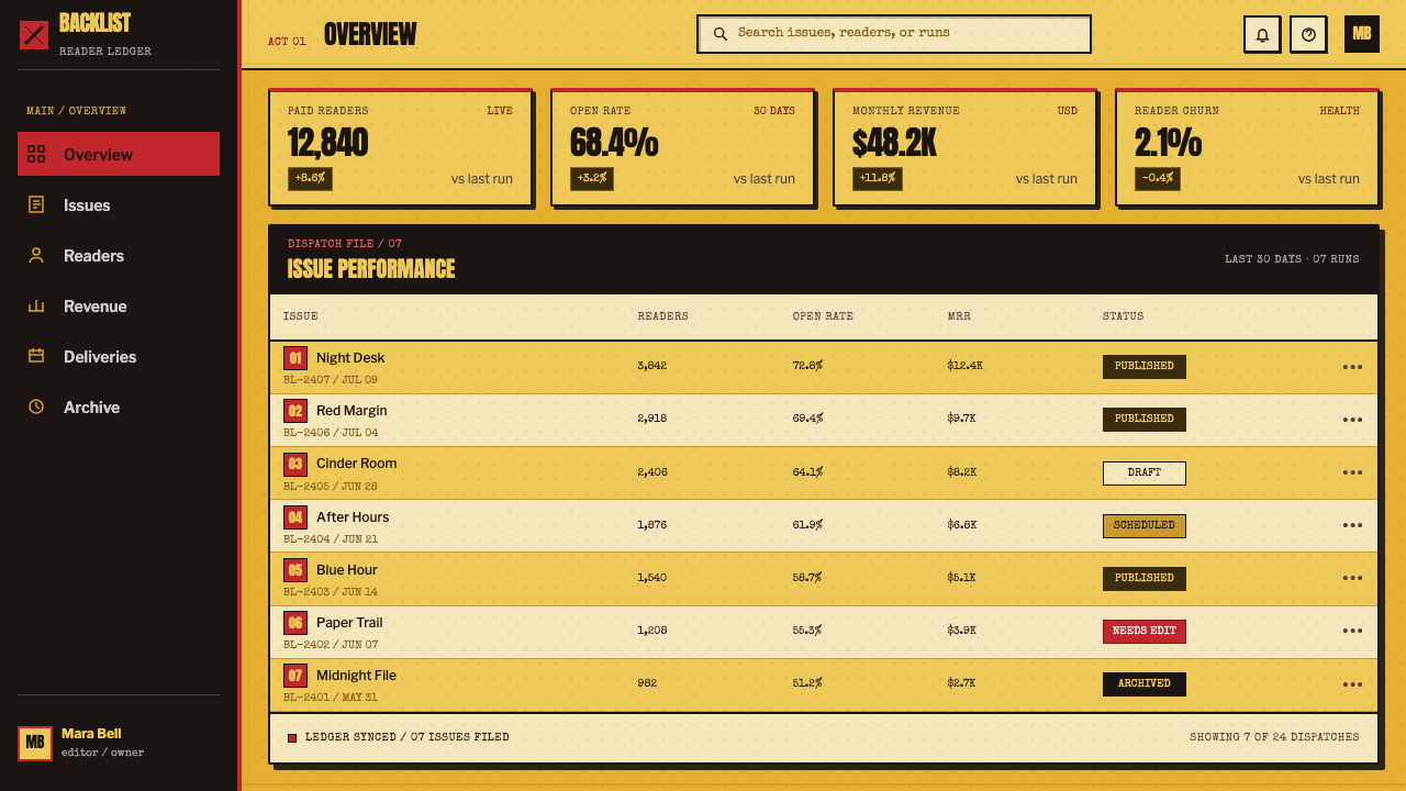
For web interfaces, this approach fits editorial dashboards, campaign pages, ticketing flows, catalogs, or pricing pages that benefit from urgency and strong narrative framing. Black chapter-like panels can separate major areas; red can identify a consequential action or alert; the aged paper ground can give a marketing surface a distinctive voice. Functional content must remain more disciplined than decorative content. Navigation, forms, and comparison information still need to be immediately legible, because the pulp reference should sharpen the experience rather than turn every screen into a prop.
For editorial and marketing work, use the style to turn sequencing into part of the message. A long-form story can open sections with black title cards, pair forceful headlines with rough print texture, and let red appear at moments of jeopardy or emphasis. The common mistake is confusing purposeful cheapness with indiscriminate damage. Excessive grain, too many creases, constant red, or unreadable distressed type produces noise without tension. The reference works because every rough element supports the fiction of a mass-market crime paperback.
Pulp Fiction (1994) — FAQ
Is this style simply a generic vintage paperback look?
No. Its identity depends on a specific combination: American crime-paperback reference, goldenrod low-cost stock, red-and-black alarm, visible printing wear, and chapter cards that shape narrative rhythm. A nostalgic paper texture alone does not create the Pulp Fiction language. The crucial idea is that graphic cheapness and story structure reinforce one another.
Why are black chapter cards so important?
They make the edit visible. A black card with a title behaves like a printed divider between stories, giving discontinuous scenes a named order and a sharp reset. It turns an interruption into a design event. Without that device, the palette may still recall pulp covers, but the style loses its clearest link between print culture and fractured cinematic narrative.
Should every element look damaged or worn?
No. Wear works as evidence, not as wallpaper. Halftone grain, a crease, or imperfect registration has force because it appears against areas that remain readable and compositionally decisive. If all surfaces are equally distressed, the eye cannot distinguish title, warning, image, and chapter break. The design needs contrast between controlled structure and physical roughness.
Can the style work for information-heavy interfaces?
Yes, when the pulp language is assigned to hierarchy rather than allowed to obstruct it. Use chapter-like breaks for major sections, reserve red for consequential moments, and keep essential labels and comparisons firm and readable. It is particularly useful when an interface needs editorial momentum. It is less suitable when a calm, neutral, or invisible visual system is the primary goal.
What is the most common implementation mistake?
Treating loudness as the whole system. Red, rough texture, and black type are ingredients, not the recipe. The style needs a goldenrod paper premise, visible but controlled print imperfection, decisive chapter interruption, and a hierarchy that still reads at a glance. When those parts are not coordinated, the result becomes generic retro noise instead of dangerous paperback rhythm.
Related design styles
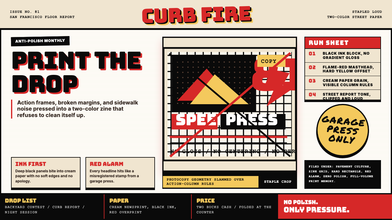 Thrasher Skate Zine (1981)Loud without polish. Flame red type, black ink blocks, and cream zine grids h…
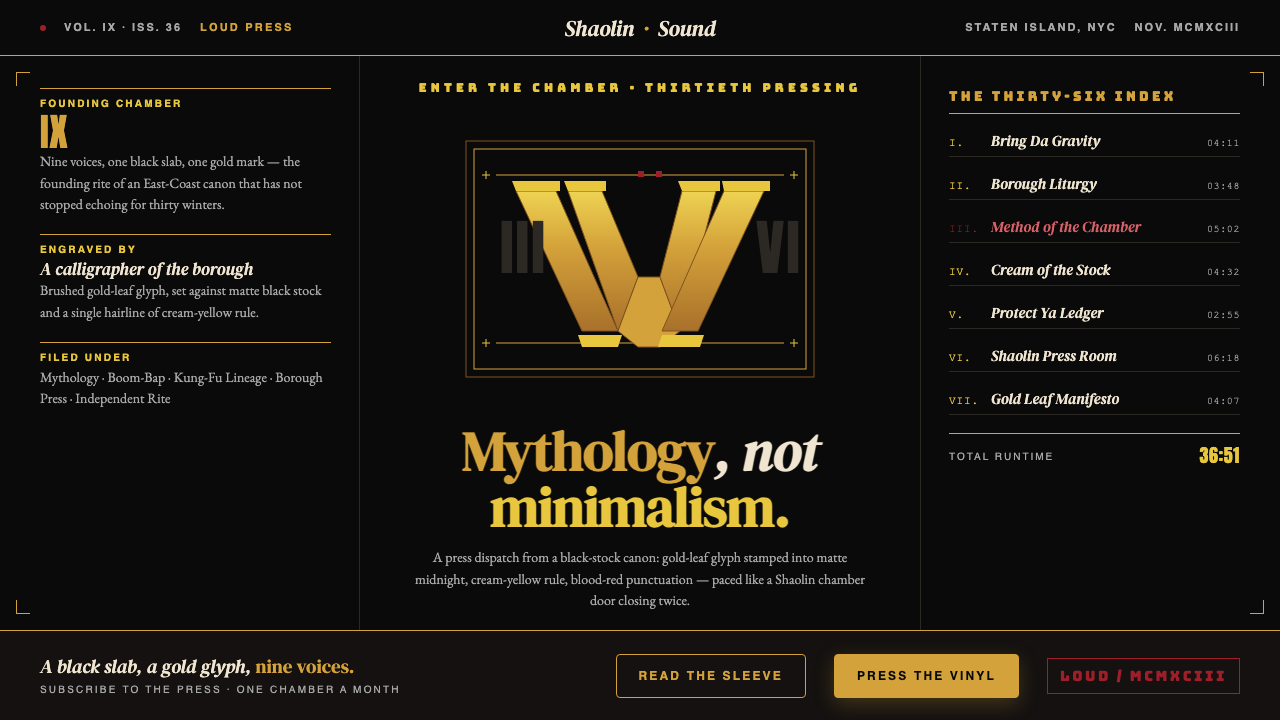 Wu-Tang Clan — 36 ChambersMythology, not minimalism. Gold-leaf glyph on matte black, cream-yellow rule,…
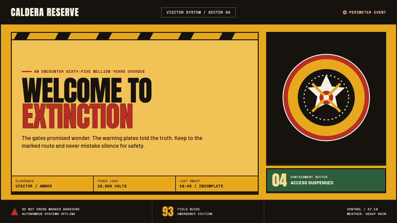 Jurassic Park (1993)Warm welcome, lethal edge. Amber plates, red rings and black chevrons turn aw…
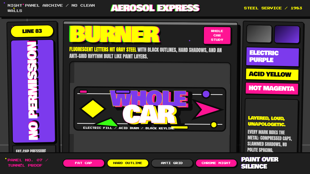 NYC Subway Graffiti (1983)Bombed steel gets loud. Electric purple and acid yellow stack as hard-outline…
 Public Enemy — Fight the PowerTakes a side loudly. Red bands, black ink, and target geometry hit like a ral…
 Rolling Stone MagazineCounterculture gets editorial weight. Cream paper, lipstick red script, serif…