About Pulp Fiction (1994)
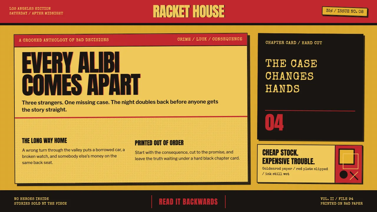
This is the design language of a 35-cent crime paperback yanked off a drugstore spinner rack, then cut apart on Tarantino's editing table. Screaming red-and-yellow, worn goldenrod stock, hard black lettering — and the film's own device: black-card chapter titles that snap between scenes like tabbed dividers in a lurid dime-novel anthology.
Everything is loud, cheap-looking on purpose, and proud of it. Halftone grain, cover creases, ink that mis-registers a hair off its plate. Nothing is polished; the wear IS the design. A story too disreputable for a hardcover, printed on the cheapest yellow stock they had — and better for it.
- Origin
- Los Angeles / American crime-fiction paperback tradition
- Era
- Film released 1994; visual lineage from 1940s–1960s American pulp paperbacks (Gold Medal, Signet, Black Lizard)
- Key figures
- Quentin Tarantino · Roger Avary · Andrzej Sekula · James Verdesoto · Robert McGinnis
- Movements
- Pulp paperback cover art · Hardboiled crime fiction · American independent cinema · Postmodern pastiche
Pulp Fiction (1994) design spec
Colors
Typography
The other 11 sections — buttons, cards, spacing, motion, techniques and more — open once you unlock. Download the DESIGN.md or send it to your AI in one click. Unlock once, yours forever.
Sign up nowStyles similar to Pulp Fiction (1994)
Also inspired by film, games & music, with a close feel.
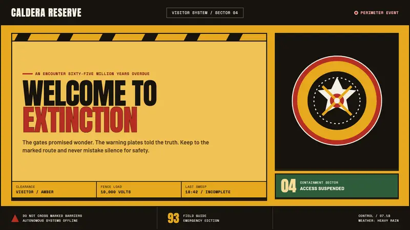 Jurassic Park (1993)Warm welcome, lethal edge. Amber plates, red rings and black chevrons turn awe into warning.
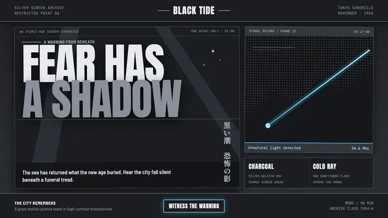 Godzilla (1954 Showa)Fear takes monumental form. Charcoal halftones split under one atomic-blue ray.
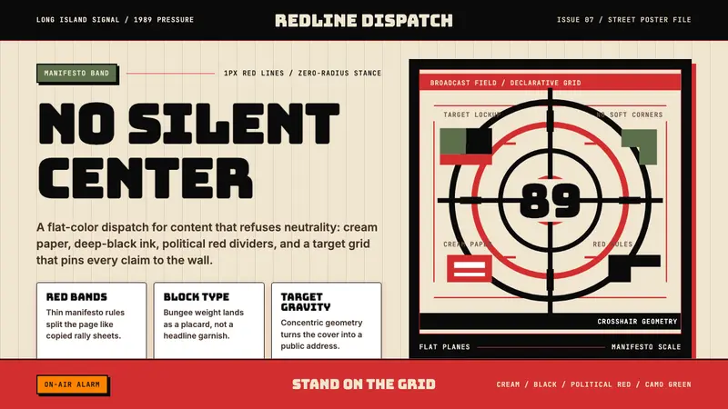 Public Enemy — Fight the PowerTakes a side loudly. Red bands, black ink, and target geometry hit like a rally poster.
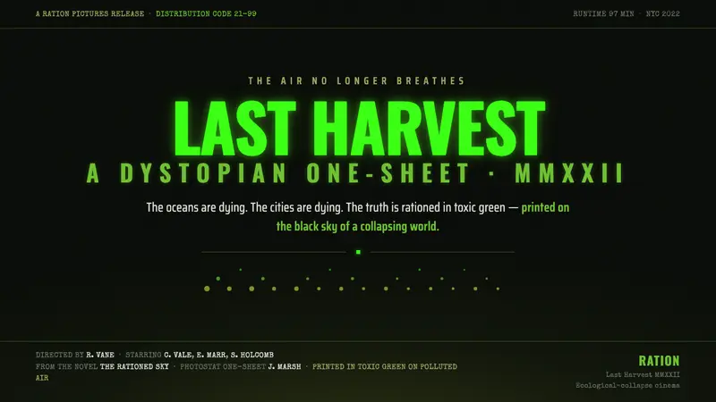 Soylent Green 1973The air no longer breathes. Toxic green titles glow over smoggy near-black, in photostat grain.