What is Senegalese Mbalax Poster (Dakar 1985)?
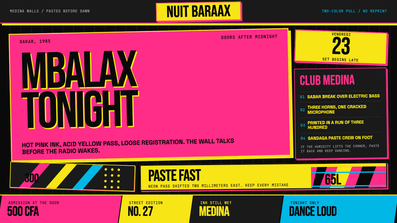
Dakar's mbalax concert posters of the 1980s turned imperfection into a visual language — misregistered ink, bleeding halftones, and condensed type shouting into the night.
Senegalese Mbalax Poster (Dakar 1985) in brief
The Senegalese Mbalax Poster (Dakar 1985) style draws its entire visual grammar from the wheat-pasted concert announcements that blanketed the walls of Dakar's Medina, Plateau, and Pikine neighborhoods in the 1980s. These were working documents, not art objects — printed in haste, pasted before dawn, and dissolved by humidity before the next weekend's show demanded a fresh round. The rawness was not carelessness; it was the only available speed.
Visually, the style is defined by a commitment to constraint pushed to its expressive limit. Two screaming colors — a hot, almost fluorescent pink and an acid, sulfurous yellow — are layered over a deep black field that reads like newsprint held up to a streetlamp. The palette carries the urgency of a Friday night announcement; there is no room for subtlety, because the poster has seconds to compete with everything else on the wall.
Every element reinforces the sense that the poster was made fast, with limited resources, and that none of this diminishes its authority. Condensed letterforms crammed with band names and venue details, halftone dots that bleed at the edges, ink that drifts slightly off its intended position — these are not accidents to be corrected. They are the handwriting of a specific moment, the graphic equivalent of a djembe hit landing just ahead of the beat.
Where does Senegalese Mbalax Poster (Dakar 1985) come from?
Mbalax emerged in the late 1970s as a fusion of traditional Serer and Wolof percussion — particularly the sabar drum polyrhythms that had anchored Senegalese ceremonial music for centuries — with Cuban son, Latin American brass arrangements, and Afropop melodic structures. The sound was local and cosmopolitan at once, shaped by Dakar's position as a port city with deep Atlantic exchange networks. By 1979, when Youssou N'Dour formed Étoile de Dakar, the genre had its flagship act, and the live concert became the primary site of cultural participation in the city.
The concert poster tradition that grew around mbalax was rooted in an older Dakar street-printing culture, but the 1980s gave it particular intensity. Print shops in the Medina and around the Sandaga market operated with limited ink colors and aging screen-printing equipment. Budgets were tight and lead times were measured in hours. These constraints produced a visual dialect: two-color jobs on rough newsprint stock, condensed display type set in fat Latin caps because that was what the available lettering allowed, and a deliberate acceptance of the misregistration that happened when a second ink pass drifted from the first.
The Thiossane club, opened by Youssou N'Dour in Dakar, became one of the central anchors of this scene, but the music and its promotional graphics spread across dozens of venues in the city and beyond. Thione Seck, Omar Pene, and Ismaël Lô each brought distinct musical personalities to mbalax, and their respective camp followings meant that the poster tradition diversified even as it shared a common graphic vernacular. Hot pink for one headliner, acid yellow for another — the color choices were practical, memorable, and loud enough to be read from a moving car.
By the early 1990s, offset printing and photocopied flyers began to displace the older screen-print aesthetic, and the precise graphic moment of the 1985-era poster began to fade. What remained was a visual archive of extraordinary density — photographs of the walls, surviving posters in private collections, and the memories of designers who had worked in those Medina shops — that later design researchers and contemporary practitioners would mine as a primary source for understanding what urgent, resource-constrained, joyful graphic communication looked like before digital tools arrived.
What defines the Senegalese Mbalax Poster (Dakar 1985) look?
Color
The palette is deliberately restricted to two assertive colors deployed against near-total black. Hot pink — the kind that reads almost neon under artificial light — functions as the dominant voice, loud enough to be a headline in its own right. Acid yellow serves as the second scream, used for contrast and to push certain text elements forward. The black ground is not neutral; it carries the weight of newsprint darkness, absorbing the colors and giving them an urgency they would lose on white. Together, the three tones produce a palette that communicates before the eye has time to read the words.
Typography
Condensed letterforms are the typographic backbone — display caps squeezed to narrow proportions so that long band names, venue names, and dates can be compressed into a small vertical slice without losing legibility from distance. The type shouts rather than whispers; headlines occupy a disproportionate share of the composition, because the first job of the poster is to announce the headliner's name at read-from-a-moving-vehicle scale. Secondary information — support acts, ticket prices, show times — drops dramatically in size, creating a steep hierarchy that mirrors how the music itself layers its rhythms. Lettering is Latin-script but its spirit is borrowed from the hand-cut signage tradition of Dakar's commercial strips.
Misregistration and Drift
Deliberate imperfection is the defining textural quality of this aesthetic. When two ink passes through a manual screen-printing press fail to align precisely, the second color appears slightly offset from the first — producing a shadow-like doubling or a halo effect around letterforms and shapes. In authentic 1985-era posters this was unavoidable; in contemporary applications of the style, it is simulated as a design choice. The drift should feel slight and directional — not chaotic noise but a tremor of handmade energy. It activates the composition in a way that perfect registration never could.
Halftone and Print Grain
Photographs and tonal areas in screen-printed posters are rendered through coarse halftone dot patterns — visible grids of colored dots that bleed slightly at their edges when ink is absorbed into rough newsprint. The dots are not small or subtle; they are part of the image's visual texture, as present as the subject they render. This grain quality communicates the physical process of making the thing — it is impossible to mistake for digital work. Areas of high ink density become saturated zones of almost brutal color; areas of low density open into the black of the ground itself.
Composition and Urgency
Compositions in this tradition are top-heavy and centripetal — the most important information crowds the upper two-thirds of the sheet, while lower areas accommodate stacked secondary details. There is little or no true negative space; every zone carries text, texture, or color. This density is not accidental — it mirrors the sonic density of mbalax itself, where multiple polyrhythmic layers never fully resolve into silence. The composition communicates immediacy: tonight, this place, this music. The poster's job is to be impossible to walk past without registering its message.
Material Ground and Texture
The implied substrate is rough newsprint — an absorbent, slightly fibrous surface that softens ink edges and gives the overall impression a matte, dusty finish rather than a crisp commercial sheen. The physical impermanence of newsprint is part of the aesthetic's meaning: these posters were not made to last. The material choice encodes the ephemeral nature of the event itself. In digital applications, this quality can be approximated through deliberate texture overlays and a general avoidance of crisp, anti-aliased edges — everything should look as if it would smear slightly if touched.
Text Density and Information Stacking
These posters carry an enormous amount of information for their size — band names, support acts, venue, date, time, ticket price, sometimes a call to arrive early. All of this is stacked in descending hierarchical bands, each compressed to the maximum density the press and paper could handle. There is a particular aesthetic pleasure in watching a designer navigate this density: the transitions between type sizes are abrupt and decisive, never gradual. The eye jumps from register to register rather than flowing smoothly, and this jumpiness is part of the energy the style transmits.
Who shaped Senegalese Mbalax Poster (Dakar 1985)?
N'Dour founded Étoile de Dakar in 1979 and later Super Étoile, making him the most prominent figure in the mbalax scene whose concerts generated the most prolific run of the street-poster tradition. His Thiossane club in Dakar became the primary venue around which the poster culture crystallized. The visual identity of his events — dense, two-color, urgent — set a template that other promoters in the scene followed and adapted. International recognition from the mid-1980s onward brought him attention far beyond Dakar, but the visual grammar of the concert poster had already been established in the years of local saturation.
Seck was a foundational voice in mbalax, coming from a griot family lineage that grounded his music in deep Wolof and Serer musical tradition. His concerts competed with those of N'Dour for the loyalties of Dakar audiences, and the rivalry was visible in the poster culture: competing shows on the same weekend demanded competing announcements on the same walls. This proximity of rival posters — each trying to out-shout the other — drove a visual escalation that pushed color saturation and type density to their practical limits.
Pene, as the lead voice of Super Diamono, brought a melodic softness to mbalax that distinguished his music from the more percussive thrust of other acts — but the poster culture around his concerts was no less visually assertive. His contribution to the tradition illustrates that the graphic intensity of the street poster was not tied to any single performer's style; it was the format itself, born of the technical and economic constraints of Dakar print shops, that imposed the aesthetic. Every act that played a venue of sufficient size received the same rough-newsprint two-color treatment.
Lô is a singer-songwriter and guitarist whose approach to mbalax incorporated a more introspective acoustic sensibility alongside the genre's characteristic polyrhythmic energy. His concert posters from the period participate in the same two-color newsprint tradition, but the typography around his name sometimes took on a slightly more considered layout — reflecting a segment of the audience that was drawn to a subtler strand of the genre. His work is a reminder that the Dakar street poster, while visually consistent, served a diverse musical ecosystem.
No single named designer can be credited with inventing the mbalax poster aesthetic — it emerged from a collective of anonymous print workers in the small screen-printing operations clustered around the Medina neighborhood and the Sandaga market district. These artisans worked with the equipment and inks available to them, meeting impossible deadlines for clients who needed announcements ready by morning. Their collective technical improvisation — accepting misregistration, maximizing ink density, selecting condensed type for legibility at scale — produced the visual system that subsequent designers would recognize as a distinct aesthetic. The anonymous craftsman is the true author of this tradition.
How do you use Senegalese Mbalax Poster (Dakar 1985) today?
The Senegalese Mbalax Poster style is most powerful in contexts that require immediate attention, a sense of live energy, and cultural reference to music, community, or street life. Its visual vocabulary reads as authentic and specific rather than generic — which means it can elevate the right project dramatically while feeling incongruous in the wrong one. Before reaching for it, ask whether the project's audience is one that will read the visual signals as exciting rather than chaotic.
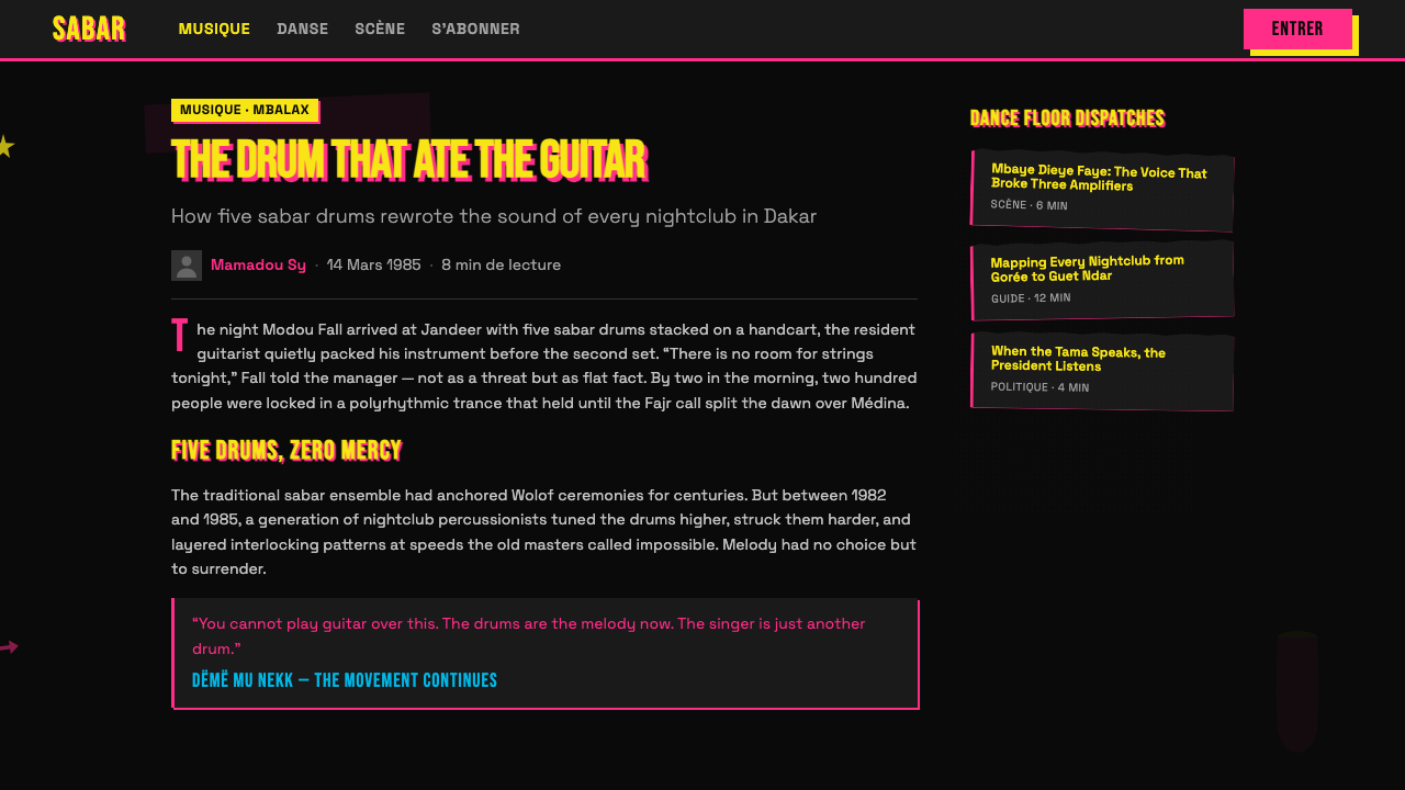
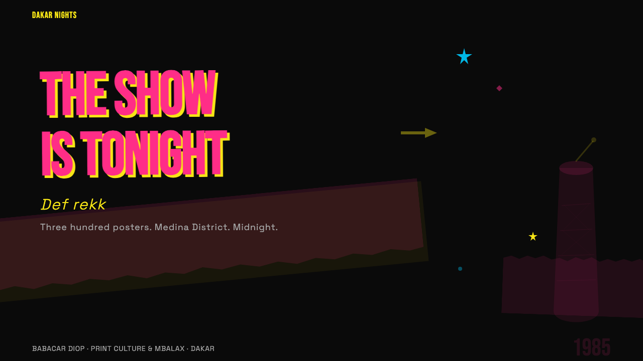
For presentation slides, this aesthetic works best on event or festival contexts — music releases, cultural programming announcements, brand launches that want an underground or community feel. A cover slide can commit fully to the style: hot-pink headline over black, secondary text in acid yellow, a halftone image or texture overlay occupying the lower half. Content slides should dial back the intensity — use the black ground with a single accent color for headers, and keep body text in white with generous line spacing to counteract the style's natural compression. Reserve the full two-color density for section dividers and call-out moments.
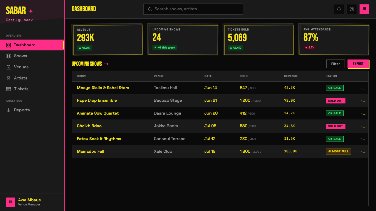
For web interfaces, the style is suited to event listing pages, festival landing pages, artist profiles, and any surface where the content itself is about live performance, nightlife, or cultural events. A dark background application works well — the full palette lands cleanly on web screens, where the near-neon pink and acid yellow have plenty of luminance to work with. Dashboard and data contexts are generally a poor fit; the style's emotional register is festive and urgent, which clashes with the neutral reliability expected in analytical interfaces. An exception is data visualizations within creative industry tools, where the energy can be appropriate.
For editorial and marketing work, the style offers a powerful alternative to the polished minimalism that dominates contemporary brand design. Print-inspired campaigns for music labels, cultural institutions, or youth-facing brands can use the misregistration effect, the halftone grain, and the two-color restriction as a deliberate antidote to digital slickness. The key is commitment: the style falls apart if it is applied halfway. A layout that is mostly clean with a few grain textures sprinkled in reads as confused; one that fully commits to the print aesthetic — black ground, two colors, condensed type at aggressive scale — reads as intentional.
A common mistake when applying this style is confusing its energy with pure chaos and treating misregistration as an excuse for poor craft. The original Dakar posters were made fast, but they were made by people who had internalized their constraints deeply — every decision about type size, ink placement, and color assignment was a practiced one, even if it looked spontaneous. Digital applications of the style fail when the imperfections are randomly distributed rather than directionally consistent, when the halftone dots are scaled without reference to how they would interact with the type, or when a third or fourth color is added to relieve the tension that the two-color restriction is supposed to create. Trust the restriction. The limitation is the style.
Senegalese Mbalax Poster (Dakar 1985) — FAQ
Is this style usable outside of music and event contexts?
Yes, but with care. The style's visual energy is coded as festive, urgent, and communal — associations that are specific enough to feel either very relevant or very wrong depending on the project. It works well for any context that wants to signal grassroots energy, subcultural credibility, or proximity to live experience: arts organizations, independent publishers, community initiatives, and brands positioned against corporate polish. It is poorly suited to finance, healthcare, legal services, or any context where the audience needs to feel that the institution is stable and trustworthy. The two-color newsprint aesthetic reads as hand-made, which is a powerful quality — but hand-made in a midnight-rush-to-paste-before-dawn sense, not in an artisanal-luxury sense.
How do I get the misregistration effect right without it looking like a mistake?
The key is directionality and consistency. In the original screen-print process, misregistration happened in a single consistent direction — the second ink pass drifted because the paper shifted slightly in one direction on the press. A digital misregistration effect should mimic this: choose one direction (slightly right and down is common) and offset all secondary-color elements by the same small amount. Random or multi-directional drift reads as glitch art rather than print process; consistent single-direction drift reads as process artifact. Keep the offset amount subtle — just enough to create a ghost or halo effect around key text and shapes, not so much that elements appear to occupy separate visual planes entirely.
Can this style work in a light or white background version?
Technically possible, but it loses something essential. The black ground is not just a color choice — it is what activates the hot pink and acid yellow at the intensity level the style depends on. On white, the same colors become festive but not urgent; they read more like carnival graphics than street poster energy. If a light-background application is required by the project context, consider keeping the text blocks and key graphic elements on locally dark areas, using white only in the margins and breathing zones. An alternative approach is to use a deep charcoal or dark warm gray instead of pure black — this retains some of the newsprint darkness while reading lighter overall. The colors should remain the same two-color restriction; adding softer tones to compensate for the loss of the dark ground will dilute the essential character of the style.
What distinguishes this style from other African-inspired graphic aesthetics?
The Mbalax poster tradition is hyper-specific to Dakar and to the production constraints of a particular moment in Senegalese urban culture — it is not a generalized 'African aesthetic' and should not be treated as one. Other West African graphic traditions from the same era — Ghanaian film posters, Nigerian Yoruba typography, Malian photographic portrait studio backdrops — have their own distinct visual DNA that is not interchangeable. The mbalax poster is defined by its two-color screen-print limitation, its Latin-script typography, its black newsprint ground, and its anchoring in the specific concert culture of Dakar's club scene. Any attempt to blur it into a generic pan-African reference flattens the specificity that makes it powerful. Use it because you mean to reference this specific tradition, not as a shorthand for a continent.
How does the halftone dot quality affect legibility, and when does it become a problem?
Halftone grain adds texture but reduces sharpness, so the two must be balanced against the legibility needs of the content. In headline-scale text, the grain is almost never a problem — the letterforms are large enough to read through a coarse dot screen. In body text or fine detail, the grain can break up letterforms and make sustained reading difficult. The practical rule is to use grain texture primarily in image areas and large color zones, and keep text — especially secondary and tertiary text — on areas of solid color where the dots are either fully saturated (no grain) or fully absent (black ground). Apply the heaviest grain to decorative and atmospheric zones, not to the information-critical zones. The original Dakar posters understood this intuitively: the halftone was for the photo of the performer, not for the show time and ticket price.
Related design styles
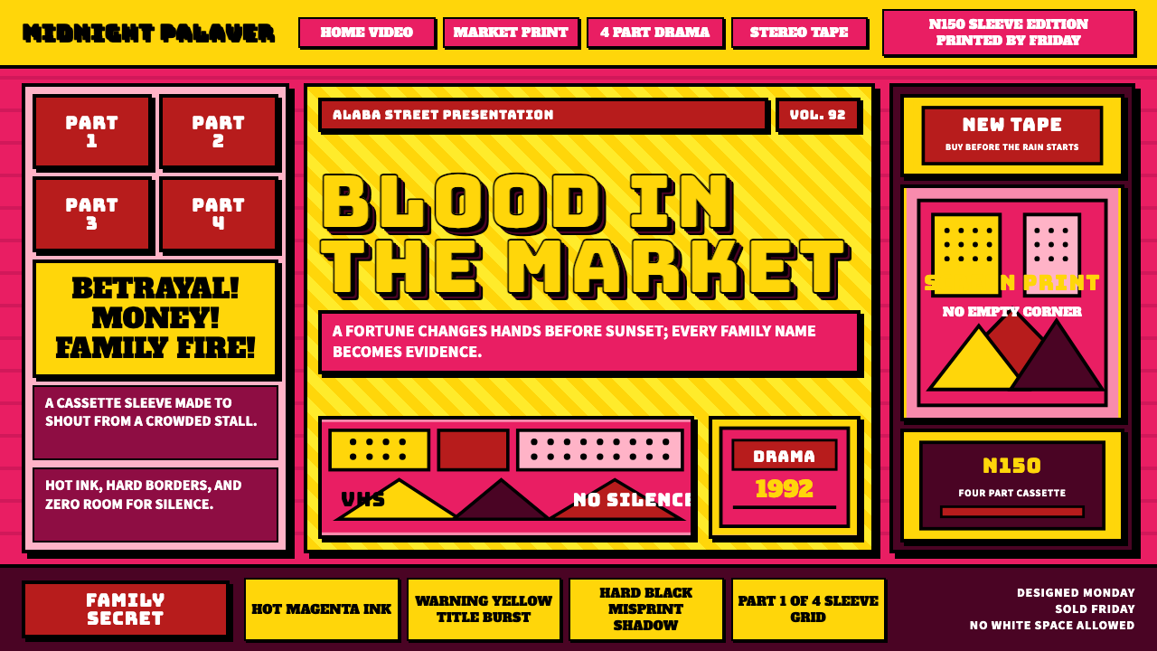 Nollywood VHS CoversEvery inch shouts. Magenta, warning yellow, hard shadows, and part stamps pac…
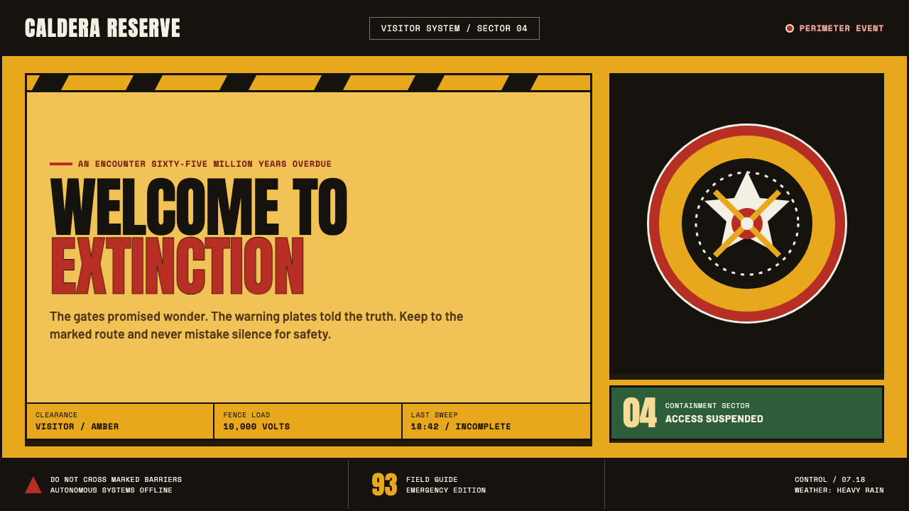 Jurassic Park (1993)Warm welcome, lethal edge. Amber plates, red rings and black chevrons turn aw…
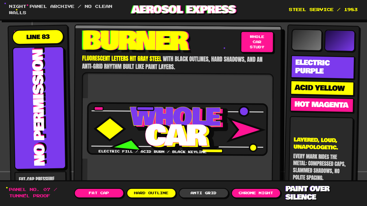 NYC Subway Graffiti (1983)Bombed steel gets loud. Electric purple and acid yellow stack as hard-outline…
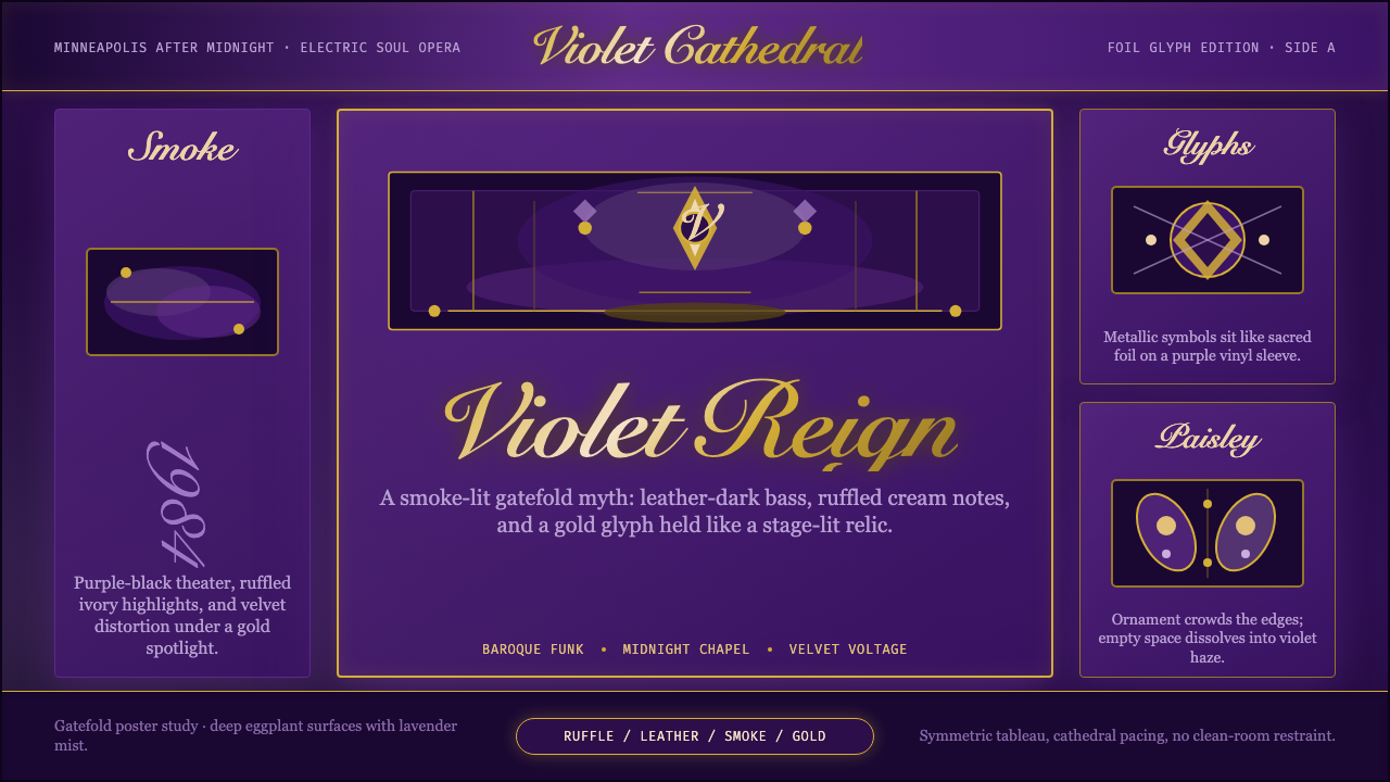 Prince — Purple Rain (1984)Decadence turns electric. Eggplant violet, gold foil glyphs, and smoky symmet…
 Stranger Things (1983)Red light breaks the void. A spurred serif blooms through VHS static and cold…
 Pakistani Truck ArtBlessing crowds every inch. Fuchsia, kelly green, and gold stack into scallop…