What is Kryptonite Green?
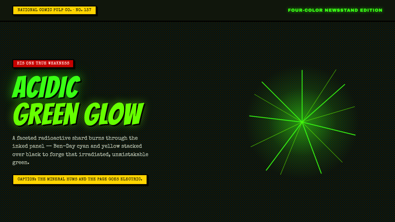
Kryptonite Green turns pulp science fiction into a visual warning: radioactive neon, ink-black space, and halftone grit colliding like a crystal shard inside a comic panel.
Kryptonite Green in brief
Kryptonite Green is the visual language of Silver-Age DC Comics kryptonite: a faceted radioactive crystal glowing with acidic force against a dark, heavily inked panel. Its core ingredients are neon mineral green, deep black gutters and grounds, thick retro caption boxes, explosive display lettering, and the rough optical texture of four-color newsstand printing.
The style draws from North American comics produced between the 1950s and 1980s, when inexpensive reproduction was part of the image rather than an invisible technical layer. Cyan and yellow halftone dots stack into green over black, producing a surface that feels chemically active, slightly unstable, and physically printed. The result is not polished futurism; it is pulp science fiction with visible machinery.
Kryptonite Green communicates through collision. Large lettering bursts against rigid caption panels, irregular crystal facets interrupt flat ink fields, and bright green seems to radiate without requiring a realistic glow. Every element is loud, but the black ground gives the noise a stage. The aesthetic works because its rawness is organized: gutters divide the story, captions control sequence, and the radioactive accent marks danger, power, or narrative focus.
Where does Kryptonite Green come from?
The source image is the kryptonite crystal of Silver-Age DC Comics, where Superman's singular vulnerability became a recurring visual device. The crystal is not presented as an ordinary mineral. It is faceted, luminous, and hostile, an object whose color alone signals radiation and threat. Against black ink, its green reads less like decoration than an alarm embedded in the page.
The broader setting is the United States newsstand comic, especially the Silver and Bronze Age period from 1950 to 1990. These comics joined pulp serial illustration with superhero storytelling and four-color CMYK printing. Their visual authority came from repetition: heavy outlines, compact panels, caption boxes, emphatic lettering, and color fields that could remain legible even when reproduction was rough.
Ben-Day dots provide the crucial surface logic. The dot process, patented by Benjamin Henry Day Jr. in 1879, allowed color and tone to be built from patterned fields rather than continuous pigment. In the Kryptonite Green vocabulary, cyan and yellow dots layer over black to create a green that is visibly assembled. The image therefore carries both fiction and production history: the crystal appears radioactive because the print surface exposes how its color was made.
DC Comics and the Superman editorial line supplied the recognizable narrative frame, while the period's printing conventions supplied its physical character. Together they produced a style that contemporary design can borrow without copying a particular panel: dark grounds create drama, green establishes the visual charge, captions create editorial rhythm, and halftone texture keeps the composition tied to pulp reproduction rather than immaculate digital polish.
What defines the Kryptonite Green look?
Radioactive Green
Green is the emotional and narrative engine of the system. It should feel mineral, acidic, and electrically alive rather than botanical or soothing. Used against black, the color becomes a signal for danger, mutation, power, and concentrated energy. It works best as a dominant accent with enough surrounding darkness to make its apparent radiation legible.
Ink-Black Ground
Black is not merely a background; it is the inked environment that gives the crystal its threat. Deep fields, gutters, outlines, and compact shadow areas create the sense of a panel under pressure. Black also prevents the neon accent from becoming generic signage. The contrast should feel graphic and physical, as if bright pigment is fighting its way through dense printed ink.
Ben-Day Grit
Halftone dots are structural evidence, not a decorative filter. Cyan and yellow fields can overlap to build green, while dot density suggests tone and vibration. The pattern should remain visible enough to make the image feel printed, but controlled enough that text and interface states stay readable. A clean vector surface loses the historical mechanism that makes this style distinctive.
Caption Architecture
Thick-bordered caption boxes establish editorial order inside the chaos. They contain typewriter-like copy, scene-setting statements, warnings, or explanatory fragments, and their borders make language feel physically placed on the page. Captions should be rectangular, emphatic, and slightly retro, acting as anchors between bursts of display type and irregular crystal forms.
Explosive Lettering
Display type should behave like a sound effect or a burst of force. Wide, heavy, condensed, or irregular letterforms can suggest impact, emergency, and serialized drama. Typewriter caption text provides the quieter counterpoint. The contrast between the two voices is essential: one shouts from the panel, while the other explains what the reader is seeing.
Faceted Energy
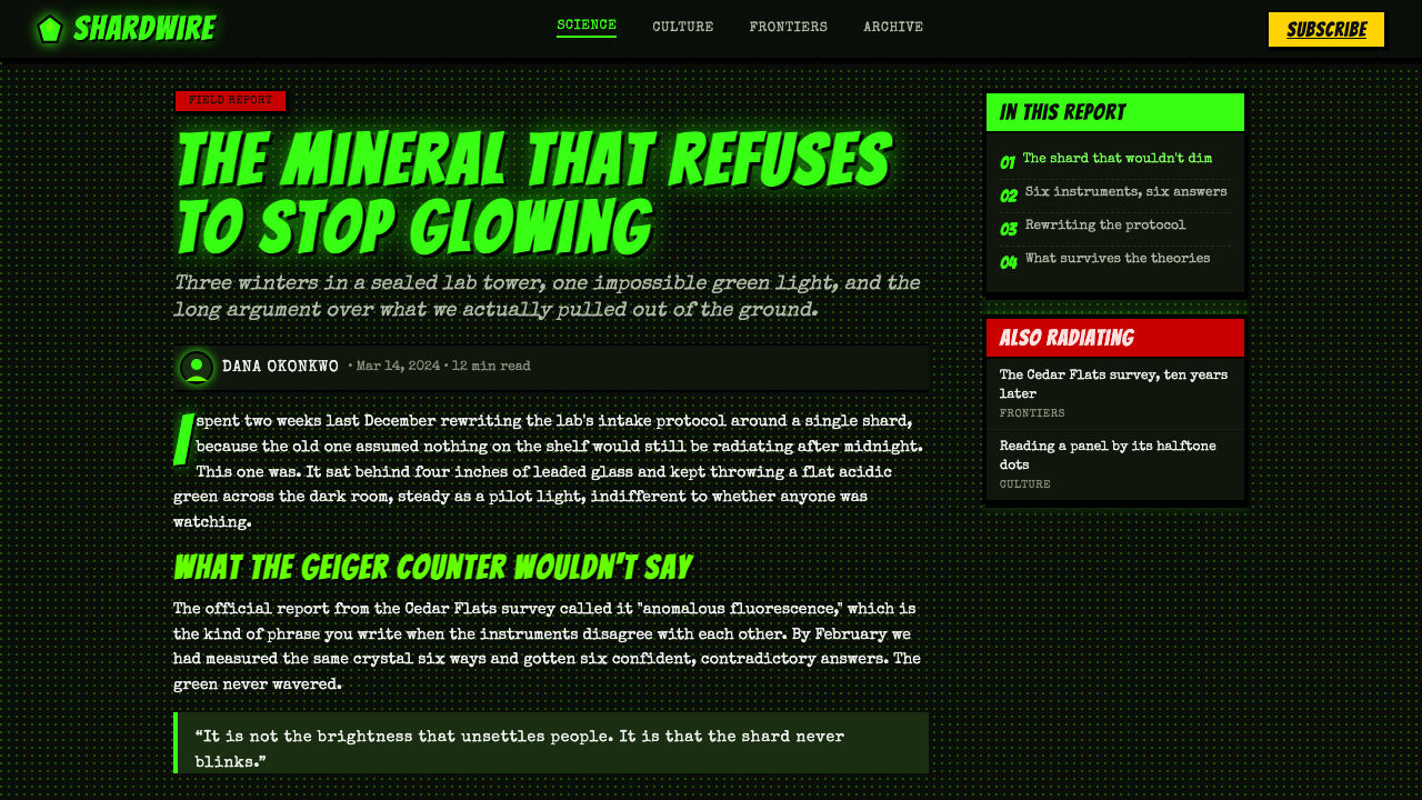
The crystal form is angular rather than soft, with planes that catch color as separate graphic decisions. Facets can be outlined, filled, or partially interrupted by dots, but they should retain a sense of mineral structure. The apparent glow comes from adjacency and contrast: bright green planes, black cuts, and sharp rays imply radiation without needing a realistic light simulation.
Who shaped Kryptonite Green?
DC Comics, historically associated with National Comics, provides the publishing and visual ecosystem in which kryptonite became an enduring image. Its superhero comics established the combination of ink-heavy panels, emphatic lettering, caption boxes, and four-color reproduction that contemporary designers recognize as the foundation of Kryptonite Green.
The Superman editorial line supplied the narrative purpose behind the color. Kryptonite is not simply a green object; it is the hero's singular vulnerability, so its appearance must interrupt confidence and introduce danger. That role explains why the aesthetic treats green as a concentrated signal rather than an evenly distributed palette color.
Benjamin Henry Day Jr. is associated with the Ben-Day dot process patented in 1879. That process matters to Kryptonite Green because it turns color into a visible construction of patterned dots. The resulting grit connects the radioactive crystal to the economics and mechanics of mass-produced comics, where reproduction limits became part of the visual identity.
How do you use Kryptonite Green today?
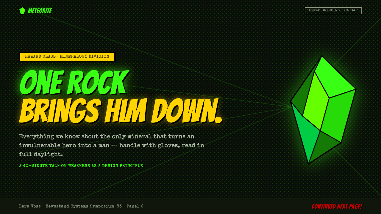
For presentation slides, use Kryptonite Green as a narrative system. Cover slides can place a large faceted shard or radioactive burst against an ink-black field, with explosive display lettering arranged like a comic impact. Content slides should introduce thick caption boxes, compact typewriter notes, and panel-like gutters. Data slides benefit from diagrammatic treatment: charts can become printed evidence, with halftone fields distinguishing categories and the green accent reserved for the most important signal.
For web interfaces, the style suits dark dashboards, monitoring tools, game-like utilities, and pricing pages that want urgency or serialized energy. Keep navigation and major surfaces anchored in black, use green for active states, alerts, selected metrics, or the most valuable plan, and let caption panels carry explanatory text. Borders should feel printed and decisive. A dashboard can use panel divisions as its organizing grammar, while a pricing page can treat each tier as a comic frame with clear hierarchy and one radioactive emphasis.
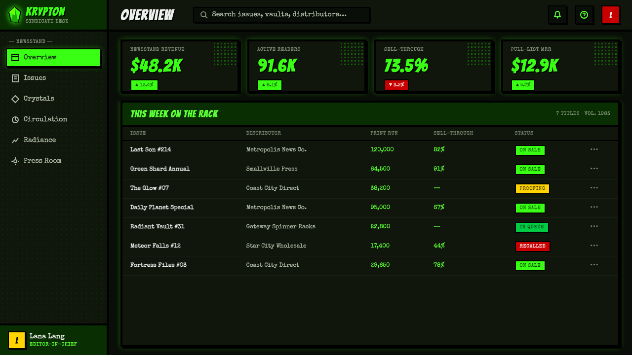
For editorial and marketing work, the style is strongest when it behaves like a pulp cover or a page from a larger serial. Headlines can be oversized and confrontational, while supporting copy sits inside framed captions or narrow blocks that feel mechanically placed. Marketing campaigns can use a recurring crystal shard, warning label, or green burst as a recognizable motif. Editorial layouts should let black gutters separate sections, with halftone texture appearing in controlled fields rather than coating every surface.
The style also works well for launches, technology stories, entertainment brands, and products that want to suggest hidden energy, danger, or a cult comic-book lineage. Use the green accent to mark transformation or consequence, not merely to decorate buttons. A black field with one strong green interruption often carries more authority than a page where every component glows. The system depends on tension between restraint in placement and aggression in the selected moments.
The common mistake is treating Kryptonite Green as generic neon branding. Bright green alone is not enough. If the design removes the black gutters, caption architecture, explosive lettering, and Ben-Day grit, it loses the newsstand-comic logic and becomes a glossy cyberpunk surface. Another mistake is making every element equally loud. Preserve quiet black areas, assign captions a supporting voice, and let the radioactive color appear where the story needs danger or focus.
Kryptonite Green — FAQ
Is Kryptonite Green just a neon green palette?
No. Neon green is the most recognizable ingredient, but the style depends on the relationship between green, ink-black grounds, thick caption borders, faceted crystal geometry, and Ben-Day grit. Remove those relationships and the result becomes generic digital neon. Kryptonite Green is better understood as a pulp-print system in which color, texture, lettering, and panel structure all reinforce the idea of radioactive force.
Why are halftone dots important to the aesthetic?
The dots make reproduction visible. In the source tradition, cyan and yellow patterned fields could stack into green over black, so the radioactive color appeared as a constructed print effect rather than a perfectly smooth digital surface. The dots also add vibration and period character. They should support hierarchy and atmosphere without obscuring captions, labels, or important interface information.
Can Kryptonite Green work without illustrations?
Yes, if the structural vocabulary remains. A dark field, a sharp green interruption, thick caption architecture, comic-like gutters, emphatic display type, and controlled halftone texture can carry the style without depicting a literal crystal. The crystal is the source metaphor, not a mandatory logo. What matters is preserving the sensation of concentrated energy breaking through an organized printed frame.
Does the style require a dark background?
A dark background is foundational because it gives the green its radioactive contrast and makes the inked-panel reference immediately legible. A lighter variation is possible for a specific application, but it should retain heavy borders, strong black structure, and visible print texture. If the light ground becomes dominant and the black framework disappears, the design will drift away from Kryptonite Green toward ordinary bright-color illustration.
What products are a good fit for Kryptonite Green?
It is a strong fit for products and campaigns that want urgency, spectacle, danger, or a serialized comic-book identity: dark dashboards, monitoring interfaces, entertainment launches, technology stories, game-like tools, and bold pricing pages. It is less suitable when the central promise depends on softness, calm, natural warmth, or quiet luxury. The style should amplify the product's narrative energy, not contradict its character.
Related design styles
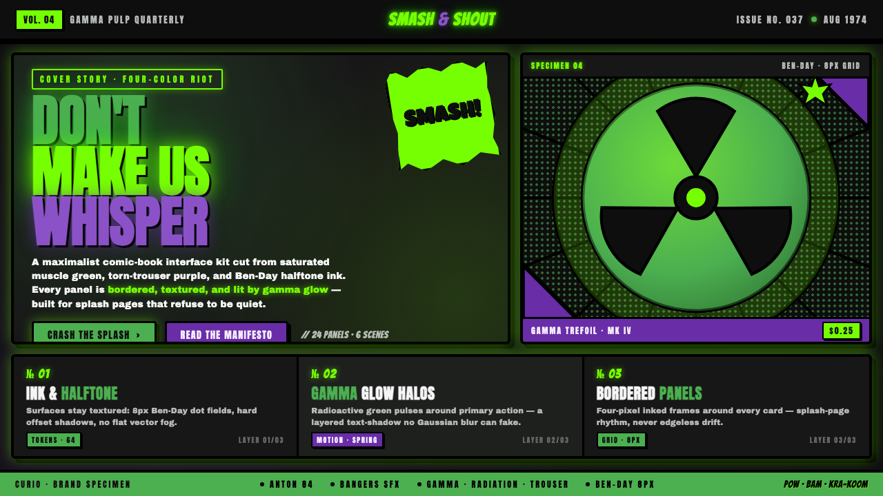 Hulk Gamma GreenDon't make us whisper. Muscle green, trouser purple, inked panels, Ben-Day ha…
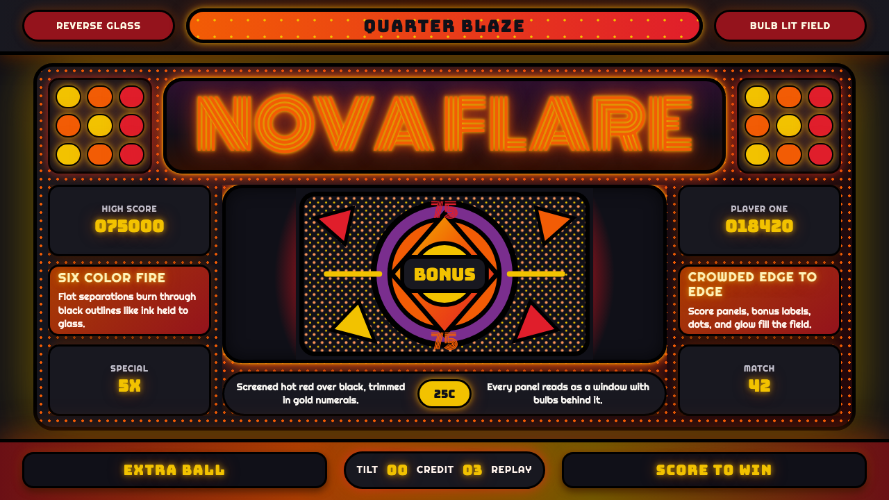 Pinball BackglassGlows like paid light. Monoton type, black outlines, orange-red halftones cro…
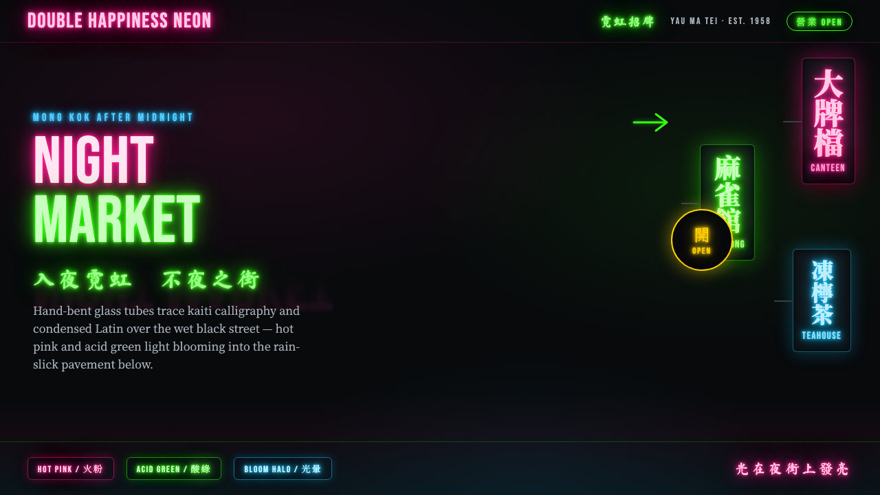 Hong Kong Neon SignboardsLight only reads against the wet black night. Hand-bent pink and green tubes…
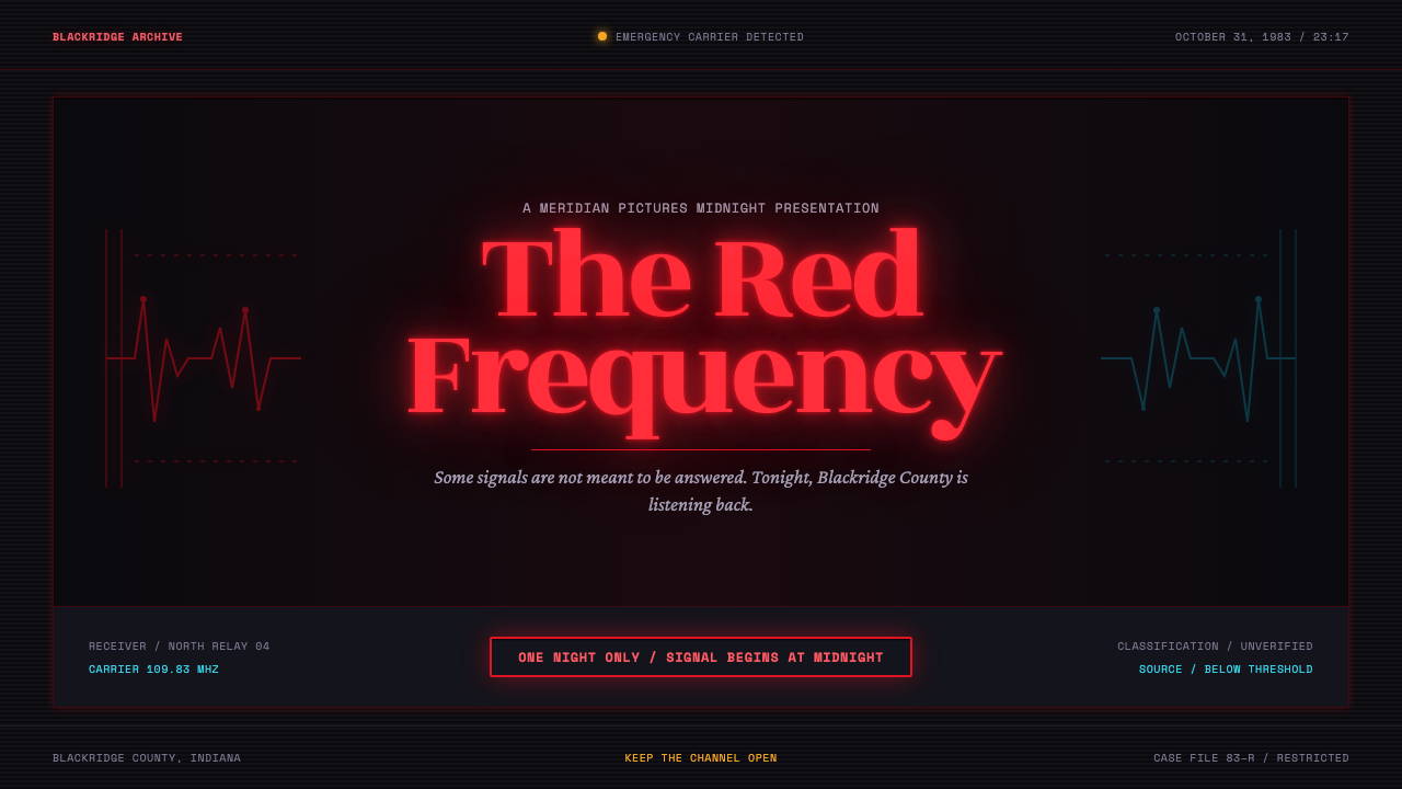 Stranger Things (1983)Red light breaks the void. A spurred serif blooms through VHS static and cold…
 Las Vegas Neon (1960)Night refuses to dim. Hot-pink tubes, cyan bloom and amber bulbs turn black i…
 Mystery Machine (Scooby-Doo 1969)Groovy by day, spooky by night. Balloon type and acid-green panels hide the n…