What is Hong Kong Neon Signboards?
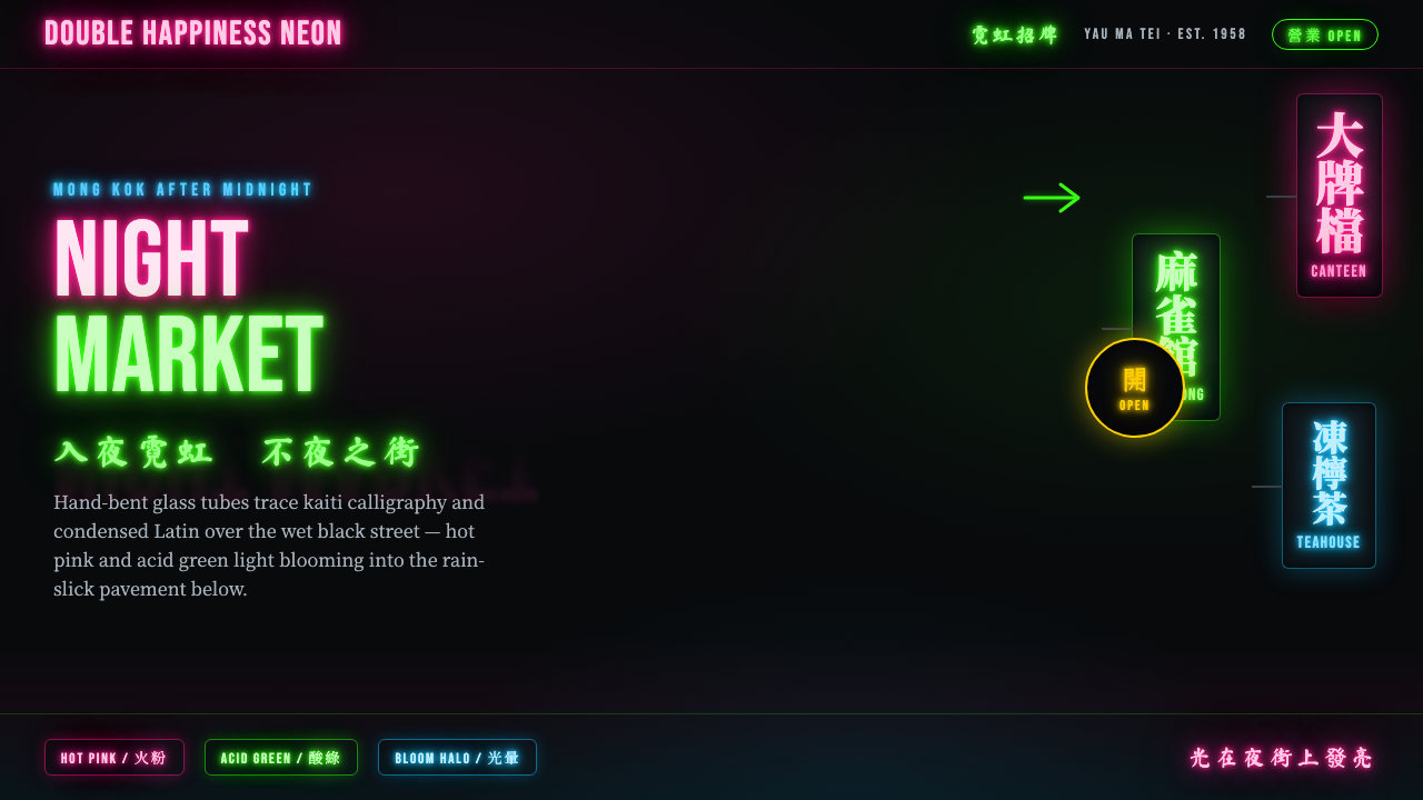
Hong Kong neon signboards turned the wet black night into a crowded, bilingual field of hand-bent light.
Hong Kong Neon Signboards in brief
Hong Kong neon signage is the glowing commercial language of the city’s mid-century streets, most closely associated with the trade districts of Yau Ma Tei and Mong Kok. Glass tubes were bent by hand into illuminated Chinese calligraphy and condensed Latin lettering, then projected from building facades above rain-slick asphalt. The signs did more than identify shops: together they made a suspended streetscape, dense enough to feel architectural.
Its visual force comes from contrast. Near-black night provides the field; vivid pink and acid green provide the event. Light appears to bleed from the tubes into the surrounding darkness, producing soft halos that seem amplified by wet pavement below. The effect is not clean, isolated illumination. It is accumulated atmosphere: glow, reflection, overlap, and visual noise held together by the physical path of the tube.
The system joins ancient kaiti brushwork with modern commerce. Chinese characters retain the gestural logic of calligraphy even when rendered as continuous glass light, while condensed Latin letters provide a second commercial register. Rather than separating these scripts into quiet zones, Hong Kong street signage layers them in bilingual columns and projecting planes. The result is practical, crowded, theatrical, and inseparable from the night street.
Where does Hong Kong Neon Signboards come from?
Neon signboards were introduced to Hong Kong in the 1920s, but their defining urban presence belongs to the period from 1950 to 1990, with their strongest concentration from the 1950s through the 1980s. Their home was not an abstract city skyline but the working commercial streets of Yau Ma Tei and Mong Kok, where signs competed for attention above narrow, active streets.
The craft depended on Hong Kong neon-tube benders and shop sign-makers. Their work required lettering to be conceived not as ink placed on a surface, but as a continuous route of luminous glass. A Chinese character had to remain recognizable while being translated into bends, turns, spacing, and joins; Latin text had to remain compressed, direct, and legible beside it. Craft skill made this density possible.
Bilingual commercial calligraphy is central to the style’s identity. Kaiti-derived Chinese letterforms bring the memory of brushwork into an urban trade environment, while condensed Latin lettering introduces a compact second voice. The pairing is not decorative multiculturalism. It is a visual response to a city whose commercial messages occupy more than one written language and must work at street speed.
From around 2014 to the present, archival revival has reframed these signboards as a cultural record as well as a street-language tradition. neonsigns.hk and the West Kowloon Cultural District Authority have documented the surviving craft and its visual legacy. That revival matters because the style is not simply a palette of bright tubes: it is evidence of handwork, commercial communication, bilingual typography, and a specific kind of Hong Kong urban night.
What defines the Hong Kong Neon Signboards look?
Night as Ground
The background is almost black, not as an empty neutral but as the condition that makes light readable. Darkness is allowed to remain broad and uninterrupted around the signs, so every tube feels suspended rather than merely placed on a dark panel. A wet-looking ground or reflective surface extends the sign’s presence below its physical edge.
Hand-Bent Line
The essential mark is the path of bent glass. Curves, corners, joins, and slight irregularities should read as a made line with physical continuity. It should not resemble a uniformly glowing digital outline. The tube is both drawing instrument and material object, giving the lettering a crafted rhythm that remains visible even when the sign is seen from a distance.
Bilingual Columns
Chinese calligraphy and condensed Latin lettering share the same illuminated territory. Vertical and projecting signboard arrangements produce a crowded bilingual rhythm rather than a single centered identity. Chinese carries the more calligraphic gesture; Latin text supplies compact commercial clarity. Their coexistence should feel structural, not like a translated label added afterward.
Bloom and Spill
Light is never confined precisely to the tube. It blooms softly into the surrounding dark and appears to stain nearby surfaces, especially rain-slick pavement. This halo should preserve the tube as the sharp source while allowing its color to diffuse outward. The atmosphere comes from this tension between a defined hand-bent line and uncontrolled luminous spill.
Dense Overlap
The signs do not seek generous separation. They stack, interrupt, and visually compete, creating a depth made from overlapping luminous planes. This density should still preserve reading paths: a larger calligraphic sign may command attention while smaller bilingual elements fill the surrounding street field. Crowding is not disorder; it is the city’s commercial texture.
Hot Pink and Acid Green
Hot pink and acid green are the signature emotional contrast: one reads as heated, floral, and theatrical; the other as sharp, electric, and slightly abrasive. Used against black, they create a night-world that is vivid without needing daylight realism. Their strongest role is to establish separate sign identities within a crowded field, not to decorate every available surface.
Who shaped Hong Kong Neon Signboards?
Hong Kong neon-tube benders are the makers behind the style’s most distinctive visual fact: lettering that is also a continuous physical line. Their handwork transforms Chinese calligraphy and Latin letters into illuminated glass paths, making craft visible in every curve, turn, and connection. Without this material skill, the style loses the tension between commercial legibility and handmade gesture.
Shop sign-makers gave neon its public role on the commercial street. They had to make names, messages, scripts, and projecting forms function amid visual competition, weather, darkness, and passing traffic. Their contribution was not only fabrication but composition: deciding how a sign would occupy the street’s crowded field and remain part of a bilingual urban conversation.
The archivists of neonsigns.hk represent the contemporary archival revival of Hong Kong neon. Their documentation helps frame the signboards as more than nostalgic scenery: they are records of a local craft, bilingual commerce, and a street environment whose visual language was built through accumulated individual signs.
The West Kowloon Cultural District Authority has documented this heritage alongside neonsigns.hk. Its involvement places the signboards within a wider public cultural record, emphasizing that their value lies not merely in dramatic nighttime imagery but in the relationship between material craft, language, commerce, and the urban memory of Hong Kong.
How do you use Hong Kong Neon Signboards today?
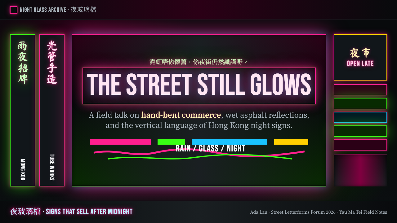
For presentation covers, treat the page as a night street rather than a dark corporate template. Leave a broad black field, place one large hand-bent bilingual title as the primary projection, and let a smaller sign interrupt it from a different direction. Pink or green light should appear to bloom beyond the lettering, while restrained reflections suggest wet pavement. The cover works when it feels spatial and suspended, not when every element glows equally.
Content and data slides need more discipline. Keep body copy calm and readable against the dark ground, then use neon-like calligraphic or condensed labels to mark section changes and key values. Charts can borrow the style through luminous linework, bilingual legends, and reflected accents, but the data must remain easier to read than the atmosphere. Use overlapping sign logic for hierarchy, not as camouflage for dense information.
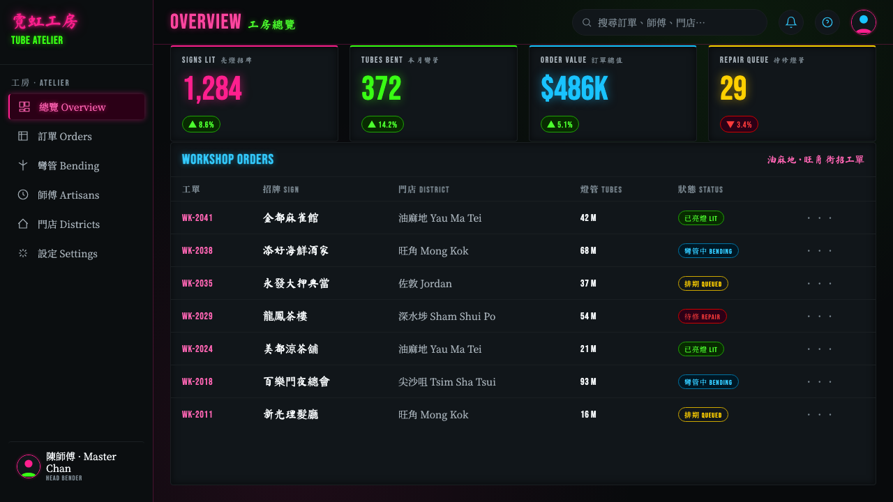
For web interfaces, this style is strongest in dashboards, media libraries, event pages, and pricing experiences that benefit from nocturnal energy and clear commercial identity. A near-black interface can hold condensed navigation, bright status markers, and large bilingual display text. Cards should feel like signs projecting from a shared street field: distinct identities, limited glow, and deliberate depth created by overlap rather than generic floating surfaces.
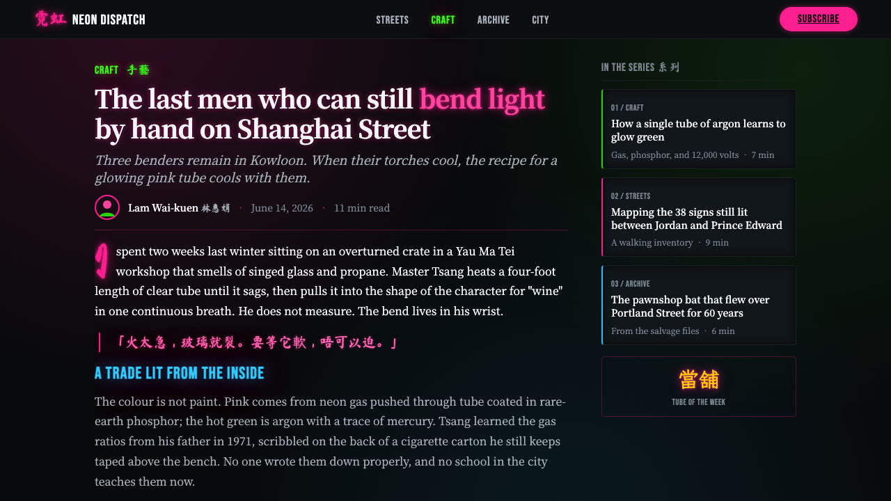
Editorial and marketing work can use the style to turn a page into an urban scene. Long-form articles benefit from quiet reading areas interrupted by luminous chapter markers, archival captions, or vertical bilingual pull quotes. Marketing pages can alternate between dense signboard compositions and nearly empty black intervals, allowing a featured message to appear as an event in the dark. Reflections and bloom should reinforce the narrative of a wet nighttime street.
The common mistake is to reduce Hong Kong neon to bright colored text on black. That loses the essential system: hand-bent line quality, bilingual calligraphic tension, projecting signboard density, and light reacting with darkness and wet ground. Another mistake is applying bloom everywhere until the screen becomes unreadable. The glow needs darkness around it, just as a crowded street still needs distinct signs that can be recognized.
Hong Kong Neon Signboards — FAQ
Is Hong Kong neon signage simply a dark interface with bright text?
No. Bright text on a dark background captures only the most superficial contrast. The style depends on hand-bent glass as a visible line, bilingual commercial lettering, signs that project and overlap in space, bloom that reacts with surrounding darkness, and reflections that suggest wet asphalt. Remove those relationships and the result becomes generic neon decoration rather than Hong Kong signboard language.
Why are Chinese calligraphy and condensed Latin lettering used together?
Their coexistence is part of the style’s commercial and urban identity. Kaiti-derived Chinese forms carry a handwritten, calligraphic rhythm even when formed from tubes, while condensed Latin lettering offers a compact complementary register. Together they create bilingual columns that feel embedded in the street rather than translated into a single universal visual voice.
How should glow be used without hurting legibility?
Treat glow as emitted atmosphere, not as a replacement for the letterform. Keep the hand-bent tube or core line visually decisive, then let the surrounding light soften outward into darkness. Reserve stronger bloom for primary signs and focal moments. If every line produces the same large halo, separate signs merge and the visual field loses the commercial readability that made street neon functional.
Can the style work for information-heavy dashboards and pricing pages?
Yes, provided the signboard atmosphere is assigned to hierarchy rather than every component. Use the dark field to create focus, bright bilingual labels for priority states or sections, and restrained overlapping panels to establish a navigable street-like depth. Tables, metrics, and pricing information should remain quiet enough to scan. The style works when commerce and information feel illuminated, not obscured.
Related design styles
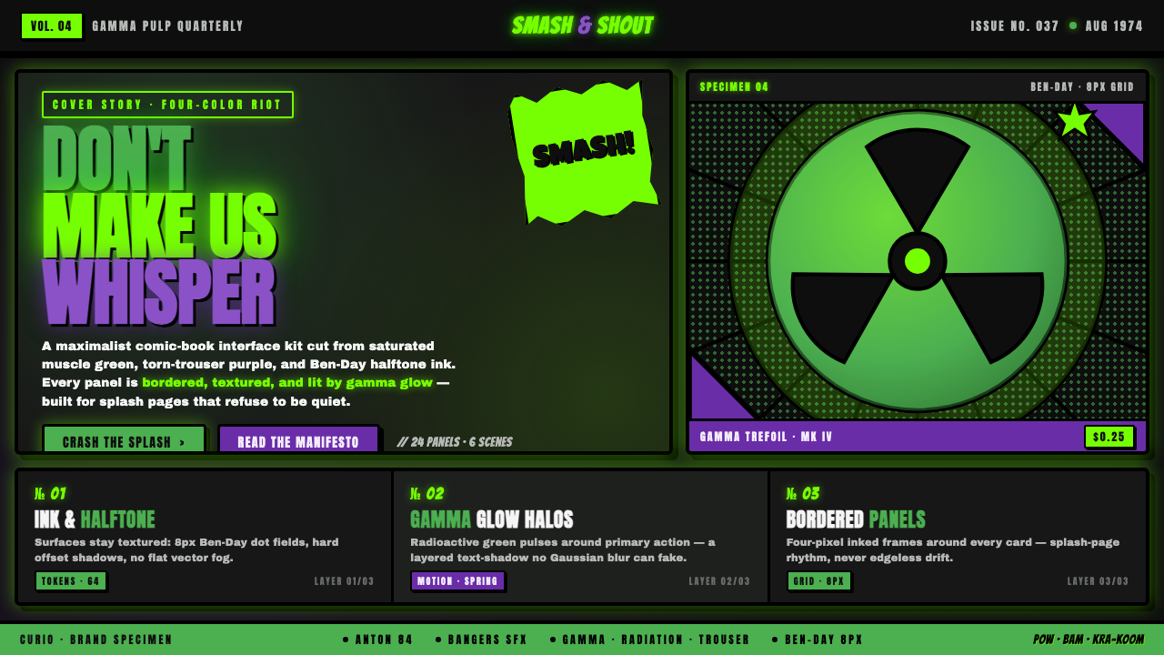 Hulk Gamma GreenDon't make us whisper. Muscle green, trouser purple, inked panels, Ben-Day ha…
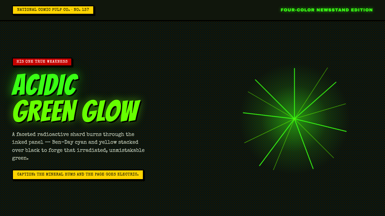 Kryptonite GreenRadioactive pulp glows hard. Neon green shard, black gutters, Ben-Day grit.
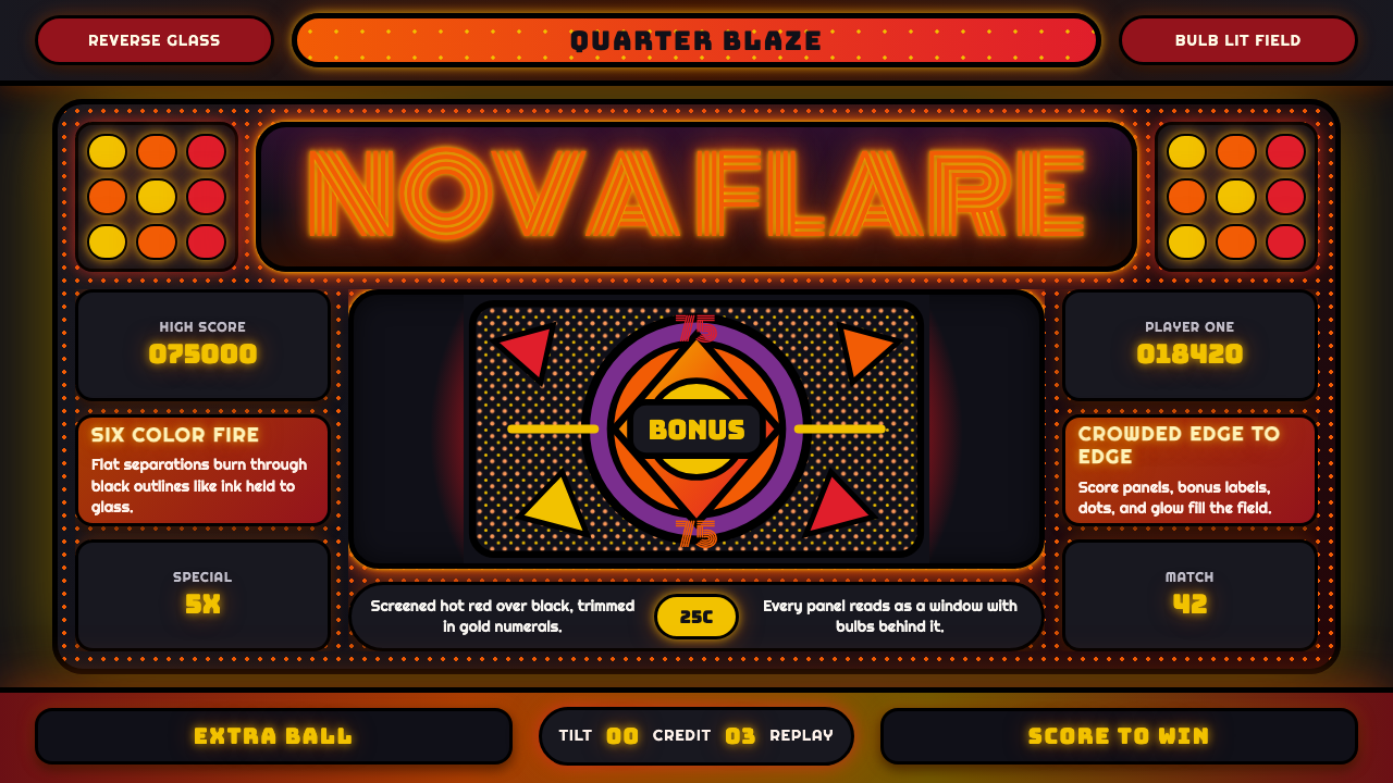 Pinball BackglassGlows like paid light. Monoton type, black outlines, orange-red halftones cro…
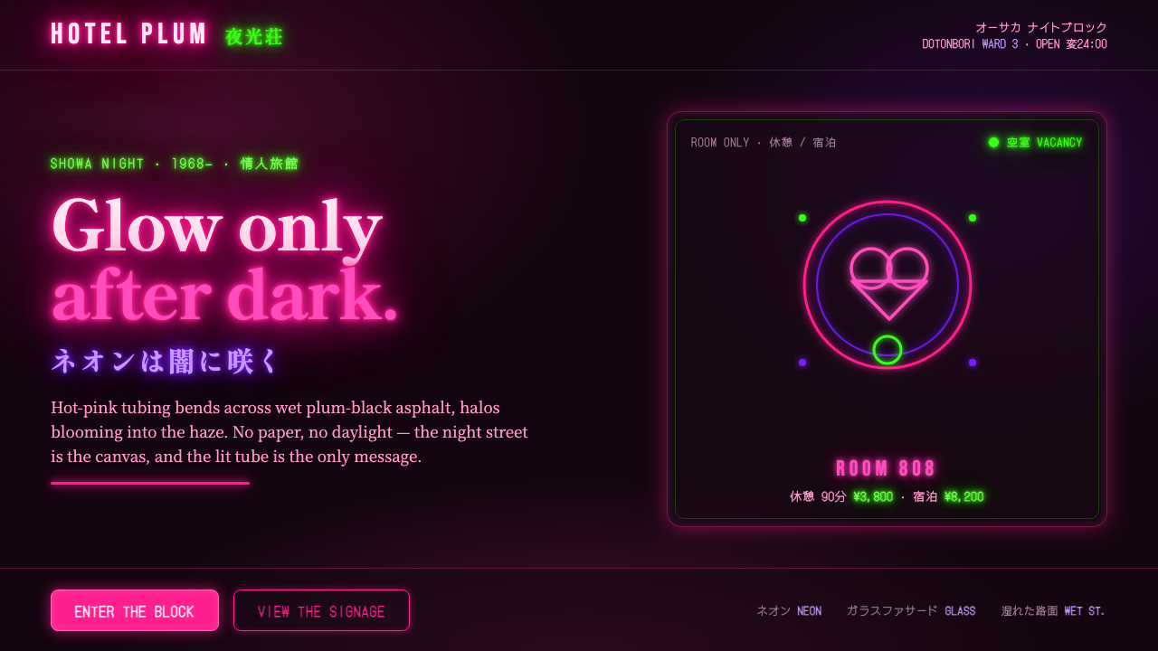 Osaka Love Hotel NeonReads only in the dark. Hot-pink neon tubing blooms over wet plum-black aspha…
 Stranger Things (1983)Red light breaks the void. A spurred serif blooms through VHS static and cold…
 Tamil Cinema Poster (MGR era)The wall becomes a shrine. Red, yellow, green, and pink crash into cream pane…