What is Osaka Love Hotel Neon?
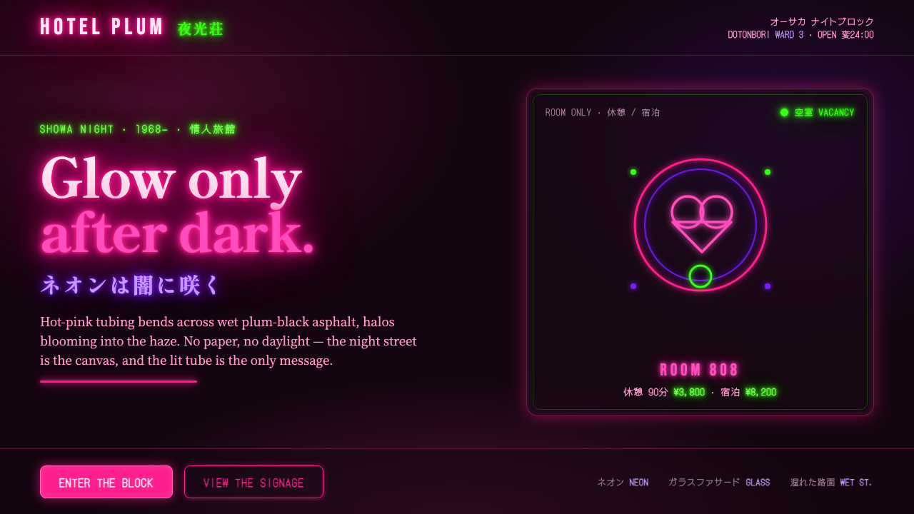
Osaka Love Hotel Neon reads only after dark: hot pink tubing blooms through haze, then returns in fragments from a wet plum-black street.
Osaka Love Hotel Neon in brief
Osaka Love Hotel Neon distills the nocturnal commercial vernacular of Showa-era Osaka pleasure-quarter blocks. Its scene is a wet, nearly black street; above it rise castle-kitsch façades, ornate signs, and glowing hot-pink or magenta neon tubing. The style is not a neutral Japanese retro look. It is built from the theatrical address of love-hotel architecture, where a building must announce fantasy, privacy, and availability from the street.
The visual language depends on darkness as its working surface. Neon is not merely colored signage placed on a background: each bright mark appears to emit light, bloom outward, soften into haze, and spill onto nearby surfaces. Wet pavement completes the composition by reflecting the sign back toward the viewer. The road becomes a second, unstable signboard, stretched and broken by puddles, shadow, and perspective.
Fancy kanji and katakana signage, plush-velvet richness, and deliberately excessive façade motifs give the style its kitsch charge. Yet the image should remain legible as a place, not dissolve into generic cyberpunk. The important contrast is between dense commercial invitation and deep surrounding void: the night ground carries almost no visual argument of its own, allowing lettering, tubes, reflections, and architectural silhouettes to become the message.
Where does Osaka Love Hotel Neon come from?
The source setting is Osaka, Japan, in and around love-hotel blocks adjacent to the Dotonbori area during the broad Showa nightlife period from 1950 to 1990. The style takes its name and emotional atmosphere from a commercial street culture rather than from a formal academy or a single authored manifesto. It belongs to an environment in which nightlife architecture competed for notice after dark, using façade fantasy and signage as direct street communication.
Around 1968, when Hotel Love opened in Osaka, the phrase and building type gained a particularly visible point of reference. The resulting visual culture was commercial vernacular: practical in its need to be noticed, but extravagant in how it performed that need. Castle-kitsch forms, plush associations, and decorative signage gave establishments an identity that was immediately more theatrical than an ordinary hotel frontage.
Japanese neon-signage craft supplied the essential medium. Osaka neon-tube benders shaped luminous gas tubing into letters and expressive contours, while pleasure-quarter signage craftsmen produced the ornate kanji and katakana that made the street readable at night. Their work was neither a detached graphic layer nor a simple illuminated label. It fused wording, silhouette, glow, and the face of the building into one nocturnal signal.
Showa kitsch is central to the mood because it permits abundance without demanding refinement in the modernist sense. The style uses romance, spectacle, and commercial excess openly. In contemporary translation, that origin matters: the goal is to preserve the sense of hot-pink neon cutting through damp darkness and dense local signage, rather than treating the look as a stock futuristic city scene or reducing it to a single bright accent.
What defines the Osaka Love Hotel Neon look?
Night Ground
The ground is plum-black, immersive, and visibly light-absorbing. It should feel like an urban night rather than black paper: haze, recesses, wetness, and barely described architecture give the darkness depth. Large pale fields work against the system because they remove the condition that makes the neon appear electrically alive.
Bloom and Haze
Every pink or magenta mark behaves as a source of light. Its contour is readable, but never isolated; a soft halo leaks into the surrounding dark and makes adjacent surfaces seem touched by the sign. Glow is therefore compositional structure, not cosmetic polish. Without it, the tubing becomes flat typography and the scene loses its nocturnal charge.
Tubing and Lettering
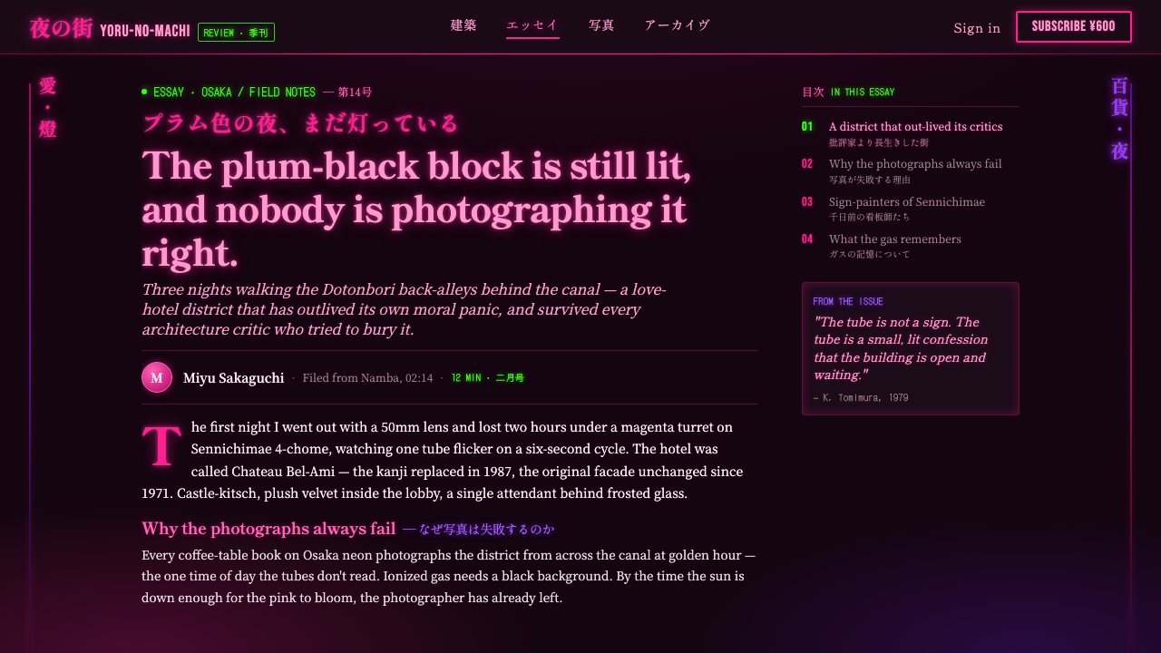
Neon tubing is drawn as shaped, continuous light rather than as a filled graphic block. Fancy kanji and katakana can become the dominant image, with their complexity supplying ornament through language itself. The lettering should read as street signage made by craft, not as a clean corporate wordmark placed over a dark interface.
Wet Reflection
Pavement is active rather than neutral. Reflections repeat the sign in elongated, interrupted fragments, linking the lower part of a composition to its illuminated upper architecture. The reflection should remain unstable and darker than its source, so it reads as water and asphalt receiving light rather than as a perfectly mirrored duplicate.
Showa Kitsch
Castle-like fantasy, plush richness, and overt commercial seduction keep the style from becoming austere neon minimalism. Kitsch here is purposeful: it promises an experience before the visitor crosses the threshold. Architectural motifs and decorative sign treatment may be lavish, but they should still serve the premise of spectacle, romance, and nighttime invitation.
Dense Invitation
The composition favors a concentrated field of signals over a single isolated object. Signage, façade edges, luminous accents, and reflected traces can overlap in visual conversation, while the surrounding darkness preserves hierarchy. Density should suggest a pleasure-quarter block with competing invitations, not indiscriminate clutter with no readable focal point.
Who shaped Osaka Love Hotel Neon?
These proprietors represent the commercial force behind the style. Their establishments needed a street-facing identity after dark, encouraging façades and signs to operate as immediate promises of fantasy, privacy, and spectacle. The resulting language is inseparable from the pleasure-quarter economy rather than an abstract exercise in neon decoration.
Osaka neon-tube benders supplied the physical language of shaped light. Their craft turned ionized-gas tubing into letterforms, contours, and glowing declarations that could remain visible through darkness and haze. In this aesthetic, the bent tube is not an effect applied afterward; it is the source form from which bloom, color, and atmosphere follow.
Pleasure-quarter signage craftsmen made the dense linguistic surface of the block possible. Through elaborate kanji and katakana signage, they gave businesses a theatrical local voice and transformed reading into part of the visual event. Their contribution explains why authentic use should value expressive lettering and layered sign presence instead of relying on anonymous geometric neon alone.
How do you use Osaka Love Hotel Neon today?
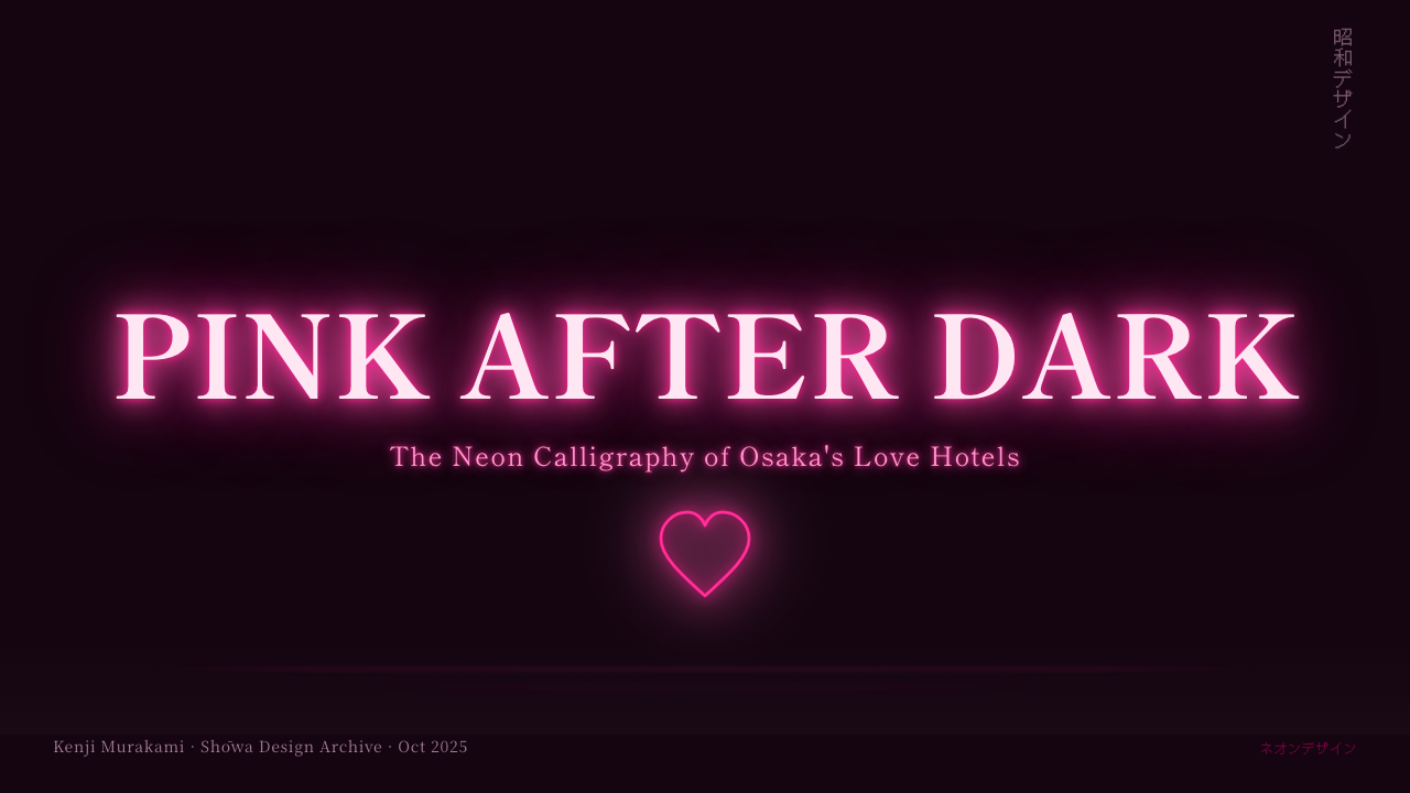
For presentation covers, Osaka Love Hotel Neon works best when the title behaves like an illuminated sign emerging from a near-black field. Let one dominant pink or magenta statement establish the scene, then support it with a façade silhouette, haze, or a restrained wet reflection. Content slides need more discipline: keep explanatory text in a quieter light treatment and reserve the strongest bloom for section titles, key terms, or a single navigational cue. On data slides, let charts remain readable first; use the neon logic to distinguish a focal series or to frame the graph as street signage, while reflections and haze stay peripheral rather than interfering with values.
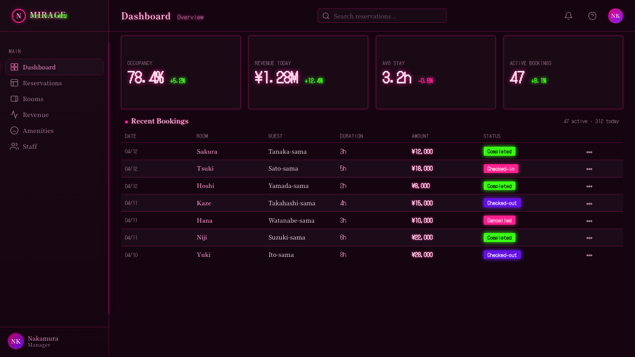
For web interfaces, the style suits nightlife discovery, entertainment dashboards, booking experiences, event pages, and premium promotional surfaces where atmosphere is part of the product promise. A dark interface can use hot pink and magenta as active signals, with large regions of quiet darkness protecting contrast and scanability. Dashboard cards should feel like signs set into the night, not translucent generic panels. Pricing or tier pages can use theatrical entry points and glowing calls to action, but essential comparisons, labels, and decisions must remain calmer than the decorative façade language.
For editorial and marketing work, treat the page as a nocturnal street sequence. A feature opening can establish the wet road and a single dominant sign; subsequent sections may reveal different sign fragments, reflected type, or cropped architectural edges. Long-form copy benefits from areas where the glow recedes enough for reading, then returns at transitions as a visual change of street corner. Marketing material can embrace spectacle, especially when introducing a destination, launch, nightlife program, or experience-oriented product, provided the emotional promise has a clear relationship to the offering.
A common mistake is to translate the style into an all-purpose dark cyberpunk treatment. That loses the Osaka love-hotel specificity: castle-kitsch architecture, fancy kanji and katakana, saturated commercial invitation, wet asphalt, and plush Showa excess. Another mistake is making every element glow equally. When all text, borders, icons, and images radiate at once, there is no darkness left for the light to describe. Choose a few true sources of illumination, let their reflections remain subordinate, and allow the night ground to do its necessary work.
Osaka Love Hotel Neon — FAQ
Is Osaka Love Hotel Neon simply a cyberpunk style?
No. Both can use darkness and bright neon, but Osaka Love Hotel Neon is anchored in Showa-era Osaka love-hotel blocks and their pleasure-quarter signage culture. Its distinctive ingredients are castle-kitsch façades, fancy kanji and katakana, plush excess, wet black street surfaces, and direct commercial invitation. A futuristic city image without those social and architectural cues may be neon-rich, but it is not this specific style.
Why must the background stay so dark?
Because darkness is the canvas that makes the neon legible as emitted light. Against a pale or busy field, pink and magenta become ordinary color accents. Against a deep night ground, their halos, haze, and pavement reflections can establish depth and atmosphere. The darkness also creates hierarchy by allowing only the intended signs and architectural edges to emerge.
Can the style work without Japanese lettering?
It can borrow the lighting logic, but it loses an important part of its place-specific voice. Fancy kanji and katakana signage are named features of the source material and help transform lettering into spectacle. If another language is necessary, treat it with the same sense of crafted, theatrical street signage rather than replacing it with a sterile corporate wordmark or unrelated pseudo-Japanese decoration.
How should reflections be used without making a layout muddy?
Treat reflection as evidence of wet pavement, not as a second equal sign. Keep it fragmented, darker than its source, and tied spatially to the light above it. A reflection should extend the atmosphere toward the lower composition while preserving the original lettering or signal as the clear focal point. If it reads as a perfect duplicate, the street surface disappears and visual hierarchy weakens.
Where does this style struggle?
It struggles where daylight clarity, institutional restraint, or prolonged dense reading are the primary needs. Utility tools, formal documentation, and interfaces with many simultaneous decisions can become exhausting if every surface carries bloom and theatrical signage. It is strongest when a night-time promise, discovery, romance, entertainment, or destination atmosphere is genuinely relevant; otherwise its commercial seduction can feel disconnected from the product.
Related design styles
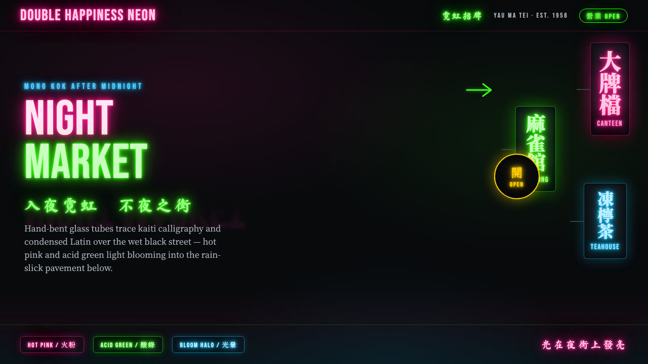 Hong Kong Neon SignboardsLight only reads against the wet black night. Hand-bent pink and green tubes…
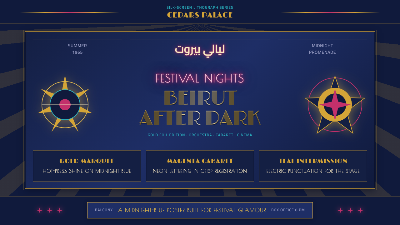 Beirut Golden-Age PosterFestival glamour after dark. Midnight blue carries foil-gold type and magenta…
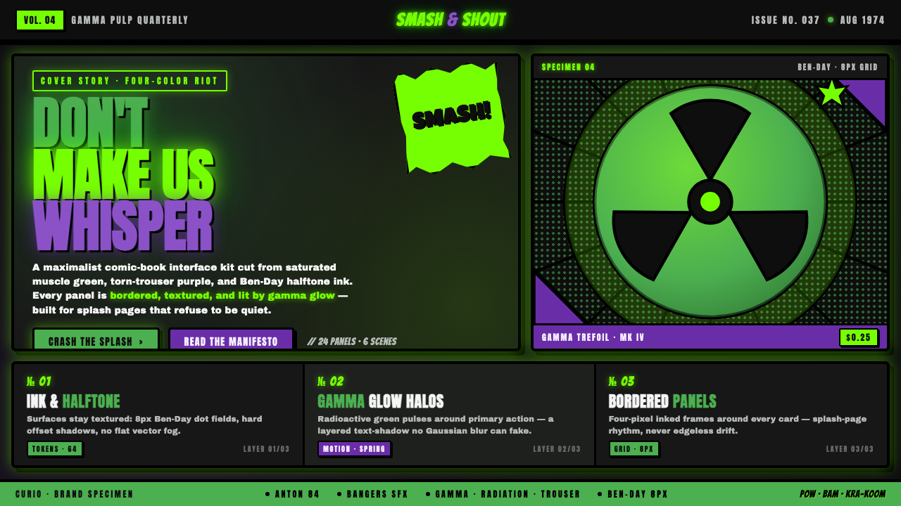 Hulk Gamma GreenDon't make us whisper. Muscle green, trouser purple, inked panels, Ben-Day ha…
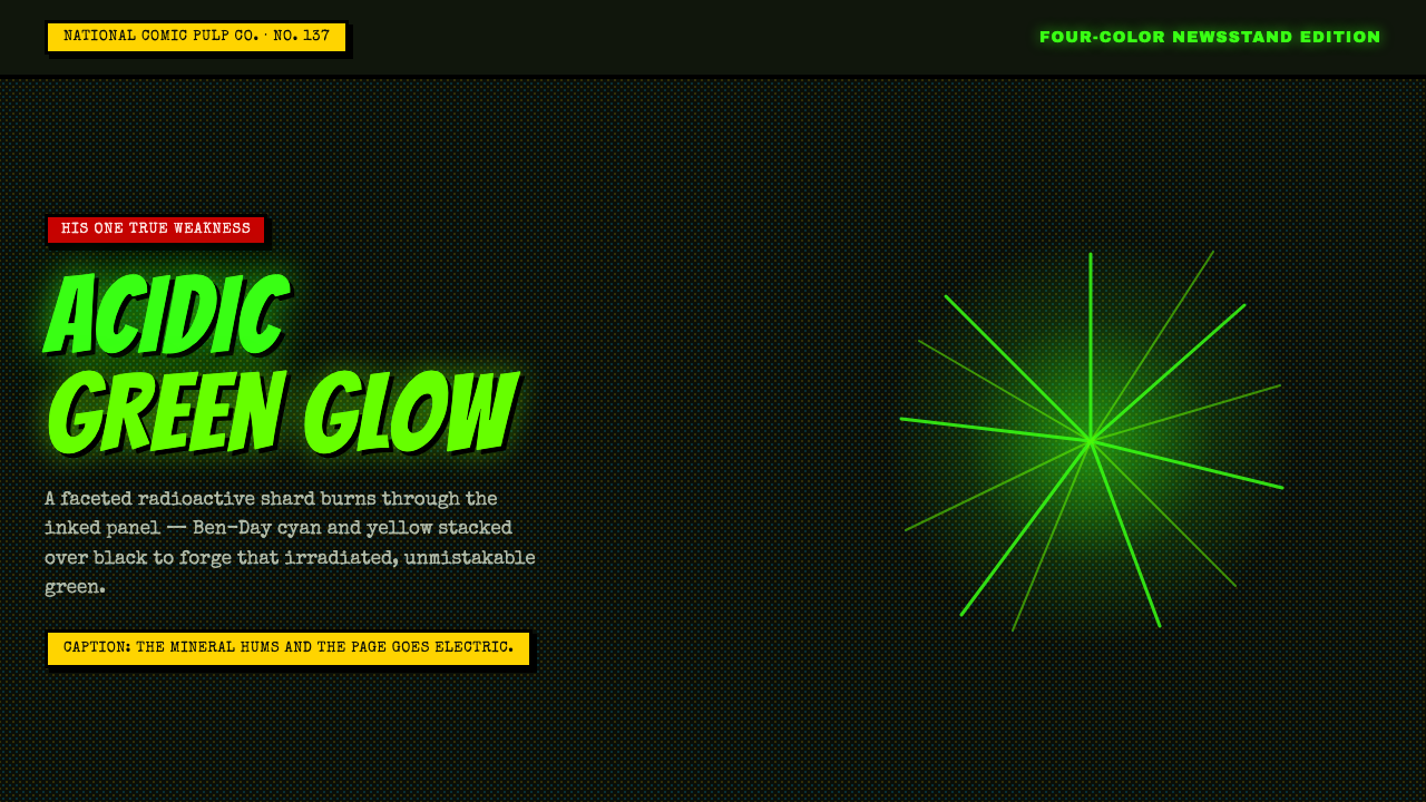 Kryptonite GreenRadioactive pulp glows hard. Neon green shard, black gutters, Ben-Day grit.
 Las Vegas Neon (1960)Night refuses to dim. Hot-pink tubes, cyan bloom and amber bulbs turn black i…
 Mexican Lucha Mask GraphicComic-book lucha, lit from above. Silver-blue mask out of arena-night dark, h…