What is Beirut Golden-Age Poster?
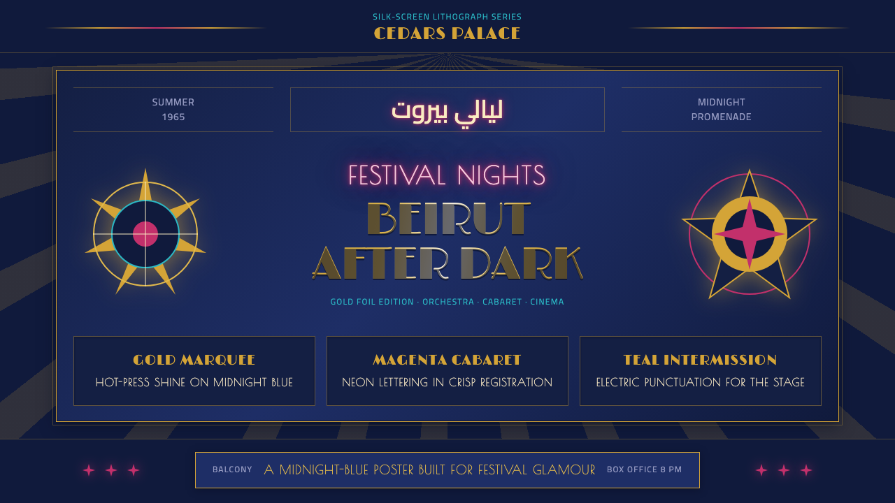
In 1960s Beirut, festival and cabaret posters turned midnight-blue backdrops into stages of their own, splashing them with gold foil, neon script, and a fusion of Kufic calligraphy and Art Deco glamour.
Beirut Golden-Age Poster in brief
The style belongs to a specific, short-lived moment: Lebanon's pre-war golden age, when Beirut's press, banking, and entertainment industries made it the undisputed cultural capital of the Arab world. Its visual signature is a deep, saturated midnight-blue ground — never beige, never white — carrying gold-foil lettering, magenta and teal neon accents, and display type that fuses the geometric confidence of Art Deco with the flowing, connected structure of Kufic Arabic calligraphy.
Nothing about the palette is restrained. Where a modernist poster tradition might isolate a single accent color against a neutral field, this style stacks metallic gold against jewel-toned neon on top of a saturated dark ground, chasing the maximalist glamour of an actual multi-pass silk-screen print run — the kind of poster that took several separate print passes and a hot-foil stamping stage just to produce one sheet.
The lettering is the most distinctive element: display headlines that swoop and interlock the way handwritten Arabic script does, rendered at a scale meant to be read from across a boulevard, not a page. Western Art Deco geometry — stepped forms, sunburst motifs, elongated proportions — is grafted directly onto that Arabic calligraphic energy, producing a hybrid alphabet that belongs equally to Paris poster tradition and to the Levantine print shops that actually made these posters.
Where does Beirut Golden-Age Poster come from?
Lebanon gained independence from French mandate rule in 1943, and within little more than a decade Beirut had rebuilt itself as the most cosmopolitan city in the Arab world — a free-trading banking center, the region's publishing and press hub, and a Mediterranean playground for both Arab and international elites. The city's nickname, 'the Paris of the Middle East,' reflected a real cultural reality: French colonial-era architecture, a bilingual Arabic-French intellectual class, and an entertainment economy sophisticated enough to import major international performers.
That cultural ambition found its most visible stage in 1956, when the Baalbeck International Festival was founded at the Roman temple ruins of Baalbek, in the Bekaa Valley. Staged among two-thousand-year-old columns, the festival paired Lebanese folkloric productions — many written by the Rahbani brothers and starring the singer Fairuz — with visiting international stars, from touring ballet companies to conductors like Herbert von Karajan. One surviving Karajan festival poster is remembered specifically for its production cost: reportedly built from some thirty-five separate ink passes, two silk-screen runs, and a hot-press gold-foil stage, all to produce a single printed sheet.
Beirut's downtown and nightlife district supported that level of craft because the city was already the Arab world's printing and publishing capital, home to newspapers, ad agencies, and lithography houses with deep technical expertise. The same silk-screen ateliers that printed newspapers and book covers turned their skill toward cabaret handbills and festival posters, competing to outdo one another with more colors, more foil, and bolder script — a commercial arms race that produced the maximalist visual density the style is remembered for.
The golden age ended abruptly. The Lebanese Civil War, which began in 1975, shut down the cabaret circuit and interrupted the Baalbeck Festival for over a decade, and much of the physical poster archive from the era was lost, damaged, or scattered during the conflict. What survives has since taken on the status of nostalgic artifact — reproduced in retrospectives, collected by design archivists, and referenced by a wave of contemporary Beirut and diaspora designers reviving Levantine visual identity as an act of cultural memory.
What defines the Beirut Golden-Age Poster look?
Ground Color
The background is always a deep, saturated midnight blue — never beige, cream, or white. That darkness is structural to the whole system: it is what makes gold foil read as luminous rather than merely warm, and what lets neon magenta and teal read as glowing accents rather than loud clashes. Lightening the ground toward pastel undoes the entire effect.
Metallic and Neon Accents
Gold foil carries the greatest weight — titles, key names, and festival branding are rendered in a warm metallic gold that catches light rather than sitting flat on the page. Magenta and teal neon act as secondary accents, used for supporting script, ornamental flourishes, or geometric motifs, but always in service of the gold, never competing with it for the dominant role.
Deco-Kufic Display Type
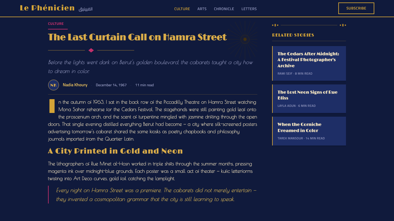
Headline lettering fuses two traditions: the geometric confidence of Western Art Deco — stepped forms, elongated proportions, sunburst radiants — with the connected, calligraphic flow of Kufic Arabic script. Letters swoop and interlock rather than sitting in a rigid grid, giving the type a handwritten, performative energy suited to being read from a distance, as on an actual street poster.
Print-Craft Texture
The visual density mimics an actual multi-pass silk-screen production: layered ink registrations, a slight richness where colors overlap, and a foil stage that sits visibly above the surrounding print. Even in digital form, this style should feel like it was built up in physical layers rather than rendered flat in a single pass.
Poster-Scale Hierarchy
Composition is built for maximum-scale reading: a dominant title, a secondary line for the venue or date, and dense but subordinate supporting text, all scaled the way an actual street or lobby poster would be scaled — one thing readable from across a room, a second layer readable up close. Nothing sits at a uniform, moderate size.
Ornamental Geometry
Sunbursts, stepped borders, and radiating line motifs recur as framing devices around the central image or title block, echoing both Art Deco theater-poster convention and the geometric interlace common in Islamic ornament. These motifs are structural framing elements, not incidental decoration — they organize the eye toward the dominant gold headline.
Who shaped Beirut Golden-Age Poster?
Founded in 1956 at the Roman ruins of Baalbek, the festival was the institutional engine behind the golden-age poster tradition, commissioning the lavish, maximalist print campaigns that promoted its mix of Lebanese folkloric theater and touring international stars every summer until the civil war forced its long suspension.
The Austrian conductor's Baalbeck Festival appearance produced one of the most famous surviving posters of the era, remembered specifically for its extravagant production process — around thirty-five separate ink passes, two silk-screen runs, and a hot-foil gold stage — which stands as physical proof of just how far the era's print shops were willing to go for a single sheet.
As Lebanon's most celebrated singer and the recurring star of the Rahbani brothers' folkloric productions at Baalbeck, Fairuz was the era's most reproduced poster subject — her name and image, rendered in gold script against midnight blue, functioned as a guarantee of quality that could sell out a festival run on its own.
Assi and Mansour Rahbani wrote and composed the folkloric musical theater that anchored Baalbeck's summer programming, blending Lebanese village imagery with modern staging. The star imagery their productions generated, centered on Fairuz, gave the era's poster designers their most consistent and commercially valuable subject matter.
The lavish color and metallic gold of these posters were made possible by Beirut's largely unsigned lithography and silk-screen workshops, which had honed their craft printing the city's newspapers, magazines, and book covers. Their technical willingness to run a poster through many separate color passes and a foil stage — rather than any single named designer — is the real author of the style's maximalist density.
How do you use Beirut Golden-Age Poster today?
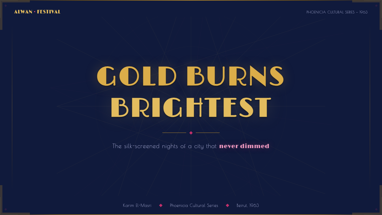
On presentation slides, this style is built for cover pages and section breaks rather than dense content — a midnight-blue field with gold-foil-style title type instantly signals an event, a premiere, or a celebration, the way the original posters announced a festival night. Reserve it for the moments that deserve theatrical weight, and let quieter, neutral slides carry the analytical content in between.
Content slides can borrow the poster's hierarchy logic even without its full density: one dominant statement in gold against the dark ground, a secondary supporting line, and everything else pushed into a smaller, quieter register. Data slides are the hardest fit for this style's maximalism — where the style helps is in single striking statistics or highlight moments, treated as a poster headline rather than a chart.
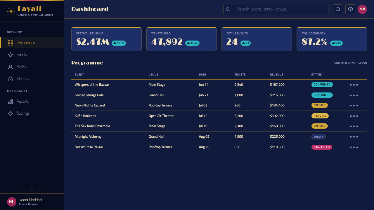
For web interfaces, the style suits entertainment, ticketing, and nightlife-adjacent products far more naturally than conventional SaaS dashboards. A festival or events site can use the midnight-blue-and-gold system for hero sections and featured-event cards; a pricing or membership page for a premium, VIP-tier product can borrow the gold-on-dark hierarchy to make an upper tier feel genuinely special rather than just more expensive.
In editorial and marketing work, the style is an obvious fit for music festival branding, luxury nightlife identity, and any culture-magazine feature revisiting a historical golden age — a retrospective on Arab cinema, a feature on Levantine design history, or a launch moment that wants to borrow glamour from a specific, real cultural era rather than a generic idea of 'vintage luxury.'
A common mistake is spreading the neon and gold accents evenly across a layout instead of letting gold lead and neon support — the historical posters lead overwhelmingly with metallic gold and use color sparingly, as an accent rather than a second dominant hue. A second mistake is flattening the print-craft texture entirely: without some sense of layered richness where colors and foil overlap, the style reads as generic 'dark and gold' rather than as this specific, maximalist Beirut poster tradition.
Beirut Golden-Age Poster — FAQ
Is this the same as generic 'Arabic poster art'?
No — it is a specific regional and historical style: Beirut's cabaret and Baalbeck Festival posters from roughly 1965 to 1975, defined by a particular combination of midnight-blue grounds, gold foil, neon accents, and a Deco-Kufic hybrid lettering born from that city's print-shop culture. Broader Arabic graphic traditions span many centuries, regions, and registers, from manuscript illumination to contemporary typography, and most of them look nothing like this specific mid-century Beirut poster language.
Does this style work with a light background instead of midnight blue?
Not convincingly, at least not without losing what makes it recognizable. The darkness of the ground is what allows gold foil to read as luminous and neon accents to glow rather than clash; on a light background, gold flattens into a dull yellow-brown and the whole system loses its nightlife, after-dark register. If a lighter variant is needed, it is closer to a different style altogether than to a faithful adaptation of this one.
How is this different from Bollywood or Egyptian cinema poster maximalism?
The two traditions share a maximalist instinct but differ in palette and lettering logic. Egyptian and South Asian cinema posters of the same broad era typically lean on illustrated star portraits and a wider, often warmer color range built around hand-painted billboard technique. The Beirut festival tradition is more restrained in its imagery — it rarely centers a large illustrated portrait — and more specific in its palette, staying disciplined around midnight blue, gold, and one or two neon accents rather than a full painter's range of hues.
Does this style suit a typical tech or software product?
Only in specific, deliberately glamorous contexts — a premium subscription tier, an events or ticketing feature, a launch moment framed as a celebration. For everyday functional interfaces, the style's theatrical density works against usability; it wants to be noticed, and most software interfaces need to recede so the user's task stays in focus. Save it for the pages designed to feel like an invitation rather than a workspace.
How literal should the Kufic-inspired lettering be — is it appropriate to use freely?
Treat it as an aesthetic register rather than a literal script to imitate. The historical posters were produced within a living Arabic typographic culture, by people fluent in both the calligraphic tradition and the commercial print trade; a respectful contemporary application borrows the swooping, interlocking energy and the Deco-geometric pairing as a visual mood, without attempting to fabricate pseudo-Arabic letterforms in a Latin-alphabet context. When actual Arabic text is needed, it is worth involving someone fluent in the script rather than approximating it decoratively.
Related design styles
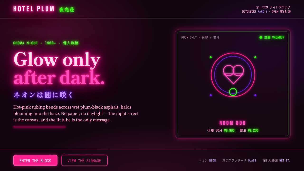 Osaka Love Hotel NeonReads only in the dark. Hot-pink neon tubing blooms over wet plum-black aspha…
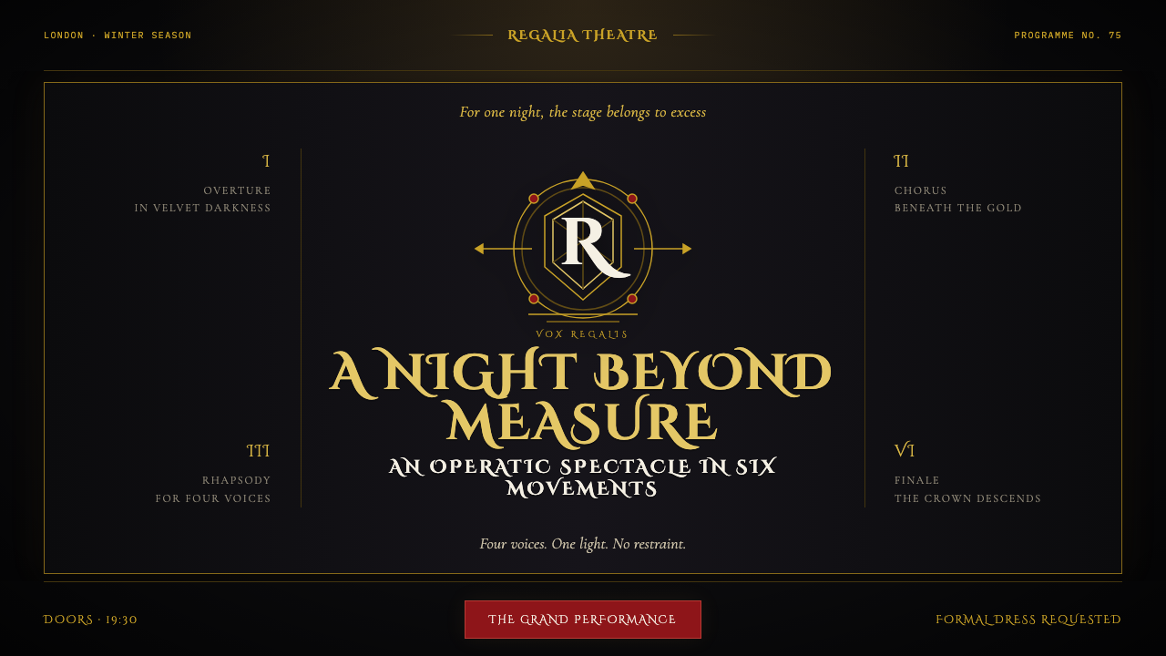 Queen — Bohemian Rhapsody (1975)Rock assumes the crown. Engraved gold, Roman capitals and a lone spotlight ru…
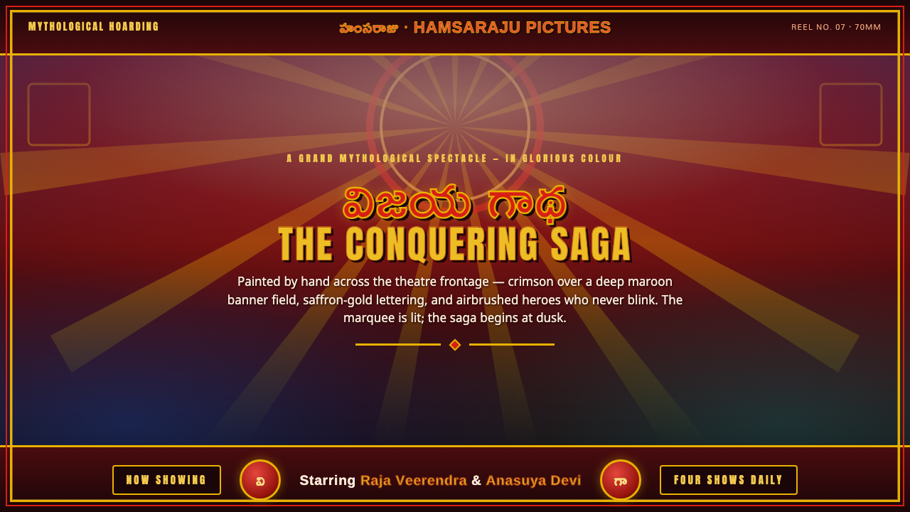 Telugu Tollywood PosterMythological marquee maximalism. Crimson over maroon, gold-outlined Telugu di…
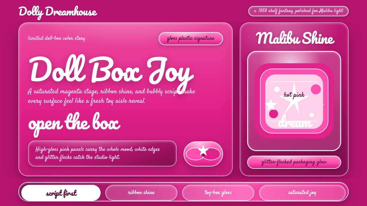 Barbie Hot Pink (Pantone 219)Saturated joy in plastic. Hot magenta, cursive script, gloss streaks, and gli…
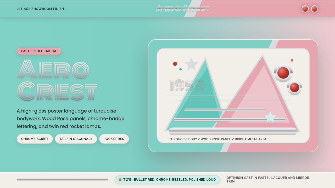 Cadillac TailfinShowroom optimism. Pastel aqua, Wood Rose panels, chrome Monoton, and rocket…
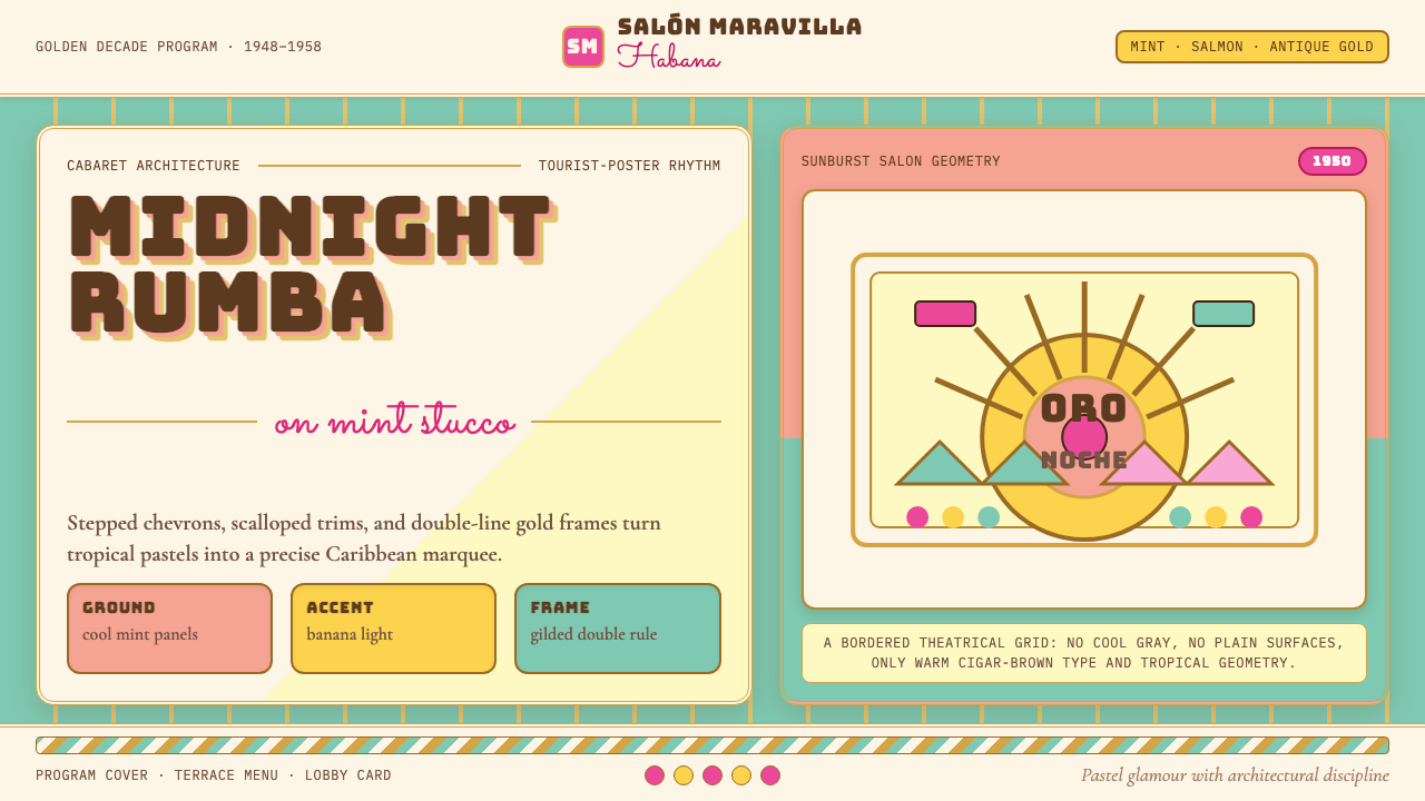 Cuban Art Deco (Havana 1950)Tropical Deco goes theatrical. Mint and salmon panels, gold double rules, Bun…