What is Queen — Bohemian Rhapsody (1975)?
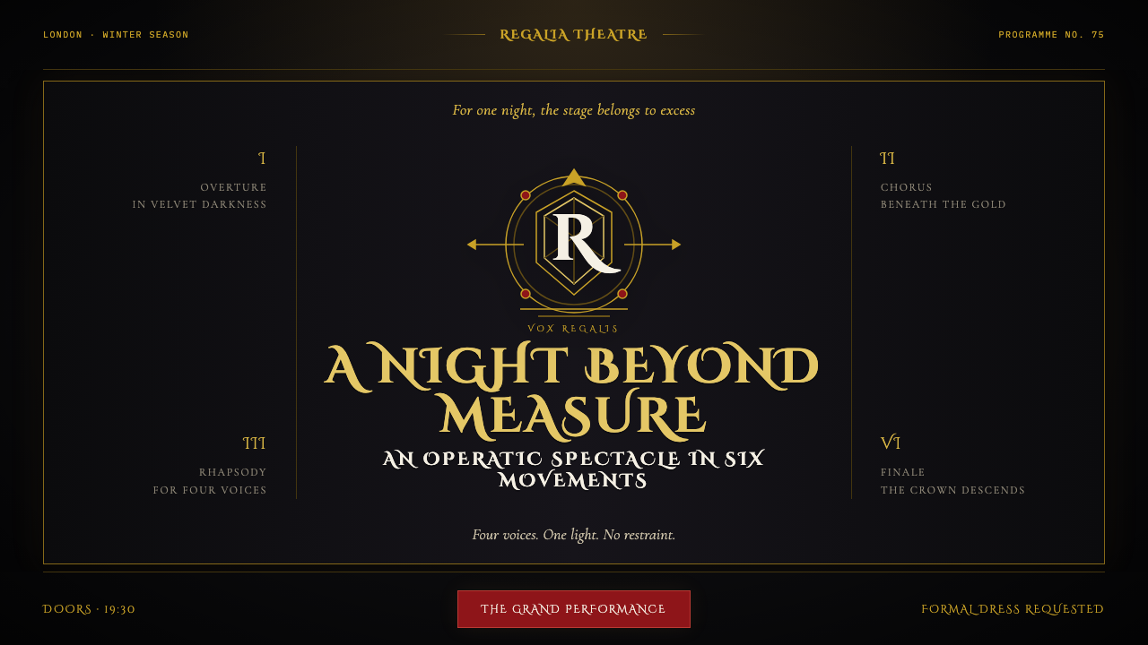
Queen’s Bohemian Rhapsody turns rock spectacle into a royal ceremony: engraved gold, Roman capitals, and a single beam of light commanding a black stage.
Queen — Bohemian Rhapsody (1975) in brief
Queen — Bohemian Rhapsody is a dark, theatrical design language rooted in the visual world surrounding the band’s 1975 single and A Night at the Opera. Its central contradiction is its power: rock music is presented with the gravity of inherited royalty. A black field becomes a stage rather than an empty background. Gold appears not as casual luxury but as ceremonial metal, recalling engraving, leaf work, embossed stationery, and the formal surfaces of an opera program. The result is grand, self-aware, and deliberately excessive without becoming visually noisy.
The style begins with Freddie Mercury’s heraldic crest for Queen: two lions, a crab, two fairies, a phoenix, a large Q, and a crown. That assembly supplies more than a logo. It establishes a whole vocabulary of rank, myth, symmetry, protection, and performance. The crest suggests that the band is not simply named Queen but crowned, shielded, and staged as a sovereign collective. In this visual language, ornamental detail is never merely decorative; it functions as evidence of ceremony.
Visually, the world of Bohemian Rhapsody is controlled by contrast. Engraving-style serif lettering carries authority, while Roman capitals make even a short title feel monumental. Gold lines and flourishes emerge from near-black space with the precision of illuminated metal. The image of four heads held in a diamond-shaped arrangement within darkness supplies the human counterpoint: faces become icons, suspended between spotlight and void. Everything is centered, balanced, and lit as though one dramatic source alone has been granted permission to exist.
Where does Queen — Bohemian Rhapsody (1975) come from?
The style belongs to London in 1975, when Queen released Bohemian Rhapsody alongside the visual world of A Night at the Opera on 21 November. The source material does not treat the record sleeve, crest, typography, and video image as separate branding exercises. They behave as parts of one theatrical proposition: the band’s identity should feel as expansive as the performance implied by its name. Glam rock, operatic rock, British heraldic revival, and album-art maximalism converge in a single, unusually formal gesture.
Freddie Mercury supplied the decisive emblem by drawing the Queen crest. Its components create a heraldic structure with a distinctly fantastical charge: lions imply guardianship and command; the crab, fairies, and phoenix turn the arms into a mythic assembly; the large Q gives the name a monumental frame; and the crown completes the declaration of rank. The design’s importance lies in how it makes the band name literal without making it ordinary. Queen becomes a visual institution, not a wordmark alone.
The presence of Brian May, Roger Taylor, and John Deacon alongside Mercury matters to the imagery because the visual identity repeatedly frames Queen as four figures rather than a solitary monarch. The celebrated four-heads-in-the-void lighting image transforms the group into a compact ceremonial unit. Individual faces are visible, yet darkness refuses ordinary portraiture. The arrangement gives each member presence while making the collective silhouette more important than personal detail.
The period’s album-art maximalism gave this language room to be unapologetically theatrical. Yet its impact depends on discipline. Black, white, and gold create an intentionally limited stage; Roman capitals establish a formal voice; engraving-style serif forms make text feel printed, carved, or inherited; and symmetry prevents the abundance of crest imagery from collapsing into clutter. This is maximalism with court etiquette: the ornament may be rich, but every element must know its place.
What defines the Queen — Bohemian Rhapsody (1975) look?
Black Stage
Near-black is not treated as a neutral background. It is theatrical space: a void, a curtain, and a stage floor at once. Elements emerge from it selectively, so absence becomes as meaningful as presence. The darkness makes gold feel luminous and makes faces appear summoned rather than merely photographed. A successful composition leaves large areas undisturbed, allowing the visible material to carry ceremonial weight.
Engraved Gold
Gold belongs to the language of engraving, leaf work, heraldic trim, and ceremonial printing. It should feel precise rather than glossy, closer to a line cut into a formal surface than to a generic metallic effect. Gold is most convincing when it traces a crest, frames an inscription, or isolates a crown and other emblematic details. Its scarcity protects its authority; when it covers everything, it loses its role as a sign of distinction.
Roman Capitals
Roman capitals give the style its public voice. They read as inscription rather than casual copy, carrying the gravity of a theater facade, a memorial plaque, or a royal announcement. Engraving-style serifs reinforce that effect by making letterforms seem carved, printed, or preserved. Titles should feel declarative and composed, while supporting text remains subordinate enough that the central name or statement can command the stage.
Heraldic Symmetry
Symmetry is the organizing force that turns fantasy into authority. The crest’s creatures, the giant Q, and the crown are not scattered as decorative curiosities; they are arranged as an emblem that can be recognized at a glance. Mirrored or centered compositions create stillness and ceremony. Even when an image is sparse, a central axis makes it feel staged for an audience, as though it is awaiting an announcement, a chord, or an entrance.
Single Dramatic Light
Lighting behaves like a verdict. Rather than spreading an even wash across the frame, one dramatic source selects what may be seen and leaves the rest in obscurity. This is essential to the four-heads-in-the-void image: faces are modeled by light, but darkness preserves their collective mystery. In related layouts, a glow behind a crown, crest, or title can establish the same hierarchy without turning the whole composition into spectacle.
Ceremonial Ornament
Ornament is permitted because it has a role to perform. Crowns, creatures, frames, flourishes, and engraved lines signal rank, inheritance, and occasion. Their purpose is not to soften the design or make it friendly; it is to make the design feel official, elevated, and slightly unreal. The strongest applications let ornament cluster around a focal emblem, leaving the surrounding black space calm enough to preserve the composition’s authority.

Who shaped Queen — Bohemian Rhapsody (1975)?
Mercury drew Queen’s heraldic crest, the source of the style’s most enduring visual system. The two lions, crab, fairies, phoenix, giant Q, and crown make rock identity behave like ceremonial arms. His contribution establishes the central contradiction of the theme: spectacle can be excessive while remaining organized, emblematic, and formally composed.
May is one of the four Queen members named in the 1975 visual context. Within the iconic four-heads-in-the-void image, his presence helps define the essential group structure of the language. The imagery does not present a lone star; it presents four figures held together by darkness, symmetry, and a shared theatrical light.
Taylor belongs to the collective image that gives this aesthetic its diamond-like human icon. The four-person arrangement makes identity feel ceremonial rather than documentary: each face is distinct, but the composition gives priority to their shared silhouette and the concentrated drama of a single visual event.
Deacon completes the quartet central to the Bohemian Rhapsody visual world. His place in the four-head composition reinforces a crucial design lesson: the individual can be visible without breaking the authority of the whole. The style’s strongest human imagery treats the group as a unified emblem, not a collection of unrelated portraits.
How do you use Queen — Bohemian Rhapsody (1975) today?
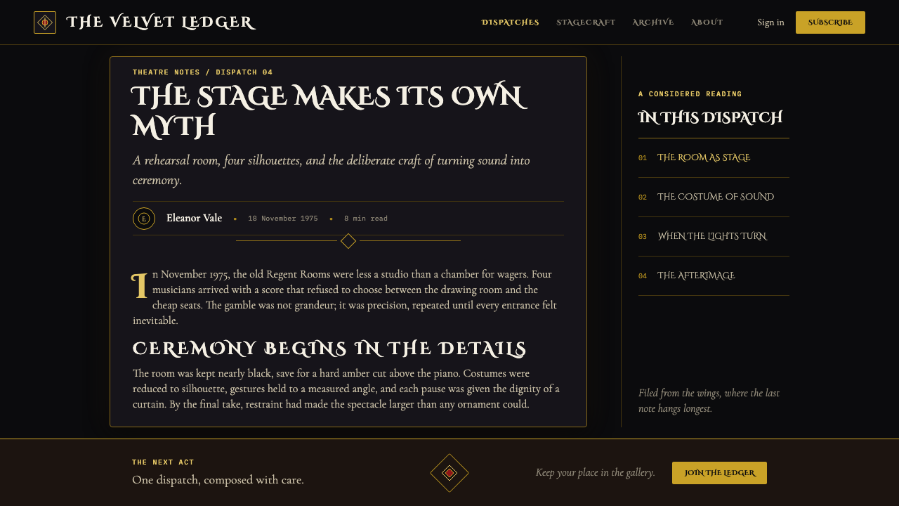
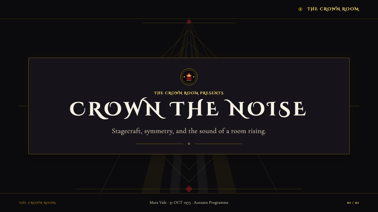
For presentation covers, this style is strongest when it behaves like a curtain rising. Use a near-black field, a central title in engraved Roman capitals, and one heraldic or crown-like focal element held in gold. A single spotlight can establish depth and importance without filling the page with effects. Content slides should retain the formal frame but relax the density: a quiet dark stage, one dominant heading, restrained gold rules or crest fragments, and clear white supporting text create a sense of continuity without turning every slide into a title card.
For data slides, treat charts as ceremonial instruments rather than neutral office graphics. The central measure should receive the brightest emphasis, while secondary information recedes into the black field. Gold can identify the decisive series, white can carry structure and labels, and darkness can remove visual clutter. A chart title in Roman capitals gives the page an announced quality, but the underlying data still needs direct reading order and unambiguous comparison. The theatrical atmosphere should frame the information, never obscure it.
For web interfaces, the style suits dashboards, membership spaces, premium product pages, and pricing contexts where authority and occasion are useful values. A dark interface can use one concentrated hero area for the crest, title, or primary action, then let functional sections become calmer and more typographic. Pricing tiers work especially well when they are presented as distinct houses or offerings within a formal hierarchy, but practical details must remain plain enough to compare. The style should make an action feel consequential, not make the interface difficult to operate.
For editorial and marketing work, Bohemian Rhapsody’s visual language is suited to launches, cultural programs, long-form profiles, event pages, and collector-oriented campaigns. Begin with a ceremonial opening image or title panel, then alternate dense black moments with more open reading surfaces so the audience has room to absorb information. Pull quotes can be treated like inscriptions, while section dividers may borrow crest fragments, thin engraved lines, or a crown silhouette. This creates a sequence that feels like entering, observing, and leaving a performance.
The common mistake is confusing ceremonial richness with indiscriminate luxury. Adding gold to every border, applying ornate flourishes to every line, or making all text monumental destroys hierarchy quickly. Another mistake is turning the black field into a generic dark interface with scattered metallic effects. This theme depends on concentration: one authoritative title, one chosen light source, one controlled emblematic center, and enough darkness around them for the ceremony to be believable.
Queen — Bohemian Rhapsody (1975) — FAQ
Is this simply a black-and-gold luxury style?
No. Black and gold are necessary signals, but the defining logic is ceremonial and heraldic. The design needs an emblematic center, formal typography, controlled symmetry, and a relationship between darkness and a single dramatic light. Generic luxury design often spreads metallic decoration broadly; the Bohemian Rhapsody language concentrates it around rank, announcement, and stage presence.
Can the style work without using the Queen crest directly?
Yes. The transferable principle is not copying the crest but building an equivalent ceremonial center. A crown-like mark, a monogram, a framed title, or a symmetrical symbolic object can take that role. What must remain is the discipline of an emblem: it should organize the composition, not become one decorative item among many.
How should photography be handled in this visual language?
Photography works best when it behaves like a stage image rather than a casual scene. Isolate the subject against darkness, let one concentrated light define the face or object, and preserve generous surrounding void. Group imagery is particularly effective when it can be arranged with formal balance, echoing the four-heads-in-the-void composition without attempting to reproduce it literally.
When does this style become too theatrical for a product?
It becomes excessive when ceremony competes with comprehension. A dashboard still needs fast scanning, a pricing page still needs transparent comparison, and an editorial page still needs sustained reading comfort. Use the grand treatment for moments of entry, identity, primary action, or major announcement. Let routine controls, explanatory copy, and dense information recede into a clearer, quieter supporting system.
Related design styles
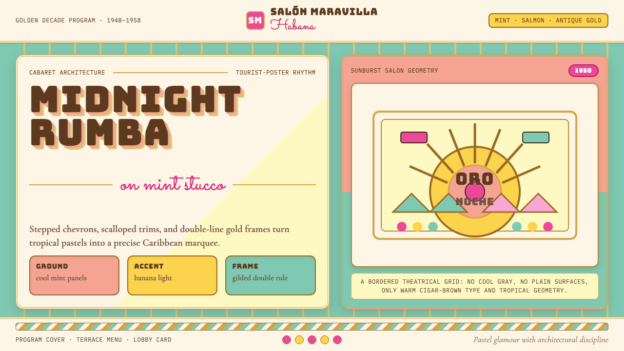 Cuban Art Deco (Havana 1950)Tropical Deco goes theatrical. Mint and salmon panels, gold double rules, Bun…
 Art Deco Teal BathroomColour was the modern bath. Water-duck teal glaze, snazzy black trim, Limelig…
 Godzilla (1954 Showa)Fear takes monumental form. Charcoal halftones split under one atomic-blue ra…
 Lucha Libre PosterStreet-poster voltage. Yellow Anton banners, crimson diagonals, cobalt grids…
 Manila LVN Film PosterLobby-card drama for the screen. Cream slab title on poster-black, scarlet ba…
 Art Deco Jazz AgeJazz Age glamour. Sunburst rays, stepped ziggurats, gold on black — Chrysler…