What is Hollywood Golden Age (1930)?
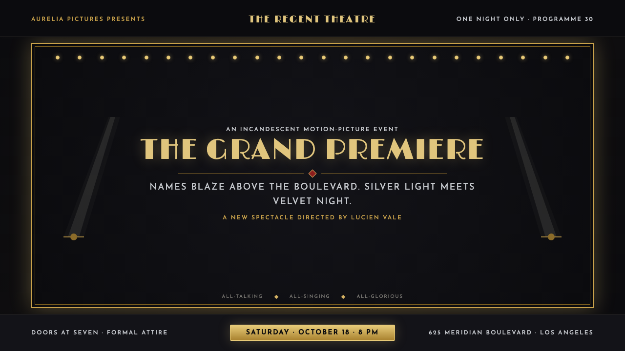
Hollywood Golden Age is the black-and-gold spectacle of the studio-system heyday, when a searchlight raked the sky, a marquee blazed brighter than the boulevard, and a name in lights was the whole point.
Hollywood Golden Age (1930) in brief
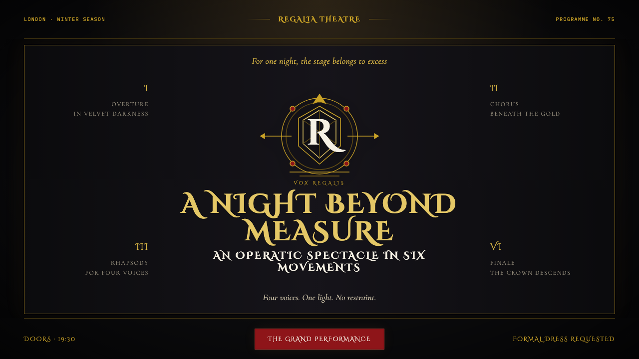
This is a system of warm metal against ink-black night. Gold, brass, and incandescent-bulb amber sit against a deep, near-total black ground, the same relationship a lit theatre marquee has to the night sky above it. Nothing here is pastel or muted; the contrast is total, the way a searchlight beam reads against darkness rather than daylight.
Everything is centered and ceremonial. Names and titles sit on a strict central axis, framed the way a velvet stage curtain frames a performer, with symmetry doing the work that asymmetric tension does in more casual systems. This is a visual language built for premieres and unveilings — a formal announcement, not a casual conversation.
The system fuses two related sources: the geometric confidence of machine-age Art Deco, seen in cinema architecture and title cards of the period, and the polish of studio glamour photography — silvered, high-contrast portrait lighting that flatters and monumentalizes its subject. Incandescent bulbs rim every edge that matters, turning ordinary architectural trim into a frame of pure light.
Where does Hollywood Golden Age (1930) come from?
This system draws its energy from the sound-era studio glamour of 1927 to 1934, when the arrival of synchronized sound transformed cinema almost overnight and premiere culture reached its peak around 1930. The transition from silent film to 'talkies' turned every major release into an event, and the theatres built to show them were designed to match — palatial, illuminated, and unmistakably the brightest object on their boulevard.
Cedric Gibbons, the influential art director whose work shaped the visual polish of MGM's productions for decades, and William Cameron Menzies, known for his precise, architecturally-minded approach to production design, helped establish the chromed, geometric opulence that defined studio-era set design. Their work translated Art Deco's machine-age confidence directly onto the screen, giving films of the period a monumental, symmetrical visual language distinct from anything theatrical stagecraft had produced before.
George Hurrell defined the era's portrait photography with a silvered, high-contrast lighting style that turned studio contract stars into monumental icons rather than ordinary people photographed on set. His technique — dramatic key lighting, retouched perfection, a glamour built from controlled shadow as much as from light — became the visual standard the entire star system measured itself against, and it is the direct source of this system's polished, flattering treatment of any central subject.
Sid Grauman, the theatre impresario behind Los Angeles's most famous movie palaces, turned the film premiere itself into ceremonial spectacle — searchlights raking the sky, velvet ropes, a name in lights above the marquee announcing the night's event to the entire boulevard. Gilbert Adrian's costume design for MGM's leading stars completed the picture, extending the same polished, monumental glamour from architecture and lighting into what the stars themselves wore in front of the cameras.
What defines the Hollywood Golden Age (1930) look?
Warm Metal on Ink Black
The core relationship is gold, brass, and amber against a deep, near-total black ground — the same visual logic as a lit marquee against the night sky. Contrast is total and unapologetic, never softened toward gray.
Centered Ceremony
Compositions favor strict central symmetry over asymmetric tension, as though every layout were framed by a stage curtain for a formal unveiling. Names and titles sit on the central axis, not off to one side.
Marquee Bulb Framing
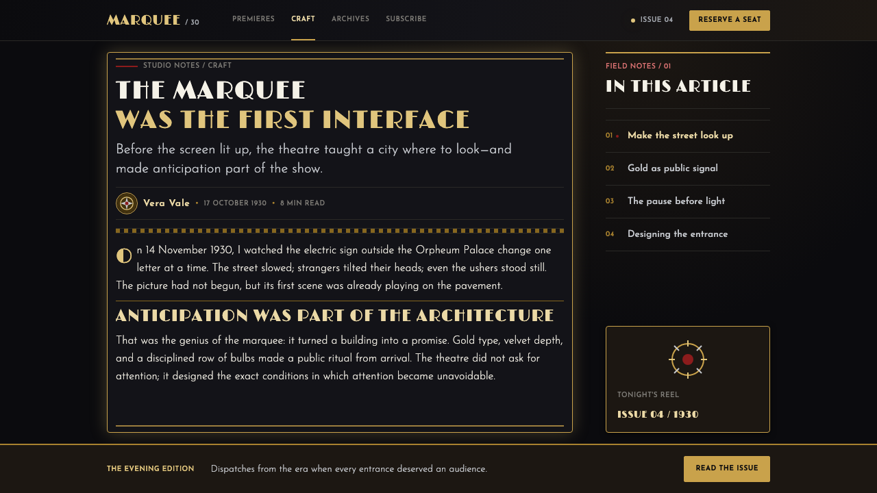
Incandescent bulbs rim the edges of key elements the way they rim a theatre facade, turning architectural or layout trim into a literal frame of light rather than a plain border or rule line.
Cinema Art Deco Geometry
Shapes lean toward the machine-age confidence of Art Deco — stepped, faceted, geometric forms rather than organic curves — reflecting the influence of studio production design on the era's visual identity.
Silvered Portrait Lighting
Any central figure or focal subject is treated with the high-contrast, flattering drama of studio glamour photography — strong directional highlight, deep controlled shadow, a monumentalizing rather than documentary quality.
Block-Letter Gold Type
Titles and names are set in bold, blocky, monumental lettering rendered in gold against the black ground — the visual equivalent of a name blazing above a theatre entrance, meant to be read from a block away.

Who shaped Hollywood Golden Age (1930)?
Gibbons was the influential art director whose work shaped the chromed, geometric opulence of MGM's productions for decades, establishing much of the visual vocabulary — Art Deco confidence rendered as monumental set design — that this system draws on.
Adrian designed costumes for MGM's leading stars during the studio-system heyday, extending the era's polished, monumental glamour from architecture and lighting into what its most photographed figures actually wore on screen.
Hurrell defined studio-era portrait photography with a silvered, high-contrast lighting style that turned contract stars into monumental icons, and his technique is the direct source of this system's polished, dramatically lit treatment of any central subject.
Grauman, a theatre impresario behind Los Angeles's most famous movie palaces, turned the film premiere itself into ceremonial spectacle — searchlights, velvet ropes, and a name in lights announcing the night's event — establishing the ceremonial staging this system reproduces.
Menzies brought a precise, architecturally-minded approach to production design during the era, helping define the geometric, monumental visual language that carried Art Deco's machine-age confidence directly onto the cinema screen.
How do you use Hollywood Golden Age (1930) today?
This system rewards work that wants to feel like an announcement or a premiere rather than a quiet, everyday interaction — applying it well means committing to total black-and-gold contrast and formal centered symmetry rather than softening either into a casual, asymmetric layout.
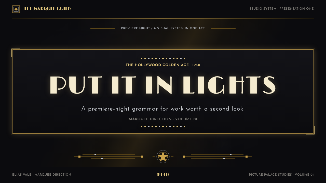
For presentation slides, the style is strongest on cover pages built around a single centered title in bold gold block lettering against ink-black, framed by a bulb-lit border the way a marquee frames a name. Content slides should preserve the black ground and centered structure, using gold sparingly for headers and key figures rather than throughout the body; data slides work well when a single number or statistic is treated like a marquee announcement — large, centered, gold on black.
For web interfaces, the palette suits entertainment, awards, luxury events, and premium subscription products where occasion and prestige matter more than everyday utility. A black base with gold accents for primary actions reads as an invitation to something special; over-application across every button or icon, however, quickly loses the sense of occasion that makes gold-on-black feel earned rather than routine.
For editorial and marketing work, the system suits film history writing, awards-season coverage, and luxury brand campaigns built around glamour and prestige. Treat a hero image the way studio portrait photography treated its subjects — high contrast, dramatically lit, centered — and let a single gold title carry the same weight a marquee name carried above a theatre entrance.
The most common mistake is treating this as generic 'gold luxury' styling without the ceremonial symmetry and searchlight drama that give it specificity. Gold-on-black alone reads as a jewelry ad; this system needs the centered, framed, premiere-night staging — bulb-rimmed borders, monumental block lettering, silvered portrait lighting — to read as Hollywood Golden Age rather than generic opulence.
Hollywood Golden Age (1930) — FAQ
Why does everything need to be centered and symmetrical in this system?
Centered symmetry reflects the ceremonial nature of a film premiere itself — a marquee, a velvet curtain, and a searchlight are all staged as a formal unveiling, not a casual arrangement. Breaking the symmetry undermines the sense of occasion that distinguishes this system from ordinary Art Deco geometry.
Why is the black background so essential rather than a dark gray or navy?
The gold and bulb-lit elements need true, ink-black darkness to read the way a marquee reads against a night sky — a lighter or grayer background reduces the contrast and turns the dramatic glow into ordinary highlighting. The blackness itself is doing narrative work: it is the night the movies learned to talk.
How does this differ from generic Art Deco styling?
Generic Art Deco can appear in daylight palettes, pastel tones, or architectural contexts unrelated to entertainment. This system fuses Art Deco geometry specifically with cinema glamour photography and theatre marquee culture — the black-and-gold contrast, the silvered portrait lighting, the searchlight drama — making it distinctly about the movies rather than Art Deco in general.
Does this style work for content that isn't about film or entertainment?
It transfers well to anything that wants to feel like a special occasion rather than an everyday utility — awards ceremonies, luxury product launches, premium event invitations, or brand campaigns trading on prestige and spectacle. It is a poor fit for everyday tools or high-frequency utility products, where the constant sense of occasion would feel exhausting rather than special.
Can the gold accent be replaced with a different metallic tone?
Brass or warm bronze can substitute for gold without breaking the system, since both share the same warm-metal-on-black logic drawn from bulb-lit marquees and studio lighting. A cool silver or chrome accent, however, shifts the mood toward a different, more industrial visual language and loses the warm, theatrical glamour this style depends on.
Related design styles
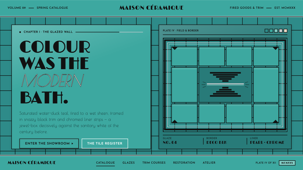 Art Deco Teal BathroomColour was the modern bath. Water-duck teal glaze, snazzy black trim, Limelig…
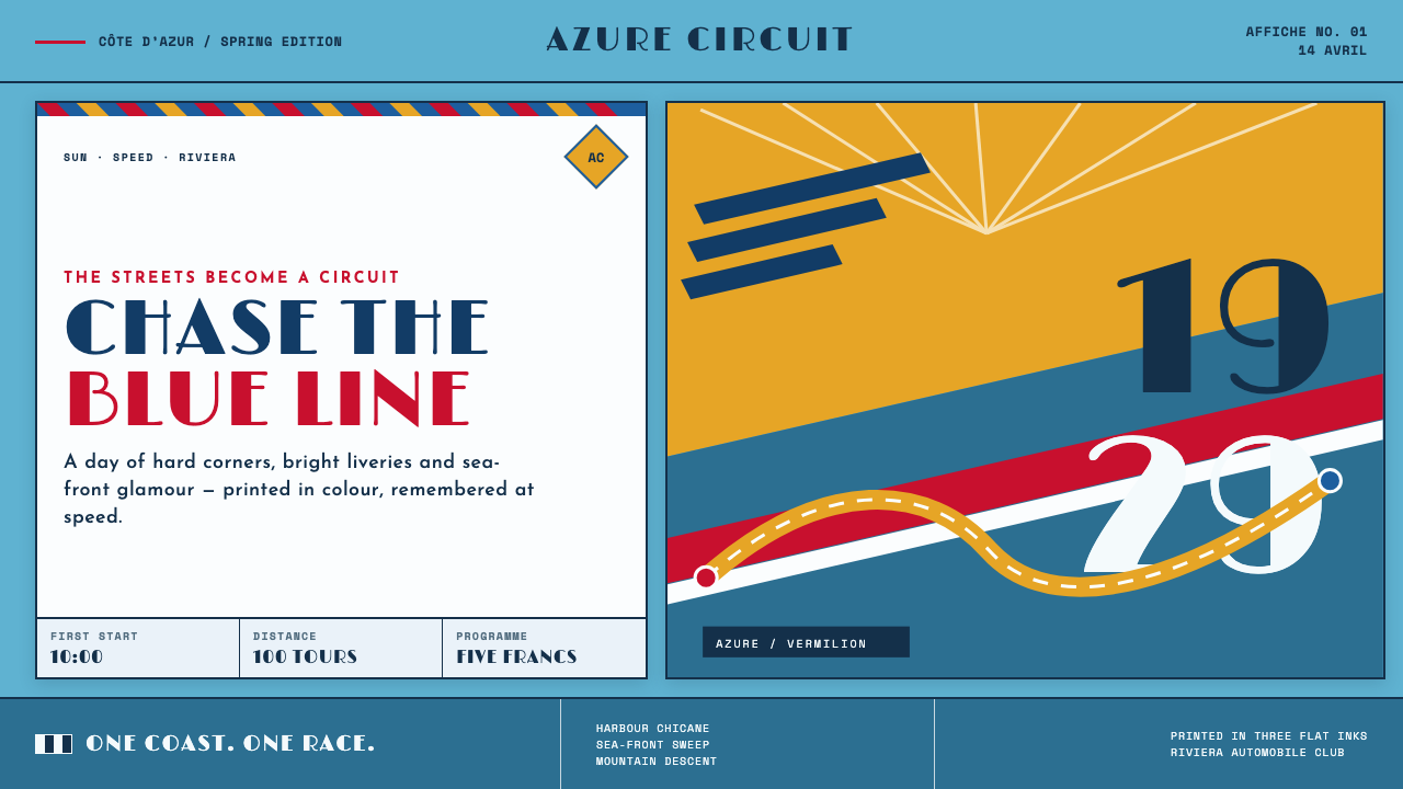 Monaco Grand Prix (1929)Speed becomes glamour. Riviera azure, racing red, and giant Deco numerals cut…
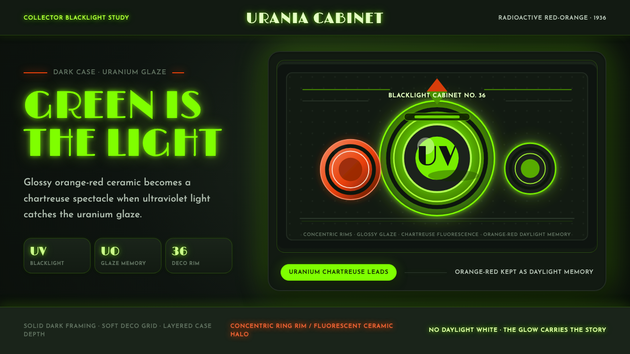 Fiestaware Radioactive Red-OrangeGlows like a collector's secret. Chartreuse rims cut through a dark deco case.
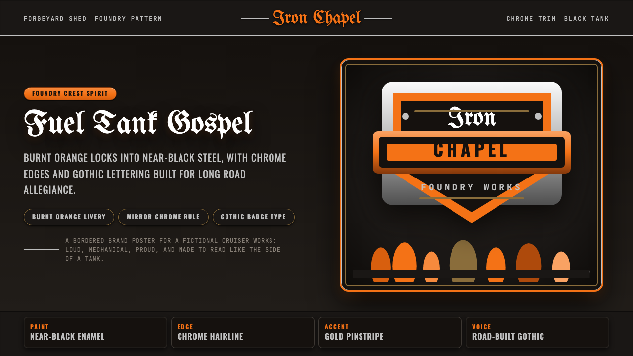 Harley Orange & BlackBuilt like a tank badge. Burnt orange, chrome hairlines, gothic type on near…
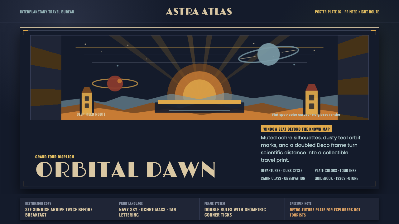 JPL Visions of the FutureSpace travel as print craft. Burnt orange silhouettes and Deco tan type on na…
 Queen — Bohemian Rhapsody (1975)Rock assumes the crown. Engraved gold, Roman capitals and a lone spotlight ru…