What is Art Deco Teal Bathroom (1930s)?
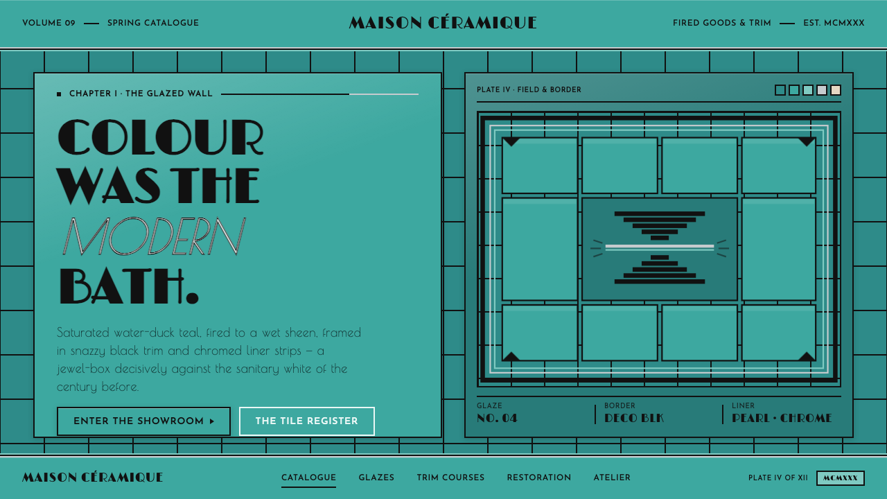
The 1930s modern bath was a saturated jewel box — water-duck teal tile, black Deco trim, chrome glints, and Limelight lettering turning hygiene into spectacle.
Art Deco Teal Bathroom (1930s) in brief
Art Deco Teal Bathroom is the visual language of the 1930s American residential bath: a continuous field of glossy water-duck teal glazed tile, framed by crisp black border courses, chrome dividers, pearlescent liner strips, and warm porcelain fixture surfaces. It is saturated, polished, and unapologetically ornamental, but its ornament is architectural rather than incidental.
The central idea is that colour, not white, announces modernity. Teal is not a small accent floating on a neutral page; it is the environment itself. Black trim establishes the room’s geometry, chrome introduces a cool reflective flash, and porcelain appears only where the interface should feel like a fixture. The result is a screen design that behaves like a tiled room rather than a white canvas decorated with bathroom references.
Its Art Deco character comes through in the controlled contrast between rounded gloss and sharp framing, while Streamline Moderne contributes a sense of sleek movement and manufactured finish. Limelight Deco caps and geometric display lettering give headings the presence of signage, allowing the interface to feel theatrical without becoming nostalgic or cluttered.
Where does Art Deco Teal Bathroom (1930s) come from?
The style belongs to the broad Art Deco interior culture of 1900–1950, with its clearest expression here concentrated in the 1930s. Its regional anchor is North America, specifically the American Deco residential bathroom. This was not a style imagined as a small decorative panel. The tile field, trim, fixtures, lettering, and reflective accents are conceived as one coordinated environment.
The coloured glazed-tile interior is the foundation of that environment. Glossy tile gives the wall a continuous, saturated surface that catches light across the room, while water-duck teal establishes a distinctive identity immediately. In this setting, the bathroom does not retreat behind white enamel and pale walls. Colour becomes the badge of the modern bath, and the glazed surface becomes both material and atmosphere.
Art Deco supplies the formal discipline: strong framing, crisp contrast, geometric display language, and a polished sense of luxury. Streamline Moderne adds the impression of speed, smoothness, and contemporary manufacture. The system does not treat these movements as separate historical costumes; it combines their shared interest in geometry, finish, and modern domestic life into a single bathroom vocabulary.
The people and industries behind the aesthetic are best understood as a working network rather than a single author. Art Deco interior designers shaped the spatial language, coloured glazed-tile manufacturers made saturated ceramic surfaces possible as a visual field, and Streamline Moderne stylists refined the sleek modern finish. Together they established a design world in which tile, metal, porcelain, and typography could speak with one voice.
What defines the Art Deco Teal Bathroom (1930s) look?
Teal Tile Field
The dominant surface is a saturated water-duck teal glaze extending across the environment. It should feel continuous and immersive, like a wall assembled from glossy ceramic units whose repetition creates rhythm without becoming a pattern overlay. Teal carries the atmosphere, not merely the accent role.
Black Deco Trim
Black border courses give the teal field its architecture. They frame panels, mark transitions, and create decisive visual stops. The trim should be crisp and deliberate, with enough presence to read as construction rather than decoration. Its purpose is to make the saturated field feel contained and designed.
Chrome Dividers
Chrome introduces a cool, reflective counterpoint to the dense teal glaze and matte black framing. Used as dividers or narrow hardware-like details, it catches attention through glint rather than colour contrast. Chrome should remain selective: its strength comes from appearing as a polished interruption inside the ceramic field.
Porcelain Restraint
Warm porcelain is reserved for fixture-like surfaces: controls, panels, cards, or objects that should feel tactile and sanitary. It is not the page background. Keeping porcelain local preserves the historical logic of the style, where white belongs to the bath fixture while colour belongs to the room.
Geometric Display Lettering
Headlines should have the authority of bathroom signage, using geometric display lettering and Limelight Deco caps to create a strong period signal. Text is treated as part of the interior architecture: titles frame space, labels behave like plaques, and hierarchy comes from contrast in scale and placement rather than typographic variety.
Gloss Against Structure
The style depends on the tension between reflective surfaces and hard framing. Glossy tile and chrome suggest light, cleanliness, and finish; black lines provide weight and order. Depth should be communicated through material contrast, enclosure, and alignment, not through soft atmospheric effects that would blur the Deco silhouette.
Who shaped Art Deco Teal Bathroom (1930s)?
These designers established the coordinated interior language behind the style: geometric framing, saturated colour, polished surfaces, and a sense that every fixture and finish belonged to one designed room. Their contribution is spatial rather than limited to a single object or graphic.
These manufacturers made the saturated ceramic field central to the modern bathroom. Their coloured glazed tiles supplied the continuous water-duck teal surface that turns the wall from background into atmosphere and gives the style its defining material identity.
Streamline Moderne stylists contributed the sleek, polished side of the system. Their influence appears in the controlled sense of movement, smooth finish, chrome emphasis, and manufactured modernity that keeps the bathroom from feeling merely decorative.
How do you use Art Deco Teal Bathroom (1930s) today?
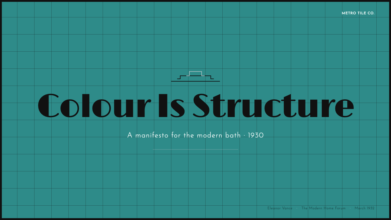
For presentation slides, use the teal field as an immediate cover gesture, with black Deco framing to contain the title and a chrome-like divider to separate the opening statement from supporting information. Content slides should keep the same room logic: teal establishes the environment, porcelain surfaces hold readable text or controls, and black trim organizes sections. Data slides can treat charts as tiled panels, using restrained chrome dividers and strong geometric labels so information feels installed rather than scattered.
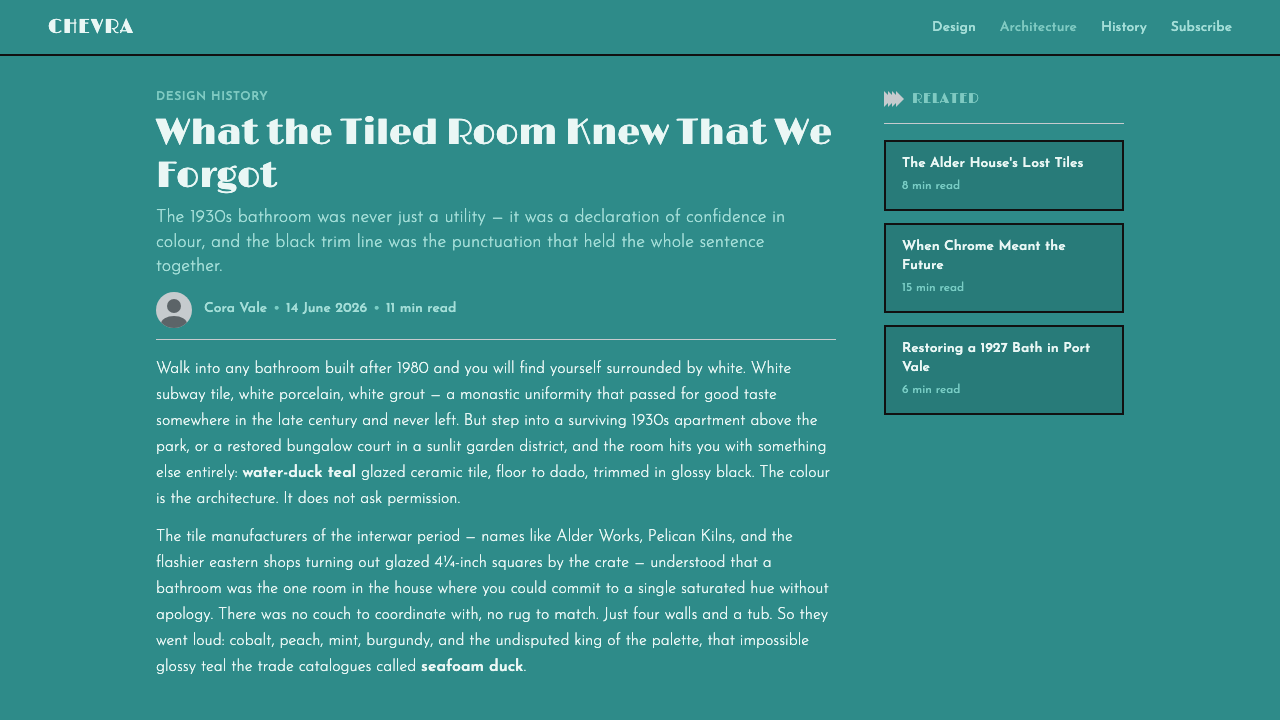
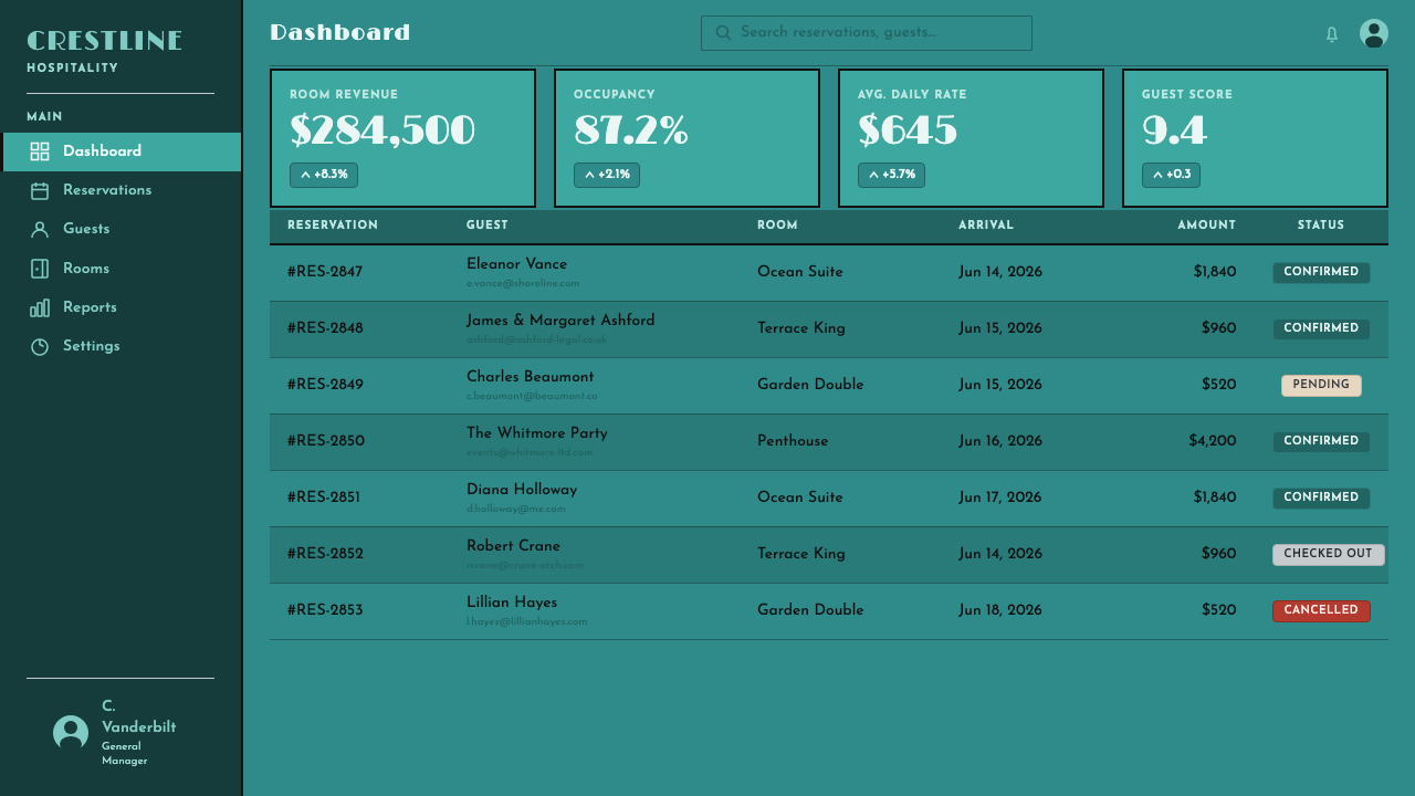
For web interfaces, the system suits dashboards and pricing pages that need a memorable, high-contrast identity. A saturated teal shell can hold navigation and major states, while warm porcelain surfaces create readable working areas for tables, forms, and plan details. Black framing should clarify grouping and selected states; chrome can signal active separators or hardware-like controls. The interface should feel polished and constructed, with colour carrying the atmosphere and local light surfaces carrying usability.
For editorial and marketing work, the style is especially effective when the page behaves like a decorated interior rather than a neutral article sheet. Use a broad teal opening field for a campaign statement, black trim for section boundaries, and porcelain blocks for quotations, specifications, or product facts. Marketing compositions can lean into the jewel-box quality, pairing bold geometric headlines with close, glossy colour fields and carefully placed chrome accents.
The most common mistake is treating teal as an accent on a white page. That reverses the hierarchy: in this style, teal is the room and porcelain is the fixture. Other failures include spreading black trim everywhere until it becomes visual noise, using chrome as a generic metallic gradient, or mixing too many decorative type treatments. Keep the material roles distinct, let the framing do real organizational work, and allow the saturated field to remain the dominant experience.
Art Deco Teal Bathroom (1930s) — FAQ
Is the style simply a teal-and-black colour scheme?
No. Teal and black are necessary signals, but the style depends on a complete material hierarchy. Teal must behave as the environmental tile field, black must behave as architectural trim, chrome must appear as a selective reflective detail, and porcelain must remain local to fixture-like surfaces. Without those roles, the result is only a colour palette, not an Art Deco bathroom.
Why should porcelain not become the main background?
Because the defining historical idea is that colour, rather than white, marked the modern bath. Warm porcelain belongs to the fixtures and tactile working surfaces. If it covers the entire page, the visual environment loses its saturated tiled identity and the system begins to resemble a generic light interface with teal decoration.
How should chrome be used without making the interface look metallic?
Treat chrome as a narrow reflective interruption, not as a broad surface treatment. It works best on dividers, hardware-like controls, or small framing details where its glint can contrast with teal glaze and black trim. When chrome spreads across every component, it stops reading as a period material and becomes a generic visual effect.
Is Art Deco Teal Bathroom the same as Streamline Moderne?
They overlap but are not identical. Art Deco provides the geometric framing, decorative discipline, and polished luxury, while Streamline Moderne contributes sleekness, movement, chrome emphasis, and manufactured modernity. This design system combines both within the specific setting of the American residential bathroom and its coloured glazed-tile interior.
Where does this style work best, and where can it struggle?
It works best where a strong environmental identity, polished modernity, and clear visual grouping are valuable: dashboards, pricing pages, promotional campaigns, and structured editorial layouts. It can struggle when a product needs quiet neutrality, organic warmth, or a broad range of competing moods. Its saturated field and assertive framing are strengths only when the product can support that level of visual presence.
Related design styles
 Hollywood Golden Age (1930)Black-and-gold spectacle commands the night. Marquee bulbs frame monumental D…
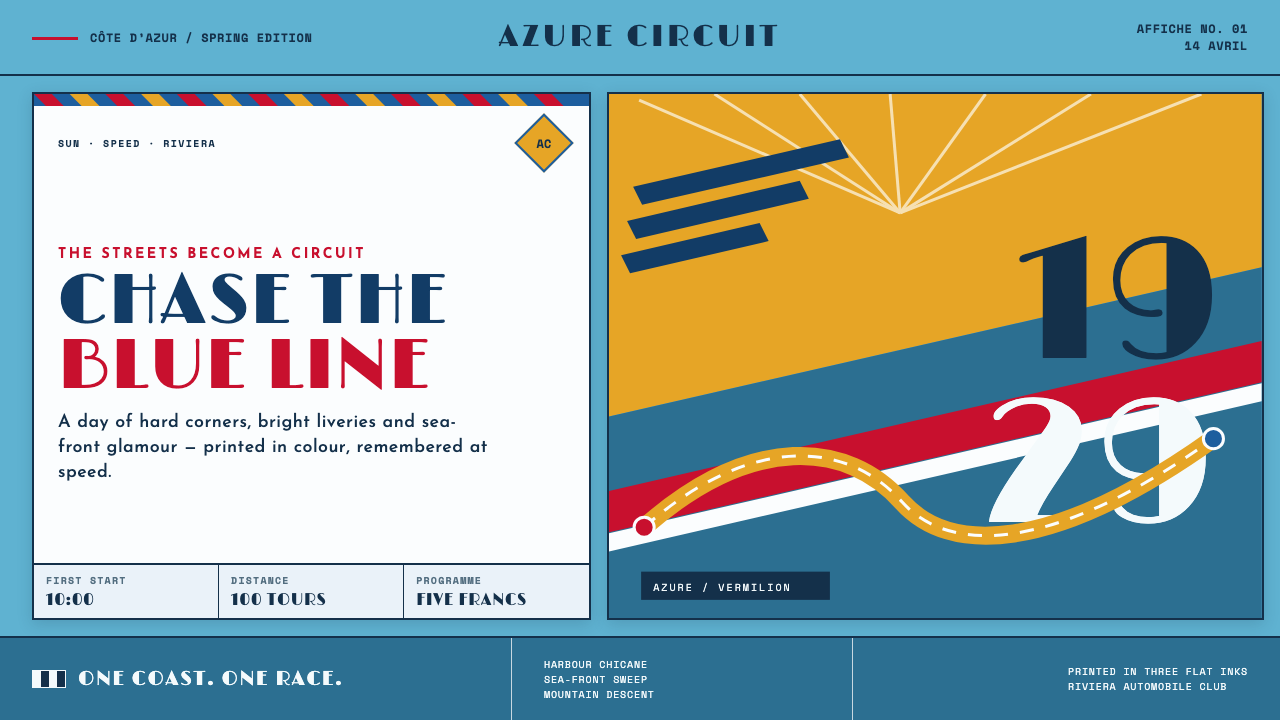 Monaco Grand Prix (1929)Speed becomes glamour. Riviera azure, racing red, and giant Deco numerals cut…
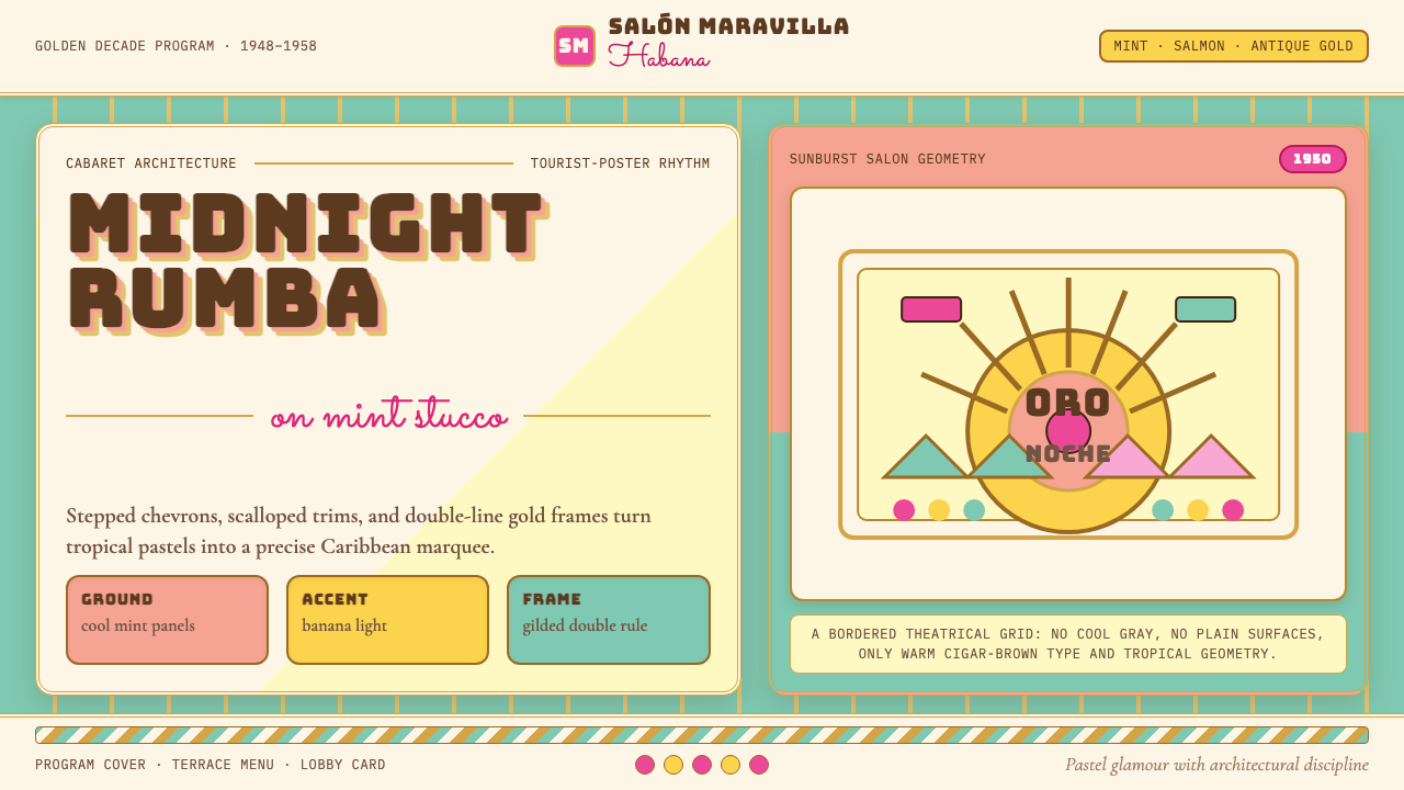 Cuban Art Deco (Havana 1950)Tropical Deco goes theatrical. Mint and salmon panels, gold double rules, Bun…
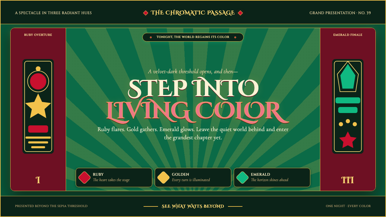 The Wizard of Oz (1939 Technicolor)Color arrives like a curtain rising. Ruby, gold, and emerald blaze across a d…
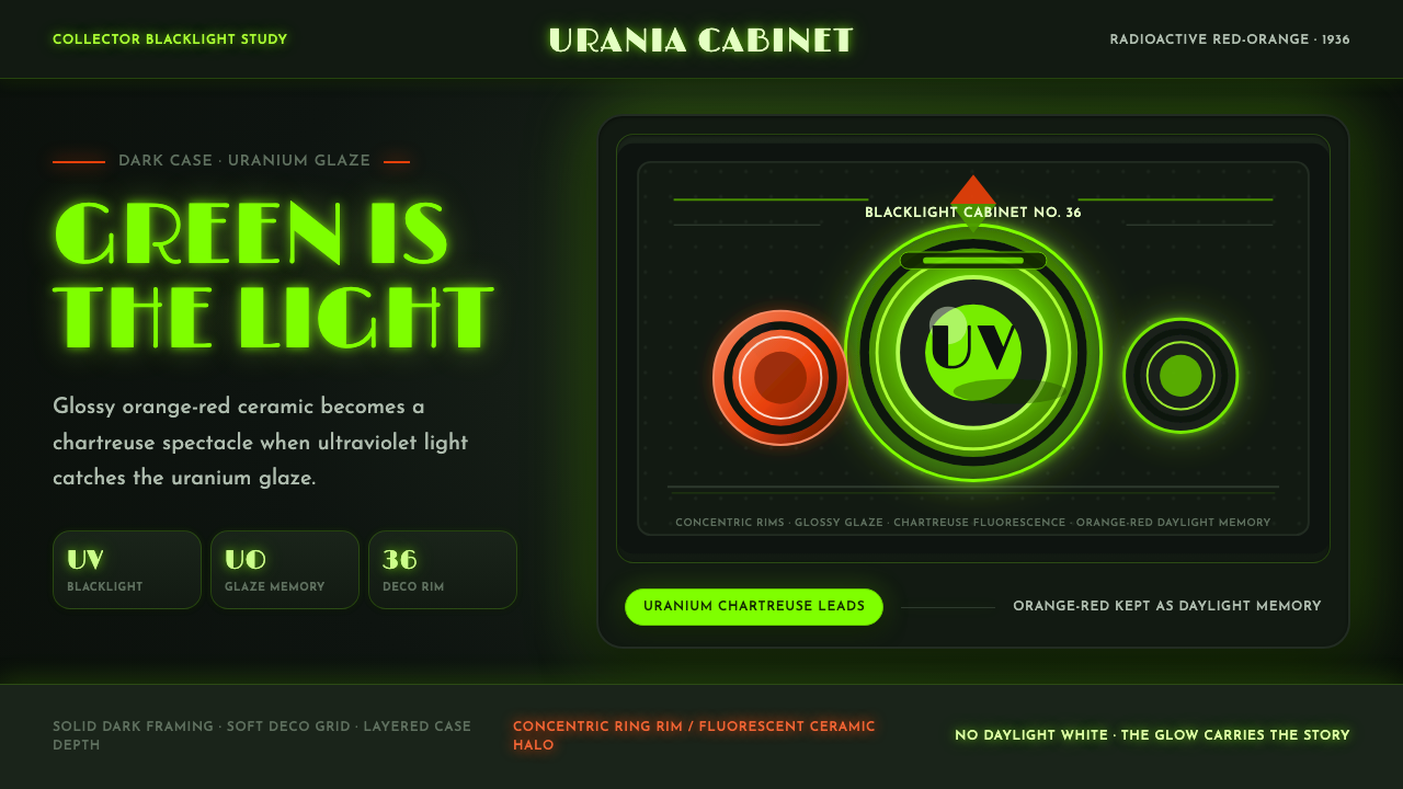 Fiestaware Radioactive Red-OrangeGlows like a collector's secret. Chartreuse rims cut through a dark deco case.
 Harley Orange & BlackBuilt like a tank badge. Burnt orange, chrome hairlines, gothic type on near…