What is The Wizard of Oz (1939 Technicolor)?
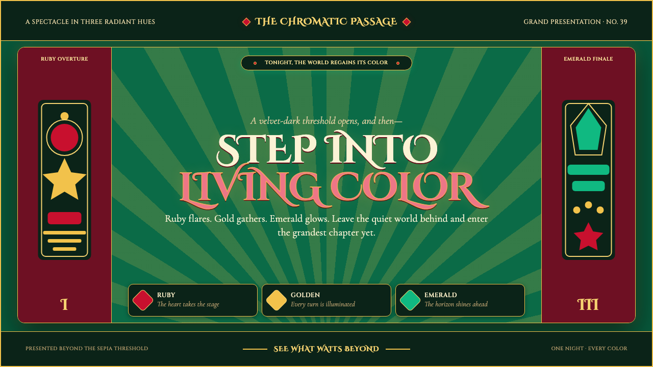
Color arrives like a curtain rising: ruby, gold, and emerald blaze across a dark Deco stage.
The Wizard of Oz (1939 Technicolor) in brief
The Wizard of Oz design language begins at a threshold. A drained, sepia farmhouse interior gives way to a fantasy landscape drenched in three-strip Technicolor, making color itself the story’s first dramatic event. This is not a restrained cinematic palette translated into interface form; it is a world built around the shock of arrival. Ruby red, Emerald City green, and yellow-brick gold do not quietly support the composition. They announce it, like footlights flaring against a theater curtain.
Its visual character joins Golden Age Hollywood spectacle with Art Deco title design and storybook fantasy illustration. The ground is deep emerald, dense enough to make gold and ruby appear illuminated rather than merely placed. Type behaves like a title card: formal, theatrical, and proud of its silhouette. Decorative framing, radiating motifs, winding paths, ornamental borders, and layered panels are not incidental flourishes. They establish the sense that every screen belongs to a staged, hand-crafted fantasy.
The system has one deliberate reversal: Kansas mode. Where the Oz world is saturated and ceremonial, Kansas is drained toward sepia and reserved for introductions, framing, transitions, or moments before transformation. This contrast is essential. Without the muted threshold, the saturated world loses the reveal that gives it meaning. The style is therefore not simply colorful maximalism; it is a controlled passage from ordinary space into spectacle.
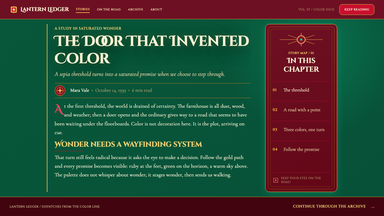
Where does The Wizard of Oz (1939 Technicolor) come from?
This aesthetic belongs to The Wizard of Oz, produced during 1938 and 1939 and released in 1939, at MGM Studios in Culver City, California. Its historical setting is the three-strip Technicolor era, a period identified here as running from 1935 to 1955. The visual premise is inseparable from that process: the famed transition from sepia Kansas through an opening farmhouse door into Oz turns technical color into a visible narrative boundary. The image is not merely remembered for its hues; it is remembered for color arriving as an event.
The source materials place the film within Golden Age Hollywood, where visual systems could operate at the scale of a complete imagined world. Oz is staged with the confidence of an elaborate production: a dark green field functions as the surrounding theater, while ruby and gold act as focal lights. The result is richly artificial in the best sense. It does not ask viewers to mistake fantasy for ordinary life; it asks them to enter a realm whose colors, routes, city glow, and decorative surfaces have been deliberately intensified.
Art Deco title design supplies the system’s graphic discipline. Deco gives the exuberance a composed face: emphatic titles, framed fields, geometric order, metallic-seeming brightness, and an appetite for ceremony. Storybook fantasy illustration supplies the opposite but complementary force: a winding yellow road, an enchanted city, theatrical contrast, and the invitation to see every journey as a page turn. Together, these movements make the style ornamental without becoming arbitrary. Ornament is part of the promise that this world is larger than the frame.
The approved key figures associated with this origin are Victor Fleming, L. Frank Baum, Adrian, Cedric Gibbons, and Natalie Kalmus. In a design reading, their significance is collective rather than reducible to a single visual gesture: the film’s identity rests on an interlocking relationship among its story world, Hollywood staging, Deco presentation, costume-like color drama, and Technicolor-era spectacle. That is why an Oz-derived interface works best when it feels coordinated as a world, rather than when isolated ruby, green, and gold accents are scattered across an otherwise neutral product.
What defines the The Wizard of Oz (1939 Technicolor) look?
The Emerald Stage
Deep emerald is the governing field, closer to velvet theater scenery than to a quiet background. It creates a dark stage on which ruby and gold can read as illuminated signals. Large green areas should feel enveloping and ceremonial, not merely decorative. The surrounding darkness gives the brighter hues their theatrical force and keeps the composition rooted in Emerald City rather than in a generic luxury palette.
Ruby, Gold, and Reveal
Ruby slipper red and yellow-brick gold are the principal accents. Ruby carries glamour, urgency, and the sparkle of a stage costume; gold carries route, invitation, and forward movement. They work most convincingly when they appear as distinct cues against emerald, rather than blending into a broad rainbow. Their power comes from contrast and placement: a ruby action, a golden path, a gold-lit heading, or a small bright token that rewards attention.
Kansas to Oz
The sepia Kansas mode is a narrative device, not a competing theme. Its drained appearance belongs at the beginning of a journey, in contextual framing, or in a pause before a richer state opens. It should feel plain, weathered, and deliberately held back. The transition into emerald, ruby, and gold gains emotional force because Kansas establishes what the user is leaving behind.
Deco Title Cards
Typography should behave as display lettering, not invisible utility text. Headings deserve centered or carefully staged placement, strong silhouettes, deliberate capitals where appropriate, and framing that makes each title feel announced. Supporting copy remains readable and orderly, but it should participate in the presentation through spacing, rules, and ornamental alignment. The visual reference is a Hollywood title card: information delivered with confidence before the scene begins.
Storybook Pathways
The yellow brick road is more than a color reference. It offers a compositional principle: direction can be shown as a journey. Curves, stepped sequences, road-like dividers, and progressive reveal can guide attention from one scene or decision to the next. The path should feel inviting rather than technical. Even functional navigation can borrow its logic by making progress visibly lead toward a brighter destination.
Theatrical Ornament
This system welcomes ornament, but ornament must help stage the fantasy. Borders, rays, medallion-like emblems, layered curtains, and framed panels can create abundance without clutter when they establish depth, ceremony, or sequence. Decorative elements should appear intentional and repeated as a family. Random glitter, unrelated motifs, or decorative density applied everywhere weaken the feeling of authored Hollywood spectacle.

Who shaped The Wizard of Oz (1939 Technicolor)?
Victor Fleming is named among the key figures associated with the 1939 film. Within this design system, the relevant lesson is cinematic unity: Oz should be treated as a staged visual world whose threshold, color drama, and spectacle are coordinated across the whole composition rather than handled as disconnected decoration.
L. Frank Baum is listed among the film’s key figures and anchors the storybook dimension of the style. The design vocabulary of paths, destinations, framed episodes, and transformative entry points should retain a narrative purpose: each visual flourish ought to make the user feel that a page, scene, or chapter is opening.
Adrian is included among the key figures connected to the film. The system draws on the idea of color as costume-like presence: ruby should not read as a generic alert color, but as a glamorous material cue with enough contrast to feel dressed, sequined, and ready for a spotlight.
Cedric Gibbons is named as a key figure in the source material. His place in this design reading is the Deco-facing side of Oz: formal framing, presentation, and the sense that a screen can be arranged with the ceremony of a grand studio production rather than the neutrality of a utility panel.
Natalie Kalmus is among the listed key figures, and the three-strip Technicolor context is central to the system. The practical lesson is that color must be composed as a dramatic relationship. Emerald, ruby, gold, and sepia each have a role; their contrast and sequence matter more than sheer saturation or decorative variety.
How do you use The Wizard of Oz (1939 Technicolor) today?
For presentation covers, use the Oz threshold as the central idea. A restrained sepia opening panel can introduce the subject before a deep emerald field carries the actual title. Let a single ruby or gold motif establish the focal point, and make the title read like a ceremonial card rather than a report label. On content slides, keep the theatrical framing but give information a stable reading order: sectional banners, clear headings, gold route-like dividers, and emerald panels can organize material without disguising it.
For data slides, translate the yellow brick road into a progression rather than using decoration as an afterthought. A sequence, funnel, timeline, or comparison can visibly move toward a destination, while ruby signals critical moments and gold highlights chosen outcomes. Avoid applying every signature hue to every mark. The dark emerald field is strongest when the data itself has room to breathe and the most important comparison earns the brightest emphasis.
For web interfaces, this style suits dashboards, guided workflows, pricing pages, memberships, and products that benefit from visible ceremony. A dashboard can use emerald as the surrounding stage, framed modules as scenes, ruby for consequential actions, and gold for progress or featured routes. A pricing page can treat plans as illuminated destinations rather than anonymous cards. Usability still comes first: labels, status, and controls must remain unmistakable beneath the visual drama.
For editorial and marketing work, the style is especially effective when a campaign has a before-and-after story to tell. Start with a Kansas-like muted section, then reveal an Oz-like feature area when the central promise appears. Long-form editorial layouts can use Deco title treatments, ornamental rules, pull quotes in framed fields, and path-like section transitions. Marketing should preserve the emotional logic of reveal: do not begin at maximum intensity everywhere, because spectacle needs an ordinary edge from which to emerge.
The common mistake is to reduce Oz to a loose combination of green, red, and yellow. That produces a costume palette without the threshold, theater, or narrative movement that makes the reference coherent. Another mistake is uninterrupted maximalism: if every panel sparkles, frames itself, and competes for attention, nothing feels magical. Reserve the most saturated, brightest, and most ornamental moments for decisions, destinations, and reveals; let Kansas-like quietness create the contrast they need.
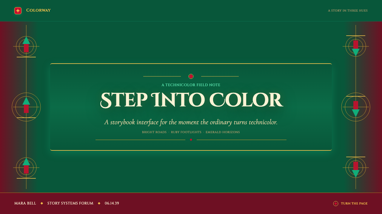
The Wizard of Oz (1939 Technicolor) — FAQ
Is this style simply an Oz-themed palette?
No. The palette is recognizable, but the system depends on a sequence: muted Kansas establishes an ordinary world, emerald creates the stage, ruby and gold introduce spectacle and direction, and Deco framing gives the whole experience ceremony. Using the colors without that relationship may reference the film, but it will not recreate its visual logic.
When should Kansas mode be used?
Use it for beginnings, context, framing, and pauses before a major reveal. It is most useful when the product needs to distinguish orientation from action, or ordinary setup from an aspirational destination. It should remain visibly restrained so that the arrival of Oz colors feels earned rather than arbitrary.
Can the style work for practical dashboards and pricing pages?
Yes, provided its theatrical elements reinforce hierarchy instead of obscuring it. Use the dark emerald field to contain the experience, ruby for consequential actions, gold for progress or featured choices, and framed sections to separate tasks. Dense operational information still needs direct labels, legible states, and calm areas where users can scan without visual competition.
How much ornament is appropriate?
Enough to make the interface feel staged and authored, but not enough to flatten every element into the same level of importance. Reuse a small family of borders, rays, path motifs, and framed fields. Give ornament a job: signal a transition, announce a title, frame a destination, or make a key reward feel special. If it does none of these, it is likely weakening the composition.
What is the biggest visual error to avoid?
Avoid making every moment Oz. The reference is powerful because its saturated world is an arrival after sepia, and because ruby and gold blaze against an emerald stage rather than competing across a uniformly bright surface. Preserve contrast, sequence, and focal hierarchy. The style succeeds when color feels like a curtain rising, not like permanent noise.
Related design styles
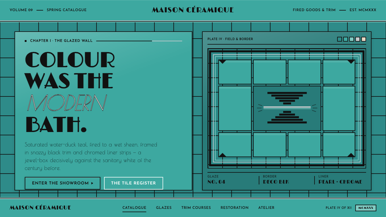 Art Deco Teal BathroomColour was the modern bath. Water-duck teal glaze, snazzy black trim, Limelig…
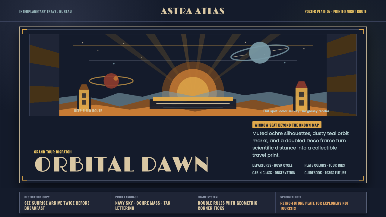 JPL Visions of the FutureSpace travel as print craft. Burnt orange silhouettes and Deco tan type on na…
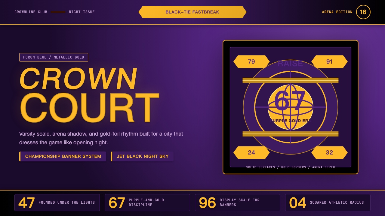 Los Angeles LakersShowtime royalty. Forum Blue and metallic gold turn varsity type into arena g…
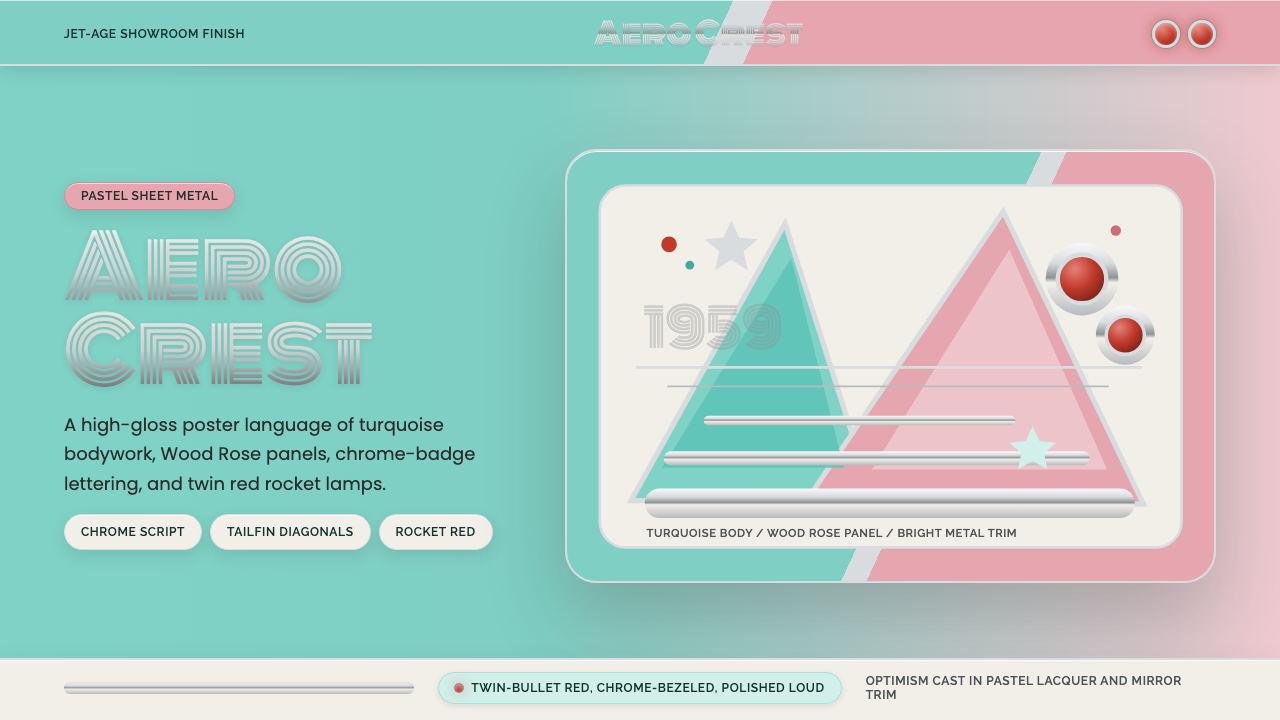 Cadillac TailfinShowroom optimism. Pastel aqua, Wood Rose panels, chrome Monoton, and rocket…
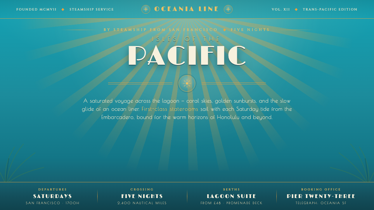 Matson Liner Travel PosterCruise-poster paradise. Lagoon-turquoise ground, coral-and-gold sunbursts, ai…
 Tom and Jerry (1940)Every frame lands a laugh. Scarlet, scalloped gold and a yellow impact burst…