What is Matson Liner Travel Poster?
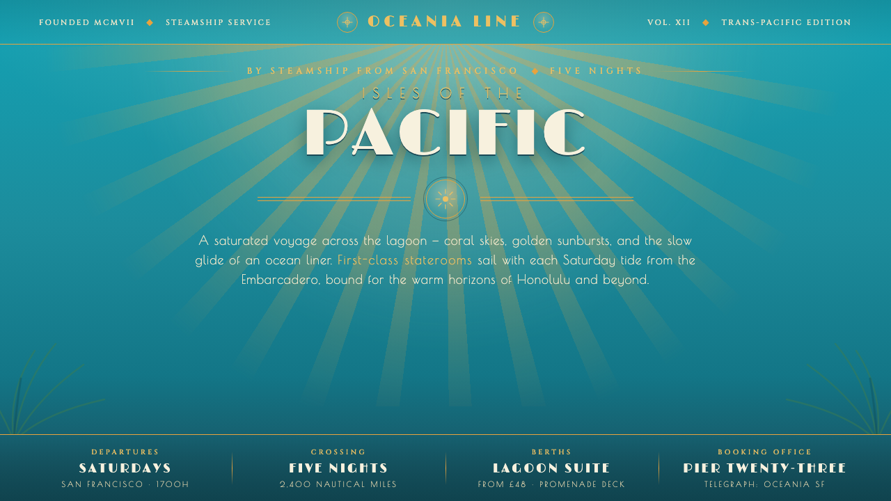
Matson liner posters turned a Pacific crossing into a vision of paradise — lagoon color, radiant skies, and Deco elegance promising glamour beyond the horizon.
Matson Liner Travel Poster in brief
Matson Liner Travel Poster is a visual style derived from the posters and menu covers produced for Matson Lines during its peak campaigns of the 1930s and 1940s. Illustrated by Frank McIntosh and Eugene Savage, these works presented Hawaii as a saturated, airbrushed paradise reached by steamship from San Francisco. Lagoon turquoise, coral skies, palm green, and glowing gold transformed travel advertising into an invitation to enter a more brilliant world.
The style belongs to the meeting point between Art Deco travel graphics and mid-century cruise advertising. Its compositions combine refined display lettering, decorative rules, radiant sunbursts, and smoothly modeled tropical imagery. Unlike restrained modernist systems, it does not remove atmosphere in pursuit of neutrality. It builds desire through atmosphere: warm light, expansive water, lush foliage, and the suggestion that the voyage itself is part of the luxury.
Its most important principle is chromatic immersion. The ground is vivid lagoon turquoise rather than cream or white, allowing coral, gold, and palm green to feel luminous against it. Airbrushed transitions soften the meeting of sea, sky, light, and landscape, while Deco geometry supplies control. Romance and structure remain in balance: the tropical setting provides sensual abundance, and the typography and rules frame that abundance as elegant travel.
Where does Matson Liner Travel Poster come from?
The style emerged from the travel culture surrounding the Matson Navigation Company, which connected San Francisco with Hawaii across the Pacific. Its broad historical frame extends from 1900 to 1950, but the defining campaigns belong to the 1930s and 1940s. Posters and menu covers had to do more than identify a route: they had to make an ocean crossing feel desirable, sophisticated, and inseparable from the destination awaiting the passenger.
Hawaii was therefore presented not as neutral geography but as an intensified visual promise. Lagoon-colored water, coral skies, green palm fronds, and golden radiance formed a compact vocabulary of abundance and warmth. The saturation distinguished the imagined destination from ordinary life, while the smooth airbrushed finish gave natural forms a dreamlike polish. The viewer was invited to anticipate paradise before boarding the steamship.
Art Deco supplied the organizing discipline. Elegant display lettering, fine rules, radiant geometry, and carefully arranged silhouettes prevented the tropical imagery from becoming visually unruly. The approach could accommodate luxuriant color because its framing remained composed. Typography communicated cultivated travel; sunbursts converted sunlight into ornament; strong directional arrangements suggested distance, movement, and arrival without abandoning decorative refinement.
Frank McIntosh and Eugene Savage are the two named illustrators associated with this Matson material. Their work established a durable image of cruise-line Hawaii in which advertising, illustration, and destination fantasy became one system. When translated into contemporary digital design, the historical medium changes, but the central proposition remains: a vivid lagoon field, airbrushed luminosity, Deco structure, and glamorous lettering can make information feel like the beginning of a voyage.
What defines the Matson Liner Travel Poster look?
Lagoon Palette
Lagoon turquoise is the environmental color, not a minor accent. It fills the field and establishes a cool, saturated atmosphere against which coral skies, palm-green foliage, and golden light can glow. Cream and pure white grounds undermine the identity by turning an immersive destination into a conventional printed page. The palette should feel aquatic, sunlit, and confidently artificial rather than muted or naturalistic.
Airbrushed Light
Smooth tonal transitions are essential because they make sky, water, and radiance appear idealized rather than documentary. Color drifts gently through coral warmth, turquoise depth, and golden glow without becoming cloudy. The finish should resemble polished illustration: soft enough to suggest humid atmosphere and distant light, yet controlled enough that major silhouettes remain clear. Abrupt digital banding or indiscriminate blur breaks the illusion.
Deco Titling
Display lettering carries the cultivated glamour of ocean travel. Letterforms should appear elegant, poised, and distinctly decorative without becoming fussy. Titles often act as visual destinations in their own right, balancing the surrounding landscape rather than merely labeling it. Supporting text should remain quieter so the principal name or invitation retains ceremony. Casual typography and utilitarian interface lettering weaken the sense of occasion.
Sunbursts and Rules
Golden sunbursts convert tropical sunlight into a repeatable graphic device. Their rays direct attention toward a title, horizon, shipboard promise, or central illustration while contributing a sense of radiance. Deco rules provide the complementary linear language: they frame headings, divide information, and echo the elegance of a menu cover. Both devices should organize the composition; when scattered as filler, they become costume rather than structure.
Tropical Silhouette
Palm fronds, open water, radiant sky, and distant land establish place through a few unmistakable forms. The imagery is selective rather than botanically descriptive: a sweeping leaf or dark shoreline is valuable because it frames color and depth. Silhouettes should remain legible against the luminous ground, giving the composition foreground, middle distance, and horizon without requiring dense detail. Their role is to stage paradise, not catalogue it.
Voyage Composition
The composition should imply travel even when no vessel is shown. Diagonal movement, receding horizons, layered foliage, and rays converging beyond the foreground lead the eye outward. Text and image cooperate as stages of departure, passage, and anticipated arrival. Generous open areas preserve the scale of sea and sky, while concentrated decorative clusters create moments of luxury. A cramped layout loses the feeling of crossing into another world.
Who shaped Matson Liner Travel Poster?
Frank McIntosh is one of the two named illustrators associated with Matson Lines posters and menu covers from the 1930s and 1940s. Within the supplied history, his importance lies in helping define the saturated image of Hawaii used by the cruise line: lagoon color, tropical foliage, glowing atmosphere, and polished Deco presentation joined as a single persuasive vision of Pacific travel.
Eugene Savage is the other named illustrator central to the Matson visual tradition described here. His association with the company’s posters and menu covers places him within the creation of Hawaii as an airbrushed cruise-line paradise. The enduring value of that work is systemic: destination imagery, decorative typography, saturated color, and ocean-travel glamour reinforce one another rather than operating as separate embellishments.
The Matson Navigation Company provided the commercial and geographic framework for the style. Its Pacific route from San Francisco to Hawaii required advertising that could sell both transportation and fantasy. Through posters and menu covers, the company’s identity became inseparable from a particular imagined destination: brilliant water, coral warmth, green palms, golden radiance, and elegant travel presented as one continuous experience.
How do you use Matson Liner Travel Poster today?
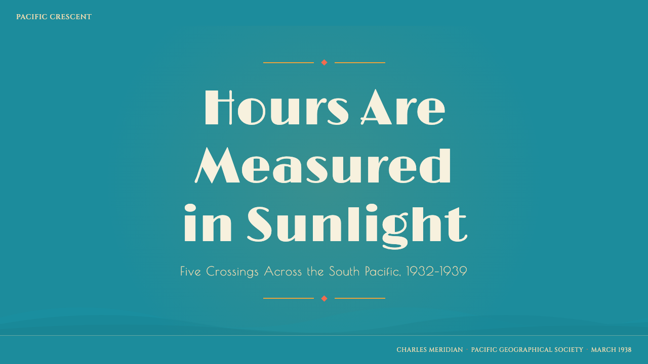
For presentation covers, begin with an uninterrupted lagoon field and one dominant promise: a destination, event, or idea expressed in refined Deco display lettering. Coral light or a golden sunburst can gather attention around the title, while palm silhouettes or a distant horizon frame the edges. Content slides should retain the atmosphere but reduce the spectacle, using decorative rules and restrained color shifts to organize headings, quotations, and supporting text.
Data slides need special discipline because the style’s gradients and tropical imagery can compete with evidence. Keep charts simple and let the palette establish categories through clearly separated lagoon, coral, palm, and gold families. Use a radiant motif to emphasize only the central finding, not every value. Open space around tables and diagrams should evoke sea and sky, while Deco rules can align labels and create a formal reading sequence.
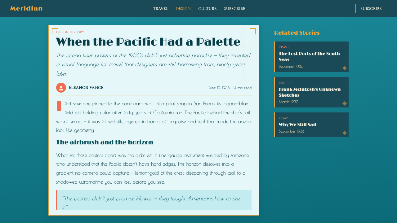
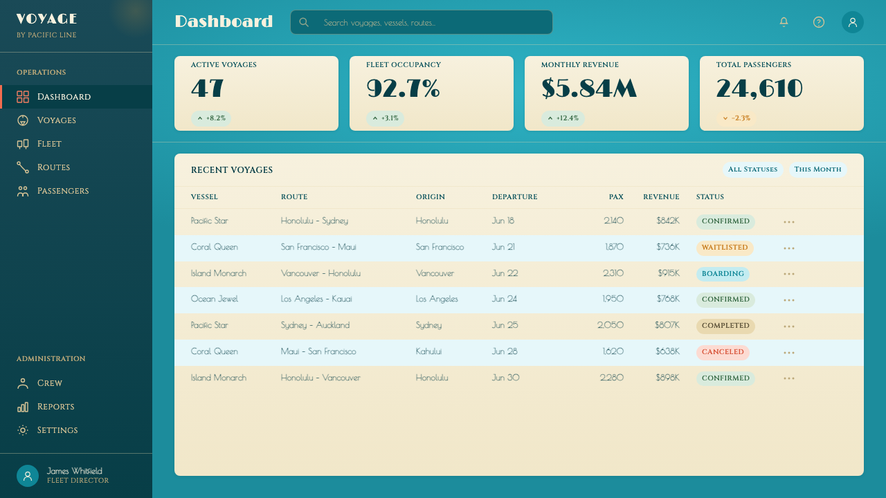
For web dashboards and pricing pages, treat the lagoon ground as the product environment. Panels may emerge through shifts in turquoise depth or through finely framed sections rather than white cards floating above the page. Coral and gold work well for selection, premium emphasis, alerts, or calls to action, while green can support secondary states. Decorative display lettering belongs in page titles and plan names; operational text must remain calm and readable.
Editorial and marketing layouts can use the style more theatrically. An article opener may pair a panoramic tropical field with an elegant title and a narrow block of introductory copy, followed by quieter sections separated with Deco rules. Campaign pages can alternate expansive destination imagery with concentrated statements about escape, arrival, or luxury. Menu-like framing is especially effective for feature lists, itineraries, event programs, and curated collections.
The common mistake is to assemble every recognizable motif at full intensity: turquoise ground, coral sky, green palms, gold rays, ornate title, multiple gradients, and decorative lines all competing at once. The authentic effect depends on hierarchy. Choose one environmental color, one luminous event, one dominant title, and a limited set of silhouettes. If every section behaves like a poster climax, the atmosphere becomes theme-park decoration rather than persuasive travel romance.
Matson Liner Travel Poster — FAQ
Is Matson Liner style simply a tropical version of Art Deco?
Art Deco provides much of the typographic and geometric structure, but the style is defined equally by cruise advertising and airbrushed destination fantasy. Its lagoon ground, coral atmosphere, palm foliage, and golden radiance are not interchangeable decorations placed over a Deco layout; they create an immersive image of Hawaii reached across the Pacific. Remove the voyage and destination logic, and the result may remain Deco but no longer feels specifically Matson.
Can the style use a white or cream background?
Not if the goal is to preserve the defining visual system. The vivid lagoon field is foundational because it makes coral, green, and gold appear suspended within a tropical atmosphere. A pale neutral ground changes the relationship between image and page: the work begins to resemble a conventional vintage print with tropical motifs. Light areas can appear inside illustrations or text zones, but they should not replace the lagoon environment.
How should photography be treated in a Matson-inspired layout?
The source style is grounded in illustrated posters and menu covers, so photography should be made to participate in that illustrated atmosphere. Choose imagery dominated by water, sky, palms, horizon, or warm light, then integrate it through smooth tonal treatment and decisive cropping. The image should feel like part of a polished destination promise rather than a neutral record. Busy documentary scenes and untreated photographic realism usually conflict with the airbrushed romance.
What kinds of products benefit most from this style?
It is strongest when the product can plausibly borrow the emotional language of voyage, escape, hospitality, leisure, or curated luxury. Travel campaigns, destination storytelling, event programs, editorial features, menus, cultural collections, and presentation narratives can all use its sense of anticipated arrival. It is less suitable for dense operational tools that demand visual neutrality throughout. In those contexts, the style works better at entrances, summaries, and premium moments than across every control.
How can the style feel glamorous without becoming kitsch?
Control the number of simultaneous attractions. Let the lagoon field establish atmosphere, choose either a coral sky or a golden burst as the principal luminous event, and reserve the most decorative lettering for one important title. Palm forms and Deco rules should frame the message rather than fill every gap. Glamour comes from confidence, spacing, and a clear promise; kitsch begins when every available symbol of paradise demands equal attention.
Related design styles
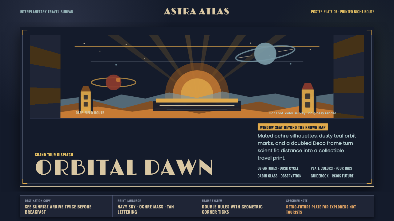 JPL Visions of the FutureSpace travel as print craft. Burnt orange silhouettes and Deco tan type on na…
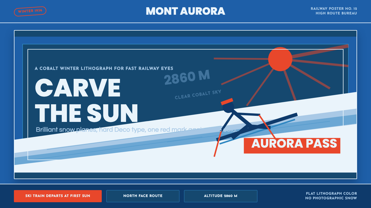 Alpine Ski PosterCold speed sells winter. Cobalt sky, snow planes, sun rays, and one resort-re…
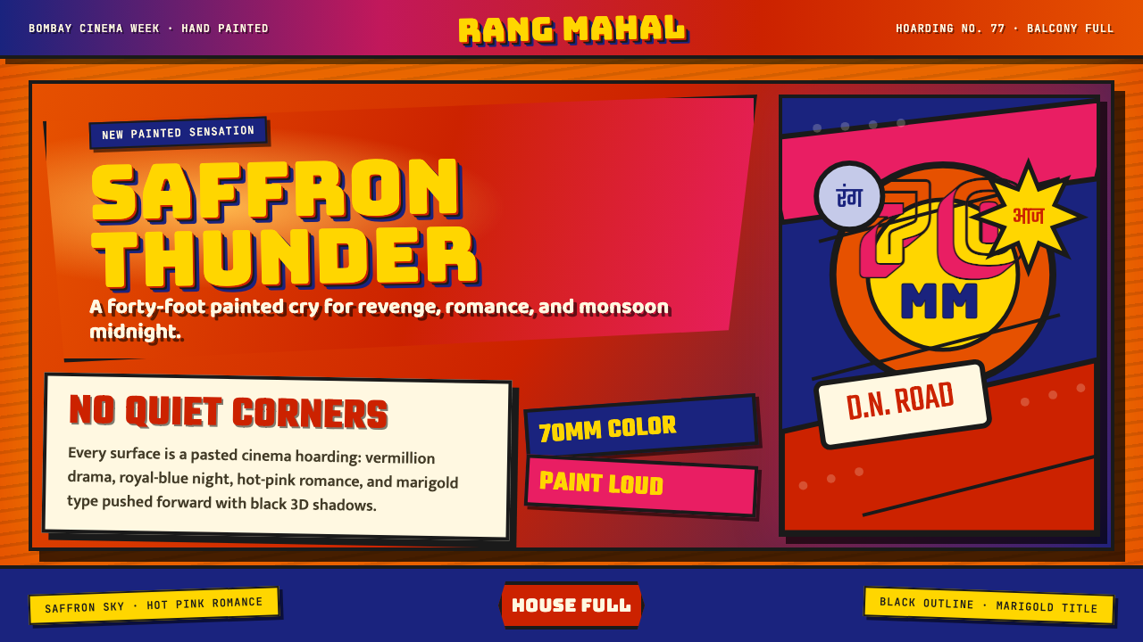 Bollywood Poster Art (1970s)Subtlety is unaffordable. Saffron fields, Bungee shadows, diagonal hoarding d…
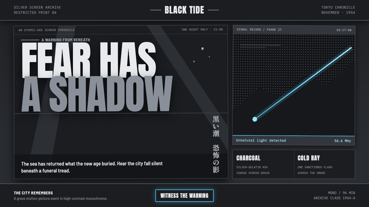 Godzilla (1954 Showa)Fear takes monumental form. Charcoal halftones split under one atomic-blue ra…
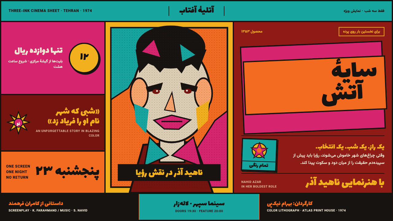 Iranian Film PosterCinema shouts in flat ink. Persian lettering clashes orange, turquoise and ma…
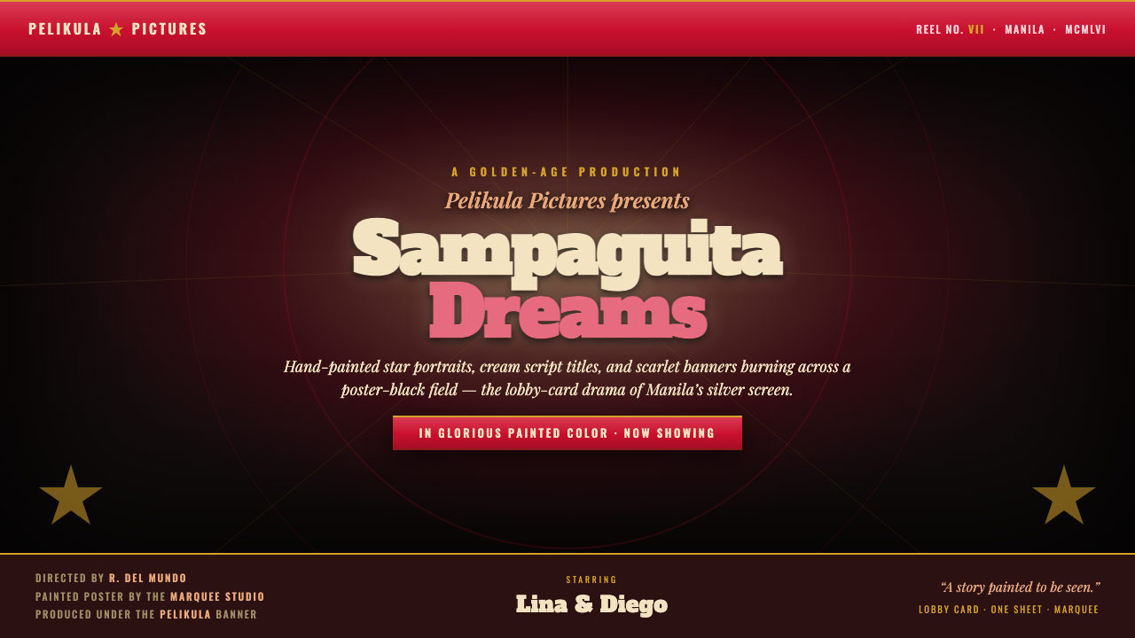 Manila LVN Film PosterLobby-card drama for the screen. Cream slab title on poster-black, scarlet ba…