What is Manila LVN Film Poster?
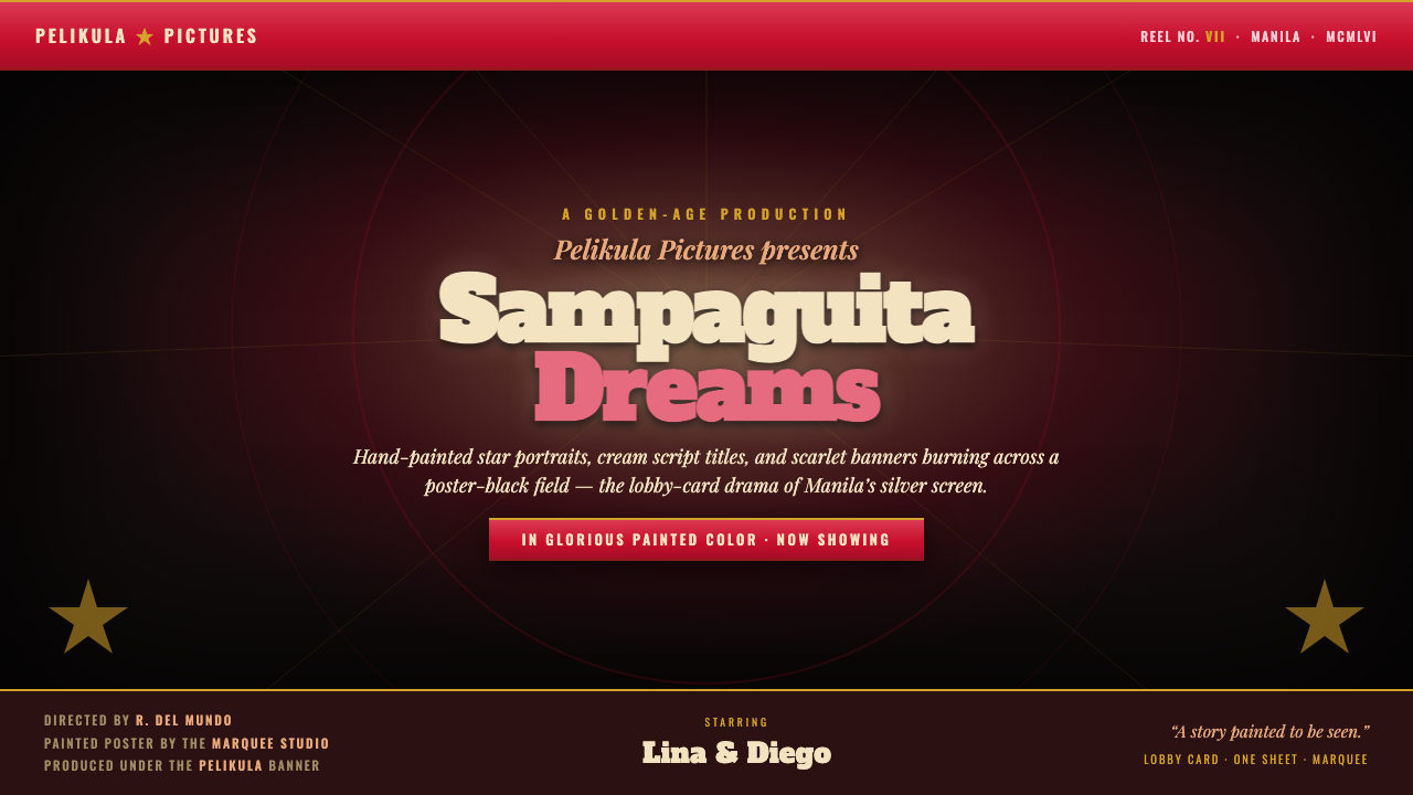
Manila LVN Film Poster turns the movie lobby card into a stage: cream title lettering, scarlet drama, gilded credits, and a star caught in black-field spotlight.
Manila LVN Film Poster in brief
Manila LVN Film Poster draws from the hand-painted and airbrushed promotional art made for Philippine cinema during the postwar core of the country’s Golden Age. Associated with Manila’s studio system and its major houses — LVN, Sampaguita, and Premiere — this visual language was built to make a film feel immediate before an audience had seen a frame. It is not quiet branding. It is an invitation to romance, danger, music, grief, or melodrama, announced at the scale of a cinema wall.
Its signature contrast is theatrical: bold star portraits in warm flesh tones rise from a poster-black field, while a cream script or slab-like title claims a distinct, highly visible voice. Saturated scarlet enters as a banner, burst, underline, or dramatic interruption. Gilt rules and small credit lines add ceremonial polish. The image behaves like a painted scene under stage lights rather than a neutral information surface.
For contemporary work, the style is best understood as a system of narrative emphasis. Darkness creates the auditorium; the portrait supplies emotional stakes; red signals urgency; cream gives the title its spoken presence; gold formalizes names, credits, and separators. Airbrushed softness belongs to faces and light, while type and banners provide the graphic structure. Every element should appear to be selling one charged story.
Where does Manila LVN Film Poster come from?
The style belongs to the Manila studio system during the Golden Age of Philippine cinema, identified here as spanning 1950–1990, with its crucial postwar poster culture concentrated between 1946 and 1960. In that core period, the promotional image was made for the silver screen and its physical surroundings. A poster had to catch the eye in a public, competitive setting and make a film’s promise legible at a glance.
LVN Pictures, associated with Doña Sisang de Leon, forms one of the principal studio references for the style. Sampaguita Pictures and Premiere Productions complete the central trio named in this visual lineage. Their shared context matters more than any single template: a Manila-based production culture in which films were presented through visibly crafted, high-drama imagery rather than restrained, anonymous advertising.
The technical character of the source material is hand-painted and airbrushed cinema poster art. That process explains the visual mixture of controlled graphics and atmospheric rendering. Portraits can feel luminous, modeled, and touched by a spotlight, while banners, title treatments, and credit divisions remain emphatically designed. The hand is visible in the apparent softness of skin, the glow around faces, and the sense that color has been laid onto a surface rather than generated by an impersonal system.
The resulting poster language distills postwar spectacle into a repeatable hierarchy: a black dramatic ground, a commanding title voice, a star image, scarlet pressure, and gilded finishing detail. It is rooted in cinema promotion, not in a generalized retro look. Its visual decisions are most convincing when they preserve that original logic — an audience must recognize the emotional proposition of the film before it reads the smaller information.
What defines the Manila LVN Film Poster look?
Poster-Black Stage
The dark field is not empty background. It functions as an auditorium, curtain, and visual silence around the story. Against it, a face, cream title, scarlet banner, or gold rule gains immediate presence. Keep the black field broad and deliberate so that focal elements appear spotlit rather than merely placed on a dark interface.
Star Portraiture
Portraits carry the emotional center. Render them with warm flesh tones and airbrushed transitions that suggest glamour, light, and proximity to the screen. The portrait should feel idealized but human, with light describing cheek, eye, and expression. Avoid clinical cutout photography; the intended effect is a painted star presence emerging from darkness.
Cream Title Voice
Cream is reserved for the title’s most expressive role, whether the lettering takes a script-like sweep or a heavy, slab-like authority. It should read as performance, not utility: a title that announces the film aloud. Restricting this pale tone to the title and selected high-priority wording preserves its cinematic authority.
Scarlet Drama
Scarlet supplies the poster’s pulse. Use it as a banner, an emphatic plane, a framing interruption, or a concentrated emotional cue. It works best when it challenges the black field and directs attention toward a face or title. Spread indiscriminately across every component, it loses the urgency that makes it feel like a dramatic signal.
Gilt Credits and Rules
Gold-toned details give the information layer ceremony. Fine rules can separate names, billing, or narrative zones without becoming ornamental clutter, while small credits feel formal rather than invisible. The effect should recall gilt finishing on a theatrical poster: luminous, precise, and subordinate to title and portrait.
Airbrushed Light
Softly modeled glow belongs to faces, fabric, and cinematic atmosphere. It implies painted illumination rather than a neutral digital gradient. Pair these feathered transitions with crisp title edges, banners, and rules so the composition retains both the hand-rendered glamour of poster art and the force of graphic signage.
Who shaped Manila LVN Film Poster?
LVN Pictures is one of the principal Manila studio references for this poster language. Its inclusion anchors the style in Philippine cinema promotion rather than in a generic vintage-film category. The LVN name supplies the article’s central association with hand-painted, airbrushed, story-selling theatrical imagery.
Doña Sisang de Leon is named in connection with LVN Pictures. Within this style’s lineage, that association locates the visual system in a specific studio culture rather than an abstract mood board. It reinforces that the poster’s glamour, hierarchy, and narrative urgency emerged from film promotion.
Sampaguita Pictures is one of the major studios identified alongside LVN in Manila’s Golden-Age poster culture. Its presence broadens the reference from a single studio name to a shared studio-system language: emphatic title treatment, star-centered imagery, and dramatic contrast designed for public display.
Premiere Productions completes the named group of Manila studio references. Together with LVN and Sampaguita, it represents the production context from which this theatrical poster sensibility is drawn — one in which promotional art gave faces, names, color, and story equal commercial force.
The studio poster painters are the essential makers behind the style’s hand-rendered quality. Their painting and airbrushing join portraiture to typography, turning promotion into a composed visual performance. Any contemporary adaptation should respect that authorship by preserving visible light, material presence, and deliberate narrative focus.
How do you use Manila LVN Film Poster today?
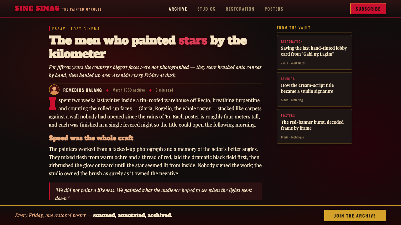
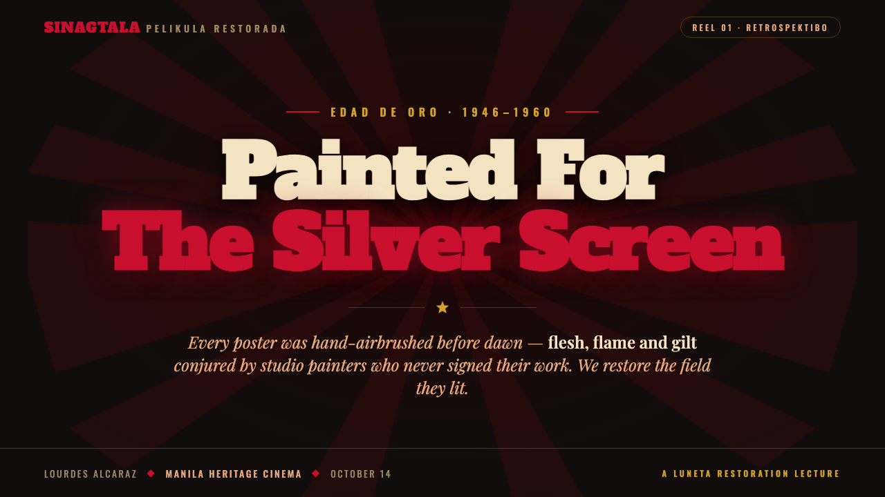
For presentation covers, treat the slide as a miniature theatrical poster. Set a single title in cream against a broad black field, introduce one star-like portrait or dramatic subject image, and let a scarlet banner carry a short premise, speaker line, or category. On content slides, retain the same dark stage but make hierarchy explicit: cream for the principal heading, gold-toned rules for separation, and restrained warm light around the image rather than around every block of text.
Data slides require more discipline than a promotional cover. Use the poster system to frame the information, not to obscure it: a cream title establishes the topic, a scarlet emphasis identifies the central comparison, and gilt dividers organize supporting labels. Charts should remain legible as charts, with the black ground creating contrast and the red reserved for the point the audience must remember. A small portrait or airbrushed vignette can introduce a chapter, but should not compete with the data.
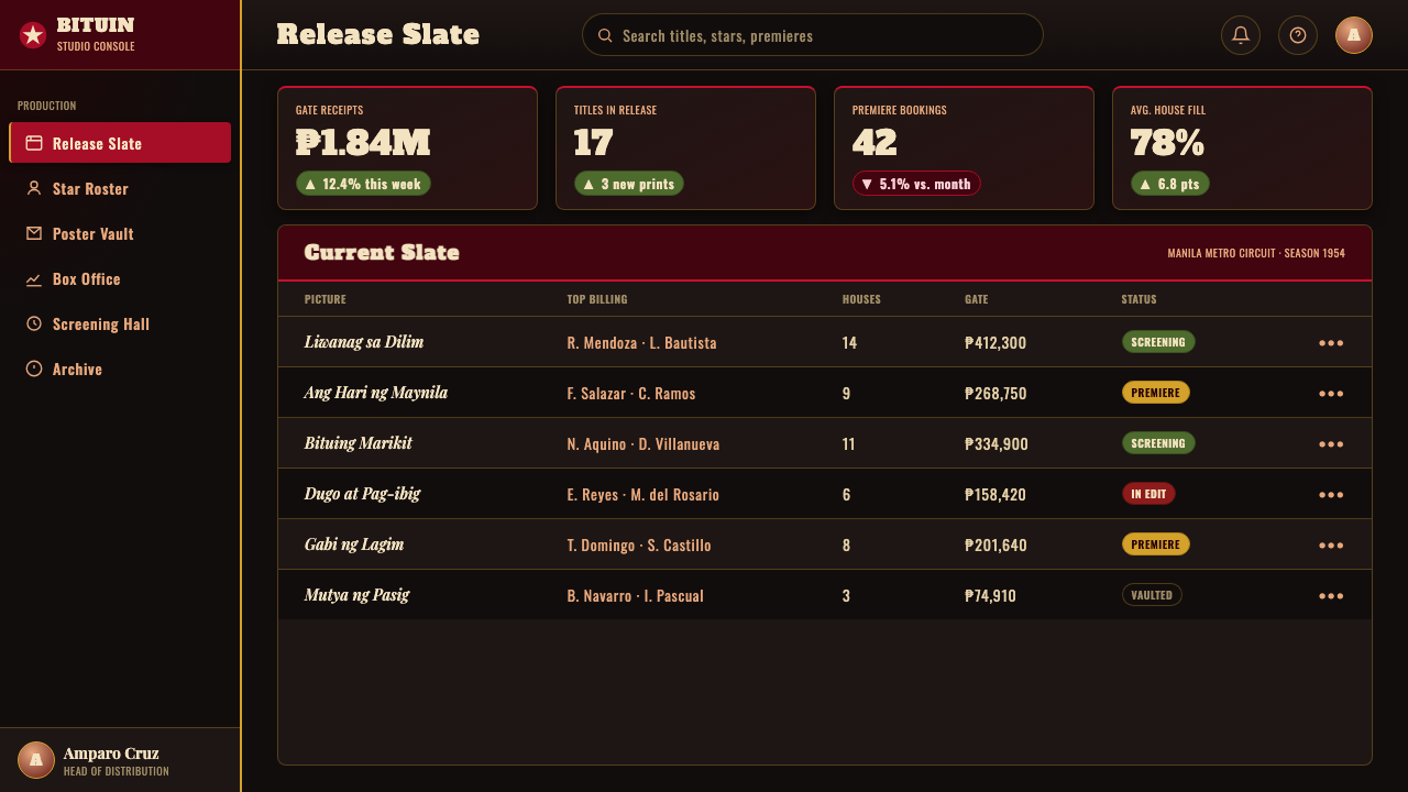
For web interfaces, this language is especially effective for dashboards, campaign hubs, media catalogs, and pricing pages that need cinematic hierarchy. The dark field can unify the product shell, while cream headings make major destinations feel announced rather than merely labeled. Scarlet works for active states, featured offers, urgent notices, or a selected tier; gold rules can divide dense information without the sterile feeling of ordinary interface borders. Keep functional controls clear and relatively calm so the theatrical treatment remains concentrated at moments of decision.
Editorial and marketing pages can use the style’s lobby-card logic to turn an article, launch page, or product story into a sequence of scenes. Open with a portrait-led hero and title treatment, move into black-ground sections divided by gilt rules, and place scarlet banners only where a narrative turn, testimonial, or call to action needs force. Use cream script sparingly for the title voice; body copy should favor clarity over imitation. The page should feel composed, not costumed.
The common mistake is reducing Manila LVN Film Poster to black, red, and retro lettering. That produces a costume without the cinema. The authentic logic is hierarchical and painterly: the title speaks, the portrait carries emotion, red creates pressure, gold handles ceremony, and darkness supplies the stage. Do not give every card a glowing portrait, every label a script treatment, or every section a scarlet banner. Reserve spectacle for the story’s decisive moments.
Manila LVN Film Poster — FAQ
Is Manila LVN Film Poster simply a vintage cinema style?
No. Its reference is specifically the hand-painted and airbrushed poster culture associated with Manila’s Golden-Age studio system, including LVN, Sampaguita, and Premiere. The useful distinction is narrative purpose: the style was made to sell a particular screen story through star portraiture, title voice, theatrical contrast, and crafted detail. Generic retro effects alone do not reproduce that structure.
How should cream script and heavy title lettering be used together?
Give them distinct jobs. Cream script is most persuasive when it supplies flourish, romance, or vocal personality to the title. Heavier lettering can provide the title’s firm, readable mass or support a secondary line. They should feel like parts of one announced film title, not like unrelated display fonts competing for attention. The black field and the scarcity of pale lettering help unify them.
Can this style support information-heavy dashboards?
Yes, if the cinematic layer establishes hierarchy instead of occupying every surface. Use the poster treatment for section identity, major headings, selected states, and important alerts. Let dense tables, filters, labels, and charts remain direct and calm. A dashboard succeeds when a user can scan and act; the Manila poster influence should make priorities memorable, not turn routine data into decoration.
Why are scarlet banners more effective than broad red decoration?
A banner has direction and purpose. It can interrupt a black field, carry a phrase, frame a face, or mark a turning point in the composition. Broad red decoration often becomes atmosphere without hierarchy. In this poster language, scarlet is strongest when it behaves as a dramatic announcement whose location and wording the audience can immediately understand.
When does Manila LVN Film Poster become the wrong choice?
It is a poor fit when a product needs to feel neutral, subdued, or almost invisible. Its strengths are emotional declaration, star focus, and high-contrast narrative framing. Use another approach for environments where the primary value is quiet utility or where dramatic portraiture would distract from sensitive, routine, or highly technical work. The style earns its intensity by having a story to announce.
Related design styles
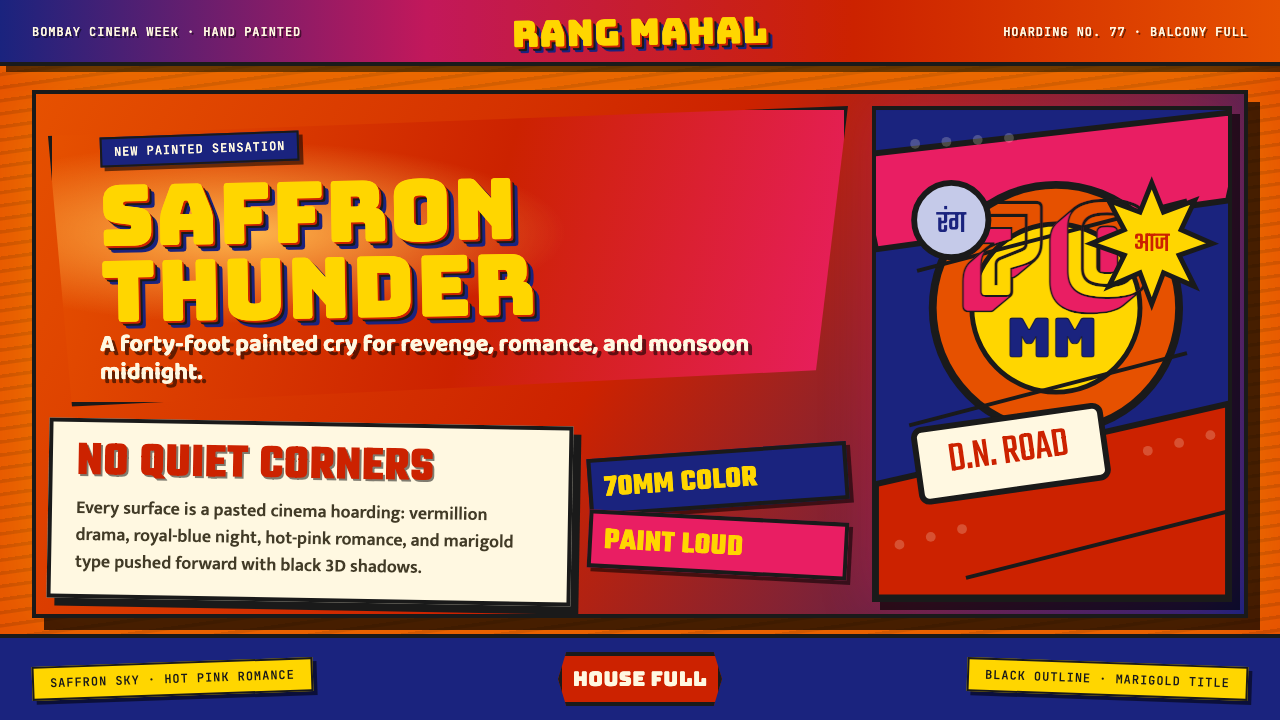 Bollywood Poster Art (1970s)Subtlety is unaffordable. Saffron fields, Bungee shadows, diagonal hoarding d…
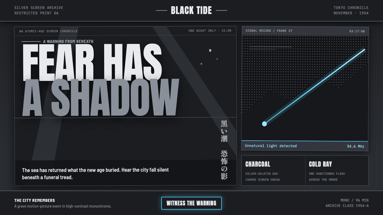 Godzilla (1954 Showa)Fear takes monumental form. Charcoal halftones split under one atomic-blue ra…
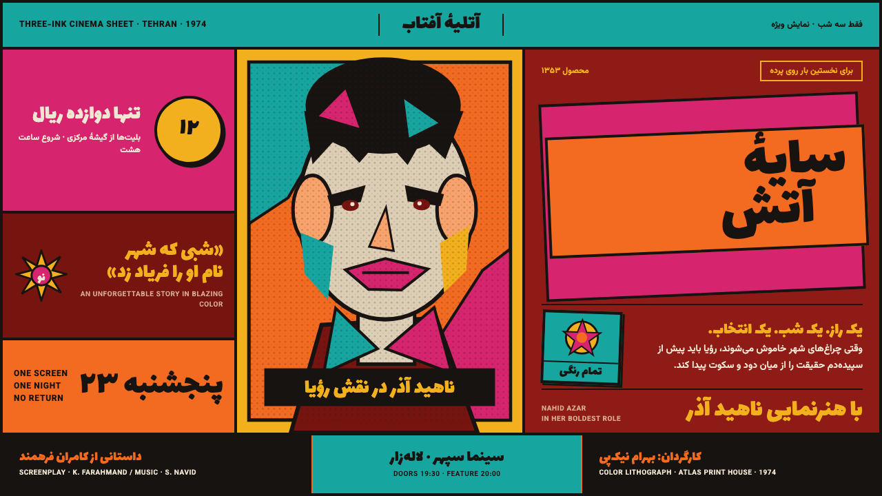 Iranian Film PosterCinema shouts in flat ink. Persian lettering clashes orange, turquoise and ma…
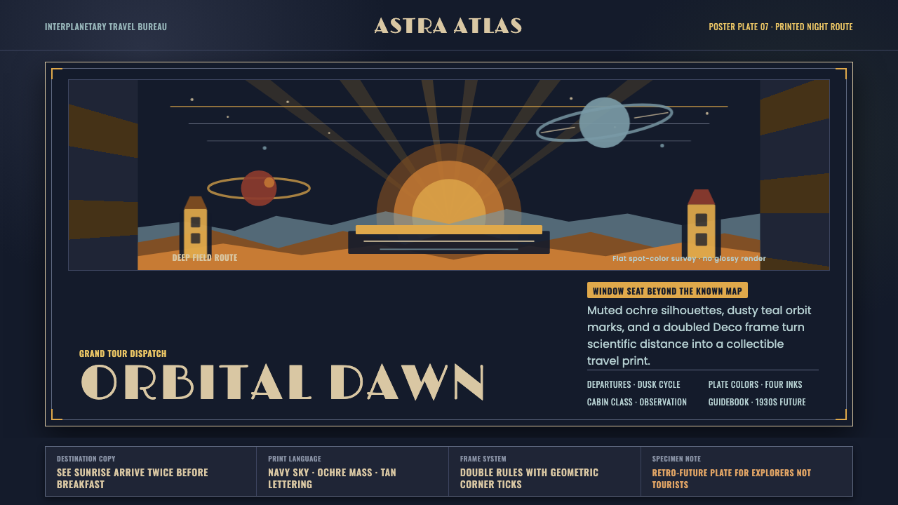 JPL Visions of the FutureSpace travel as print craft. Burnt orange silhouettes and Deco tan type on na…
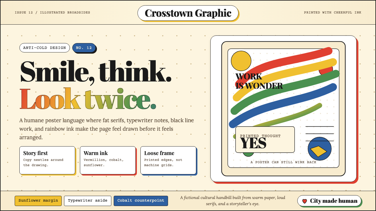 Milton Glaser / Push PinWarm counter-Swiss joy. Vermillion, cobalt and sunflower arcs orbit fat serif…
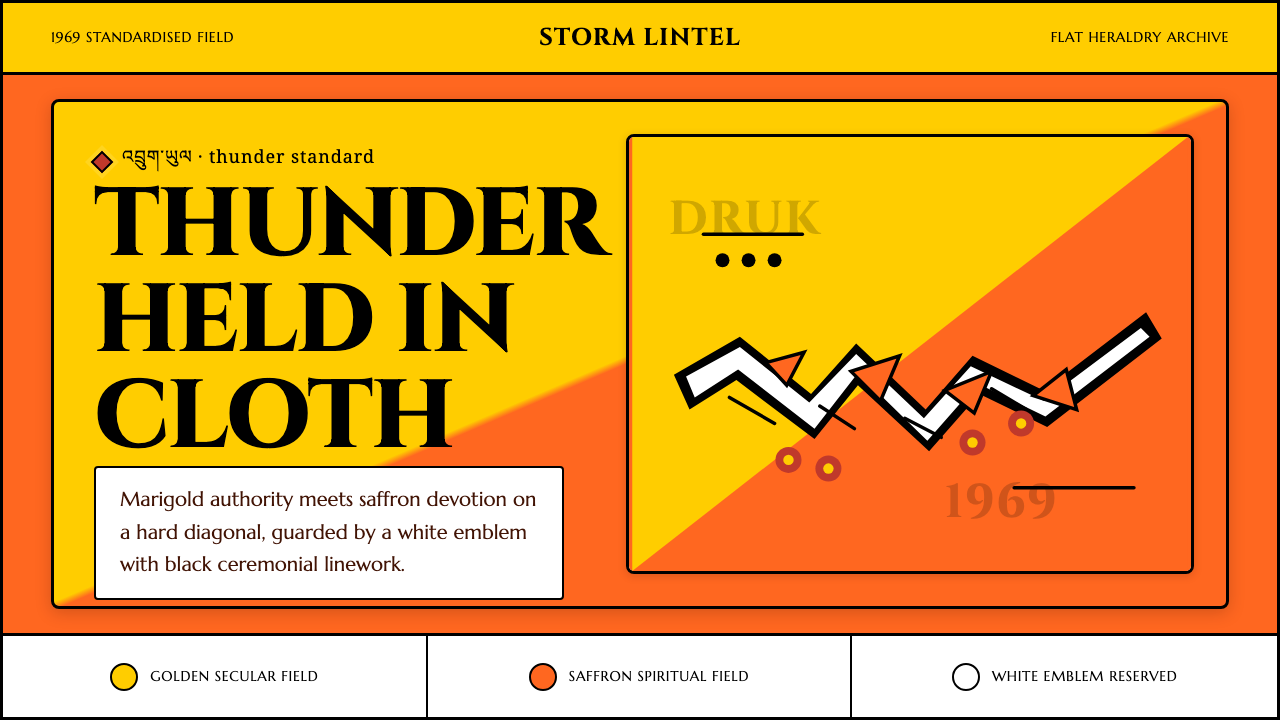 Bhutan Thunder Dragon FlagHeraldry hits like thunder. Marigold and saffron split hard around a white em…