What is Iranian Film Poster?
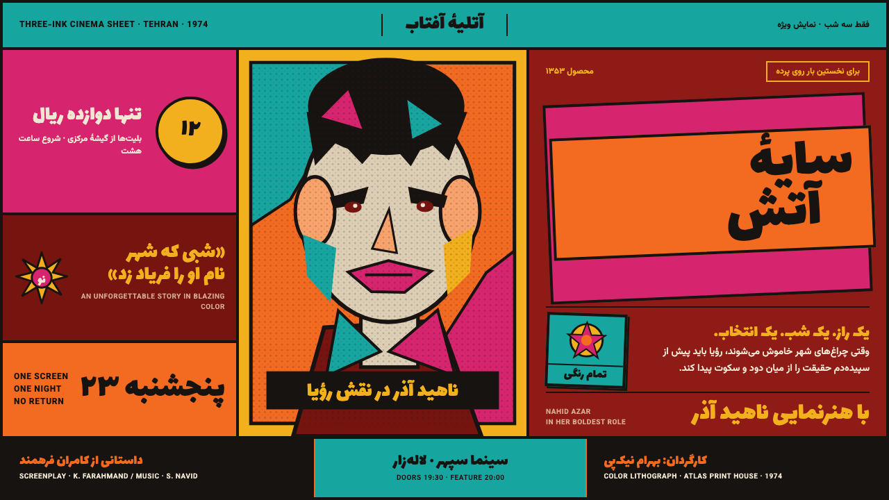
Cinema shouts in flat ink. Hand-drawn Persian lettering forces orange, turquoise, and magenta to collide on a red ground.
Iranian Film Poster in brief
The Iranian film poster of this era was a workshop object before it was a design object: a gouache painting of the film's star went to a litho house, the title was drawn by hand rather than set in type — because Persian movable type of the period was context-sensitive, changing shape depending on its neighboring letters, and unreliable at display sizes — and the finished sheet came back printed in flat, saturated ink with no gradient anywhere between two adjacent colors. Orange sits directly against turquoise, magenta lays directly over red, and every color boundary is a hard edge rather than a blend.
The overwhelming majority of these posters — reportedly more than ninety-five percent — are organized around a single device: one star's head, scaled up until it breaks the frame, paired with the name that actually sold the ticket. Everything else in the composition — diagonal bands carrying the title, small inset vignettes showing key action beats, credits crammed together at the foot of the sheet — crowds in around that central face rather than competing with it for scale.
The reading direction is right to left, and the hand-lettered Persian title leads; any Latin-alphabet text present is secondary, positioned to support the Persian rather than to balance it. Because these posters were commercial products made quickly for a fast-turnover cinema district, imperfections of the print process — registration that drifts slightly off, a visible halftone dot pattern, gouache brushwork left visible on the printed sheet — are part of the object's authentic texture rather than flaws to be corrected.
Where does Iranian Film Poster come from?
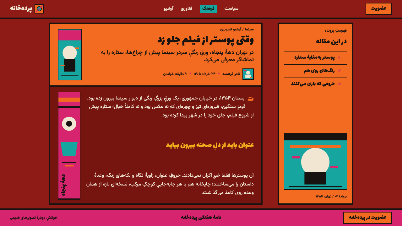
This visual system belongs to the cinema district of Tehran during the years 1950 to 1979, peaking through the 1960s and 1970s in the commercial film industry known as Filmfarsi. Cinema in Iran during this period ran on paper: posters were produced by district printers and poster ateliers working at commercial speed to keep pace with a fast-turnover exhibition schedule, which shaped the entire production chain toward hand work that could be executed quickly rather than toward a slower, more deliberate design process.
The reliance on hand-drawn titles rather than set type was a practical necessity as much as a stylistic choice: Persian movable type available at the time was context-sensitive, meaning individual letterforms changed shape depending on their position within a word, and this made large-scale, high-impact display lettering unreliable when set mechanically. Hand lettering solved the problem directly, and in doing so became a defining visual signature of the whole poster tradition rather than a compromise.
Morteza Momayez worked within and helped shape Iranian graphic design and poster culture during this period, part of a generation of designers and illustrators whose work bridged commercial cinema promotion and a broader Iranian visual arts identity. Farshid Mesghali, Muhsin Davallu, and Mas'ud Bihnam worked within the same design culture, contributing to a poster tradition that operated at the intersection of commercial necessity, popular film promotion, and a distinctly Iranian graphic sensibility.
The period also overlapped with the Iranian New Wave, a more art-house-oriented current in Iranian cinema running alongside commercial Filmfarsi output, meaning the same design and printing infrastructure that produced star-driven commercial posters existed within a broader film culture that included more formally ambitious cinema. The poster tradition documented here is specifically the commercial, star-oriented Filmfarsi branch rather than the New Wave's separate visual language.
What defines the Iranian Film Poster look?
Flat, Clashing Color
Color is applied in flat, opaque, saturated fields with no gradient at any color boundary. Combinations that would be considered clashing in a more restrained design tradition — orange against turquoise, magenta over red — are used deliberately and without hesitation, because the poster's job was to be seen from across a crowded street, not to be tasteful up close.
Hand-Drawn Persian Title
The film's title is always hand-lettered rather than set in type, a direct response to Persian movable type's unreliability at large display sizes. This hand-drawn quality gives every title a slightly irregular, expressive character distinct from any mechanically set typeface, and the title consistently leads the composition, reading right to left.
Star Head Dominance
One human head, usually the star's, is scaled up dramatically and allowed to break the frame of the composition — a device present in the overwhelming majority of surviving posters. This single element organizes everything else in the layout, which crowds in around it rather than competing with it in scale.
Diagonal Title Bands
Titles and key credits are frequently carried on diagonal bands of flat color cutting across the composition, rather than sitting in a horizontal block. This diagonal energy reinforces the sense of urgency and spectacle the poster is meant to project.
Inset Action Vignettes
Small secondary illustrations depicting key action beats from the film are inset around the dominant star head, giving the poster a narrative, almost comic-panel quality alongside its single-figure focal point. These vignettes are rendered in the same flat, hard-edged color language as the rest of the composition.
Crowded, Jammed Credits
Production and cast credits are packed tightly at the foot of the sheet, set small and dense in contrast to the enormous scale of the title and star image above. This contrast in scale — a handful of huge elements against a dense strip of small text — is itself a structural feature of the layout, not an afterthought.
Who shaped Iranian Film Poster?
Momayez worked within Iranian graphic design and poster culture during this period, contributing to a body of visual work that bridged commercial cinema promotion and a broader Iranian design identity. His generation's output helped establish the hand-lettered, flat-color visual grammar that defined the era's commercial film posters.
Mesghali worked within the same Iranian design culture that produced this poster tradition, part of a generation of illustrators and designers whose commercial and cultural work operated within the same flat-color, hand-lettered visual language documented here.
Davallu was part of the design and illustration culture surrounding Tehran's cinema district during this period, working within the commercial poster tradition that produced the star-oriented, hand-lettered, flat-color compositions characteristic of Filmfarsi cinema promotion.
Bihnam worked within the same commercial poster ateliers and design culture that produced Tehran cinema posters during this period, contributing to a tradition built on fast production, hand-drawn lettering, and bold, unblended color.
How do you use Iranian Film Poster today?
This system's core lesson is confident visual excess used with structural discipline: color that would read as clashing in a restrained palette becomes legible and effective when every boundary is a hard edge and one dominant figure organizes the entire hierarchy. Applying it well means embracing that boldness fully rather than softening it toward good taste, which defeats the purpose.
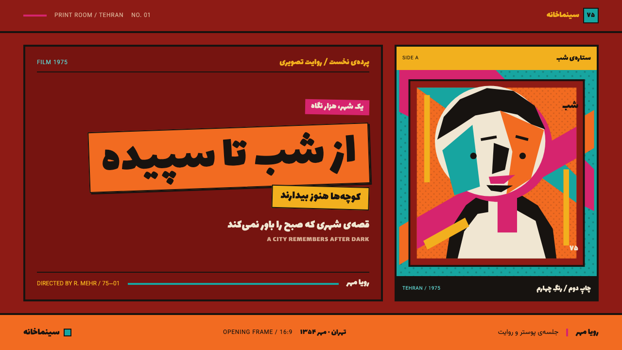
For presentation slides, this system suits a cover slide built around one dominant image or figure scaled up until it breaks the frame, surrounded by flat, saturated color blocks carrying the title in bold, expressive lettering — ideal for entertainment, event, or culture-forward content that wants energy over restraint. Content slides should preserve the scale contrast: one or two huge organizing elements against a dense, small-scale strip of supporting information, echoing the poster's enormous star head against its crowded credit block, rather than evenly distributing emphasis across every element.
For web interfaces, the flat, hard-edged color-blocking translates well to bold marketing or event landing pages that want to announce themselves loudly — large, saturated color fields used as section backgrounds, with no gradient transitions between them, and a single dominant hero image or figure breaking out of its container rather than sitting neatly inside it. This is a poor match for dashboards or any interface requiring calm, sustained attention, where the visual intensity would quickly become fatiguing.
In editorial and marketing contexts, hand-lettered or hand-lettering-inspired display type paired with flat, unblended color blocks can give a piece genuine energy and specificity, particularly for entertainment, music, or culture content — the key is committing to a small number of saturated colors used at full strength rather than a broader, more muted palette, and organizing the layout around one dominant focal element rather than several competing ones.
The most common mistake is applying this palette's colors at reduced saturation or with soft gradients in an attempt to make it more 'usable' or contemporary, which erases the exact quality — flat, hard, unapologetic color collision — that makes the system work. A second common mistake is distributing visual weight evenly across a composition instead of committing to one overwhelming focal figure, which is what allows the crowded secondary elements around it to read as energetic rather than cluttered.
Iranian Film Poster — FAQ
Why is the title always hand-lettered instead of set in a matching printed typeface?
Because Persian movable type available during this period was context-sensitive — individual letterforms changed shape depending on their neighbors within a word — which made it unreliable at the large, high-impact sizes a poster title needed. Hand lettering solved this practical problem directly, and the resulting expressive, slightly irregular titles became one of the tradition's defining visual signatures rather than a stopgap measure.
Why do the colors clash so directly instead of being harmonized?
Because these posters were made to be seen from across a crowded street in a competitive commercial cinema district, where standing out mattered more than achieving a harmonious, tasteful palette. Flat, unblended color used at full saturation, with hard edges at every boundary, produces exactly the kind of high-contrast visibility that a more restrained, harmonized palette would not.
Is the star's head always the single largest element in the composition?
In the overwhelming majority of surviving posters from this tradition — reportedly more than ninety-five percent — yes: a single head, scaled up until it breaks the frame, organizes the entire layout, with the title, credits, and any secondary vignettes arranged around it rather than competing with it in scale. This star-oriented structure is close to a defining rule of the genre rather than an occasional choice.
Should print imperfections like slight registration drift or visible halftone dots be cleaned up in a contemporary application?
Cleaning them up entirely removes part of what makes the system feel authentic rather than like a clean digital pastiche. These posters were fast, commercial print products, and slight registration drift, visible halftone patterning, and traces of gouache brushwork are honest evidence of that production process — a contemporary application aiming for the genre's real texture should reference these qualities deliberately rather than polishing them away.
Does this style only work for entertainment or film-related content?
It is most naturally suited to entertainment, event, music, and culture-forward content where energy and immediate visual impact are the priority, since the system's whole grammar — flat clashing color, one dominant scaled-up figure, dense crowded secondary information — is built for grabbing attention fast rather than for calm, sustained reading. It transfers poorly to contexts that need to project trust, precision, or restraint, such as financial or enterprise software interfaces.
Related design styles
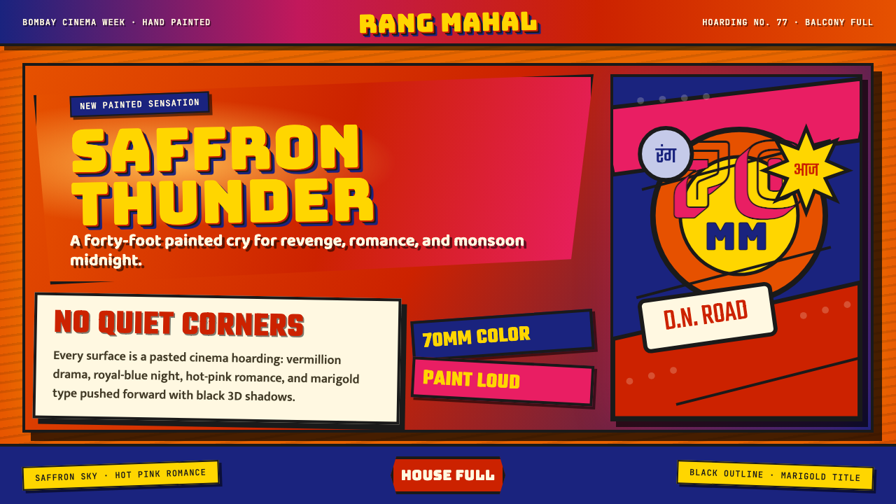 Bollywood Poster Art (1970s)Subtlety is unaffordable. Saffron fields, Bungee shadows, diagonal hoarding d…
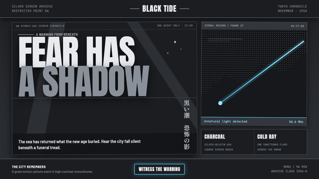 Godzilla (1954 Showa)Fear takes monumental form. Charcoal halftones split under one atomic-blue ra…
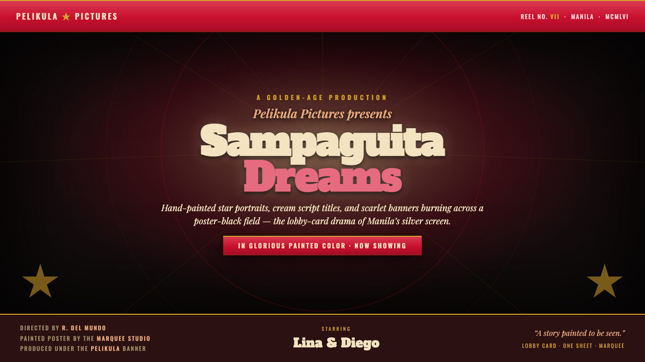 Manila LVN Film PosterLobby-card drama for the screen. Cream slab title on poster-black, scarlet ba…
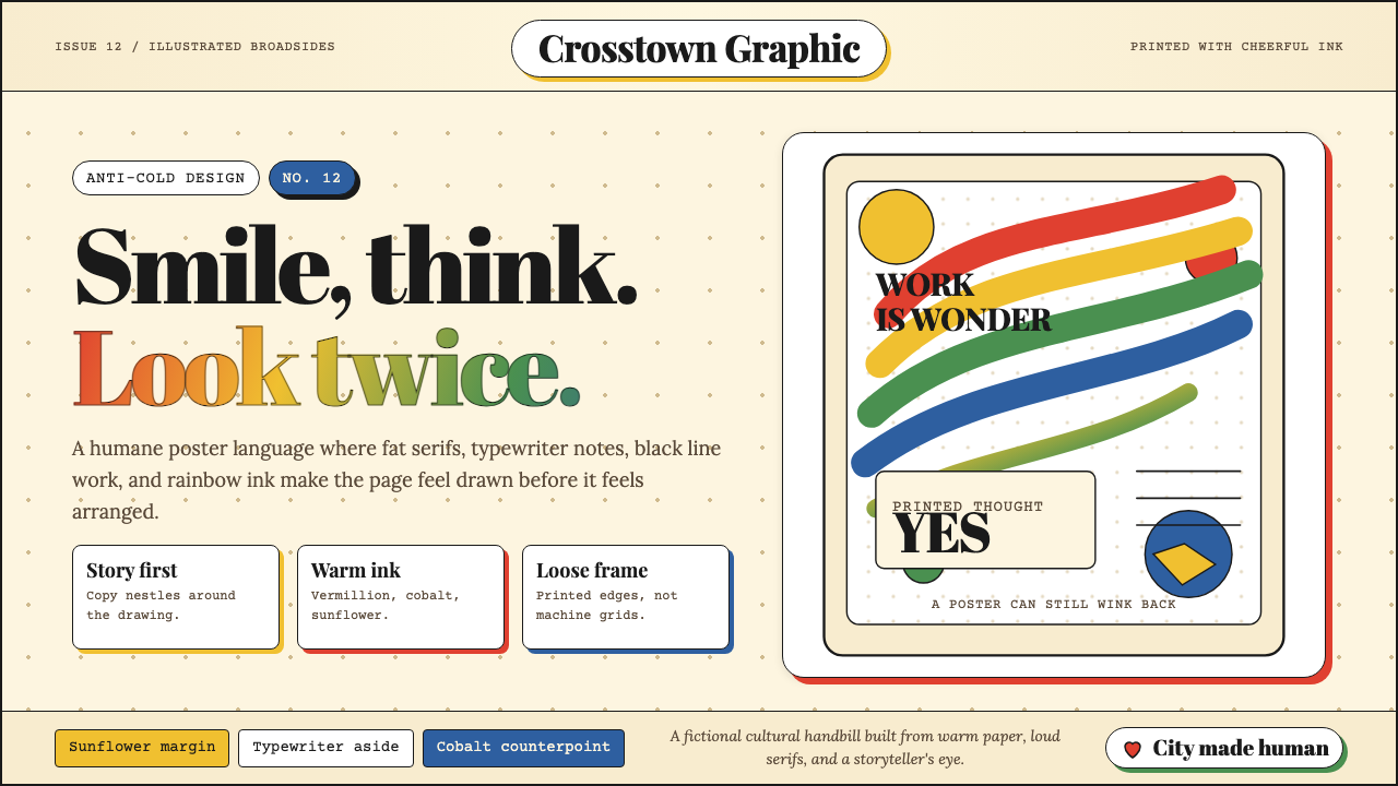 Milton Glaser / Push PinWarm counter-Swiss joy. Vermillion, cobalt and sunflower arcs orbit fat serif…
 Egyptian Political PosterState power shouts. Red poster grids, black keylines, kufic type, gold-green…
 Bhutan Thunder Dragon FlagHeraldry hits like thunder. Marigold and saffron split hard around a white em…