What is Godzilla (1954 Showa)?
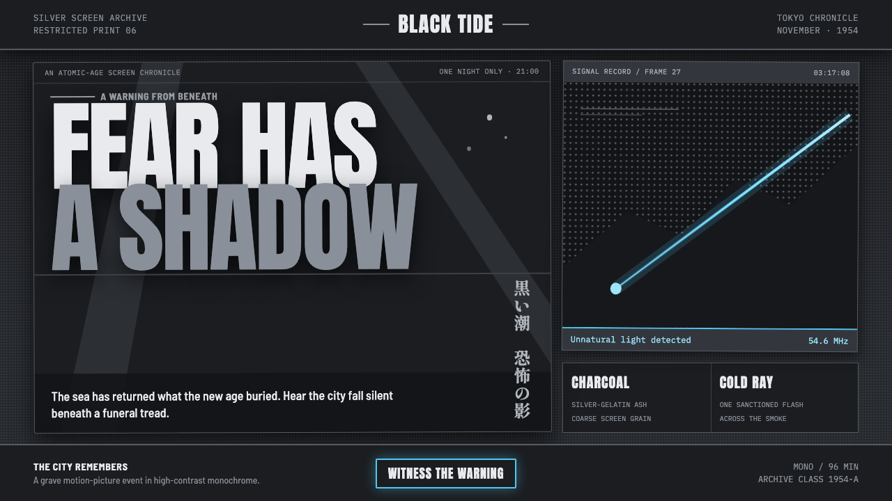
Godzilla (1954 Showa) turns postwar dread into a cinematic interface: charcoal smoke, halftone panic, and one atomic-blue rupture in the dark.
Godzilla (1954 Showa) in brief
Godzilla (1954 Showa) is a dark visual language derived from Toho’s original 1954 Gojira: black-and-white terror reconstructed for contemporary screens. Its world is built from charcoal, ash, silver-gelatin gray, smoke, and burning skyline silhouettes. Rather than presenting darkness as sleek luxury, it makes darkness feel damaged, unstable, and documentary-like — as though every surface has survived heat, rain, projection light, and public fear.
The defining visual device is restraint. Nearly everything remains monochrome: deep charcoal fields, pale ash highlights, dense black type, and halftone dot patterns that suggest old screen printing and degraded cinema stills. Against that limited world, a single electric ray-blue accent becomes unnaturally potent. It reads less as decoration than as an intrusion: the visible trace of atomic force cutting through smoke.
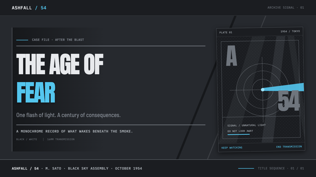
Typography carries the same pressure as the image-making. Heavy, brushed, hand-set poster lettering crowds the composition, often feeling oversized, urgent, and physically stamped into the page. Searchlight beams, monster silhouettes, torn-looking contrast, and grainy fields create the sense of a rain-warped one-sheet pinned in a 1954 cinema lobby. The result is not nostalgic polish; it is monumental fear rendered as print, shadow, and glare.
Where does Godzilla (1954 Showa) come from?
The style begins with Toho’s original Gojira, released on November 3, 1954 in Tokyo. Its stated context is Japanese tokusatsu, postwar antinuclear cinema, and Showa monster poster art — three forces that make the visual language inseparable from spectacle, destruction, and public memory. The 1954 reference point matters because the style is not a generic monster-movie costume: it is tied to a specific black-and-white image of fear taking monumental form.
The Showa kaiju cycle continued through 1975, giving the theme an era rather than a single frozen frame. Yet its interface vocabulary returns insistently to the original premise: a towering monster held in silhouette, searchlights probing smoke, and Tokyo rendered as a threatened or burning horizon. This establishes a visual drama of scale. Human information becomes small and compressed; the event around it becomes immense.
Ishirō Honda, Eiji Tsuburaya, Tomoyuki Tanaka, and Akira Ifukube are the key figures named in the source tradition for this theme. Their presence anchors the style in the Toho production world rather than in later generic creature imagery. In adaptation, that provenance calls for a serious, severe tone: image fields should suggest consequence and alarm, while the lone blue ray retains the force of an abnormal event rather than becoming a routine brand accent.
What defines the Godzilla (1954 Showa) look?
Charcoal Monochrome
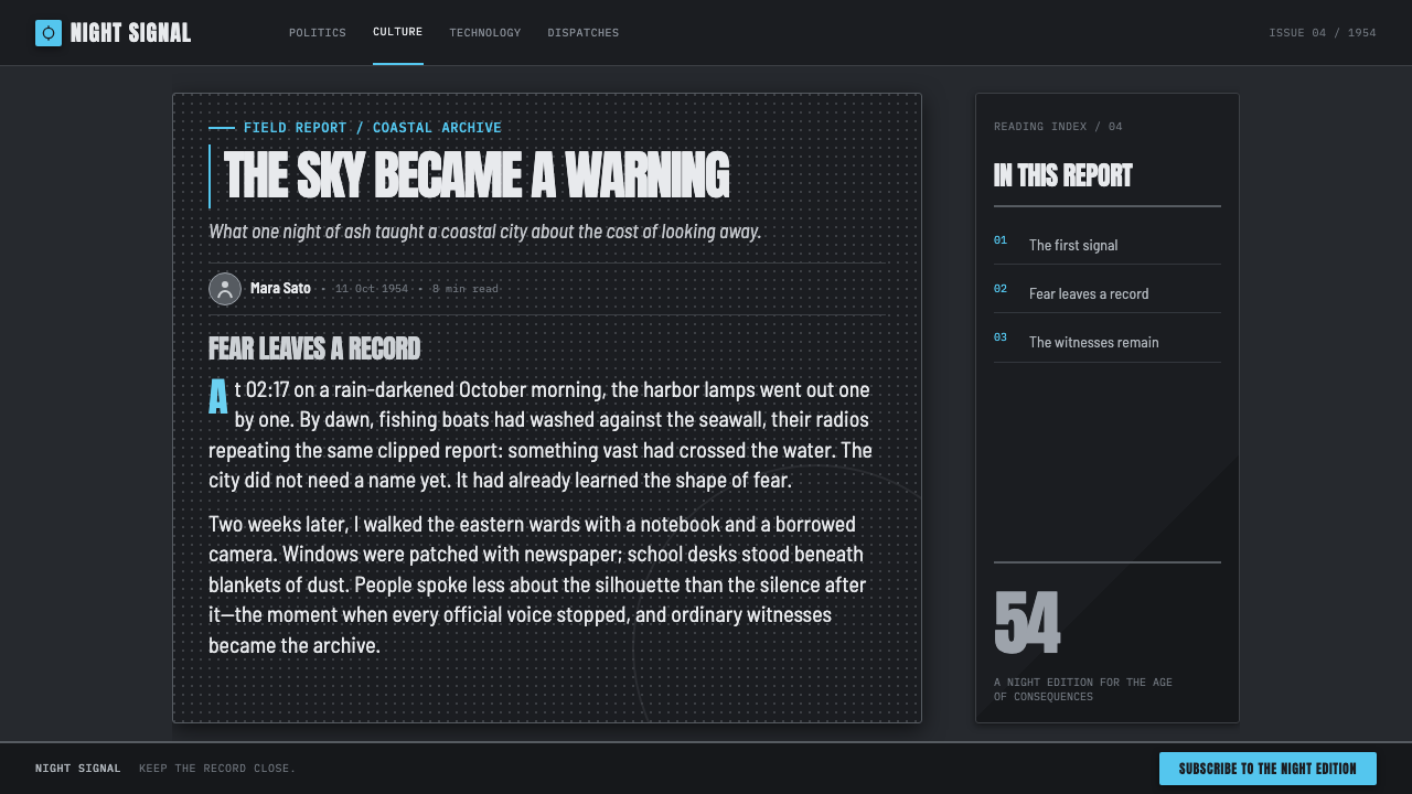
The palette lives in charcoal, ash, black, and high-contrast silver-gelatin gray. Dark fields should feel smoky rather than perfectly uniform, while pale areas behave like ash, searchlight glare, or damaged photographic paper. The purpose of grayscale is emotional compression: it keeps the page inside a world where visibility is fragile and every bright area feels exposed.
Atomic Blue
One electric blue ray is the sanctioned break from monochrome. It should appear as a narrow, decisive line of force moving through darkness, smoke, or a silhouette. Because it is singular, it can identify danger, a critical action, a selected state, or the emotional center of a composition. Repeating it casually weakens the premise.
Halftone Damage
Halftone dot fields evoke screen printing, newspaper reproduction, and aged promotional material. They should not function as a fashionable texture pasted over clean surfaces. Used properly, dots break photographs and shadows into unstable matter, letting images seem reproduced, weathered, or strained by projection. Dense and sparse fields can also create depth without relying on polished realism.
Monumental Silhouette
The monster is best treated as mass, not character detail. A black silhouette against smoke, searchlights, or a burning skyline establishes threat through scale and absence. It should feel too large for the frame, with recognizable form withheld or fragmented. This turns the interface into a stage where information exists under the shadow of an event larger than itself.
Poster Typography
Type should scream rather than politely label. Heavy, brushed, hand-set poster forms belong at the edges of the composition and can crowd image space without becoming ornamental. Headlines should feel stamped, painted, or forced into position. Supporting text needs clearer discipline, but it should remain compact and forceful, as if printed for a public warning rather than private contemplation.
Searchlight Contrast
Sharp beams and abrupt contrast organize the scene. Searchlights cut across smoke as visible paths of attention, revealing only portions of a figure or skyline. Their geometry can direct reading, frame a statistic, isolate a call to action, or separate a title from a dense field. The contrast should feel theatrical and forensic, never soft or ambient.
Who shaped Godzilla (1954 Showa)?
Honda is named among the key figures of the 1954 Toho original. In this design context, that attribution keeps the theme close to the film’s grave postwar atmosphere rather than treating Godzilla as lightweight creature spectacle. The resulting interface should make dread, scale, smoke, and civic alarm feel central.
Tsuburaya is another key figure named in the source material. His inclusion anchors the theme in Japanese tokusatsu, where constructed spectacle and visible image-making are part of the language. Halftones, silhouettes, searchlights, and theatrical contrast should therefore feel deliberately made, not invisibly polished.
Tanaka belongs to the named group surrounding the original Toho work. For the style, that production lineage matters because it connects every distressed poster surface to a specific studio-era monster tradition. The aesthetic works best when it feels cinematic and public-facing: made to summon an audience before a colossal screen.
Ifukube is listed among the key figures for the 1954 original. Within an interface adaptation, his place in the source constellation supports an approach based on force and rupture: dense dark passages, sudden spotlight exposure, and one unnatural blue signal. The composition should feel capable of sounding even when silent.
How do you use Godzilla (1954 Showa) today?
For presentation covers, treat the page as a theatrical poster. Use a charcoal field, a cropped monster-scale silhouette or burning-horizon image, and one hard searchlight path that creates room for the title. Let the headline be large, compressed, and emphatic, with the atomic blue reserved for a single line, marker, or ray. The cover should announce a threat or event before it explains it.
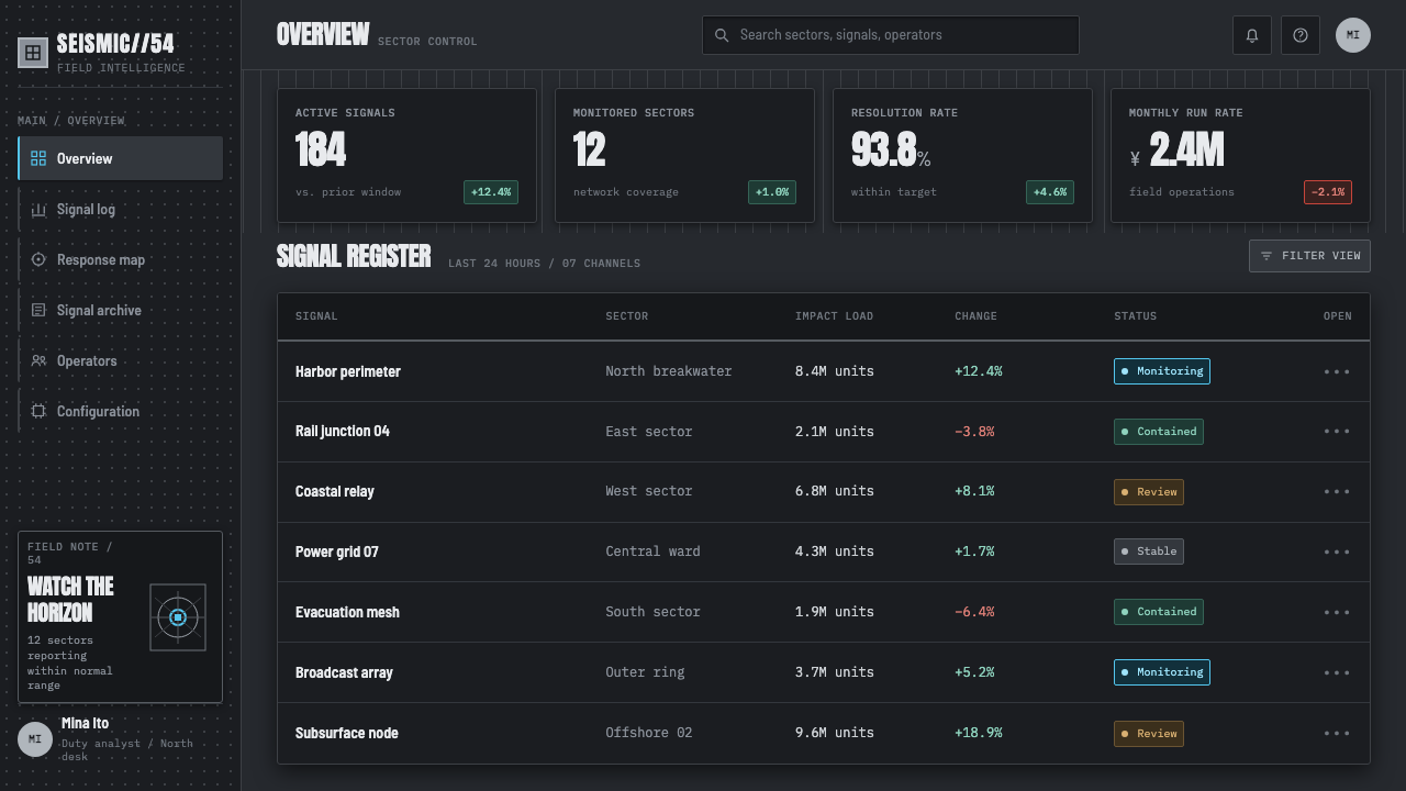
For content and data slides, translate the dramatic language into disciplined hierarchy. Keep most information in ash-on-charcoal or charcoal-on-ash groupings, then use searchlight-like contrast to isolate a section heading or key number. Charts should remain graphic and severe: bars, lines, labels, and halftone fills can behave like components of a poster image. The blue accent should identify the decisive series or exceptional signal, not decorate every value.
For web interfaces, the style is especially effective for dashboards, monitoring surfaces, launch pages, and pricing contexts that benefit from urgency and high contrast. Panels can feel like clipped poster fragments, while monochrome dividers and grain distinguish information zones. Navigation should stay plain and forceful. Reserve the blue ray for selection, escalation, or the path the user needs to follow through a dense, dark system.
For editorial and marketing pages, use the visual language to turn long-form information into an unfolding incident. A large opening silhouette can yield to narrower ash-colored reading fields, with halftone images interrupting the flow like recovered print evidence. Promotional blocks should feel like cinema lobby material: declarative headlines, limited visual ingredients, and a clear sequence from alarm to explanation to action.
The common mistake is turning the theme into a generic dark cyberpunk interface. Multiple neon accents, glossy panels, smooth gradients, and decorative glow erase its 1954 print-and-smoke character. Another mistake is making every element distressed; if grain, halftone, blue light, and giant lettering all compete everywhere, nothing feels monumental. Preserve broad quiet darkness so the ray, silhouette, and headline can arrive with consequence.
Godzilla (1954 Showa) — FAQ
Is this style simply a black-and-white monster-movie look?
No. Its visual basis is specifically the 1954 Toho Gojira context: Japanese tokusatsu, postwar antinuclear cinema, and Showa monster poster art. That combination gives the darkness a historical emotional charge. The goal is not merely to make a screen look old, but to make scale, smoke, public alarm, and atomic unease visible through a controlled visual system.
Why is only one blue accent used?
The electric ray-blue represents the unnatural flash described in the source material: a beam cutting through a world of charcoal and ash. Its force depends on scarcity. When blue appears only at critical moments, it can signal threat, attention, selection, or release. If it is distributed across buttons, labels, charts, and backgrounds alike, it loses the shock that makes it meaningful.
Can photography be used in a Godzilla (1954 Showa) layout?
Yes, but photography should enter as distressed monochrome evidence rather than glossy illustration. High-contrast gray treatment, halftone breakup, aggressive cropping, smoke, silhouettes, and searchlight exposure all help an image join the system. A clean, colorful lifestyle photograph usually disrupts the premise because it introduces a different kind of realism and a different emotional temperature.
Where does this style work best?
It works best where a product or story benefits from tension, scale, warning, investigation, or cinematic announcement: monitoring dashboards, event launches, editorial packages, campaign pages, and presentations with a decisive central claim. It is less suitable for contexts that require softness, cheerful abundance, or frictionless everyday warmth. The style asks the audience to feel that something consequential is happening.
Related design styles
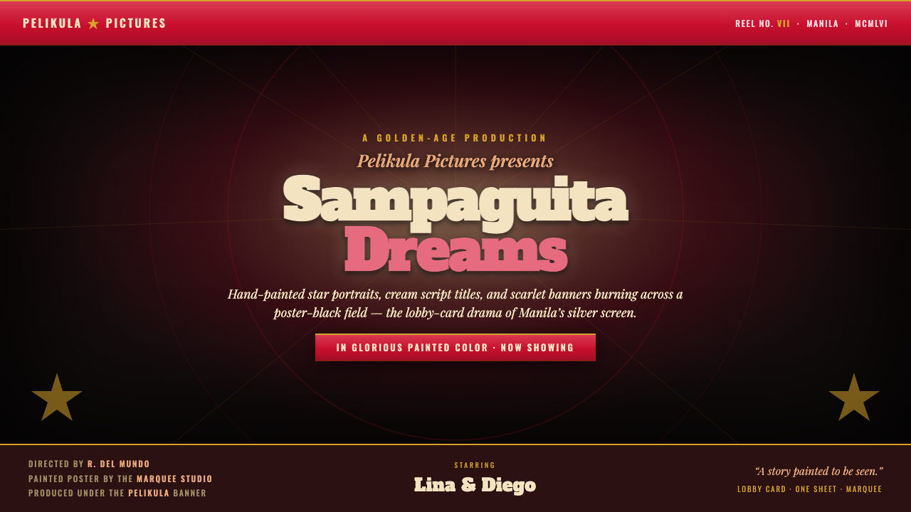 Manila LVN Film PosterLobby-card drama for the screen. Cream slab title on poster-black, scarlet ba…
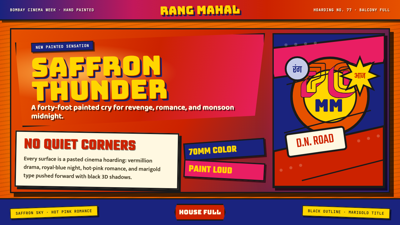 Bollywood Poster Art (1970s)Subtlety is unaffordable. Saffron fields, Bungee shadows, diagonal hoarding d…
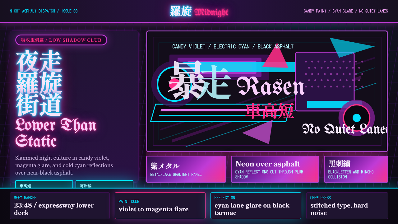 JDM BosozokuNight culture shouts. Candy violet, cyan neon, and stacked Mincho-blackletter…
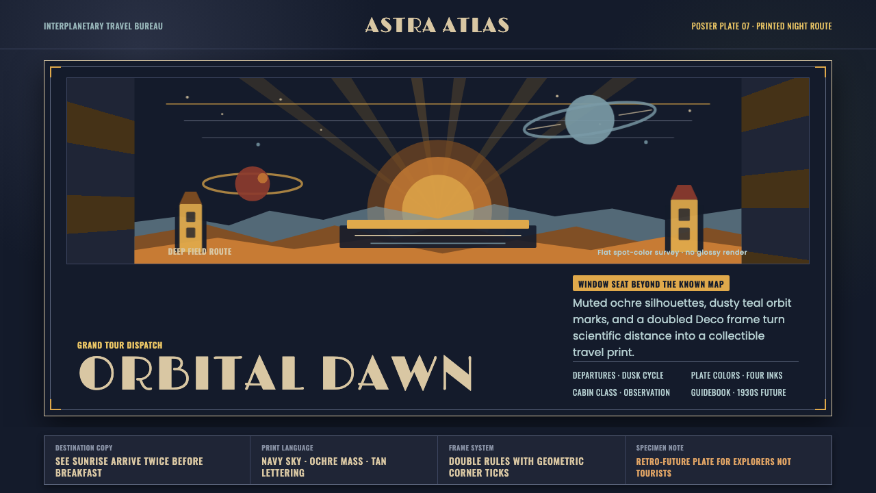 JPL Visions of the FutureSpace travel as print craft. Burnt orange silhouettes and Deco tan type on na…
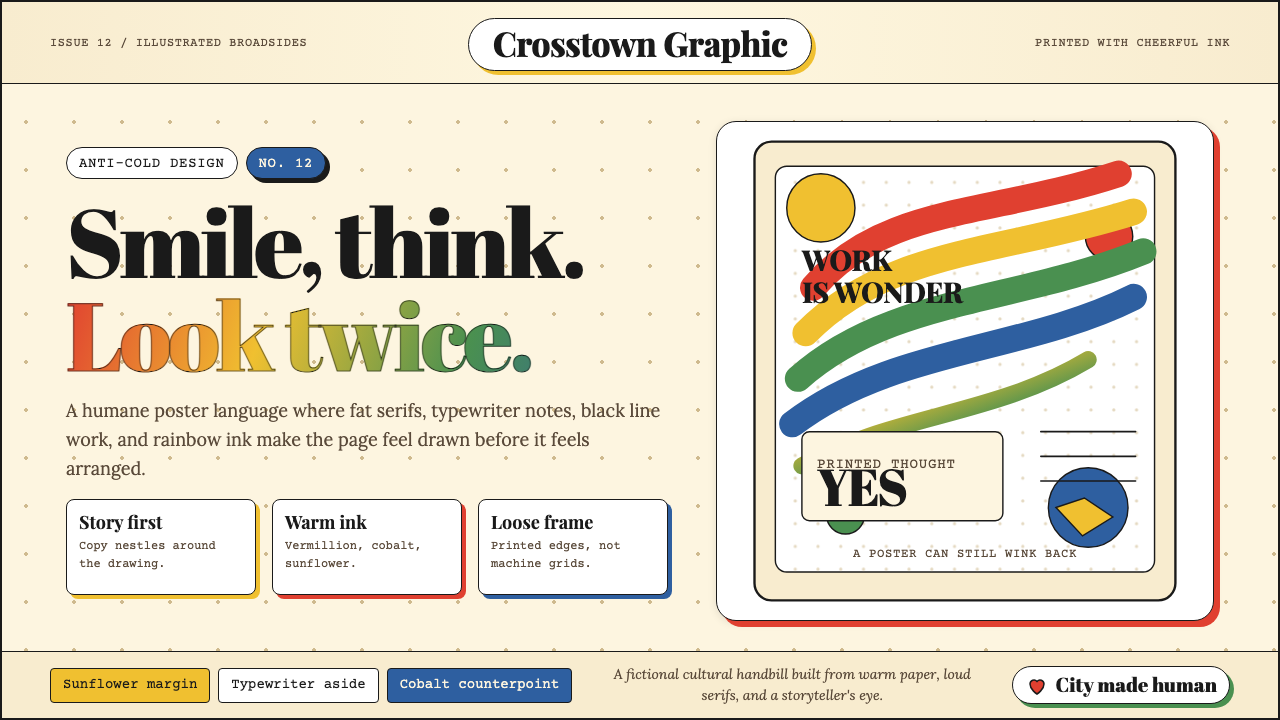 Milton Glaser / Push PinWarm counter-Swiss joy. Vermillion, cobalt and sunflower arcs orbit fat serif…
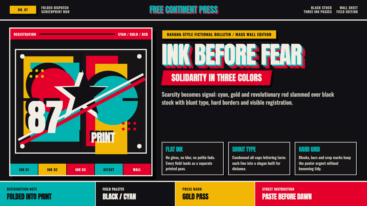 Cuban OSPAAAL Tricontinental PosterUrgency from scarcity. Cyan, gold and red slam over black in blunt silkscreen…