What is JPL Visions of the Future?
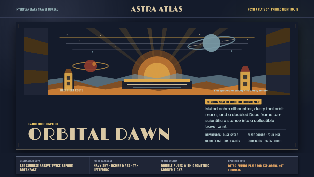
JPL turned interplanetary science into a vintage holiday promise — burnt-orange silhouettes, Deco lettering, and a navy night sky make distant worlds feel collectible, strange, and suddenly within reach.
JPL Visions of the Future in brief
JPL Visions of the Future is a 2016 poster series from NASA’s Jet Propulsion Laboratory that imagines tourism to exoplanets, moons, and worlds across the solar system. Its central conceit is simple but powerful: scientific speculation is presented through the familiar language of a travel advertisement, turning destinations beyond ordinary human experience into places one might dream of visiting.
The visual language combines the populist optimism of 1930s WPA national-park posters with the glamour and geometry of Art Deco travel advertising. Flat spot-color illustration, simplified silhouettes, condensed geometric capitals, and ornamental framing make each composition feel printed rather than rendered. The result is retro-futurist without becoming nostalgic for a specific machine age: the past supplies the form, while space supplies the subject.
The palette is deliberately narrow and atmospheric. Burnt orange and ochre gold describe illuminated landforms or heroic silhouettes; warm tan lettering softens the authority of the display type; dusty teal and rust red provide restrained accents. Everything sits against a deep navy-black sky, so the darkness reads not as emptiness but as the material from which the imagined destination emerges.

Where does JPL Visions of the Future come from?
The series was released in 2016 by NASA’s Jet Propulsion Laboratory in Pasadena, California. It was designed by JPL’s in-house studio, a significant choice because the work does not treat science as an external subject to be decorated after the fact. The posters make institutional knowledge feel public, legible, and emotionally inviting through a visual format associated with leisure and discovery.
Its historical vocabulary reaches back to 1930s WPA national-park posters, which used simplified forms, bold silhouettes, limited ink colors, and direct appeals to shared experience. JPL adapts that language for destinations that cannot yet be visited in the ordinary sense. The national park becomes the exoplanet; the scenic overlook becomes a speculative world; the promise of exploration survives even when the landscape is astronomical.
Art Deco supplies the series with its second major inheritance. Geometric condensed capitals, ornamental borders, formal symmetry, and the sense of a designed destination give the posters the polish of travel advertising. Yet the work does not simply imitate period decoration. Its decorative elements organize the page, frame the scientific fantasy, and establish the authority of a collectible plate.
The result belongs to retro-futurism, but its future is not presented through technological complexity. Instead, advanced science is translated into an accessible visual myth: a dark sky, a monumental horizon, a bold destination name, and a carefully controlled accent color. The source material also credits the JPL The Studio design team, Invisible Creature for the Grand Tour poster, and Joby Harris among the key figures associated with the series.
What defines the JPL Visions of the Future look?
Nocturnal Palette
The dominant field is deep navy-black, creating a theatrical ground for warm silhouettes and lettering. Burnt orange, ochre gold, dusty teal, and rust red appear as deliberate spot colors rather than a full spectrum. The palette feels sunlit and mineral against the darkness, allowing the imagined destination to read as both remote and monumental.
Poster Silhouette
Landscapes and figures are reduced to strong, readable masses. Contours carry more meaning than surface detail, so a horizon, ridge, or traveler can function as an emblem at a glance. This simplification gives the series the authority of a national-park poster while preserving the mystery of unfamiliar worlds.
Deco Typography
Display lettering is geometric, condensed, and highly composed. The capitals feel engineered into the poster rather than placed as neutral labels. Their narrow proportions create vertical lift, while warm tan coloring prevents the typography from becoming too harsh against the night field.
Ornamental Framing
Frames and borders give each sheet the status of a designed plate. They create a threshold between the viewer and the imagined destination, making the scene feel presented, archived, and collectible. Ornament is therefore controlled and structural, not an unrelated layer of decoration.
Retro-Futurist Contrast
The subject is technologically distant, but the treatment is culturally familiar. Space travel is made approachable through the grammar of leisure advertising, while the old print vocabulary makes the future feel tangible. This tension between historical form and speculative subject is the style’s defining emotional engine.
Printed Materiality
Flat spot colors and simplified shapes imply ink, paper, and deliberate reproduction. The images avoid the atmospheric complexity of a digital render, replacing simulation with graphic conviction. Every region appears chosen for its role in the composition, which makes the poster feel made rather than generated.

Who shaped JPL Visions of the Future?
The in-house JPL studio is identified as the design team behind the series. Its role is central to the project’s character: scientific imagination is shaped into a public-facing travel language, with institutional credibility carried through a warm, nostalgic poster form.
Invisible Creature is credited in the source material for the Grand Tour poster. Its association with the project represents the series’ ability to extend one visual system into distinct destination narratives while retaining the shared language of print, travel, and speculative adventure.
Joby Harris is named among the key figures connected with the series. The source places that contribution within a broader design culture where space science, retro-futurist imagery, and the accessible rhetoric of travel posters meet.
How do you use JPL Visions of the Future today?
For presentation slides, use the style to separate the cover from the explanatory pages without breaking their relationship. A cover can behave like a destination poster: one monumental silhouette, a deep night field, a condensed display title, and a restrained warm accent. Content slides should retain the same atmospheric ground but introduce information through framed panels, clear horizon-like divisions, and simple spot-color diagrams. Data slides work best when charts are treated as landscapes or orbital emblems rather than as generic interface widgets.
For web interfaces, the language suits dashboards, mission trackers, travel planners, and pricing pages that want authority without corporate coldness. Use the navy-black field as a stable environment, warm tan for primary text, and burnt orange or ochre for active states and key values. Panels should feel like plates or windows into a larger night sky, with borders and flat fills replacing glossy surfaces. The interface should remain highly legible; the poster mood belongs in framing, color, and hierarchy rather than in obscuring the content.
For editorial and marketing work, the style offers a strong way to present technical subjects as invitations. An article can open with a destination-like title, a broad silhouette, and a small amount of supporting copy arranged like travel information. Section openings may use ornamental framing and a single accent color, while body pages should become quieter so the scientific narrative remains readable. Marketing campaigns can use the contrast between dark space and warm illustration to make a complex product feel exploratory and memorable.
For educational material, the style is especially effective when explaining distant or abstract subjects. A planetary concept, research program, or speculative scenario can be given a visual identity without pretending that it is ordinary or fully understood. Use simplified diagrams, strong contours, and carefully chosen labels. The retro travel frame gives learners an emotional entry point, while the restrained palette keeps the subject from becoming childish or visually noisy.
The common mistake is to treat the style as a generic space theme by adding stars, metallic gradients, futuristic interfaces, and excessive neon. That abandons the series’ essential discipline. JPL Visions of the Future depends on flat print logic, warm earthy accents, geometric lettering, and deliberate framing. If every element tries to look technological, the work loses the crucial contrast between familiar travel advertising and unfamiliar scientific subject matter.

JPL Visions of the Future — FAQ
Is JPL Visions of the Future simply a space-themed Art Deco style?
No. Art Deco is one of its historical sources, but the series also depends on WPA national-park posters, retro-futurism, flat spot-color illustration, and the rhetoric of travel advertising. Its identity comes from the combination: familiar vacation-poster language makes scientifically distant destinations feel emotionally accessible, while the dark palette and speculative subject preserve their strangeness.
Why does the style use such a dark background?
The navy-black field establishes the visual condition of deep space and gives the warm silhouettes their authority. It also creates a strong contrast with the historical travel-poster vocabulary. The darkness should feel like an expansive night sky, not like a generic interface backdrop; warm tan type, burnt orange forms, and restrained accents are what keep it inviting.
Can this style work without illustrations of planets or landscapes?
Yes, provided the underlying structure remains. The style can be carried by a destination-like title, a dark atmospheric field, geometric condensed lettering, a strong silhouette or emblem, and ornamental framing. Abstract charts, product objects, or architectural forms can take the place of landscapes, as long as they are simplified into decisive shapes rather than rendered with digital realism.
How should the palette be handled in a modern interface?
Keep the night field stable and reserve the warm colors for hierarchy. Warm tan can carry ordinary reading, while burnt orange or ochre can identify actions, active states, or important destinations. Dusty teal and rust red should remain supporting accents. If every component receives a different strong color, the work loses the controlled, printed quality that defines the series.
What is the biggest difference between this style and a glossy futuristic aesthetic?
Glossy futuristic design usually emphasizes technological surfaces, luminous effects, and simulated depth. JPL Visions of the Future emphasizes print, silhouette, framing, and historical familiarity. Its future is persuasive because it looks like something that could be printed, mailed, collected, or pinned up. The emotional force comes from making the unknown feel tangible, not from making it look more technologically advanced.
Related design styles
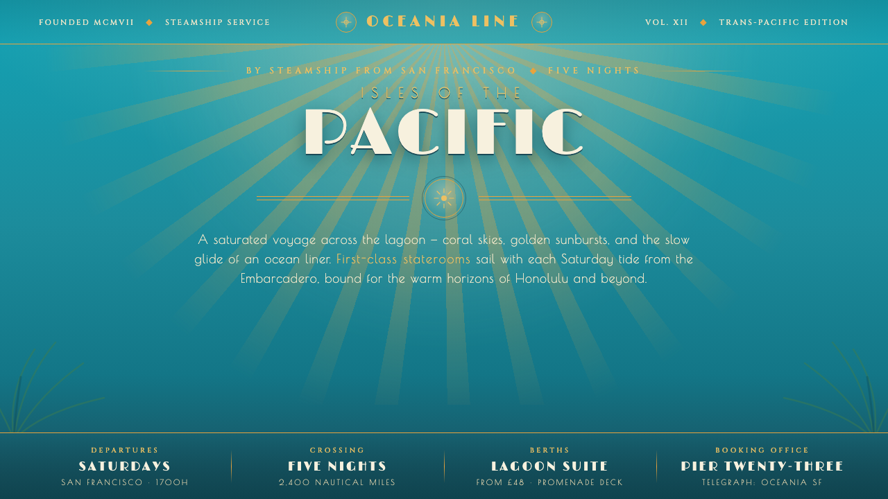 Matson Liner Travel PosterCruise-poster paradise. Lagoon-turquoise ground, coral-and-gold sunbursts, ai…
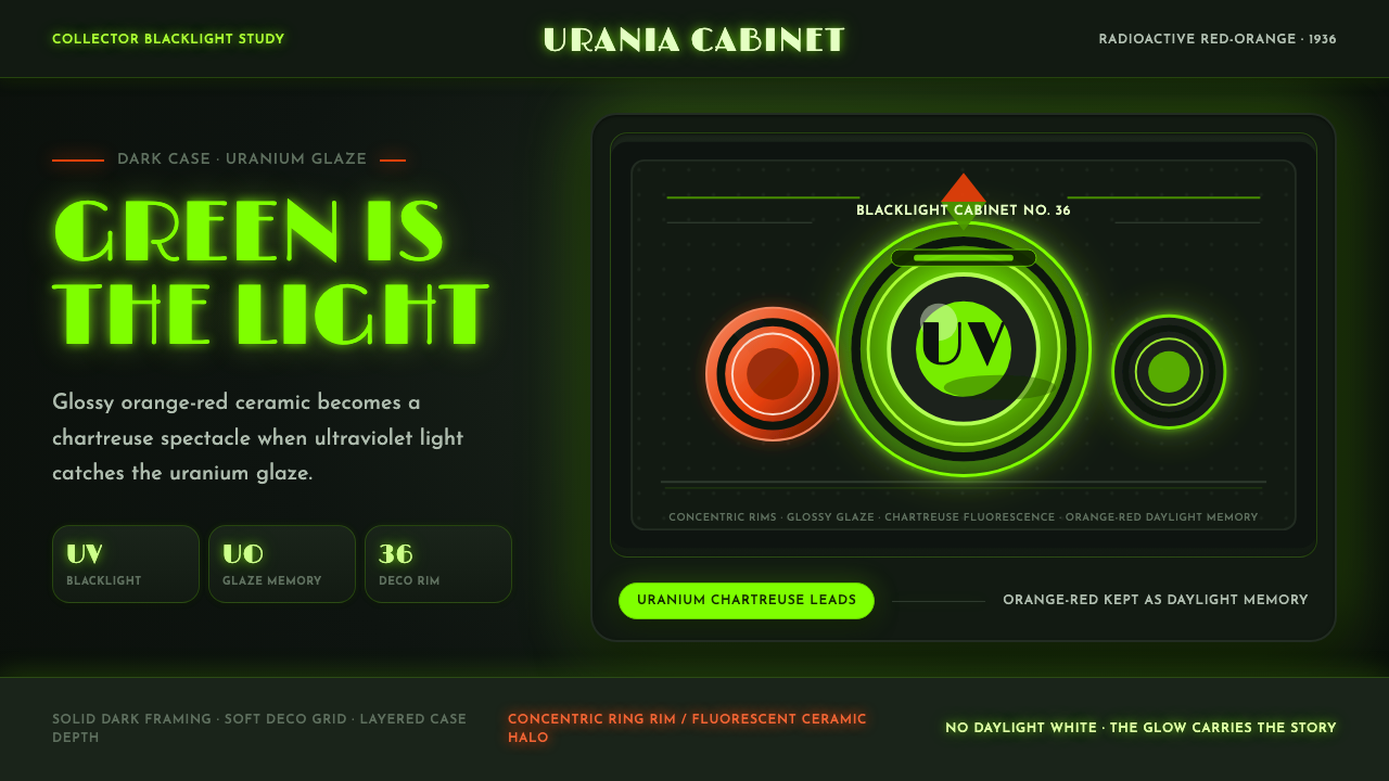 Fiestaware Radioactive Red-OrangeGlows like a collector's secret. Chartreuse rims cut through a dark deco case.
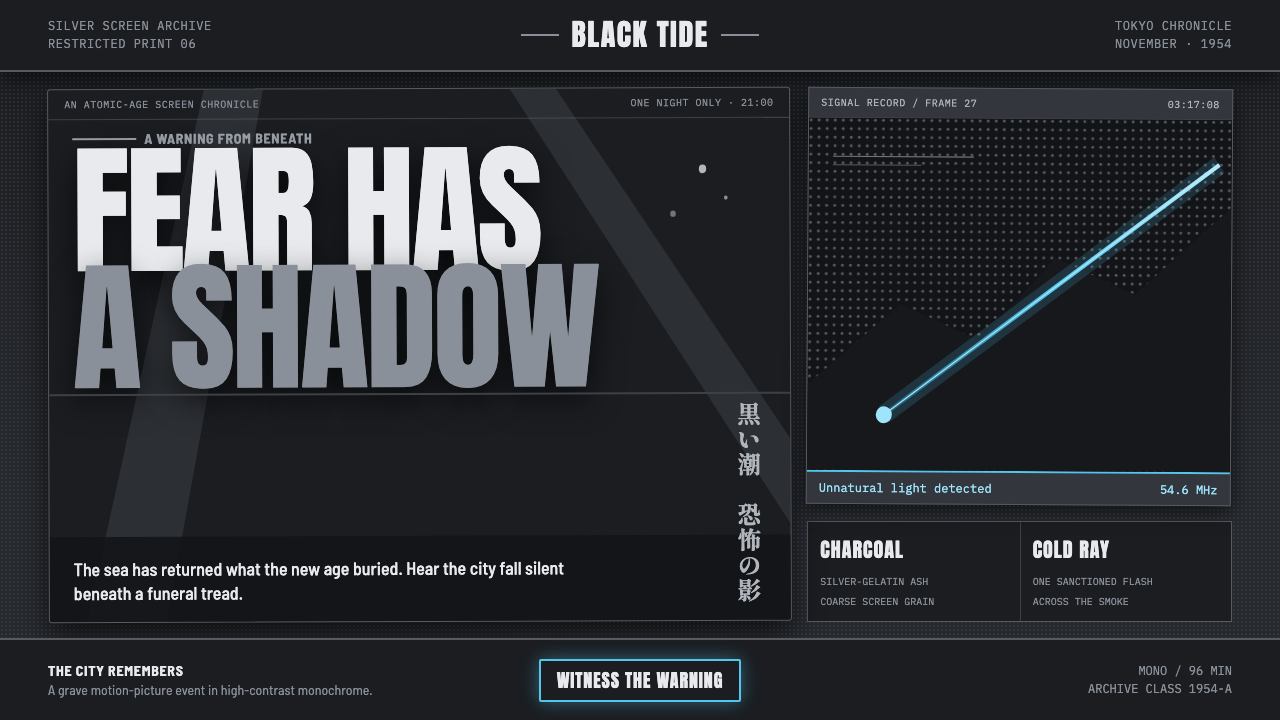 Godzilla (1954 Showa)Fear takes monumental form. Charcoal halftones split under one atomic-blue ra…
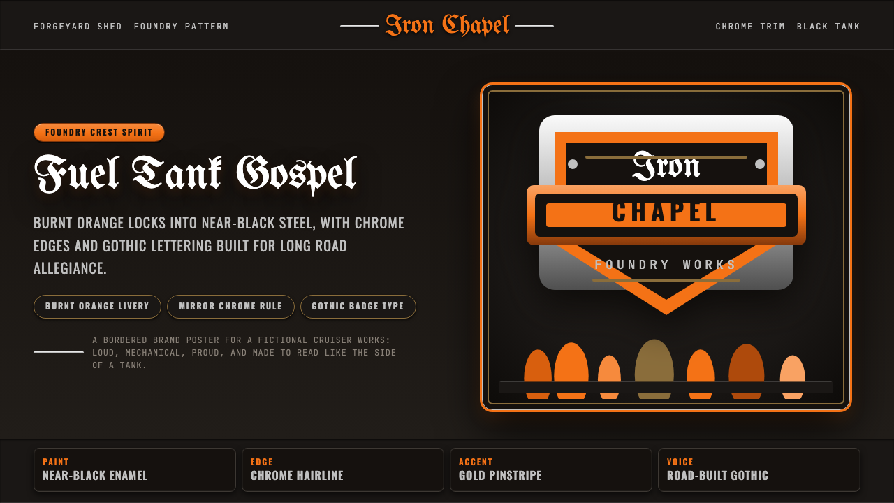 Harley Orange & BlackBuilt like a tank badge. Burnt orange, chrome hairlines, gothic type on near…
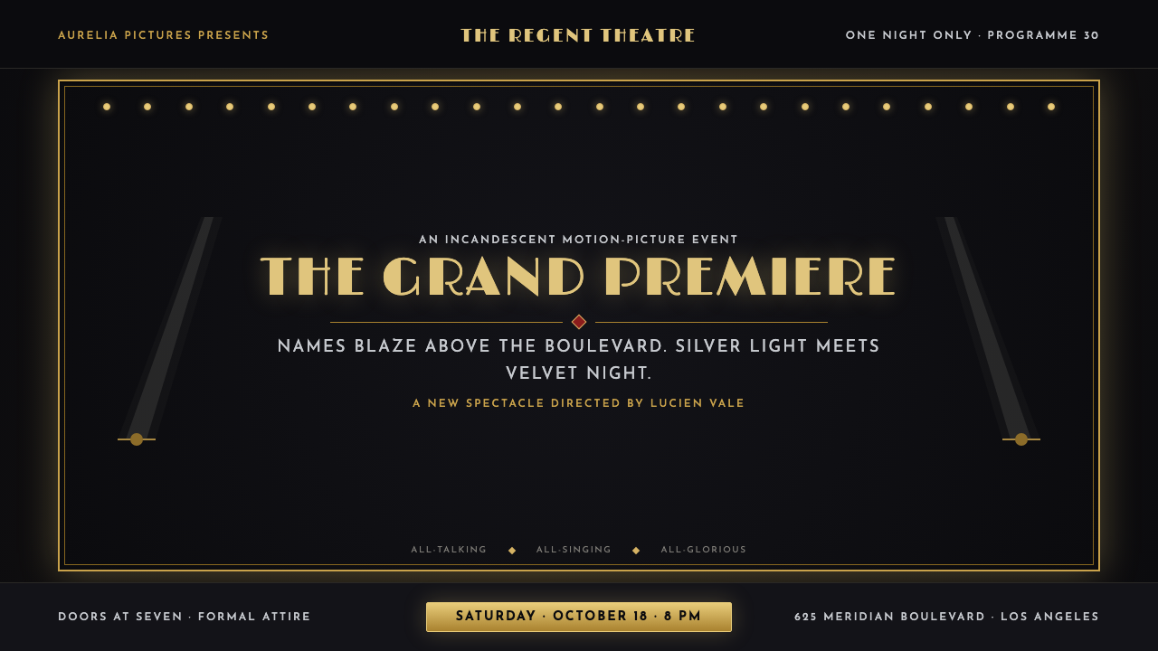 Hollywood Golden Age (1930)Black-and-gold spectacle commands the night. Marquee bulbs frame monumental D…
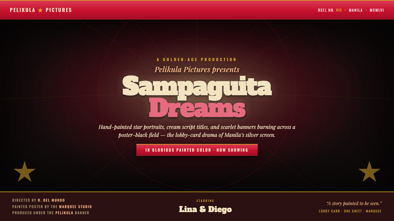 Manila LVN Film PosterLobby-card drama for the screen. Cream slab title on poster-black, scarlet ba…