What is Fiestaware Radioactive Red-Orange?
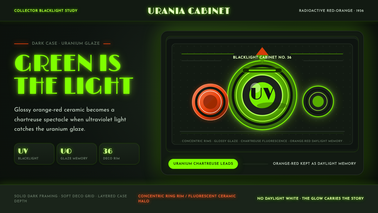
Fiestaware's most famous color was fired with real uranium oxide — and under a blacklight, the same dish that looks warm orange-red by day turns a startling chartreuse green.
Fiestaware Radioactive Red-Orange in brief
The Atomic Age Fiestaware Uranium style is built around a single, real material fact: the glossy orange-red glaze on original Fiestaware dinnerware, introduced in 1936, was fired with uranium oxide, and uranium fluoresces under ultraviolet light. That means the style has two legitimate readings of the same object rather than one — a warm, saturated orange-red surface under ordinary daylight, and a glowing chartreuse-green surface under blacklight, both true, both part of the piece's identity.
Visually, the style stages that dual reading rather than choosing between them. A dark, case-like surround — evoking a cabinet or display vitrine rather than an open, bright table setting — frames the glowing object, so the darkness reads as context and the color reads as light source rather than surface paint. Concentric ring motifs, drawn from the actual banded rims and handles of Art Deco tableware design, recur as a structural device throughout the system.
The overall mood sits at the intersection of two very different registers: the confident, mass-market optimism of Depression-era American tableware design, and the slightly eerie, secretive thrill of the present-day collector who checks a thrift-store find with a blacklight or Geiger counter. The style is not meant to read as purely retro-kitchen or purely science-fiction — it holds both at once.
Where does Fiestaware Radioactive Red-Orange come from?
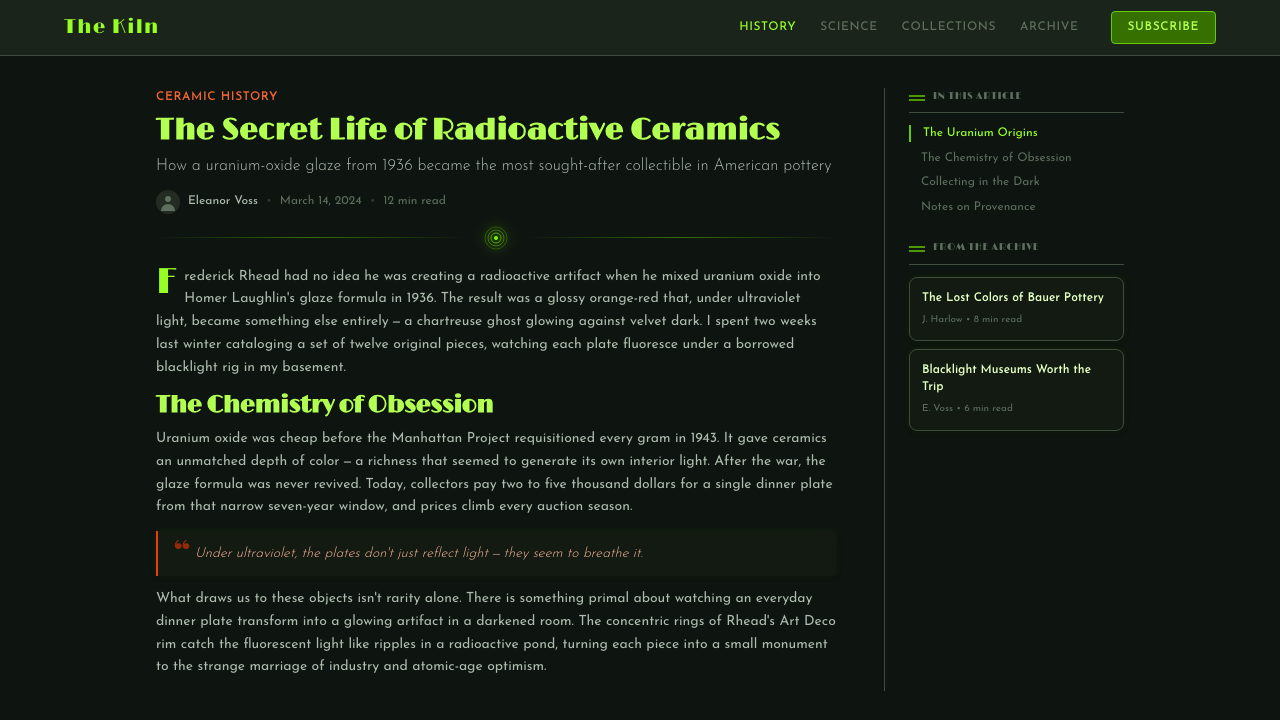
Fiestaware was introduced in 1936 by the Homer Laughlin China Company, a major American ceramics manufacturer based in East Liverpool, Ohio, on the West Virginia border. Its chief designer, Frederick Hurten Rhead, had trained in England's Staffordshire potteries before emigrating to the United States, and at Homer Laughlin he pushed the company toward a radical idea for the time: solid, saturated, mix-and-match colors rather than the printed floral patterns that dominated American tableware. Fiesta launched with a small palette that included a vivid orange-red alongside blue, green, yellow, and ivory, and its concentric ring rim design became instantly recognizable.
That orange-red — which collectors now call 'Radioactive Red' — got its distinctive glassy depth from uranium oxide mixed directly into the glaze, a coloring technique that was not unique to Fiesta but that Homer Laughlin used to particularly striking effect. The uranium content is also why the glaze fluoresces under ultraviolet light: expose an original red Fiesta piece to a blacklight and the surface glows a bright chartreuse-green, a property that has nothing to do with paint or dye and everything to do with the physics of the material itself.
That red glaze had a short first life. In 1943, with the United States deep into the Second World War, the federal government requisitioned uranium oxide supplies nationwide for the Manhattan Project, and Homer Laughlin lost access to the material needed to produce the color. Production of the uranium-glazed red halted, and it did not return until 1959, when the company reintroduced a version of the color using depleted uranium — a byproduct of the postwar nuclear industry rather than the natural uranium oxide used before the war. The color was discontinued again in 1972 as Fiesta's original run wound down.
Today, original Fiesta red pieces — both the pre-1943 and 1959–1972 production runs — sit at the center of a specific hobbyist world: uranium glass and ceramics collecting. Enthusiasts test pieces with blacklights and sometimes Geiger counters, both to authenticate the glaze and simply to see the fluorescent glow, treating ordinary Depression-era tableware as a small piece of atomic-age history that happens to still be functional and, by modern radiological safety standards, generally considered safe to display.
What defines the Fiestaware Radioactive Red-Orange look?
Color and Glow Duality
The system holds two color states as equally valid: a warm, glossy orange-red as the 'daylight' surface reading, and a bright chartreuse-green as the 'blacklight' reading of the same material. A design built on this style should let both states coexist rather than picking one — orange-red as the grounded, tactile color and chartreuse as the accent that signals something is glowing or activated.
Glaze Sheen
Surfaces read as glossy ceramic glaze — high shine, smooth, and reflective rather than matte or textured. Highlights should sit as small, hard specular points rather than broad soft gradients, echoing how light catches a curved, fired ceramic surface rather than a flat painted one.
Concentric Ring Motif
Concentric bands, drawn from the actual ringed rims and handles of Art Deco tableware, appear as a recurring structural motif — framing edges, marking boundaries between sections, or radiating outward from a focal point. The rings are regular and evenly spaced, never organic or hand-drawn in feel.
Streamlined Form
Underlying shapes favor the rounded, geometric confidence of Streamline Moderne and Art Deco industrial design — smooth curves, symmetrical profiles, and a sense of engineered precision rather than handcraft. This is mass-produced modern design language, not folk or artisanal form.
Dark Display Staging
A dark, enclosed backdrop — evoking a cabinet, vitrine, or collector's shelf rather than an open, bright table — is essential to the style's logic. Darkness is not empty negative space here; it is the condition that makes the chartreuse glow visible and meaningful, the way a blacklight only reveals its effect in a dim room.
Object as Artifact
Because the style's source objects are collected precisely for their hidden radioactive property, compositions benefit from treating individual pieces as specimens — isolated, lit deliberately, given room to be examined — rather than as part of a busy table setting. The framing should suggest 'this object has a secret' rather than 'this object is in daily use.'

Who shaped Fiestaware Radioactive Red-Orange?
Rhead was Homer Laughlin's chief designer through the 1930s and the creative force behind Fiesta's break from printed floral patterns toward bold, solid, mix-and-match color. Trained in England's Staffordshire pottery tradition, he brought both technical glaze knowledge and a modernist sensibility to what became one of the best-selling American dinnerware lines of the twentieth century.
Founded in East Liverpool, Ohio, Homer Laughlin was one of the largest American ceramics manufacturers of its era. Its willingness to use uranium oxide in a mass-market glaze — and later to navigate wartime material shortages and a 1959 relaunch with depleted uranium — makes the company itself a central character in the object's unusual history, not just its maker.
When the U.S. federal government requisitioned uranium oxide nationwide in 1943 for the Manhattan Project, it directly and abruptly ended the first production run of Fiesta's red glaze — an ordinary tableware color halted not by fashion or cost but by its ingredient becoming a strategic wartime material. That interruption, and the 1959 depleted-uranium relaunch that followed it, is what splits Fiesta red collecting into distinct, dateable production eras.
A dedicated hobbyist community treats uranium-glazed Fiesta red, along with uranium glass more broadly, as a specialized collecting category distinct from ordinary vintage dinnerware. Their practice of testing pieces under blacklight or with radiation detectors — part authentication, part simple spectacle — is what keeps the 'glowing secret' identity of these objects visible and culturally active today.
How do you use Fiestaware Radioactive Red-Orange today?
On presentation slides, this style works best as a cover or section-break treatment: a dark, near-black field with a single glowing chartreuse-green focal element — a shape, a numeral, an icon rendered as if lit from within — surrounded by a thin concentric ring frame. Content slides should keep the dark ground but restrain the glow to small accent details, such as underlines or bullet markers, so body text stays easy to read. Data visuals suit this style unusually well: bars or nodes can be rendered as if lit from within against a dark chart background, letting the brightest, most saturated element in a chart double as the most important data point.
For web interfaces, the style suits products in categories like collectibles marketplaces, vintage or retro-tech brands, gaming, or any dashboard that wants to feel like a specialized instrument rather than a generic productivity tool. A dark UI base with a single glowing accent color for primary actions and active states reads as focused and slightly technical — appropriate for a pricing page positioning a premium tier as the 'illuminated' one against duller default tiers rendered in muted orange-red.
In editorial and marketing contexts, the style fits stories about design history, collecting culture, retro-futurism, or science communication particularly well. A magazine-style layout can stage a 'before and after' structure — an orange-red daylight image transitioning to a chartreuse blacklight image — as a literal storytelling device, using the object's real dual nature as the narrative hook rather than an invented gimmick.
A common mistake is applying a generic neon or cyberpunk glow treatment without the concentric ring motif or the orange-red 'daylight' counterpart — this collapses the style into generic sci-fi glow rather than something rooted in the specific Fiesta object and its two true readings. The orange-red must appear somewhere in the system for the chartreuse to read as its transformation rather than as an arbitrary neon accent.
A second common mistake is scattering multiple bright colors across a dark background as if this were a general 'atomic' or '1950s retro' mood board. The style's discipline comes from restriction: one warm color, one glowing green, a dark ground, and ring motifs — not a wider midcentury palette of turquoise, coral, and mustard borrowed from unrelated diner or Googie sources.
Fiestaware Radioactive Red-Orange — FAQ
Was Fiestaware's radioactive red glaze actually dangerous?
The glaze does contain measurable radioactivity, which is why collectors can detect it with a Geiger counter and it fluoresces under blacklight, but the levels involved are generally regarded by hobbyist and safety references as low enough that owning or displaying original pieces is not considered a significant hazard. That said, treating antique radioactive-glazed pieces as everyday food service ware, especially with acidic foods over long periods, is the kind of use collectors typically caution against — this is a question about specific antique objects and materials, not a general safety claim about ceramics.
Why did the color disappear in 1943 and then come back years later in a different form?
The 1943 stoppage was caused by wartime material scarcity, not a design decision: the U.S. government requisitioned uranium oxide supplies nationwide for the Manhattan Project, and Homer Laughlin simply lost access to the ingredient. When the color returned in 1959, the company used depleted uranium instead of the natural uranium oxide used before the war — a byproduct available from the postwar nuclear industry — which is why collectors treat the pre-1943 and 1959–1972 runs as distinct, separately dateable production eras rather than one continuous product.
How is 'uranium glass' collecting related to Fiestaware specifically?
Uranium glass collecting is a broader hobby covering any glass or ceramic object made with a uranium-containing colorant that fluoresces under UV light — Fiesta's original red glaze is one of the most famous and widely collected examples of this category applied to functional tableware rather than decorative glass. Fiesta's popularity, documented production history, and the sheer number of surviving pieces make it a common entry point into the broader uranium glass and ceramics collecting world.
How can a digital product convey the 'blacklight glow' quality without actually using UV light?
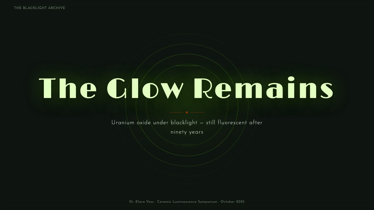
The effect is conveyed through contrast and context rather than any literal light source: place a saturated chartreuse-green element against a genuinely dark, near-black ground, keep the green isolated rather than blended with other bright colors, and pair it somewhere in the system with the orange-red 'daylight' color so the glow reads as a transformation of a known object rather than an arbitrary neon choice. Subtle soft-focus haloing around the green element can reinforce the sense of emitted light without needing any literal glow filter overused elsewhere.
Does this style only work for kitschy, nostalgic products, or can it read as premium?
It can read as premium when the dark-case staging and material specificity are taken seriously rather than played for camp. A dark, restrained ground with a single precise glowing accent and disciplined concentric ring detailing reads closer to a jewelry display case or a specialized scientific instrument than to a novelty kitchen theme. The kitsch reading only dominates when the style is applied loosely — bright multicolor palettes, cartoonish atom motifs, or an overly bright, cluttered ground undercut the quiet, specimen-like quality that makes the look feel considered rather than gimmicky.
Related design styles
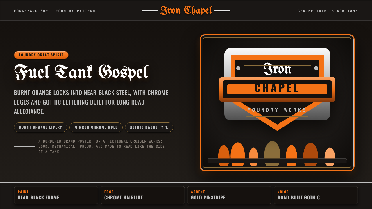 Harley Orange & BlackBuilt like a tank badge. Burnt orange, chrome hairlines, gothic type on near…
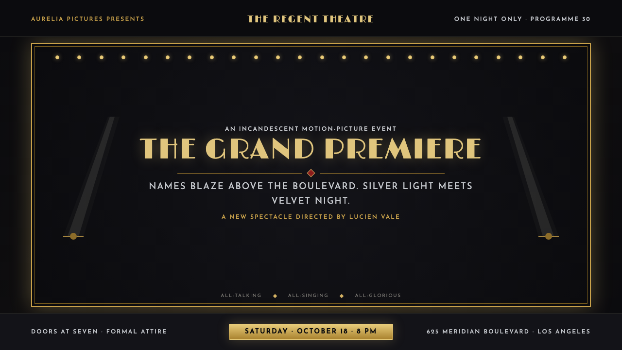 Hollywood Golden Age (1930)Black-and-gold spectacle commands the night. Marquee bulbs frame monumental D…
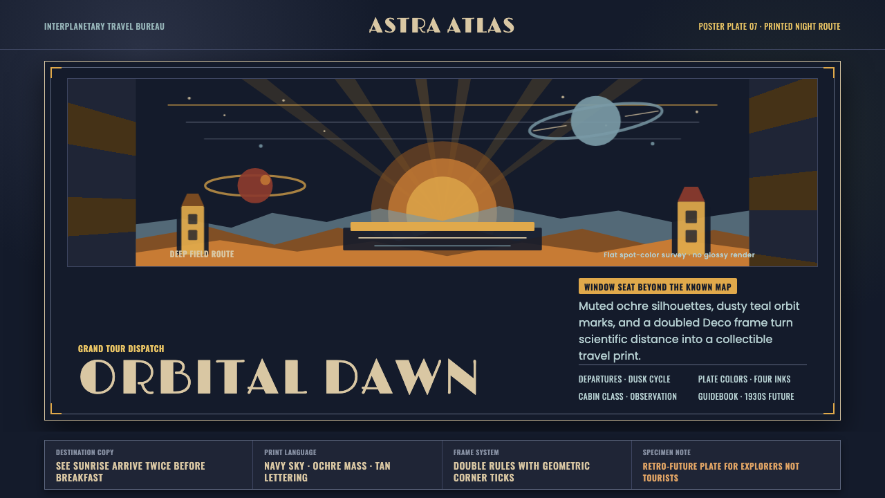 JPL Visions of the FutureSpace travel as print craft. Burnt orange silhouettes and Deco tan type on na…
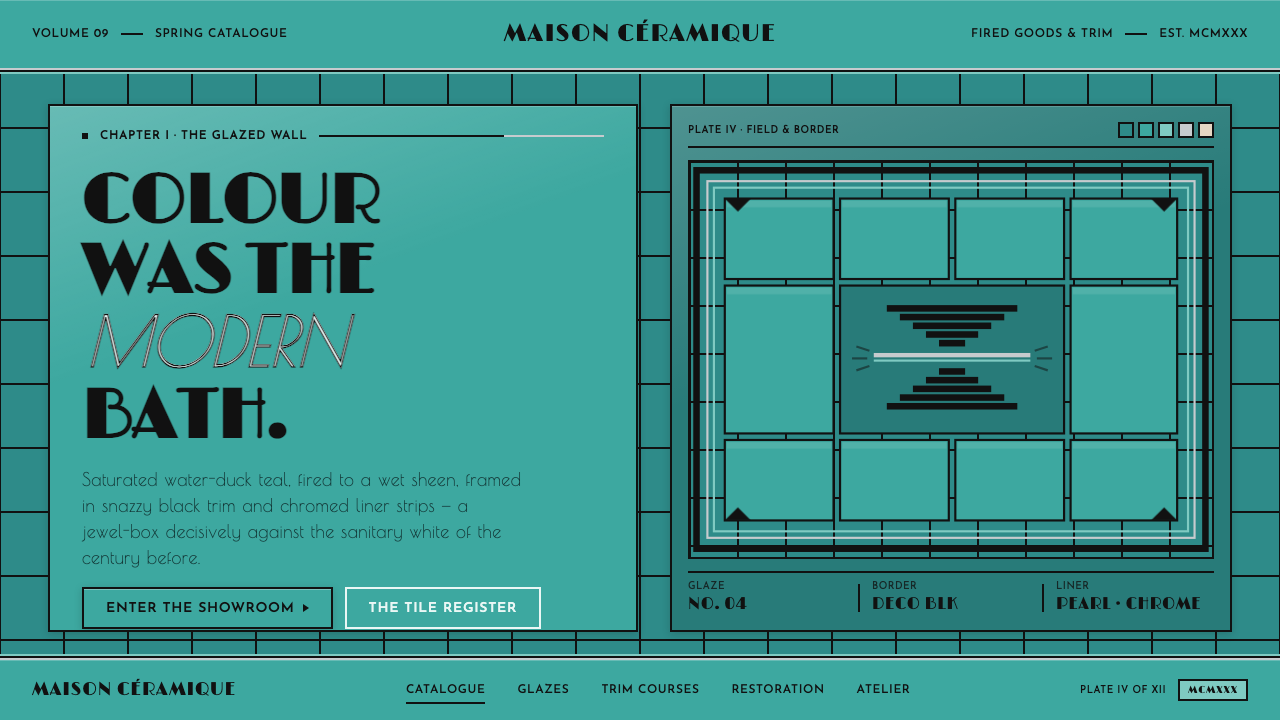 Art Deco Teal BathroomColour was the modern bath. Water-duck teal glaze, snazzy black trim, Limelig…
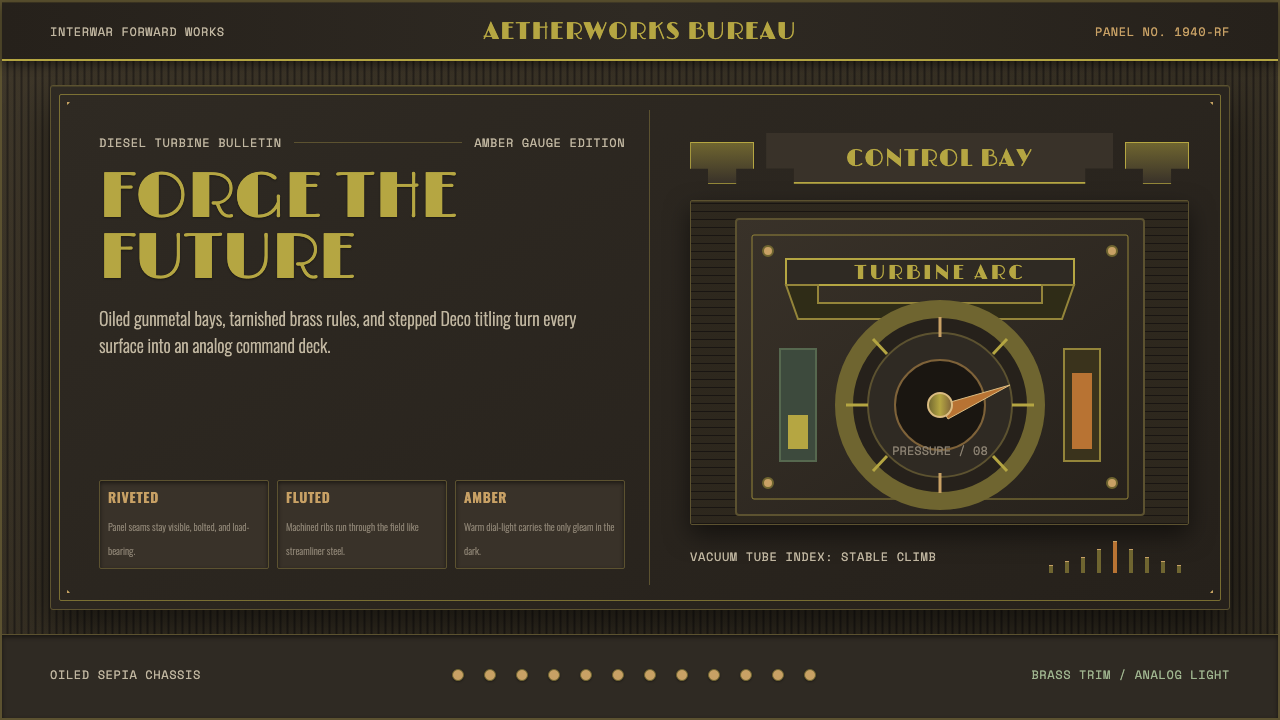 Dieselpunk RetrofutureMachine age, dark and bolted. Gunmetal grid, brass rivets, amber gauge geomet…
 Poster Stamp (Cinderella)Blazes in miniature. Vermilion stamps, chrome keylines, and toothed edges on…