What is Dieselpunk Retrofuture?
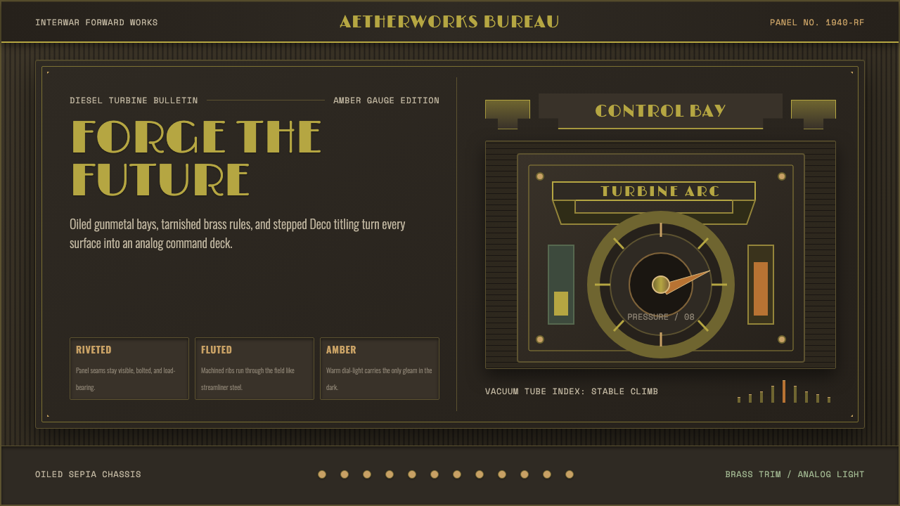
Dieselpunk is the interwar machine age projected into an imagined future — gunmetal and rivets, amber gauges and olive-drab steel, a world where every surface has been fabricated, fluted, and bolted rather than grown or printed.
Dieselpunk Retrofuture in brief
Dieselpunk is a retrofuturist aesthetic rooted in the visual culture of the 1920s through 1940s — a period when diesel turbines, riveted airframes, and industrial control panels represented the leading edge of human technology. The style imagines that era continuing forward without the interruption of the digital age: a world of analog dials, stepped Art Deco lettering, military-surplus color, and machinery that looks like it was assembled by hand in a factory smelling of oil and metal.
Where steampunk looks to the Victorian era and leans toward brass filigree and romantic fantasy, dieselpunk is harder and darker. Its references are the great industrial structures of the interwar decades — the Chrysler Building's eagle-head gargoyles, Hugh Ferriss's monumental charcoal cityscapes, the instrument panels of wartime aircraft and submarines. The mood is not whimsy but operational weight: these machines were built to work, and to last, and to dominate.
Visually, dieselpunk is defined by a specific set of tensions: warm amber and tarnished brass against cold gunmetal and military olive; Art Deco geometric elegance against industrial grit; the sleek streamlined forms of Norman Bel Geddes against the bolted, riveted surfaces of actual wartime machinery. The result is an aesthetic that feels both aspirational and heavy — a future that was dreamed in the 1940s and never fully arrived.
Where does Dieselpunk Retrofuture come from?
The term 'dieselpunk' entered common usage in the early 2000s, coined by game designer Lewis Pollak, though the aesthetic it describes had been accumulating across film, illustration, and industrial design since the 1920s. Its visual DNA is inseparable from the cultural moment that produced it: a period of unprecedented industrial expansion in the United States and Europe, when the machine was simultaneously a symbol of progress, a tool of war, and a subject of aesthetic fascination.
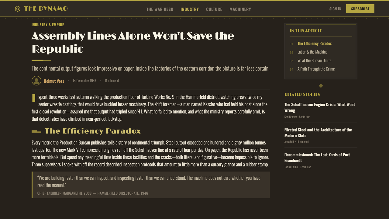
Art Deco, the dominant style of the interwar decades, provided dieselpunk with its formal vocabulary. Deco's characteristic stepped forms, sunburst motifs, chevron patterns, and geometric lettering — originally applied to luxury objects and skyscrapers — translate readily into the dieselpunk context, where they appear on control panels, uniform insignia, and propaganda posters. The architects Raymond Hood and Hugh Ferriss captured the monumentality of this era: Hood's Rockefeller Center and Ferriss's charcoal renderings of imagined megastructures established the dark, massive, dramatically lit architectural imagination that dieselpunk inherits.
Industrial design of the 1930s contributed the streamlining impulse. Norman Bel Geddes and Raymond Loewy applied aerodynamic forms to locomotives, ships, and consumer appliances, creating objects that looked as though they had been shaped by wind tunnels even when they had not. This streamlining — horizontal speed lines, teardrop profiles, chrome trim on matte metal bodies — became one of dieselpunk's core visual signatures, set in deliberate tension with the bolted, riveted industrial surfaces borrowed from actual heavy machinery.
The Second World War gave dieselpunk its characteristic palette and military vocabulary. Olive drab, khaki, gunmetal grey, and worn leather became the colors of functional equipment designed to operate in extreme conditions. The instrument aesthetics of wartime aircraft — amber-lit gauges with white needles on black faces, toggle switches in metal panels, rubber-grip controls — supplied a readability and tactility that dieselpunk designers have repeatedly returned to as an alternative to the glowing screens of digital interfaces.
What defines the Dieselpunk Retrofuture look?
Color Palette
The dieselpunk palette reads like the instrument panel of a 1940s military machine: olive drab and gunmetal grey form the dominant neutral ground, warmed by tarnished brass, burnished copper, and worn khaki. Amber is the signature accent — the glow of analog gauges, the color of aged lacquer and warning lights. Where highlights appear, they tend toward warm gold or muted ivory rather than pure white. The overall effect is of surfaces that have been used, exposed to weather, and maintained rather than surfaces that are pristine or aspirationally clean.
Surface and Texture
Dieselpunk surfaces are fabricated, not natural. Metal panels show rivets, bolts, and weld seams. Leather is worn and stitched. Gauges have protective glass covers and machined bezels. The visual logic is one of assembly: every element looks as though it was manufactured separately and joined by mechanical fasteners. This fabricated quality distinguishes dieselpunk from other dark aesthetics — it is not about decay or organic aging, but about the marks left by making, use, and maintenance.
Typography
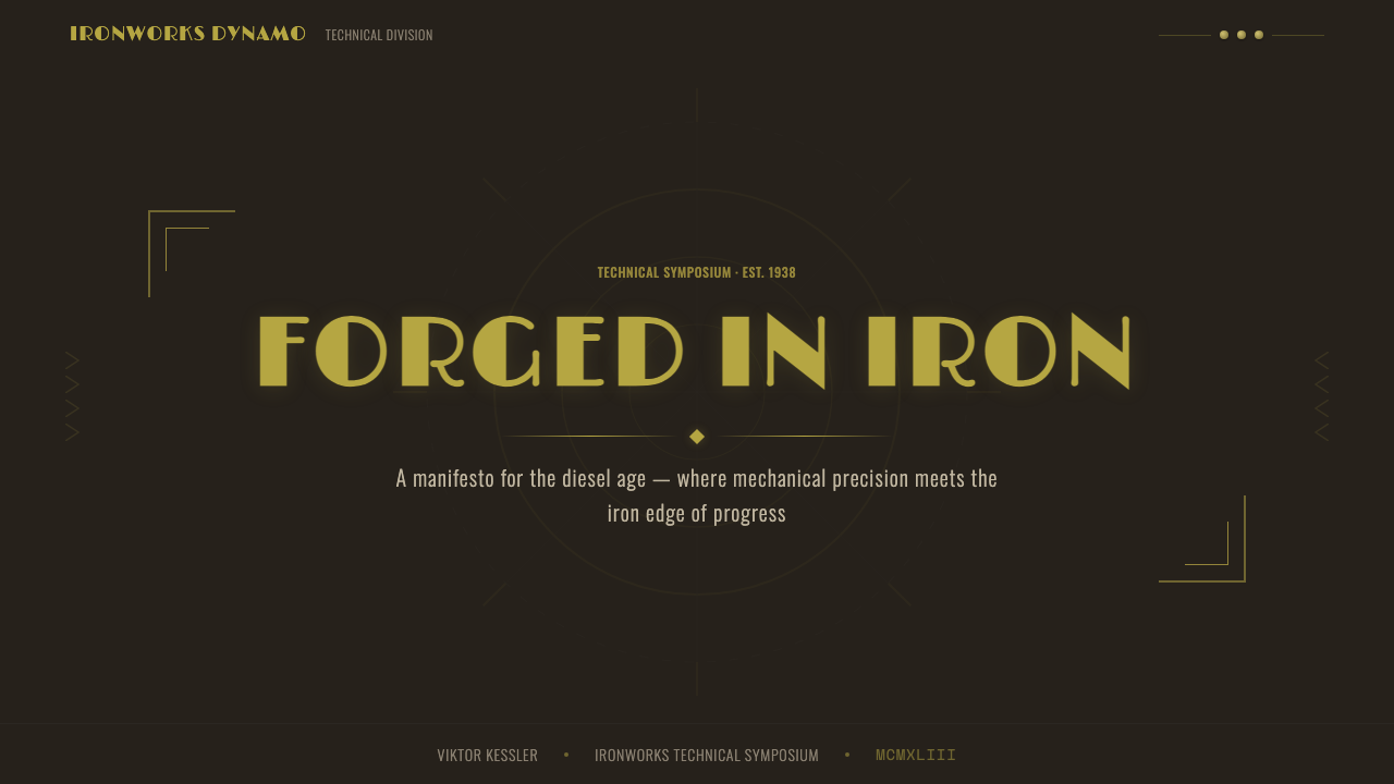
Dieselpunk typography draws directly from interwar Art Deco lettering: stepped capitals with geometric construction, condensed forms with strong vertical emphasis, and occasional inline or shadow treatments that evoke engraved metal signage. Display type tends toward the monumental — wide letter-spacing, all-capitals setting, and stencil-cut forms that suggest military or industrial origin. Body text, where it appears, often uses squared-off serifs or slab serifs that feel mechanical rather than calligraphic.
Geometry and Form
The dieselpunk formal vocabulary combines two competing geometric logics. The Art Deco inheritance provides stepped forms, sunburst radiations, chevron patterns, and highly structured symmetrical or bilateral arrangements. Against this, the industrial inheritance provides circular gauge faces, rectangular panel grids, and the irregular geometry of functional components arranged for access rather than appearance. The most characteristic dieselpunk compositions hold both in tension — an ordered Art Deco frame containing or surrounding the controlled chaos of machinery.
Lighting and Mood
Dieselpunk compositions are dramatically lit from within — the amber glow of gauges, the warm cone of an industrial lamp, the backlit silhouette of a machine operator. This internal illumination creates pools of warm light against dark or shadowed surroundings, producing high-contrast compositions where functional elements catch the light and structural backgrounds recede into darkness. The mood is cinematic in the tradition of 1940s film noir: purposeful, operational, slightly ominous.
Iconography
Dieselpunk iconography is drawn from the operational vocabulary of the interwar machine age: gauge needles, compass roses, aircraft silhouettes, globe cross-sections, gear assemblies, radio towers, and schematic diagrams. Military insignia — wings, stars, chevrons, unit badges — appear frequently, stripped of specific allegiance but retaining their graphic authority. The recurring icon is the instrument face: circular, divided into arc segments, with a central needle pointing toward a reading. This form recurs at multiple scales, from actual gauges to decorative roundels to compositional layouts.
Streamlining vs. Riveting
One of dieselpunk's productive internal tensions is between the smooth, aerodynamic surfaces of 1930s streamline design and the bolted, riveted surfaces of actual industrial and military hardware. Streamline design abstracted the machine into a clean, fast-looking object; actual machines were assembled from plates, fasteners, and panels that left visible marks. Dieselpunk compositions often hold both simultaneously — a streamlined silhouette with riveted detail panels, or a smooth surface interrupted by clusters of mechanical fasteners. This tension keeps the aesthetic from becoming merely sleek or merely grimy.

Who shaped Dieselpunk Retrofuture?
Ferriss was a commercial architectural renderer whose charcoal drawings — massive, shadow-heavy depictions of imagined skyscrapers and urban megastructures — became some of the most reproduced images of the interwar period. His 1929 book 'The Metropolis of Tomorrow' collected these visions into a unified urban fantasy: towers that merged Art Deco geometry with monumental scale, lit from below by artificial light rather than natural sky. Ferriss's visual imagination established the dark, aspirational cityscape that dieselpunk inherits as its environmental backdrop.
Bel Geddes was the most theatrical of the American industrial designers, whose streamlined visions for trains, ocean liners, and automobiles — collected in his 1932 book 'Horizons' — established the aspirational future that dieselpunk retrofutures. His 'Futurama' installation for the 1939 World's Fair depicted an automated American city of 1960 in which streamlined vehicles moved along elevated highways above orderly grids of towers and parks. Though the actual 1960 looked nothing like his prediction, Futurama's visual language became the canonical image of the American machine-age future.
Loewy applied Art Deco geometry and streamline principles to an extraordinary range of commercial objects — the Pennsylvania Railroad GG1 locomotive, the Studebaker Avanti, the Lucky Strike cigarette package, the Coca-Cola refrigerator. His genius was to make industrial objects legible as designed things: objects with intentional form rather than utilitarian accident. Loewy's streamlined locomotives in particular — their nose forms, their speed stripes, their two-tone paint schemes — are direct ancestors of the dieselpunk aesthetic as it applies to vehicles and transportation imagery.
Hood was the architect most responsible for giving New York its Art Deco skyline identity, designing the American Standard Building, the Daily News Building, and the central complex of Rockefeller Center. His buildings combined Deco geometric ornament with functional mass — setback silhouettes required by zoning, but executed with decorative stone and metal details that made the step-backs feel intentional rather than imposed. The Rockefeller Center complex in particular, with its axial planning, its metalwork decorations, and its underground concourses, established the dieselpunk vision of the corporate-industrial city.
Hughes occupies a unique position in dieselpunk mythology as both a real historical figure and an archetype: the obsessive industrialist-aviator who pushed machine technology to its limits through sheer personal will. His aircraft — the H-1 Racer, the Spruce Goose — represented the interwar machine age at its most ambitious extreme, combining Art Deco aesthetics with engineering achievement. As a cultural figure, Hughes embodies the dieselpunk protagonist: a man who understood machines as extensions of human ambition, operating in a world where the boundary between technological mastery and dangerous obsession was always permeable.
How do you use Dieselpunk Retrofuture today?
Dieselpunk is most convincing when its visual references are specific rather than generic. The style has a tendency to collapse into a generic 'dark steampunk' when designers reach for the obvious gear-and-rivet clichés without understanding the underlying design logic. Effective dieselpunk work roots itself in the actual visual culture of the 1920s–1940s: Art Deco stepped lettering, interwar color standards, the specific instrument-panel aesthetics of wartime aviation and naval design, and the streamline vocabulary of the great industrial designers. Specificity is authenticity.
For presentation slides, dieselpunk works best when the full color system is applied with restraint. A cover slide benefits from the high-contrast dramatic quality: a dark field broken by a single bright amber or brass-toned accent, title set in stencil-cut or stepped display type, with a schematic diagram or gauge-face element as a secondary graphic. Content slides should lean into the diagrammatic quality of the style — tabular data displayed on ruled grids, callouts framed as instrument readouts, section dividers rendered as horizontal metal-panel lines. The overall effect should feel like a classified technical briefing from 1943, not a consumer product deck.
For web interfaces and dashboards, dieselpunk translates into a dark-ground system with amber, brass, and warm-white typographic accents. Navigation and structural chrome should use the gunmetal and olive tones; interactive states and data highlights use amber. Chart components gain authority from the instrument-panel reference: circular gauges rather than donut charts, ruled linear scales rather than rounded bar charts, toggle-style controls rather than pill-style toggles. The default should always be 'could this have been made in 1940?' — if the answer is no, reconsider the component.
For editorial and marketing work, the style supports immersive world-building rather than conventional information hierarchy. Dieselpunk marketing is most effective as full-bleed compositions: dark backgrounds with dramatic central illumination, title type set at monumental scale in Art Deco lettering, supporting imagery treated as technical schematic rather than photography. The advertising vocabulary of the interwar period — bold central image, minimal text, strong geometric frame — translates directly to contemporary digital formats, particularly for gaming, entertainment, and industrial product contexts.
The most common mistake when applying dieselpunk is over-riveting: adding rivet and bolt details to every surface until the composition reads as costume rather than style. Authentic dieselpunk constrains its industrial texture to structural elements — edges, joins, panel seams — and keeps large surface areas relatively clean, as actual industrial hardware does. The second common mistake is mixing the diesel-era color palette with contemporary bright colors or digital gradients, which immediately breaks the period coherence. When in doubt, ask whether the color could be reproduced with the pigments, dyes, and industrial coatings available in 1940.
Dieselpunk Retrofuture — FAQ
What is the difference between dieselpunk and steampunk?
The most direct answer is temporal and tonal. Steampunk is rooted in the Victorian era (roughly 1837–1901) and draws heavily on British imperial aesthetics — brass clockwork, airships, corsets, and a romanticism about craft and invention. Dieselpunk is rooted in the interwar period (1918–1945) and references American and European industrial culture — diesel engines, military equipment, Art Deco architecture, and wartime machinery. The tone differs significantly too: steampunk tends toward adventure and whimsy; dieselpunk tends toward operational weight and a certain darkness. If steampunk is a Jules Verne novel, dieselpunk is a Howard Hawks air-war film.
Can dieselpunk work for consumer-facing products, or is it too heavy?
Dieselpunk has a natural home in entertainment, gaming, and industrial-adjacent products where the aesthetic weight is an asset rather than a liability. For consumer products in adjacent categories — travel gear, audio equipment, specialty tools, food and beverage with craft positioning — the style can work when applied with restraint and specificity. It struggles in categories where warmth, approachability, and softness are table stakes: health and wellness, children's products, social platforms. The test is whether the product's values include durability, mastery, operational seriousness, or mechanical authenticity — if so, dieselpunk's weight is appropriate. If the product's values are warmth and ease, dieselpunk will work against it.
How should I handle the colour palette in a light-background context?
Dieselpunk is fundamentally a dark-ground aesthetic, and forcing it onto a light background typically produces something that looks like Art Deco without the machine-age grit. If a light background is required, the most effective approach is to treat it as aged parchment or natural linen rather than white — a warm, slightly yellowed ground that evokes worn paper or fieldwork materials. The color accents then shift from glowing amber to aged brass and tarnished copper on the dark end, and warm ivory on the light end. This variant is closer to colonial-era adventure serial than to military dieselpunk proper, but it preserves the core period logic.
Is there a risk of dieselpunk reading as glorifying militarism?
Yes, and it is a real consideration. The aesthetic draws heavily on visual languages that were used by actual military and propaganda machines of the 1930s and 1940s, including regimes whose imagery is now rightly associated with ideological violence. The way to navigate this is through specificity and context: dieselpunk works best when it references the civilian and industrial sides of the era — commercial aviation, World's Fair futurism, streamlined consumer products, the architectural ambitions of cities — rather than military insignia, propaganda poster compositions, or imagery with direct associations to specific historical atrocities. The machine-age dream was shared across political spectrum; the design language can be retrieved without endorsing the worst of what that era produced.
How does dieselpunk relate to Art Deco, and where do they part ways?
Art Deco is one of dieselpunk's primary sources, but dieselpunk departs from it in crucial ways. Art Deco was a style of luxury: its canonical contexts were ocean liner interiors, department store facades, jewelry, and the lobbies of corporate skyscrapers. It aspired to elegance, and its materials — polished chrome, lacquered wood, gilded plaster — were expensive. Dieselpunk takes Art Deco's formal vocabulary — the stepped letterforms, the geometric ornament, the chevron and sunburst — and puts it to work in a context of industrial utility. Where Art Deco is polished and precious, dieselpunk is worn and operational. Where Art Deco decorates the surface, dieselpunk's geometric language is embedded in function. The result is Art Deco that has been to war and come back with oil on its hands.
Related design styles
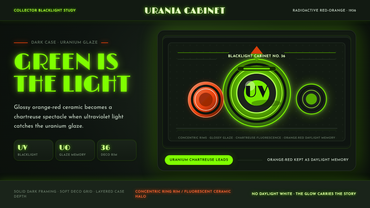 Fiestaware Radioactive Red-OrangeGlows like a collector's secret. Chartreuse rims cut through a dark deco case.
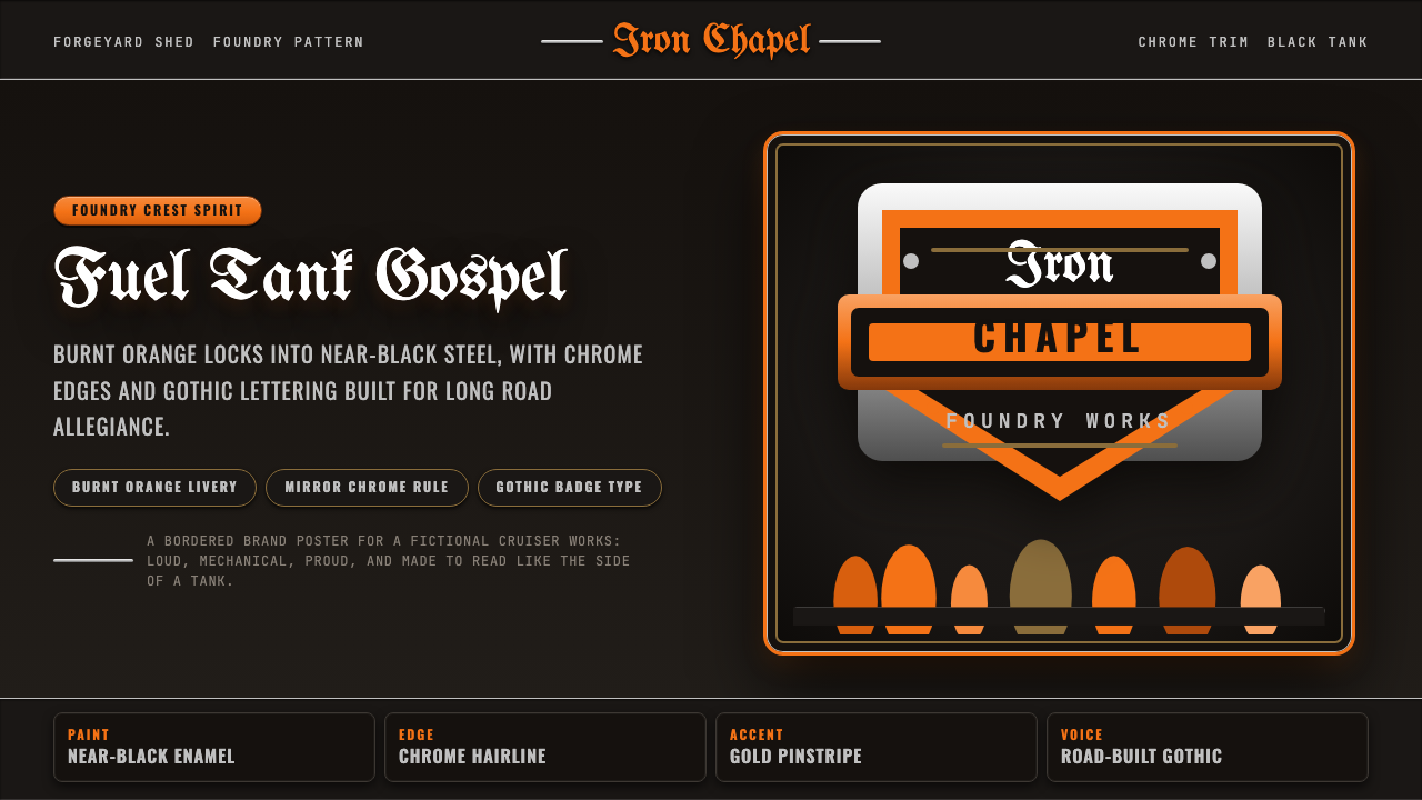 Harley Orange & BlackBuilt like a tank badge. Burnt orange, chrome hairlines, gothic type on near…
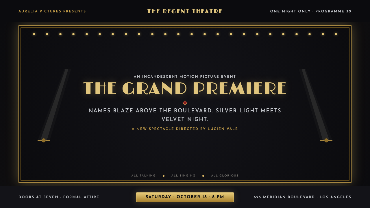 Hollywood Golden Age (1930)Black-and-gold spectacle commands the night. Marquee bulbs frame monumental D…
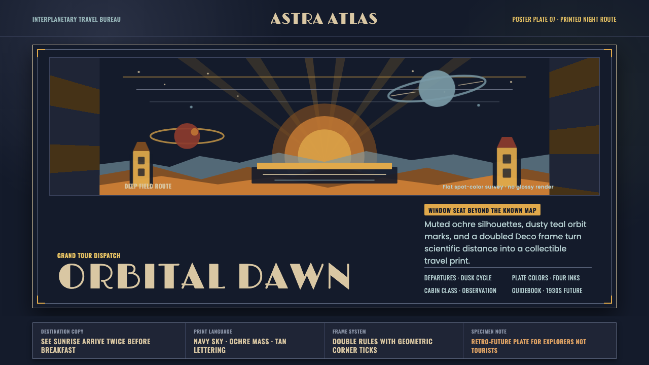 JPL Visions of the FutureSpace travel as print craft. Burnt orange silhouettes and Deco tan type on na…
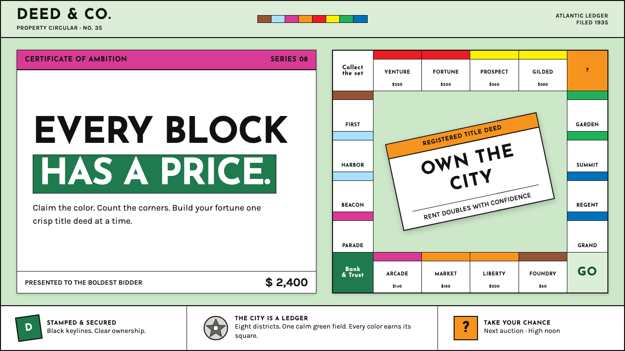 Monopoly (1935)Everything is ownable. Candy-bright deed bands snap across a calm sage board.
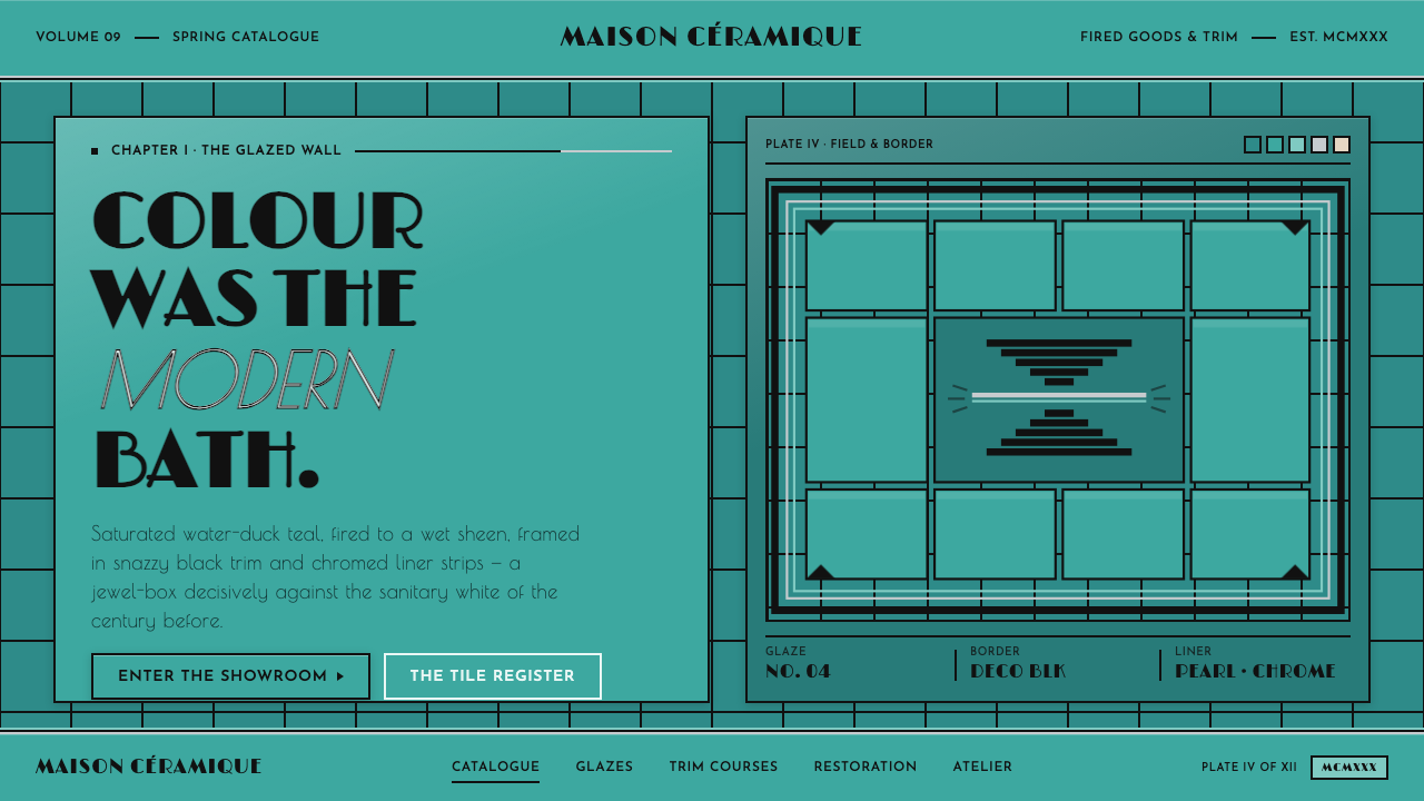 Art Deco Teal BathroomColour was the modern bath. Water-duck teal glaze, snazzy black trim, Limelig…