What is Bhutan Thunder Dragon Flag (1969)?
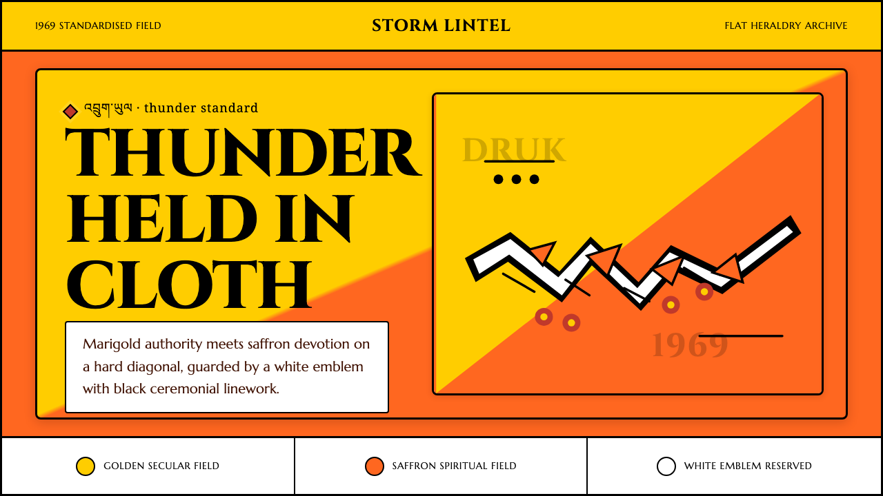
Bhutan's flag halves itself along a single diagonal, saffron meeting marigold beneath a white dragon that has stood for the kingdom's sovereignty since long before the country owned a flag to fly it on.
Bhutan Thunder Dragon Flag (1969) in brief
The flag of Bhutan is one of the simplest and most legible pieces of heraldry flown by any nation: a rectangle sliced on the diagonal into two triangular fields — golden-yellow in the upper-left, deep saffron-orange in the lower-right — crossed by a single white dragon coiled diagonally along the seam, four claws gripping a jewel apiece. There is no crest, no border, no secondary device. Every element that appears is load-bearing.
Each part of the composition carries an assigned meaning rather than a decorative one. The golden-yellow field stands for the secular authority of the Druk Gyalpo, the reigning king, and for the country's civil administration. The saffron-orange field stands for the spiritual authority of the Drukpa Kagyu school of Buddhism, the state religion. The white dragon — the Druk, or thunder dragon — is the emblem the country is named for, and the jewels clutched in its claws stand for wealth and perfection, guarding the nation against threats from without and within.
Visually this makes Bhutan's flag closer to a coat of arms compressed onto cloth than to the striped tricolors most nations fly. There is no repeating pattern, no field of stars, no crossed bars — one diagonal division and one charge, both rendered in flat, fully saturated color with no shading, no gradient, and no softened or pastel tone anywhere on the field. The dragon's body is picked out in a firm outline against the color beneath it, so it reads clearly at a distance and at small scale alike, the way a well-drawn crest is meant to.
Where does Bhutan Thunder Dragon Flag (1969) come from?
The story behind the flag begins three centuries before the flag itself. In 1616 the Tibetan lama Ngawang Namgyal, later known as the Zhabdrung Rinpoche, fled sectarian rivalry in Tibet and unified the valleys of Bhutan under the banner of the Drukpa Kagyu school, the 'Dragon' lineage of Buddhism. He built the great dzong-fortresses that still anchor Bhutanese towns and established a dual system of government — a temporal ruler managing civil affairs alongside a spiritual head guiding religious life. That dual structure, temporal and spiritual authority sharing power under one roof, is the exact relationship the flag's two color fields would later be built to represent.
The Drukpa lineage itself traces its name to a founding legend: when the Tibetan master Tsangpa Gyare consecrated the site of the first Drukpa monastery in the twelfth century, nine dragons were said to have roared into the sky. Bhutan's own name in its own language, Druk Yul, means 'Land of the Thunder Dragon,' and the roar of dragons in Himalayan thunderstorms became bound up with national identity centuries before any cloth flag existed to depict it.
Formal flags are a comparatively recent addition to Bhutanese statecraft. Early versions, sewn by hand for use at dzongs and on diplomatic missions in the first half of the twentieth century, varied in their proportions, in the angle of the diagonal, and even in the dragon's coloring — some renderings showed a dragon in green or multicolored scales rather than plain white. A friendship treaty with newly independent India in 1949 brought Bhutan into closer contact with the conventions of modern international diplomacy, and with them came pressure toward a single, consistent national symbol that could be reproduced accurately abroad.
That consistency arrived under the third king, Jigme Dorji Wangchuck, whose reign pushed Bhutan toward membership in international bodies, culminating in its admission to the United Nations in 1971. In the years just before that admission, the flag was standardized into the form flown today: a fixed diagonal, a plain white dragon facing the hoist, and the two-tone field locked to its modern proportions. The definitive modern rendering is credited to Mayum Choying Wangmo Dorji, a member of the royal family entrusted with resolving the inconsistencies of earlier hand-sewn versions into one official design — the flag this system is built from.
What defines the Bhutan Thunder Dragon Flag (1969) look?
Color and Field
The palette is deliberately narrow: a warm golden-yellow and a deeper saffron-orange, meeting along one diagonal seam with no third field color competing for attention. Both tones sit at full, flat saturation — there is no lightening toward the edges and no darkening in the corners. White is spent almost entirely on the dragon, which keeps the two background fields reading as a single, confident statement rather than a busy composition.
Diagonal Composition
Where most national flags divide their field with horizontal stripes, vertical bars, or a canton in one corner, this system is built around a single bend — a diagonal cut running corner to corner. That one decision does most of the compositional work: it creates directional energy that a horizontal split cannot, and it gives the dragon a natural line to travel along, so the charge and the field division reinforce each other instead of competing.
The Dragon Emblem
The Druk is drawn coiled rather than rampant, its body following the diagonal seam so it appears to be surging out of one field into the other. All four claws are visible and each grips a single round jewel — a deliberate multiplication of the same motif rather than one dragon holding one prize, which reads as abundance rather than a single trophy. The head faces outward from the hoist, mouth open, a posture read locally as vigilant rather than aggressive.
Contour and Detail
A firm, continuous outline separates the white dragon from the colored field beneath it at every point of contact, so the figure never blurs into its background even when the flag is reproduced at very small scale — on a badge, an app icon, a loading mark. Scale detail along the body and stylized cloud or flame motifs around the claws are rendered as clean linear marks rather than dense cross-hatching, keeping the figure legible rather than ornate.
Symbolic Palette
Nothing in this system is chosen for taste alone; every color and every figure is assigned meaning first and aesthetics second. Gold reads as governance, saffron reads as devotion, white reads as purity and sovereignty, and the jewel reads as protected value. Applying the system with integrity means preserving that hierarchy of meaning — using the two background tones for structure and reserving white for the single most important element on the page, exactly as the flag reserves it for the dragon alone.
Flatness and Restraint
There is no gradient anywhere in this palette, no drop shadow softening the dragon's silhouette, and no pastel dilution of either background tone. Where an accent beyond gold, saffron, and white is needed, it should be a deep, restrained red rather than a bright secondary hue — used sparingly, the way a seal or a single ceremonial mark is used, never as a third competing field.

Who shaped Bhutan Thunder Dragon Flag (1969)?
The Tibetan lama who unified Bhutan's valleys in the seventeenth century under the Drukpa Kagyu school, Ngawang Namgyal built the dzong-fortress system and established the dual temporal-and-spiritual government whose two halves the flag's gold and saffron fields still represent. Without his consolidation of a distinct 'Drukpa' state, there would be no thunder-dragon nation for a dragon flag to symbolize.
Bhutan's third hereditary king oversaw the country's turn toward international diplomacy in the mid-twentieth century, a shift that culminated in Bhutan's admission to the United Nations in 1971. It was under his reign, in the years leading up to that admission, that a single standardized flag design — fixed proportions, fixed diagonal, one dragon in white — was needed and adopted, replacing the varied hand-sewn versions that had come before.
A member of the Bhutanese royal family, Mayum Choying Wangmo Dorji is credited with finalizing the modern flag's precise form in the years around 1969, resolving the inconsistent proportions, dragon postures, and colorings of earlier versions into the single official design that Bhutan has flown ever since. Her version is the direct ancestor of the flag this system renders in digital form.
The 'Dragon' school of Tibetan Buddhism that gives Bhutan both its name and its state religion, the Drukpa Kagyu lineage traces to a founding legend of dragons roaring over a twelfth-century monastery consecration. As Bhutan's established religion since Zhabdrung Ngawang Namgyal's unification, it is the lineage the flag's saffron field represents, and the reason the country's central emblem is a dragon rather than any other animal.
How do you use Bhutan Thunder Dragon Flag (1969) today?
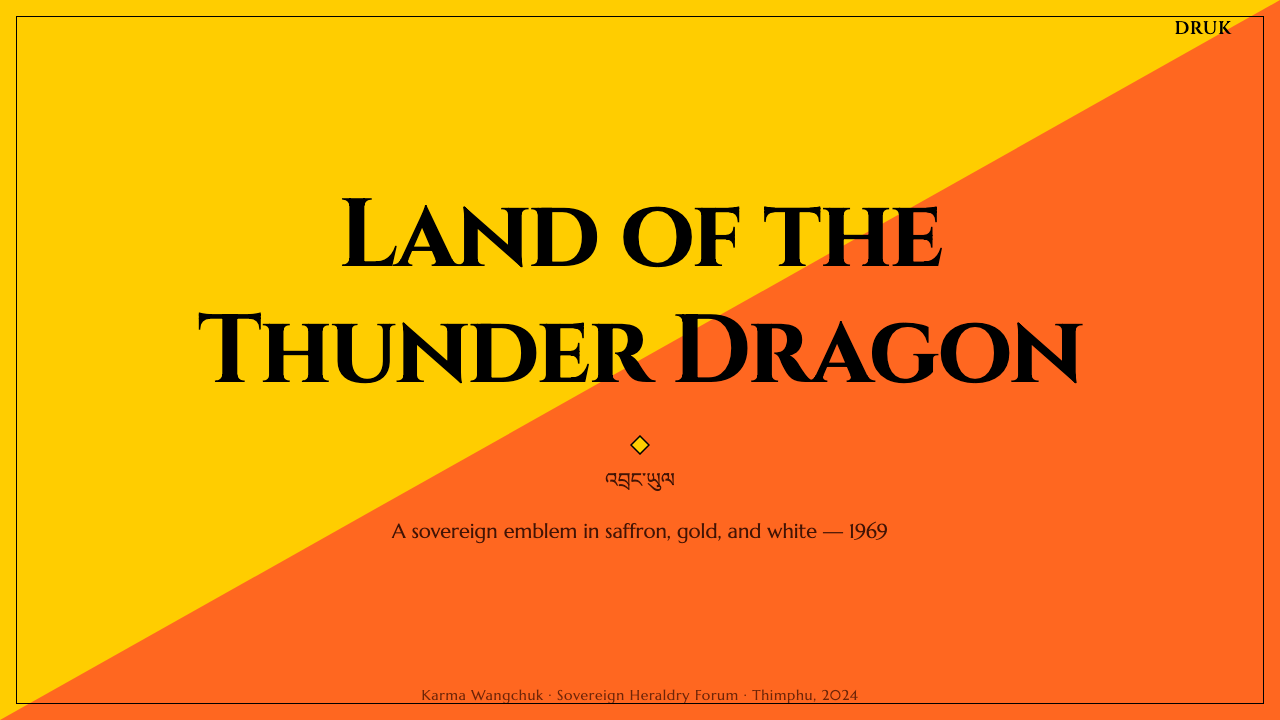
On presentation slides, this system works best when the diagonal is treated as an actual structural device rather than a background flourish. A cover slide can run the two-tone diagonal corner to corner behind a title set in white or near-white type, echoing the flag's own hierarchy of field-then-figure. Content slides should keep the diagonal subtler — a thin band of saffron along one edge, gold reserved for a single header bar — while data slides do best translating the palette into two-series comparisons: gold against saffron reads as an immediate, legible opposition without needing a third color to separate categories.
For dashboards and pricing pages, the two-field logic maps cleanly onto tier or state distinctions — a saffron-tinted panel for one plan, a gold-tinted panel for another, both resolving to the same white-on-dark or dark-on-white text treatment the flag uses for its dragon. Because the source palette has no gradient anywhere, buttons, cards, and active states should stay flat-filled rather than glossy or beveled; a hairline dark outline around key components does the same work the dragon's contour line does on the flag itself.
In long-form editorial and marketing layouts, the diagonal motif works well as a section divider or hero-image mask rather than as a repeating pattern — used once per page, at full confidence, it reads as intentional; used repeatedly, it starts to look like a background texture and loses the heraldic weight that makes it distinctive. Pull quotes and callouts benefit from the saffron tone as a background wash, with gold reserved for the rarer, higher-priority call to action.
The most common mistake is treating this as a generic warm orange-and-yellow palette and adding a third accent color to round it out — a teal, a coral, a soft pink — because two tones feel restrictive. That restriction is the entire point: the flag communicates through exactly two field colors and one white figure, and diluting that with a third competing hue collapses the symbolic clarity the whole system depends on.
Bhutan Thunder Dragon Flag (1969) — FAQ
Why does the flag use a diagonal split instead of horizontal stripes like most national flags?
A diagonal division, known in heraldry as a bend, creates a sense of motion and direction that a horizontal stripe cannot — and it gives a coiled figure like the Druk a natural line to follow across the field. Rather than sitting still on top of a striped background, the dragon appears to be moving along the seam itself, so the field division and the central figure reinforce one another instead of existing as two separate design decisions.
Does the color split have a fixed proportion, or can the two fields be different sizes?
On the official flag the diagonal runs corner to corner, giving each field an equal share of the area, and that balance is part of the message — neither the temporal nor the spiritual authority the colors represent is meant to outweigh the other. Interface adaptations can flex the ratio for practical layout reasons, but pushing one field to dominate the other undercuts the parity the original heraldry is built to express.
Is the dragon specific to Bhutan, or does it borrow from Chinese dragon iconography?
The Druk is a distinct figure from the East Asian dragon, even though both traditions share a serpentine, clawed silhouette common across the region. The Bhutanese dragon is defined by its posture along the diagonal, its four claws each gripping a single jewel, and its direct tie to the Drukpa Kagyu lineage's founding legend of roaring dragons — a specifically Himalayan Buddhist origin rather than an imperial Chinese one. Treating it as interchangeable with generic East Asian dragon ornament erases that distinction.
Can this heraldic system work with a dark background instead of the flag's bright gold-and-saffron ground?
It can, but it changes the register. The flag's power comes from full-saturation, light-catching color fields meeting under a bright white figure — a daylight, outdoor-banner logic. A dark adaptation should keep saffron as the dominant warm tone against a deep neutral ground, use gold sparingly as an accent rather than an equal field, and preserve white strictly for the most important figure or headline on the page, exactly as the flag reserves it for the dragon alone.
What's the most common mistake when applying this system to a product that has nothing to do with Bhutan?
Stripping the colors of their meaning and using them as a purely decorative sunset or autumn palette. The system reads as confident heraldry, not seasonal warmth, because the two tones are held at full flat saturation with a hard-edged white figure between them — soften the edges, add a gradient, or blend the two colors into each other, and the design stops reading as a flag and starts reading as generic warm branding with no particular identity behind it.
Related design styles
 Bollywood Poster Art (1970s)Subtlety is unaffordable. Saffron fields, Bungee shadows, diagonal hoarding d…
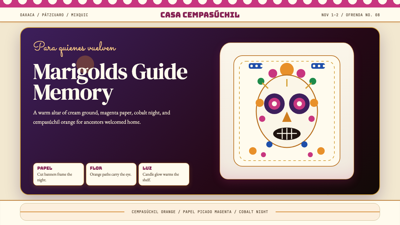 Día de los MuertosRemembrance glows. Marigold orange, magenta papel picado, and cream altar tie…
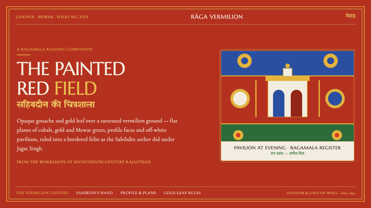 Mewar Rajput MiniatureThe ground is the painting. Vermilion fields, cobalt, gold-leaf rules, profil…
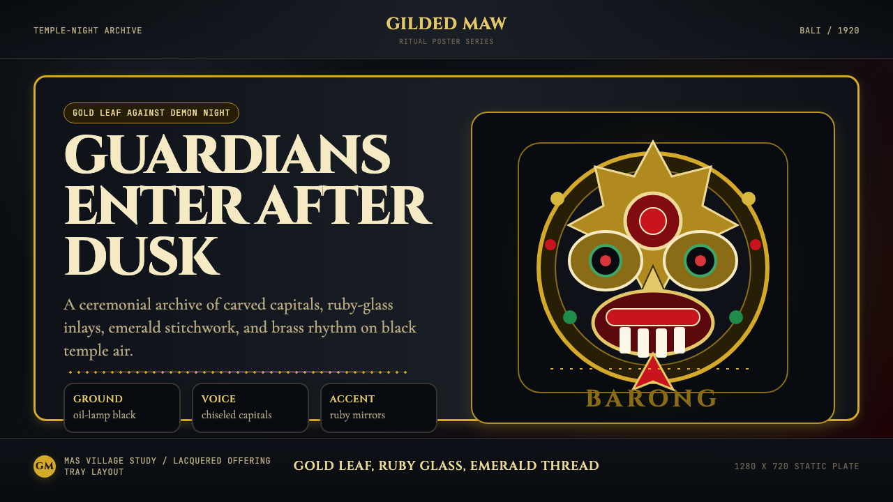 Balinese Barong Mask (1920)Protection glows after dark. Cinzel capitals frame gold, ruby, and emerald ge…
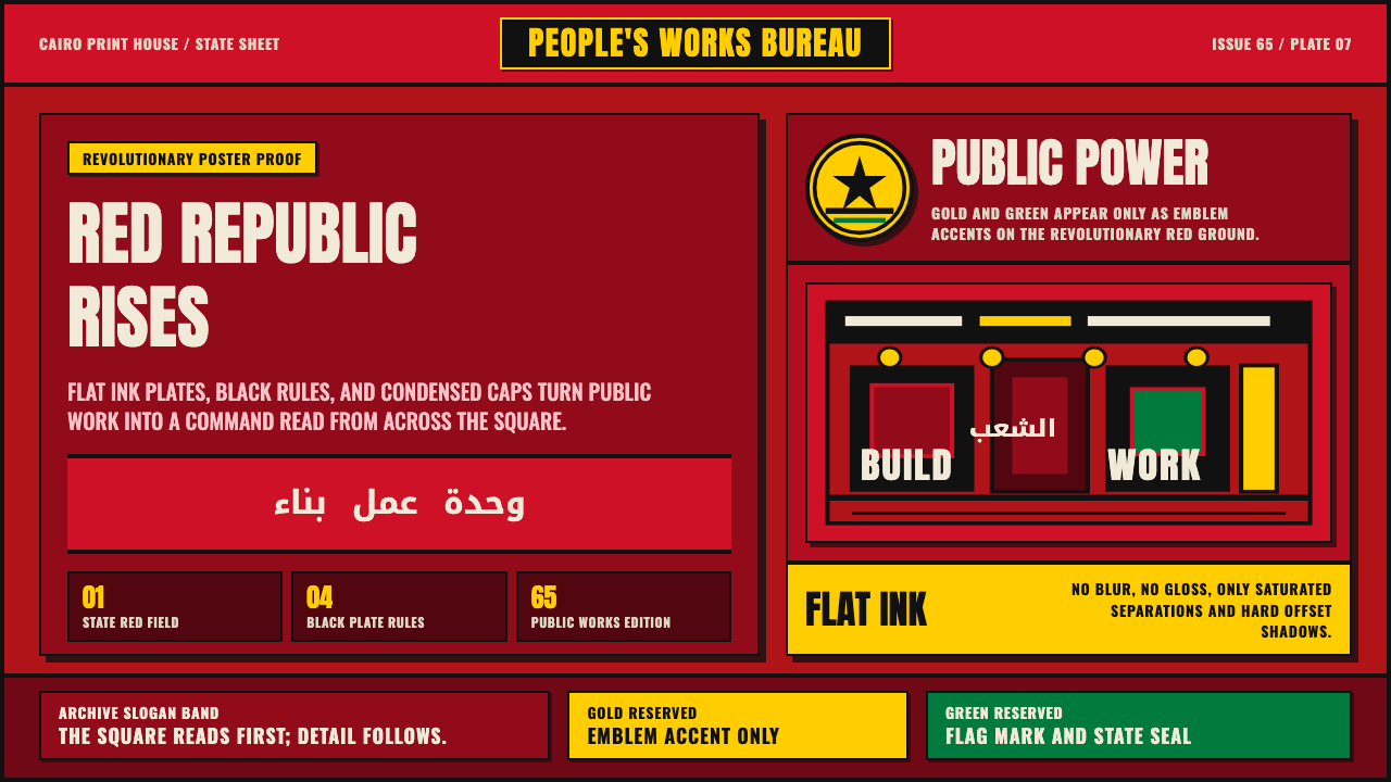 Egyptian Political PosterState power shouts. Red poster grids, black keylines, kufic type, gold-green…
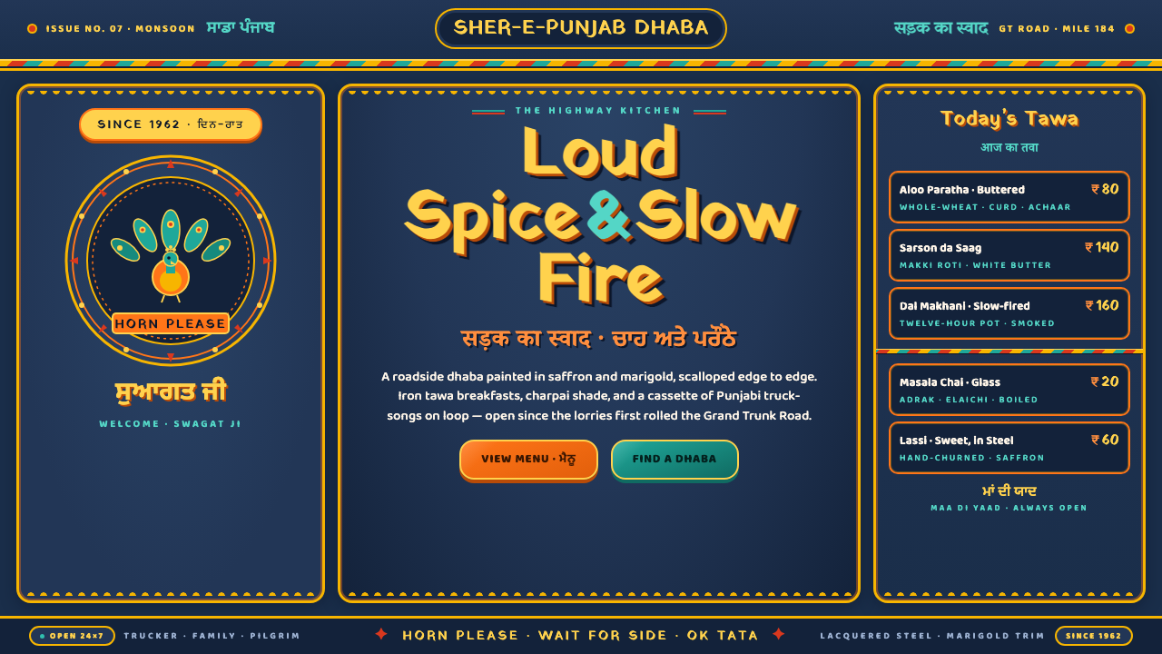 Indian Dhaba Truck-Art MenuHighway maximalism, lacquered. Saffron and marigold glow on indigo steel, sca…