What is Mon Hongsa Emblem?
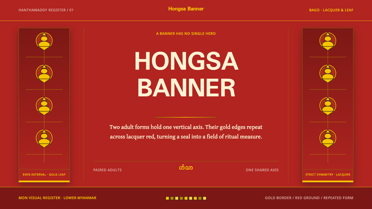
The hintha is a bird that almost never appears alone — a gilded pair stacked on a lacquer-red banner, repeated at even intervals until the repetition itself becomes the picture.
Mon Hongsa Emblem in brief
Mon Hongsa Emblem is a design style built on a bird that is rarely shown alone. The hintha — hamsa in Sanskrit, hongsa in Thai, often translated as 'swan' — is the emblem of the Mon people of Lower Burma and of Hanthawaddy, the Realm of Hamsa. Burmese culture reads the bird not as a swan but as a ruddy shelduck: plump-bodied, short-necked, with a beak that opens like a flower and a tail that flares. As an ornamental language the style is gold on lacquer red, in pairs, in rows, laid down a hanging banner at regular intervals.
The idea that governs the style is that repetition outranks the hero. Many emblematic systems build a page around one commanding figure. This one treats the emblem as a unit, a module to be repeated at even intervals until the repetition becomes the image, the way a monastery banner is more a rhythm than a picture. Symmetry is strict and bilateral: whatever stands on one side of the centre line stands on the other. There is no focal bird, no main event, no star of the show.
The material logic behind it is gilding. Every filled shape is outlined with a hairline of gold, because gold leaf laid over lacquer always leaves a thin line of light at the edge. Rather than hide that, the style turns it into a rule: each shape — a body, a wing, a tail — carries its own fine golden contour. The result is dark, rich and ceremonial, closer to a temple textile or a lacquered screen than to a flat poster.
Where does Mon Hongsa Emblem come from?
The Mon are one of the old peoples of Lower Burma, now Myanmar, and their culture has been closely tied to Buddhism and temple building for centuries. The hintha is their emblem. The kingdom they called Hanthawaddy — the name means Realm of Hamsa — ruled from Bago, also known as Pegu, and the source material dates Hanthawaddy Pegu to the years 1287 to 1552, with a restoration between 1740 and 1757. The region the style belongs to takes in Bago, Mottama, Mawlamyine and the Mon State coast.
Bago's founding legend gives the emblem its shape. According to the tradition, two Mon princes saw a pair of hintha on an island in a lake, a female standing on the back of a male. They were not a mother with a chick; they were two adult birds, and the seal of Bago calls them the brother-and-sister hintha. The story is a founding legend in the old sense, a reason why the city stands where it does, and it explains why the emblem is almost always paired and almost always stacked: the stacked pair is the founding image, and everything else descends from it.
From legend the pair passed into objects and habits. It became a seal, then a flag, then a habit of ornament: gold on a lacquer-red field, tiled at even intervals down hanging banners, gilded onto the finials at the tops of monastery flagpoles. The banner and the flagpole share a property — they are tall, narrow and vertical, made to be seen from a distance, and they depend on a repeated unit rather than a single large image. The movements the source lists, Mon Buddhist temple art and Burmese royal and monastic heraldry, describe the same continuity, in which the symbol of a people, the symbol of a court and the decoration of a monastery are one visual vocabulary.
The emblem did not stop with the old kingdom. The source traces it into the Mon State flags of 1974 and 2018, and lists twentieth-century ethnic-nationalist flag design among the movements behind the style. That gives the emblem a double life: it is a piece of Buddhist ornament and also a living political and cultural symbol. Two rulers anchor the older story. Shin Sawbu and Dhammazedi, who ruled Hanthawaddy in the fifteenth century, are remembered above all as patrons of Buddhism, and the golden, temple-centred character of the style reflects the world they presided over. A designer who uses the emblem should keep that double life in view: the hintha is respected heraldry, not a clip-art bird.
What defines the Mon Hongsa Emblem look?
Lacquer-Red Field
The ground is a deep, glossy-looking red, the red of lacquered wood and temple banners, dark enough that gold reads as light rather than as colour. It is a saturated ground but not a bright one; it sits low in value and gives the whole composition a ceremonial weight. Large areas are left as plain field. Ornament is placed on the red, never mixed into it, so the ground reads as a surface that has been prepared to receive gold.
Gold Leaf and Hairline Edges
Gold is the only metal in the system and is treated as foil, not as a metallic gradient. Every filled shape is wrapped in a gold hairline, reproducing the thin line of light that real gold leaf leaves at its edge over lacquer. Fills stay flat; the outline does the work of definition. Shine comes from the contrast between warm gold and dark red, never from simulated chrome, bevels or glossy highlights.
The Banner as Unit
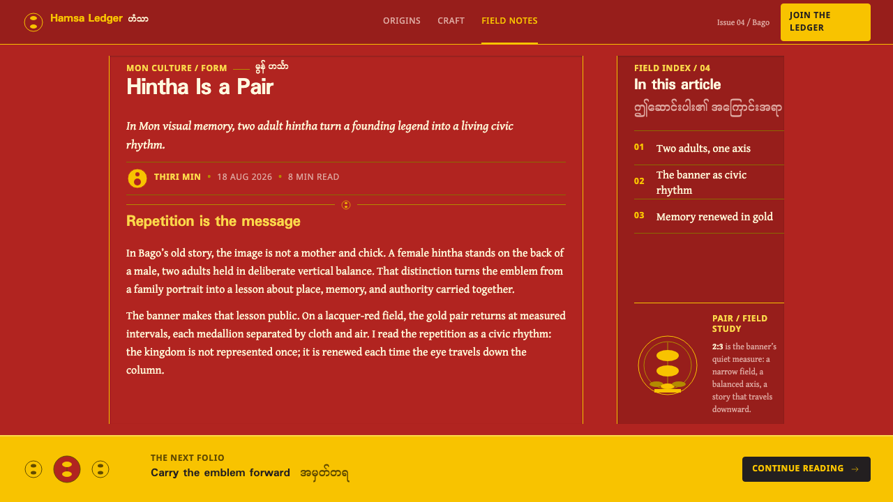
The system is built from the hanging banner: a tall, narrow strip with its emblem repeated down its length. Compositions are assembled from such strips placed side by side, rather than from a single large canvas subdivided into boxes. The vertical axis dominates, which gives the style a processional, hanging quality, as if the page had been suspended from a pole.
Strict Bilateral Symmetry
Everything mirrors about a central axis. The emblem itself is a paired form, and banners, borders and panels follow the same rule. Symmetry here is not softened by an offset accent or an asymmetric title; the centre line is a fact of the layout. This gives the style a stillness and authority similar to heraldry, and it makes any deliberate departure from symmetry read as an error rather than as variety.
Repetition Over Hierarchy
Elements recur at even intervals and equal weight. No emblem is larger, brighter or more central than its neighbours; importance is expressed by position along the banner or by where the viewer's attention is led, not by scale. Rhythm substitutes for a focal point. A reader scans the banner as one scans a line of beads, and understands the structure from the regularity itself.
The Paired Emblem
The unit of repetition is the pair, not the single bird: one hintha stacked on another, as in the founding legend. Each bird is drawn from the same few traits — a plump rounded body, a short neck, a beak that opens like a flower, a flaring tail — simplified into a silhouette that can be tiled without losing legibility. Because the pair is a stable, tile-able shape, it works equally as a seal, a border motif or a repeated field pattern.
Who shaped Mon Hongsa Emblem?
Shin Sawbu was a Mon ruler of Hanthawaddy in the fifteenth century and is remembered as one of the kingdom's great patrons of Buddhism. Tradition associates her with the gilding of the Shwedagon pagoda, the gold-covered stupa that dominates the skyline of Yangon, and with a gift of gold said to equal her own weight. The link to this style is direct: gold applied as a devotional act to the surface of a sacred structure is the cultural logic behind gold on red.
Dhammazedi ruled Hanthawaddy in the same century and had been a monk before he became king. He is remembered for religious reform and for the Kalyani Inscriptions at Bago, a major record of Mon Buddhist history set in stone. He stands for the monastic and scholarly side of the kingdom, the side that valued ordered, repeated, formally correct ritual — qualities that echo in a style where regularity is a virtue.
Their story belongs to the founding of Bago: they are the witnesses who saw the pair of hintha on an island in a lake, and whose sighting explains why the city stands where it does. They are not named here, because the source material does not name them. What matters for design is the image they saw — two birds, one standing on the other — which became the seal's pair and then the style's unit.
How do you use Mon Hongsa Emblem today?
Mon Hongsa Emblem is a ceremonial, ordered style. It works best where the subject has gravity, heritage or ritual, and where the designer is willing to let repetition and symmetry do the work that scale and contrast do elsewhere. Applying it well means adopting the banner logic: a repeated unit, a central axis, flat gold, hairline edges, dark red ground.
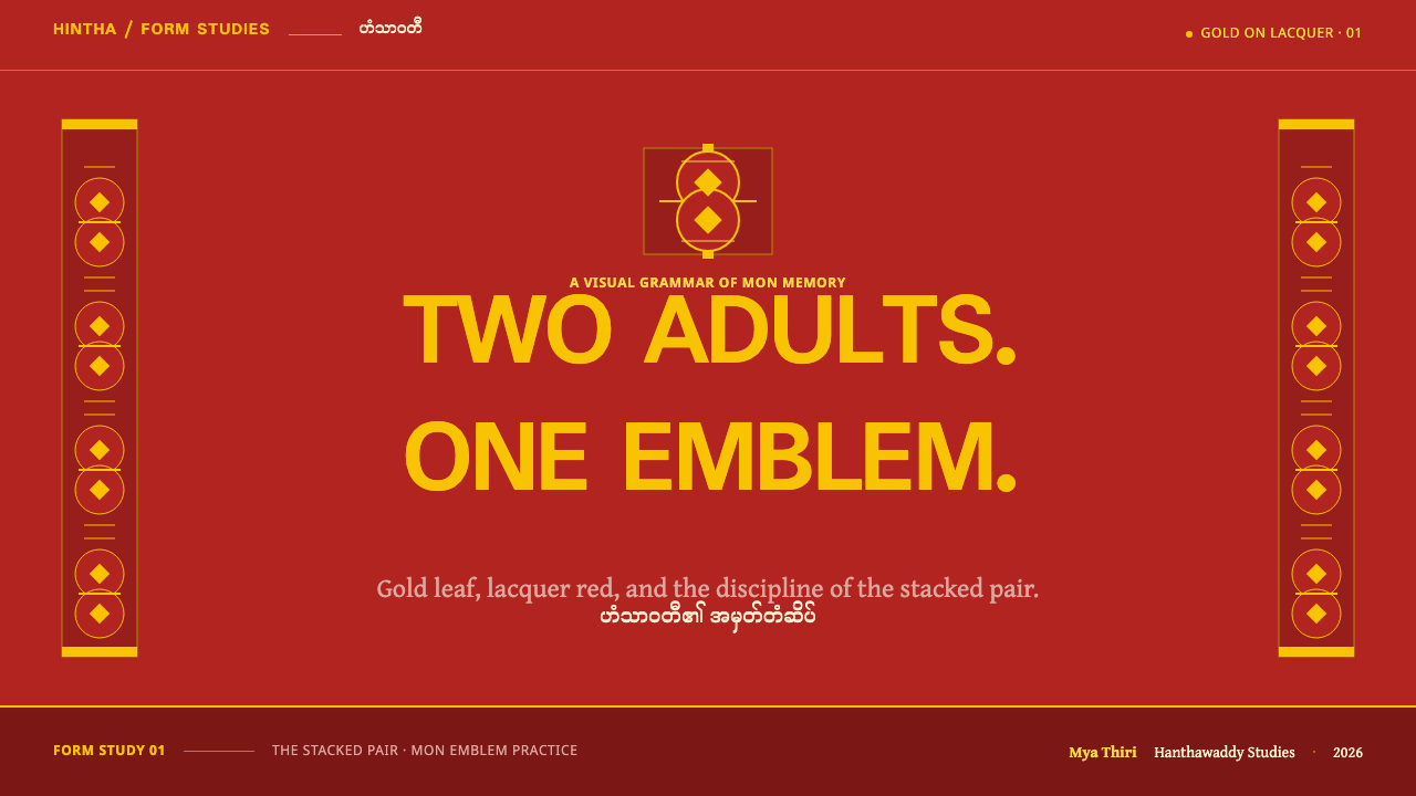
For presentation slides, the cover should feel like a banner hung in a hall. Place a narrow vertical strip of repeated paired emblems down each side, centre the title on the axis between two fine gold rules, and keep the red field otherwise plain. Content slides work as rows of equal-weight modules, with identical spacing and no oversized hero panel; if one point matters more, place it at the centre rather than enlarging it. For data, prefer unit charts built from repeated identical marks over single large bars, so the chart inherits the banner rhythm.
For web interfaces, dashboards can be laid out as symmetrical tile grids of equal cards, each outlined in gold hairline on a deep red ground, with status shown by position or by filled versus outlined units rather than by size. Pricing pages are an interesting test: three or four tiers of identical width, mirrored around the centre, with the recommended tier marked by an inset gold contour instead of being made larger. Navigation can be centred and typographic, framed by two matching rules, with no decorative icons beyond the paired emblem.
In editorial and marketing work the style suits subjects that carry heritage and ritual: temples and pilgrimage, tea and food of Southeast Asia, festivals, cultural institutions, ceremonial hospitality, long-form history. Layouts can borrow the vertical rhythm of banners for scrolling pages, with one narrow column of repeated emblems as a margin and the text set on the central axis. Section breaks are marked by a gold hairline and a single paired emblem rather than by large images or ornaments.
A common mistake is treating the style as generic red-and-gold decoration. Red and gold appear in many traditions, and borrowing the colours without the banner logic, the strict symmetry, the flat foil treatment and the hairline edges produces a pastiche that could belong to anywhere. Other frequent errors are rendering the gold as a shiny metallic gradient, enlarging one emblem into a hero, and breaking the symmetry for the sake of variety. Finally, keep in mind that the hintha is a live cultural and political emblem: do not turn it into a mascot, and do not alter the pair into a single swan.
Mon Hongsa Emblem — FAQ
Is the hintha a swan?
Not in the Burmese reading. The word comes from the Sanskrit hamsa, which is often translated as swan or goose, but Burmese culture reads the hintha as a ruddy shelduck: plump-bodied, short-necked, with a flowering beak and a flaring tail. That distinction matters visually, because the silhouette in this style is rounded and compact rather than long-necked and elegant. Drawing it as a classic long-necked swan loses the identity of the emblem.
What was Hanthawaddy?
Hanthawaddy was the Mon kingdom of Lower Burma, ruled from Bago, also called Pegu. Its name means the Realm of Hamsa, after the emblem. The source material dates Hanthawaddy Pegu to 1287 to 1552, with a restoration from 1740 to 1757. Its coastal territory is the region this style belongs to, including Bago, Mottama, Mawlamyine and the Mon State coast.
Why does the style put repetition ahead of a hero element?
Because its source objects work that way. A hanging banner is read as a rhythm of repeated units, not as one large picture, and a gilded finial is a single repeating form raised on a pole. Treating the emblem as a tile rather than a headline gives the style its stillness and its ceremonial weight. When importance has to be shown, it is expressed by position and by the viewer's path along the banner, not by making one element larger.
Can this style work on a light background?
It is built as a dark style: gold hairlines on a lacquer-red ground only read as light because the field is deep. A pale or white ground can be used for supporting content, such as long text or tables, but the emblem and its banners should return to the red field. Reversing the whole system, with red outlines on cream, is possible but loses the sense of gilding that defines the style, so it should be treated as a different, secondary variant.
Is it appropriate to use the hintha as a decorative or brand motif?
Handle it with care. The hintha is a long-standing Buddhist and royal emblem and also appears on the Mon State flags of 1974 and 2018, which gives it living political and cultural weight. Use it where the subject genuinely relates to Mon or Burmese heritage, credit the origin, keep the paired form intact and avoid using it as a mascot, a joke or a generic exotic flourish. If the use is commercial, consider whether it could be read as implying a political position.
Related design styles
 Mewar Rajput MiniatureThe ground is the painting. Vermilion fields, cobalt, gold-leaf rules, profil…
 Bhutan Thunder Dragon FlagHeraldry hits like thunder. Marigold and saffron split hard around a white em…
 Journey to the West (Monkey King)A god roars off the block. Vermilion opera paint and gilt rules ignite a lacq…
 Kabuki Oshiroi WhitefacePowder becomes stage light. Cool white cuts through black lacquer with one he…
 Kerala Kathakali (Pacha Green Makeup)Fierce ceremonial night. Pacha green, vermilion, and oil-gold frame monumenta…
 Sri Lankan Kandyan Mask & DanceRitual carries weight. Gold serif type and ruby-emerald filigree burn on blac…