What is Los Angeles Lakers?什么是 Los Angeles Lakers?
Forum Blue and gold against jet black — the Lakers palette turned a basketball franchise into Hollywood's most glamorous visual identity.论坛蓝与金色映衬纯黑——湖人的配色将一支篮球队化作好莱坞最耀眼的视觉符号。
Los Angeles Lakers in briefLos Angeles Lakers 速览
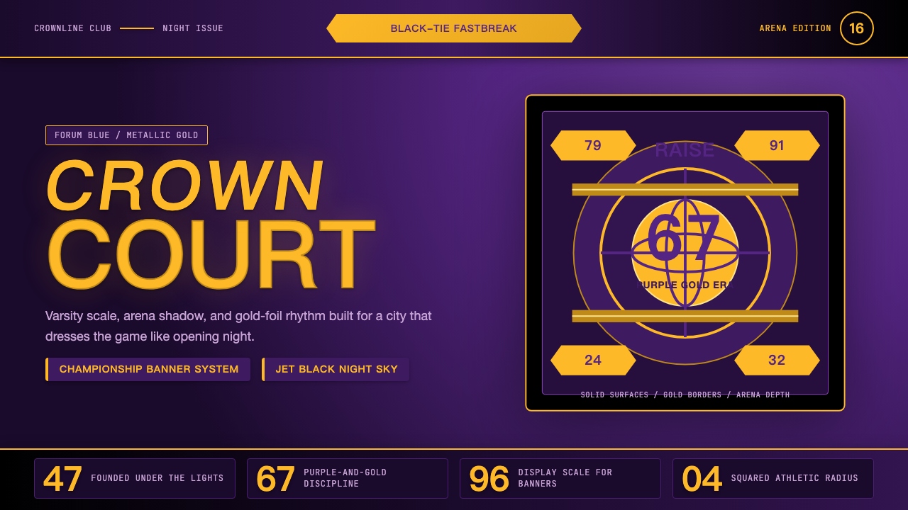
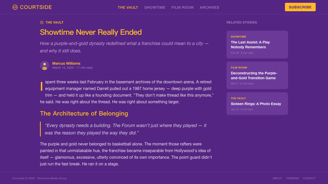
Lakers Purple-and-Gold is a sports design identity so visually commanding that it long ago transcended its athletic origins. Built on a triad of deep royal purple, warm metallic gold, and jet black, the system communicates power, ceremony, and urban glamour simultaneously. It is one of the rare sports palettes that functions as luxury branding — not because it borrows from fashion, but because every element of the system reinforces a single, coherent statement: this is the premier franchise in the most cinematic city in the world.湖人紫金配色是一套超越体育本身、具有独立视觉权威的运动设计语言。它以深邃的皇家紫、温暖的金属金和纯粹的哑光黑构成三角支柱,同时传递力量、仪式感与都市魅力。在极少数能够兼容奢华品牌语境的运动色板中,它是其中之一——并非因为借鉴了时装,而是因为系统的每一个元素都在强化同一陈述:这是世界上最具电影气质的城市中最顶尖的球队。
The visual vocabulary is rooted in varsity athletic tradition — arched wordmarks, bold block lettering, slab-serif numerals — but elevated by the choice of materials and finish. Where a typical collegiate identity stays matte, the Lakers system reaches for metallic foil, high-gloss laminate, and the sheen of a championship trophy. Gold is never flat; it catches light. Purple is never muddy; it holds depth. The black ground beneath them is absolute, functioning less as a background color and more as a stage.这套视觉词汇植根于美式校队传统——拱形字标、粗重块状字母、粗衬线球衣号码——却因材质与光泽的选择而得到升华。普通校队身份停留在哑光层面,而湖人系统伸向金属箔烫金、高光覆膜和总冠军奖杯般的光泽。金色从不平淡,它捕捉光线;紫色从不浑浊,它蕴藏深度。其下的黑色底面是绝对的,它发挥的作用与其说是背景色,不如说是一方舞台。
What makes this palette distinctive in contemporary design applications is its refusal to be casual. Even in minimal treatments — a monogram on a white ground, a single gold wordmark on black — the system retains its formal authority. It is equally at home on a championship banner hanging from arena rafters and on a presentation deck cover. The combination of ceremonial color, muscular type, and restrained compositional structure gives it a versatility that few sports identities can claim.这套配色在当代设计应用中的独特之处,在于它拒绝随意。即便是最简练的处理——白底上的首字母组合,黑底上的单行金色字标——系统依然保持其正式权威。它同样适合悬挂在球馆顶端的总冠军旗帜,也适合演示文稿的封面。仪式色彩、强劲字形与克制的构图结构三者共同赋予它极少数运动身份能够声称的普适性。
See the Los Angeles Lakers design system查看 Los Angeles Lakers 完整设计系统
Where does Los Angeles Lakers come from?Los Angeles Lakers 从何而来?
The franchise that would become the Los Angeles Lakers was founded in 1947 as the Minneapolis Lakers — a name tied to Minnesota's designation as the Land of Ten Thousand Lakes, not to any body of water in Southern California. The team relocated to Los Angeles in 1960 and brought with it the name alone, severed entirely from its geographic logic. The visual identity followed the move through several iterations before arriving at the purple-and-gold combination that would define the franchise beginning in 1967. That identity has remained, through refinements, the most recognizable in professional basketball.这支后来成为洛杉矶湖人的球队,于1947年以明尼阿波利斯湖人的名称成立——这个名字源于明尼苏达州「万湖之地」的称谓,与南加州任何水域毫无关联。球队于1960年迁往洛杉矶,只带走了这个名字,与其地理逻辑彻底切断。视觉身份随迁移经历了几次演变,最终于1967年确立了定义球队此后半个多世纪的紫金配色。这套身份经历多次精炼,始终是职业篮球中辨识度最高的存在。
The specific shade of purple adopted by the Lakers in the late 1960s was described internally as Forum Blue — a reference to the Great Western Forum, the arena in Inglewood where the team played from 1967 until 1999. The name was partly a rebranding of what the broader public called simply purple, giving the color an institutional weight and a proper noun. Forum Blue sits on the cooler, bluer edge of the purple spectrum, which prevents it from reading as red-violet and allows it to hold contrast against gold without the two colors fighting for warmth. The gold, rendered in metallic finishes rather than flat pigment, operates in the warm amber register rather than bright yellow, which gives the pairing its sense of maturity and occasion.湖人在1960年代末采用的这种紫色,内部称为「论坛蓝」——这是对英格尔伍德大西部论坛球馆(球队在此主场作战直至1999年)的致敬。这个命名某种程度上是对公众口中所说的「紫色」的重新定义,赋予这种颜色以机构分量和专有名词身份。论坛蓝位于紫色光谱偏冷、偏蓝的一端,使它不至于读作红紫,也让它在与金色形成对比时不会双方互相争夺暖调。金色以金属质感呈现而非平面颜料,处于暖琥珀色调而非明黄区间,这赋予了整体搭配成熟感与仪式感。
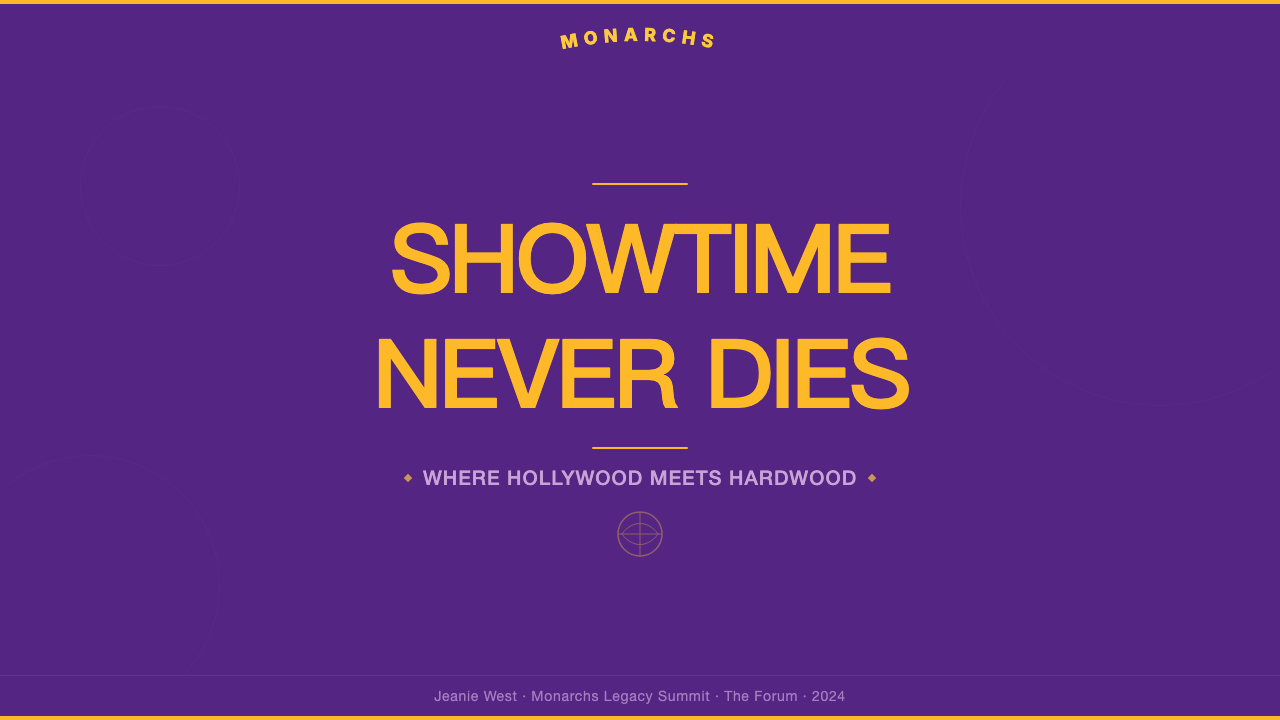
The Showtime era — roughly 1979 through 1991 — cemented the aesthetic's cultural meaning. Under owner Jerry Buss, who purchased the team in 1979, the Lakers became the intersection of Hollywood celebrity and athletic excellence. Jack Nicholson's courtside seat became as much a part of the visual narrative as Magic Johnson's no-look passes. Pat Riley's slicked-back hair and Armani suits on the sideline extended the palette's black-tie register into the coaching staff. The arena itself — lit for spectacle, populated by recognizable faces — turned every home game into something closer to a premiere than a sporting event. The design identity absorbed all of this cultural energy and held it.大致从1979年延续至1991年的「Showtime」时代,将这套美学的文化意涵凝固成型。在1979年购买球队的老板杰里·巴斯的主导下,湖人成为好莱坞名流文化与竞技卓越的交汇点。杰克·尼科尔森的场边座位与魔术师约翰逊的不看人传球共同构成视觉叙事的组成部分。帕特·莱利在场边的背头与阿玛尼西装,将这套配色的黑领结气质延伸进了教练团队。球馆本身——为奇观而点亮、为名人而聚集——将每场主场比赛变成更接近首映式而非体育赛事的东西。这套设计身份吸收了所有这些文化能量并将其保存。
The franchise's sixteen championship banners, from 1949 through 2020, gave the identity repeated ceremonial exposure at the highest level of the sport. Each banner hanging from the rafters reinforced the color pairing as the visual language of achievement. Kobe Bryant's two retired jersey numbers — visible from every seat in the arena — made the typographic register of the identity inseparable from his legacy. The result is a design system with a depth of cultural association that cannot be manufactured: it accumulated over decades of genuine sporting significance, Hollywood adjacency, and the stewardship of figures — Buss, Magic, Kobe, Riley — who understood spectacle as inseparable from competition.球队从1949年到2020年赢得的十六座总冠军奖杯,让这套身份在运动最高舞台上反复经历仪式性曝光。悬挂于球馆顶端的每一面冠军旗帜,都强化了这对色彩作为成就的视觉语言。科比·布莱恩特的两个退役号码——从球馆每个座位都清晰可见——使这套身份的字形语言与他的遗产不可分割。结果是一套具有深厚文化积淀的设计系统,这种积淀无法人为制造:它是在数十年真实的体育意义、好莱坞邻近性,以及巴斯、魔术师、科比、莱利等理解奇观与竞争不可分离的人物的守护下,一点一点积累而成的。
What defines the Los Angeles Lakers look?Los Angeles Lakers 的视觉特征是什么?
Color Palette色彩
The system rests on three colors, each with a precise role. Royal purple — Forum Blue — occupies the mid-range of the purple spectrum, leaning blue enough to avoid the warmth of violet, rich enough to hold authority in large fields. Metallic gold operates in the warm amber register, always implying sheen and finish rather than flat pigment; it is the color of a trophy in arena light. Jet black functions as the ground: absolute, stage-like, the surface against which purple and gold become ceremonial. These three colors are never casual — each deployment is a statement of occasion.这套系统依托三种颜色,各司其职。皇家紫——论坛蓝——处于紫色光谱的中段,偏蓝足以避免紫红的暖调,饱满足以在大面积铺陈时保持权威。金属金处于暖琥珀色调,始终暗示光泽与质感而非平面颜料;它是球馆灯光下奖杯的颜色。纯黑充当底面:绝对的、舞台般的、让紫色与金色化为仪式语言的背景。这三种颜色从不随意——每一次使用都是对场合的宣告。
Typographic Character字形气质
The type vocabulary is rooted in varsity athletic tradition: arched wordmarks whose curves mirror the ball's arc, bold block lettering that reads from the upper deck, and slab-serif jersey numerals whose thick strokes project physical mass. The overall effect is muscular rather than elegant — designed for distance and arena scale, not fine print. When the system is applied to smaller formats, this boldness must be preserved; the identity loses its character when reduced to a lighter, more refined typographic register.字形词汇植根于美式校队传统:曲线呼应球弧的拱形字标,从顶层看台也清晰可读的粗重块状字母,以及以厚实笔画传递体量感的粗衬线球衣号码。整体效果是强劲而非优雅——为距离与球馆尺度而设计,而非为精细印刷。当这套系统应用于更小格式时,这种粗犷必须保留;一旦降格为更轻盈、更精细的字形语言,身份便失去其性格。
Metallic Finish金属光泽
The Lakers system is one of the very few sports identities where metallic finish is not an embellishment but a structural requirement. Gold rendered as flat color becomes ordinary; rendered with sheen, it becomes ceremonial. Foil stamping, high-gloss lamination, and reflective surface treatments are not luxuries in this system — they are the difference between the identity reading as collegiate and reading as championship. In digital environments, this quality must be approximated through gradient, highlight, and shadow treatments that simulate the play of light across a metallic surface.湖人系统是极少数将金属光泽视为结构性要求而非装饰点缀的运动身份之一。金色以平面颜料呈现时流于普通;以光泽呈现时化为仪式。烫金工艺、高光覆膜与反光表面处理,在这套系统中不是奢侈选项——它们是身份被读作校队或被读作总冠军之间的分野。在数字环境中,这种品质必须通过模拟金属面上光线流动的渐变、高光与阴影处理来近似实现。
Black as Stage黑色作为舞台
In most design systems, black is a neutral — an alternative to white for dark-mode treatments or typographic use. In the Lakers palette, black is load-bearing. It is the condition under which Forum Blue becomes royal and gold becomes luminous. A purple-and-gold composition on a white or cream ground loses approximately half of its ceremonial weight. The system is fundamentally dark-ground, and treating it otherwise is not a variation — it is a misreading. Black absorbs everything that is not purple or gold, which makes those two colors perform at maximum intensity.在大多数设计系统中,黑色是中性色——深色模式处理或字体应用中白色的替代。在湖人配色里,黑色是承重结构。它是论坛蓝化为皇家紫、金色化为光芒的前提条件。紫金构图置于白色或奶油底面时,约有一半的仪式感量消失。这套系统在本质上是深色底面的,任何其他处理都不是变体——而是误读。黑色吸收一切非紫非金的元素,使这两种颜色以最大强度运作。
Ceremonial Hierarchy仪式性层级
The palette enforces a strict hierarchy: gold leads in moments of primary communication — the wordmark, the championship designation, the key data point — while purple holds the field, and black frames everything. This hierarchy is not arbitrary; it mirrors the visual experience of the arena itself, where a gold trophy on a purple court under arena lighting tells the story before a word is read. Reversing the hierarchy — purple as accent, gold as field — produces a less legible, less authoritative composition. The system's power depends on maintaining this order.这套配色执行严格的层级:金色在主要传达时刻领衔——字标、总冠军标注、关键数据点——紫色持守底面,黑色框定一切。这一层级并非随意;它映射了球馆本身的视觉经验:在球馆灯光下,紫色球场上的金色奖杯,在任何文字被阅读之前便已讲完故事。颠倒层级——以紫为点缀、以金为底面——产生可读性更低、权威性更弱的构图。这套系统的力量依赖于维护这一秩序。
Compositional Restraint构图克制
Despite its visual boldness, the Lakers identity is compositionally restrained. The wordmark occupies space without competing elements; the shield emblem stands alone; championship designations are listed, not designed. This restraint is itself a marker of confidence — the palette and form are strong enough to need no supporting ornamentation. Designs that add decorative filigree, starburst accents, or complex background patterns around the core identity elements are working against the system, importing complexity into something that derives its authority from simplicity.尽管视觉上大胆,湖人身份在构图上是克制的。字标占据空间而没有竞争性元素;盾徽独立矗立;总冠军标注被列举,而非被设计。这种克制本身是自信的标志——配色与形态足够强大,不需要任何辅助装饰。在核心身份元素周围添加装饰花纹、星暴点缀或复杂背景纹样的设计,是在对抗这套系统——将复杂性引入一个从简洁中汲取权威的事物。
Cultural Weight文化分量
Unlike design systems that build meaning from scratch, the Lakers identity arrives pre-loaded with cultural associations that span decades: championships, celebrity audiences, the Showtime fast break, Kobe's fadeaway, the Staples Center lights. This accumulated meaning is not separate from the design — it is part of what the colors communicate. When the purple-and-gold palette is applied in non-sports contexts, it borrows this freight deliberately. The association is glamour, achievement, and Los Angeles in its mythologized form — neither gritty nor casual, but cinematic.与从零建立意义的设计系统不同,湖人身份携带着横跨数十年的文化积淀:总冠军、名流观众、Showtime的快攻、科比的后仰跳投、斯台普斯中心的灯光。这些积累的意义并不独立于设计之外——它是这些颜色所传达内容的一部分。当紫金色板被应用于非体育语境时,它是在有意借用这份重量。其关联是魅力、成就,以及洛杉矶的神话化形态——既不粗粝,也不随意,而是电影化的。
See the Los Angeles Lakers design system查看 Los Angeles Lakers 完整设计系统
Who shaped Los Angeles Lakers?谁塑造了 Los Angeles Lakers?
Jerry Buss purchased the Lakers in 1979 and immediately understood that the team's visual and cultural identity needed to match the ambition of the city it represented. He transformed the Forum into a destination — improving lighting, adding entertainment, filling the sideline seats with recognizable faces — and in doing so turned the arena environment into an extension of the design identity itself. Buss's instinct that sports and entertainment were the same business produced the Showtime era aesthetic: black tie on the floor, Hollywood in the stands, championship banners in the rafters. His stewardship gave the purple-and-gold palette its most durable cultural context.杰里·巴斯于1979年收购湖人,并立即意识到球队的视觉与文化身份需要匹配其所代表城市的野心。他将论坛球馆变成了目的地——改善灯光、增加娱乐内容、让知名面孔填满场边座位——由此将球馆环境变成了设计身份的延伸。巴斯将体育与娱乐视为同一门生意的直觉,催生了Showtime时代的美学:球场上的黑领结、看台上的好莱坞、顶端的冠军旗帜。他的守护赋予了紫金配色最持久的文化语境。
Earvin 'Magic' Johnson joined the Lakers in 1979 and became the human embodiment of everything the Showtime identity aspired to communicate. His no-look passes and full-court vision made basketball feel like improvised jazz; his smile made the Forum feel like a party. More than any other figure, Magic translated the palette's promise — glamour, generosity, spectacle — into athletic gesture. Five championships and three MVP awards under his tenure gave the gold in the identity its championship meaning. When designers invoke the Lakers aesthetic, they are invoking the visual world Magic made famous.欧文·「魔术师」约翰逊于1979年加入湖人,成为Showtime身份所有抱负的人形化身。他的不看人传球与全场视野让篮球感觉像即兴爵士;他的笑容让论坛球馆感觉像一场派对。比任何其他人物都更多,魔术师将这套配色的承诺——魅力、慷慨、奇观——转化为运动姿态。在他效力期间赢得的五座总冠军和三座MVP,赋予了身份中金色以总冠军的意涵。当设计师援引湖人美学时,他们援引的是魔术师让其闻名的视觉世界。
Kobe Bryant's twenty-year career with the Lakers — the entirety of his professional life — made him the definitive figure of the post-Showtime identity. His two retired jersey numbers hang permanently in the arena, making the typographic register of the system inseparable from his legacy. Kobe brought a different emotional register to the purple-and-gold: where the Showtime era was celebratory and open, his era was intense and private. The palette absorbed both registers and held them simultaneously. His ability to treat the uniform as a vehicle for something beyond basketball — preparation, obsession, craft — elevated the identity to something closer to a philosophy than a color scheme.科比·布莱恩特在湖人二十年的职业生涯——他职业生命的全部——使他成为后Showtime时代身份最具决定性的人物。他的两个退役号码永久悬挂于球馆,使这套系统的字形语言与他的遗产不可分割。科比为紫金带来了不同的情感语调:Showtime时代是欢庆与开放的,他的时代是强烈与内敛的。这套配色吸收了两种语调并同时保存它们。他将球衣视为承载篮球之外某些东西——准备、痴迷、技艺——的载体的能力,将这套身份提升至更接近一种哲学而非一套配色方案的地位。
As head coach from 1981 to 1990, Pat Riley extended the Lakers visual identity off the court in ways no coaching figure had done before. His impeccably tailored suits on the sideline — dark, precisely cut, worn with intention — treated the coaching role as a performance that had to be worthy of the arena and the audience. Riley understood that in Los Angeles, appearance and achievement were inseparable, and he dressed accordingly. His image contributed directly to the identity's black-tie register, demonstrating that the formal quality of Forum Blue and gold was not limited to the jersey or the banner — it extended to anyone who represented the franchise.作为1981年至1990年间的主教练,帕特·莱利以任何教练人物此前从未做到的方式将湖人视觉身份延伸至场外。他在场边穿着无可挑剔的定制西装——深色、精准剪裁、刻意穿戴——将教练角色视为必须配得上球馆与观众的表演。莱利理解在洛杉矶,外表与成就是不可分离的,他也如此着装。他的形象直接强化了这套身份的黑领结气质,展示出论坛蓝与金色的正式品质并不局限于球衣或旗帜——它延伸至每一个代表球队的人。
Elgin Baylor spent his entire career with the Lakers from 1958 to 1971, bridging the Minneapolis era and the Los Angeles identity. Before the purple-and-gold palette was codified, Baylor's artistry — hang time, improvised mid-air adjustments, a scoring fluency that anticipated everything that would follow — established the franchise's standard for what excellence looked like. His retired number in the arena rafters predates the championship era but belongs to the same visual conversation. Baylor represents the claim that the identity's depth does not begin with Showtime but with a longer tradition of play that the palette eventually came to represent.埃尔金·贝勒从1958年至1971年整个职业生涯都效力于湖人,是连接明尼阿波利斯时代与洛杉矶身份的桥梁。在紫金配色成型之前,贝勒的艺术——腾空时间、空中即兴调整、预示了此后一切的得分流畅度——确立了球队对卓越面貌的标准。他在球馆顶端的退役号码早于总冠军时代,却属于同一视觉对话。贝勒代表的主张是:这套身份的深度并非始于Showtime,而是始于一段更漫长的比赛传统,而这套配色最终成为了那段传统的视觉语言。
How do you use Los Angeles Lakers today?今天怎么用 Los Angeles Lakers?
The Lakers palette is among the most context-sensitive in the Curio library. Its power derives from cultural association — glamour, achievement, Los Angeles — which means it arrives in any design pre-loaded with meaning. Applied thoughtfully, that pre-loading is an asset: the palette communicates prestige and ambition before a single word is read. Applied carelessly, it reads as costume — the visual equivalent of wearing a championship ring to a casual meeting. The first question before applying this style is always: does the context warrant this level of ceremony?湖人色板是Curio库中语境敏感性最强的之一。它的力量来自文化关联——魅力、成就、洛杉矶——这意味着它在任何设计中都是携带着预设意义到来的。审慎运用时,这种预设是一种资产:配色在任何文字被阅读之前便已传达出声望与野心。粗心运用时,它读作戏服——视觉上相当于穿着总冠军戒指参加一场休闲会议。使用这种风格之前的第一个问题始终是:这个场合值得这个级别的仪式感吗?
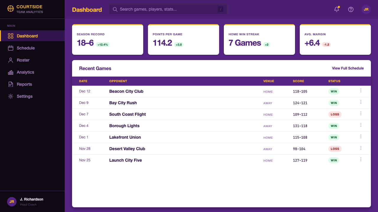
For presentation slides, the palette performs best in high-stakes contexts: investor decks, product launches, brand strategy presentations, award submissions, and any format where a sense of occasion is appropriate. A cover slide should commit fully: deep purple or black fills the entire frame, a gold wordmark or headline anchors the center or sits in asymmetric tension with a diagonal element, and the client or event name appears in a smaller, lighter treatment. Content slides work best on black grounds with gold used exclusively for headers, key metrics, and call-outs; body text sits in near-white for maximum legibility. Data slides take on a trophy-case quality — charts and graphs treated as objects of achievement, with bars and segments in gold against dark fields, and accent purple used to mark reference lines or secondary datasets.对于演示文稿,这套配色在高风险场合表现最佳:投资人路演、产品发布、品牌战略汇报、奖项申报,以及任何适合营造场合感的格式。封面页应当全情投入:深紫或黑色填满整个画面,金色字标或标题锚定中央或与对角线元素形成非对称张力,客户或活动名称以更小、更轻的处理呈现。内容页在黑色底面上效果最佳,金色专用于标题、关键指标和引用语;正文以近白色呈现以获得最大可读性。数据页呈现出奖杯展示柜般的品质——图表被视为成就的对象,柱条与扇区以金色映衬深色底面,强调紫用于参考线或次要数据集。
For web interfaces and dashboards, the system is best suited to platforms where authority and exclusivity are selling propositions: premium analytics tools, sports data platforms, financial dashboards, or membership tiers for high-end products. The approach is to treat the dark background as the default state and reserve gold for interactive elements, primary actions, and tier markers. Navigation should be typographic and minimal — the identity does not need decoration, only structure. Card components work well with a subtle metallic shimmer on borders or headers, approximating the foil quality of physical materials. Pricing pages benefit from the palette's natural hierarchy: a gold-badged premium tier stands out without requiring additional visual complexity.对于网页界面和仪表板,这套系统最适合权威性与独特性是核心价值主张的平台:高端分析工具、体育数据平台、金融仪表板,或高端产品的会员层级。方法是将深色背景视为默认状态,将金色保留给交互元素、主要操作和层级标记。导航应当是字体性的、简练的——这套身份不需要装饰,只需要结构。卡片组件在边框或标题处配合微妙的金属光泽效果,近似物理材质的箔感。定价页面受益于这套配色的自然层级:金色标注的高端层级无需额外视觉复杂度便已脱颖而出。
For editorial and marketing applications, the style supports layouts that feel like event programs rather than web pages — deliberate, formal, and designed for a moment of attention. Full-width feature blocks alternating between purple-on-black and gold-on-black create a cinematic scrolling experience. Pull quotes and key statistics presented in oversized gold numerals against dark fields carry the energy of an arena scoreboard. Marketing materials for product launches, championship announcements, or brand milestones benefit from the palette's ceremonial register: use the full triad — black ground, gold lead, purple structure — for documents meant to be saved rather than skimmed.对于编辑与营销应用,这种风格支持感觉像活动手册而非网页的版面——刻意、正式、为特定的注意力时刻而设计。在紫黑与金黑之间交替的全宽特性区块创造出电影般的滚动体验。在深色底面上以超大金色数字呈现的引用语和关键统计数据,携带着球馆计分板的能量。产品发布、总冠军宣布或品牌里程碑的营销材料,受益于这套配色的仪式性语调:对于意在被保存而非被浏览的文件,使用完整三角——黑色底面、金色领衔、紫色结构。
A common mistake when applying this palette is treating purple and gold as interchangeable. They are not. Gold is the active color — the headline, the call to action, the metric that matters. Purple is the structural color — the section divider, the secondary text container, the background for supporting information. When gold is reduced to an accent and purple is promoted to the primary communication role, the system inverts its own hierarchy and loses the clarity that gives it authority. A second common error is lightening the palette for contexts that feel 'too formal': adding cream or off-white backgrounds, softening gold to a muted yellow, or using purple only as a light tint. These adjustments destroy the system's character. If the context calls for warmth or casualness, a different palette is the correct answer — not a diluted version of this one.应用这套配色时最常见的错误,是将紫色与金色视为可互换的。它们不是。金色是主动色——标题、行动号召、重要指标。紫色是结构色——段落分割、次要文字容器、辅助信息的背景。当金色被降格为点缀、紫色被提升为主要传达角色时,系统颠倒了自身的层级,失去了赋予其权威的清晰度。第二个常见错误是为了让场合感觉「不那么正式」而将色板调亮:添加奶油色或米白背景、将金色软化为哑黄、或只将紫色作为浅色调使用。这些调整摧毁了系统的性格。如果场合需要温暖或随意,正确的答案是换一套配色——而不是这套的稀释版本。
See the Los Angeles Lakers design system查看 Los Angeles Lakers 完整设计系统
Los Angeles Lakers — FAQLos Angeles Lakers · 常见问题
Is this palette only appropriate for sports and entertainment contexts?这套配色是否只适合体育与娱乐场景?
Not exclusively, but the cultural associations are strong enough that context selection matters enormously. The palette works well anywhere that prestige, achievement, and ceremony are appropriate: luxury product launches, award programs, financial platforms targeting high-net-worth users, premium membership tiers, and brand identities for companies that want to position themselves as category leaders. It works poorly for contexts requiring approachability, warmth, or inclusion — community products, children's platforms, healthcare applications, or brands positioning on openness and accessibility. The palette does not whisper; it announces. If that announcement is coherent with the product's values, it is an asset. If it creates a mismatch, it creates confusion.并非专属,但文化关联足够强烈,场景选择至关重要。这套配色在任何声望、成就与仪式感适宜的地方都表现良好:奢华产品发布、颁奖典礼、面向高净值用户的金融平台、高端会员层级,以及希望将自身定位为品类领导者的品牌。在需要亲和力、温暖感或包容性的场景中表现欠佳——社区产品、儿童平台、医疗应用,或以开放性与可及性为定位的品牌。这套配色不是耳语,而是宣告。如果这个宣告与产品价值观一致,它是一种资产。如果造成不匹配,它制造混乱。
Can the palette be used on light backgrounds?这套配色能用在浅色背景上吗?
It can be adapted, but with significant trade-offs. On a white or cream ground, the purple reads more as a traditional corporate color and the gold — especially in flat digital rendering — risks looking muddy or indistinct. The black-ground configuration is not a stylistic preference but a structural requirement for the palette to achieve its full contrast and ceremonial quality. A light-background application works best when it is treated as a secondary or supporting register — letterhead, document body, supporting materials — while primary communication surfaces (covers, hero sections, key pages) maintain the dark ground. Attempting to build an entire visual system on a light background using this palette typically results in something that looks less like the Lakers identity and more like generic collegiate design.可以改编,但有明显的代价。在白色或奶油底面上,紫色更接近普通企业色,金色——尤其在数字平面渲染中——有显得浑浊或模糊不清的风险。黑色底面配置不是风格偏好,而是这套配色实现完整对比度和仪式感品质的结构性要求。浅色背景应用最适合作为次级或支持性语调——信头纸、文件正文、辅助材料——而主要传达面(封面、英雄区域、关键页面)维持深色底面。尝试用这套配色在浅色底面上构建完整视觉系统,通常产出的东西看起来不像湖人身份,更像普通校队设计。
How should gold be rendered digitally when metallic finishes are unavailable?在无法使用金属质感时,数字端的金色应如何呈现?
The key is to use light and shadow to imply surface rather than rendering gold as a uniform flat color. A subtle gradient from a slightly lighter, more yellow-shifted tone at the top to a richer, deeper amber at the bottom suggests the play of light across a curved metallic surface. A thin highlight stroke along the top edge of a gold element and a slight deepening at its base reinforce the three-dimensional quality. This approach avoids the need for actual metallic materials while preserving the visual richness that distinguishes the system's gold from a generic yellow. The goal is for the color to look earned — like it has been polished — rather than simply selected from a color picker.关键在于使用光与影来暗示表面,而不是将金色渲染为均匀的平面色。从顶部略偏亮、偏黄的色调过渡至底部更浓郁、更深沉的琥珀色,这种微妙渐变暗示光线在弧形金属面上的流动。金色元素顶边的细高光线条和底部的轻微加深,强化三维品质。这种处理无需实际金属材质,同时保留了将这套系统的金色与普通黄色区分开来的视觉丰富性。目标是让这种颜色看起来是赢来的——像被擦亮过的——而不是从颜色选择器中随意点选的。
What is the difference between using this palette for a sports brand versus a non-sports brand?将这套配色用于体育品牌与非体育品牌,有何不同?
For a sports brand — particularly one in basketball or adjacent entertainment — the palette carries direct categorical meaning, and the design challenge is to differentiate within the reference rather than despite it. The Lakers identity is a benchmark; working in the same space requires a clear point of distinction, whether through typographic treatment, compositional approach, or the way gold is deployed. For a non-sports brand, the reference operates at the level of feeling rather than category: the palette communicates achievement, glamour, and cinematic ambition without literally saying basketball. The design latitude is wider, but the responsibility to earn the palette's authority through the quality of the work is higher — the cultural freight only transfers if the execution is genuinely excellent.对于体育品牌——尤其是篮球或相邻娱乐领域的品牌——这套配色携带直接的品类意涵,设计挑战在于在参照框架内实现差异化,而非对抗它。湖人身份是一个基准;在同一空间工作,需要明确的差异化点,无论是字形处理、构图方法还是金色的部署方式。对于非体育品牌,这个参照在感受层面而非品类层面发挥作用:配色传达成就、魅力与电影化野心,而不直接指向篮球。设计空间更宽阔,但通过作品质量来赢得这套配色权威的责任也更高——文化积淀只有在执行层面真正卓越时才能转移。
Does this style work for data-heavy interfaces, or does the drama overwhelm the information?这种风格适合数据密集型界面吗?还是说强烈的戏剧感会淹没信息?
The palette works well for data-heavy interfaces when information hierarchy is carefully maintained. The key insight is that the palette's drama comes from color contrast, not from visual complexity — which means a dark, high-contrast data environment can be both dramatic and highly legible. The discipline required is to use gold sparingly: reserve it for the most important number, the primary trend line, the metric that drives the decision. Supporting data in near-white, secondary data in a muted purple, and reference lines in a dim gray allow the gold-highlighted element to dominate without competition. The common failure mode is applying gold to too many data points simultaneously, which flattens the hierarchy and makes the display feel overwhelming. Used as a spotlight rather than a floodlight, gold in a data environment functions as a natural attention direction system.当信息层级得到精心维护时,这套配色在数据密集型界面中表现良好。关键洞察是:这套配色的戏剧感来自色彩对比,而非视觉复杂度——这意味着一个深色、高对比度的数据环境可以同时做到戏剧化和高度可读。所需的自律是克制地使用金色:将其保留给最重要的数字、主要趋势线、驱动决策的指标。辅助数据用近白色,次级数据用哑光紫,参考线用暗灰——让金色高亮的元素在无竞争的情况下主导视野。常见的失败模式是同时对过多数据点使用金色,这会拉平层级,让展示感觉压迫。用作聚光灯而非泛光灯时,金色在数据环境中充当自然的注意力导向系统。
Related design styles相关设计风格
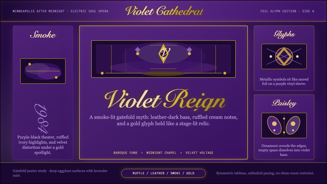 Prince — Purple Rain (1984)Decadence turns electric. Eggplant violet, gold foil glyphs, and smoky symmet…颓艳通电:茄紫、金箔符号与烟雾对称搭起神话舞台。
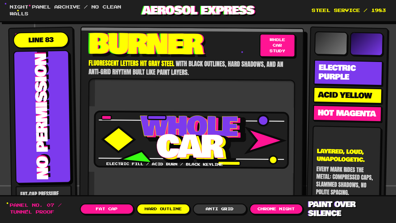 NYC Subway Graffiti (1983)Bombed steel gets loud. Electric purple and acid yellow stack as hard-outline…钢板被炸响:电紫与酸黄层叠,黑线框出狂野字形。
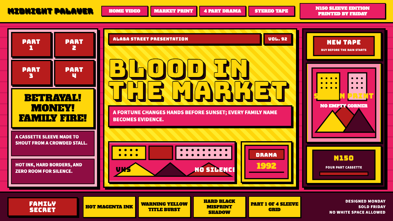 Nollywood VHS CoversEvery inch shouts. Magenta, warning yellow, hard shadows, and part stamps pac…每寸都在叫卖:洋红、警示黄、硬黑投影和分集印章塞满画面。
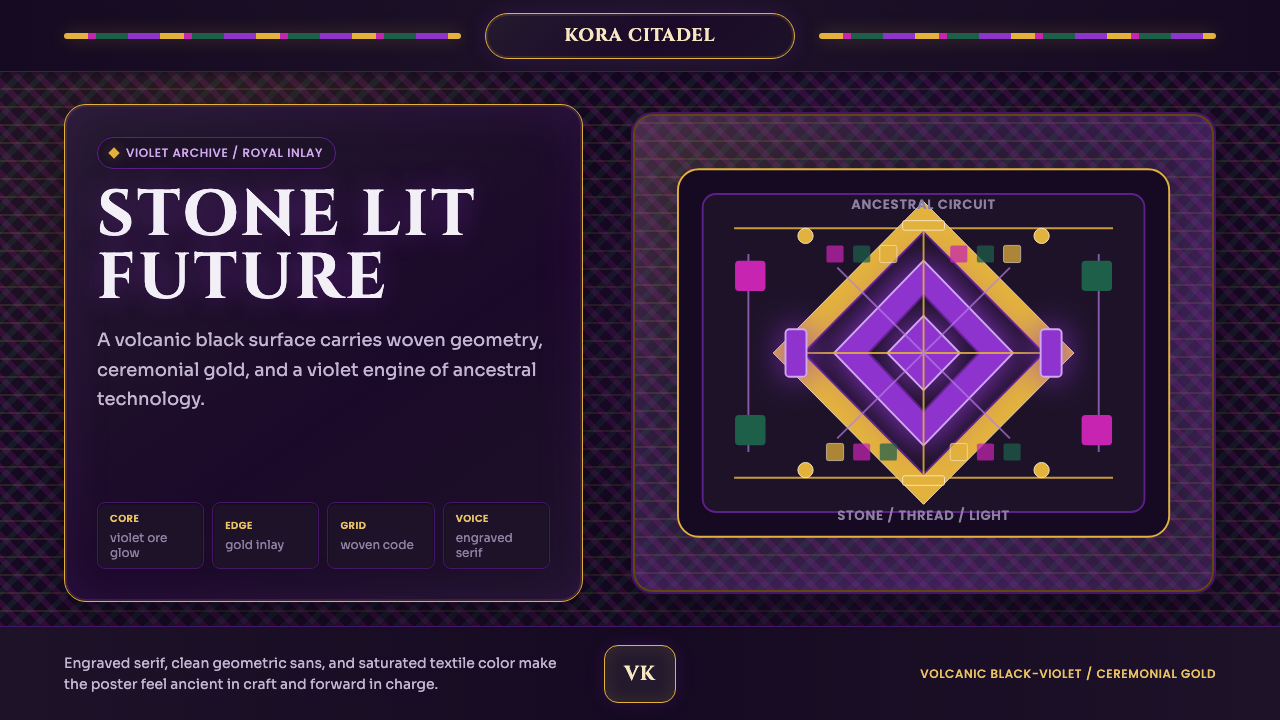 Africanfuturism VibraniumCeremony goes electric. Violet glow and gold inlay thread a volcanic textile…仪式感通电:紫光与金线织入火山黑几何网格。
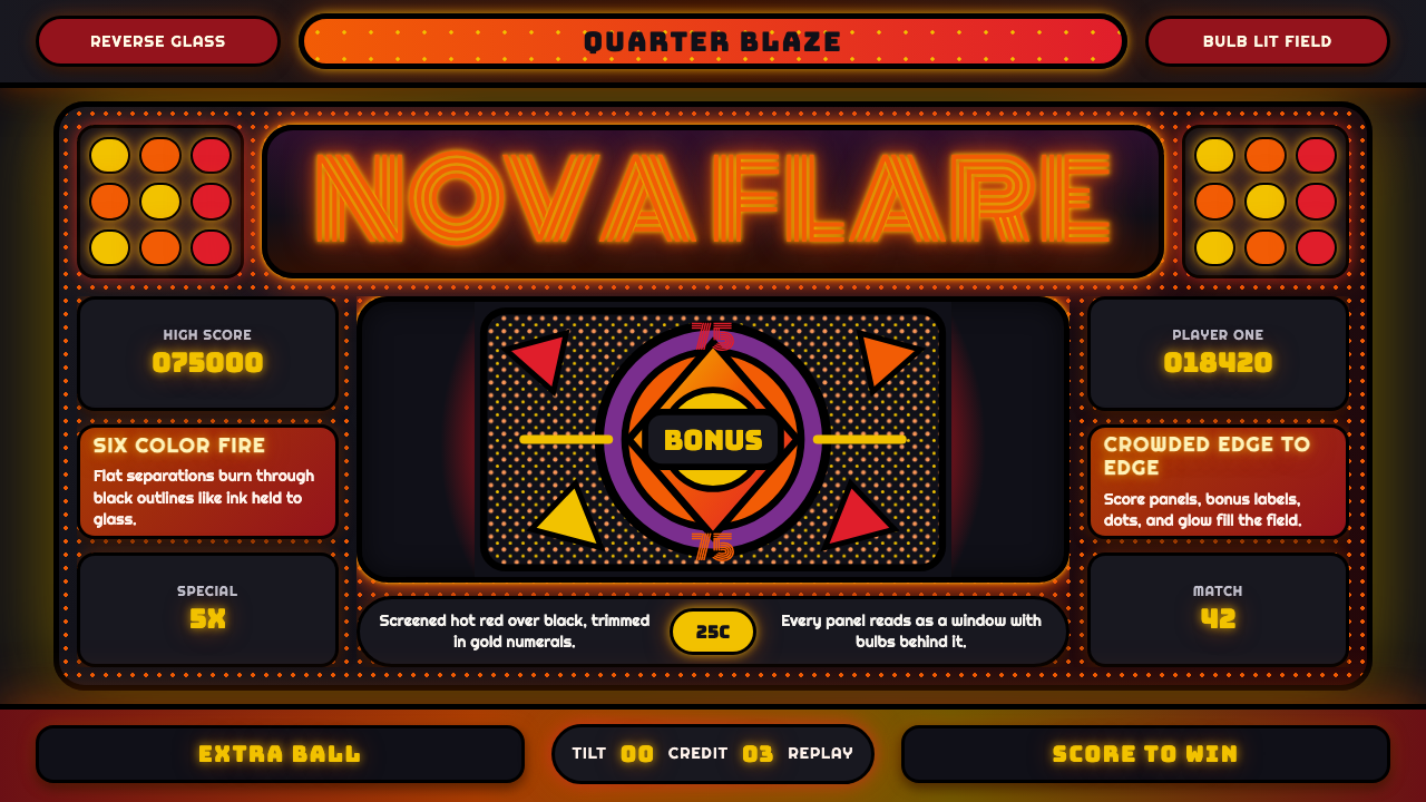 Pinball BackglassGlows like paid light. Monoton type, black outlines, orange-red halftones cro…像投币后的灯光燃起。Monoton 字体、黑描边与橙红半调挤满玻璃。
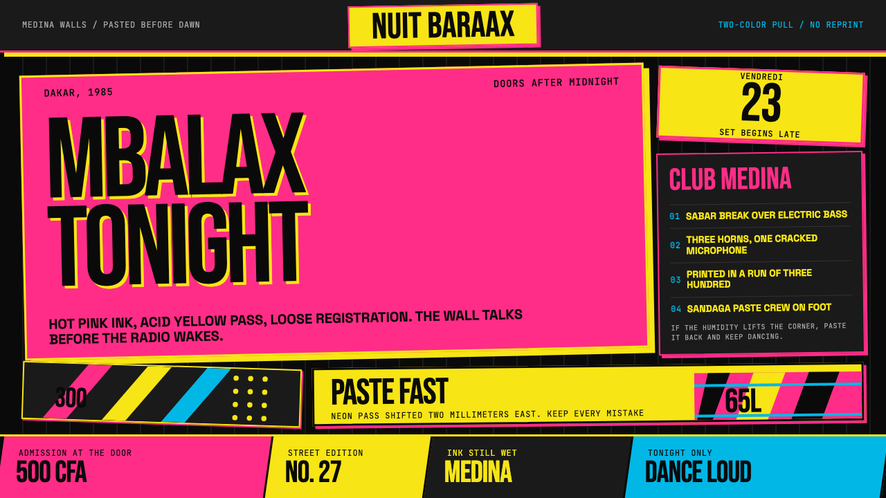 Senegalese Mbalax Poster (Dakar 1985)Street urgency, screen-printed loud. Hot pink and acid yellow drift over blac…街头急迫感:黑色新闻纸上,荧光粉与酸黄错位套印。